Tab with Content
The Tab With Content Module is designed to streamline workflows, standardize task execution, and improve efficiency across various industries. It provides a structured approach to completing processes, ensuring consistency and compliance.
Vertical Tabs Module with Numbering
The Vertical Tab module in the HubSpot CMS allows you to add "Complex Data" in your website pages easily.
Fully Responsive Design
The Vertical Tab module in the HubSpot CMS.
Get Started
The Vertical Tab module in the HubSpot CMS.
Clean UI Design
The Vertical Tab module in the HubSpot CMS.
User Experience
The Vertical Tab module in the HubSpot CMS.
SEO Optimization
The Vertical Tab module in the HubSpot CMS.
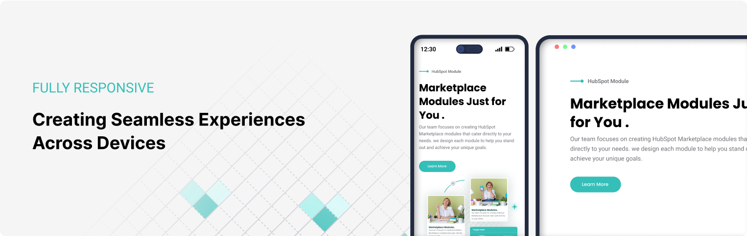
Fully Responsive Design
In the age of smartphones, tablets, and a multitude of screen sizes, having a fully responsive design has become essential for any website or application. Fully responsive design is a development approach that allows websites to adapt seamlessly across various devices and screen sizes, providing a consistent user experience whether someone is using a large desktop monitor, a laptop, a tablet, or a smartphone.
Get Started
In the age of smartphones, tablets, and a multitude of screen sizes, having a fully responsive design has become essential for any website or application. Fully responsive design is a development approach that allows websites to adapt seamlessly across various devices and screen sizes, providing a consistent user experience whether someone is using a large desktop monitor, a laptop, a tablet, or a smartphone.
Clean UI Design
In the age of smartphones, tablets, and a multitude of screen sizes, having a fully responsive design has become essential for any website or application. Fully responsive design is a development approach that allows websites to adapt seamlessly across various devices and screen sizes, providing a consistent user experience whether someone is using a large desktop monitor, a laptop, a tablet, or a smartphone.
User Experience
In the age of smartphones, tablets, and a multitude of screen sizes, having a fully responsive design has become essential for any website or application. Fully responsive design is a development approach that allows websites to adapt seamlessly across various devices and screen sizes, providing a consistent user experience whether someone is using a large desktop monitor, a laptop, a tablet, or a smartphone.
SEO Optimization
In the age of smartphones, tablets, and a multitude of screen sizes, having a fully responsive design has become essential for any website or application. Fully responsive design is a development approach that allows websites to adapt seamlessly across various devices and screen sizes, providing a consistent user experience whether someone is using a large desktop monitor, a laptop, a tablet, or a smartphone.
Horizontal Tabs Module with Numbering
The Horizontal Tab module in the HubSpot CMS allows you to add "Complex Data" in your website pages easily.
Fully Responsive Design
In the age of smartphones, tablets, and a multitude of screen sizes, having a fully responsive design has become essential for any website or application. Fully responsive design is a development approach that allows websites to adapt seamlessly across various devices and screen sizes, providing a consistent user experience whether someone is using a large desktop monitor, a laptop, a tablet, or a smartphone.
Get Started
In the age of smartphones, tablets, and a multitude of screen sizes, having a fully responsive design has become essential for any website or application. Fully responsive design is a development approach that allows websites to adapt seamlessly across various devices and screen sizes, providing a consistent user experience whether someone is using a large desktop monitor, a laptop, a tablet, or a smartphone.
Clean UI Design
In the age of smartphones, tablets, and a multitude of screen sizes, having a fully responsive design has become essential for any website or application. Fully responsive design is a development approach that allows websites to adapt seamlessly across various devices and screen sizes, providing a consistent user experience whether someone is using a large desktop monitor, a laptop, a tablet, or a smartphone.
User Experience
In the age of smartphones, tablets, and a multitude of screen sizes, having a fully responsive design has become essential for any website or application. Fully responsive design is a development approach that allows websites to adapt seamlessly across various devices and screen sizes, providing a consistent user experience whether someone is using a large desktop monitor, a laptop, a tablet, or a smartphone.
SEO Optimization
In the age of smartphones, tablets, and a multitude of screen sizes, having a fully responsive design has become essential for any website or application. Fully responsive design is a development approach that allows websites to adapt seamlessly across various devices and screen sizes, providing a consistent user experience whether someone is using a large desktop monitor, a laptop, a tablet, or a smartphone.