
 $19
$19
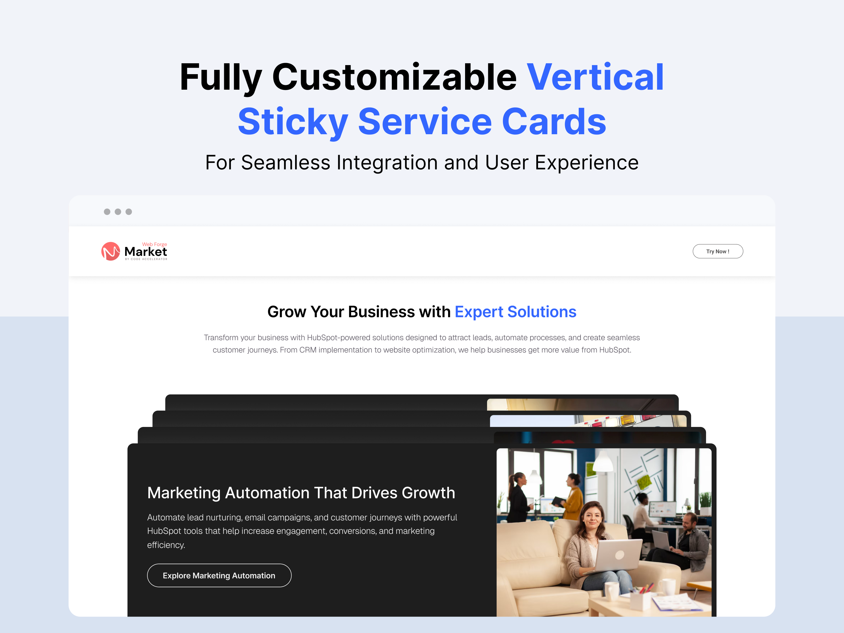
Vertical Sticky Service Cards

Key Features Vertical Sticky Service Cards Module :
- Vertical Sticky Scroll Experience : Create an engaging scrolling journey with service cards that remain sticky and reveal content progressively.
- Smooth Card Stacking Animation : Showcase services with seamless stacking and transition effects that add depth and visual appeal.
- Responsive Design: Adjusts seamlessly across devices, from desktops to mobile screens.
- Customizable Styles: Fully customizable with CSS variables for themes, fonts, colors, and animations.
- Performance Optimization: Lightweight animations optimized to ensure smooth interactions without lag.
- Multiple Card Support : Display multiple feature cards, service highlights, team members, or product showcases in a clean and organized layout.
Discover More in the Knowledge Base
Explore detailed documentation, setup instructions, feature explanations, and best practices to help you get the most out of this module quickly and efficiently.
 $19
$19
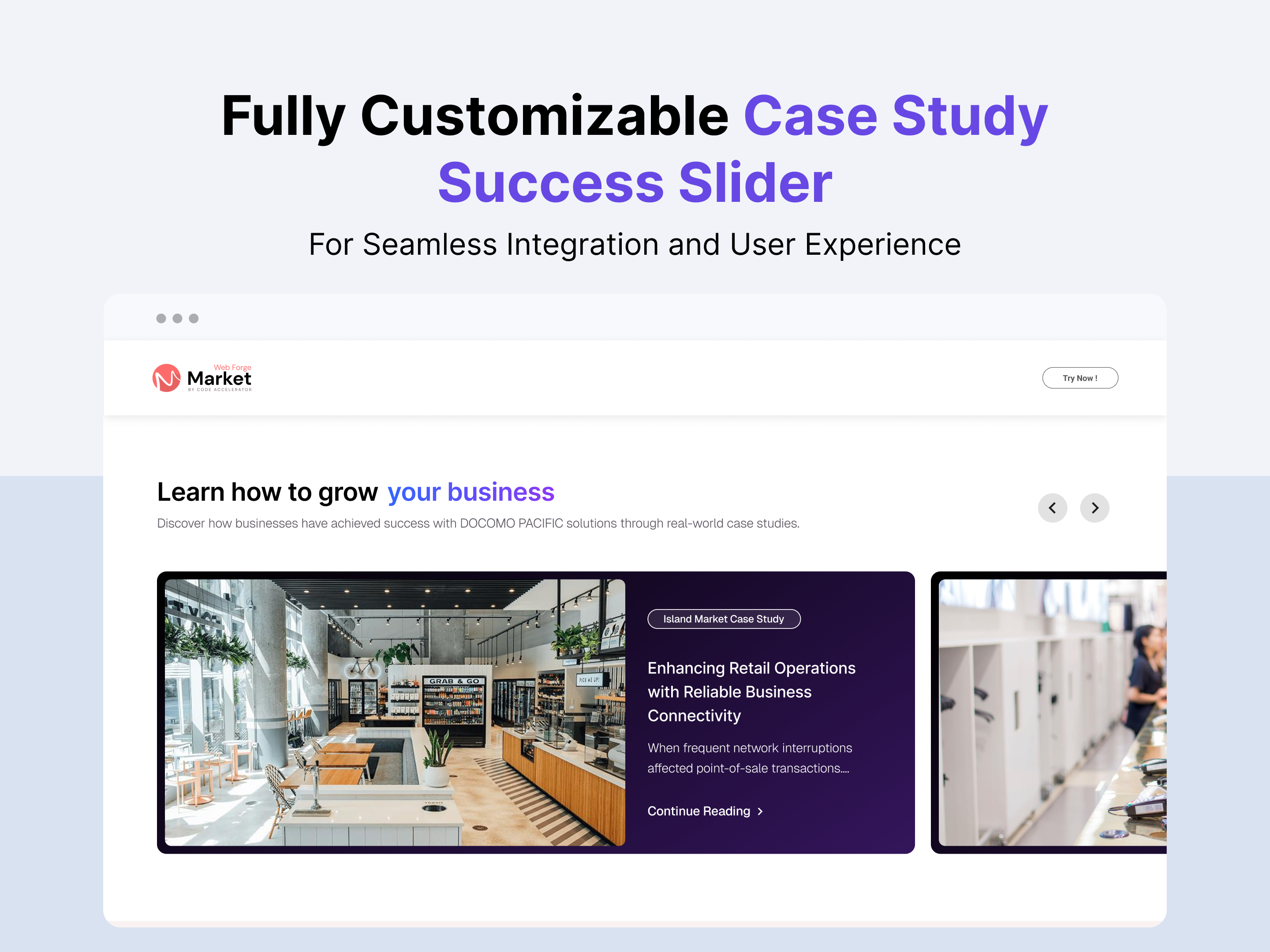
Case Study Success Slider
Key Features of a Case Study Success Slider Module :
✅ Fully Mobile Responsive – Seamlessly adapts to all screen sizes for the best viewing experience.
✅ Multiple Testimonial Items Support – Easily add and manage multiple testimonials including customer name, position, company, and review content.
✅ Slide Arrows Option – Optional navigation arrows enhance usability.
✅ Modern & Clean Design – Sleek, contemporary styling fits perfectly into any modern website.
✅ Easy to Edit – Quickly customize content, styles, and settings without hassle.
✅ Easy to Integrate – Simple setup and integration into any page or theme.
✅ Optimized for Performance – Lightweight and fast for smooth transitions and loading.
✅ Smooth Animation Effects - Built-in fade or slide animations enhance visual engagement without affecting performance.
Discover More in the Knowledge Base
Explore detailed documentation, setup instructions, feature explanations, and best practices to help you get the most out of this module quickly and efficiently.
 $19
$19
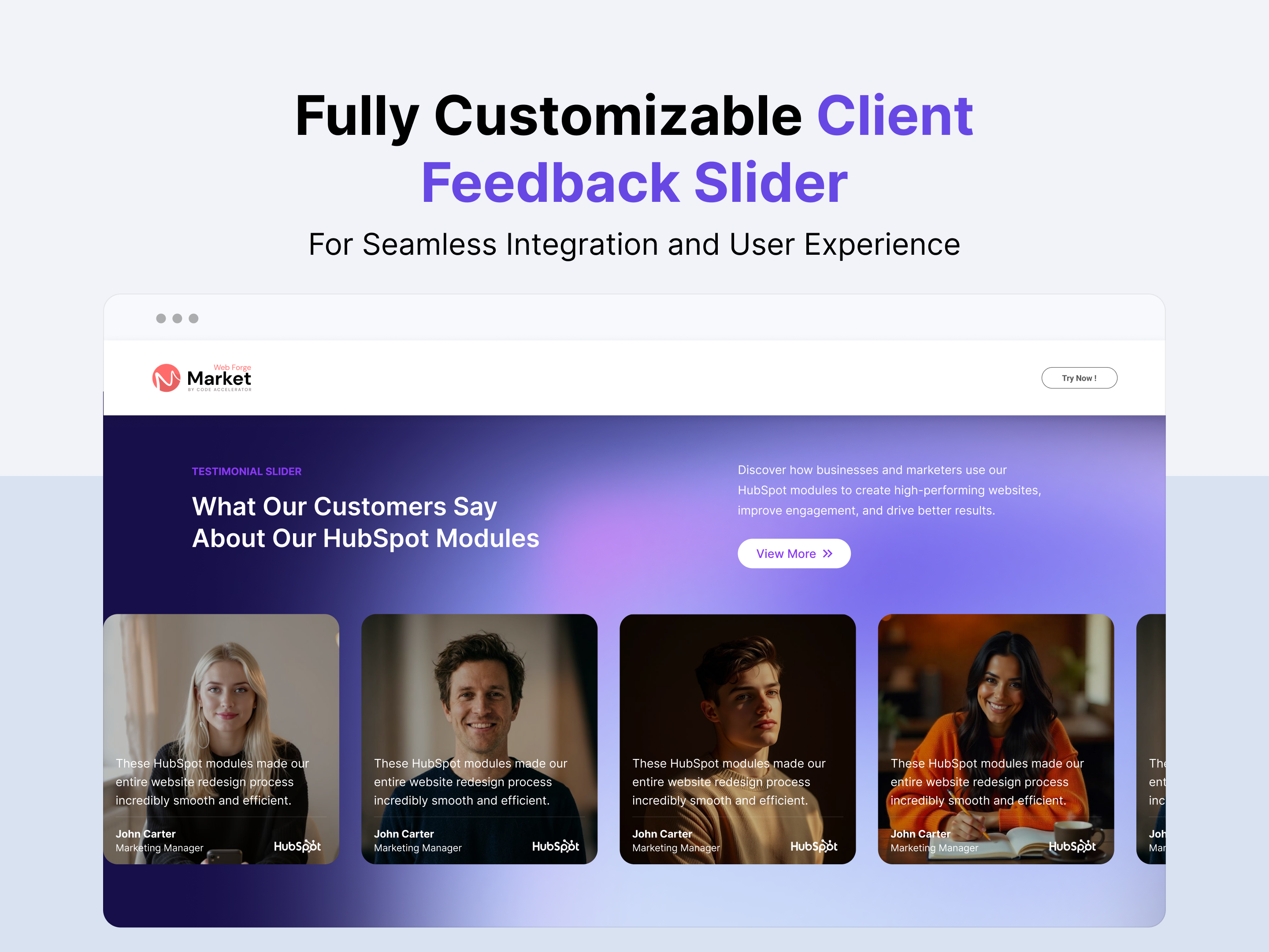
Client Feedback Slider
Key Features of a Client Feedback Slider Module :
✅ 2 Unique Layout Options – Choose from three beautifully crafted slider layouts to match any design style.
✅ Fully Mobile Responsive – Seamlessly adapts to all screen sizes for the best viewing experience.
✅ Multiple Testimonial Items Support – Easily add and manage multiple testimonials including customer name, position, company, and review content.
✅ Slide Arrows Option – Optional navigation arrows enhance usability.
✅ Modern & Clean Design – Sleek, contemporary styling fits perfectly into any modern website.
✅ Easy to Edit – Quickly customize content, styles, and settings without hassle.
✅ Easy to Integrate – Simple setup and integration into any page or theme.
✅ Optimized for Performance – Lightweight and fast for smooth transitions and loading.
✅ Smooth Animation Effects - Built-in fade or slide animations enhance visual engagement without affecting performance.
Discover More in the Knowledge Base
Explore detailed documentation, setup instructions, feature explanations, and best practices to help you get the most out of this module quickly and efficiently.
 $19
$19
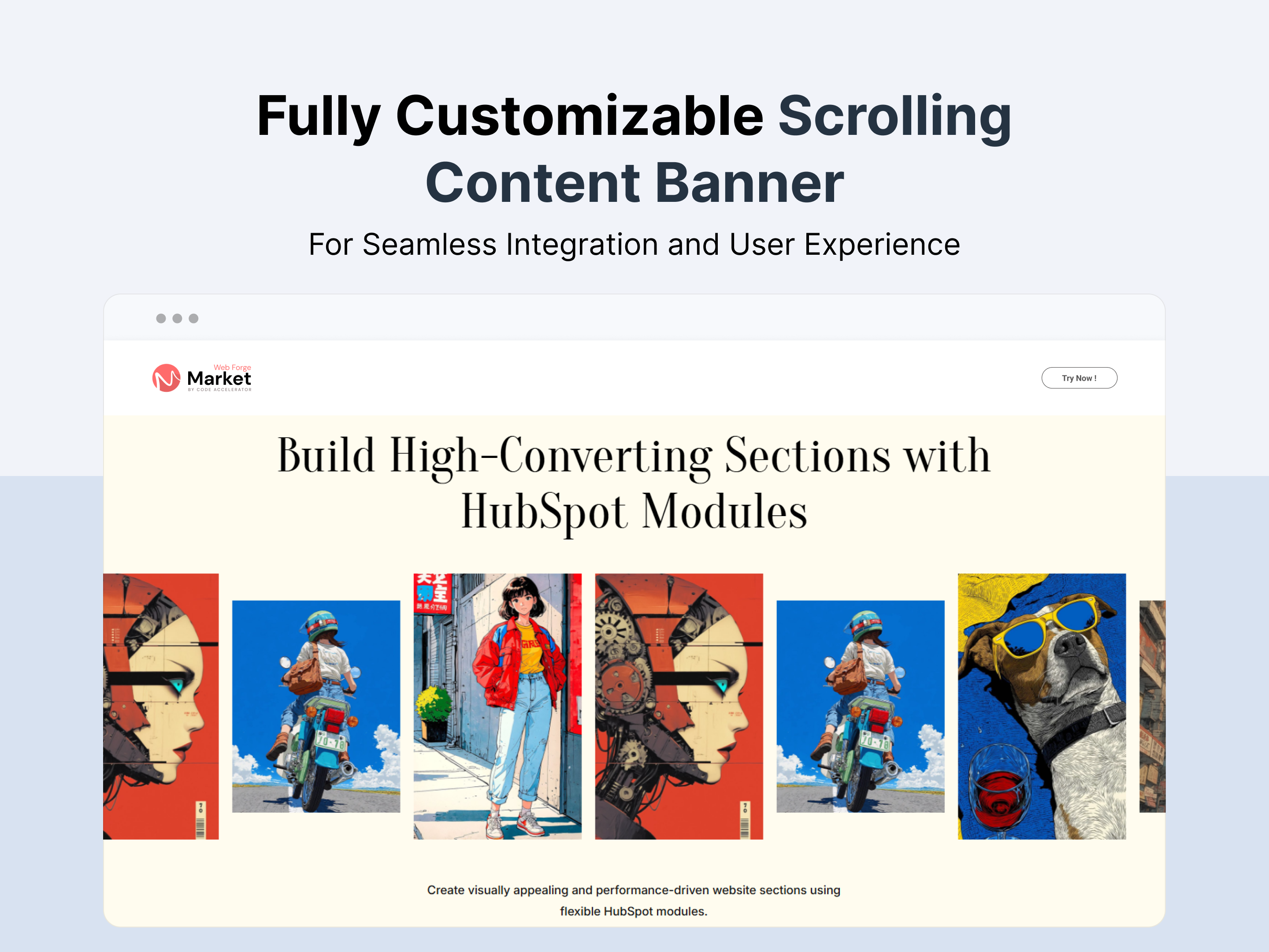
Scrolling Content Banner
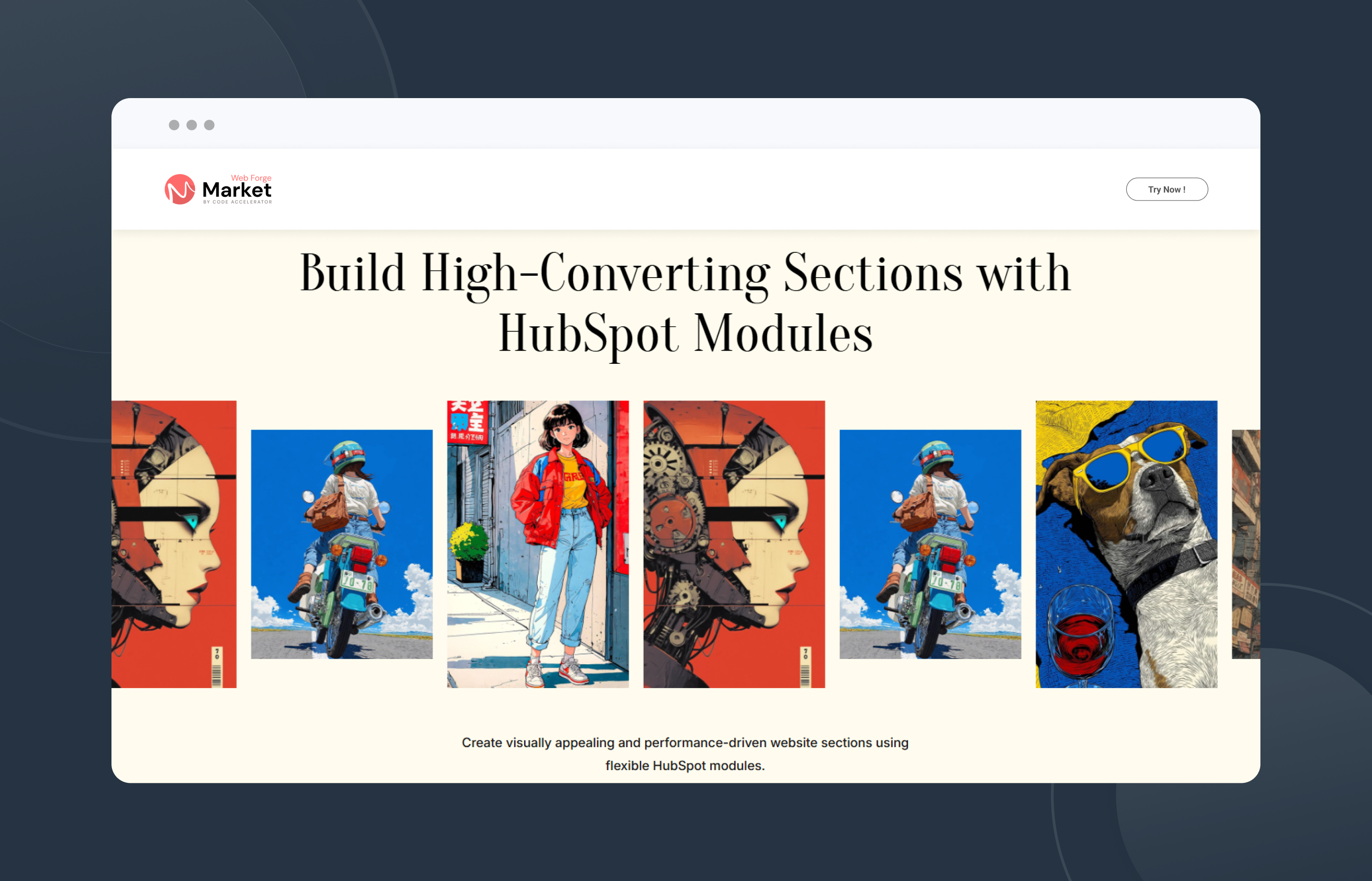
Key Features Scrolling Content Banner Module :
- Responsive Design: Adjusts seamlessly across devices, from desktops to mobile screens.
- Pause on Hover : Allow users to pause the scrolling content when hovering over the banner for improved readability and interaction.
- Customizable Styles: Fully customizable with CSS variables for themes, fonts, colors, and animations.
- Performance Optimization: Lightweight animations optimized to ensure smooth interactions without lag.
- Continuous Scrolling Animation : Display content in a smooth, uninterrupted scrolling motion to capture attention and keep visitors engaged.
Discover More in the Knowledge Base
Explore detailed documentation, setup instructions, feature explanations, and best practices to help you get the most out of this module quickly and efficiently.
 $29
$29
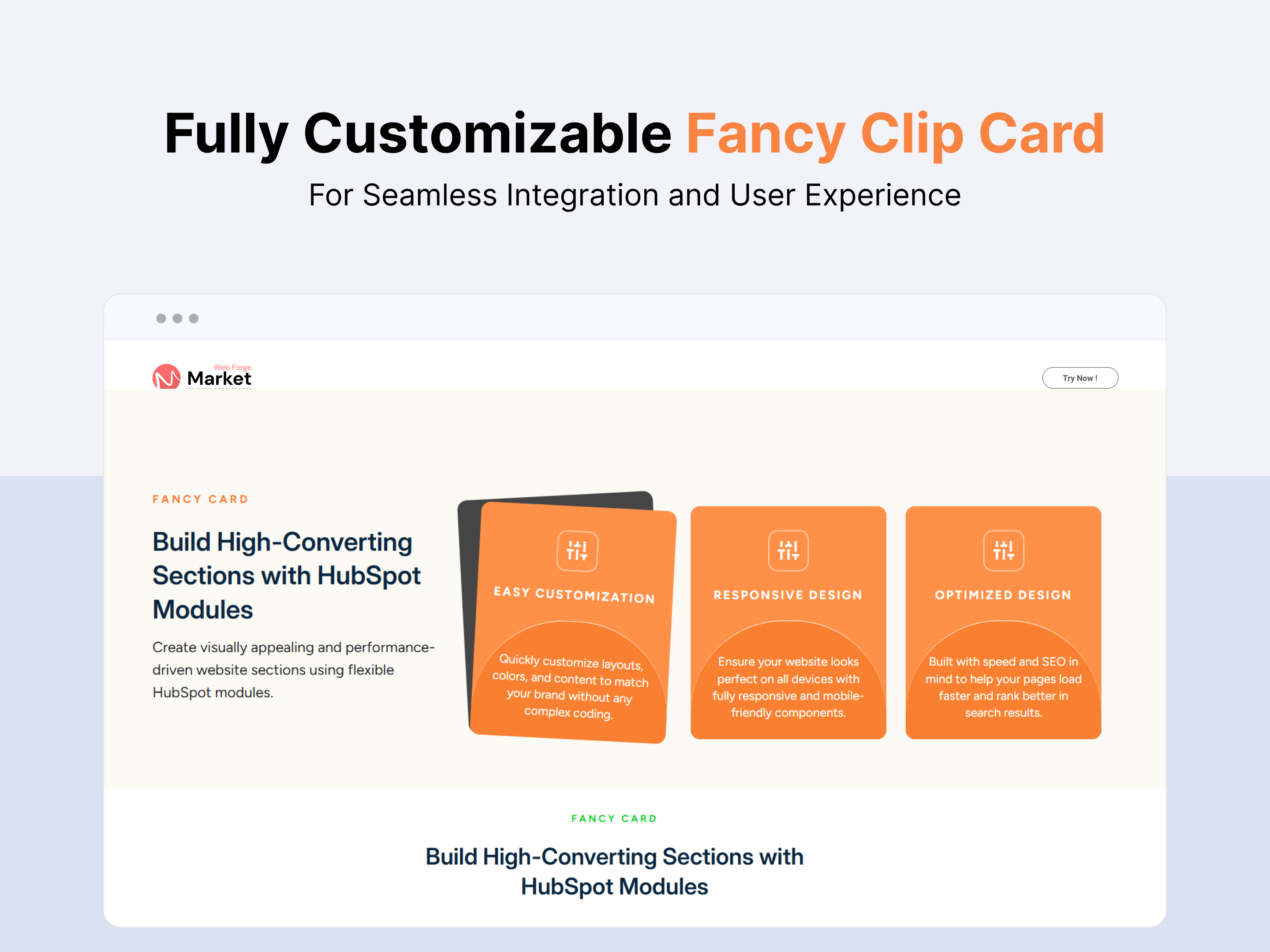
Fancy Clip Card
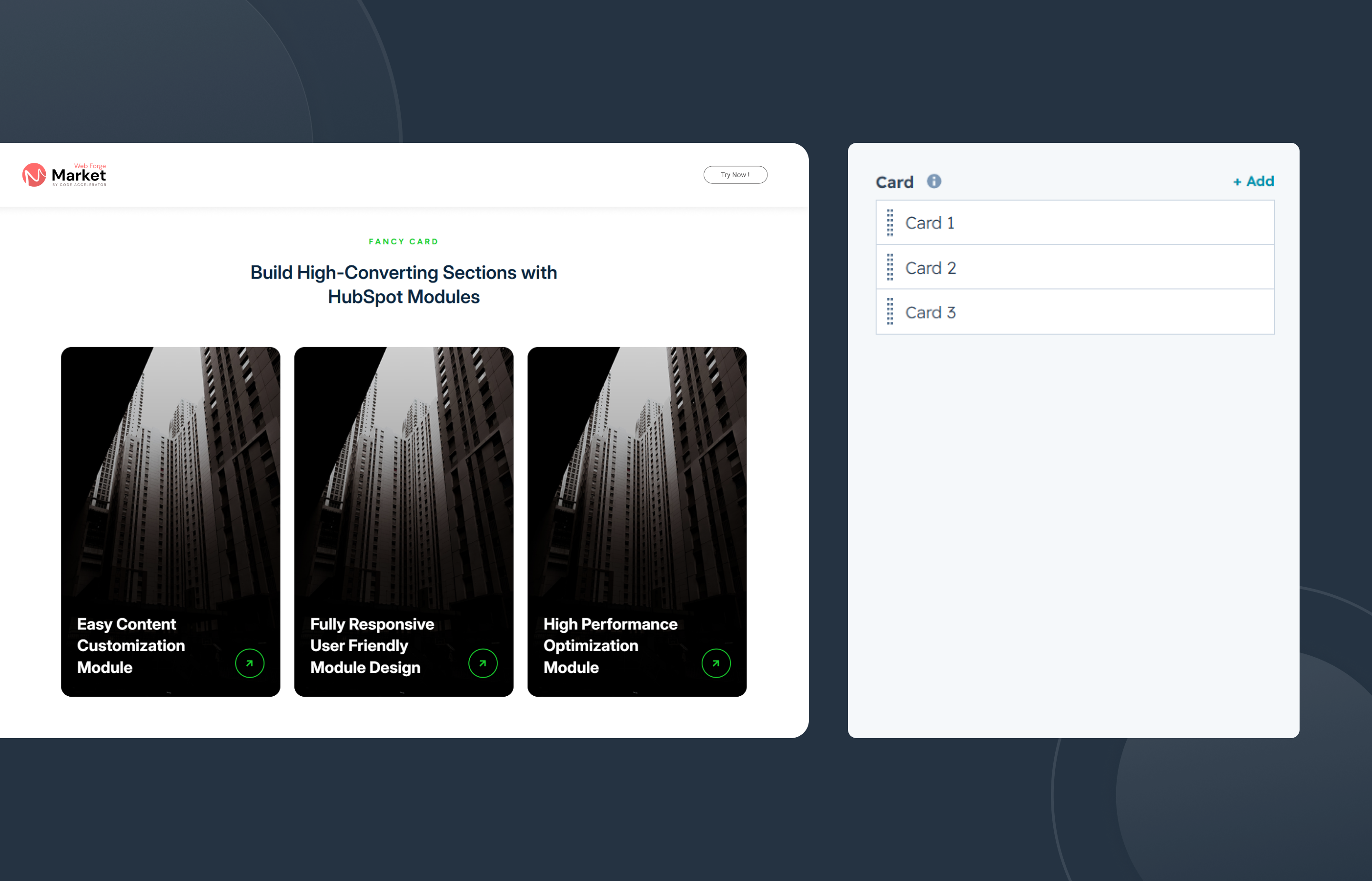
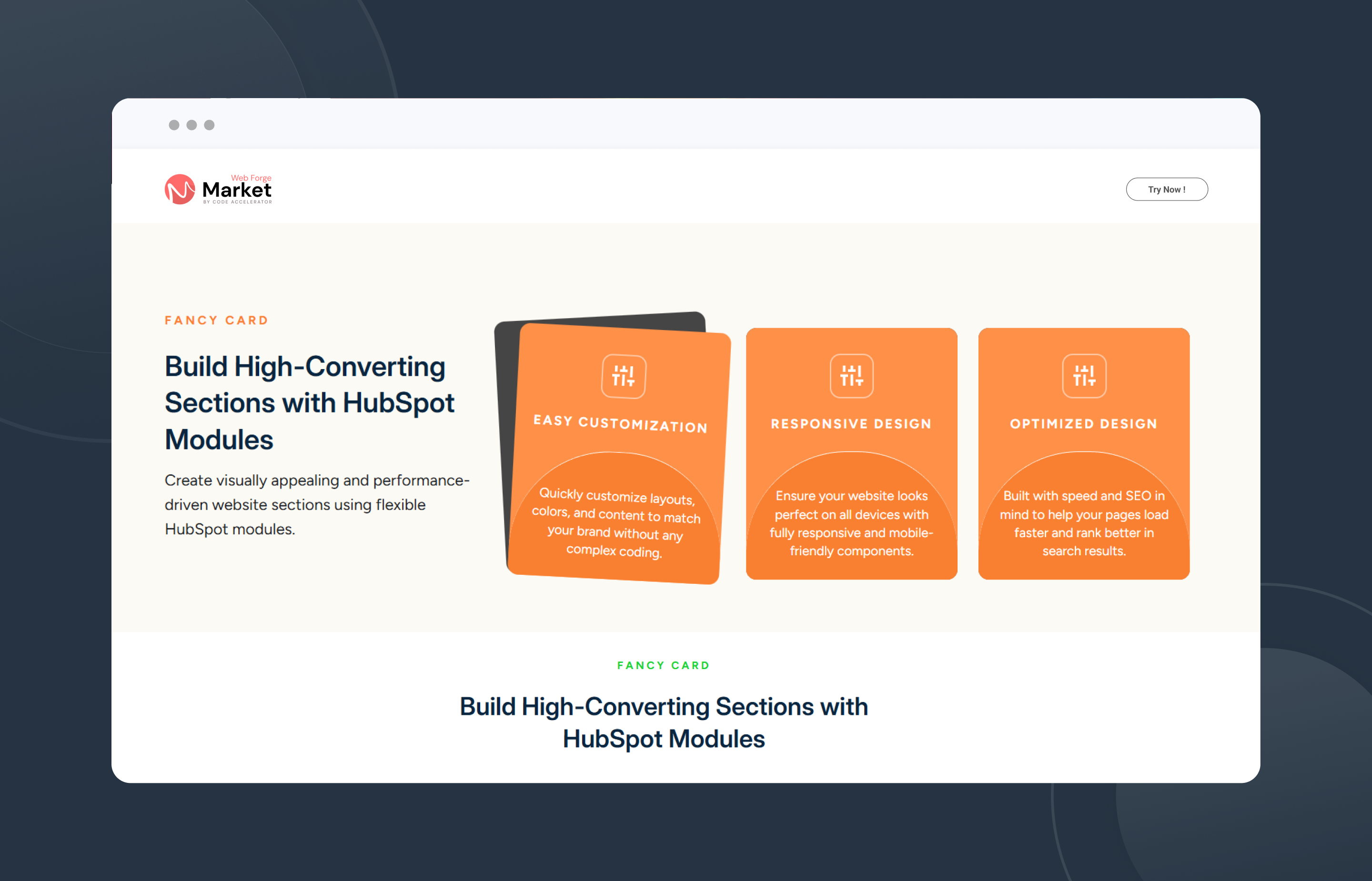
Key Features Fancy Clip Card Module :
- Responsive Design: Adjusts seamlessly across devices, from desktops to mobile screens.
- Hover Effects: Visual feedback when users hover over cards, such as scaling, highlighting, or revealing additional information.
- Customizable Styles: Fully customizable with CSS variables for themes, fonts, colors, and animations.
- Performance Optimization: Lightweight animations optimized to ensure smooth interactions without lag.
- Multiple Card Support : Display multiple feature cards, service highlights, team members, or product showcases in a clean and organized layout.
Discover More in the Knowledge Base
Explore detailed documentation, setup instructions, feature explanations, and best practices to help you get the most out of this module quickly and efficiently.
 $29
$29
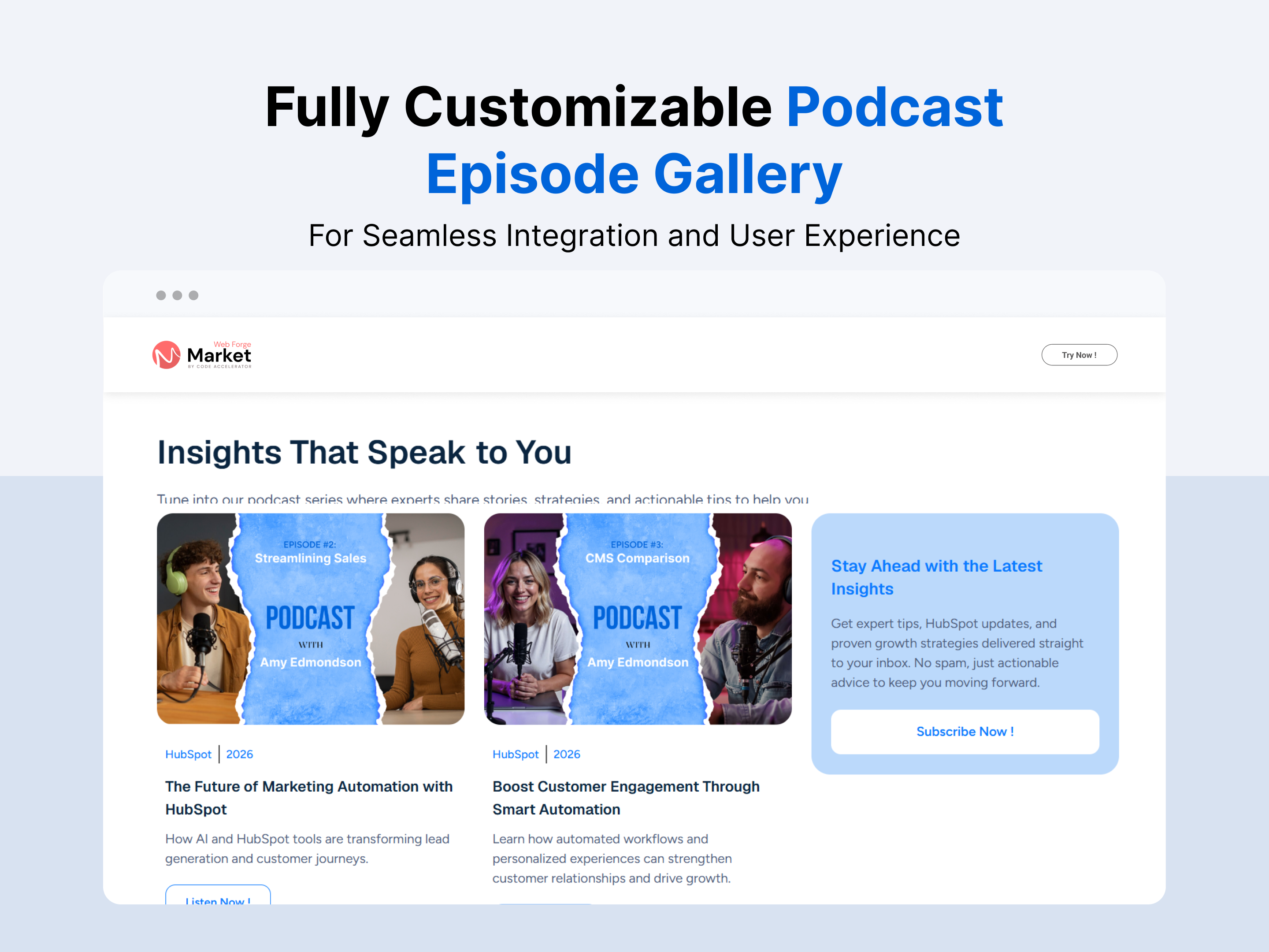
Podcast Episode Gallery
Key Features of the Podcast Episode Gallery Module :
-
User-Friendly Interface:
- Intuitive Design: Easily navigate through the module with a clean and straightforward layout.
- Drag-and-Drop Functionality: Simplify the process of adding images, text.
-
Fully Responsive:
- Mobile Optimization: Automatically adjusts content for optimal viewing on all devices, including desktops, tablets, and smartphones.
- No Coding Required: Enjoy a seamless experience without the need for additional coding or styling adjustments.
-
Customization Options:
- Styling Controls: Modify colors, typography, margins, paddings, box shadows, and borders directly from the styles tab to match your branding.
- Template Variety: Choose from a selection of pre-designed templates or create your own unique layout.
-
Lead Generation Focused :
Collect visitor information efficiently to grow your email list and marketing database. - Custom Episode Cards :
Display episode artwork, title, description, duration, and publication date in fully customizable cards.
Discover More in the Knowledge Base
Explore detailed documentation, setup instructions, feature explanations, and best practices to help you get the most out of this module quickly and efficiently.
 $29
$29
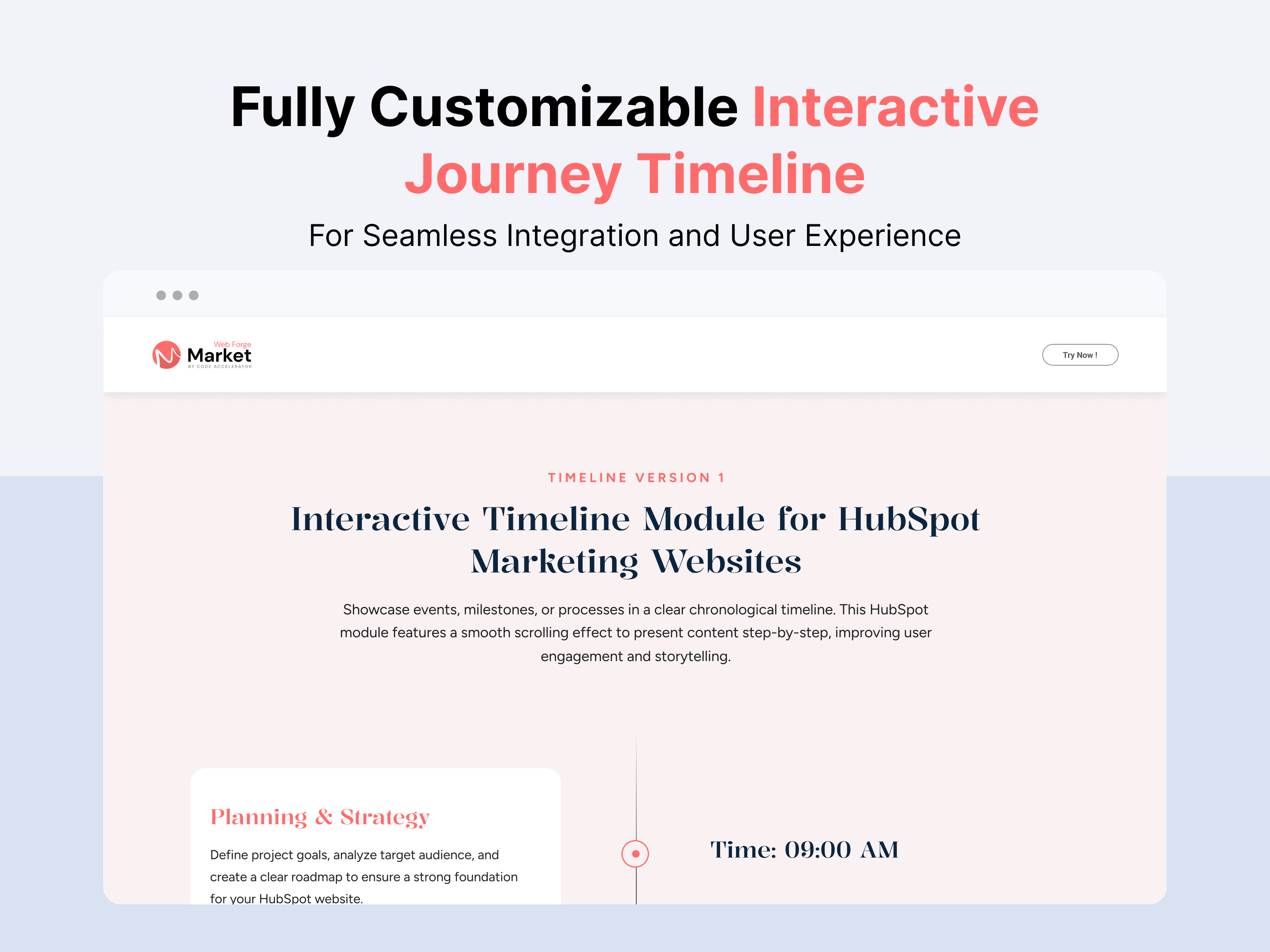
Interactive Journey Timeline
Key Features :
- Event Management: Users can add, edit, and delete events along a chronological timeline. Each event typically includes details such as a title, description, date, and optionally.
- Responsive Design: The timeline module should be responsive, meaning it adapts smoothly to different screen sizes and devices. This ensures a consistent user experience across desktops, tablets, and mobile devices.
- Customizable Styling: Users can customize the appearance of the timeline to match their branding or design preferences. This includes options for colors, fonts, sizes, and overall layout.
- Smooth Animations: Implement smooth animations to enhance the user experience during drag-and-drop actions.
- SEO-Friendly Structure : Built with clean, semantic markup to support search engine visibility and accessibility.
Discover More in the Knowledge Base
Explore detailed documentation, setup instructions, feature explanations, and best practices to help you get the most out of this module quickly and efficiently.
 $29
$29
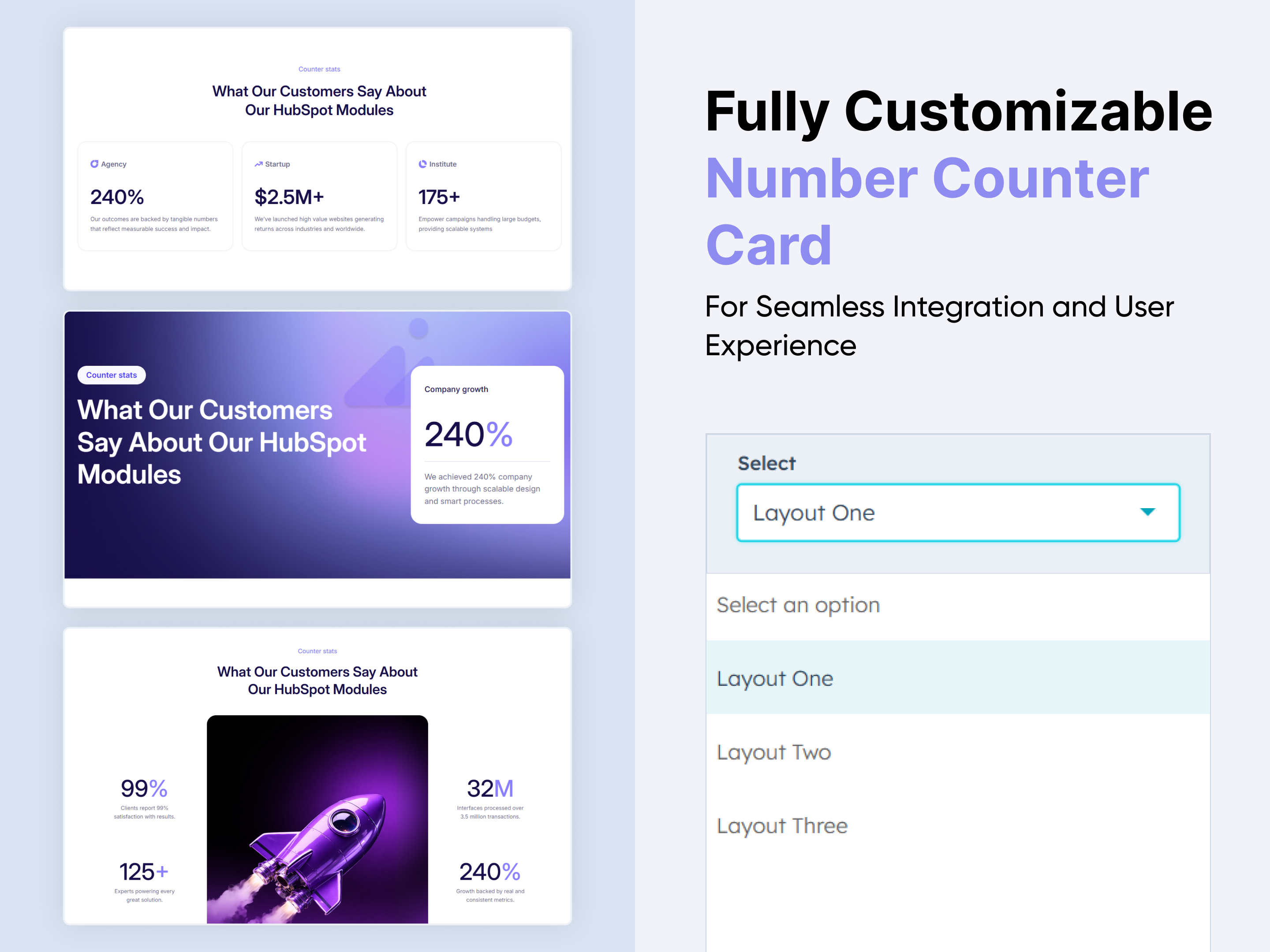
Number Counter Card
Key Features :
✅ Fully Responsive Across All Devices:
The counter adapts seamlessly to mobile, tablet, and desktop screens, ensuring a consistent user experience no matter how visitors view your site.
✅ Multiple Counter Cards Support:
Display multiple statistics in a clean and organized card-based layout.
✅ Customizable Number & Labels:
Easily add number and descriptive labels to each stat block to enhance clarity and visual appeal.
✅ Flexible Layout Options:
Choose between horizontal or vertical layouts and adjust spacing to best fit your design.
✅ Prefix & Suffix Support:
Add currency symbols, percentage signs, or custom text before or after numbers to match your content needs.
✅ Style Control in HubSpot Editor:
Customize fonts, colors, backgrounds, and borders directly within the HubSpot design editor — no coding needed.
✅ Flexible Content Options:
Add numbers, prefixes, suffixes, titles, and short descriptions for each counter.
✅ Lightweight & Fast Loading:
Built with performance in mind, ensuring smooth animations without slowing down your page.
Discover More in the Knowledge Base
Explore detailed documentation, setup instructions, feature explanations, and best practices to help you get the most out of this module quickly and efficiently.
 $29
$29
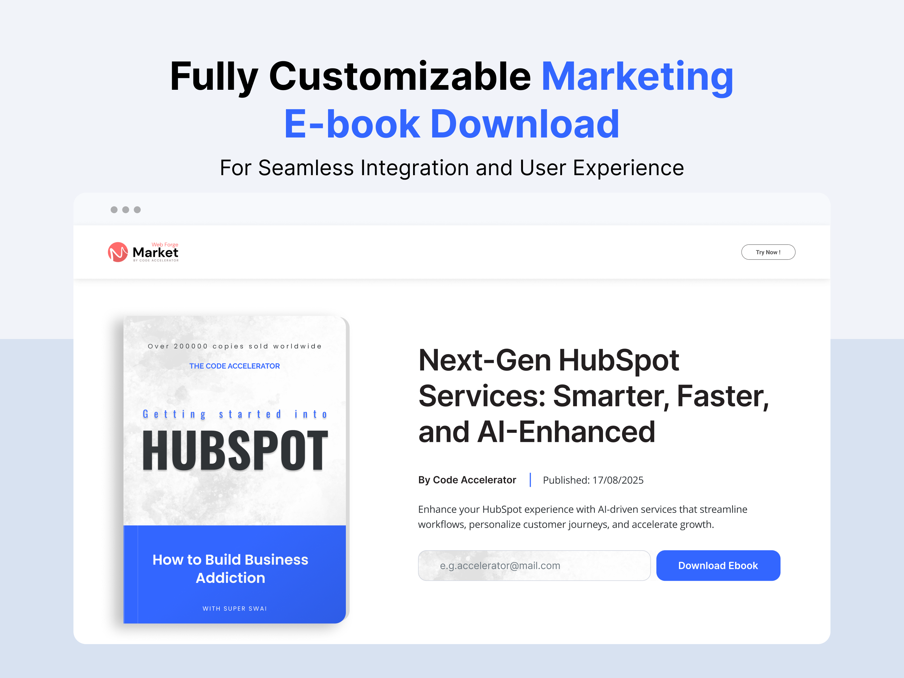
Marketing Ebook Download
The Marketing Ebook Download Module is a powerful solution designed to help businesses capture leads and deliver downloadable digital content with ease. It simplifies the process of promoting, managing, and distributing ebooks through high-converting download forms and seamless user experiences. Here’s a comprehensive overview of its key features and benefits:
Key Features of the Marketing Ebook Download Module :
-
User-Friendly Interface:
-
Intuitive Design: Easily navigate through the module with a clean and straightforward layout.
-
Drag-and-Drop Functionality: Simplify the process of adding images, text.
-
-
Fully Responsive:
-
Mobile Optimization: Automatically adjusts content for optimal viewing on all devices, including desktops, tablets, and smartphones.
-
No Coding Required: Enjoy a seamless experience without the need for additional coding or styling adjustments.
-
-
Customization Options:
-
Styling Controls: Modify colors, typography, margins, paddings, box shadows, and borders directly from the styles tab to match your branding.
-
Template Variety: Choose from a selection of pre-designed templates or create your own unique layout.
-
-
Lead Generation Focused :
Collect visitor information efficiently to grow your email list and marketing database.
Discover More in the Knowledge Base
Explore detailed documentation, setup instructions, feature explanations, and best practices to help you get the most out of this module quickly and efficiently.
 $19
$19
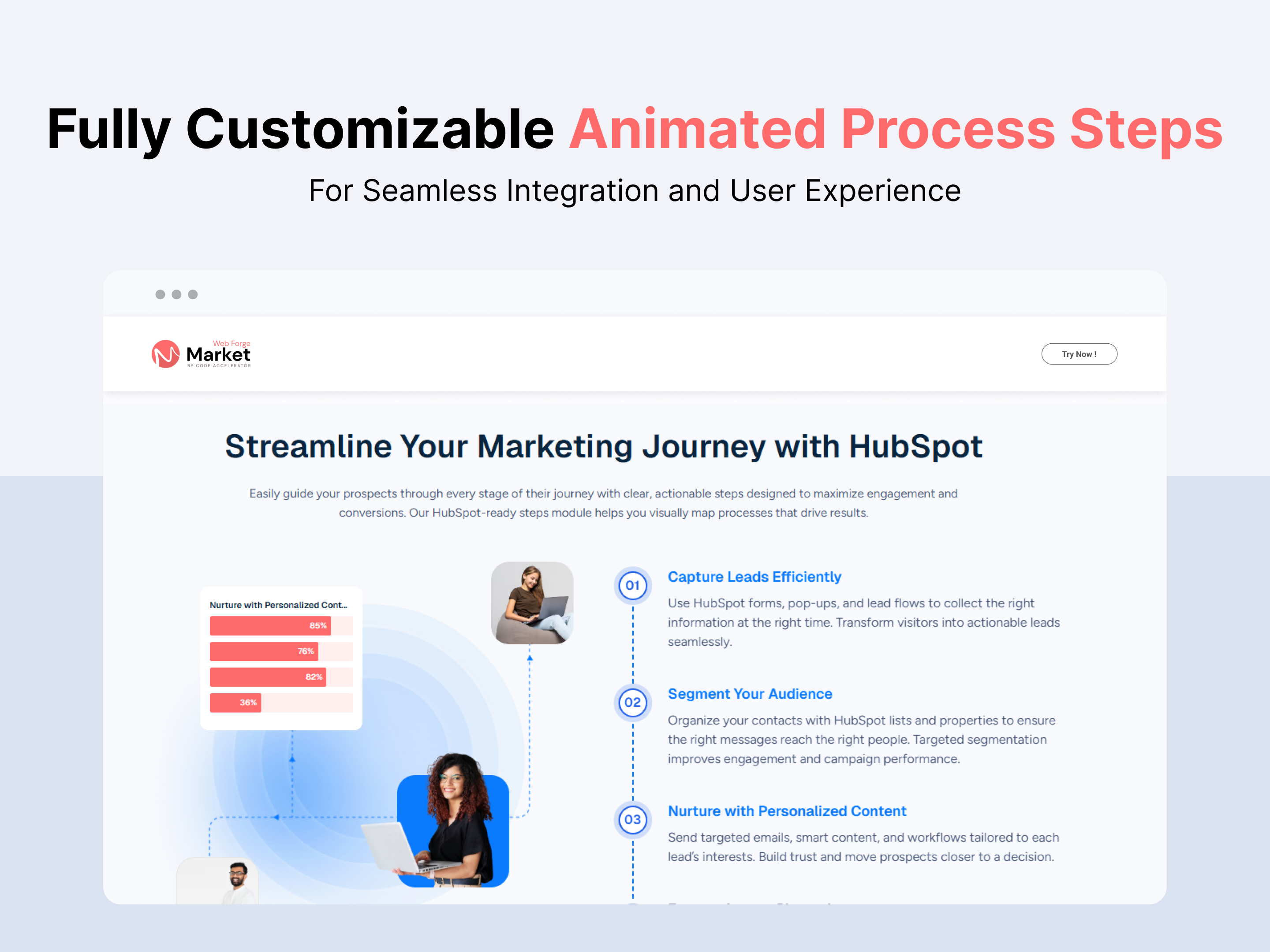
Animated Process Steps
Animated Process Steps is a responsive HubSpot module designed to showcase step-by-step processes, workflows, services, tutorials, and onboarding content in a clean, interactive, and user-friendly layout with smooth animations and sequential navigation.
Key Features of a Animated Process Steps :
✅ Chart Functionality
- Visually represent progress or performance with built-in graph elements for added clarity and impact.
✅ Step Numbering
- Each step is distinctly numbered to ensure clarity and easy tracking.
- The numbering helps users follow the process in a structured way.
✅ Two-Column Layout
- The right column typically contains the step number and title.
- The left column provides images with more details.
- This layout enhances readability and maintains a clean, structured design.
✅ Step with Tab Functionality
- Each step can include a tab-based navigation system.
- Tabs can be used to segment additional information without overwhelming the user.
✅ Responsive & Adaptive Design
- Adjusts seamlessly for different screen sizes, ensuring a smooth experience on desktop and mobile.
- On smaller screens, the two-column layout may stack vertically for better readability.
✅ Customizable Design
- Colors, fonts, and step layouts can be customized to match branding and UI design preferences.
- Step no. or visuals can be added next to steps for improved understanding.
Discover More in the Knowledge Base
Explore detailed documentation, setup instructions, feature explanations, and best practices to help you get the most out of this module quickly and efficiently.
 $39
$39
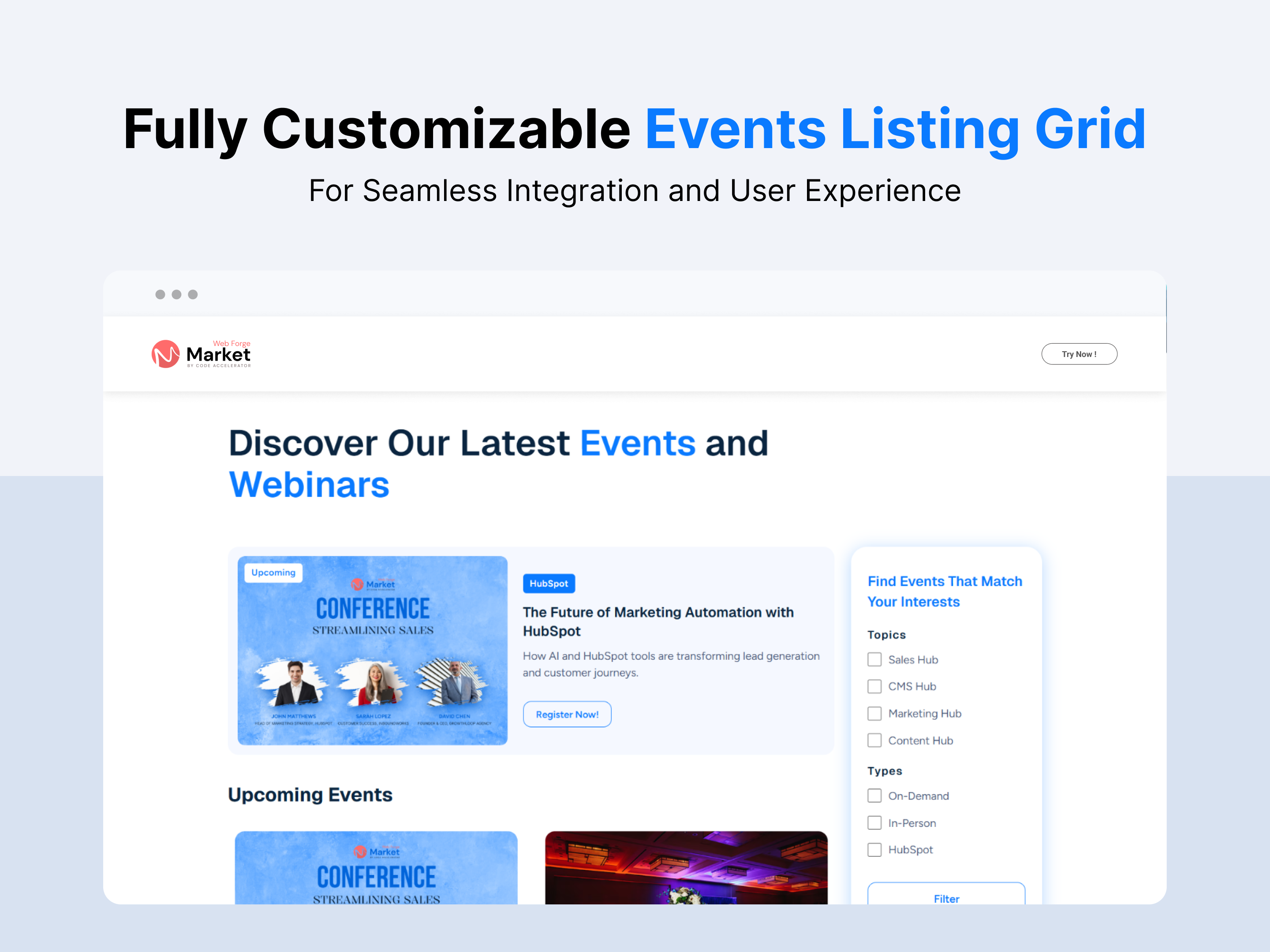
Events Listing Grid
Events Listing Grid Module helps you showcase upcoming events in a clean and organized grid layout. Highlight event details such as titles, dates, locations, and key information to keep visitors informed and engaged. Fully responsive and customizable, it’s designed to improve event visibility, enhance user experience, and increase registrations.
Key Features of the Events Listing Grid Module:
- Effortless Event Management – Easily add, edit, or remove events with a user-friendly interface.
- Customizable Design – Adjust colors, fonts, backgrounds, and more to align with your brand’s aesthetic.
- Responsive Layout – Fully adaptable across all devices, providing a seamless experience on mobile, tablet, and desktop.
- Topic & Type Checkbox Filter Support – Allow users to quickly filter events by selecting topics or event types using simple checkbox options. This feature makes it easy to find relevant events such as webinars, workshops, or conferences based on user interests.
- CTA Customization – Personalize the CTA text, links, and design to drive user engagement.
- Flexible Typography & Spacing – Customize typography and set spacing for both mobile and desktop views.
Discover More in the Knowledge Base
Explore detailed documentation, setup instructions, feature explanations, and best practices to help you get the most out of this module quickly and efficiently.
.png) $29
$29
Modern Customer Testimonials Slider
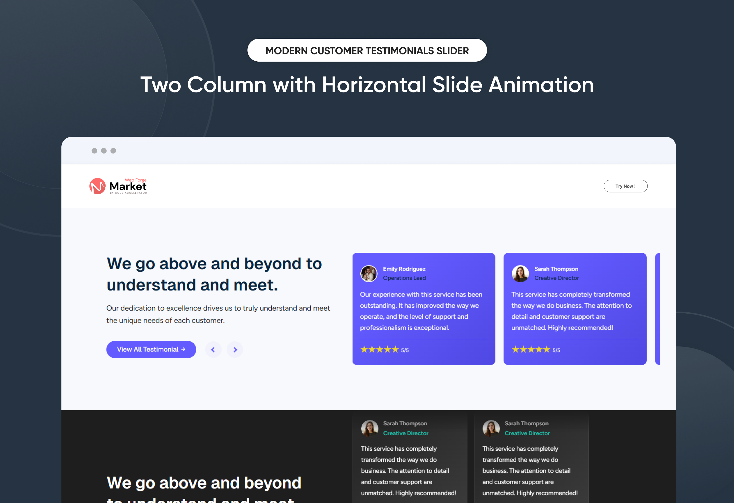
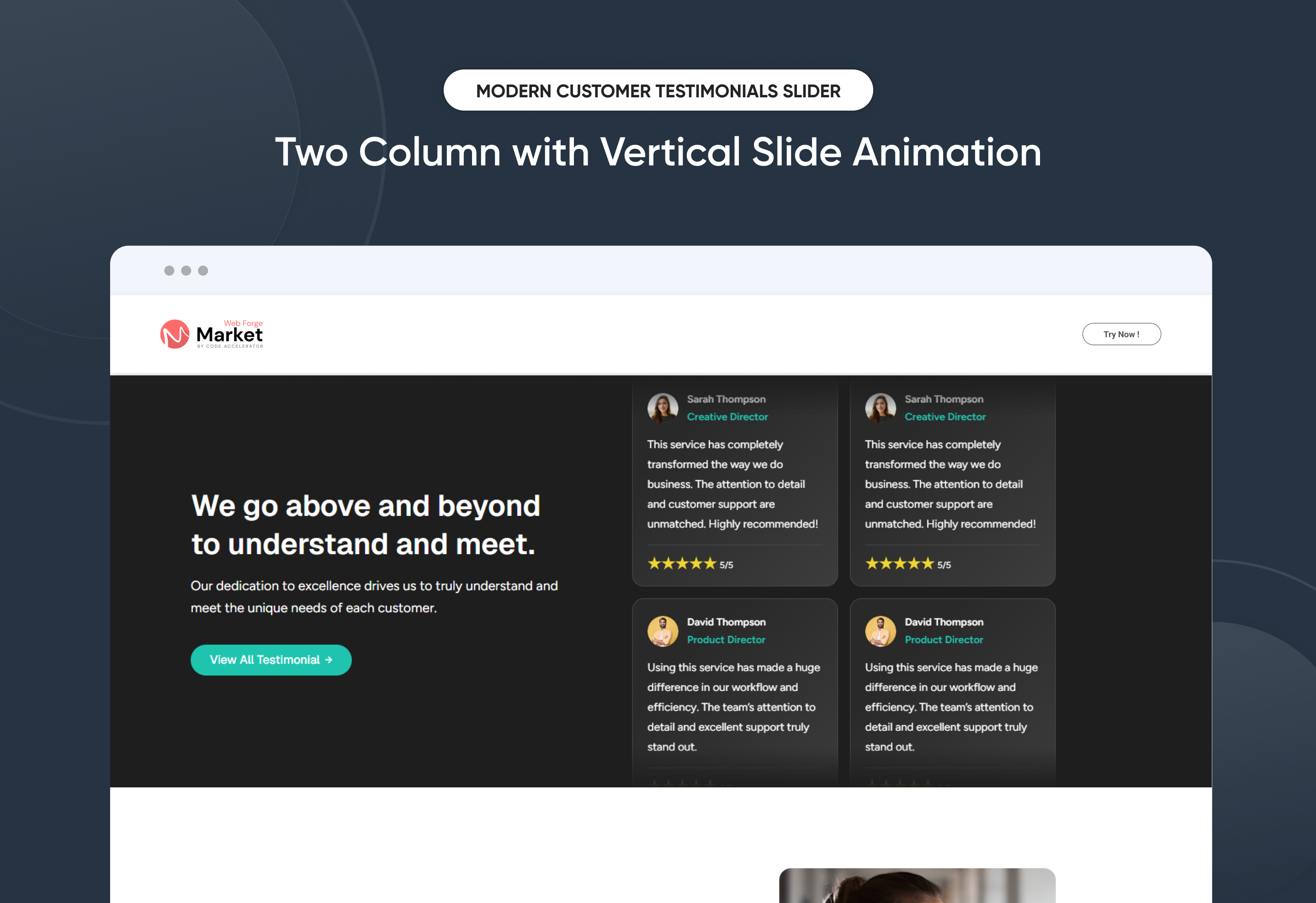
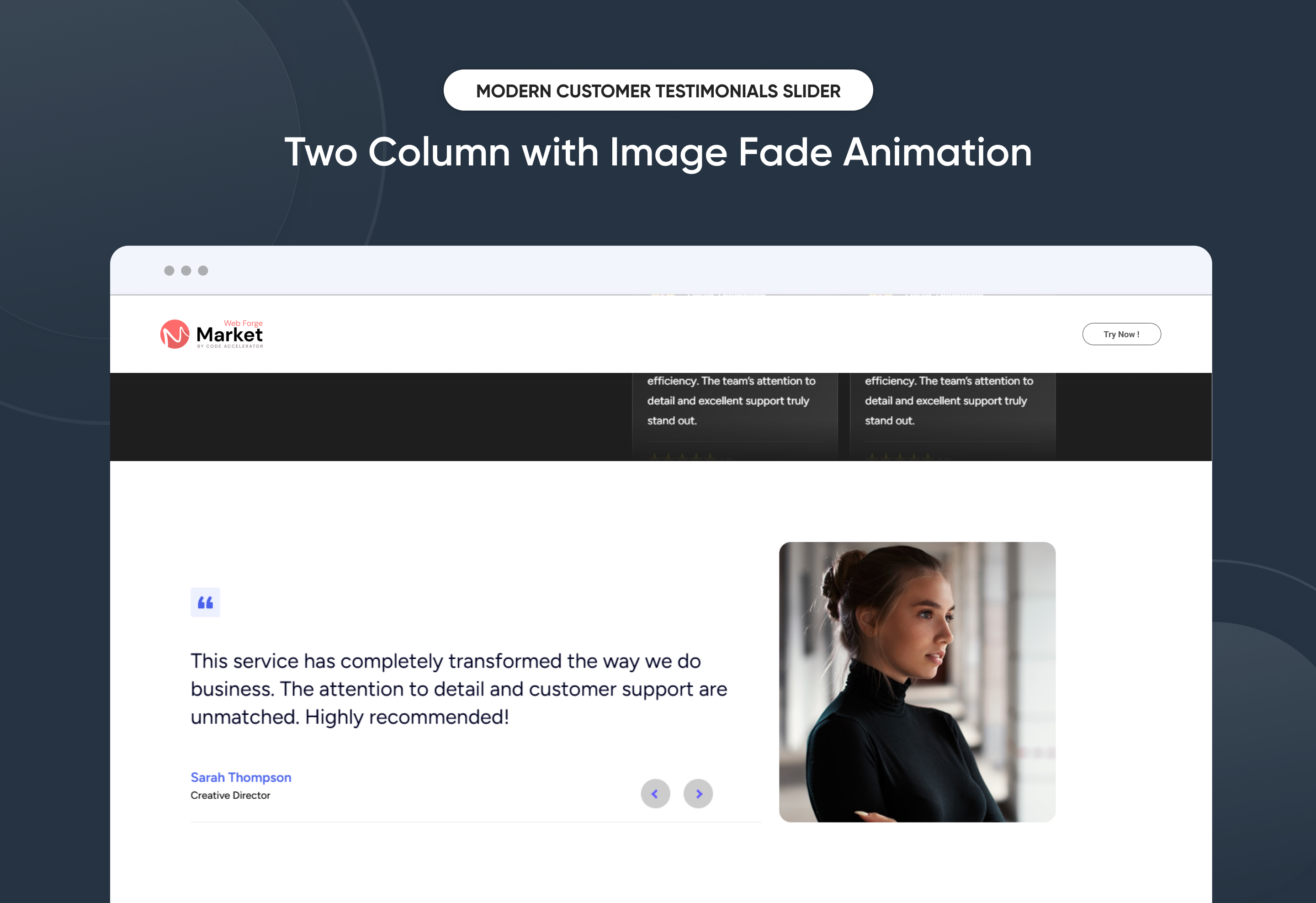
Modern Customer Testimonials Slider helps you showcase real customer feedback in a clean and visually engaging slider layout. Highlight client experiences, reviews, and success stories to build trust and credibility with your audience.
Fully responsive and customizable, it allows you to easily manage testimonial content, customer details, and images directly within HubSpot. Designed to enhance user engagement and strengthen social proof, this module helps improve brand trust and increase conversions.
Key Features of a Modern Customer Testimonials Slider Module :
✅ Two-Column Layout Design - Displays testimonial content and images side by side for a clean, professional presentation.
✅ 3 Unique Layout Options – Choose from three beautifully crafted slider layouts to match any design style.
✅ Fully Mobile Responsive – Seamlessly adapts to all screen sizes for the best viewing experience.
✅ Multiple Testimonial Items Support – Easily add and manage multiple testimonials including customer name, position, company, and review content.
✅ Slide Arrows Option – Optional navigation arrows enhance usability.
✅ Modern & Clean Design – Sleek, contemporary styling fits perfectly into any modern website.
✅ Easy to Edit – Quickly customize content, styles, and settings without hassle.
✅ Easy to Integrate – Simple setup and integration into any page or theme.
✅ Optimized for Performance – Lightweight and fast for smooth transitions and loading.
✅ Smooth Animation Effects - Built-in fade or slide animations enhance visual engagement without affecting performance.
Discover More in the Knowledge Base
Explore detailed documentation, setup instructions, feature explanations, and best practices to help you get the most out of this module quickly and efficiently.
 $29
$29
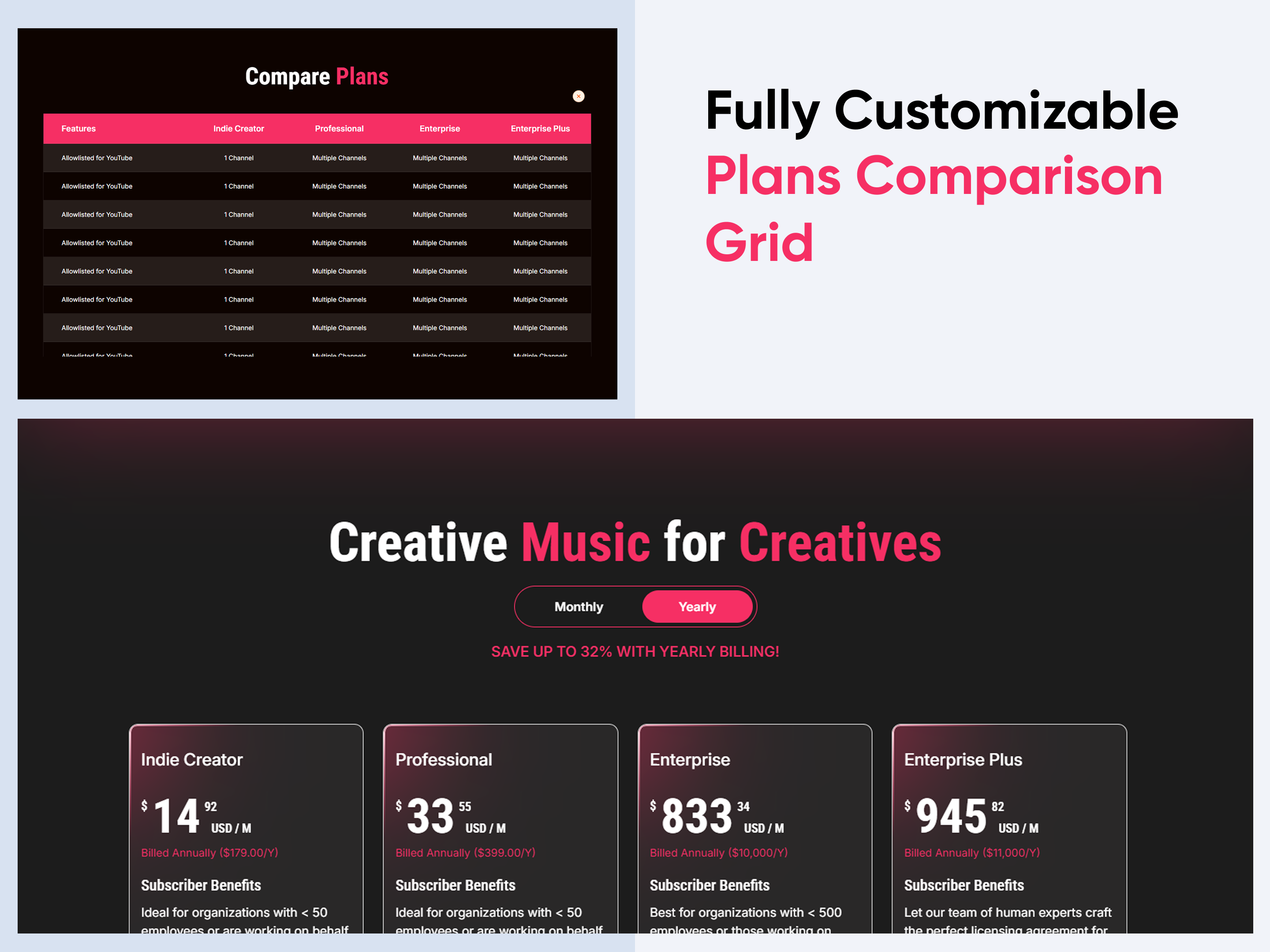
Plans Comparison Grid
Plans Comparison Grid is a clean and structured section designed to showcase multiple pricing plans or service packages in an easy-to-compare layout. It helps visitors quickly understand the differences between plans by highlighting key features, pricing details, and benefits in a visually organized grid.
Fully responsive and easy to customize, this module allows businesses to present pricing options clearly, guide users toward the right plan, and increase conversions with a modern and user-friendly comparison design.
Key Features Plans Comparison Grid Module :
✅ Fully Responsive: Works seamlessly on all devices (desktop, tablet, mobile).
✅ Multiple Plan Columns Support: Display multiple pricing plans side-by-side in a clean comparison grid.
✅ Customizable Design: Adjust colors, sizes, and spacing to match your website's style.
✅ Lightweight & Fast: Optimized for speed and performance.
✅ Monthly / Yearly Pricing Toggle: Allow users to switch between monthly and yearly pricing easily.
Discover More in the Knowledge Base
Explore detailed documentation, setup instructions, feature explanations, and best practices to help you get the most out of this module quickly and efficiently.
 $19
$19
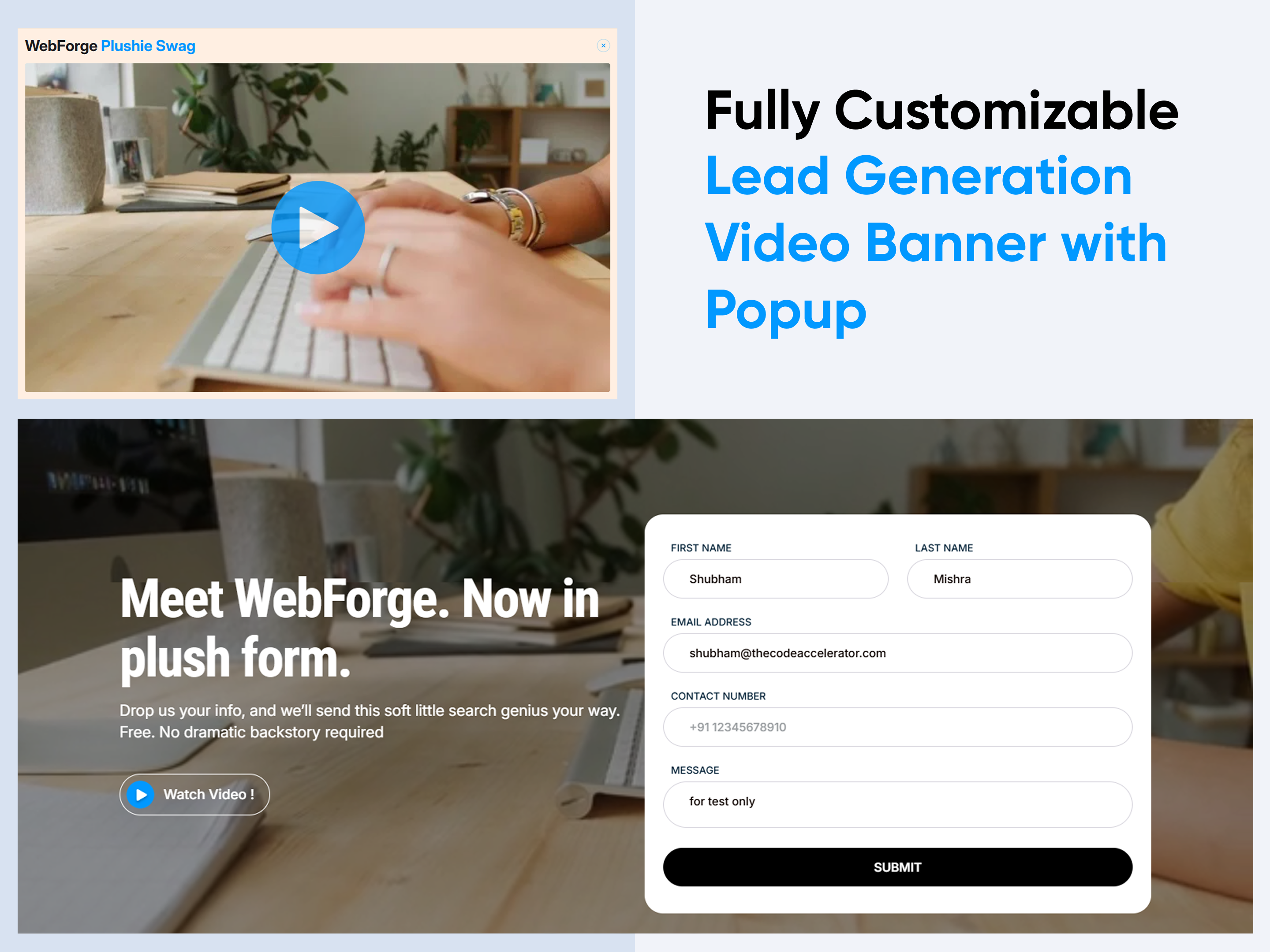
Lead Generation Video Banner with Popup
Lead Generation Video Banner with Popup is a powerful and visually engaging section designed to capture visitor attention and drive conversions through an interactive video experience. It allows you to highlight your key message, campaigns, or product offerings with a compelling background video and a strong call-to-action that opens a popup for lead capture.
Fully responsive and easy to customize, this banner helps businesses promote content, collect leads, and increase engagement with a clean and modern video hero layout.
Key Features Lead Generation Video Banner with Popup Module :
✅ Fully Responsive: Works seamlessly on all devices (desktop, tablet, mobile).
✅ Background Video Support: Add engaging background videos to create a visually impactful banner.
✅ Customizable Design: Adjust colors, sizes, and spacing to match your website's style.
✅ Lightweight & Fast: Optimized for speed and performance.
✅ Popup Trigger Control: Configure the popup to open on CTA click for better user interaction.
Discover More in the Knowledge Base
Explore detailed documentation, setup instructions, feature explanations, and best practices to help you get the most out of this module quickly and efficiently.
 $19
$19
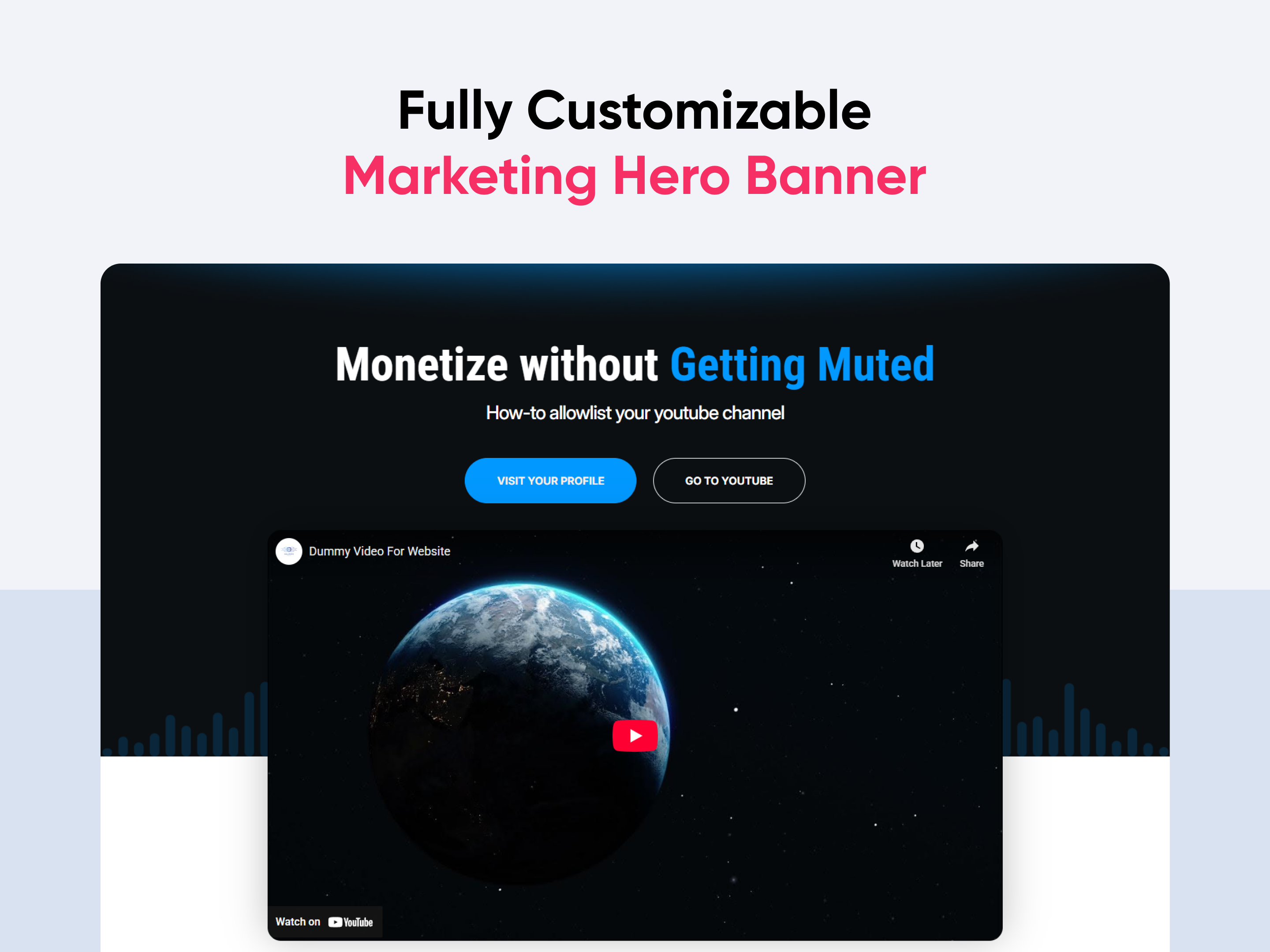
Marketing Hero Banner
Marketing Hero Banner is a powerful and visually engaging section designed to highlight your brand’s key message, campaigns, or product offerings at the top of your website. It helps capture visitor attention instantly with bold headlines, compelling visuals, and strong call-to-action elements.
Fully responsive and easy to customize, this banner allows businesses to showcase promotional content, introduce products, or drive conversions through a clean and modern hero layout.
Key Features Marketing Hero Banner Module :
✅ Fully Responsive: Works seamlessly on all devices (desktop, tablet, mobile).
✅ Custom CTA Buttons: Add primary & secondary call-to-action buttons with flexible links.
✅ Customizable Design: Adjust colors, sizes, and spacing to match your website's style.
✅ Lightweight & Fast: Optimized for speed and performance.
✅ Multiple Video Sources Support: Use YouTube, Vimeo, or self-hosted video files.
Discover More in the Knowledge Base
Explore detailed documentation, setup instructions, feature explanations, and best practices to help you get the most out of this module quickly and efficiently.
 $29
$29
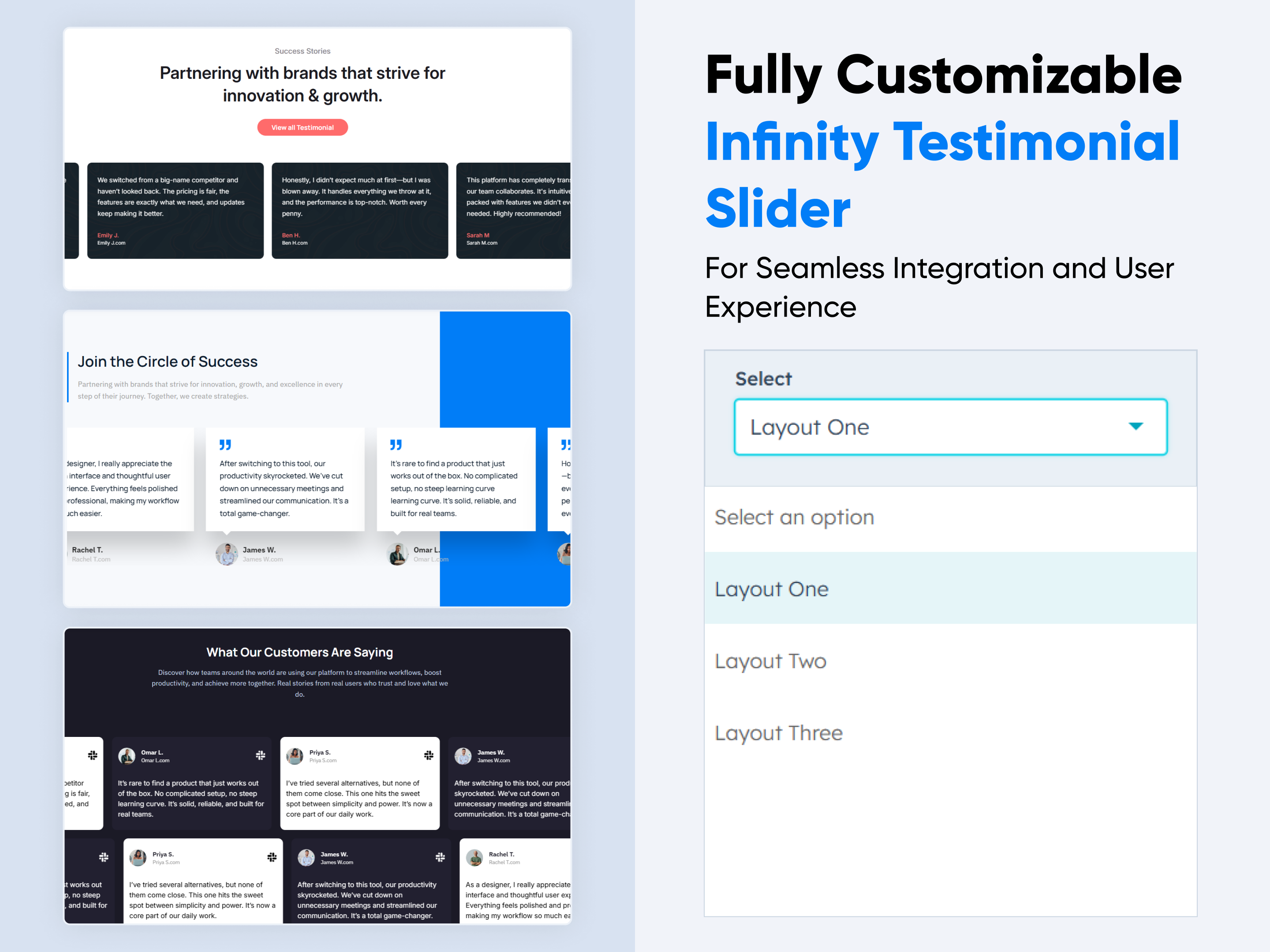
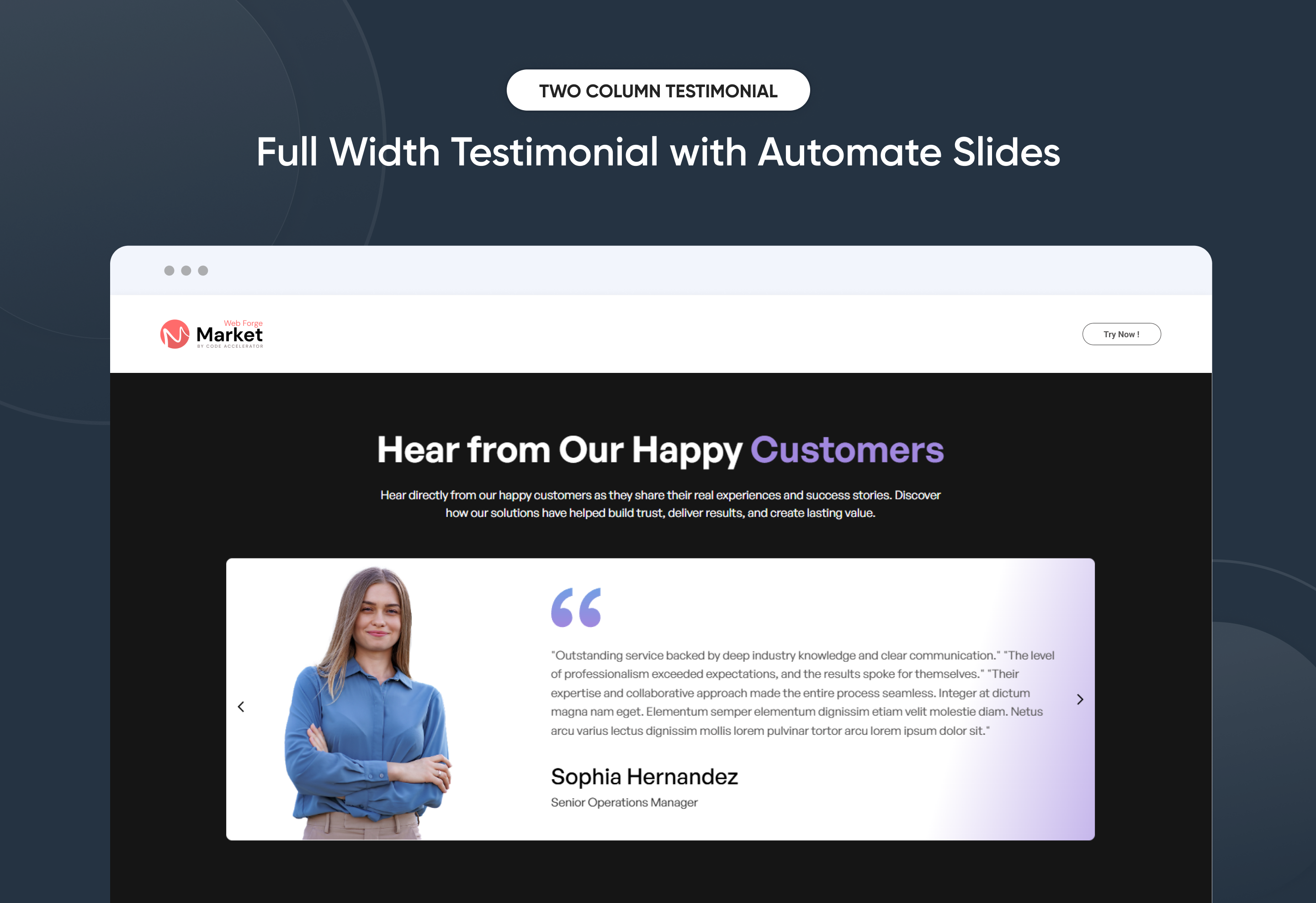
Infinity Testimonial Slider
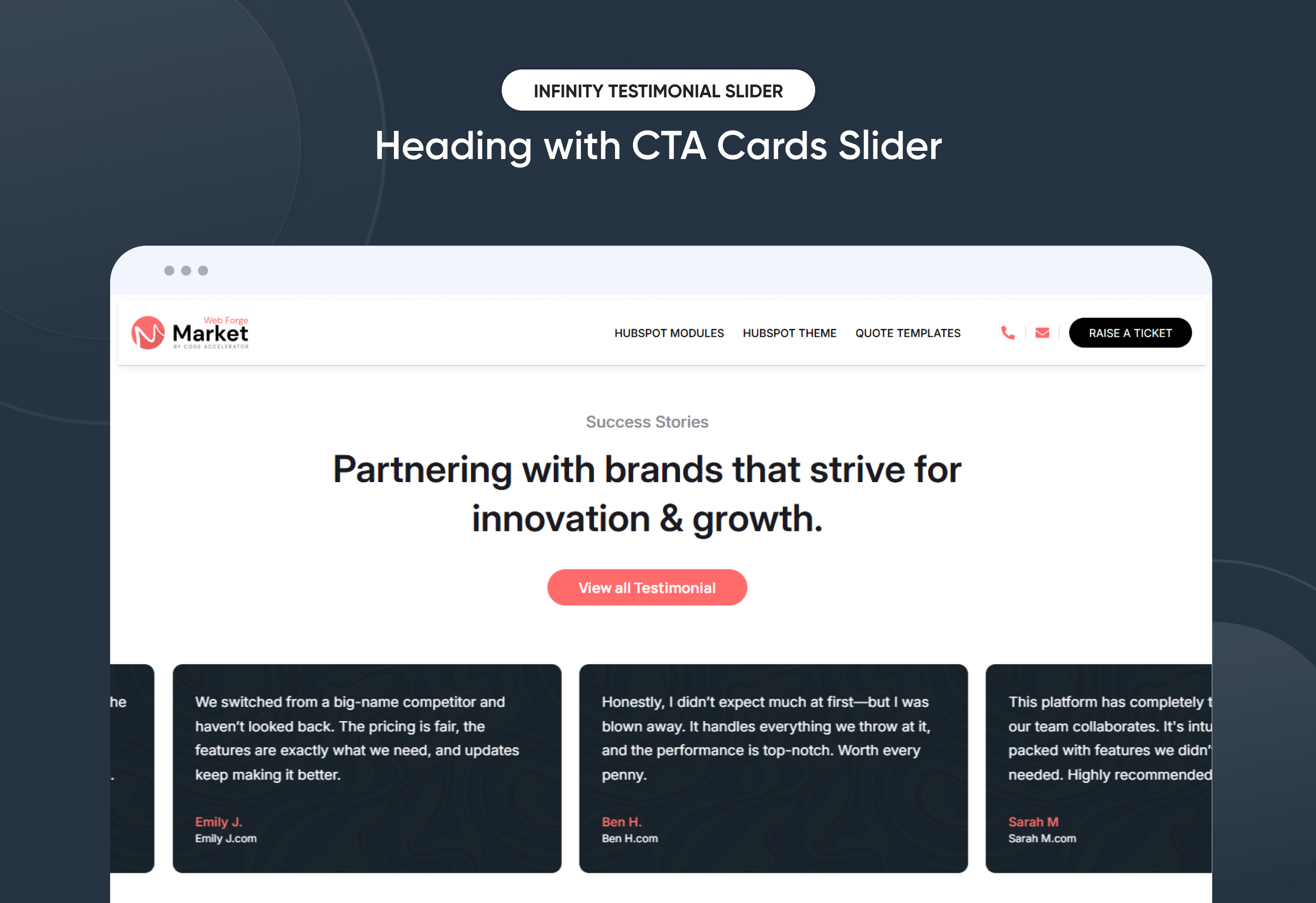
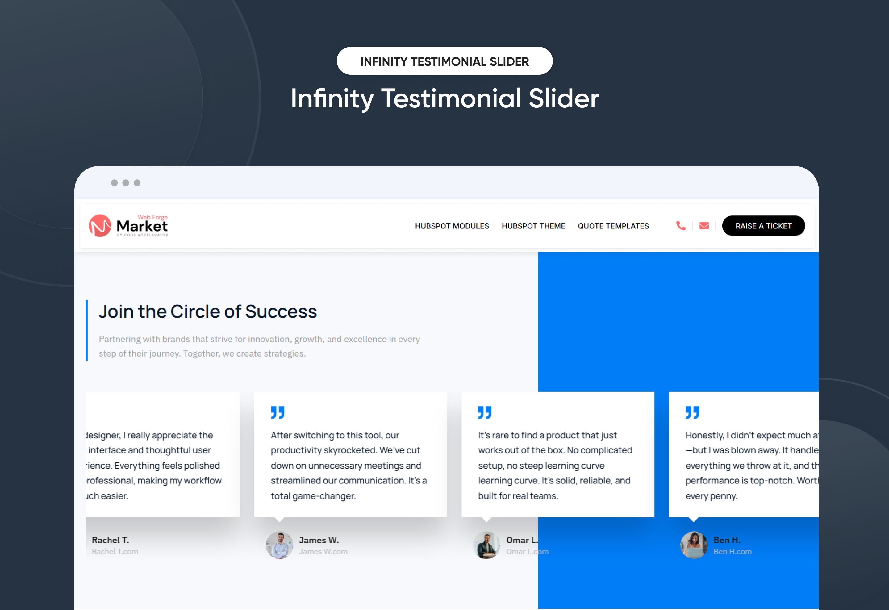
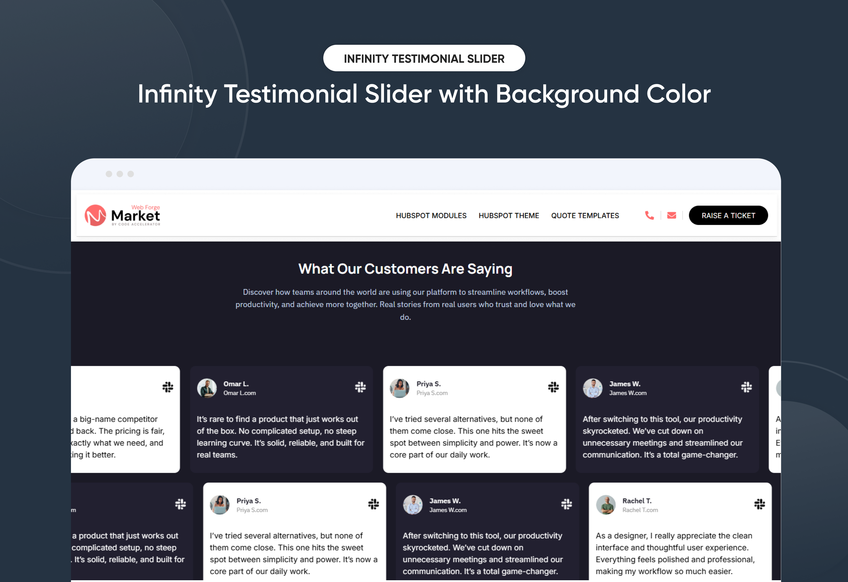
Showcase client feedback in style with the Infinity Testimonial Slider module. Smooth, continuous transitions highlight testimonials in an engaging, modern format that builds trust and enhances credibility.
Key Features of a Infinity Testimonial Slider Module :
✅ 3 Unique Layout Options – Choose from three beautifully crafted slider layouts to match any design style.
✅ Fully Mobile Responsive – Seamlessly adapts to all screen sizes for the best viewing experience.
✅ Infinite Auto Slide – Testimonials slide automatically in a smooth, endless loop.
✅ Mobile Slide Dots Option – Optional navigation dots enhance mobile usability.
✅ Modern & Clean Design – Sleek, contemporary styling fits perfectly into any modern website.
✅ Easy to Edit – Quickly customize content, styles, and settings without hassle.
✅ Easy to Integrate – Simple setup and integration into any page or theme.
✅ Optimized for Performance – Lightweight and fast for smooth transitions and loading.
Discover More in the Knowledge Base
Explore detailed documentation, setup instructions, feature explanations, and best practices to help you get the most out of this module quickly and efficiently.
 $39
$39
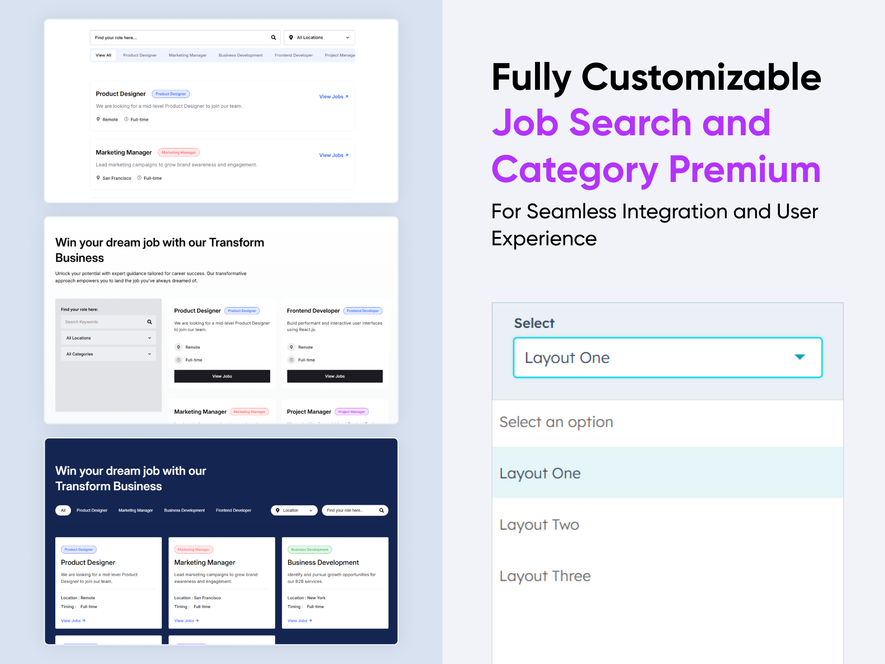
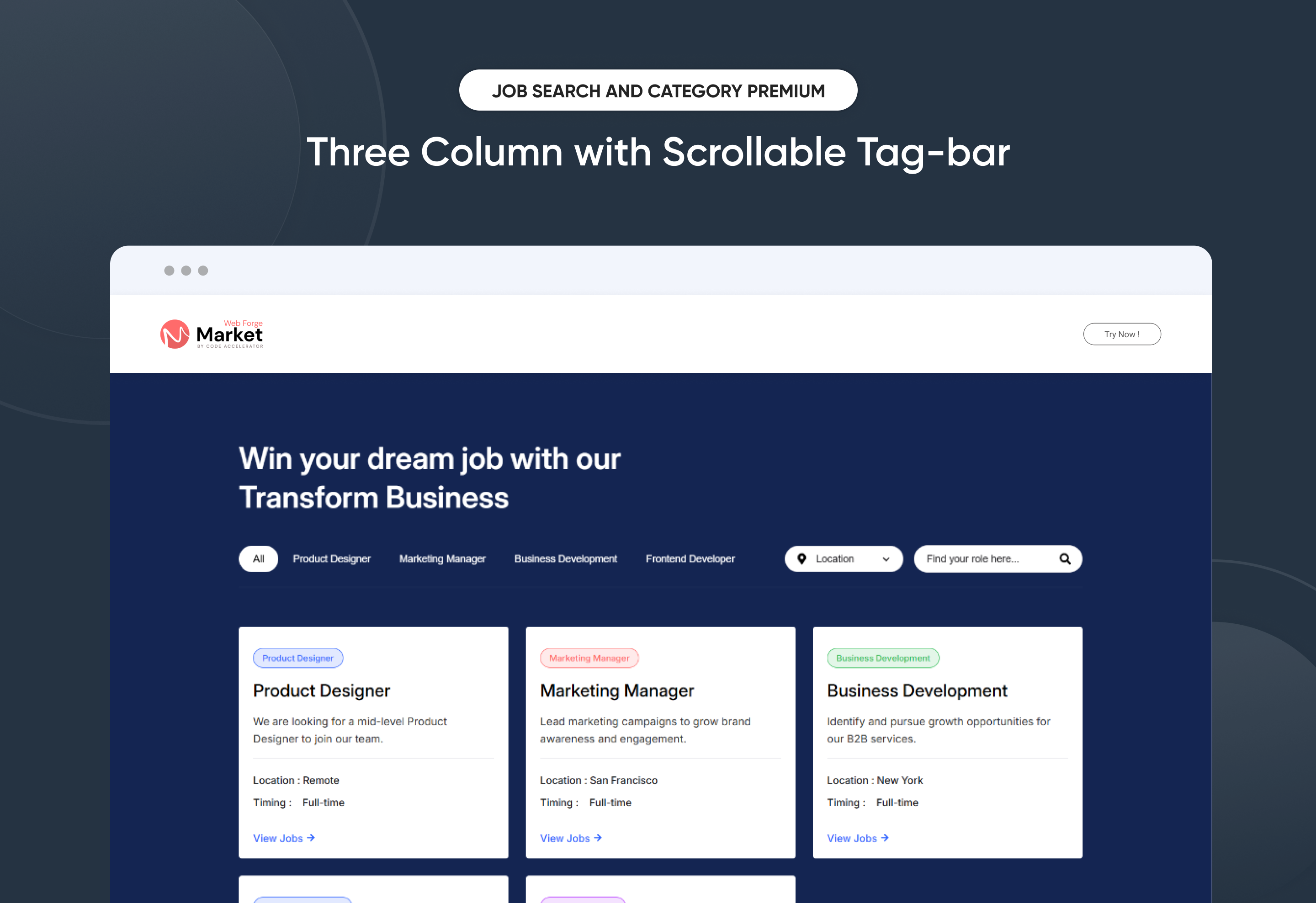
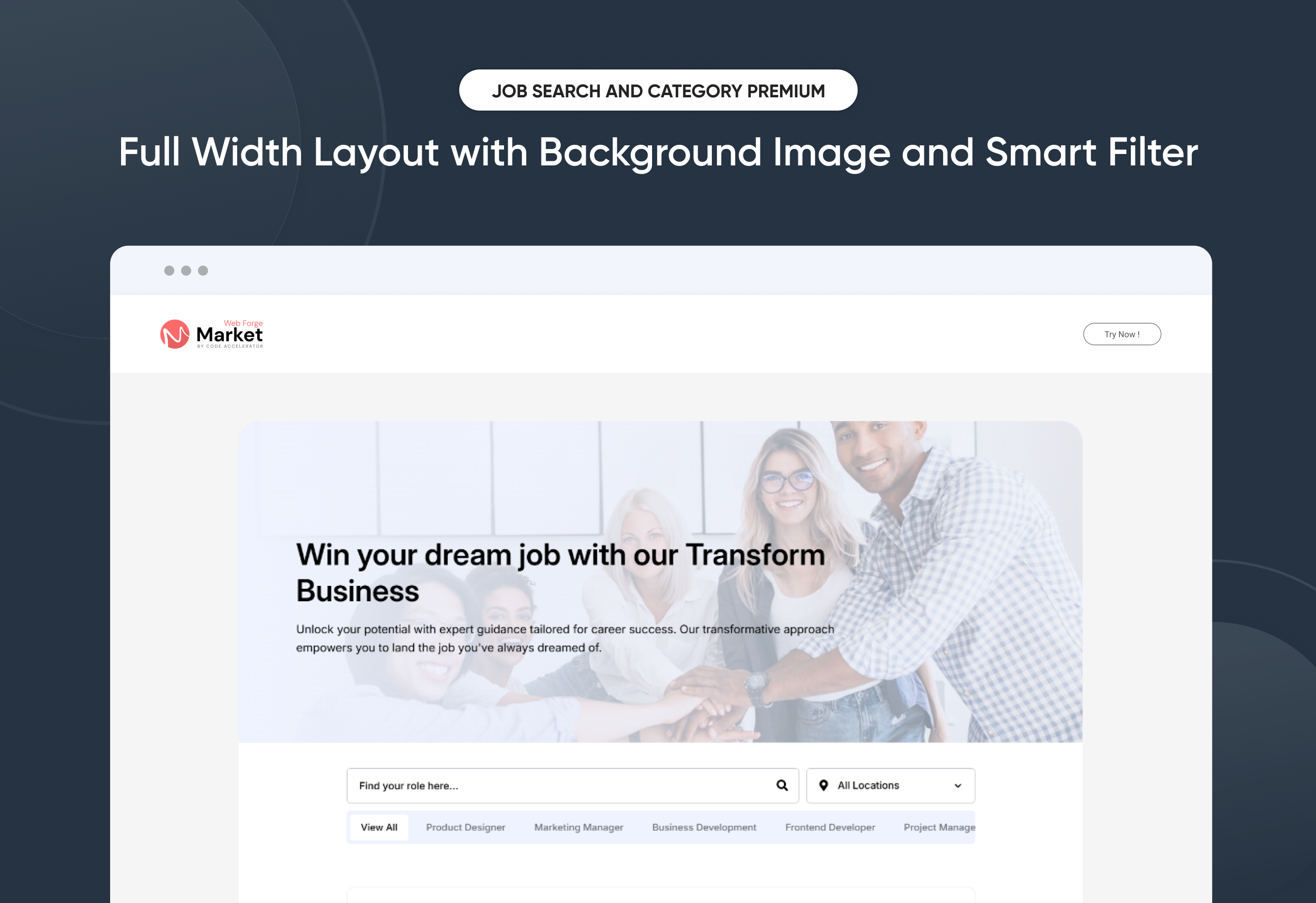
Job Search and Category Premium
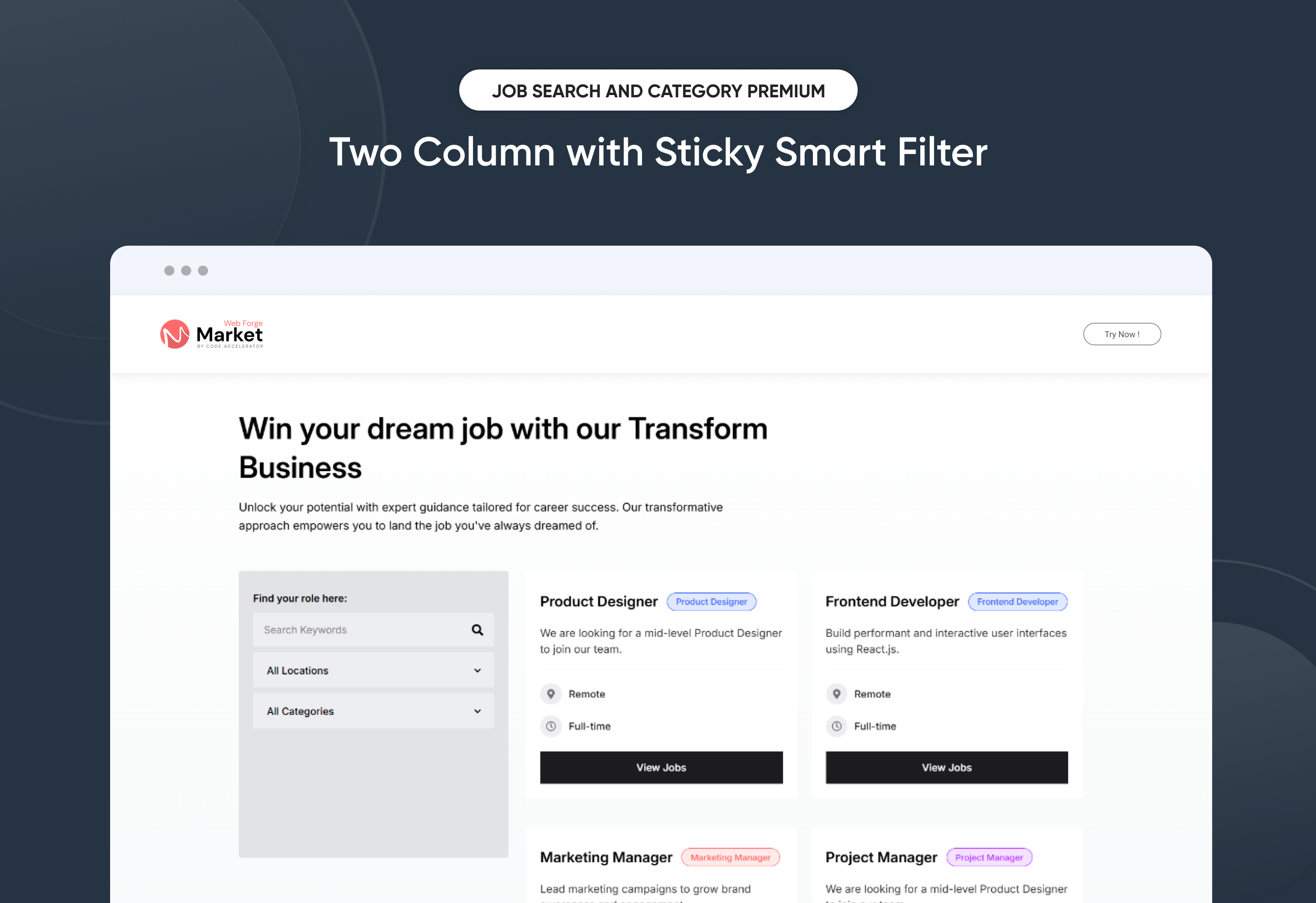
Turn your careers page into a polished recruiting engine—without touching code.
Job Search and Category Premium lets you publish, filter, and promote open roles in minutes. Drag-and-drop controls, smart search, and one-click applications create a seamless candidate journey that scales with your hiring needs.
Key Features :
✅ Advanced Search & Filters – Title, department, location, and keyword filters help visitors zero-in on the perfect role.
✅ 3 Flexible Layouts – List, grid, or accordion views adapt to any design style.
✅ Modern & Clean Design – Sleek, contemporary styling fits perfectly into any modern website.
✅ Easy to Edit – Quickly customize content, styles, and settings without hassle.
✅ Easy to Integrate – Simple setup and integration into any page or theme.
✅ Optimized for Performance – Lightweight and fast for smooth transitions and loading.
✅ Category Tabs & Badges – Highlight “Remote,” “Hot,” or “New” openings with eye-catching labels.
Discover More in the Knowledge Base
Explore detailed documentation, setup instructions, feature explanations, and best practices to help you get the most out of this module quickly and efficiently.
 $free
$free
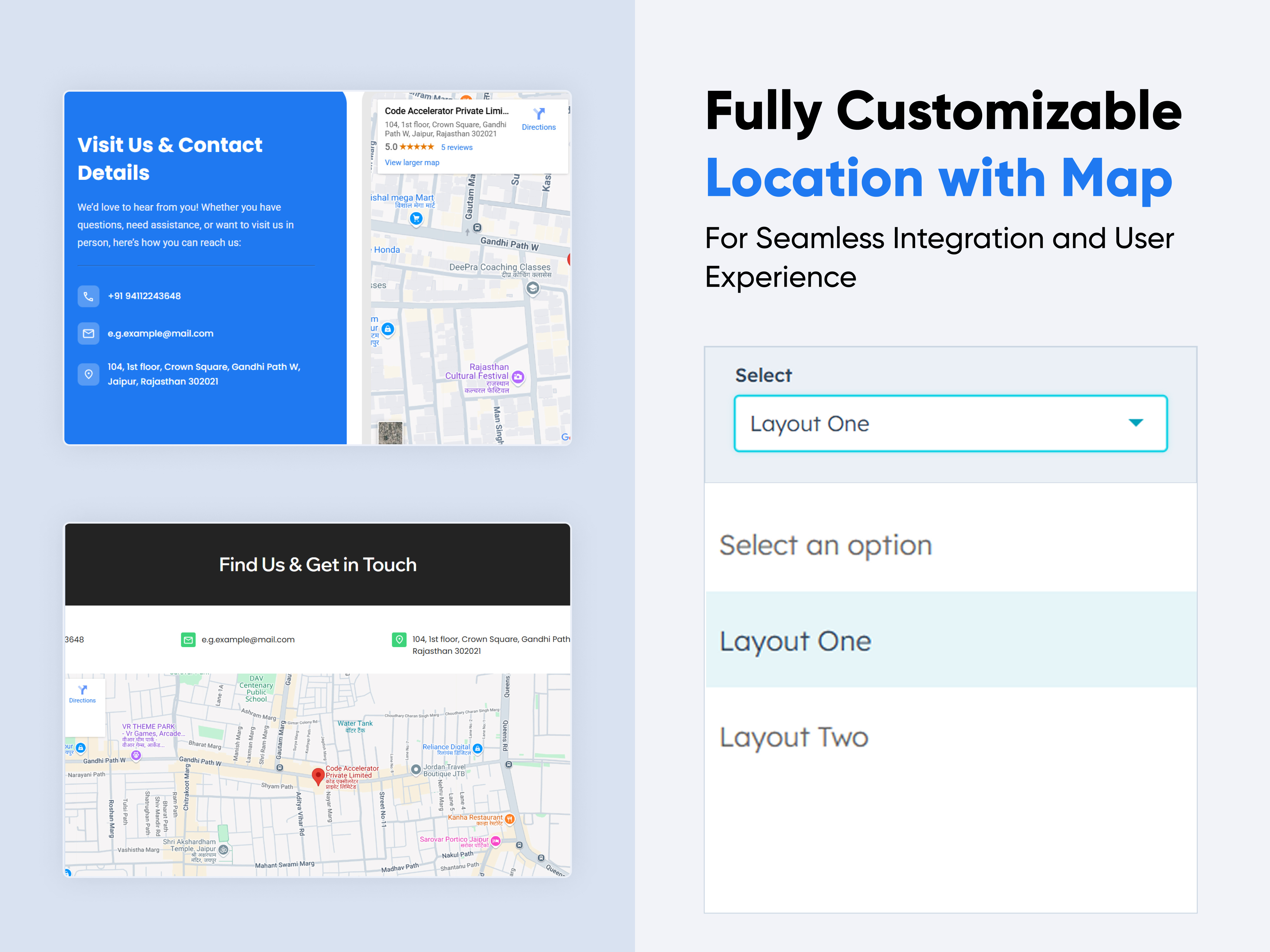
Location With Map
.jpg)
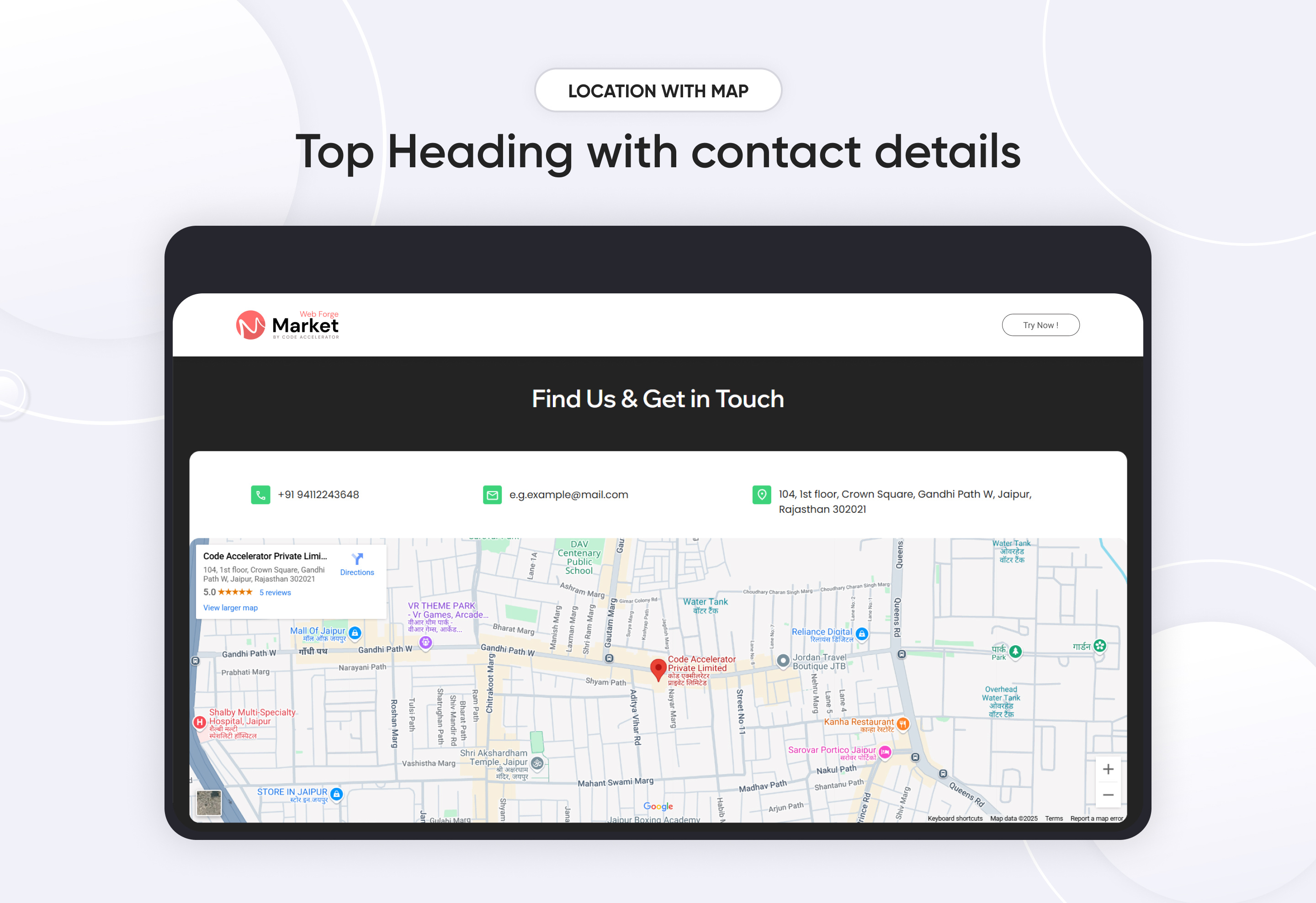
The module allows businesses, organizations, or individuals to showcase their physical address, contact numbers, email addresses, and interactive maps. It can be integrated with third-party services like Google Maps to improve accessibility.
Features of the Location With Map :
-
Responsiveness: Fully adaptive to different screen sizes, ensuring a smooth experience on mobile, tablet, and desktop.
-
Typography & Styling: Custom font styles, colors, and alignment options for enhanced design consistency.
-
Displays the physical address with Google Maps.
-
Phone numbers with clickable links for direct calling.
-
Email addresses with mailto links for quick email composition.
Discover More in the Knowledge Base
Explore detailed documentation, setup instructions, feature explanations, and best practices to help you get the most out of this module quickly and efficiently.
 $free
$free
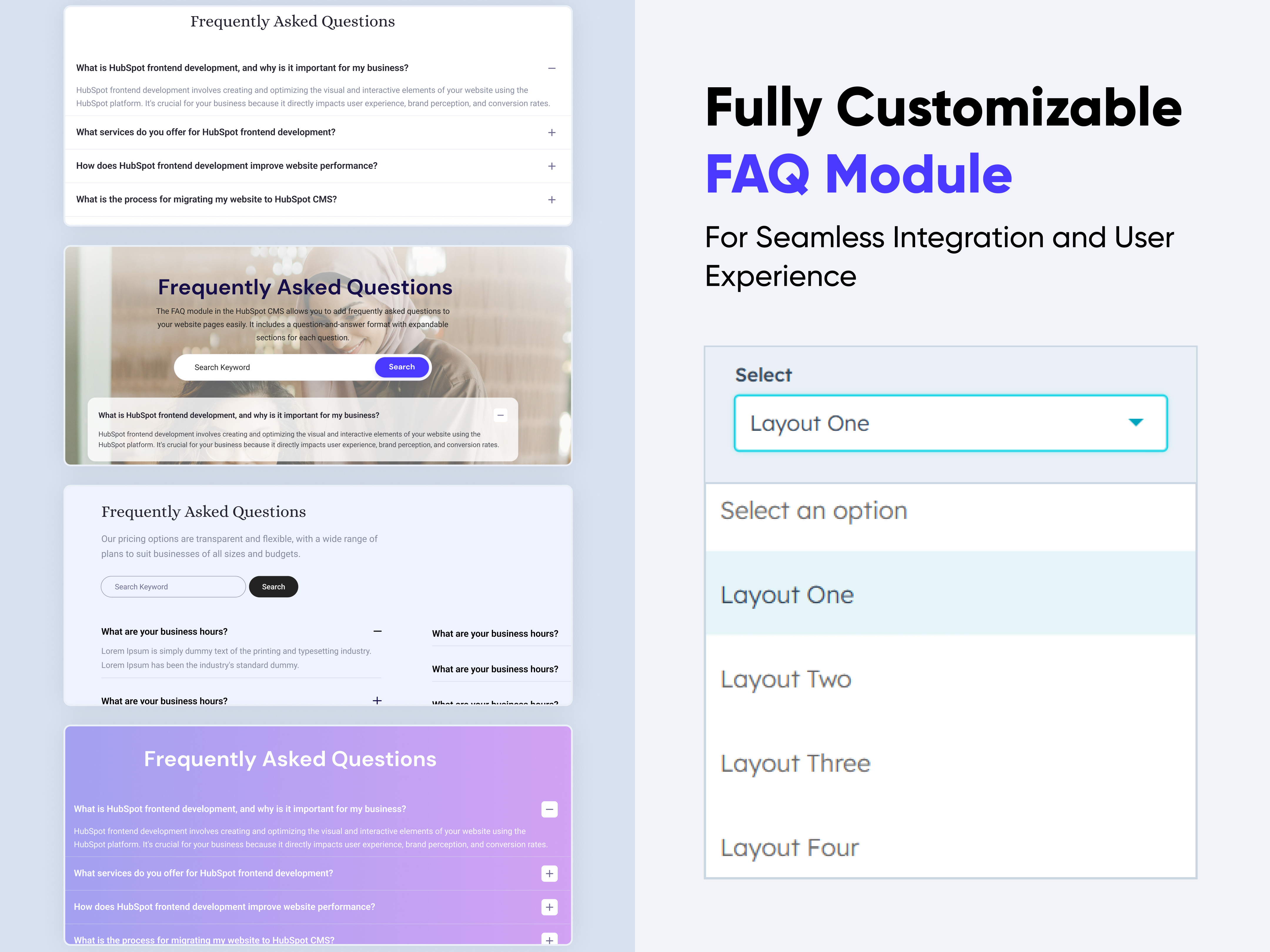
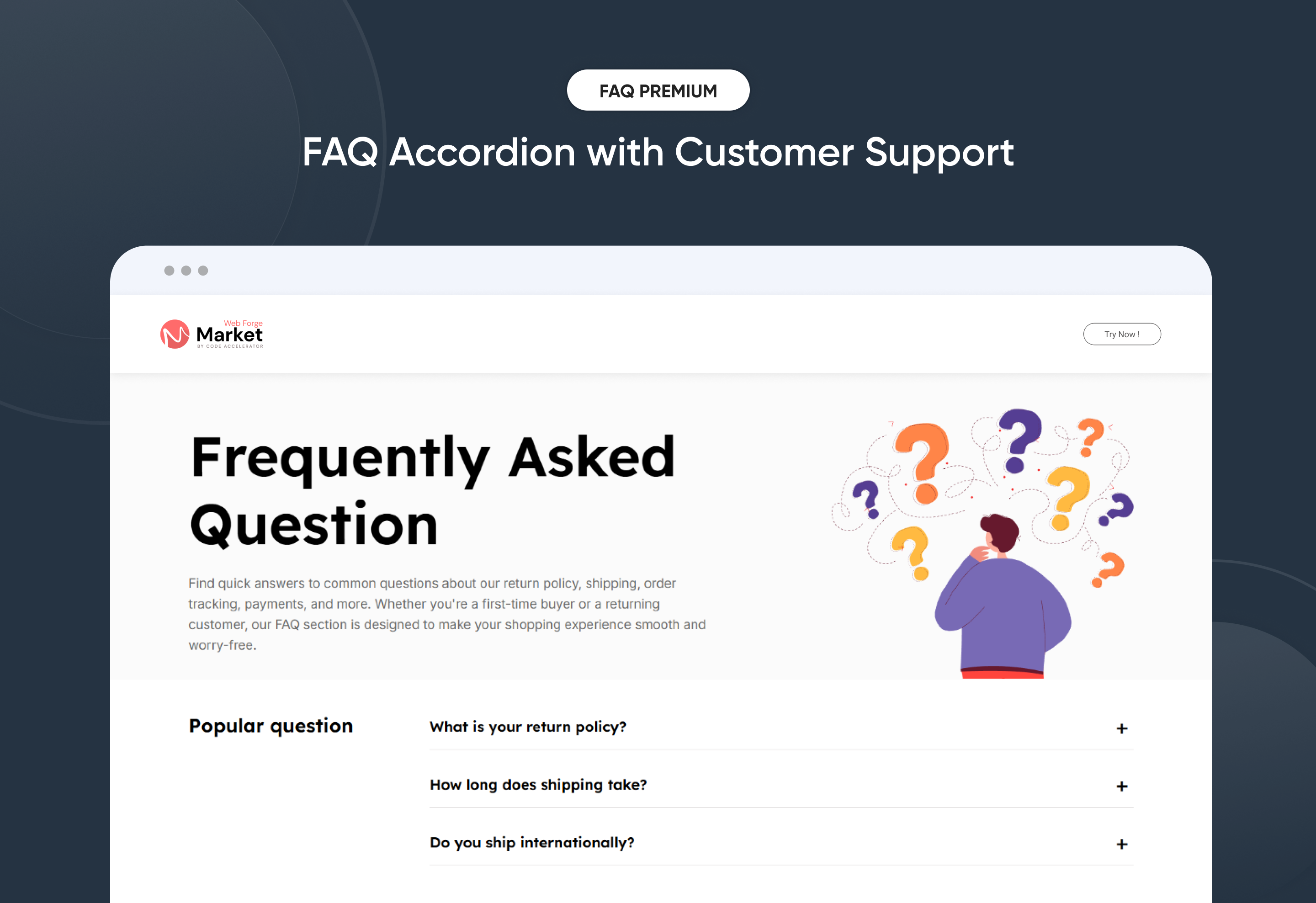
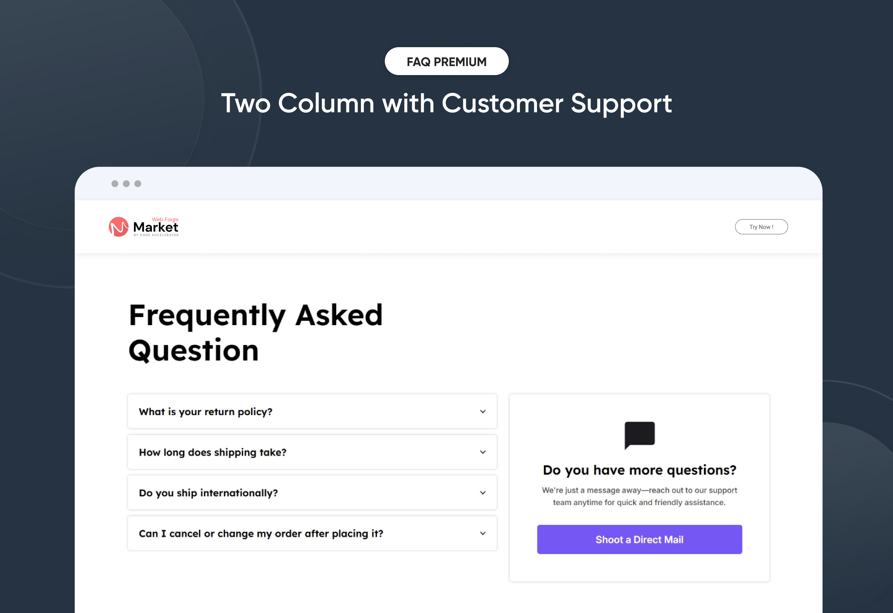
FAQ with Accordian
Customer support is essential for any business, and a well-organized FAQ section can significantly reduce the workload on your support team. Our FAQ Module is designed to streamline this process, enabling you to create, manage, and display FAQs on your website. In this knowledgebase, we will explore the features and setup process of our FAQ Module.
Key Features :
-
Customizable Layouts: Choose multiple layout options to match your website’s design.
-
Responsive Design: The FAQ section is optimized for all devices, ensuring a seamless experience for your users.
-
Search Functionality: Integrated search functionality allows users to find answers quickly.
-
Collapsible Sections: Organize your FAQs into collapsible sections for easy navigation.
Discover More in the Knowledge Base
Explore detailed documentation, setup instructions, feature explanations, and best practices to help you get the most out of this module quickly and efficiently.
 $29
$29
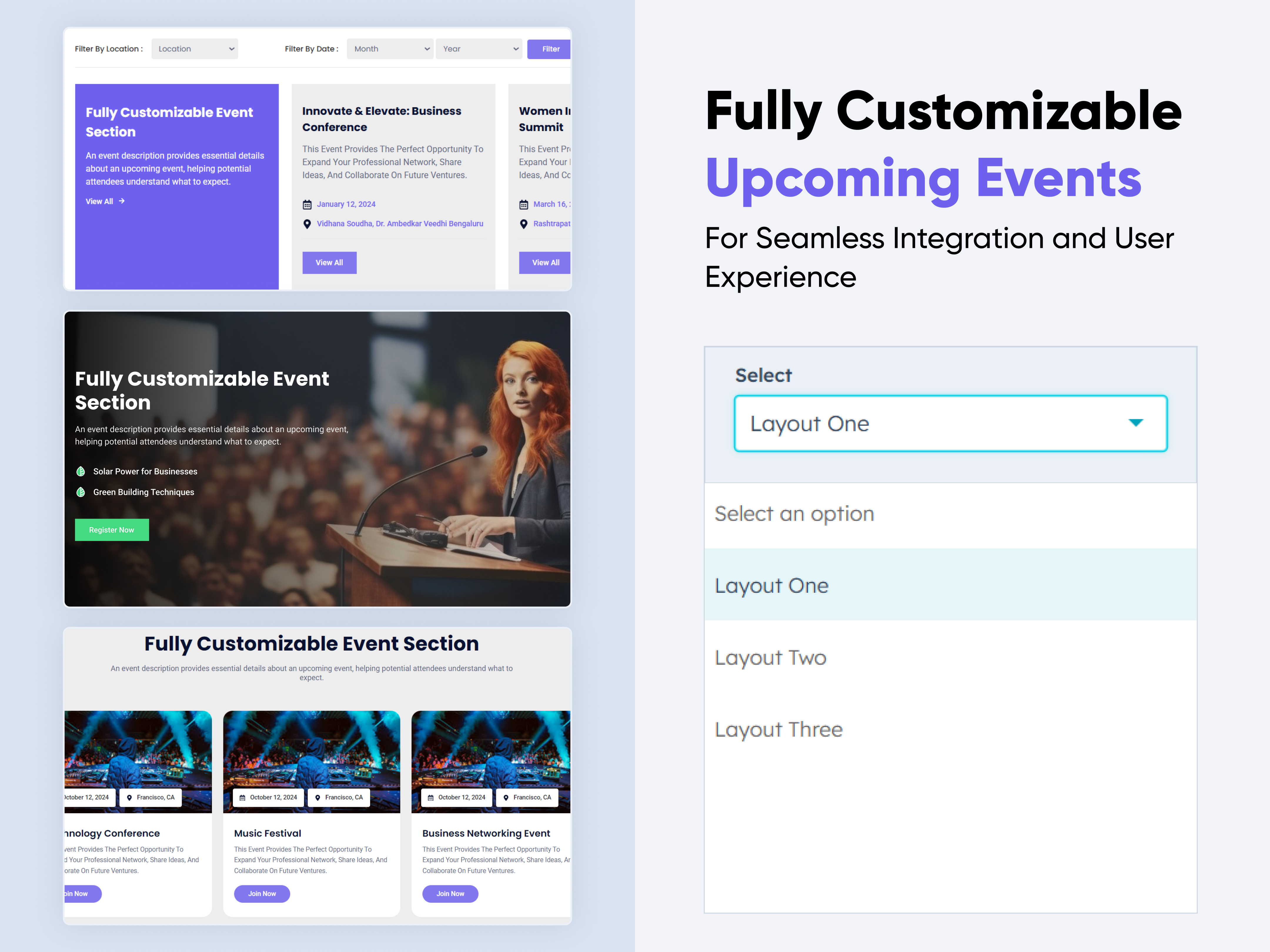
Upcoming Events
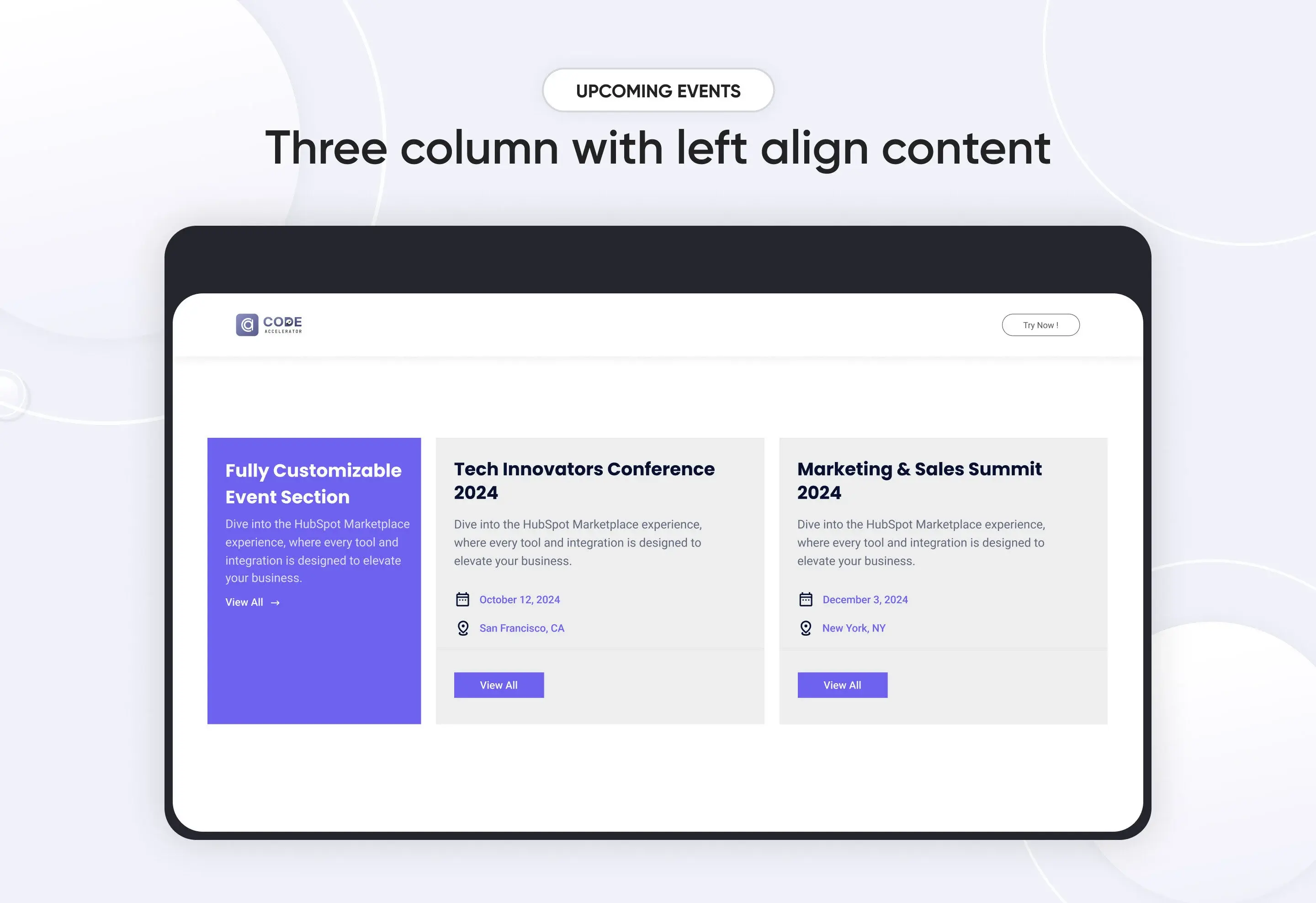
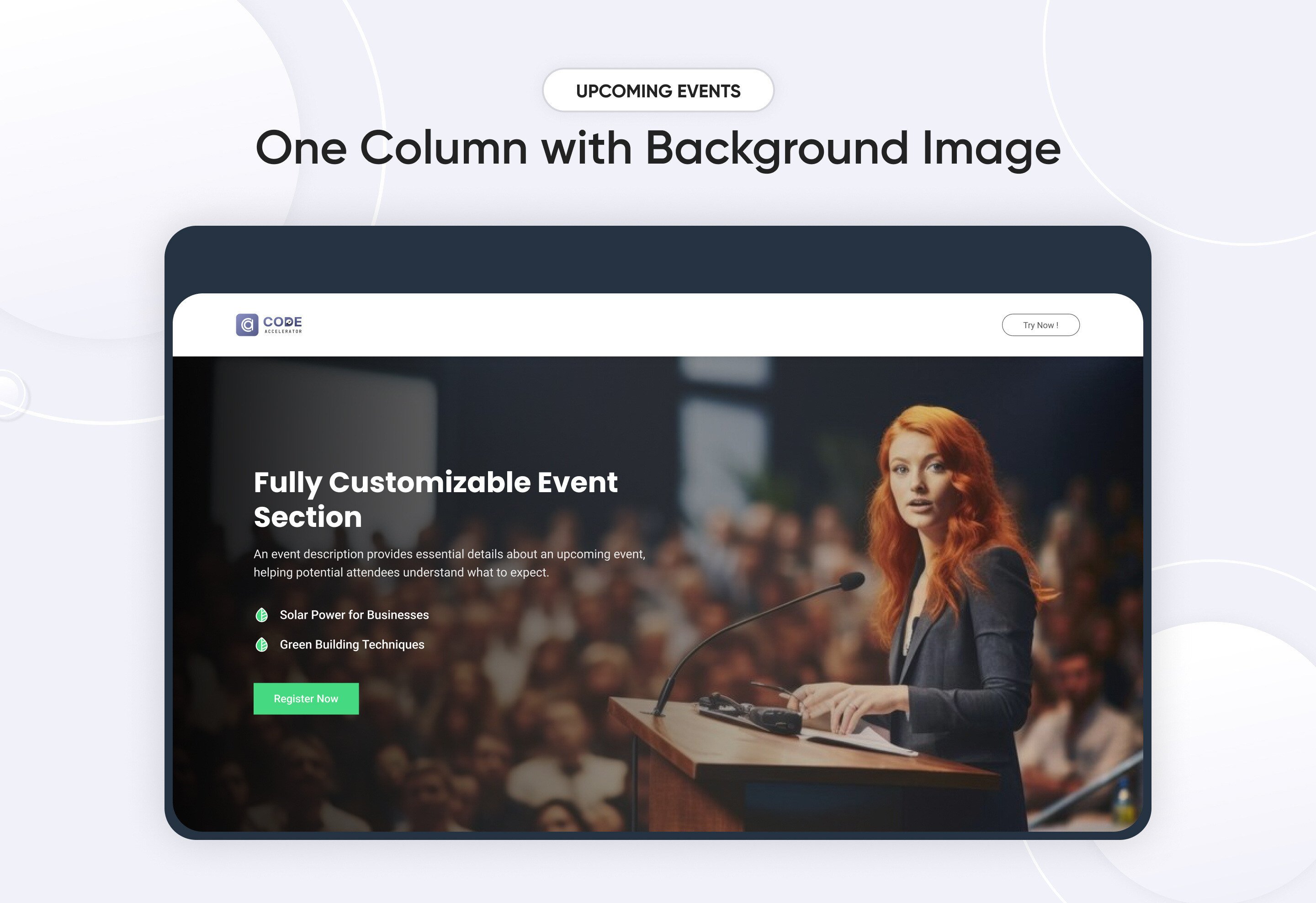
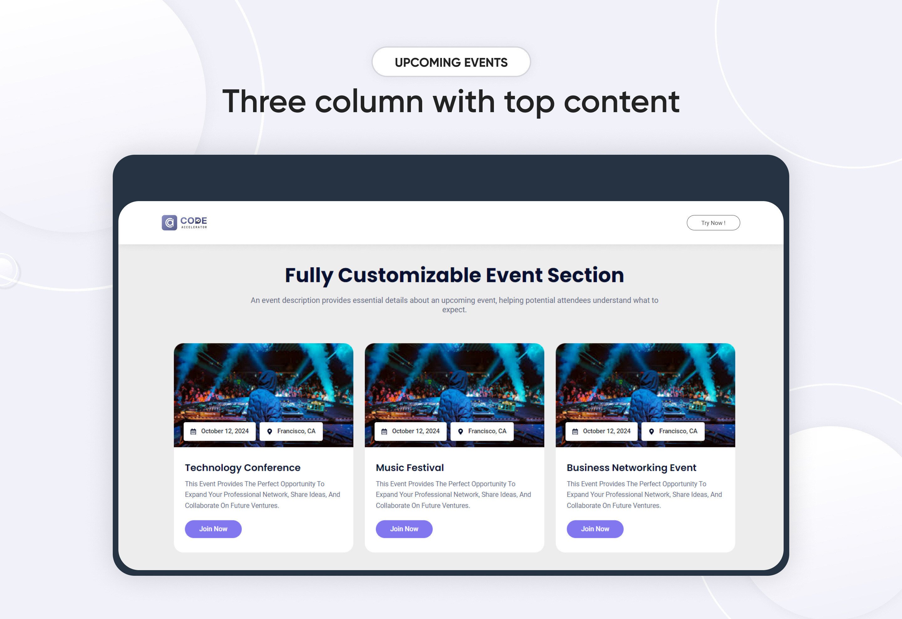
The Event Module is designed to provide an intuitive and flexible solution for managing events on your website or application. Whether you’re organizing a small meeting, a large conference, or recurring events, this module makes it easy to display, add, edit, and remove events seamlessly.
Key Features of the Upcoming Events Module:
- Effortless Event Management – Easily add, edit, or remove events with a user-friendly interface.
- Customizable Design – Adjust colors, fonts, backgrounds, and more to align with your brand’s aesthetic.
- Responsive Layout – Fully adaptable across all devices, providing a seamless experience on mobile, tablet, and desktop.
- Real-Time Updates – Instantly reflect any changes to event details, including date, location, or descriptions.
- CTA Customization – Personalize the CTA text, links, and design to drive user engagement.
- Flexible Typography & Spacing – Customize typography and set spacing for both mobile and desktop views.
Filter Options :
-
Location Filter → Allows users to select events happening in a specific city, state, or country.
-
Month Filter → Enables filtering events by a specific month.
-
Year Filter → Helps users find events from a particular year.
Discover More in the Knowledge Base
Explore detailed documentation, setup instructions, feature explanations, and best practices to help you get the most out of this module quickly and efficiently.
 $29
$29
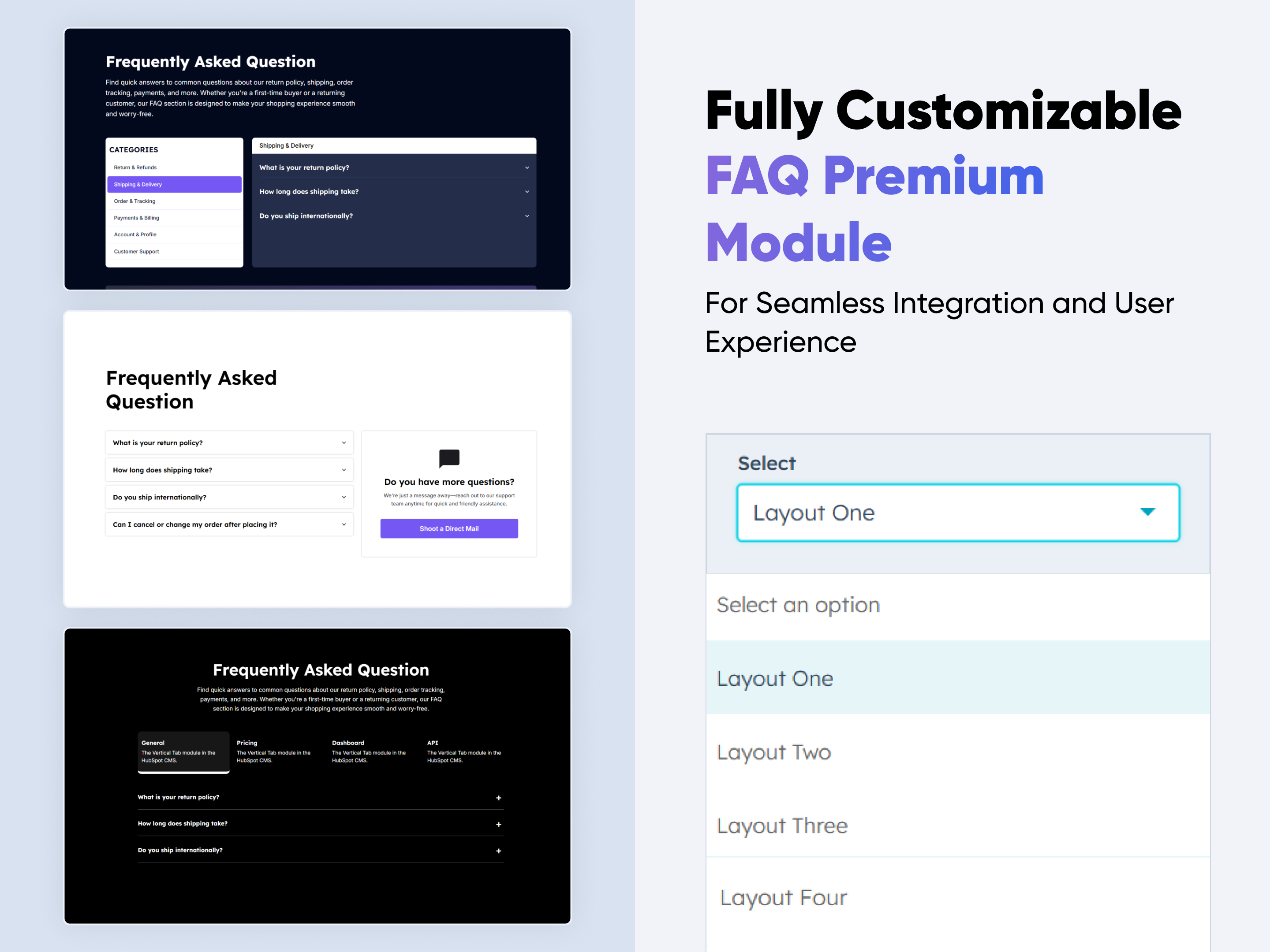
FAQ Premium
Boost customer support and engagement with the "FAQ Premium Module" for HubSpot. Featuring tabbed categories, rich content answers, live search, and responsive accordion design. Easily customizable with zero coding—perfect for modern, user-friendly websites.
Key Features of a FAQ Premium Module :
✅ Custom Tab Titles – Easily add and label multiple tabs.
✅ Accordion Functionality – Expands or collapses answers on click, keeping the layout clean and user-friendly. Only one section opens at a time to reduce clutter.
✅ Horizontal & Vertical Tab Layouts – Choose between horizontal or vertical tab orientation.
✅ Fully Responsive Design – Optimized for all devices (desktop, tablet, mobile).
✅ Extensive Style Customization – Tab background (solid or gradient), Border styles, Padding/margins, Active/inactive states
✅ Easy to Use with Drag & Drop – Built for HubSpot’s drag-and-drop page editor. No coding required to configure or style tabs
✅ Reusable and Scalable – Add multiple tab sections to a page or reuse across templates.
Discover More in the Knowledge Base
Explore detailed documentation, setup instructions, feature explanations, and best practices to help you get the most out of this module quickly and efficiently.
 $29
$29
Salpace
Boost user experience and support with the Smart FAQ Accordion Module for HubSpot. Featuring smooth accordion toggles, tabbed categories, SEO-friendly structure, and fully responsive design. Easily customizable with no coding required—perfect for creating clean, modern, and user-friendly FAQ sections on any website.
Key Features of a Smart FAQ Accordion Module :
✅ Custom Tab Titles – Easily add and label multiple tabs.
✅ Accordion Functionality – Expands or collapses answers on click, keeping the layout clean and user-friendly. Only one section opens at a time to reduce clutter.
✅ Smooth Accordion Animation – Modern toggle animation for a clean and interactive user experience.
✅ Fully Responsive Design – Optimized for all devices (desktop, tablet, mobile).
✅ Extensive Style Customization – Tab background (solid or gradient), Border styles, Padding/margins, Active/inactive states
✅ Easy to Use with Drag & Drop – Built for HubSpot’s drag-and-drop page editor. No coding required to configure or style tabs
✅ Reusable and Scalable – Add multiple tab sections to a page or reuse across templates.
Discover More in the Knowledge Base
Explore detailed documentation, setup instructions, feature explanations, and best practices to help you get the most out of this module quickly and efficiently.
 $29
$29
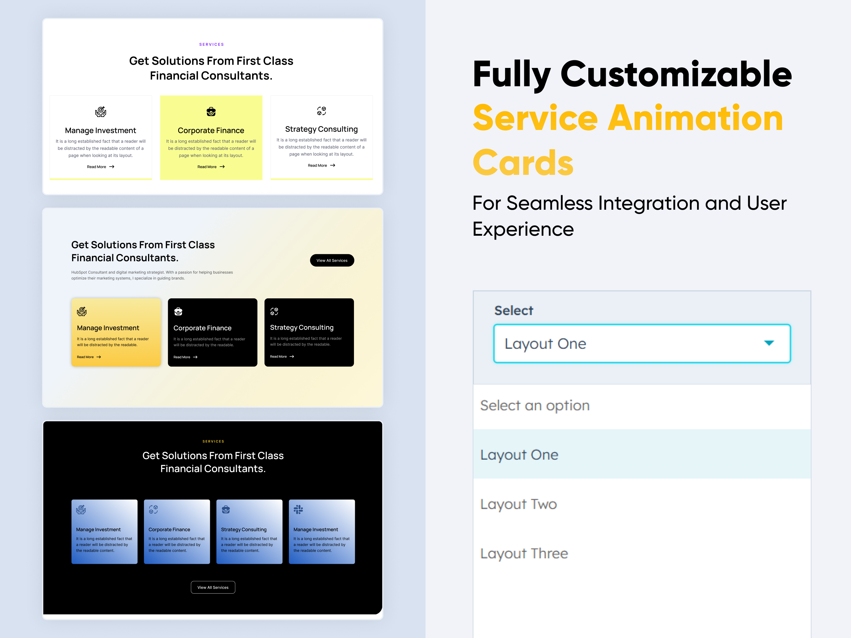
Service Animation Cards
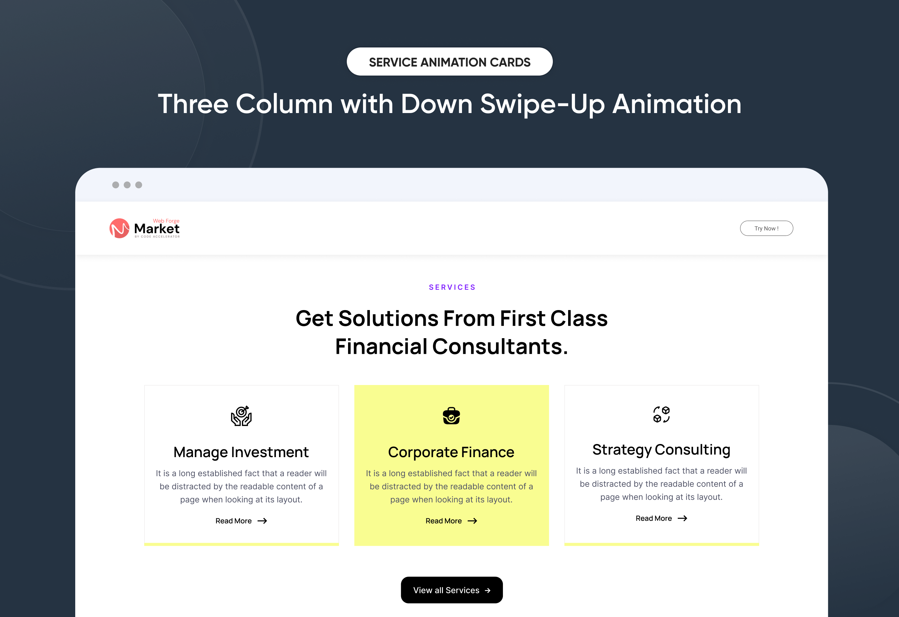
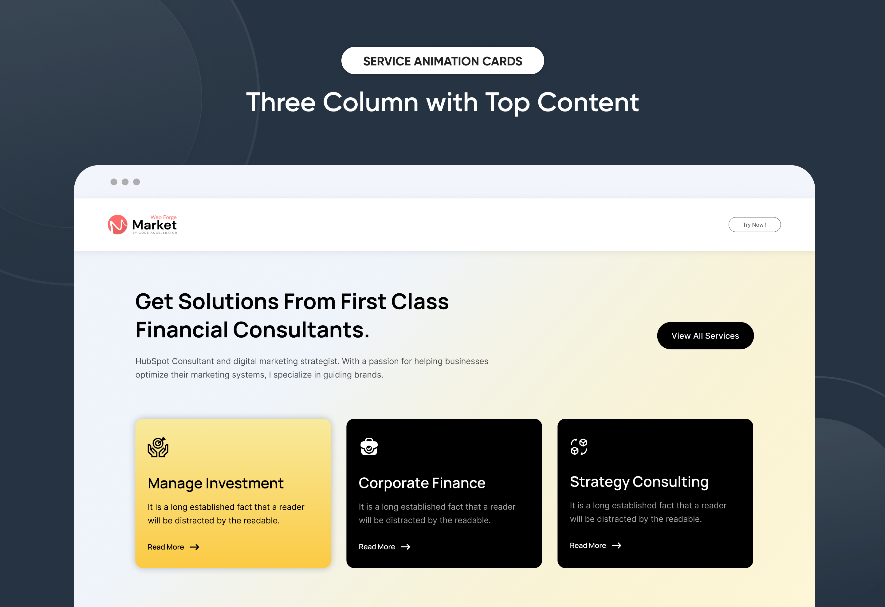
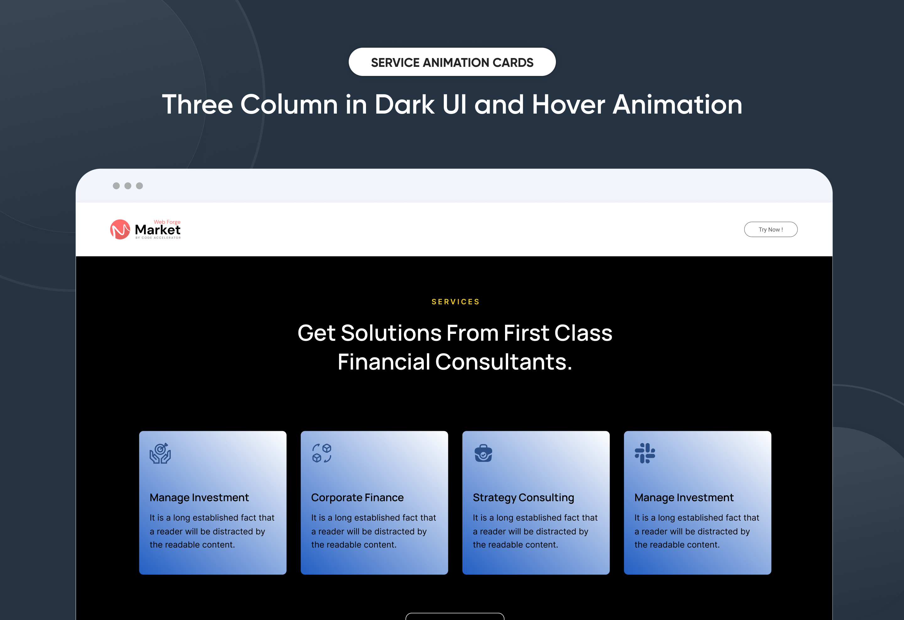
Create a personalized "Service Animation Cards" section with ease. This flexible module lets you customize styles, layouts, and design elements to match your brand. No coding needed—just simple, intuitive controls. Perfect for adding a professional touch to your site.
Key Features of a Service Animation Cards Module :
✅ 3 Unique Layout Options – Choose from three beautifully crafted slider layouts to match any design style.
✅ Fully Mobile Responsive – Seamlessly adapts to all screen sizes for the best viewing experience.
✅ Modern & Clean Design – Sleek, contemporary styling fits perfectly into any modern website.
✅ Easy to Edit – Quickly customize content, styles, and settings without hassle.
✅ Easy to Integrate – Simple setup and integration into any page or theme.
✅ Optimized for Performance – Lightweight and fast for smooth transitions and loading.
✅ Call to Action (CTA) – A friendly nudge like “Contact me” or “Book a Consultation” with a button.
Discover More in the Knowledge Base
Explore detailed documentation, setup instructions, feature explanations, and best practices to help you get the most out of this module quickly and efficiently.
 $29
$29
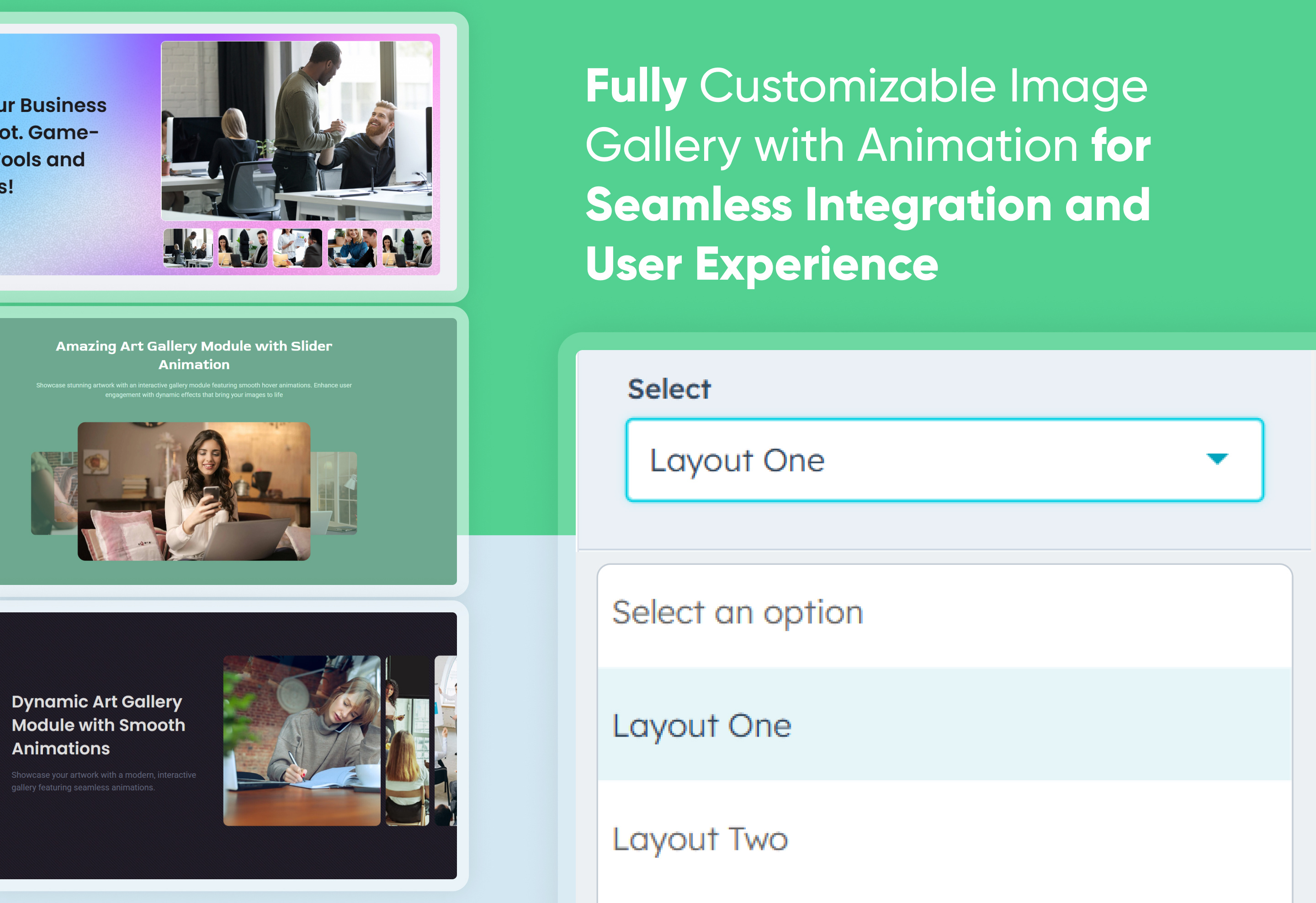
Image Gallery With Animation
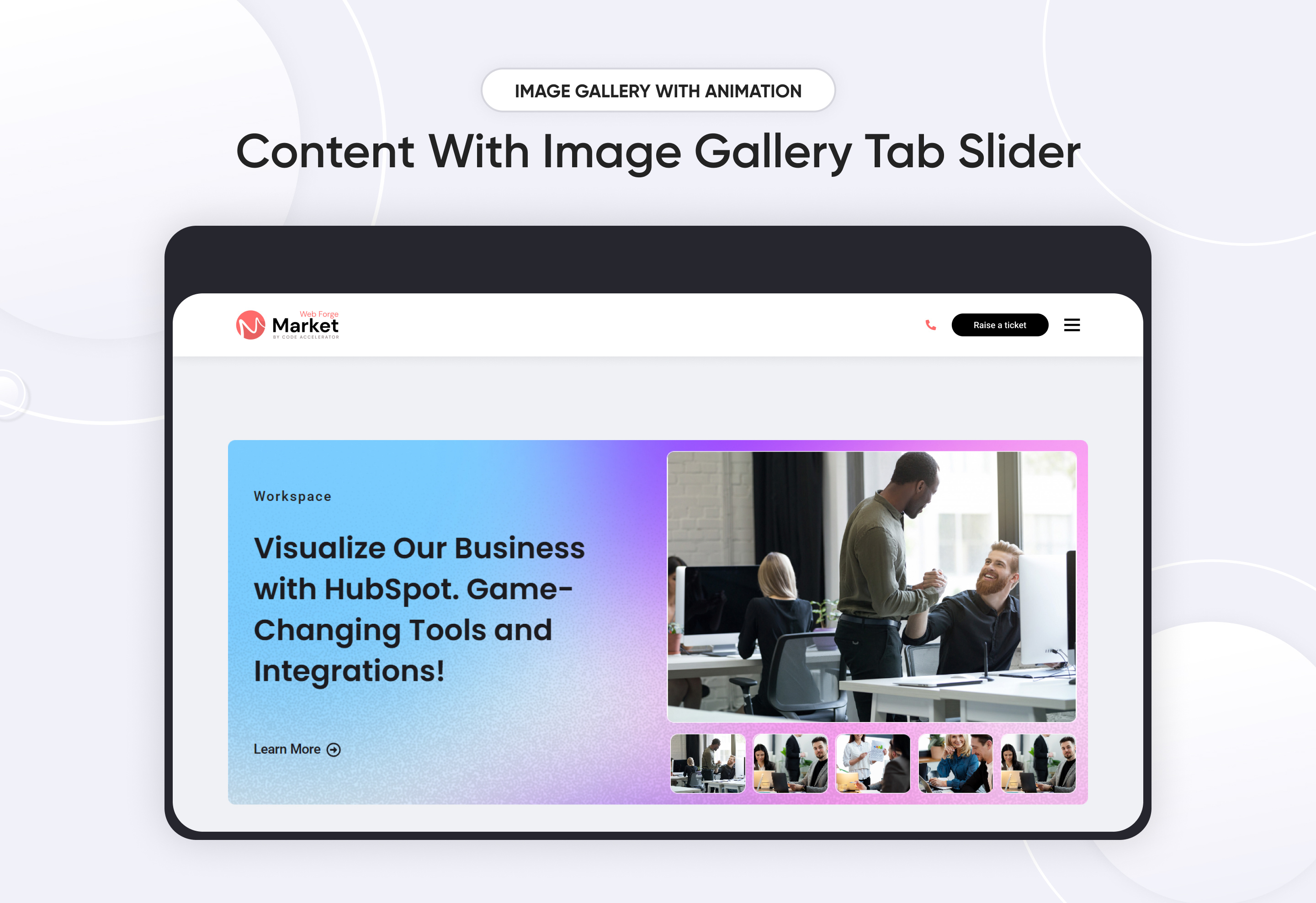
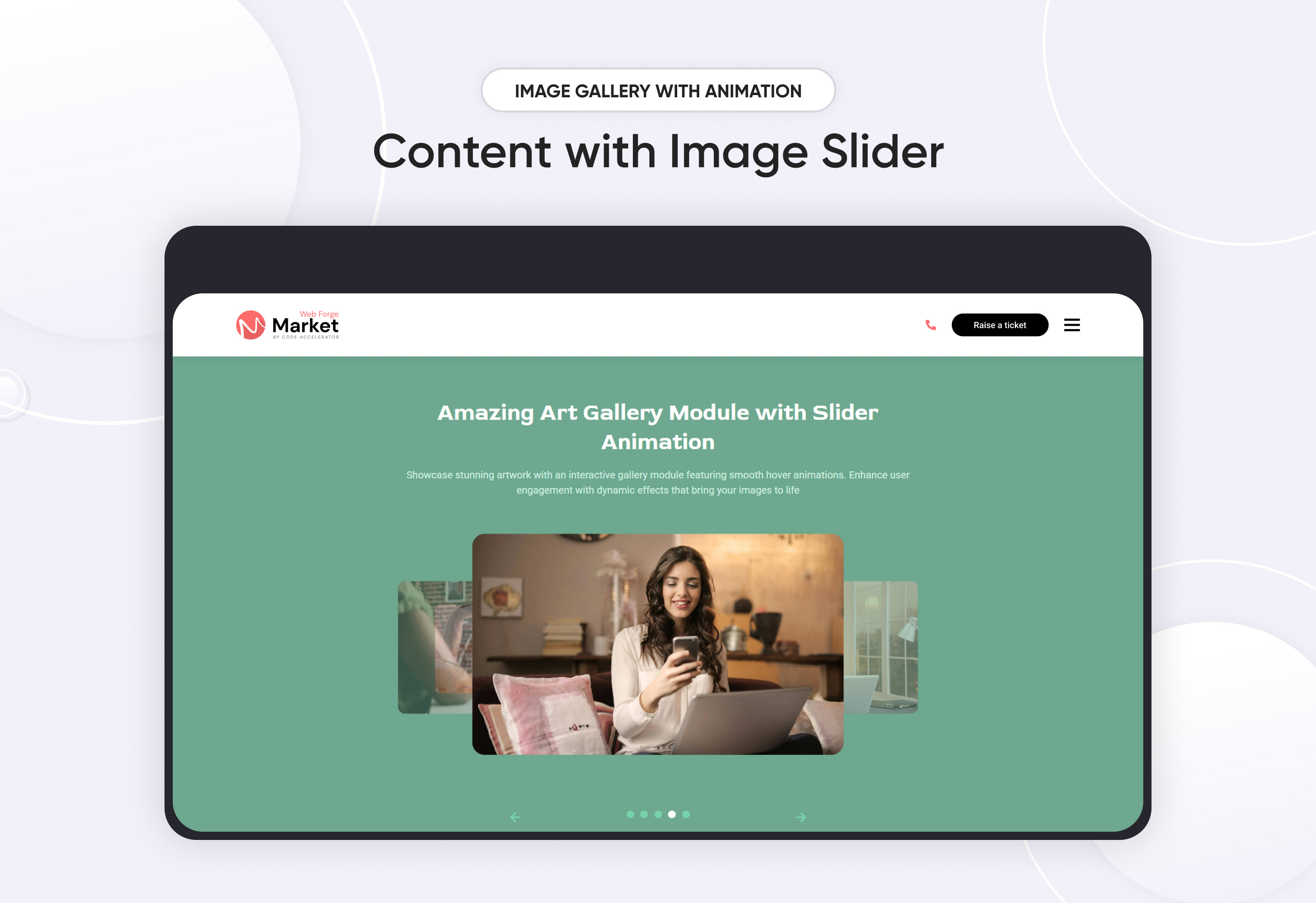
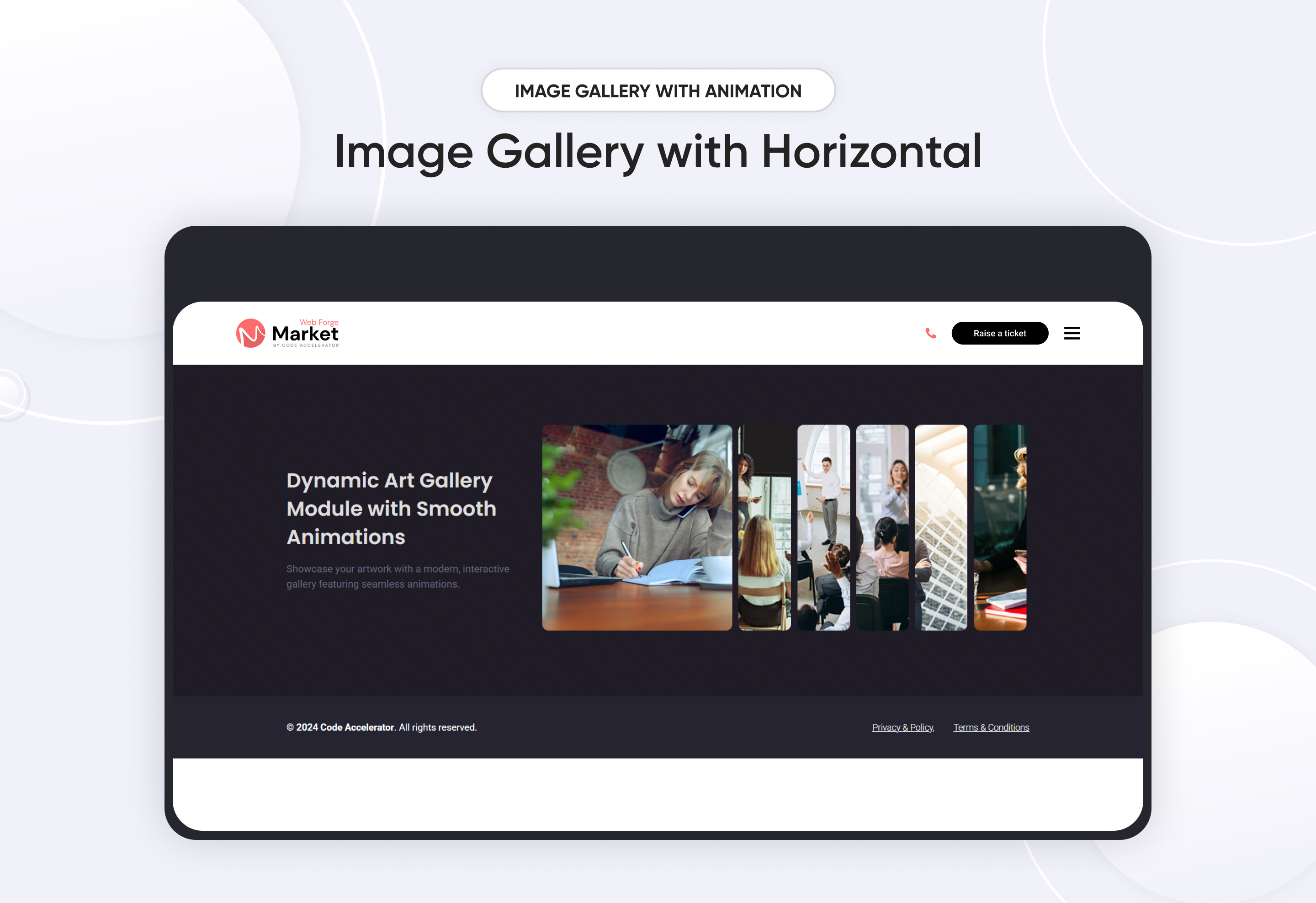
An Image Gallery with Animation module is a visually appealing and interactive way to display images on a website or application. It enhances user engagement through smooth transitions, effects, and interactive animations.
Key Features of a Image Gallery with Animation Module :
-
Image Display: Supports various image formats (JPEG, PNG, SVG, GIF, WebP
- Mobile-Friendly: Fully responsive design for different screen sizes.
- SEO-Friendly: Supports image alt attributes and structured data.
- Customizable Styles : Modify colors, borders, and effects easily.
- Image Captions & Descriptions: Adds titles or descriptions for layouts.
- Click to Expand: Enlarges an image when clicked.
Use Cases :
- Portfolio Websites
- E-commerce Product Galleries
- Travel & Photography Blogs
- Corporate Showcases
- Social Media & Community Platforms
Discover More in the Knowledge Base
Explore detailed documentation, setup instructions, feature explanations, and best practices to help you get the most out of this module quickly and efficiently.
 $free
$free
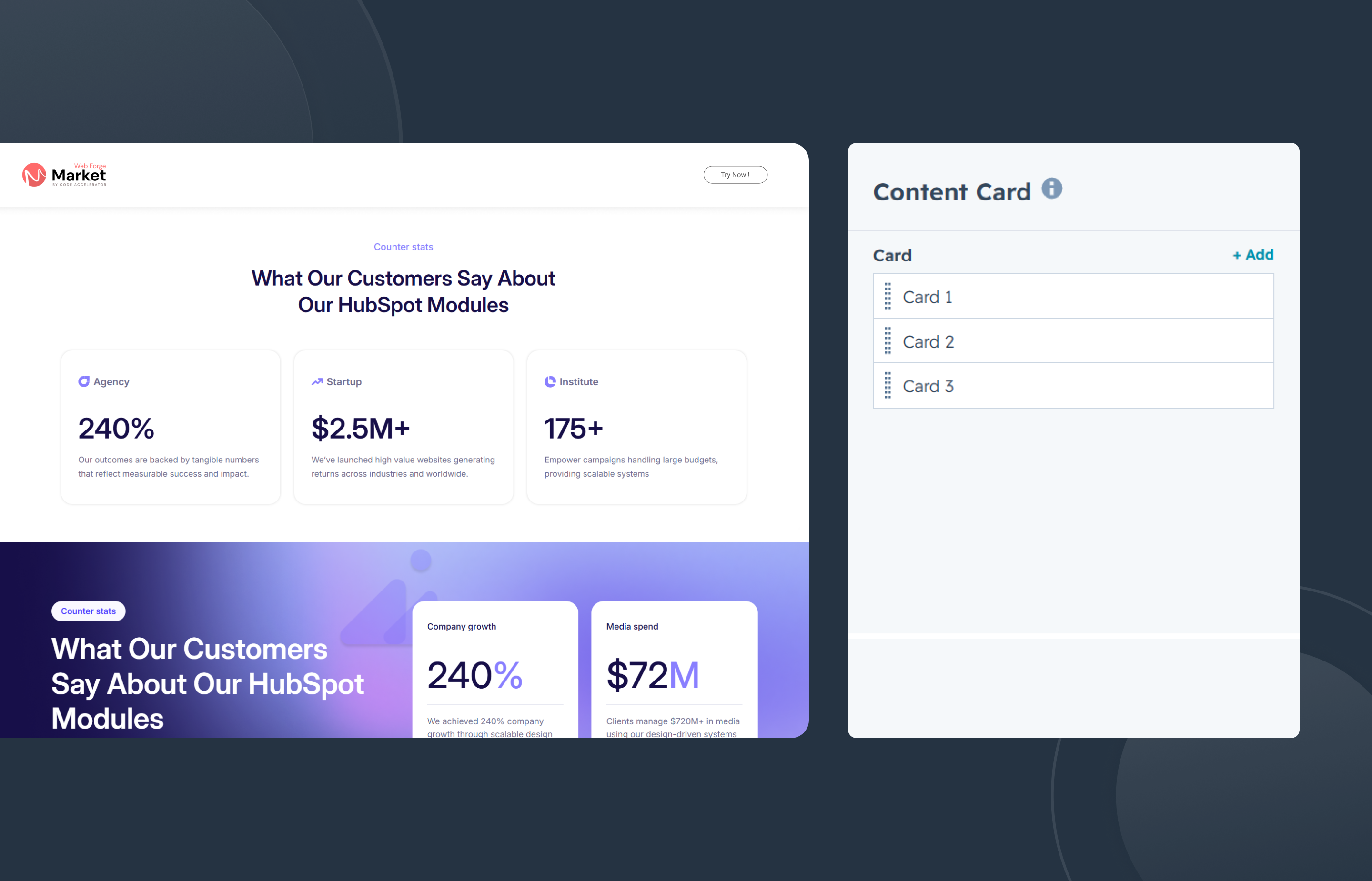
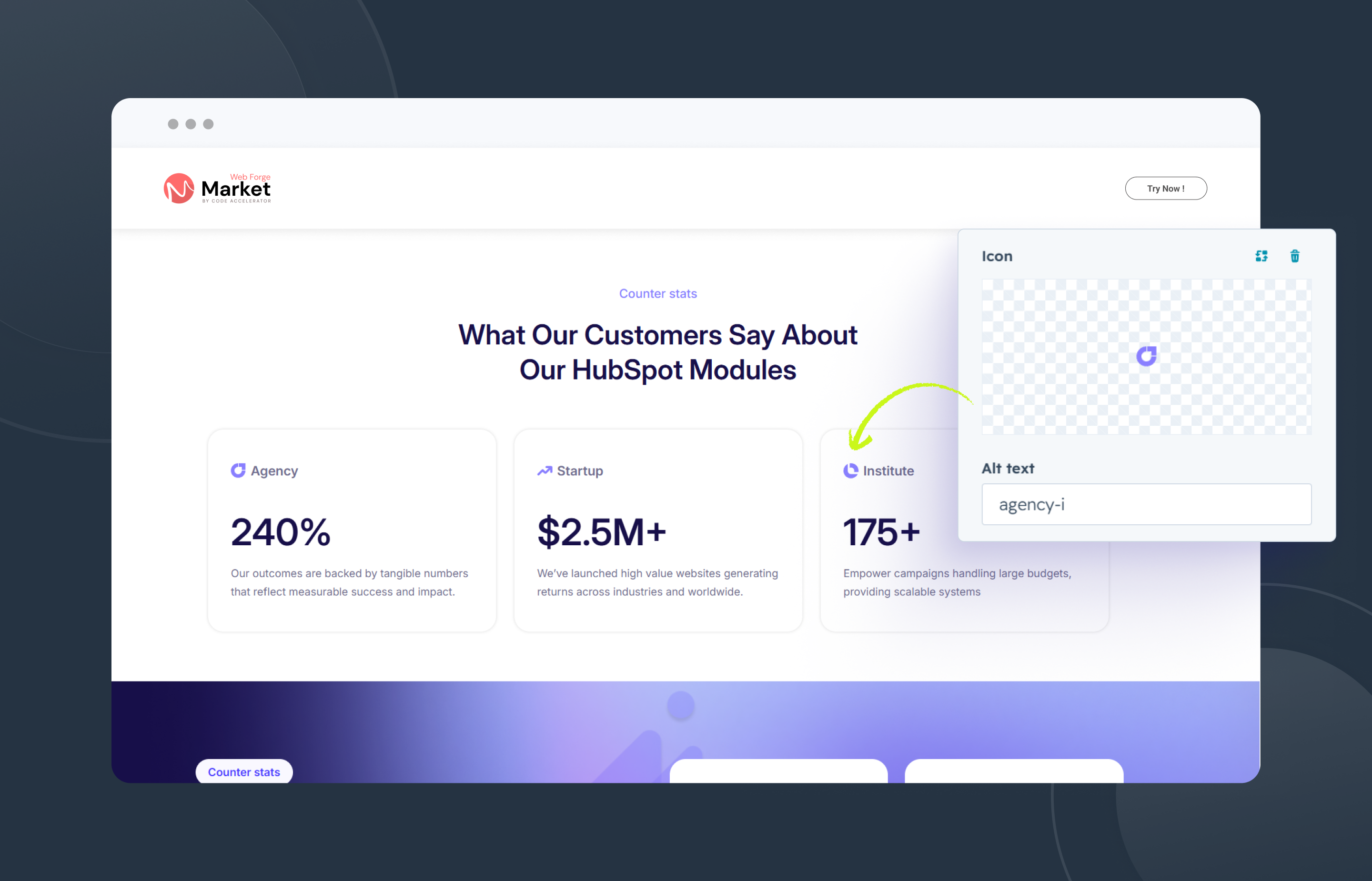
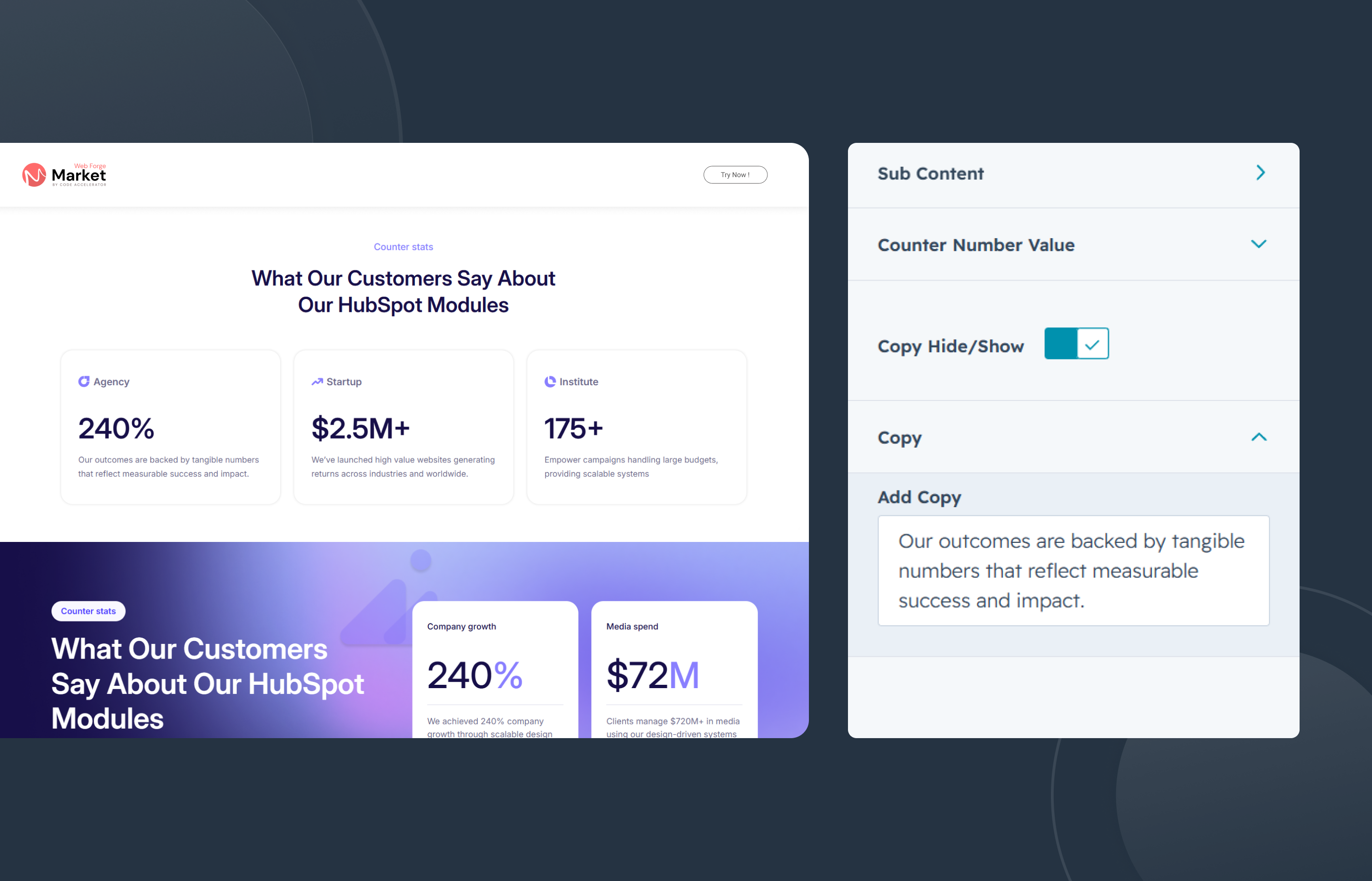
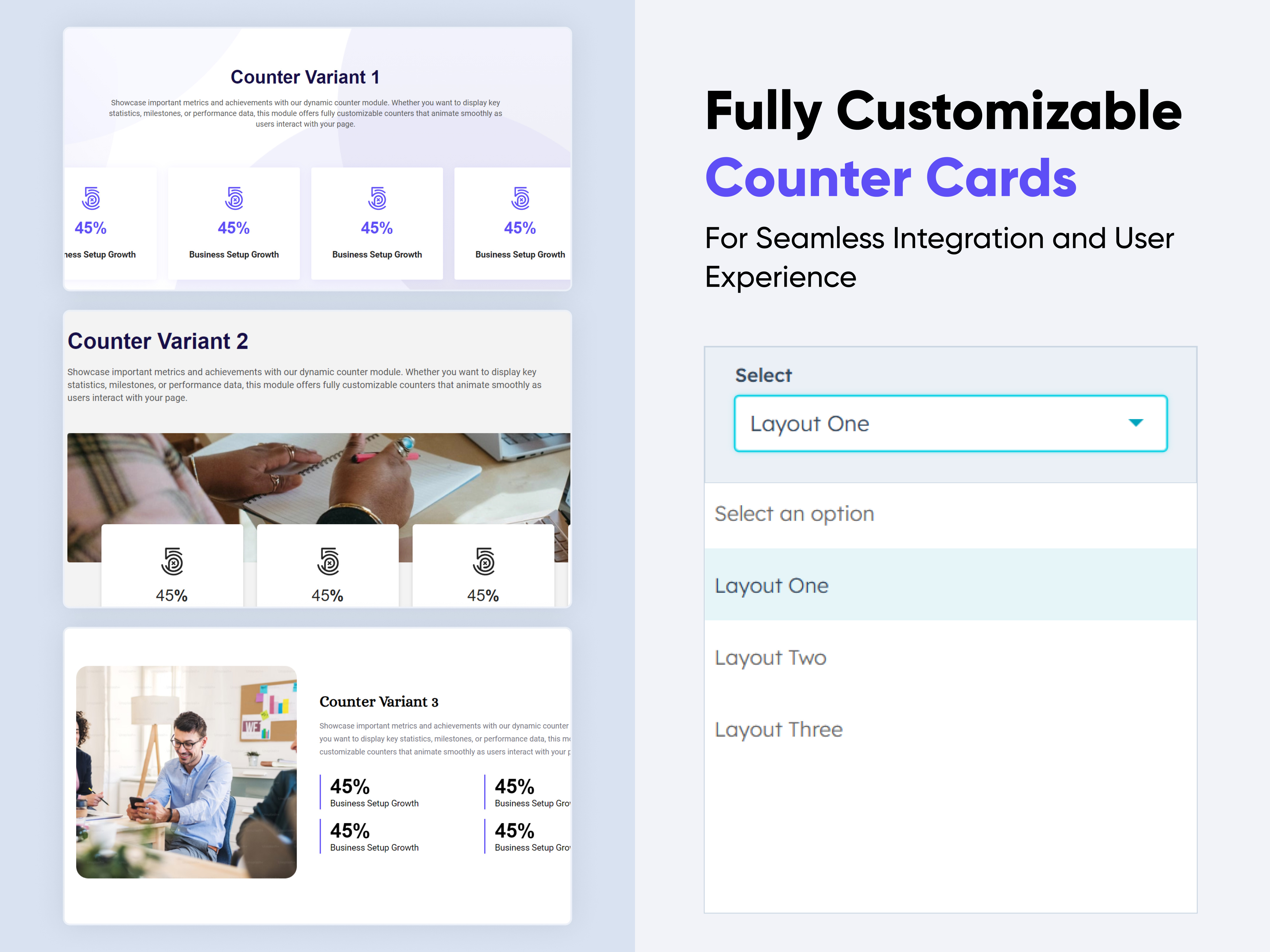
Counter Cards
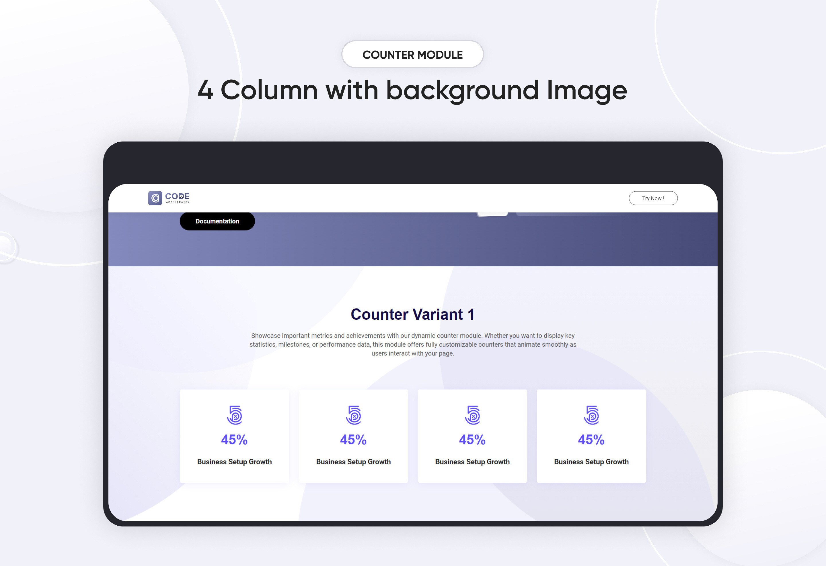
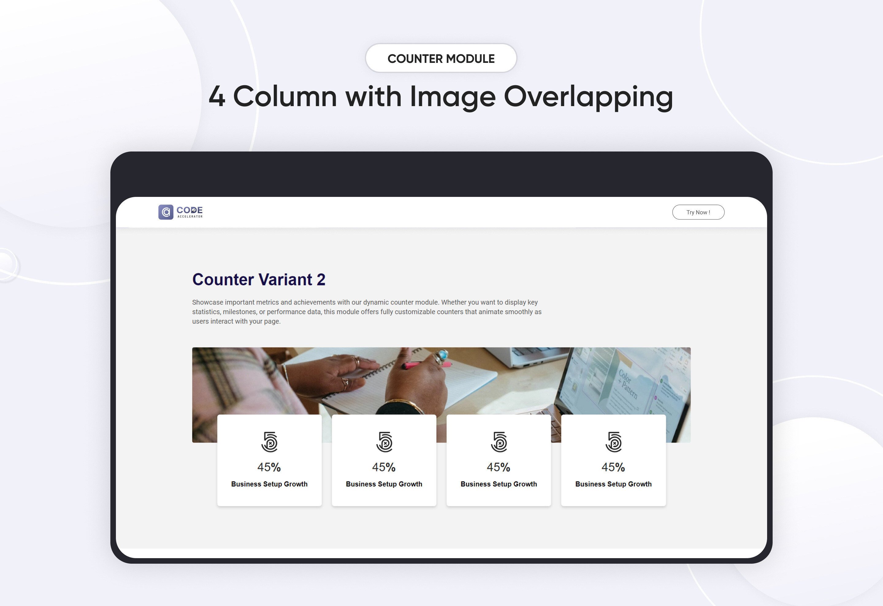
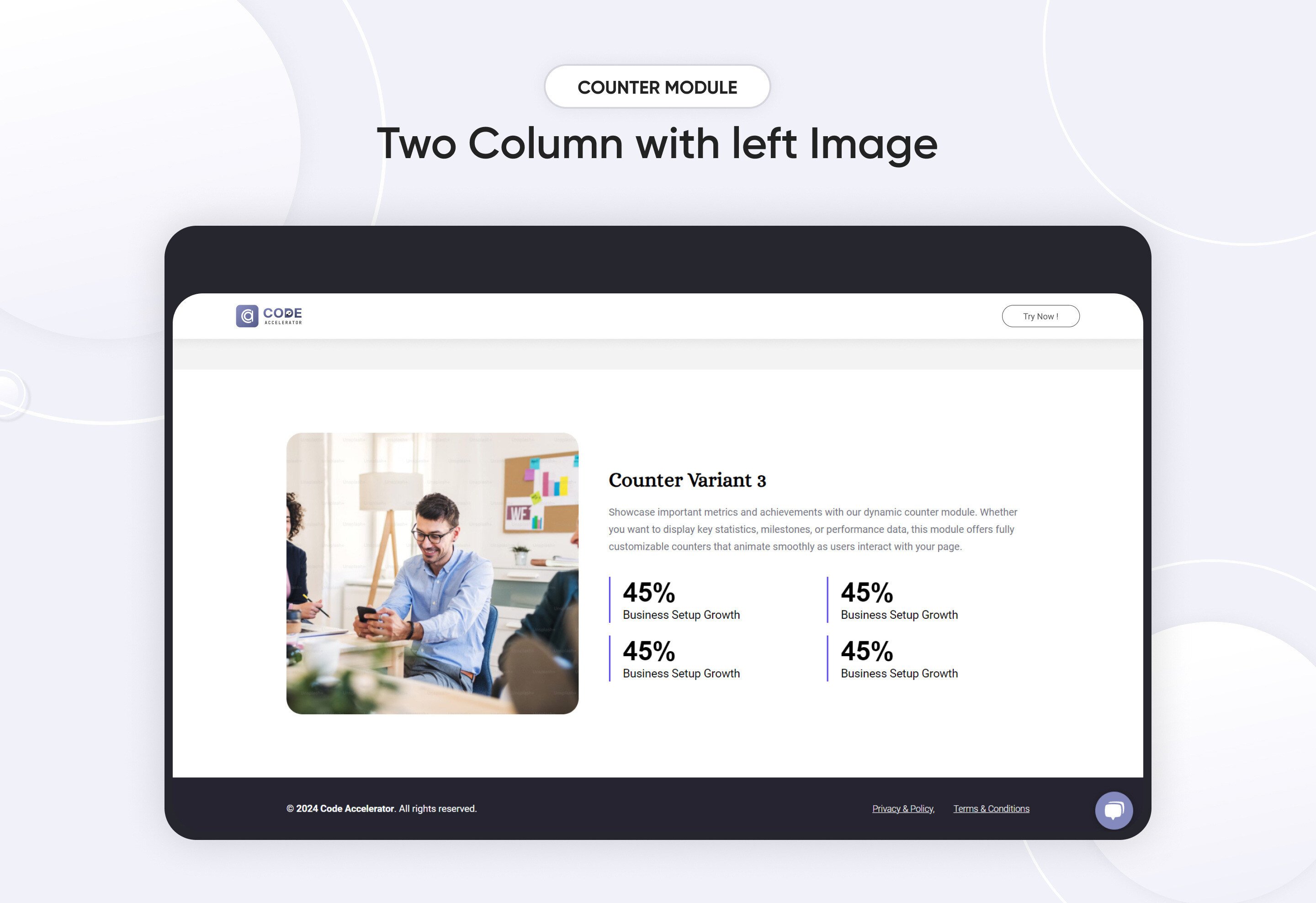
The Counter Module is a versatile and visually engaging tool designed to display animated number counters on your HubSpot website. Ideal for highlighting key metrics, milestones, or achievements, this module provides a simple yet powerful way to showcase important data, such as sales figures, customer satisfaction rates, or project milestones. Whether you're promoting business growth, achievements, or social proof, the Counter Module delivers both functionality and style.
Key Features :
-
Fully Responsive Across All Devices: The counter adapts seamlessly to mobile, tablet, and desktop screens, ensuring a consistent user experience no matter how visitors view your site.
-
Customizable Counter Settings: Easily set start and end values, and include prefixes or suffixes (like $, %, etc.) to match your metrics.
-
Variety of Style Options: Choose from multiple layout designs, font styles, and colors to suit your brand’s aesthetic.
-
Three Elegant Variants: Select from three distinct visual styles that can be applied to create the perfect presentation for your counters.
-
Flexible Column Layout Options: Arrange your counters in single, double, or multi-column layouts to best fit your page’s design.
-
Customizing Module Content: Effortlessly modify titles, labels, and descriptions to convey exactly what each counter represents.
Discover More in the Knowledge Base
Explore detailed documentation, setup instructions, feature explanations, and best practices to help you get the most out of this module quickly and efficiently.
 $29
$29
Tab with Content
Organize your website content with the "Tab with Content" module for HubSpot. Easily add customizable tabs, rich text, and responsive layouts. Choose from horizontal or vertical alignment and style them to match your brand—no coding needed. Perfect for clean, user-friendly content display.
Key Features of a Tab with Content Module :
✅ Custom Tab Titles – Easily add and label multiple tabs.
✅ Rich Text Content Area – Each tab supports a rich text editor.
✅ Horizontal & Vertical Tab Layouts – Choose between horizontal or vertical tab orientation.
✅ Fully Responsive Design – Optimized for all devices (desktop, tablet, mobile).
✅ Extensive Style Customization – Tab background (solid or gradient), Border styles, Padding/margins, Active/inactive states
✅ Easy to Use with Drag & Drop – Built for HubSpot’s drag-and-drop page editor. No coding required to configure or style tabs
✅ Reusable and Scalable – Add multiple tab sections to a page or reuse across templates.
Discover More in the Knowledge Base
Explore detailed documentation, setup instructions, feature explanations, and best practices to help you get the most out of this module quickly and efficiently.
 $29
$29
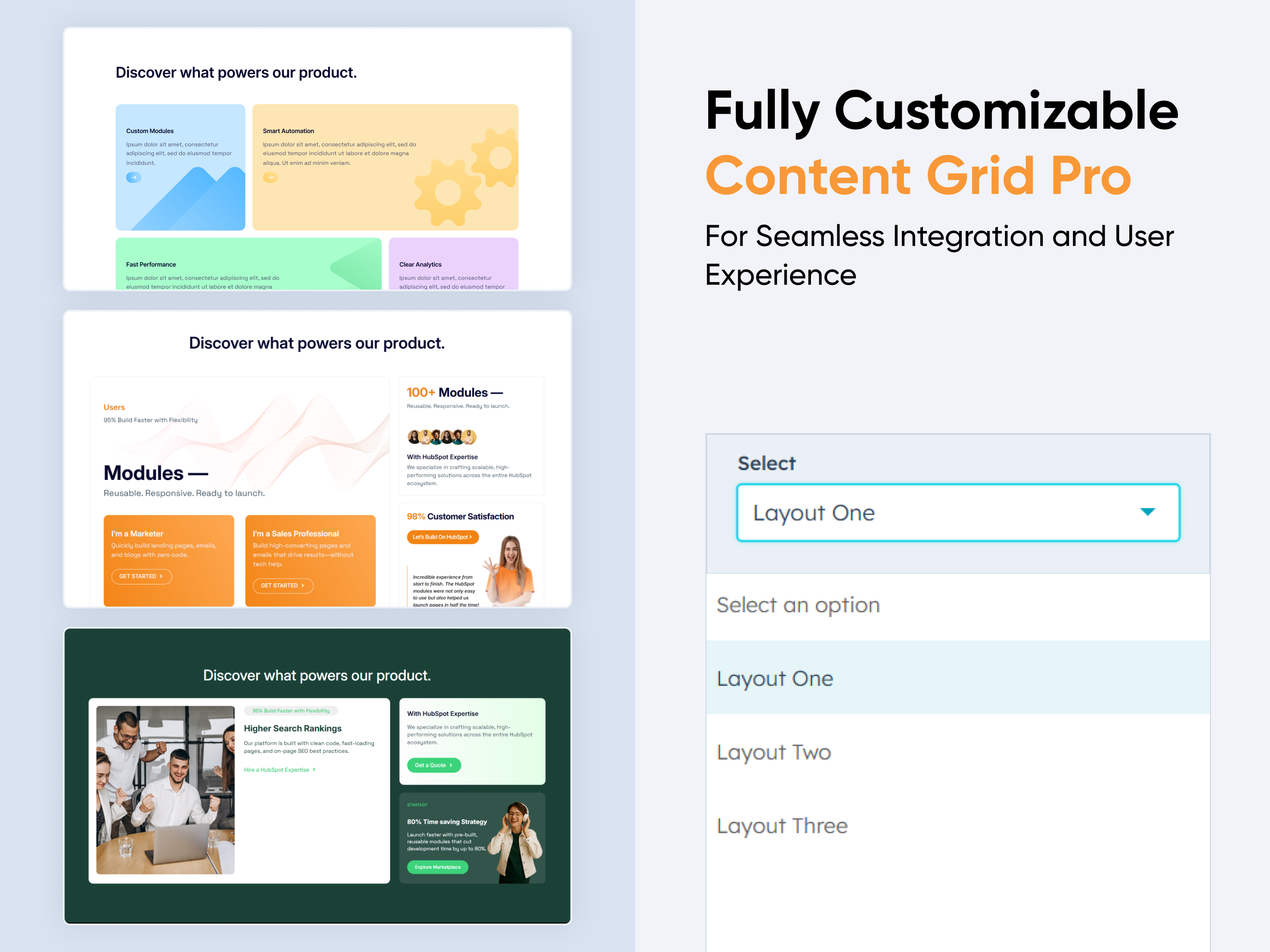
Content Grid Pro
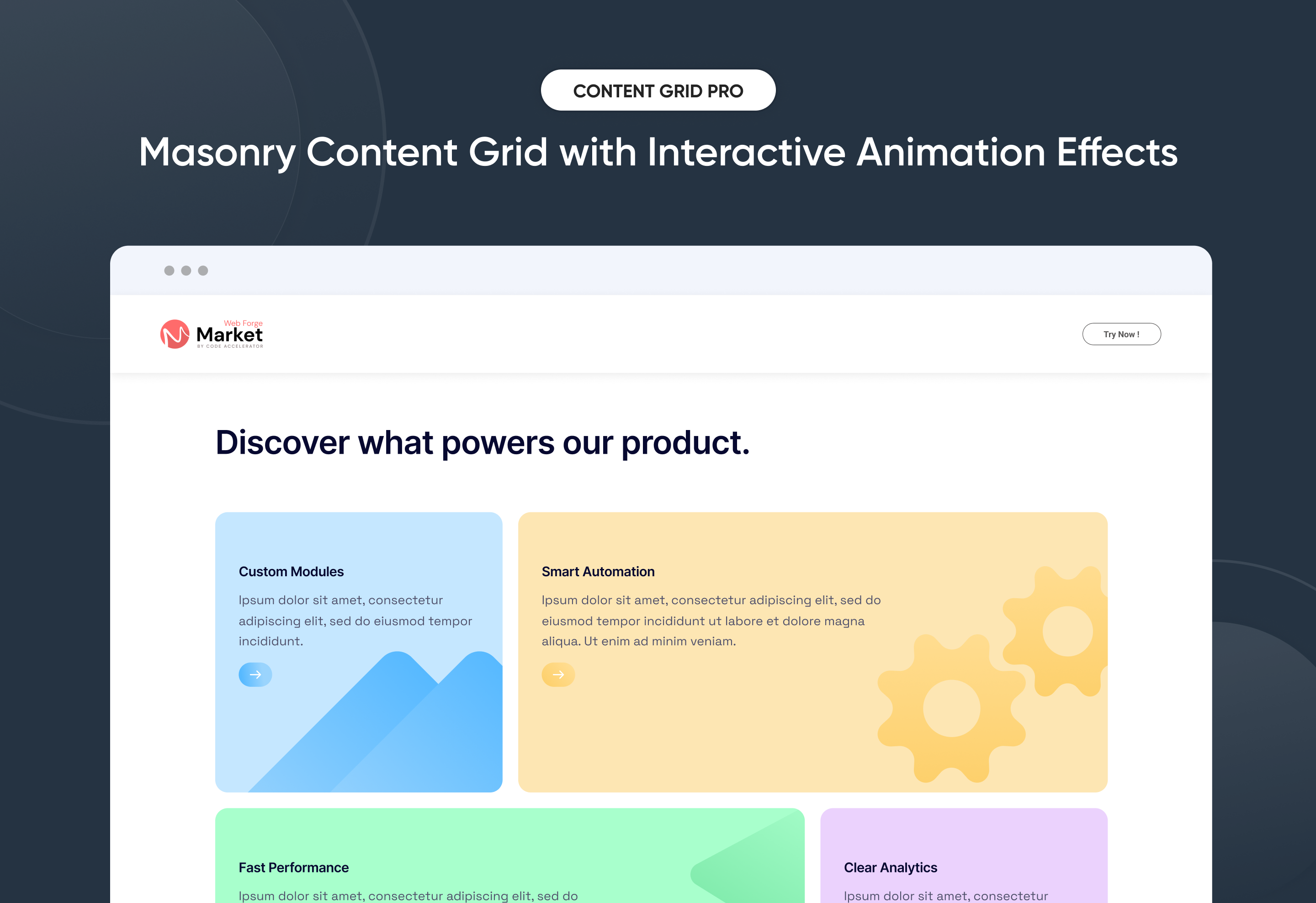
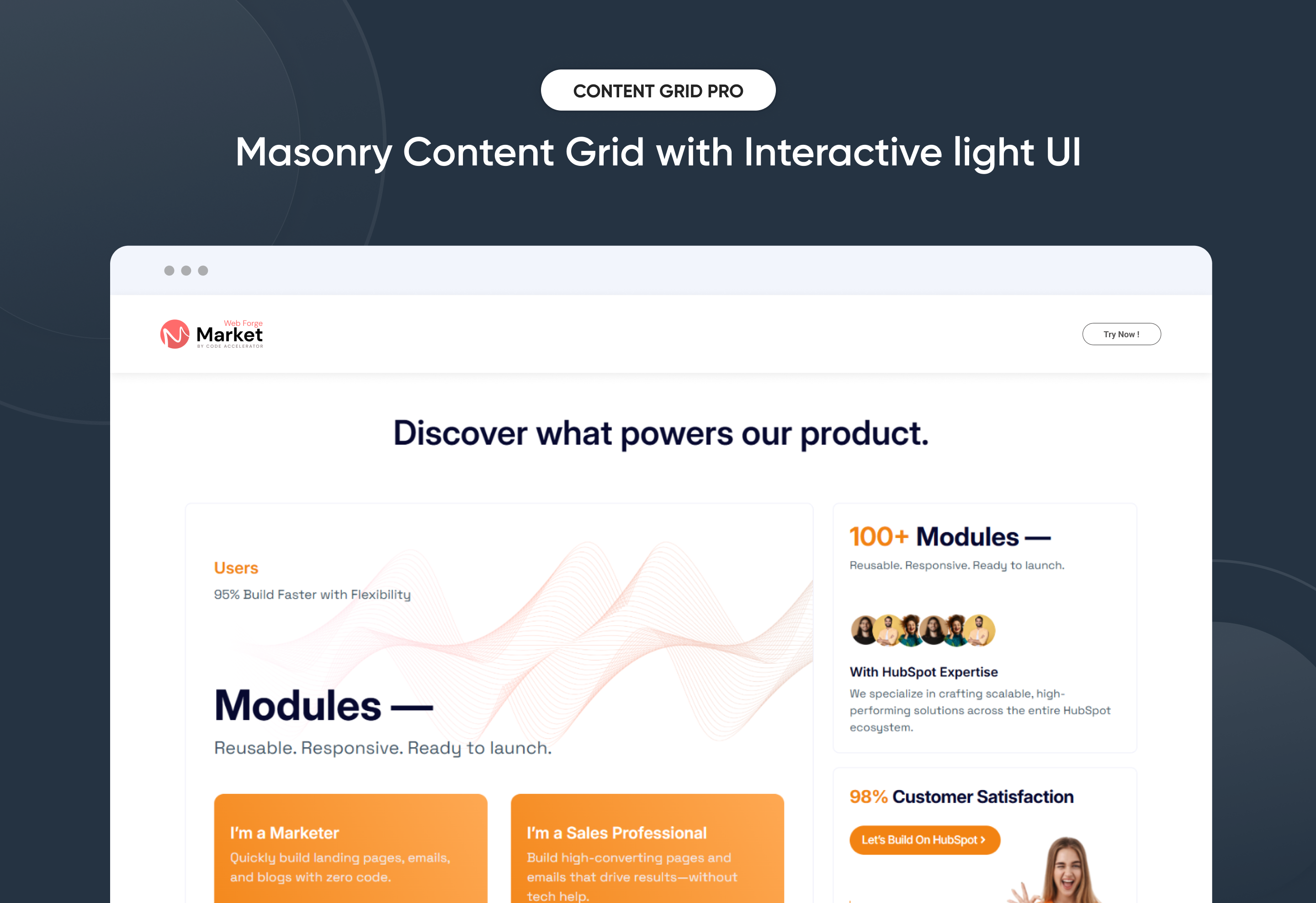
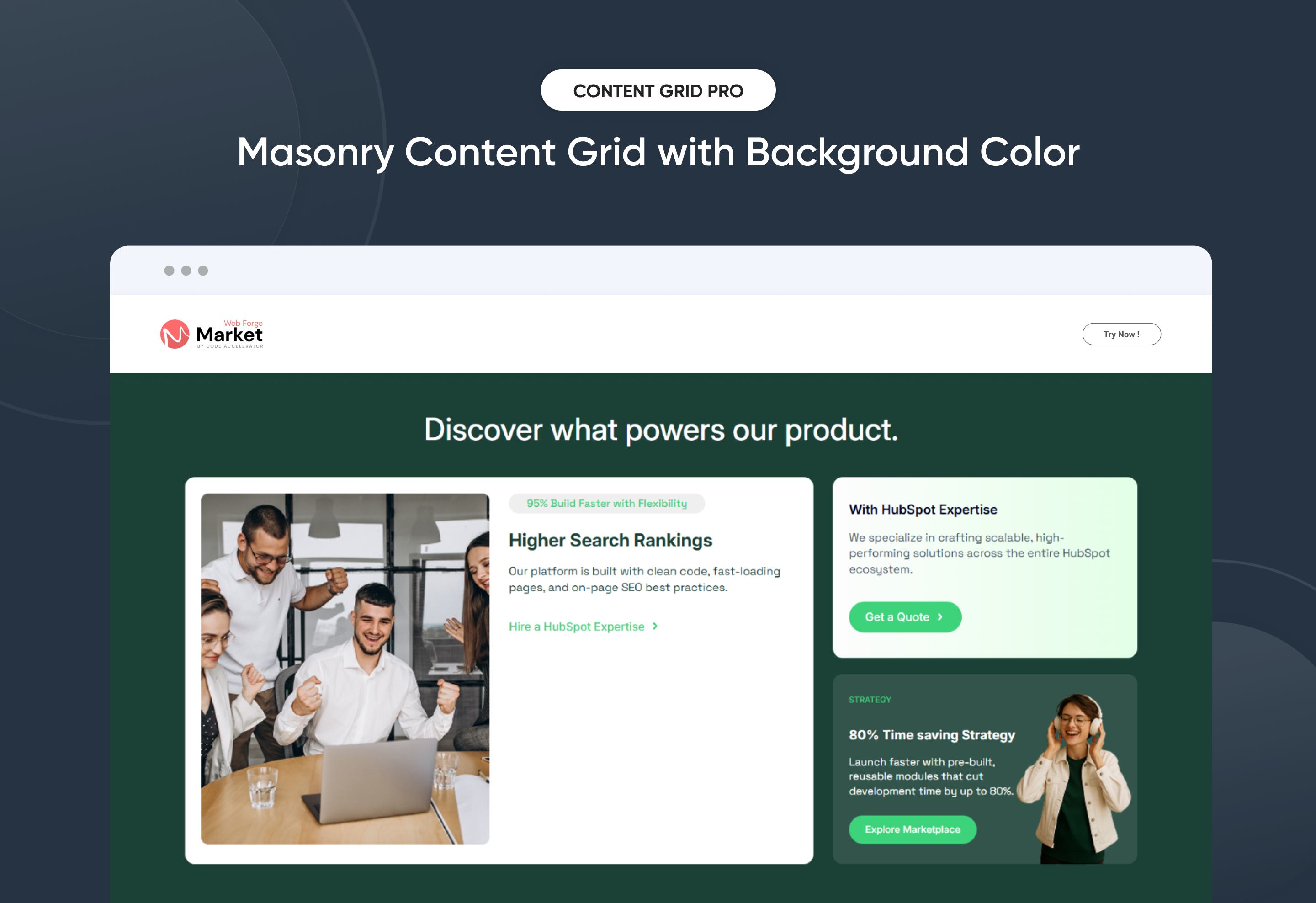
Quickly build a customizable Content Grid Pro to organize and showcase your information with clarity and style. This flexible module lets you adjust layouts, colors, and hover effects to perfectly match your brand. No coding required—just simple, drag-and-drop controls. Ideal for displaying services, portfolios, resources, or team members in a clean, engaging, and professional way on any HubSpot page.
Key Features of a Content Grid Pro Module :
✅ 3 Unique Layout Options – Choose from three beautifully crafted slider layouts to match any design style.
✅ Fully Mobile Responsive – Seamlessly adapts to all screen sizes for the best viewing experience.
✅ Modern & Clean Design – Sleek, contemporary styling fits perfectly into any modern website.
✅ Easy to Edit – Quickly customize content, styles, and settings without hassle.
✅ Hover & Animation Effects – Engage users with smooth hover states, transitions, and subtle animations.
✅ Optimized for Performance – Lightweight and fast for smooth transitions and loading.
✅ Call to Action (CTA) – A friendly nudge like “Contact me” or “Book a Consultation” with a button.
Discover More in the Knowledge Base
Explore detailed documentation, setup instructions, feature explanations, and best practices to help you get the most out of this module quickly and efficiently.
 $29
$29
Two Column Testimonial
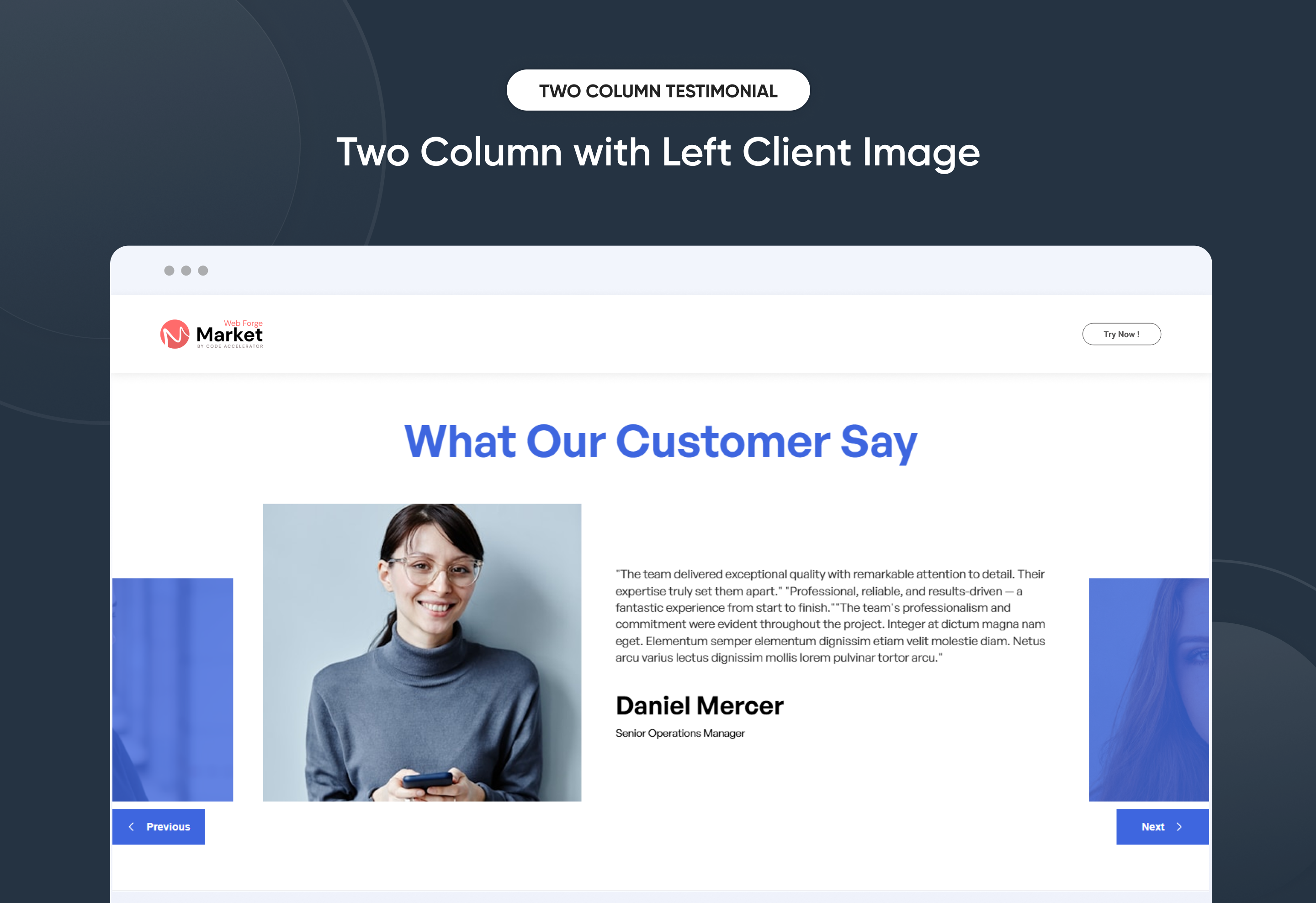
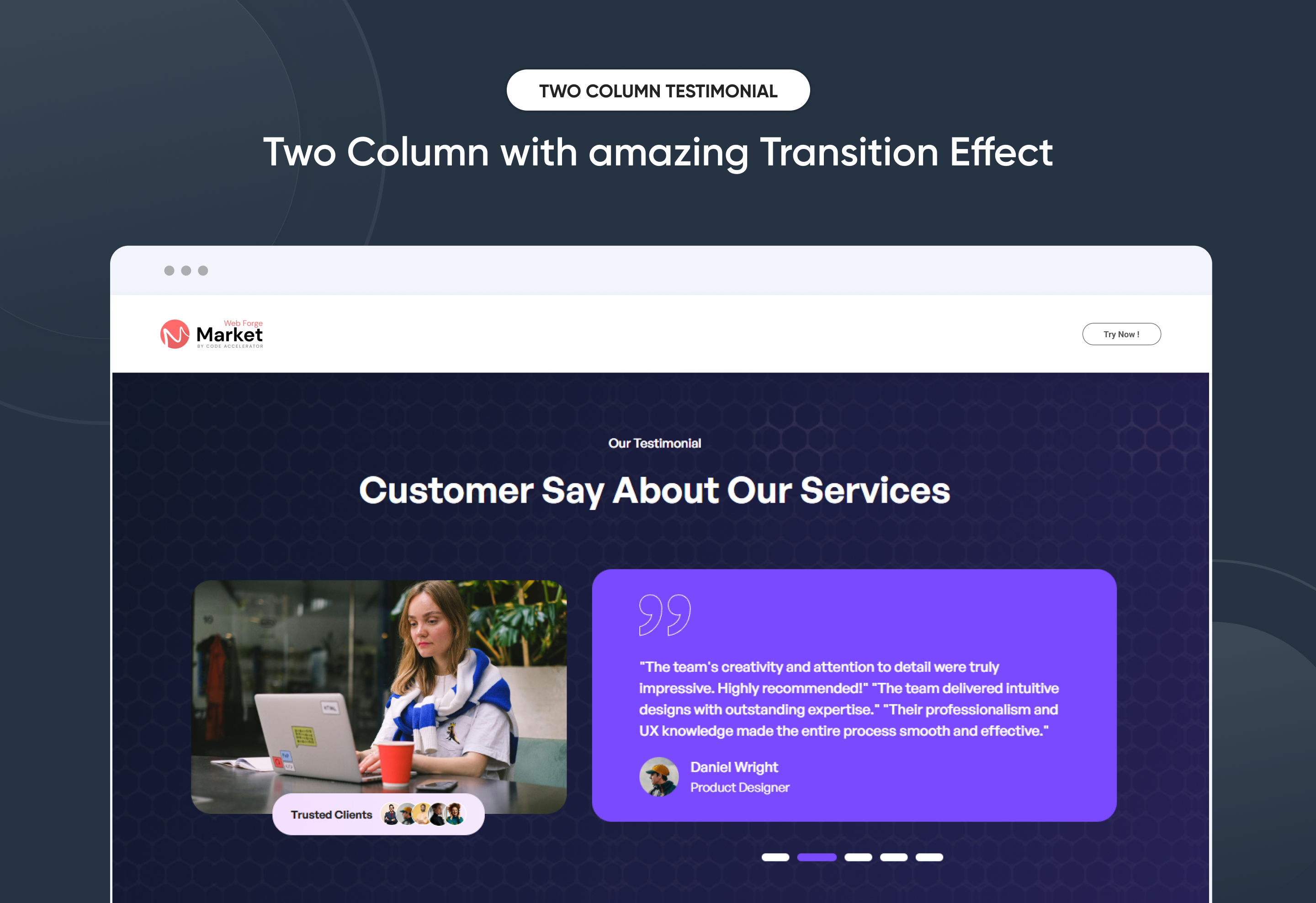
Showcase client feedback with impact using the Two Column Testimonial module. This layout beautifully balances testimonial content and visuals side by side for clear, engaging storytelling. Designed to highlight customer experiences, it helps build trust and strengthen brand credibility. With smooth transitions and a clean, modern structure, testimonials feel more authentic and readable. Fully responsive and customizable, it fits seamlessly into any page design across all devices.
Key Features of a Two Column Testimonial Module :
✅ Two-Column Layout Design - Displays testimonial content and images side by side for a clean, professional presentation.
✅ 3 Unique Layout Options – Choose from three beautifully crafted slider layouts to match any design style.
✅ Fully Mobile Responsive – Seamlessly adapts to all screen sizes for the best viewing experience.
✅ Infinite Auto Slide – Testimonials slide automatically in a smooth, endless loop.
✅ Slide Dots Option – Optional navigation dots enhance usability.
✅ Modern & Clean Design – Sleek, contemporary styling fits perfectly into any modern website.
✅ Easy to Edit – Quickly customize content, styles, and settings without hassle.
✅ Easy to Integrate – Simple setup and integration into any page or theme.
✅ Optimized for Performance – Lightweight and fast for smooth transitions and loading.
✅ Smooth Animation Effects - Built-in fade or slide animations enhance visual engagement without affecting performance.
Discover More in the Knowledge Base
Explore detailed documentation, setup instructions, feature explanations, and best practices to help you get the most out of this module quickly and efficiently.
 $29
$29
Modern Hero Banner
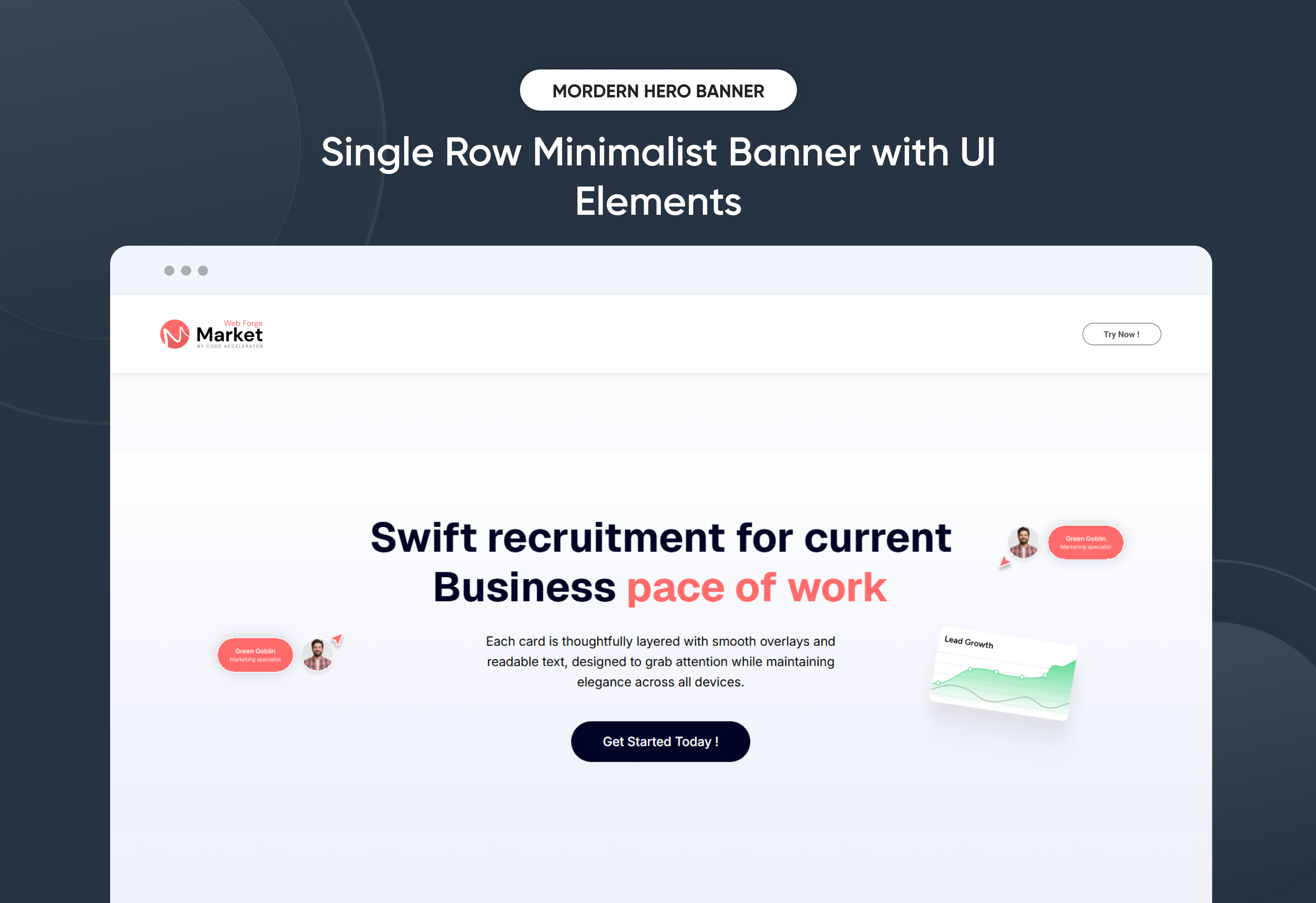
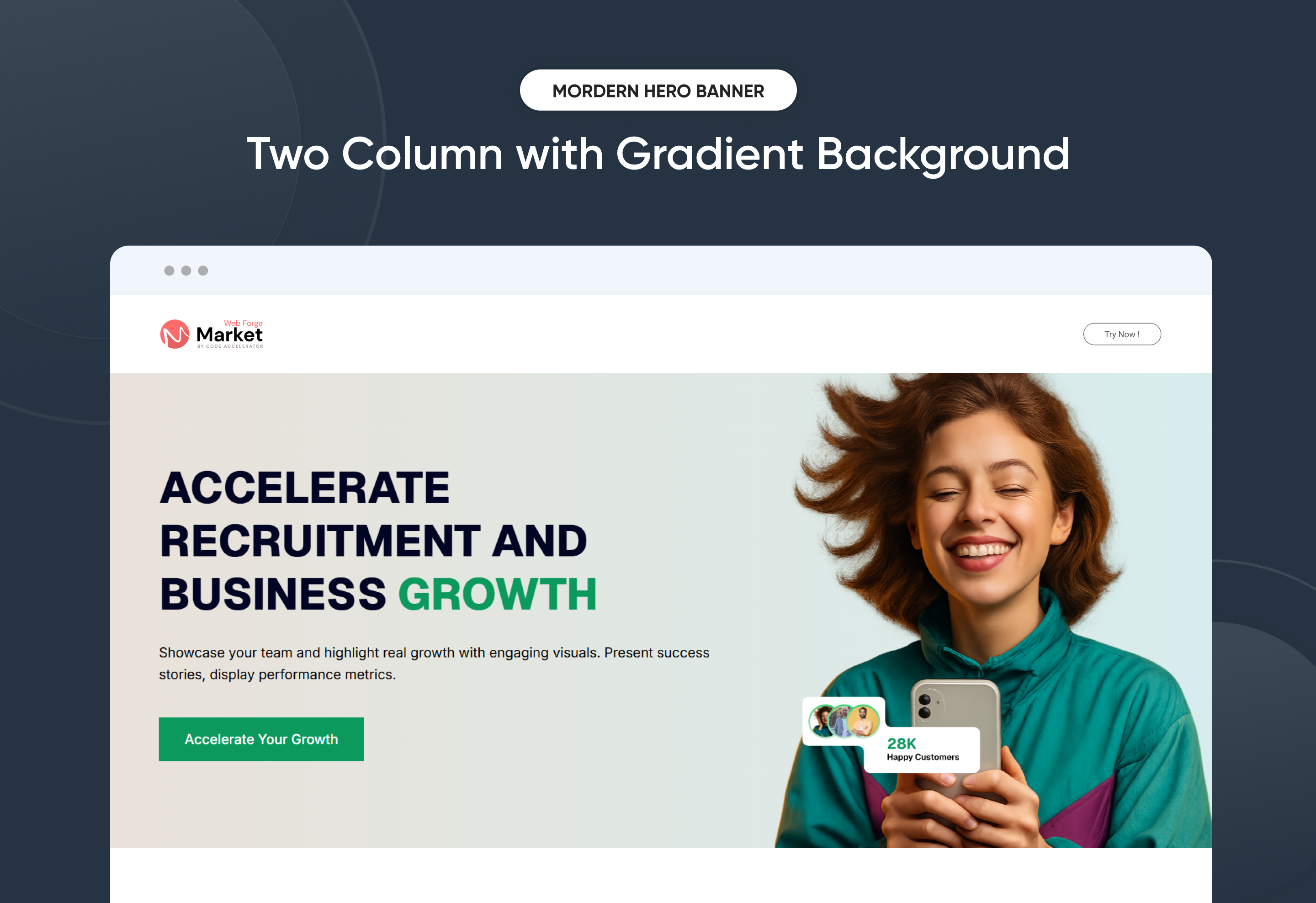
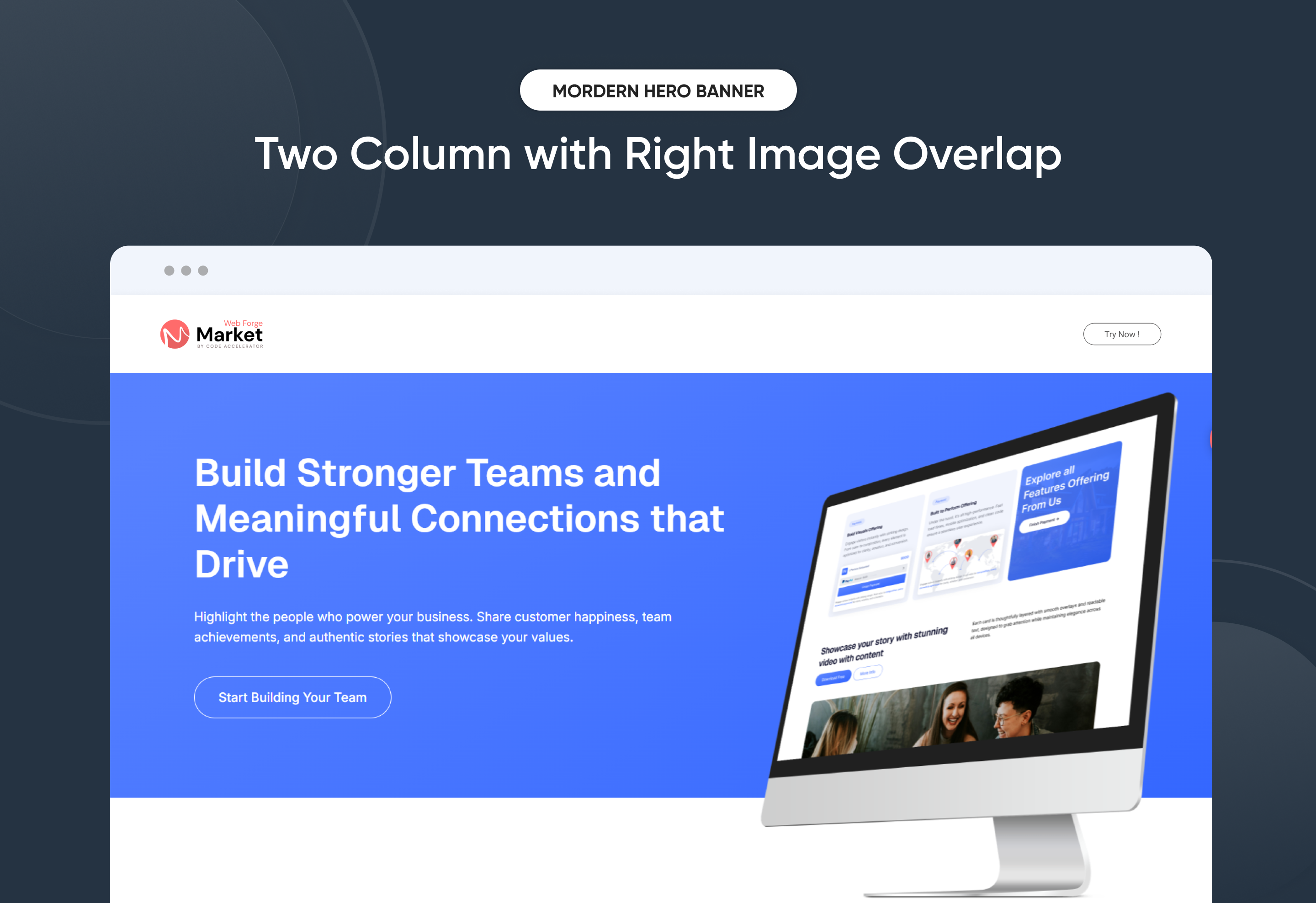
The Modern Hero Banner Module helps you make a powerful first impression with bold, responsive, and customizable hero sections. Designed for flexibility, it includes three unique layouts—growth-focused, people-driven, and digital showcase—giving you the freedom to present your brand exactly the way you want.
Easily update headings, descriptions, images, and call-to-action buttons directly inside HubSpot, without touching code. With mobile-friendly design, adjustable spacing, and complete style control, this module ensures your hero banner always looks sharp and performs seamlessly across all devices.
Whether you’re launching a campaign, showcasing services, or highlighting customer success, the Modern Hero Banner delivers a sleek, high-converting hero section that captures attention and drives results.
Key Features of a Modern Hero Banner Module :
-
Multiple Layouts – Choose from 3 distinct hero banner styles.
-
Responsive Design – Optimized for all screen sizes, ensuring a flawless experience on desktop, tablet, and mobile.
-
Flexible Content Options – Easily update headings, descriptions, and CTAs directly within HubSpot.
-
Customizable Visuals – Add images, graphics, or mockups to match your brand identity and campaign goals.
-
Engaging Call-to-Actions – Drive conversions with customizable CTA buttons tailored to your business objectives.
-
Design Flexibility – Adjust spacing, alignment, and background colors for a unique, on-brand look.
-
User-Friendly Editing – No coding required—built for marketers to launch modern hero sections quickly.
-
Optimized Performance – Lightweight and SEO-friendly to ensure speed and visibility.
-
Versatile Use Cases – Perfect for homepages, landing pages, service showcases, or campaign launches.
Discover More in the Knowledge Base
Explore detailed documentation, setup instructions, feature explanations, and best practices to help you get the most out of this module quickly and efficiently.
 $free
$free
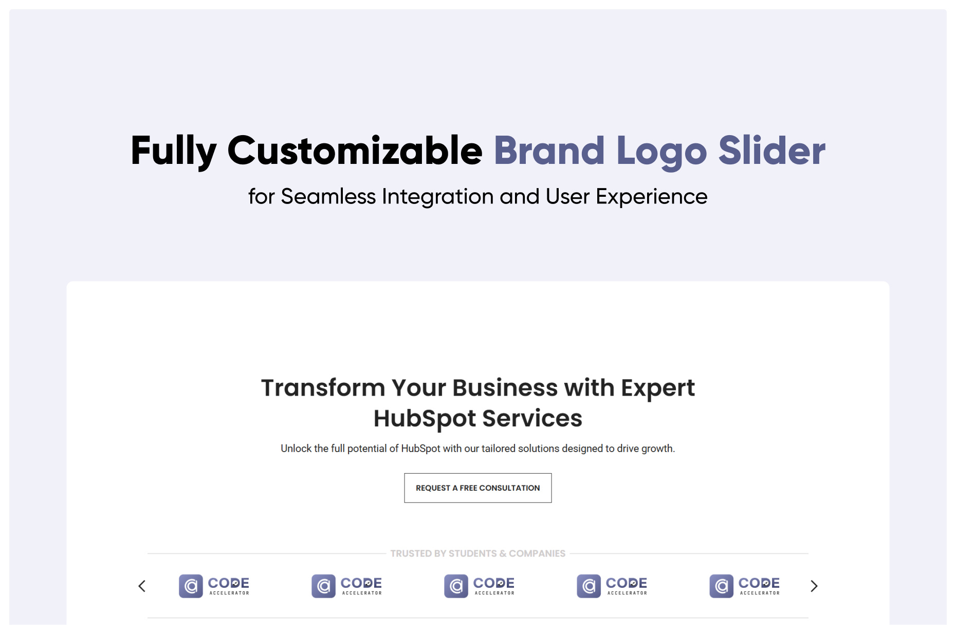
Brand Logo Slider
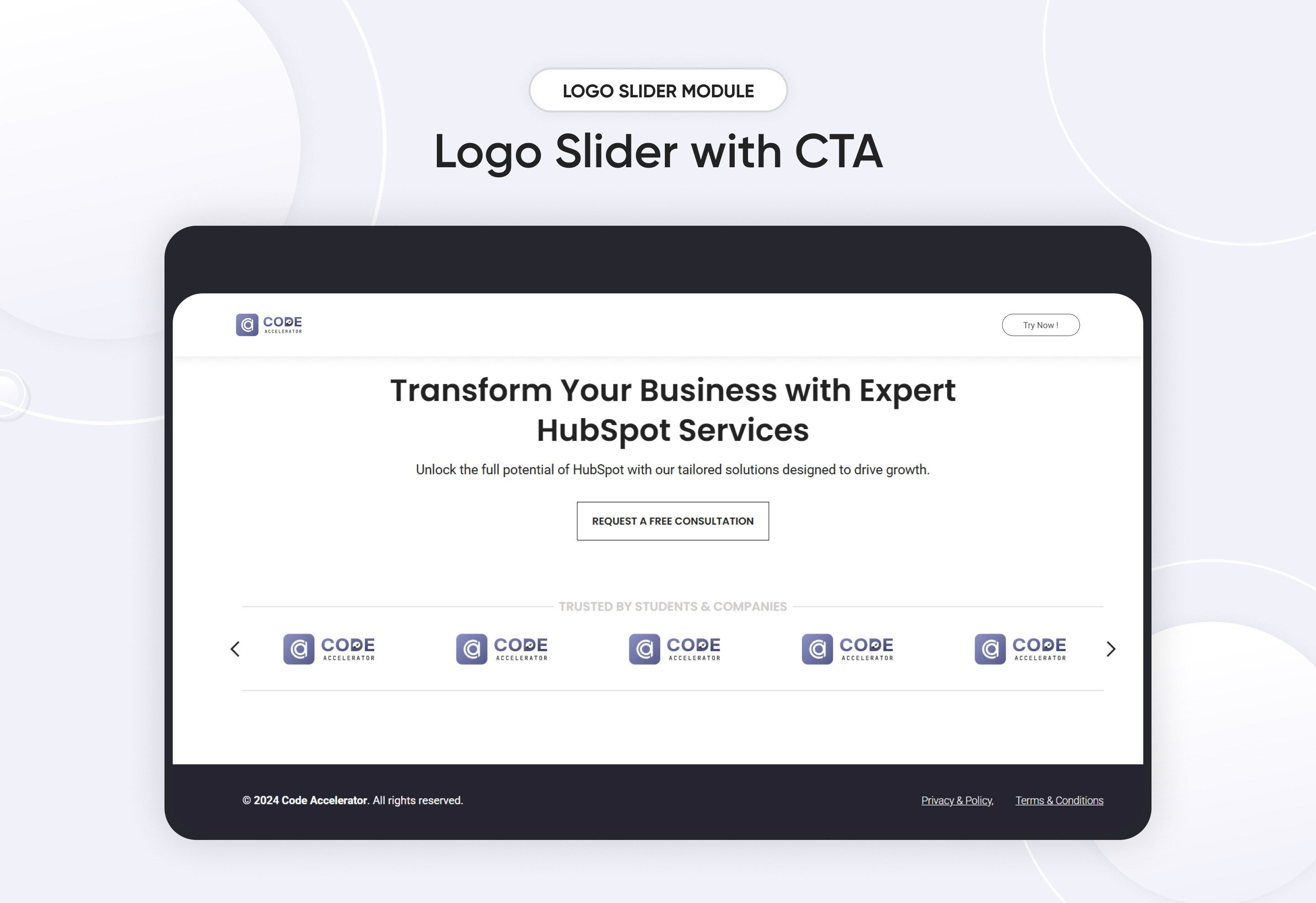
The Brand Logo Slider is a sleek and responsive carousel designed to display brand logos, client logos, or partner logos in an attractive and organized manner. It helps businesses build credibility by showcasing collaborations, sponsors, or featured brands in a visually appealing slider format.
Key Features Brand Logo Slider Module :
✅ Fully Responsive: Works seamlessly on all devices (desktop, tablet, mobile).
✅ Auto-Scrolling & Navigation: Smooth auto-slide.
✅ Customizable Design: Adjust colors, sizes, and spacing to match your website's style.
✅ Lightweight & Fast: Optimized for speed and performance.
Discover More in the Knowledge Base
Explore detailed documentation, setup instructions, feature explanations, and best practices to help you get the most out of this module quickly and efficiently.
 $29
$29
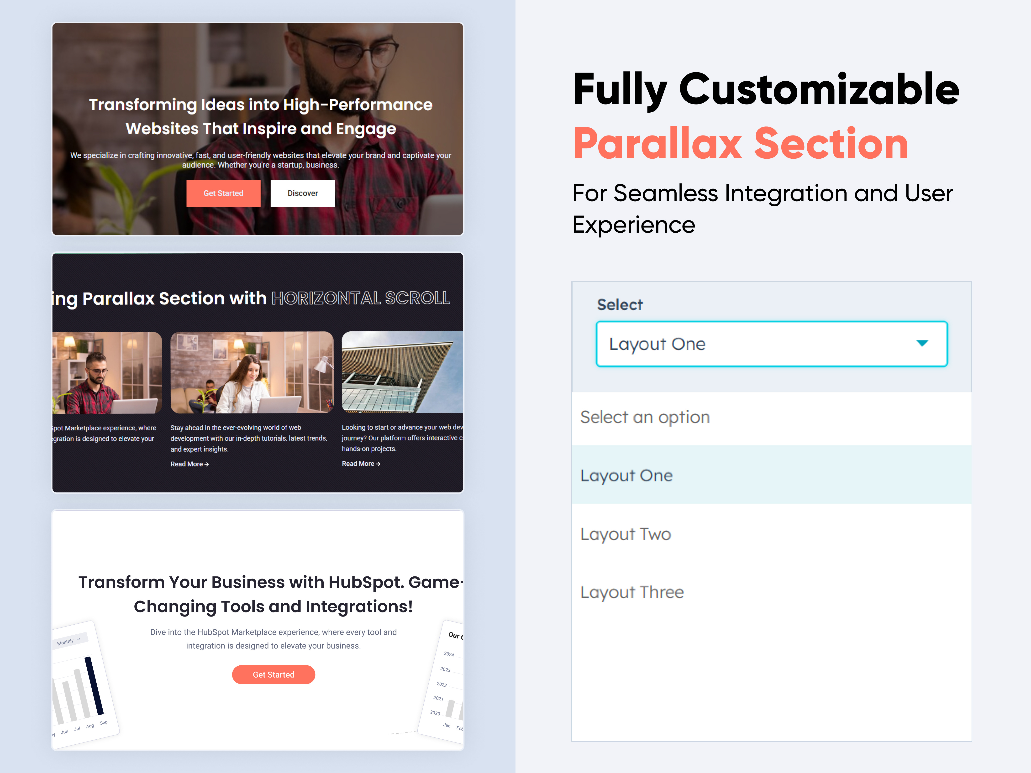
Parallax
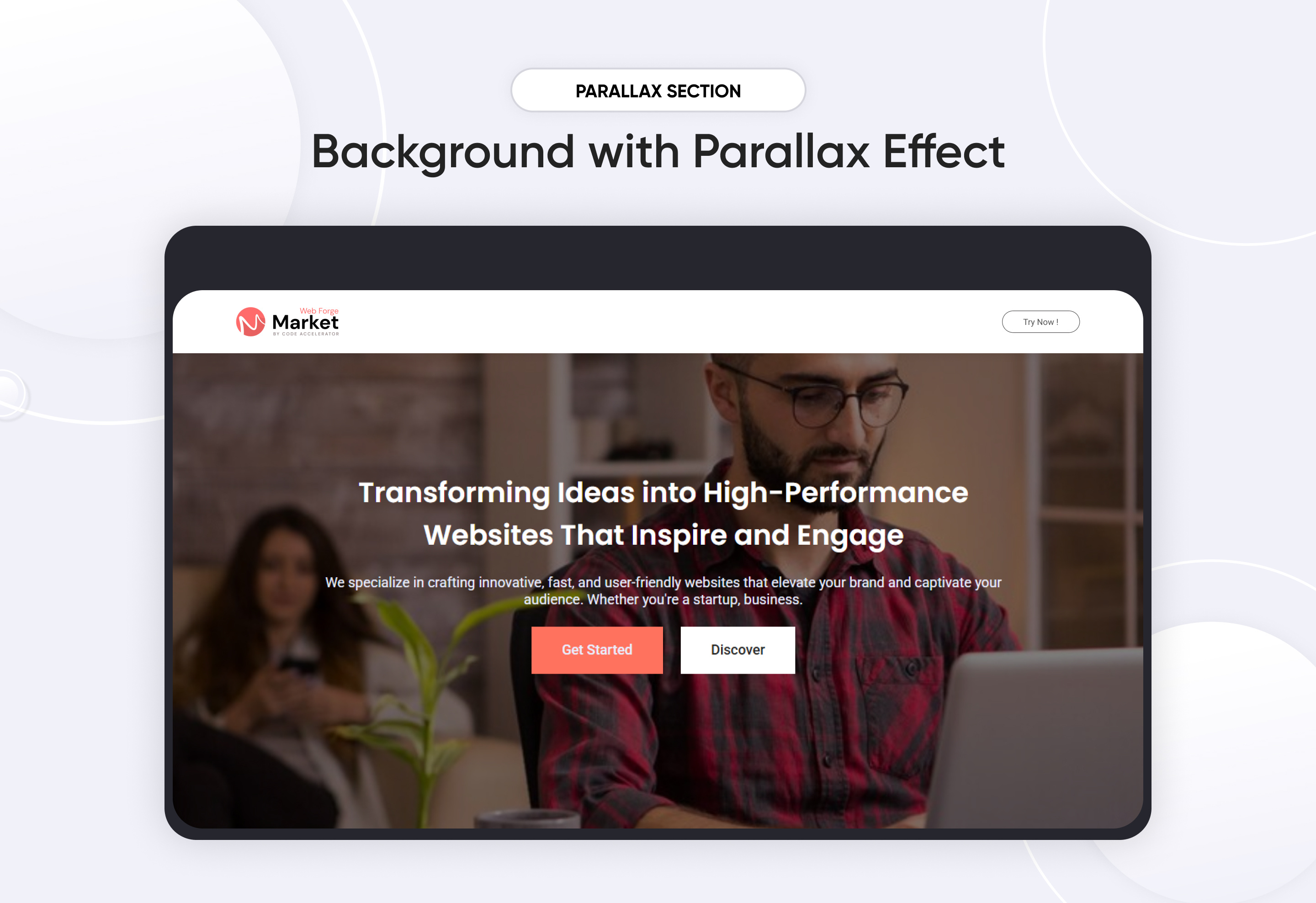
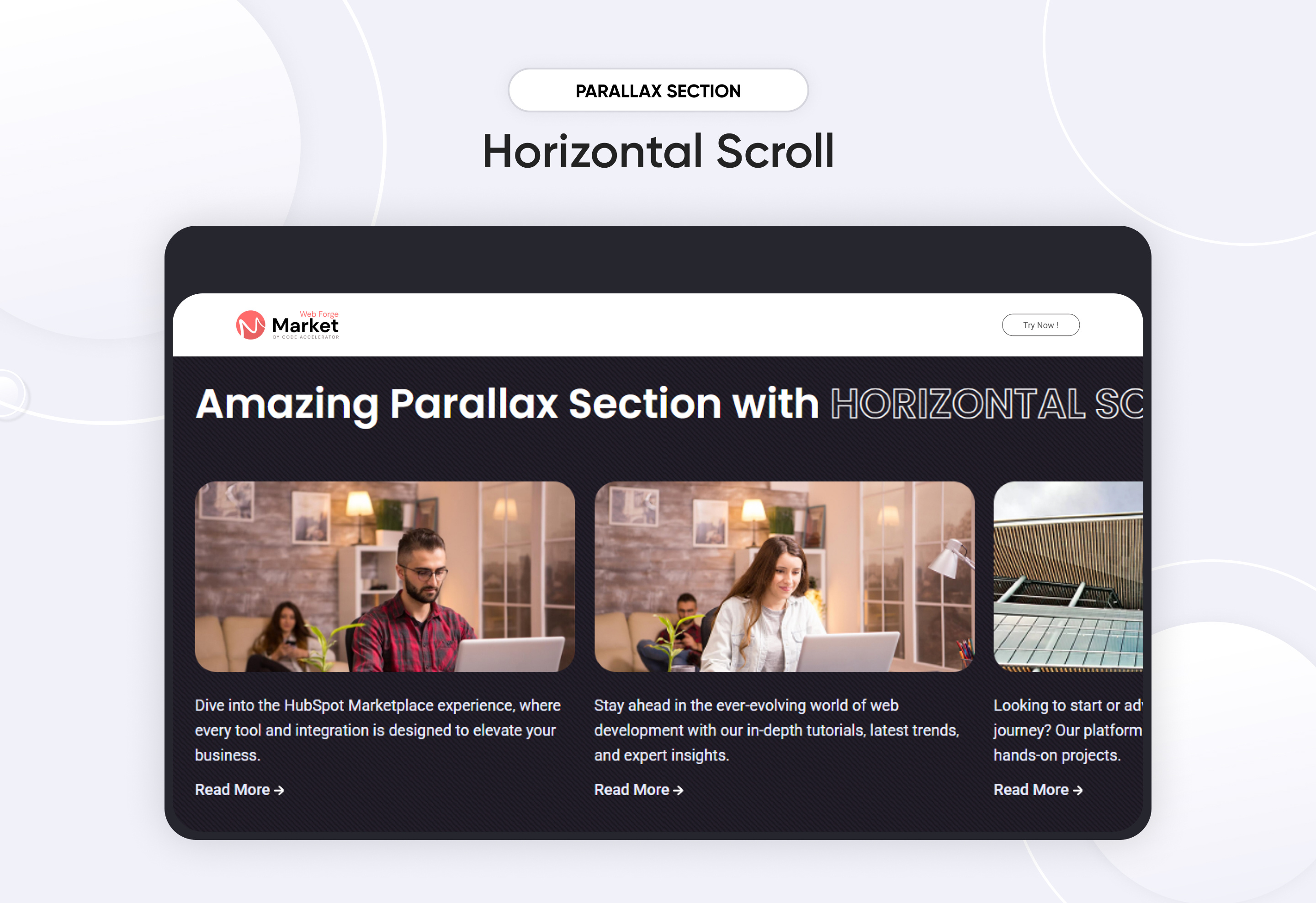
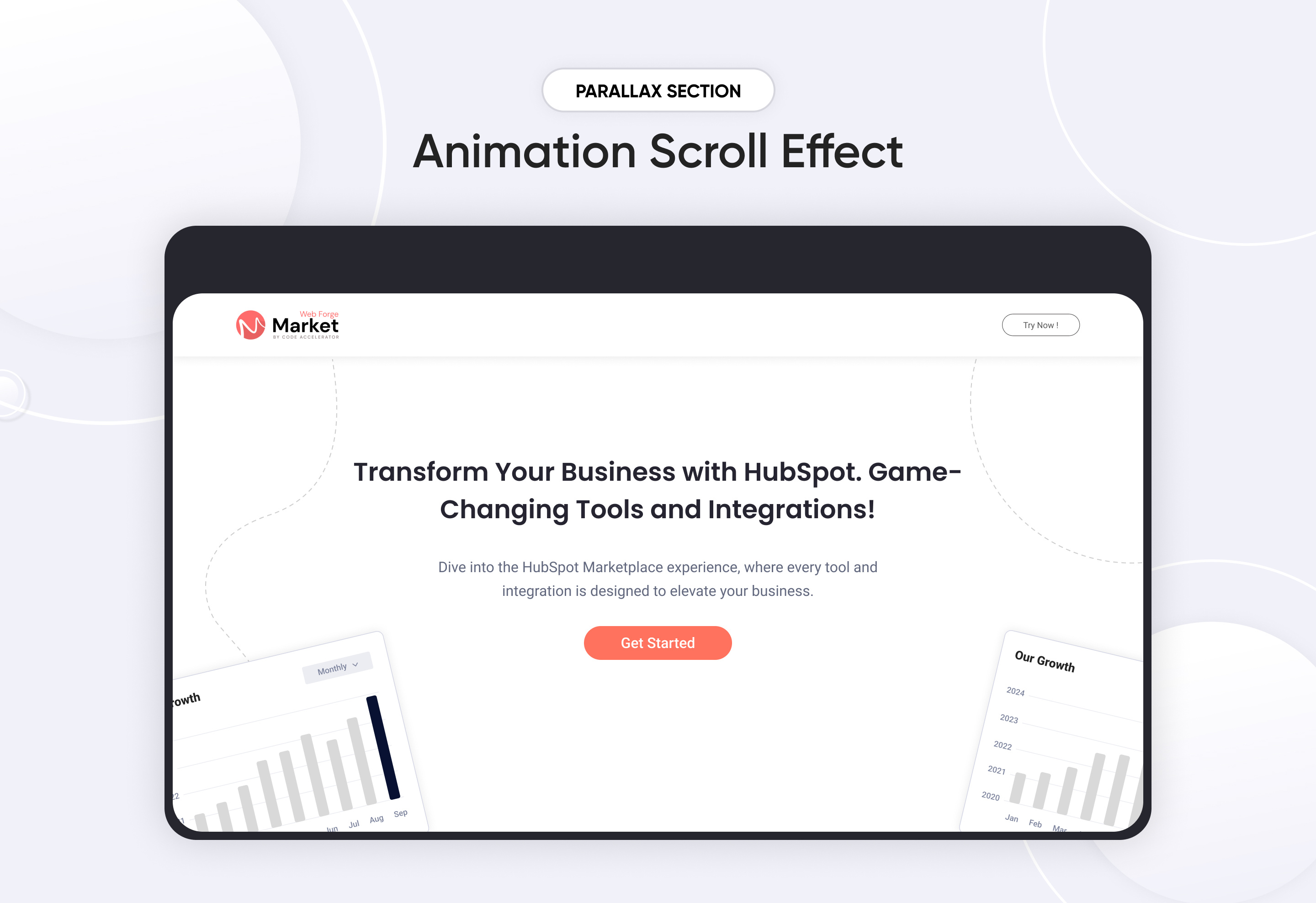
A Parallax Module is a web design feature that creates an illusion of depth by making background elements move at a different speed than foreground elements while scrolling. This effect enhances user engagement and visual appeal.
Key Features of a Parallax Module :
-
Supports horizontal scrolling.
-
Animate elements based on scroll position.
-
Automatically adapts to different screen sizes.
-
Allows disabling parallax effects on smaller devices to improve performance.
-
Change overlay colors and opacity for better text readability.
-
Use ready-made parallax layouts for faster design.
Discover More in the Knowledge Base
Explore detailed documentation, setup instructions, feature explanations, and best practices to help you get the most out of this module quickly and efficiently.
 $29
$29
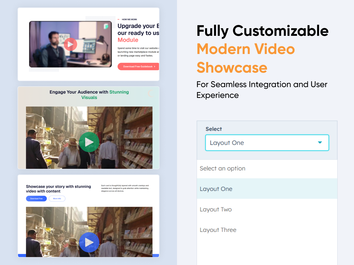
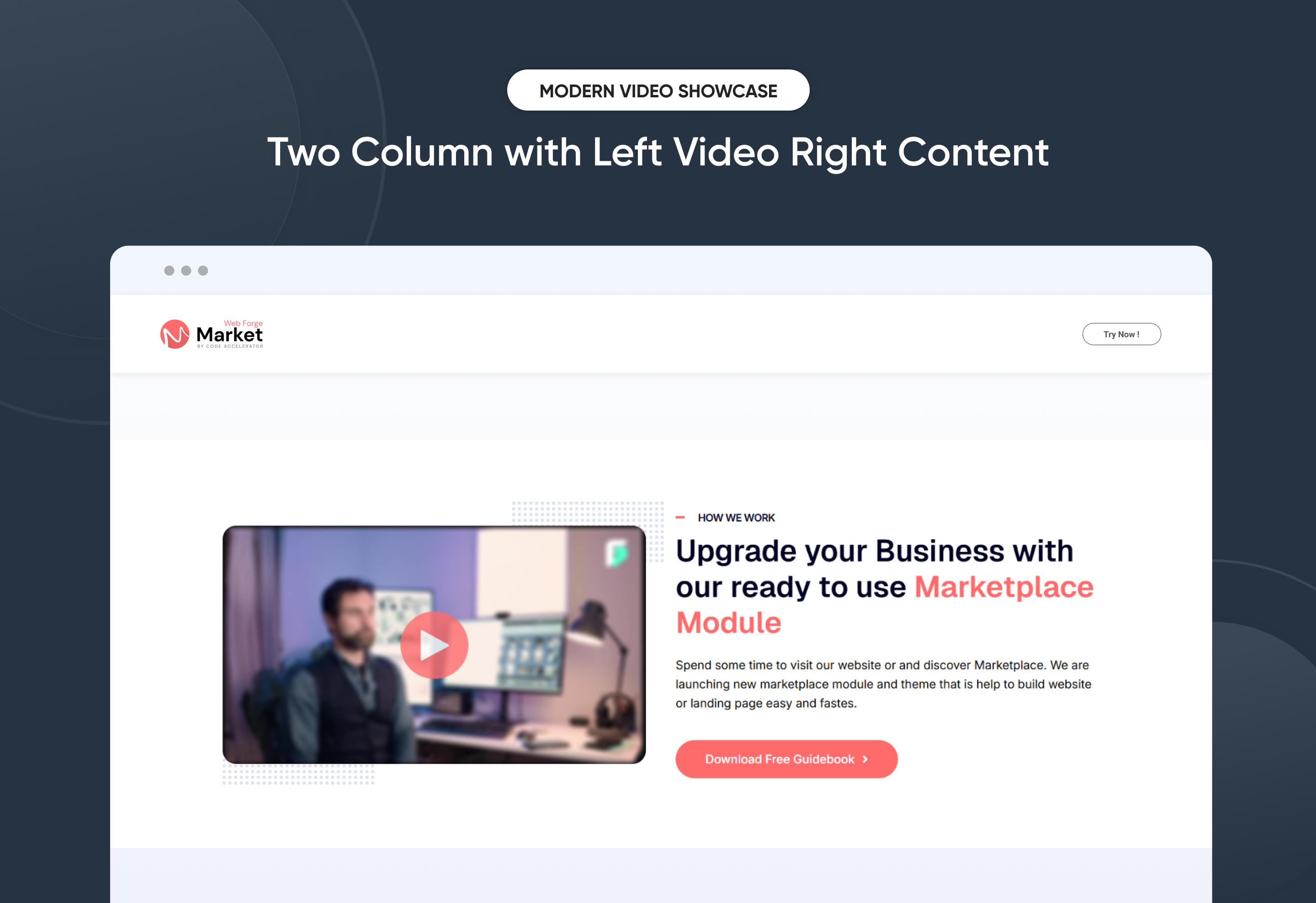
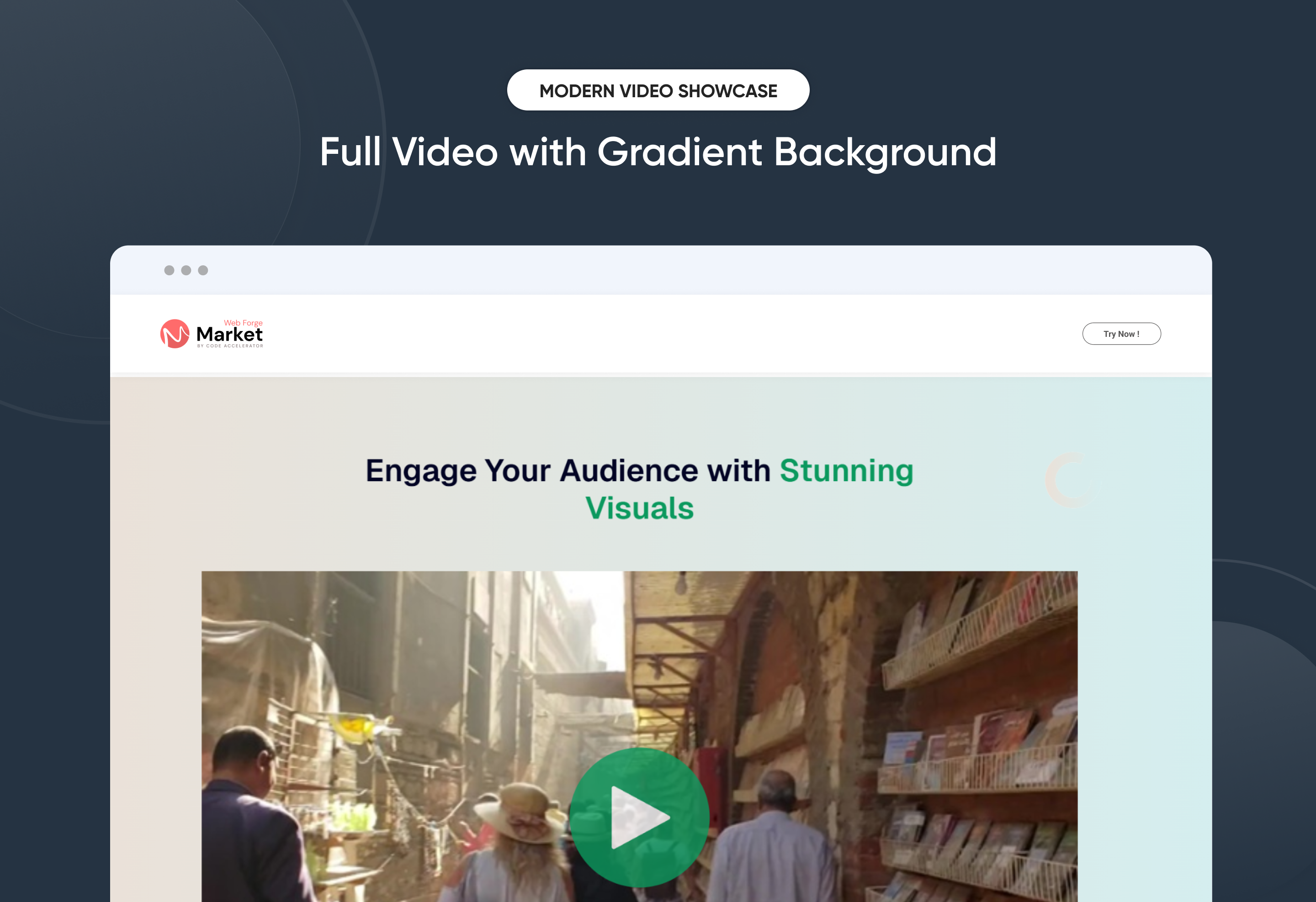
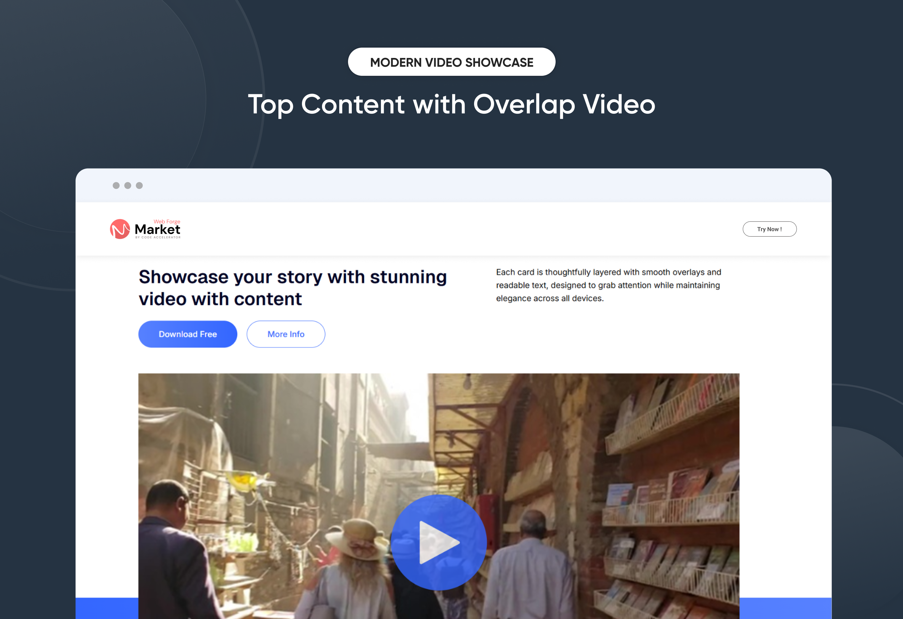
Modern Video Showcase
The Modern Video Showcase Module allows you to highlight your story, product, or service through stunning video integration combined with engaging content. Designed with flexibility and brand consistency in mind, it offers multiple layout options, customizable typography, and CTA buttons to drive user action. The module ensures smooth video playback with content, responsive design, and advanced controls for performance optimization. Perfect for landing pages, product launches, or storytelling sections, it blends video with impactful messaging to capture audience attention across all devices.
Key Features of a Modern Video Showcase Module :
-
Multiple Layouts: Side-by-side (text + video), full-width video, or stacked layout.
-
Background Settings: Gradient, solid color, or image background.
-
Content Alignment: Left, right, center positioning for text.
-
Spacing Controls: Padding & margin options for responsive adjustments.
-
Card Style: Option to wrap video in a styled card with rounded corners, shadows, or borders.
-
Video Sources: Support YouTube, Vimeo, or HubSpot video.
-
Play Button Style: Customizable icon, color, and size.
- Primary & Secondary CTA: Add up to two buttons (e.g., Download Free, More Info).
- Customizable Headings & Descriptions: Font size, weight, and color controls.
Discover More in the Knowledge Base
Explore detailed documentation, setup instructions, feature explanations, and best practices to help you get the most out of this module quickly and efficiently.
 $29
$29
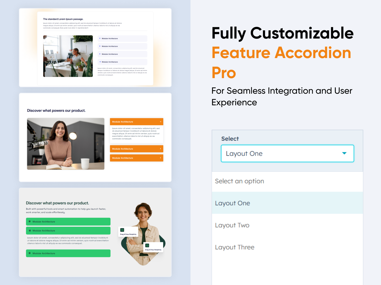
Feature Accordion Pro
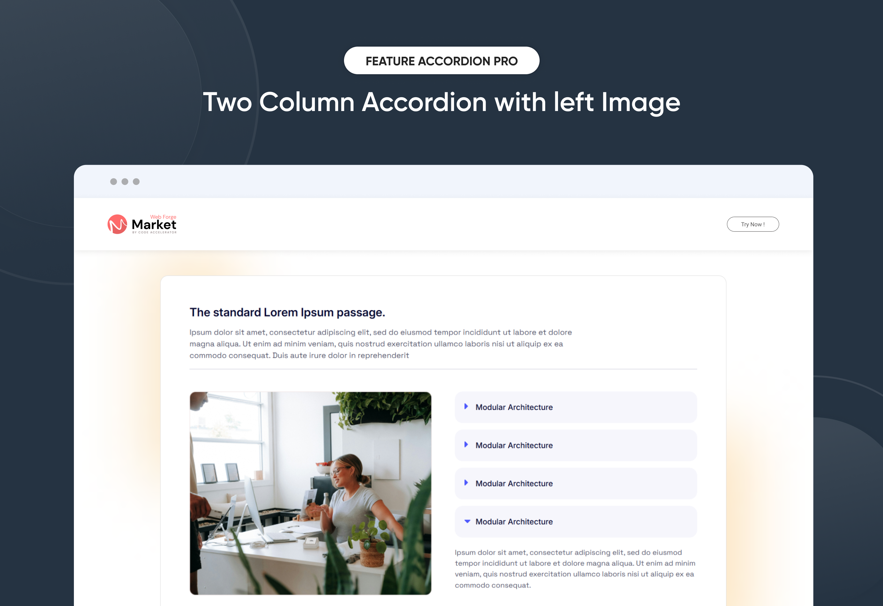
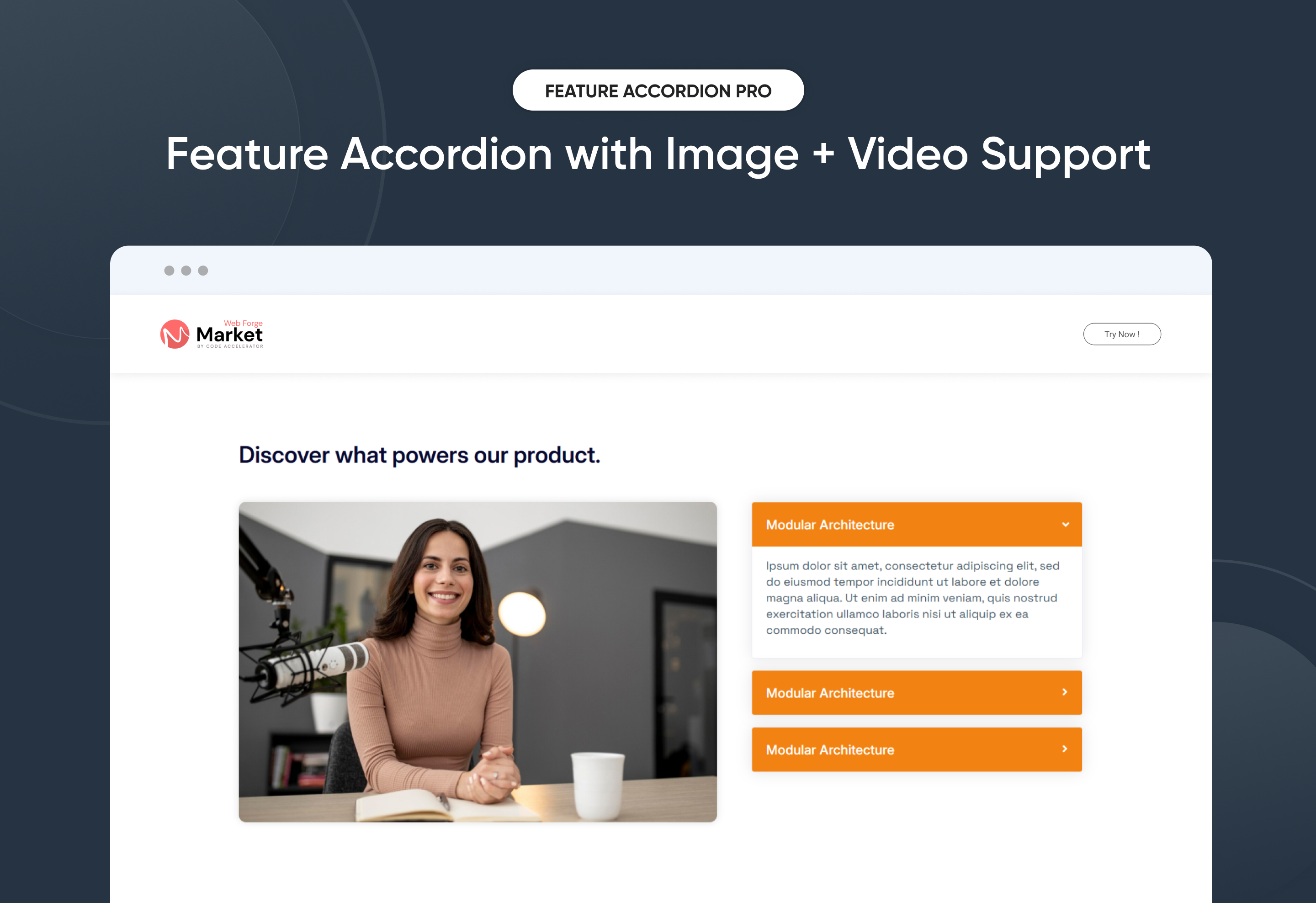
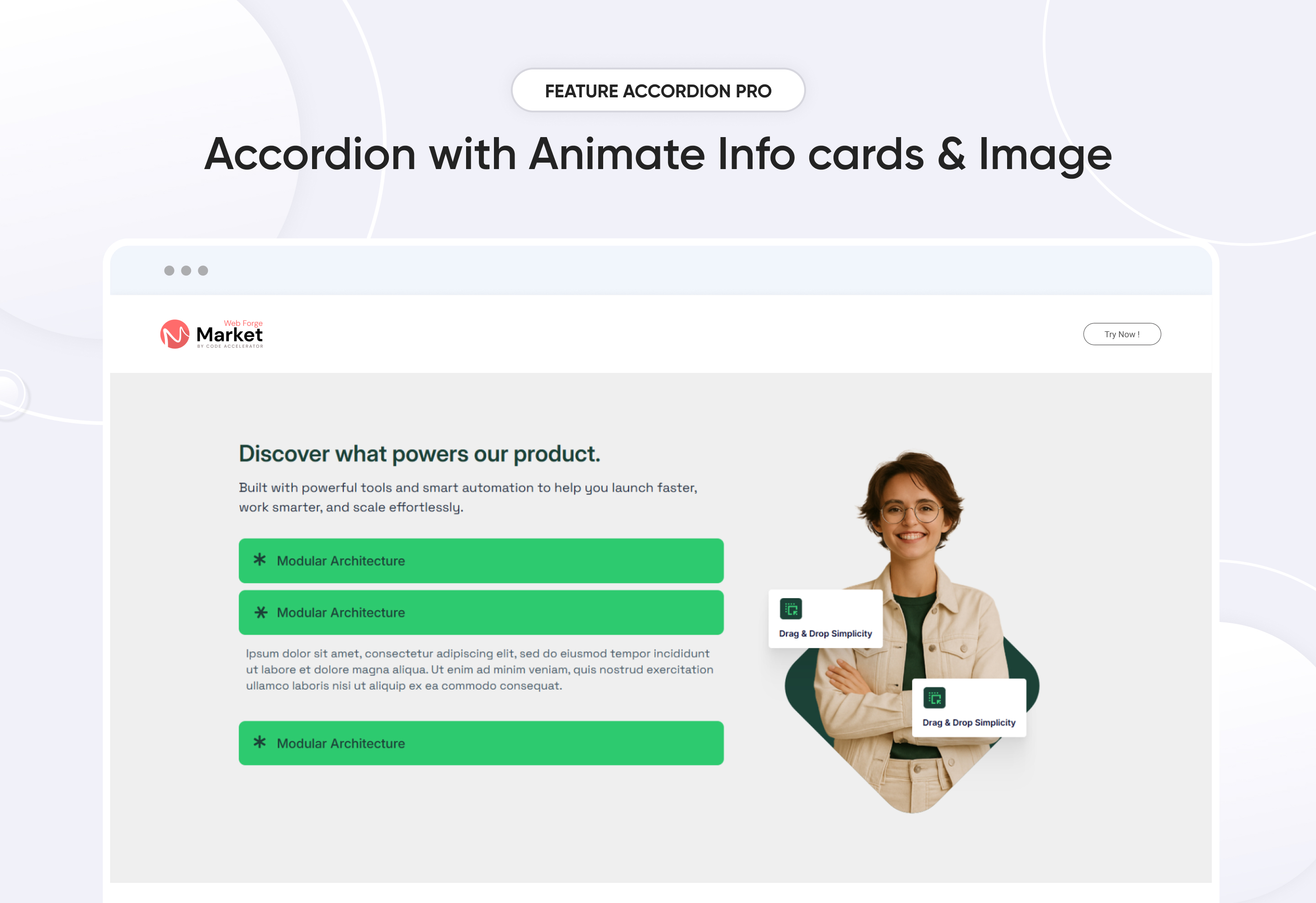
Make your content interactive and engaging with Feature Accordion Pro, a flexible and modern accordion module designed for feature showcases, FAQs, and service highlights. This module helps you organize information into expandable sections, combining text, images, and videos for a clean, user-friendly experience.
With 3 ready-to-use layouts (Layout 1, Layout 2, and Layout 3), you can present content in classic split view, synchronized media with accordion, or feature grid style — all without coding. Built for responsiveness, customization, and performance, Accordion Pro ensures your content is easy to update, visually appealing, and optimized for every device.
Key Features of a Feature Accordion Pro Module :
- Multiple Layout Options – Choose from Layout 1, Layout 2, or Layout 3 with a simple setting.
- Customizable Headline & Description– Add engaging titles, and supporting text.
- Easy Content Updates – Update text, images, and media fields without coding.
- Advanced Customization – Control fonts, colors, spacing, and layouts directly in the editor.
- Responsive Design – Optimized for desktop, tablet, and mobile.
- Background Styles – Gradient, image or solid color options.
- Typography & Color Controls – Easily adjust fonts, sizes, and colors.
- Lightweight & Fast – Clean code ensures quick load times.
- User-Friendly – Built for marketers and businesses with no coding required.
Discover More in the Knowledge Base
Explore detailed documentation, setup instructions, feature explanations, and best practices to help you get the most out of this module quickly and efficiently.
 $19
$19
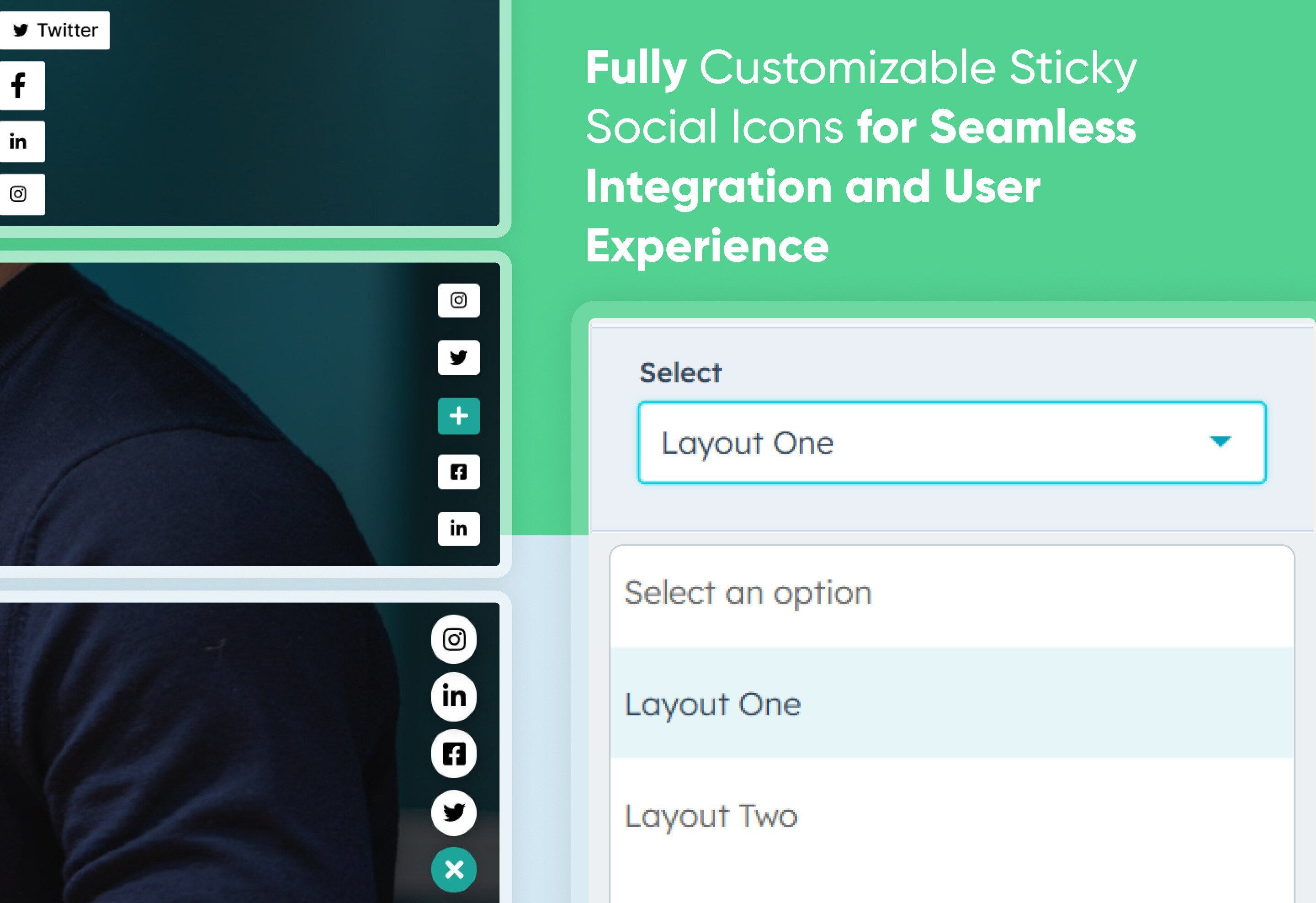
Sticky Social Icon
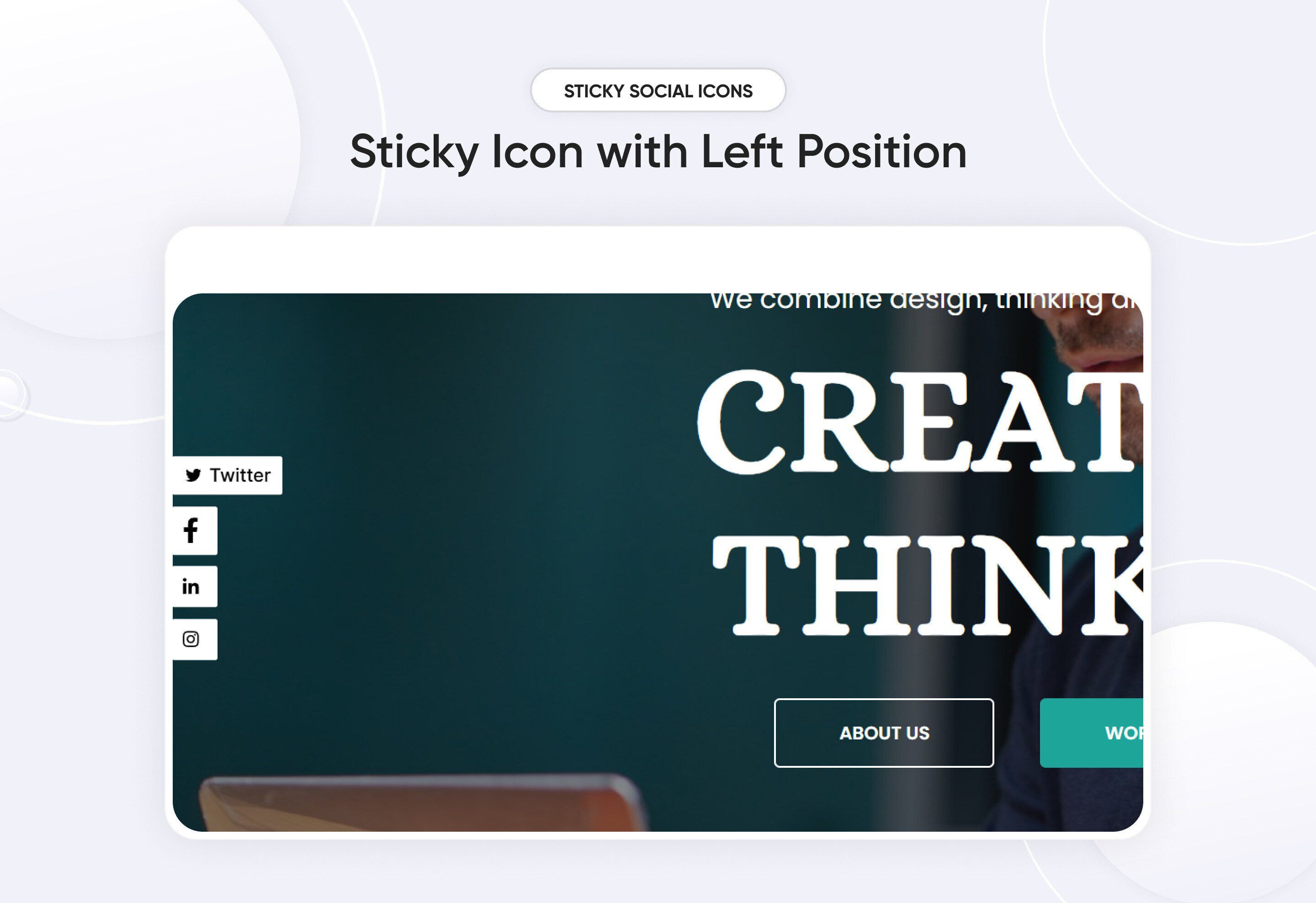
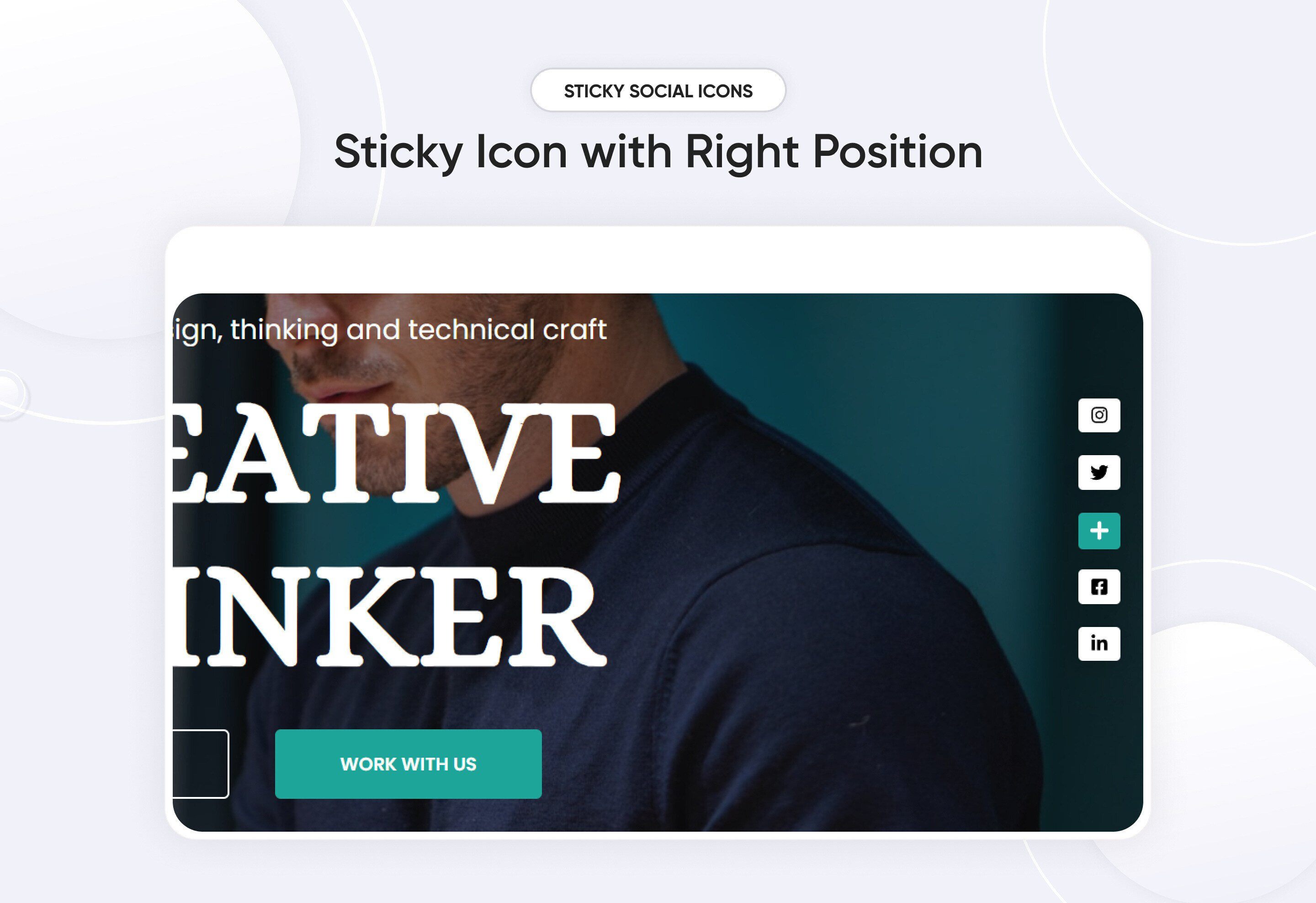
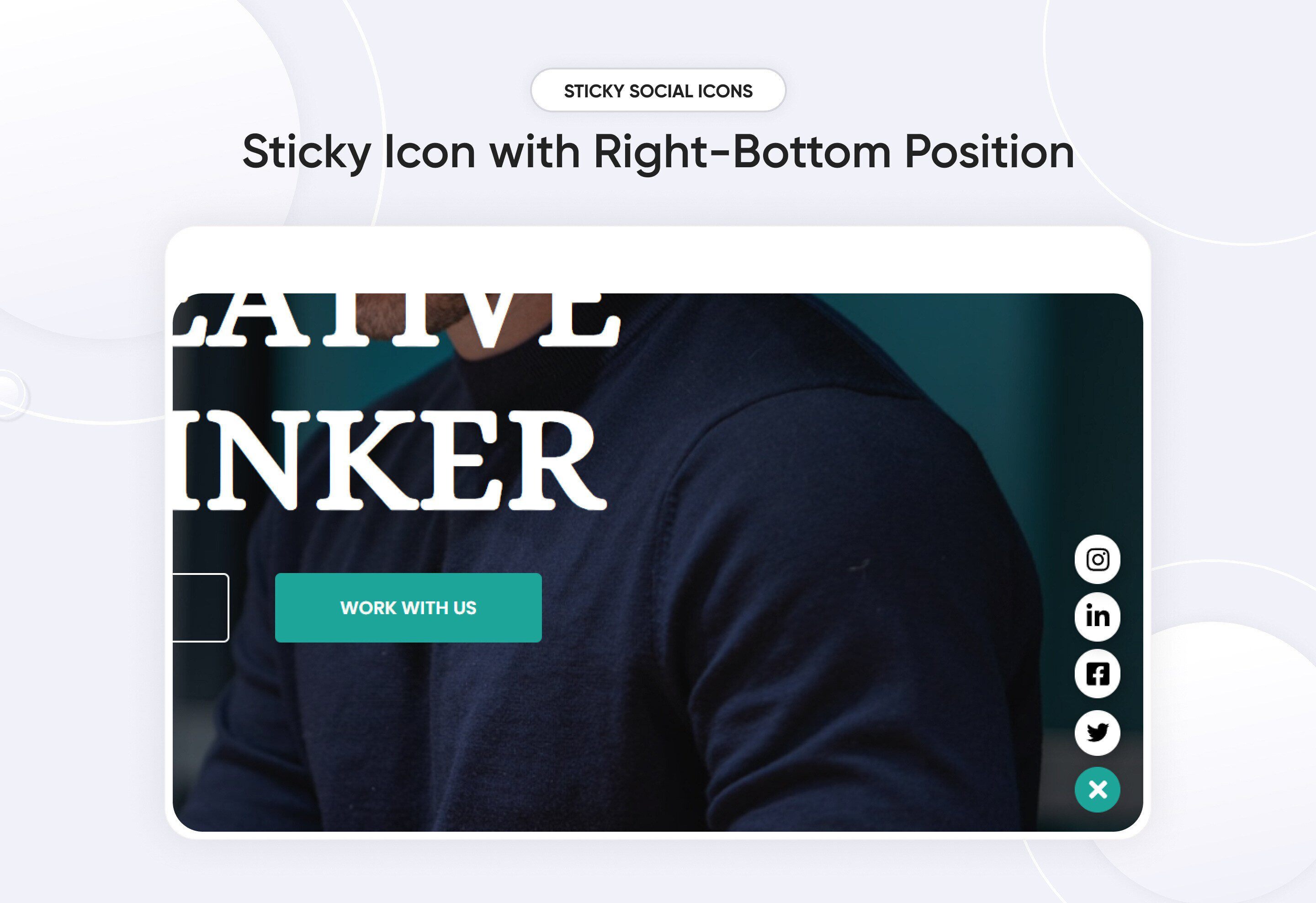
Sticky Social Icons are floating social media buttons that remain fixed on a webpage as users scroll. They provide easy access to social media profiles, boosting engagement and sharing opportunities.
Key Features Sticky Social Icon Module :
✅ Sticky & Floating Design – Icons stay visible while scrolling, ensuring users always have access.
✅ Customizable Appearance – Change colors, sizes, shapes, and positioning to match your brand.
✅ Supports Major Social Networks – Facebook, Instagram, Twitter, LinkedIn, WhatsApp, etc.
✅ Mobile-Friendly & Responsive – Optimized for all screen sizes.
✅ Animation & Hover Effects – Add stylish hover effects for better user interaction.
✅ Lightweight & Fast-Loading – Minimal impact on page speed.
Discover More in the Knowledge Base
Explore detailed documentation, setup instructions, feature explanations, and best practices to help you get the most out of this module quickly and efficiently.
 $free
$free
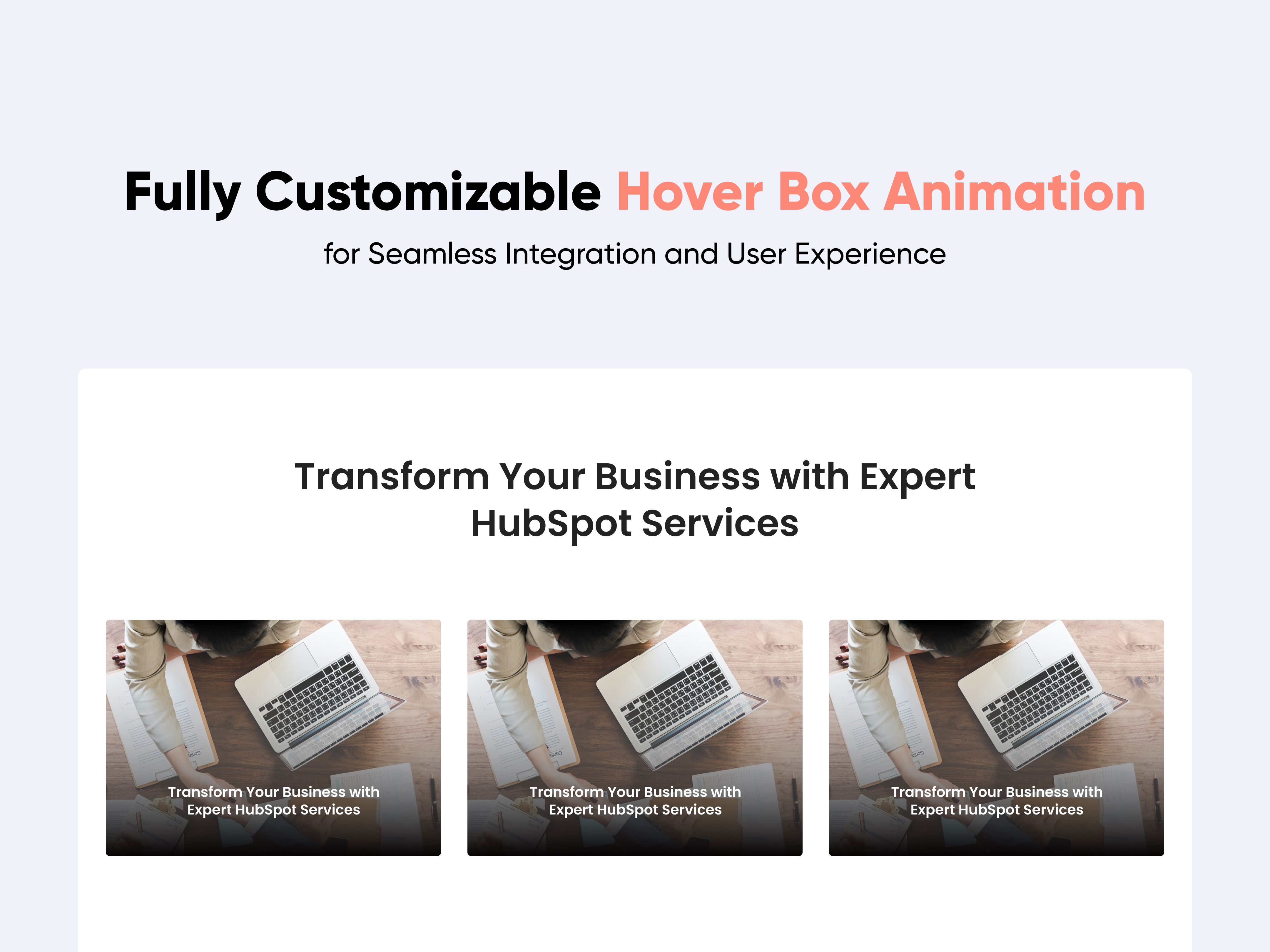
Hover Box Animation
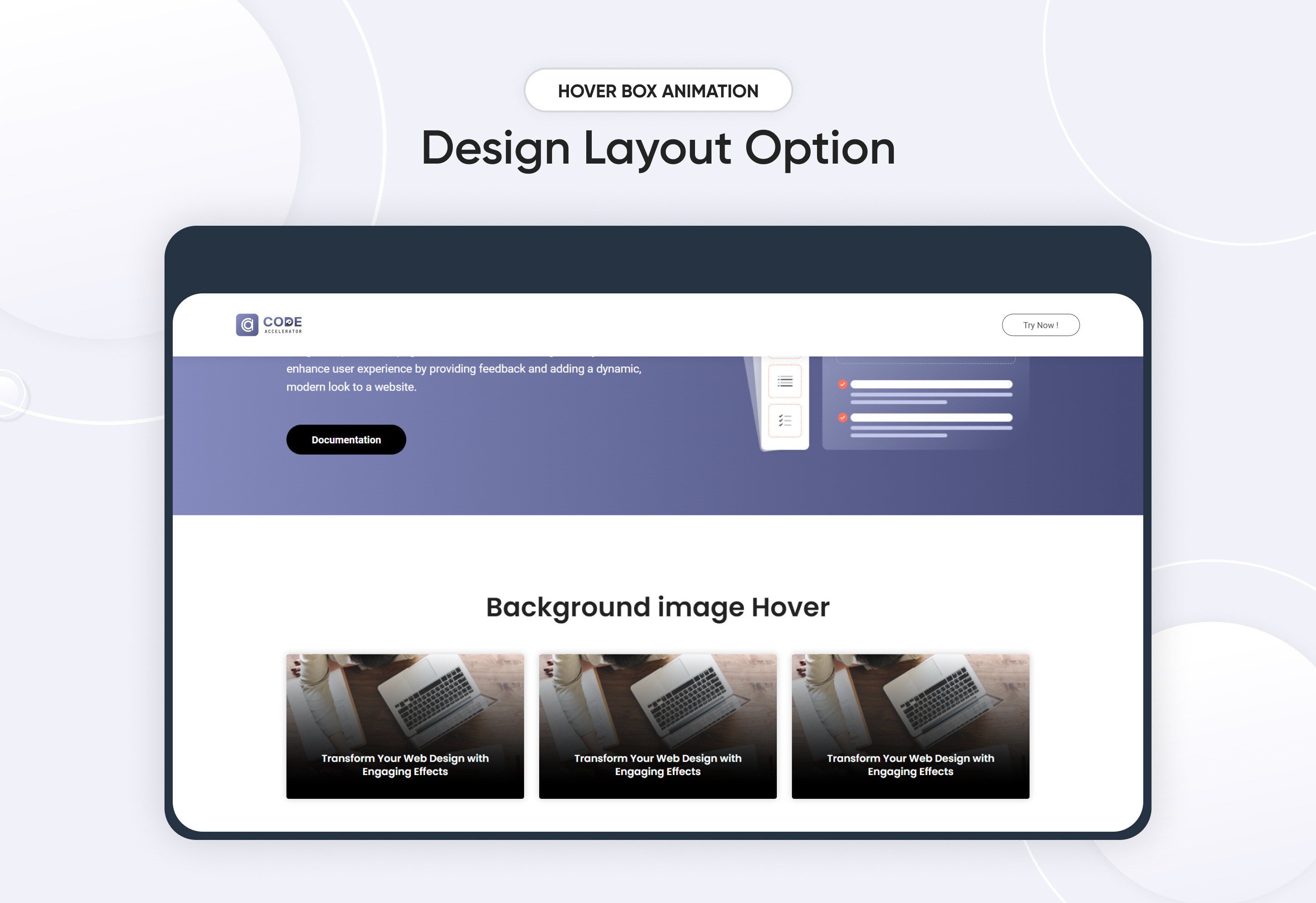
The hover module is a powerful design component that enhances user engagement by displaying additional content or options when a user hovers over an element. This interactivity not only improves the visual appeal of your website or application but also provides users with quick access to relevant information.
Key Features of the Hover Box Animation Module:
-
Dynamic Content Display: Shows additional information or actions when a user hovers over the box, enhancing interactivity.
-
Customizable Styles: Easily adjust colors, typography, borders, and shadows to match your brand aesthetics.
-
Responsive Design: Automatically adjusts layout and size for optimal viewing on various devices.
-
Call-to-Action Buttons: Include buttons within the hover box for quick access to actions like "Learn More," "Buy Now," or "Contact Us."
Discover More in the Knowledge Base
Explore detailed documentation, setup instructions, feature explanations, and best practices to help you get the most out of this module quickly and efficiently.
 $29
$29
Main Hero Banner
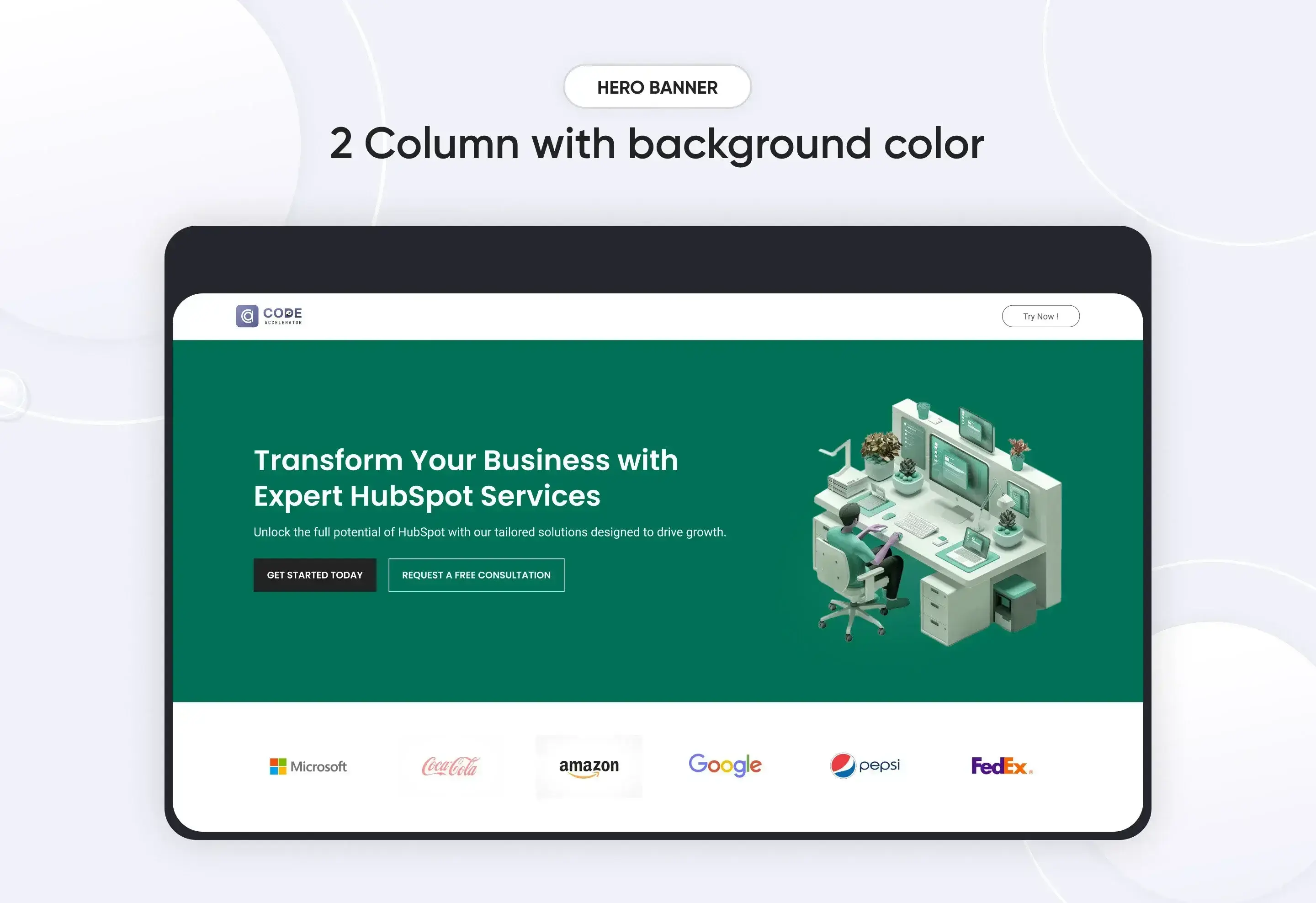
A "Main Hero Banner" module in HubSpot is a prominent section, usually placed at the top of a webpage, that serves as the first visual element visitors see when they land on your site. It is designed to grab attention and convey your primary message or call-to-action. Here's what typically goes into the content of a Hero Banner module.
Key Features :
-
Headline (Main Text)
- Prominent and Impactful: The headline is usually the largest text element in the module, designed to quickly communicate the core message or value proposition.
- Customizable Fonts and Sizes: You can adjust the font style, size, and color to align with your brand’s identity.
- Subheadline (Supporting Text)
- Additional Context: Provides further explanation or supporting details for the main headline.
- Flexible Placement: Can be placed above or below the headline, depending on the design.
- Call-to-Action (CTA)
- Action-Oriented Buttons: Typically includes one or more buttons prompting visitors to take a specific action, such as "Sign Up," "Learn More," or "Contact Us."
- Customizable Design: Button styles, colors, and text can be tailored to stand out within the hero module.
- Background Image or Overlay
- Visual Appeal: The hero module often features a full-width background image that complements the text and overall design.
- Overlay Options: A color or gradient overlay can be applied to enhance text readability over the background image or video.
- Responsive Design
- Mobile Optimization: The hero module is designed to be fully responsive, ensuring that all elements (text, CTA, images, etc.) look great and function well on any device, including desktops, tablets, and smartphones.
- Customizable Layout
- Flexible Content Arrangement: The module allows for various layouts, such as centered text, left-aligned text, or split-screen designs where text and images/videos are side by side.
- Padding and Margin Control: You can adjust the spacing around elements to ensure the content is well-balanced and visually appealing.
- SEO-Friendly
- Alt Text and Metadata: You can add alt text to images and metadata to the hero module content, helping improve SEO and accessibility.
- Theme and Brand Integration
- Consistent Styling: The hero module can be designed to seamlessly integrate with your site’s overall theme and branding, ensuring a cohesive visual experience.
Discover More in the Knowledge Base
Explore detailed documentation, setup instructions, feature explanations, and best practices to help you get the most out of this module quickly and efficiently.
 $29
$29
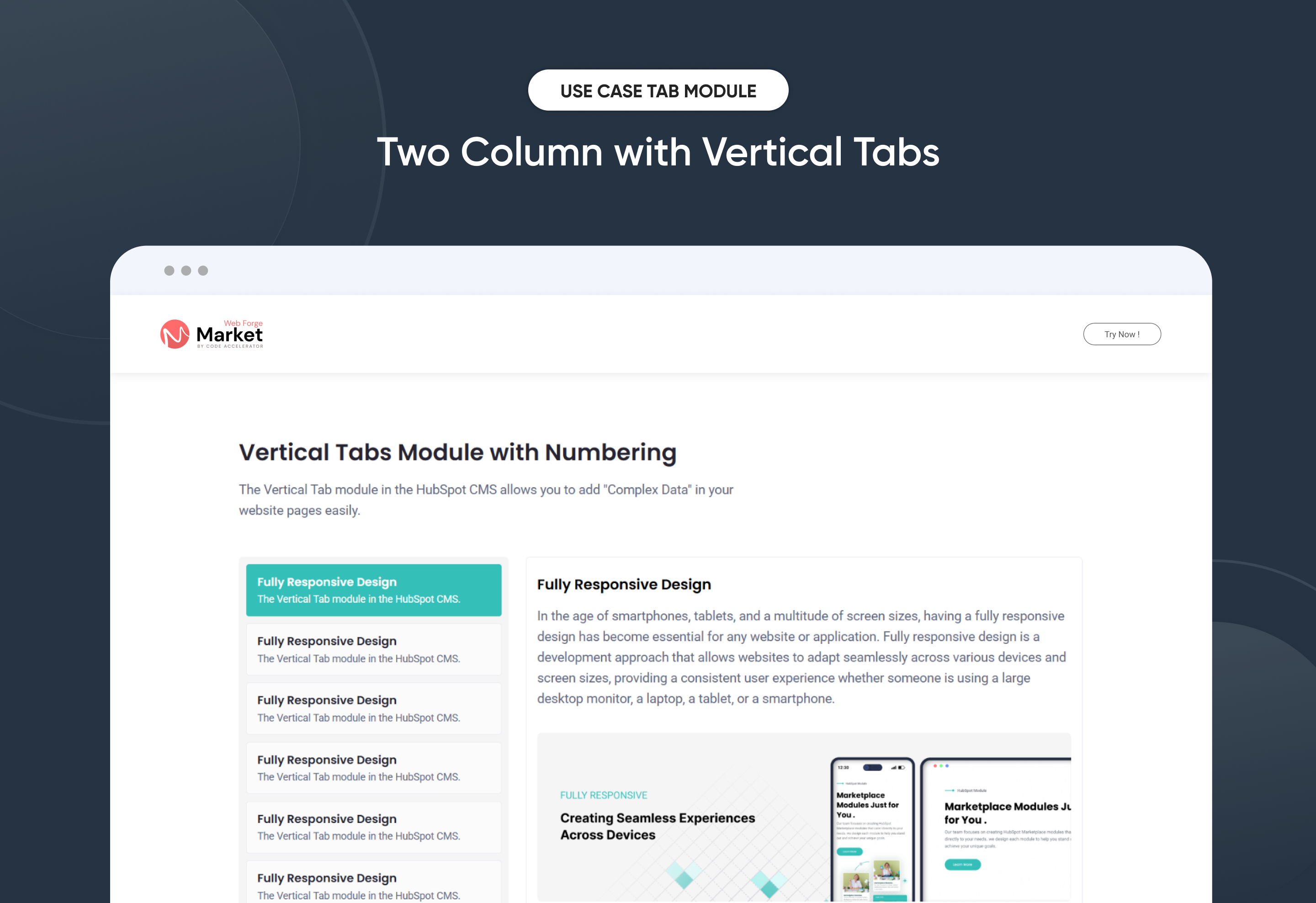
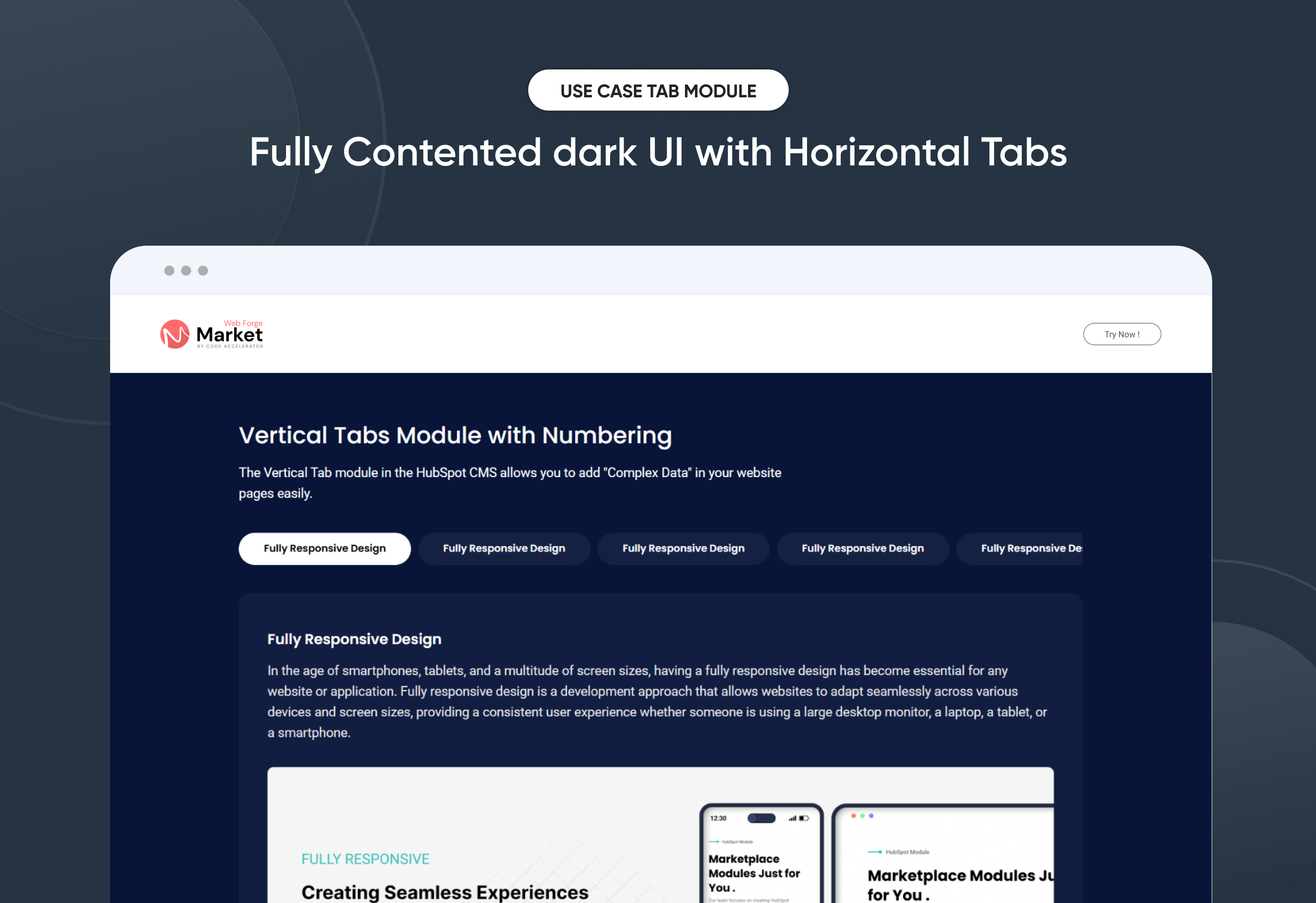
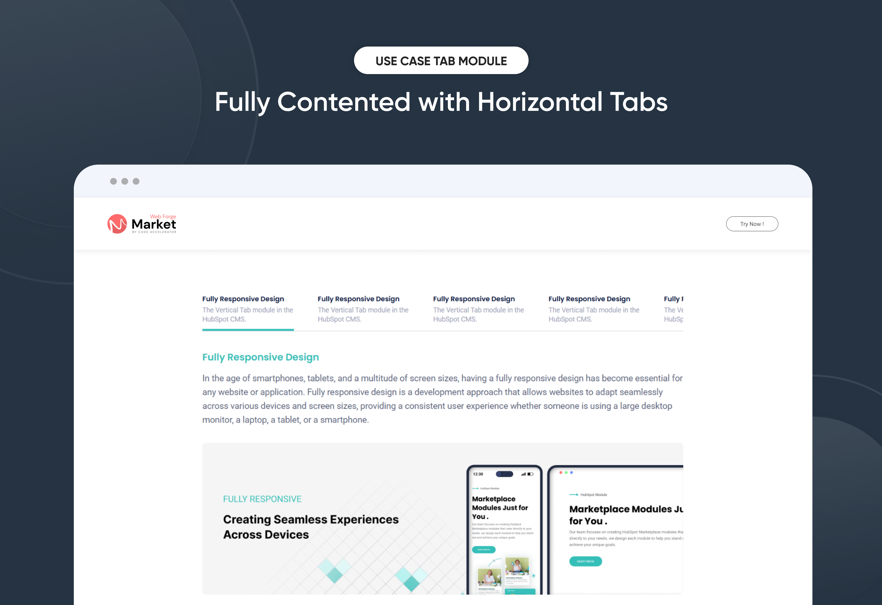
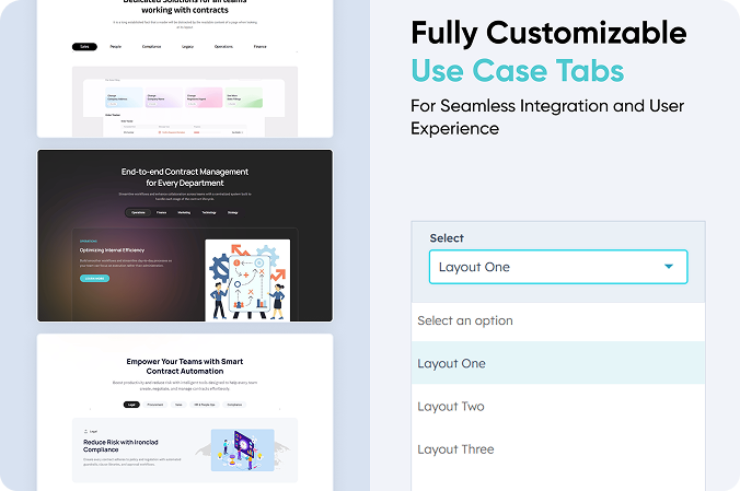
Use Case Tabs
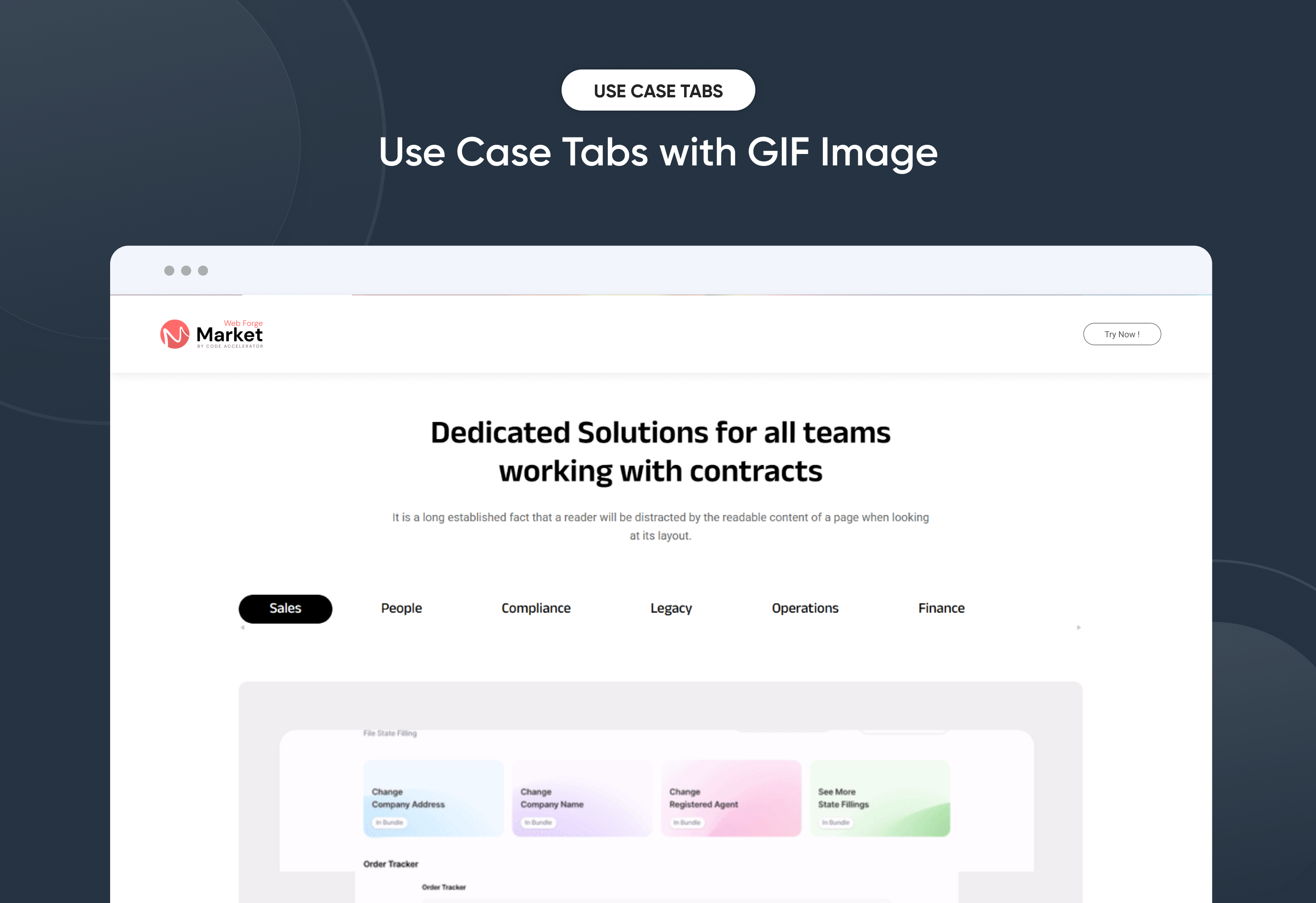
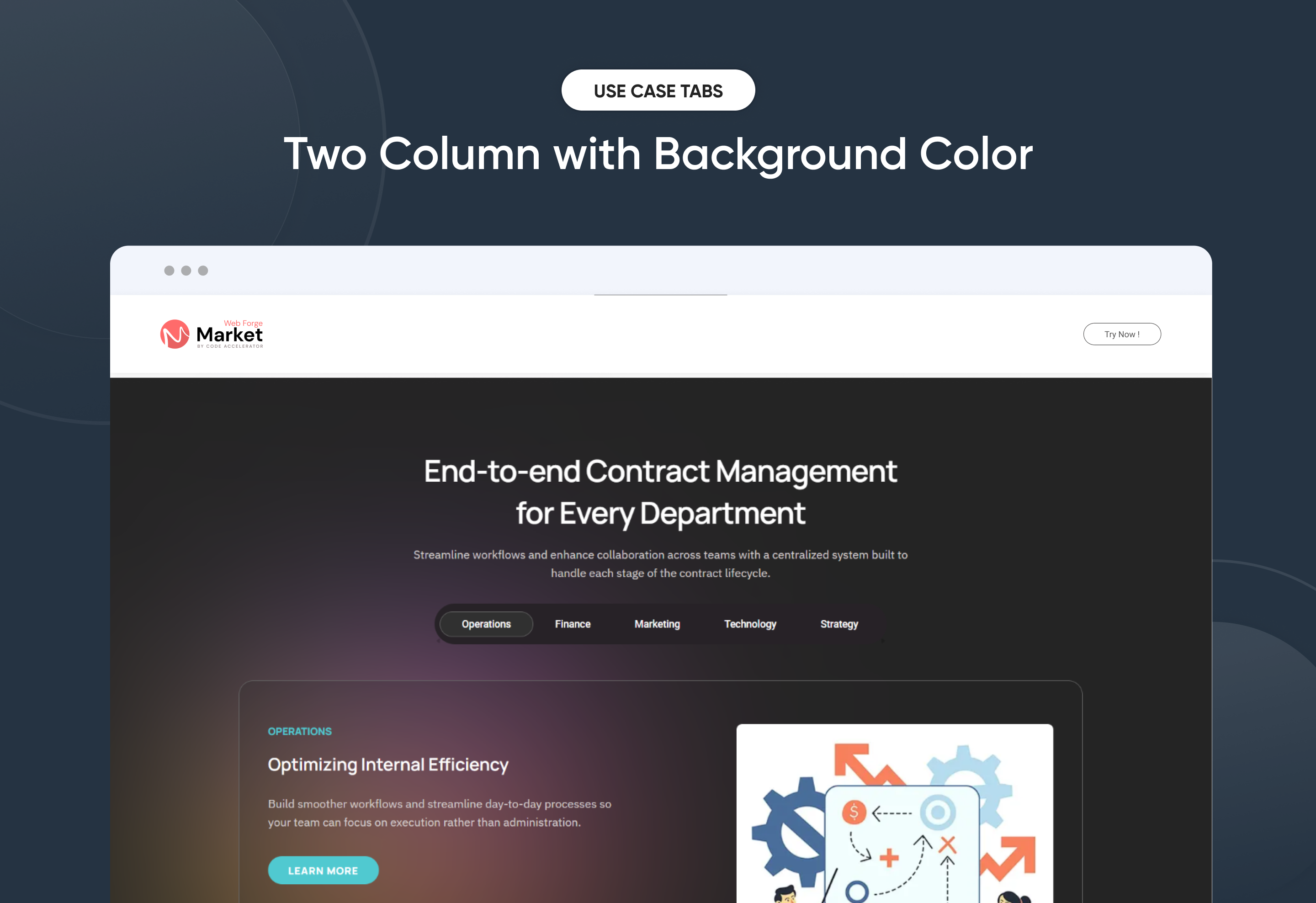
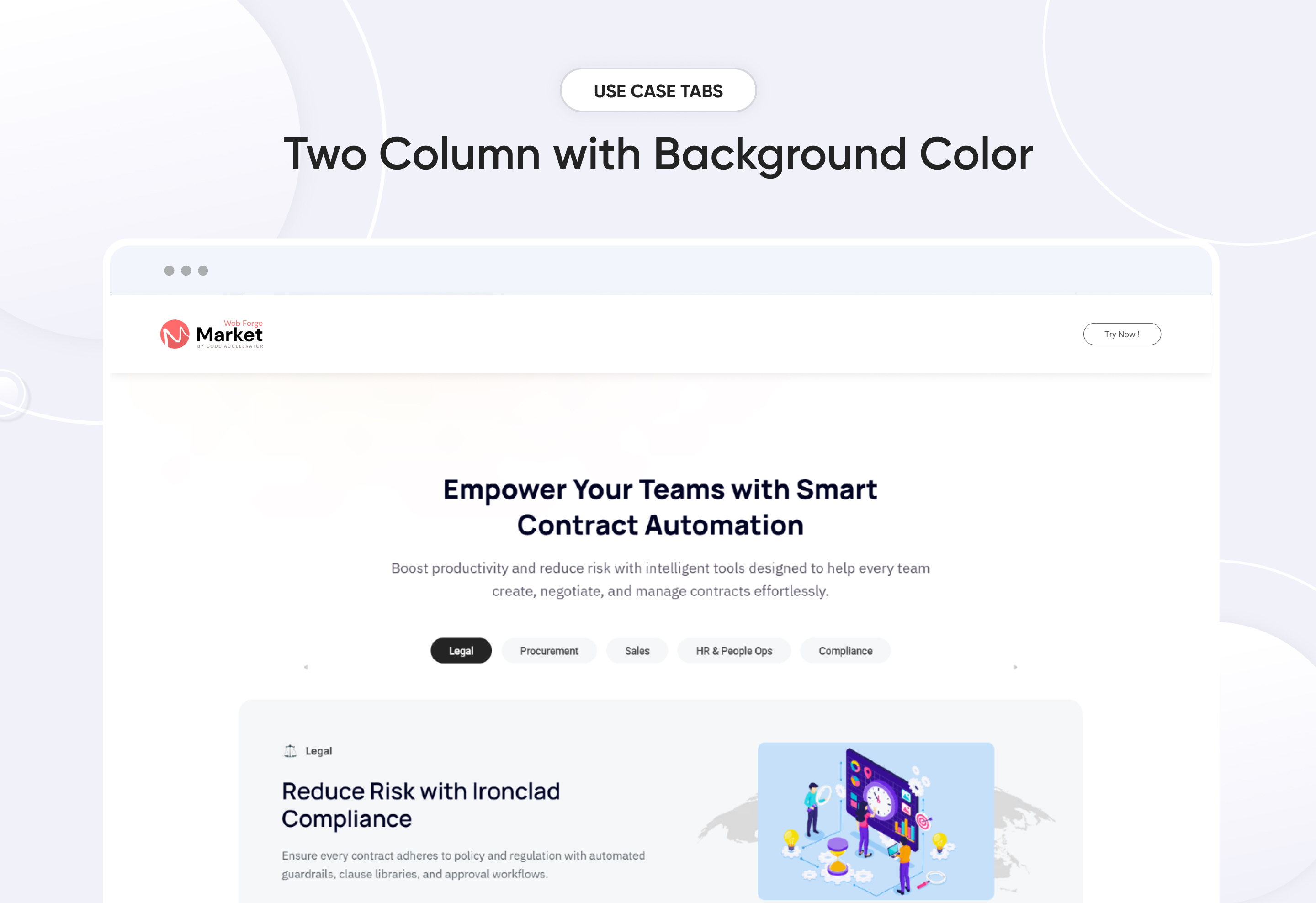
Showcase different use cases in a clean, engaging way with the “Use Case Tabs” module for HubSpot. Highlight benefits across multiple tabs — each with customizable titles, icons, heading and description . Built for responsiveness and brand flexibility, this module lets you manage tab layouts (horizontal or vertical), colors, and spacing without any code. Ideal for presenting solutions by industry, department, or product use case — all in one interactive section.
Key Features of a Use Case Tabs Module :
✅ Custom Tab Titles – Easily add and label multiple tabs.
✅ Flexible Content Types – Supports images, CTAs, and even embedded forms or videos inside each tab for maximum versatility.
✅ Icon/Image Support – Add icons or images to visually represent each tab and improve at-a-glance understanding.
✅ Fully Responsive Design – Optimized for all devices (desktop, tablet, mobile).
✅ Extensive Style Customization – Tab background (solid or gradient), Border styles, Padding/margins, Active/inactive states
✅ Easy to Use with Drag & Drop – Built for HubSpot’s drag-and-drop page editor. No coding required to configure or style tabs
✅ Reusable and Scalable – Add multiple tab sections to a page or reuse across templates.
Discover More in the Knowledge Base
Explore detailed documentation, setup instructions, feature explanations, and best practices to help you get the most out of this module quickly and efficiently.
 $19
$19
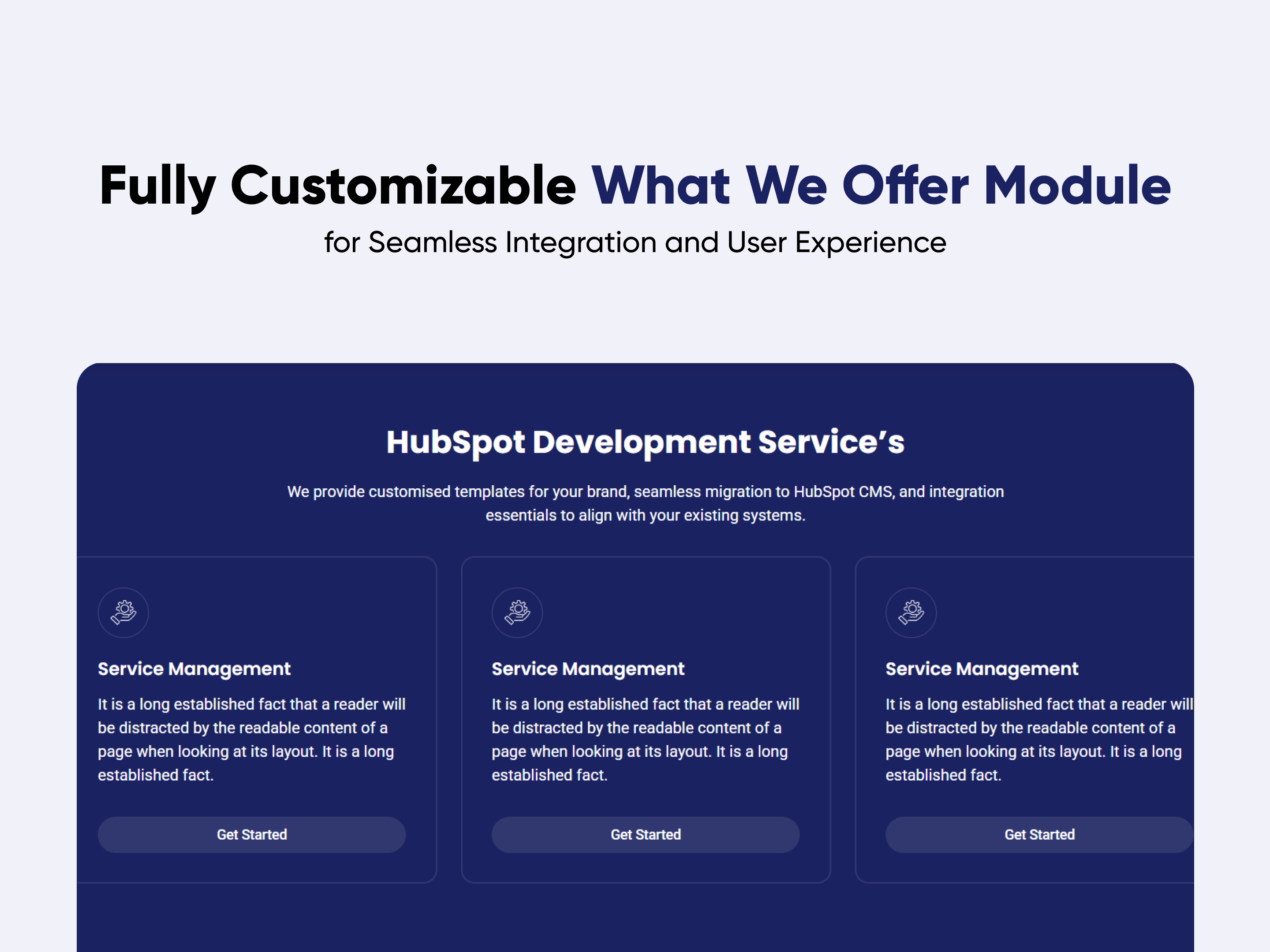
What We Offer
.png)
.png)
What we Offer are a fantastic way to showcase the services on your website! They make everything look neat and inviting, helping your visitors easily find important details about what you offer. With What we Offer, you can enhance the user experience and keep your audience engaged.
Key Features of a What we Offer Module :
✅ Title Description
✅ Icon or Image
✅ Call to Action (CTA)
✅ Hover Effects
✅ SEO Optimization
✅ Custom Styling
✅ Responsive Design
Discover More in the Knowledge Base
Explore detailed documentation, setup instructions, feature explanations, and best practices to help you get the most out of this module quickly and efficiently.
 $29
$29
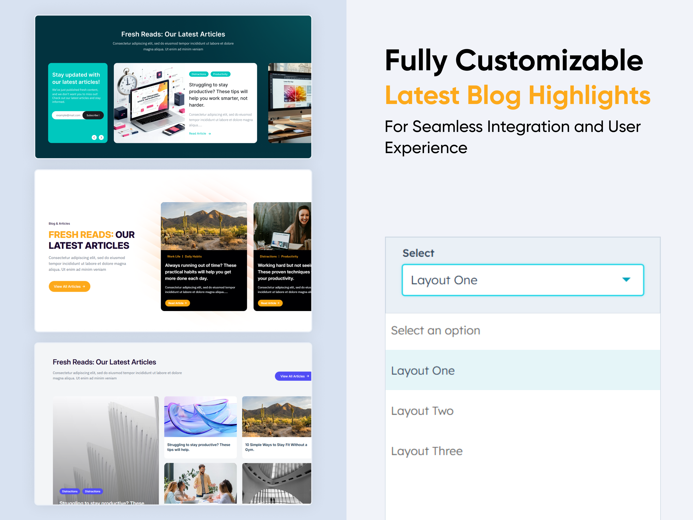
Latest Blog Highlights
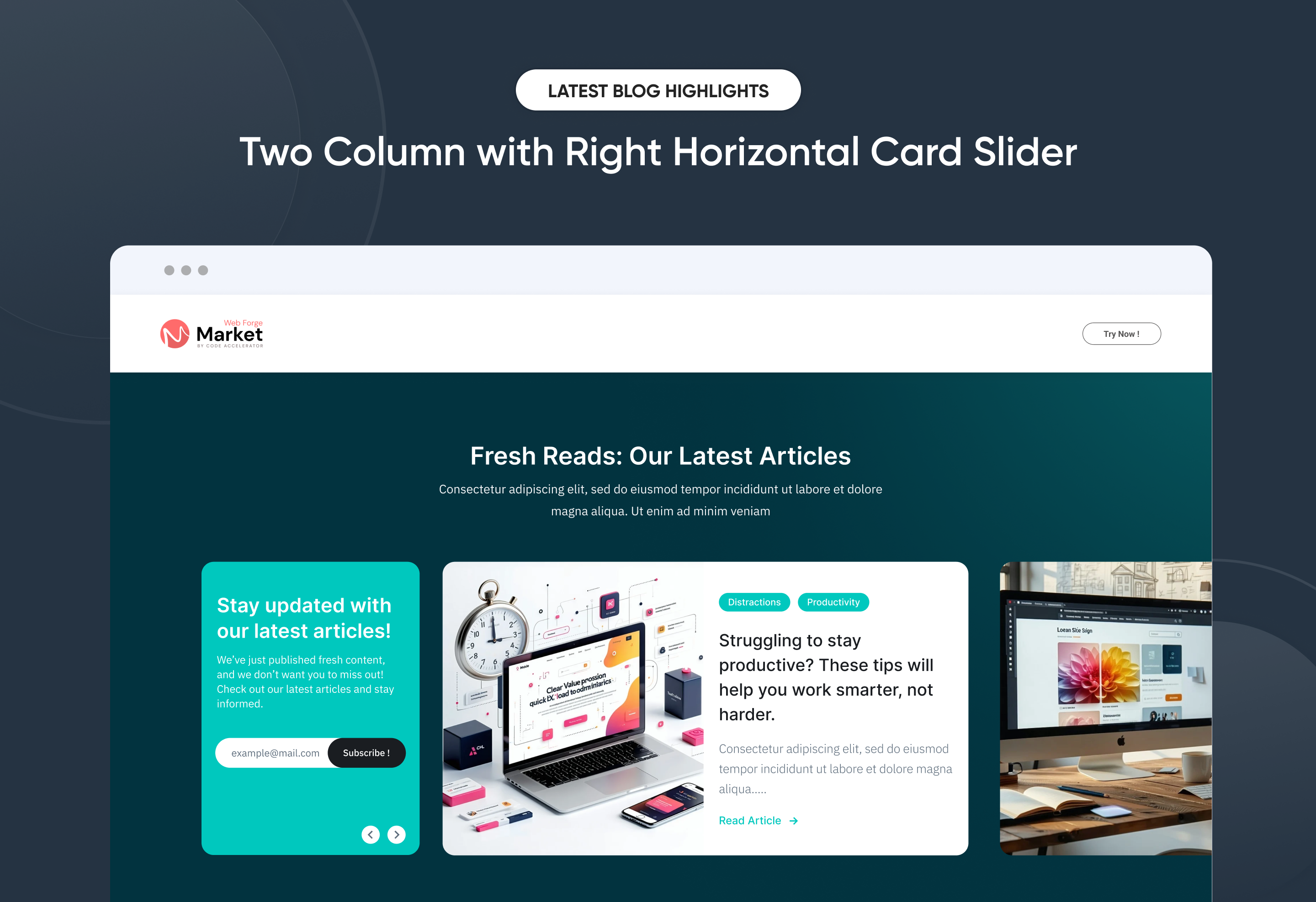
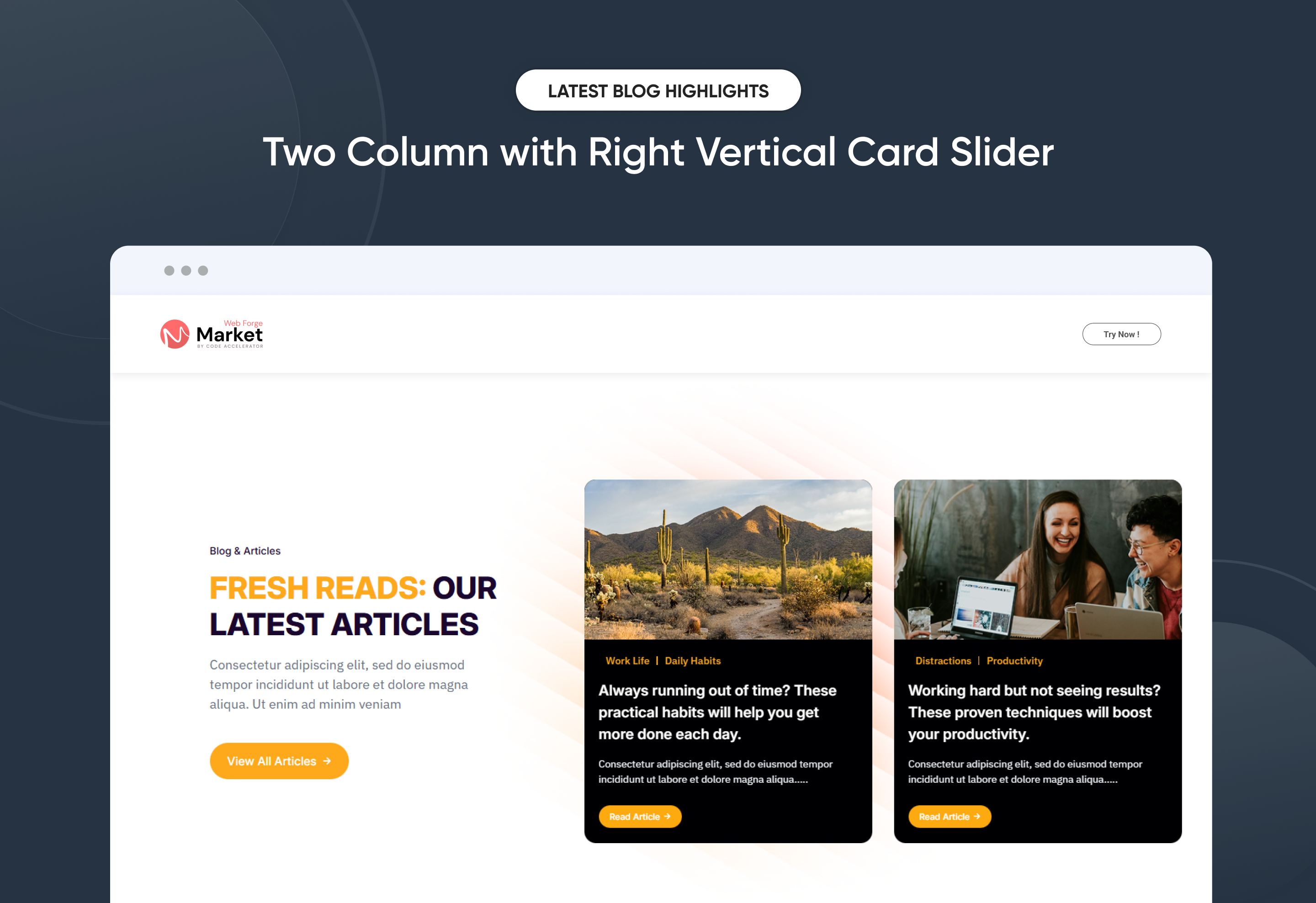
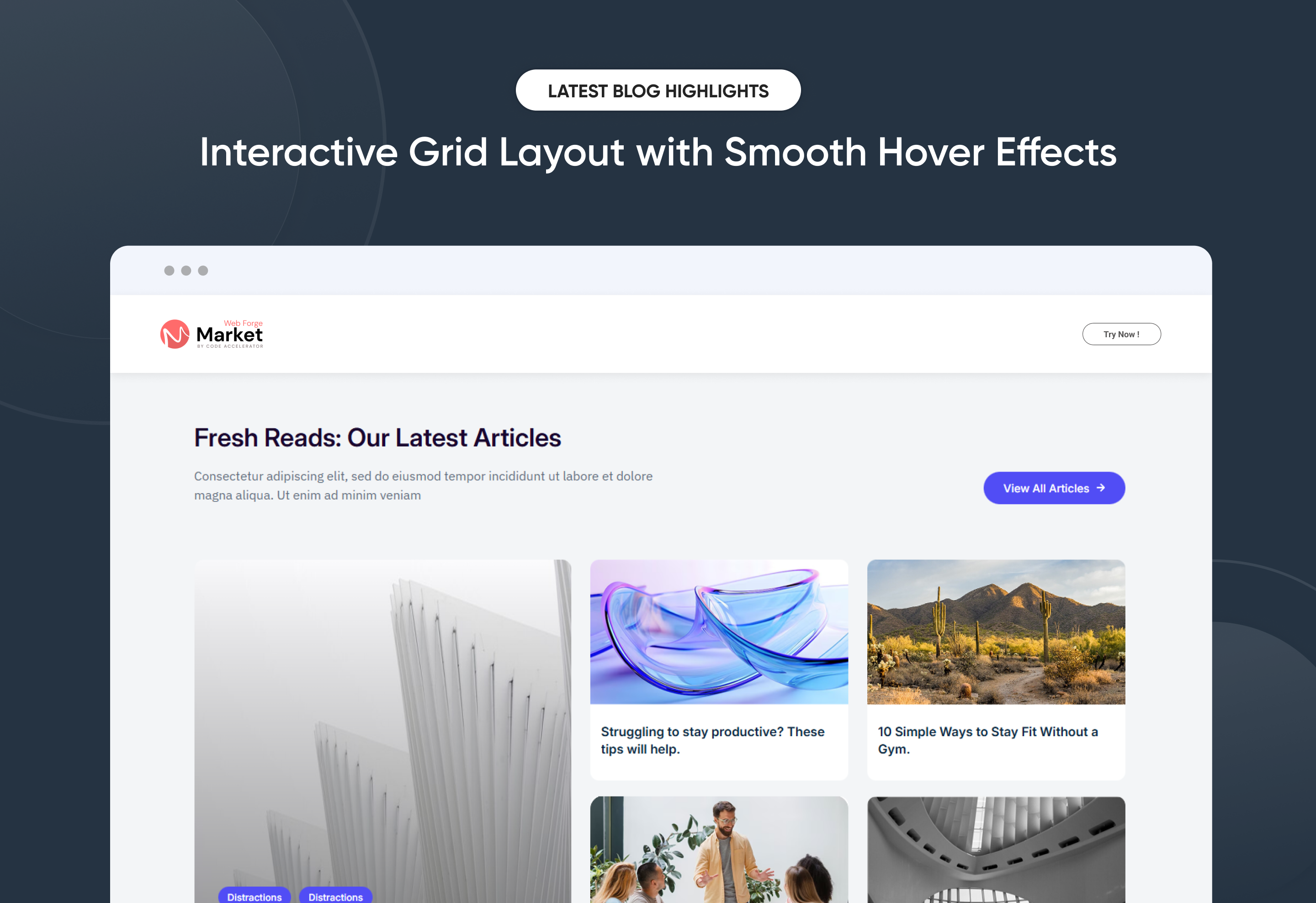
Effortlessly showcase your Latest Blog Highlights with a clean, modern layout designed to boost engagement and visibility. The Latest Blog Highlights module automatically pulls your most recent articles and gives you full control over layout, spacing, and display settings—no coding required. Customize titles, images, meta details, and call-to-action elements to match your brand style. Ideal for highlighting fresh content, driving traffic, and keeping any HubSpot page up to date.
Key Features of a Latest Blog Highlights Module :
✅ Automatic Latest Post Fetching – Dynamically displays the most recent blog posts without manual updates.
✅ Fully Mobile Responsive – Seamlessly adapts to all screen sizes for the best viewing experience.
✅ Modern & Clean Design – Sleek, contemporary styling fits perfectly into any modern website.
✅ Easy to Edit – Quickly customize content, styles, and settings without hassle.
✅ Hover & Animation Effects – Engage users with smooth hover states, transitions, and subtle animations.
✅ Optimized for Performance – Lightweight and fast for smooth transitions and loading.
✅ Call to Action (CTA) – A friendly nudge like “Contact me” or “Book a Consultation” with a button.
Discover More in the Knowledge Base
Explore detailed documentation, setup instructions, feature explanations, and best practices to help you get the most out of this module quickly and efficiently.
$29
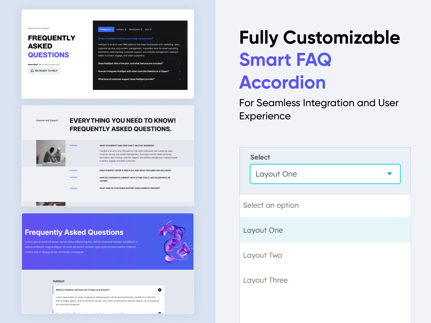
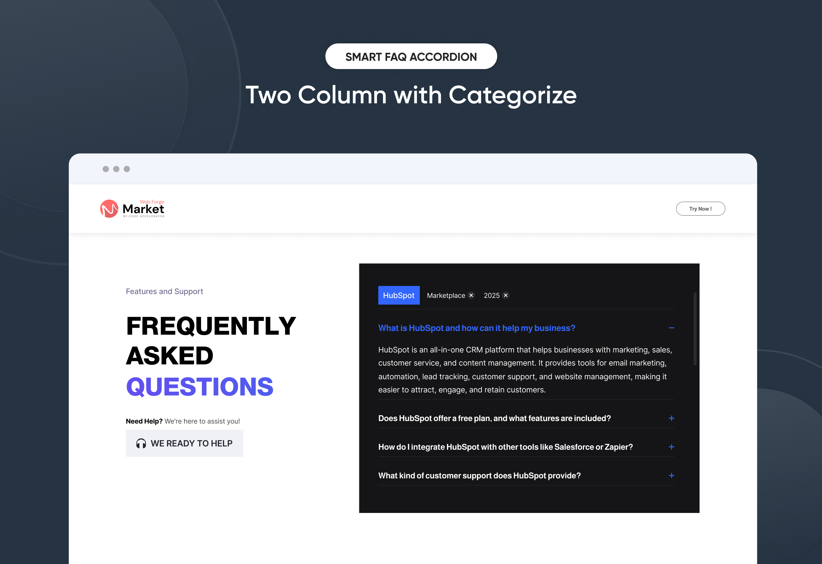
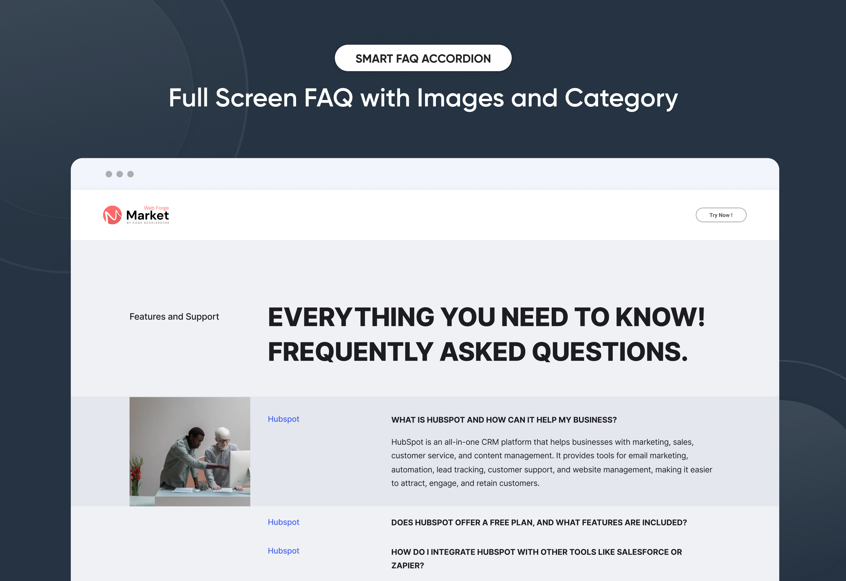
Smart FAQ Accordion
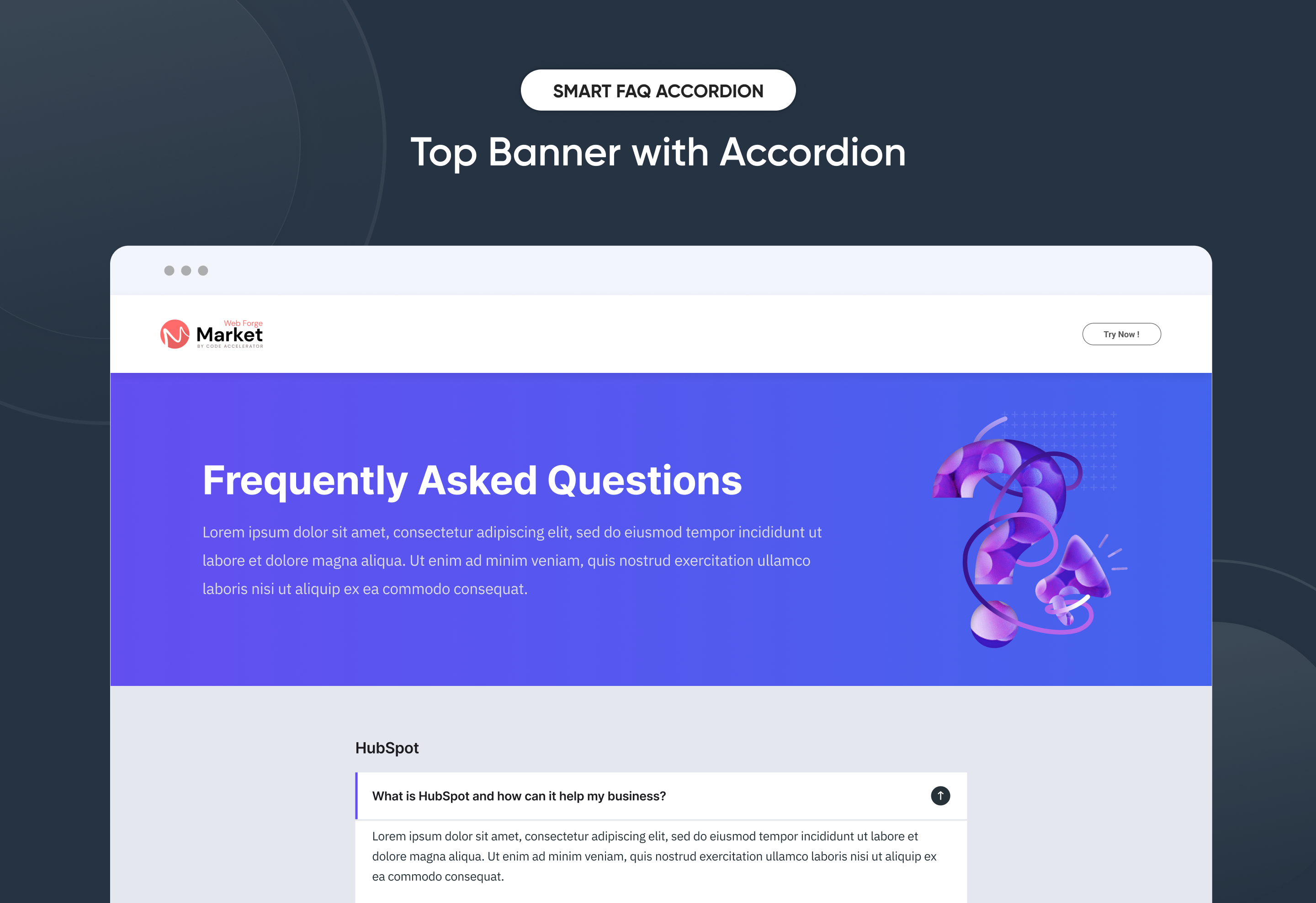
Boost user experience and support with the Smart FAQ Accordion Module for HubSpot. Featuring smooth accordion toggles, tabbed categories, SEO-friendly structure, and fully responsive design. Easily customizable with no coding required—perfect for creating clean, modern, and user-friendly FAQ sections on any website.
Key Features of a Smart FAQ Accordion Module :
✅ Custom Tab Titles – Easily add and label multiple tabs.
✅ Accordion Functionality – Expands or collapses answers on click, keeping the layout clean and user-friendly. Only one section opens at a time to reduce clutter.
✅ Smooth Accordion Animation – Modern toggle animation for a clean and interactive user experience.
✅ Fully Responsive Design – Optimized for all devices (desktop, tablet, mobile).
✅ Extensive Style Customization – Tab background (solid or gradient), Border styles, Padding/margins, Active/inactive states
✅ Easy to Use with Drag & Drop – Built for HubSpot’s drag-and-drop page editor. No coding required to configure or style tabs
✅ Reusable and Scalable – Add multiple tab sections to a page or reuse across templates.
Discover More in the Knowledge Base
Explore detailed documentation, setup instructions, feature explanations, and best practices to help you get the most out of this module quickly and efficiently.
 $29
$29
Stats Number Counter
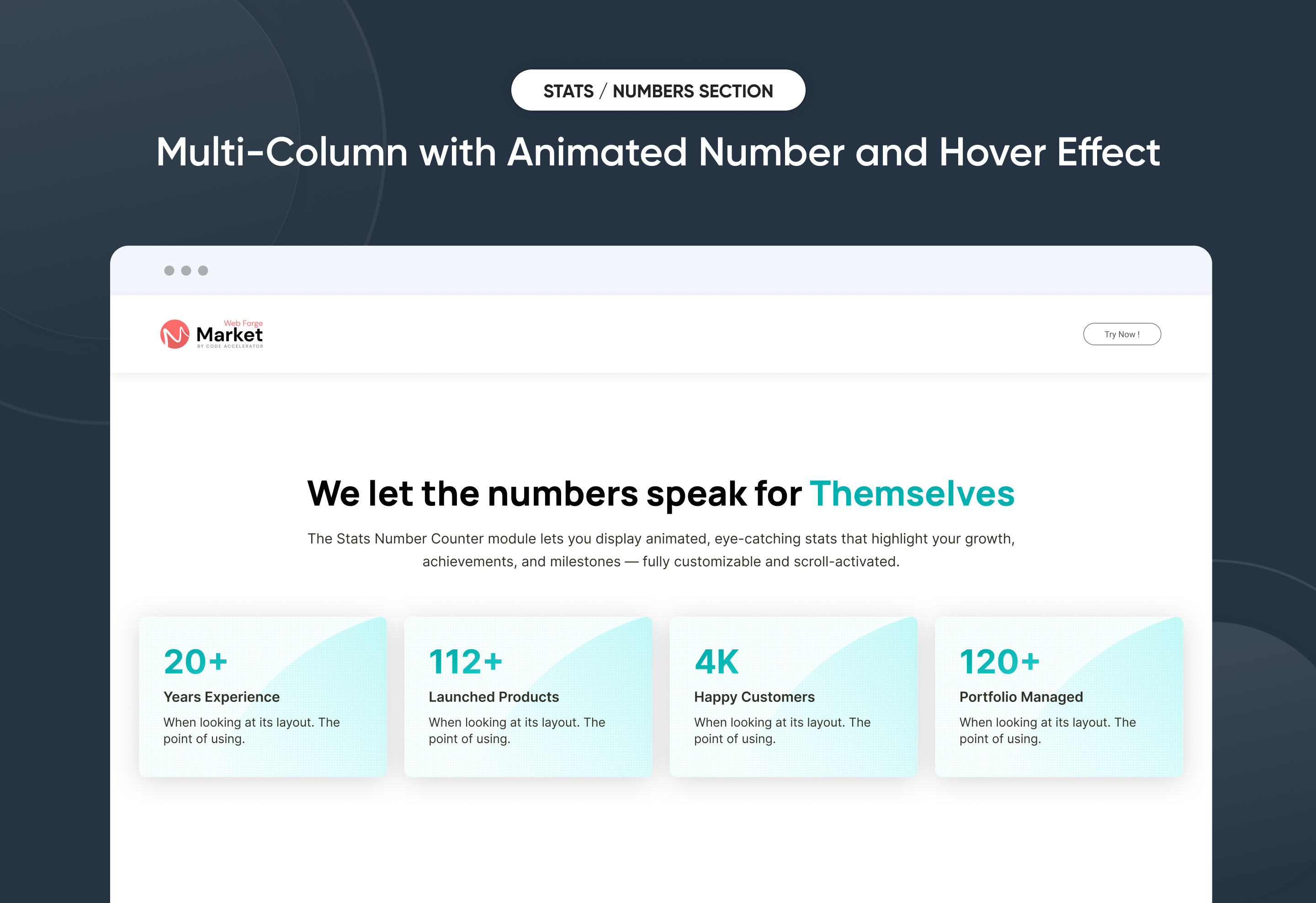
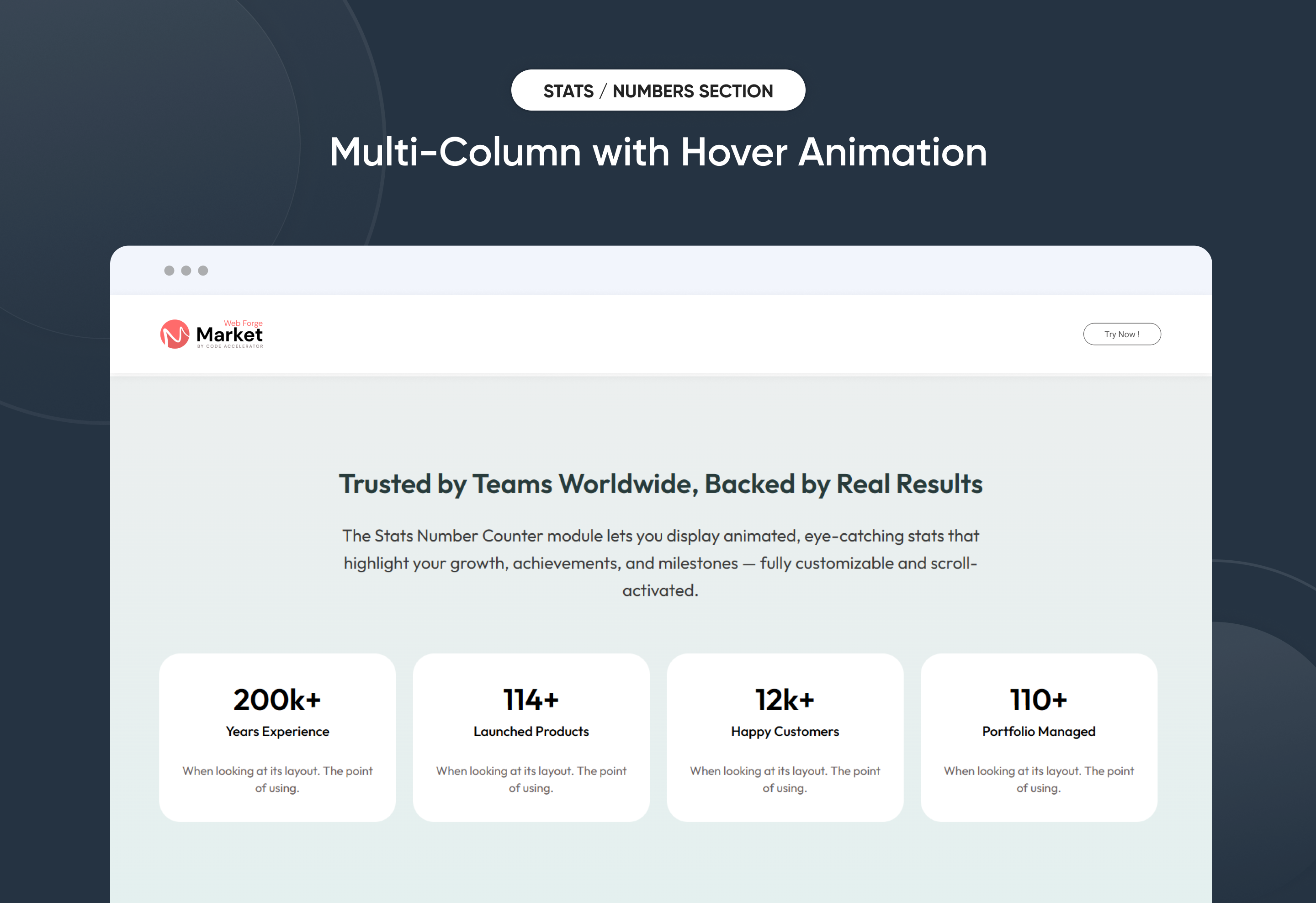
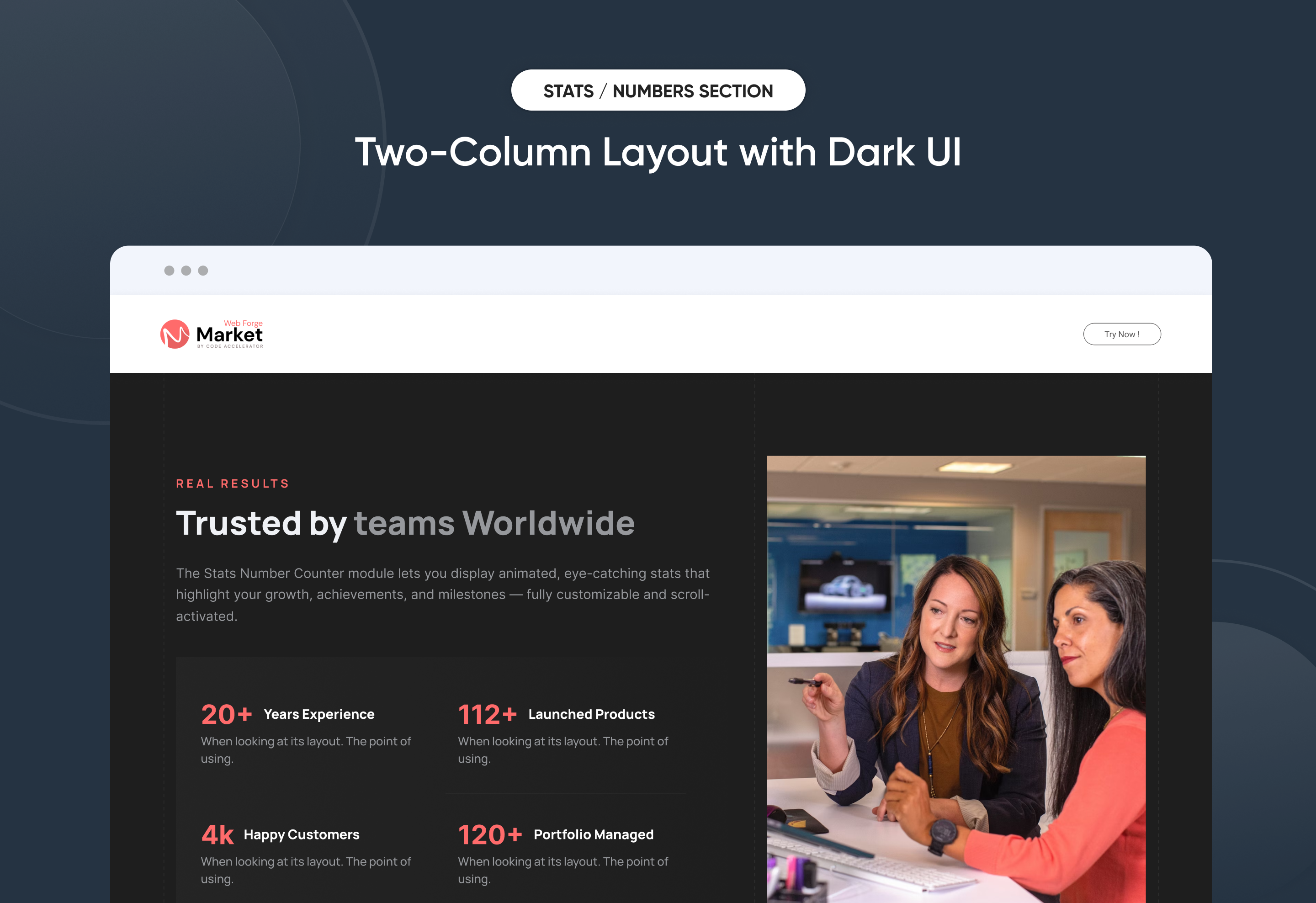
Showcase your most important metrics with engaging animated counters that activate on scroll. Whether it's sales numbers, user growth, or performance stats, this module makes data visually appealing. Fully customizable with labels, colors, and layout options — no coding required. Perfect for dashboards, landing pages, or reports that need a bold, modern touch.
Key Features :
✅ Fully Responsive Across All Devices:
The counter adapts seamlessly to mobile, tablet, and desktop screens, ensuring a consistent user experience no matter how visitors view your site.
✅ Animated Count-Up Effect:
Numbers smoothly animate from zero to their target value as users scroll, drawing attention to your key stats and achievements.
✅ Customizable Number & Labels:
Easily add number and descriptive labels to each stat block to enhance clarity and visual appeal.
✅ Flexible Layout Options:
Choose between horizontal or vertical layouts and adjust spacing to best fit your design.
✅ Prefix & Suffix Support:
Add currency symbols, percentage signs, or custom text before or after numbers to match your content needs.
✅ Style Control in HubSpot Editor:
Customize fonts, colors, backgrounds, and borders directly within the HubSpot design editor — no coding needed.
✅ Scroll Trigger Animation:
Counters only animate when they enter the viewport, improving performance and user engagement.
✅ Lightweight & Fast Loading:
Built with performance in mind, ensuring smooth animations without slowing down your page.
Discover More in the Knowledge Base
Explore detailed documentation, setup instructions, feature explanations, and best practices to help you get the most out of this module quickly and efficiently.
 $19
$19
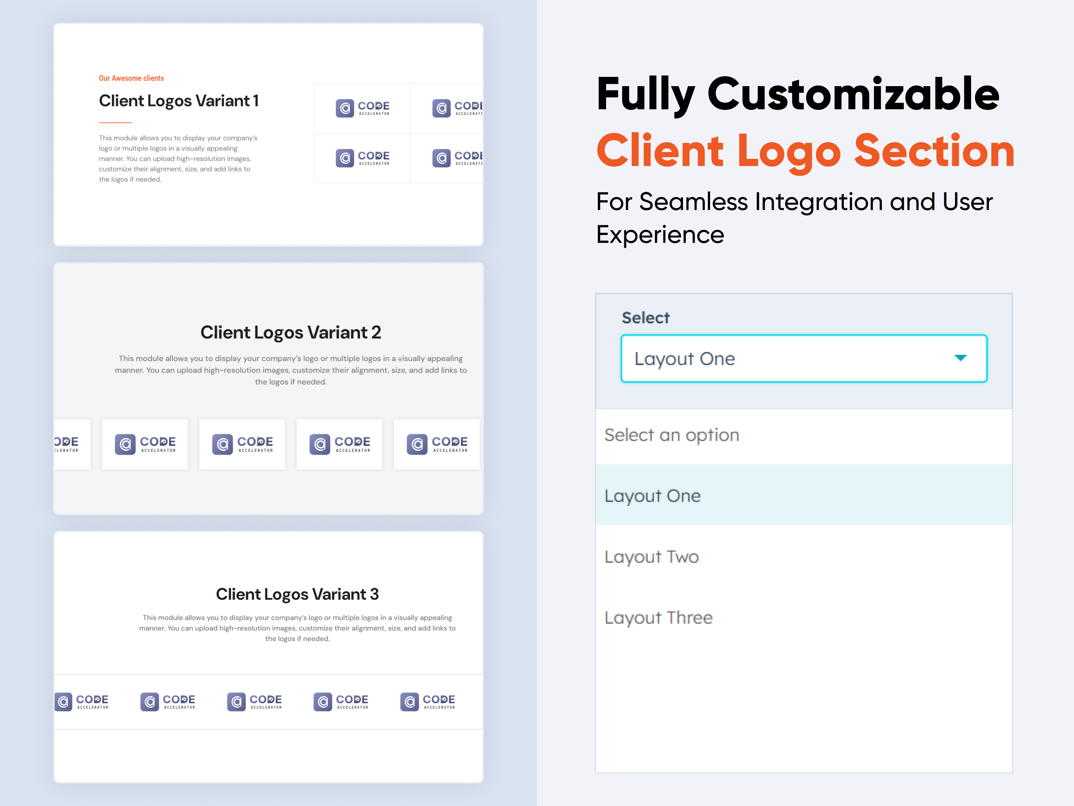
Client Logos Section
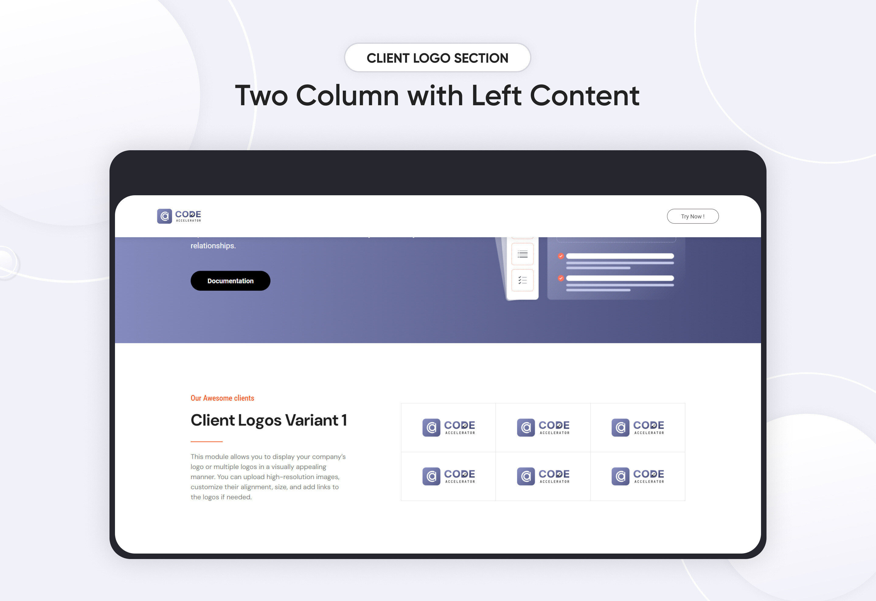
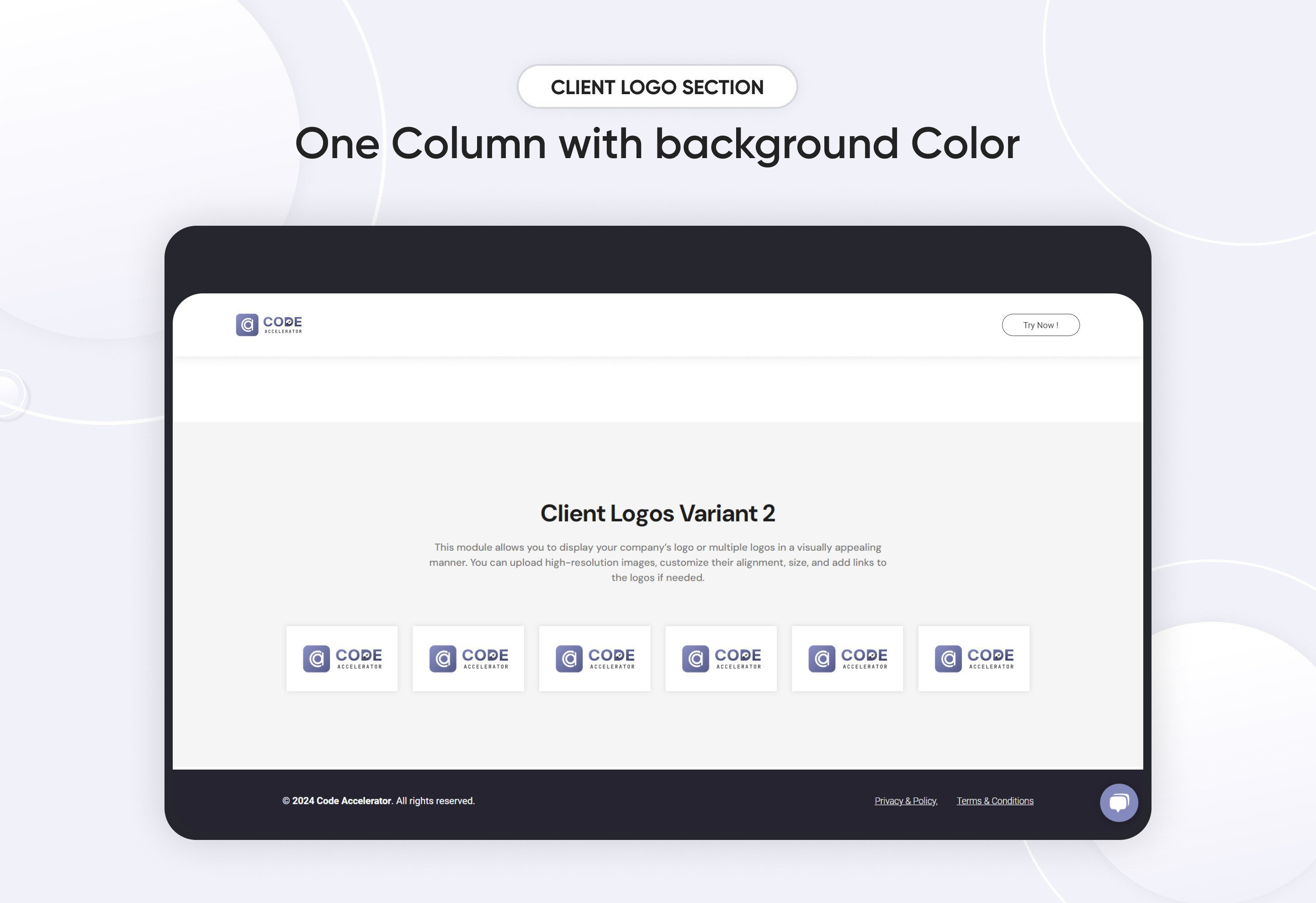
The Client Logos Module is an essential component for showcasing logos on your website with maximum flexibility and control. Whether you’re displaying your own brand, partners, sponsors, or clients, this module provides a range of customization options to ensure that the logos integrate seamlessly with your site’s design and enhance the overall visual experience.
Features and Customization Options:
-
Add/Remove Logos:
Add new logos or remove existing ones as needed. Support for various file formats ensures compatibility with your logo assets. -
Responsive Design: The module is designed to automatically adjust to different screen sizes, ensuring logos appear crisp and well-positioned on desktops, tablets, and mobile devices.
-
Background Colors:
Set background colors to complement or contrast with the logos. Use solid colors or gradients to create a distinctive look. -
Borders and Box Shadows:
Add borders and box shadows to logos to create a sense of depth and separation. Customize border color, thickness, and style (solid, dashed, etc.), and adjust shadow settings for a tailored appearance. -
Text Alignment and Typography:
Align accompanying text (e.g., logo descriptions, brand names) as desired—left, center, or right. Adjust typography settings including font family, size, color, and weight to ensure consistency with your site’s overall style. -
Margin and Padding:
Fine-tune the spacing around and within logos to achieve the desired layout. Adjust margin and padding to ensure logos are properly positioned and visually balanced. -
Layout Options:
Display logos in a grid format for a structured look or use a carousel for a dynamic, interactive presentation. Choose from various layout styles to suit your design needs.
Discover More in the Knowledge Base
Explore detailed documentation, setup instructions, feature explanations, and best practices to help you get the most out of this module quickly and efficiently.
 $29
$29
Info Cards
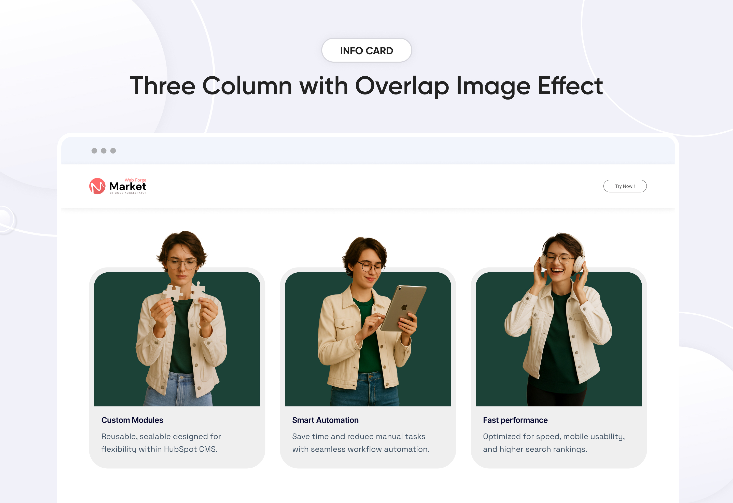
Easily build a personalized ‘Info Cards’ section to highlight key details with style. This flexible module allows you to customize layouts, colors, and design elements to suit your brand. No coding required—just simple, intuitive controls. Perfect for showcasing information in a clear, professional way on any page.
Key Features of a Info Cards Module :
✅ 3 Unique Layout Options – Choose from three beautifully crafted slider layouts to match any design style.
✅ Fully Mobile Responsive – Seamlessly adapts to all screen sizes for the best viewing experience.
✅ Modern & Clean Design – Sleek, contemporary styling fits perfectly into any modern website.
✅ Easy to Edit – Quickly customize content, styles, and settings without hassle.
✅ Hover & Animation Effects – Engage users with smooth hover states, transitions, and subtle animations.
✅ Optimized for Performance – Lightweight and fast for smooth transitions and loading.
✅ Call to Action (CTA) – A friendly nudge like “Contact me” or “Book a Consultation” with a button.
Discover More in the Knowledge Base
Explore detailed documentation, setup instructions, feature explanations, and best practices to help you get the most out of this module quickly and efficiently.
 $29
$29
Tabbed Info Display
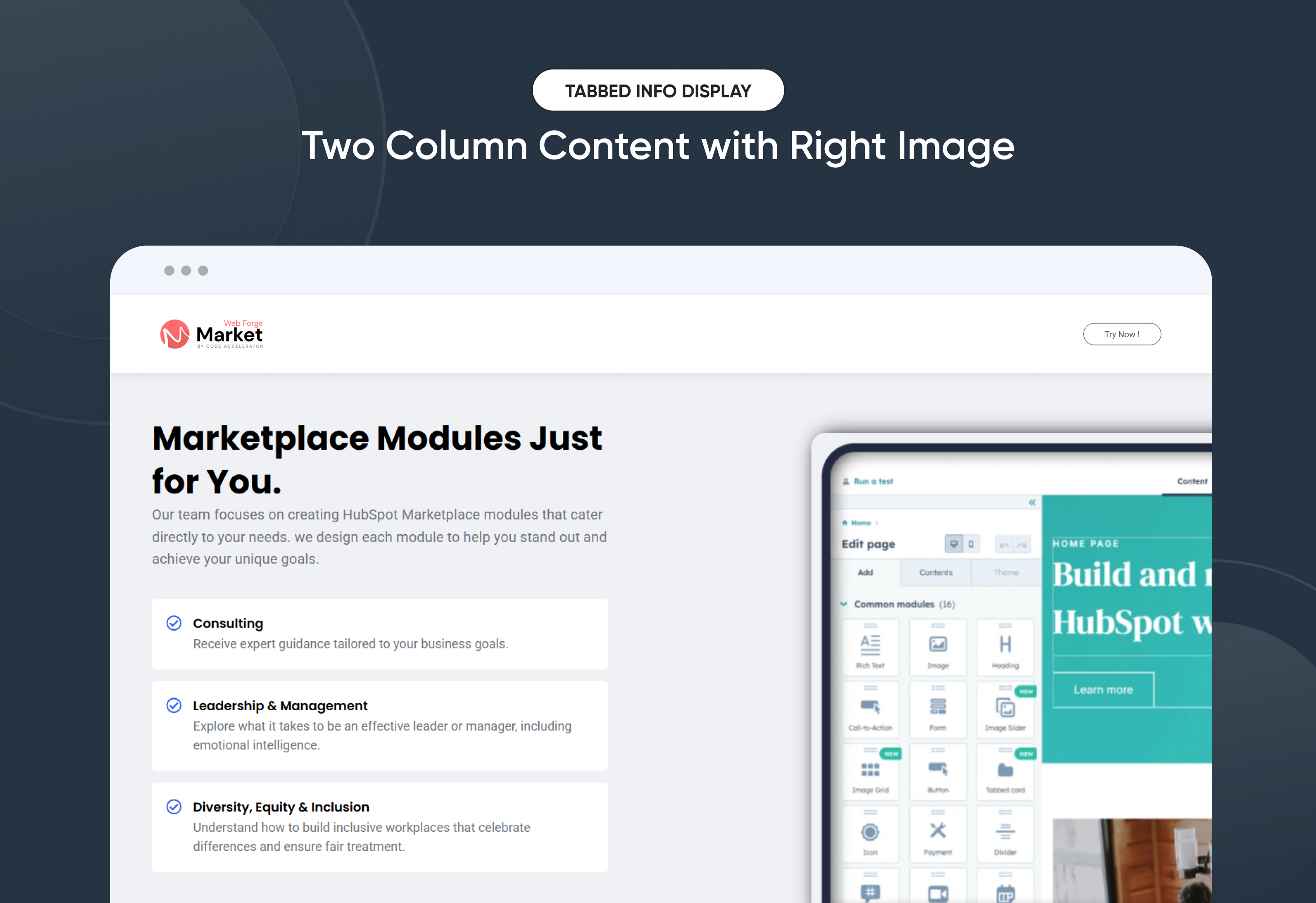
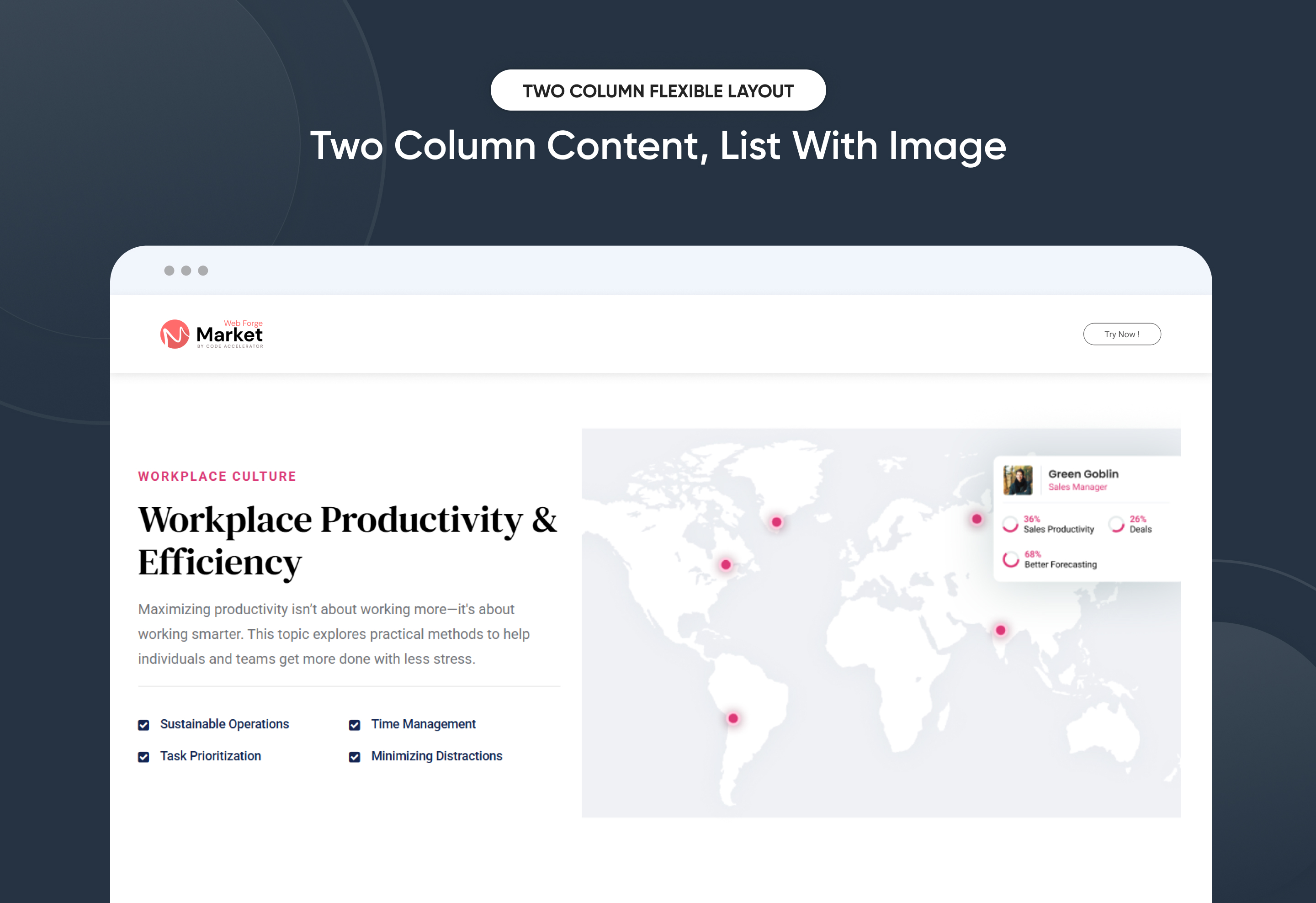
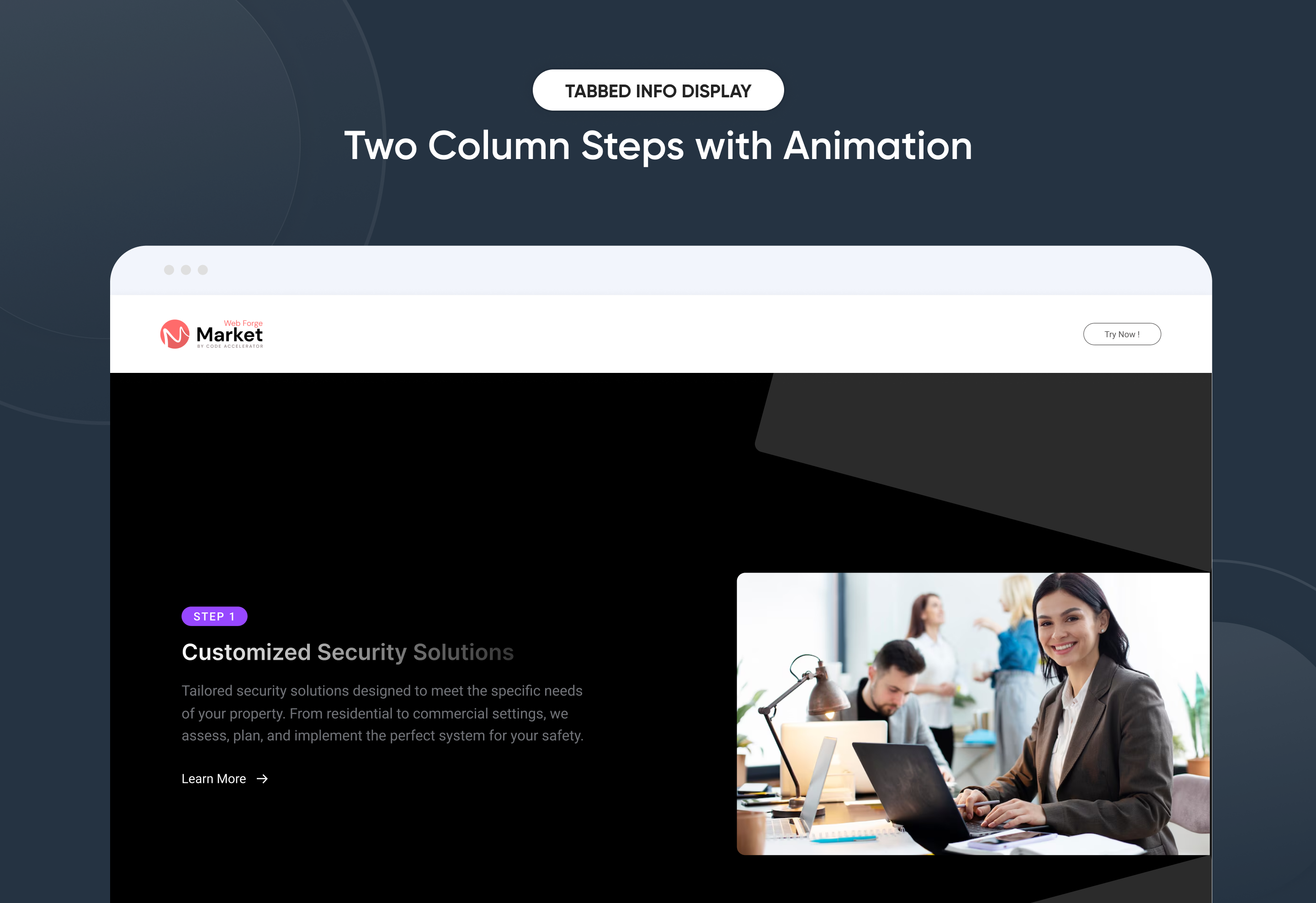
A Tabbed Info Display is a flexible and visually balanced structure where content is split into two vertical sections — typically for combining text, images, and interactive elements. It enhances clarity, storytelling, and user engagement.
Key Features of a Tabbed Info Display Module :
🧩 Multiple Layouts
-
Various column orientations: text left/image right, image left/text right, centered content, staggered steps, etc.
-
Adaptable for landing pages, product intros, service descriptions, and more.
📄 Content with List + Right Column Image
-
Left column: bullet points, icons, or descriptive content.
-
Right column: static or animated image (e.g., feature breakdown, benefits list).
🔢 Background Content with Number Value + Right Image
-
Content appears over a background color or image.
-
Includes numerical highlights (e.g., stats, KPIs) and supporting visuals in the right column.
🖼️ Content on Background Image with Multiple CTAs + Left Side Image
-
Left column: product or hero image.
-
Right column: background image, layered content, and multiple buttons for different user actions (e.g., "Learn More", "Get Started").
🔁 Repeating Content with Step-by-Step + Animated Images
-
A vertically stacked, two-column layout with steps (1-2-3...) and accompanying animated images or icons.
-
Great for onboarding flows, process explanations, or feature walkthroughs.
Discover More in the Knowledge Base
Explore detailed documentation, setup instructions, feature explanations, and best practices to help you get the most out of this module quickly and efficiently.
 $29
$29
Dynamic CTA Banner
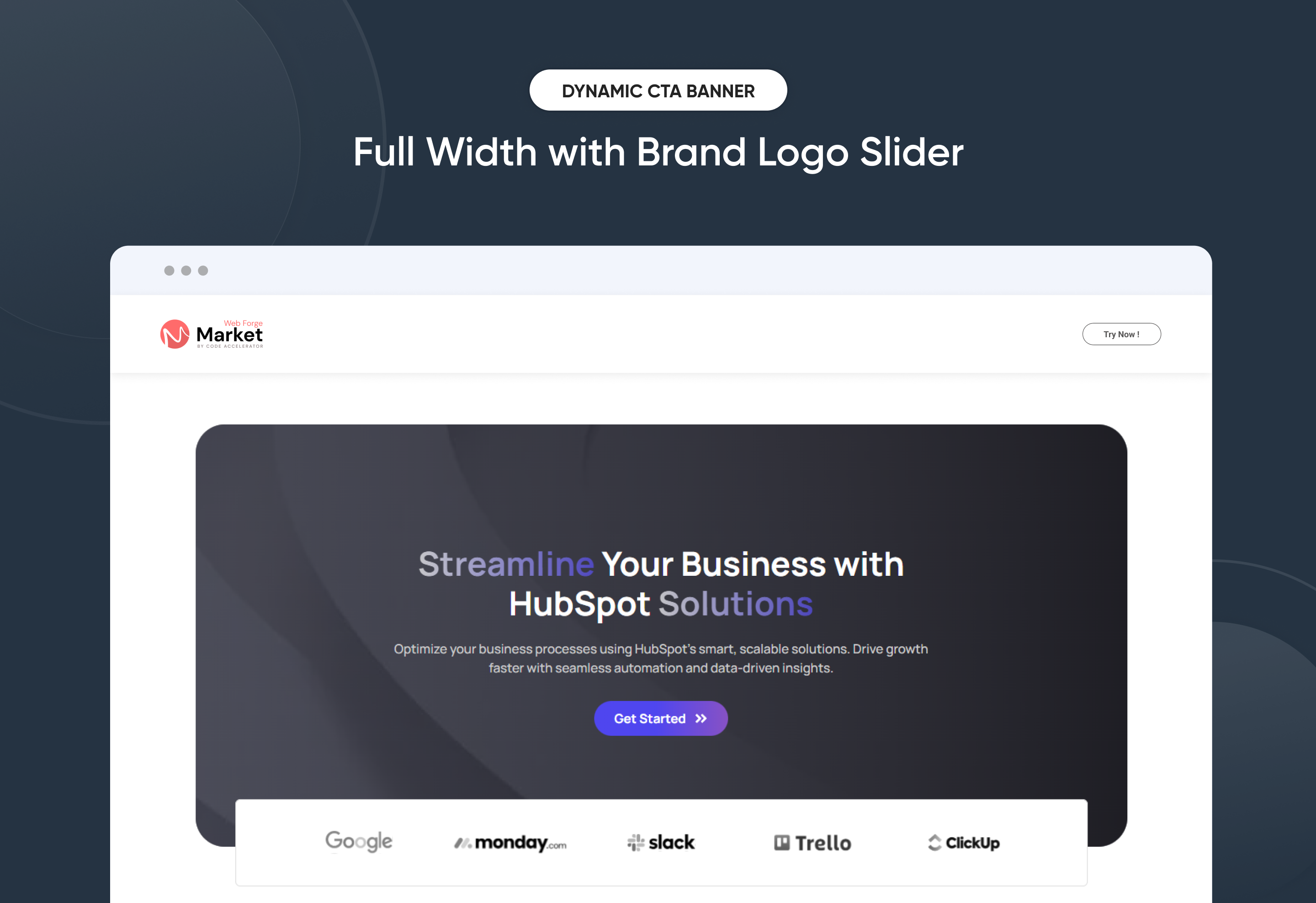
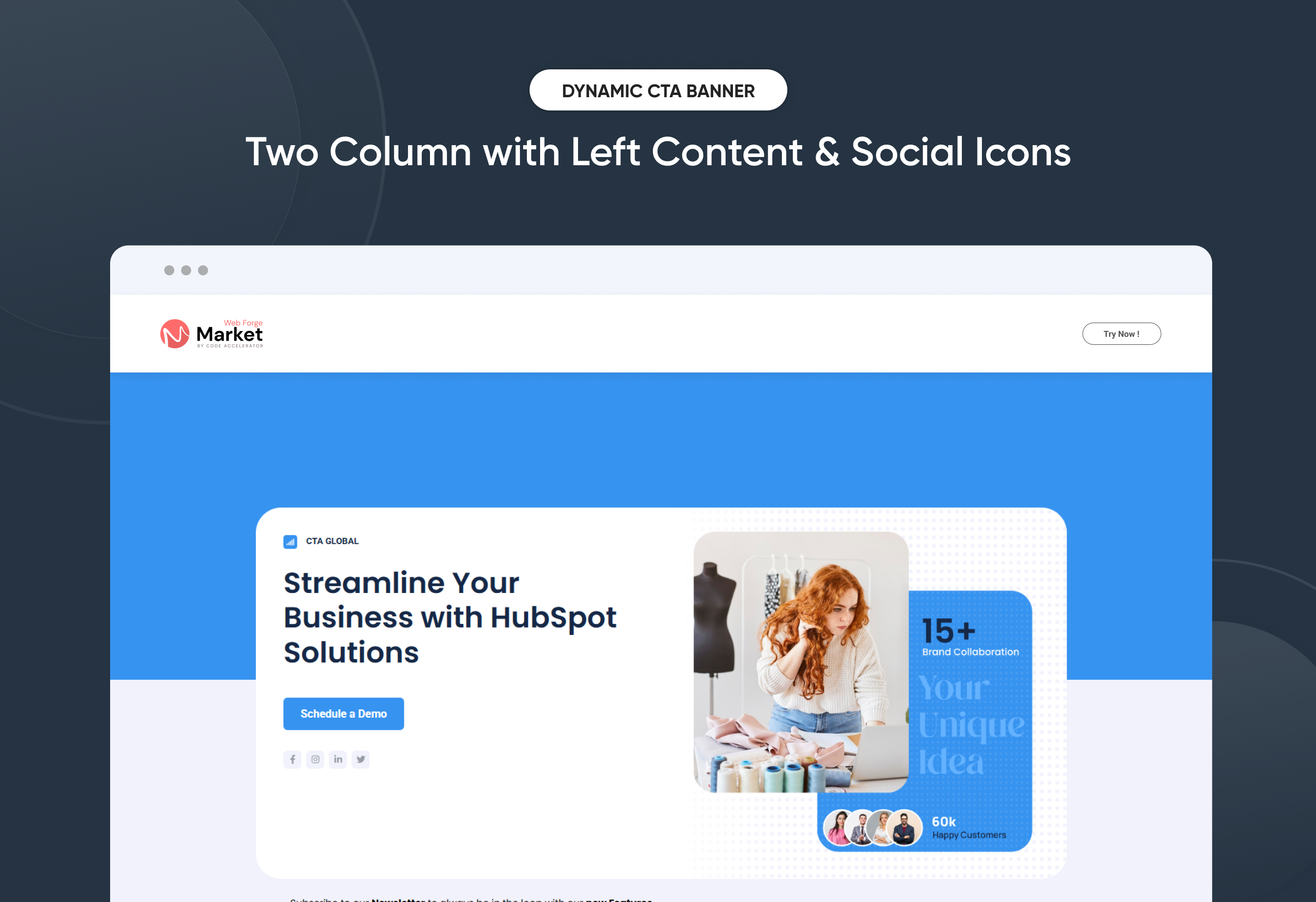
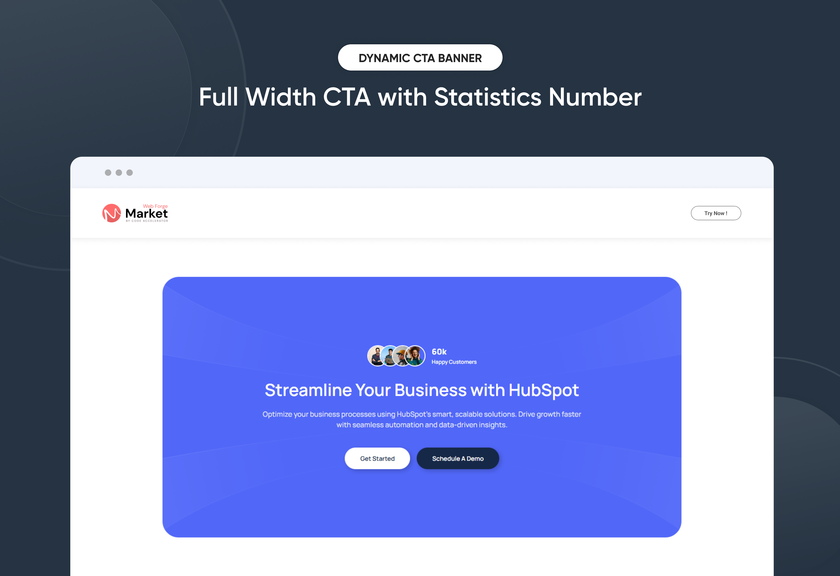
The Dynamic CTA Banner Module helps you capture attention and drive action with smart, responsive, and highly customizable call-to-action banners. Built for flexibility, it includes multiple layout options and dynamic display controls, giving you the freedom to promote offers, announcements, and key messages exactly when and where they matter most.
Easily update banner text, supporting copy, CTA buttons, and links directly inside HubSpot—no coding required. With mobile-optimized design, flexible positioning, adjustable spacing, and full style controls, this module ensures your CTA banner looks consistent and performs flawlessly across all screen sizes.
Whether you’re promoting a limited-time offer, launching a campaign, or guiding users toward conversions, the Dynamic CTA Banner delivers a clean, high-impact experience that increases engagement and drives measurable results.
Key Features of a Dynamic CTA Banner Module :
-
Multiple Layouts – Choose from 3 distinct hero banner styles.
-
Responsive Design – Optimized for all screen sizes, ensuring a flawless experience on desktop, tablet, and mobile.
-
Flexible Content Options – Easily update headings, descriptions, and CTAs directly within HubSpot.
-
Customizable Visuals – Add images, graphics, or mockups to match your brand identity and campaign goals.
-
Engaging Call-to-Actions – Drive conversions with customizable CTA buttons tailored to your business objectives.
-
Design Flexibility – Adjust spacing, alignment, and background colors for a unique, on-brand look.
-
User-Friendly Editing – No coding required—built for marketers to launch modern hero sections quickly.
-
Optimized Performance – Lightweight and SEO-friendly to ensure speed and visibility.
-
Versatile Use Cases – Perfect for homepages, landing pages, service showcases, or campaign launches.
Discover More in the Knowledge Base
Explore detailed documentation, setup instructions, feature explanations, and best practices to help you get the most out of this module quickly and efficiently.
 $free
$free
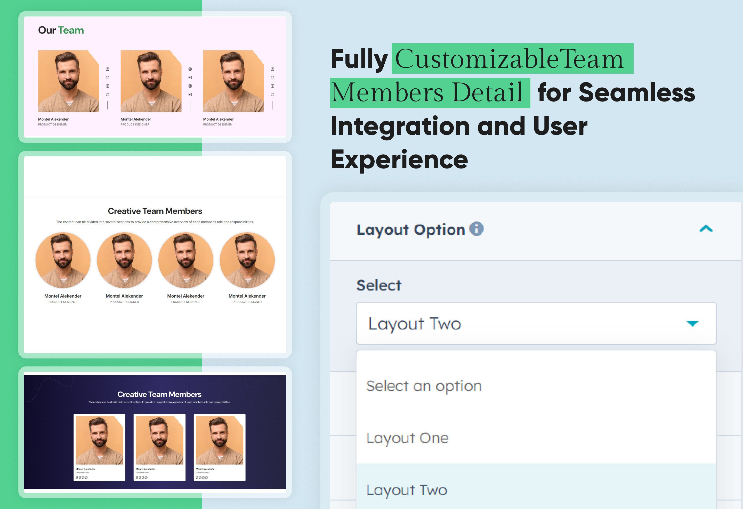
Team Members Detail
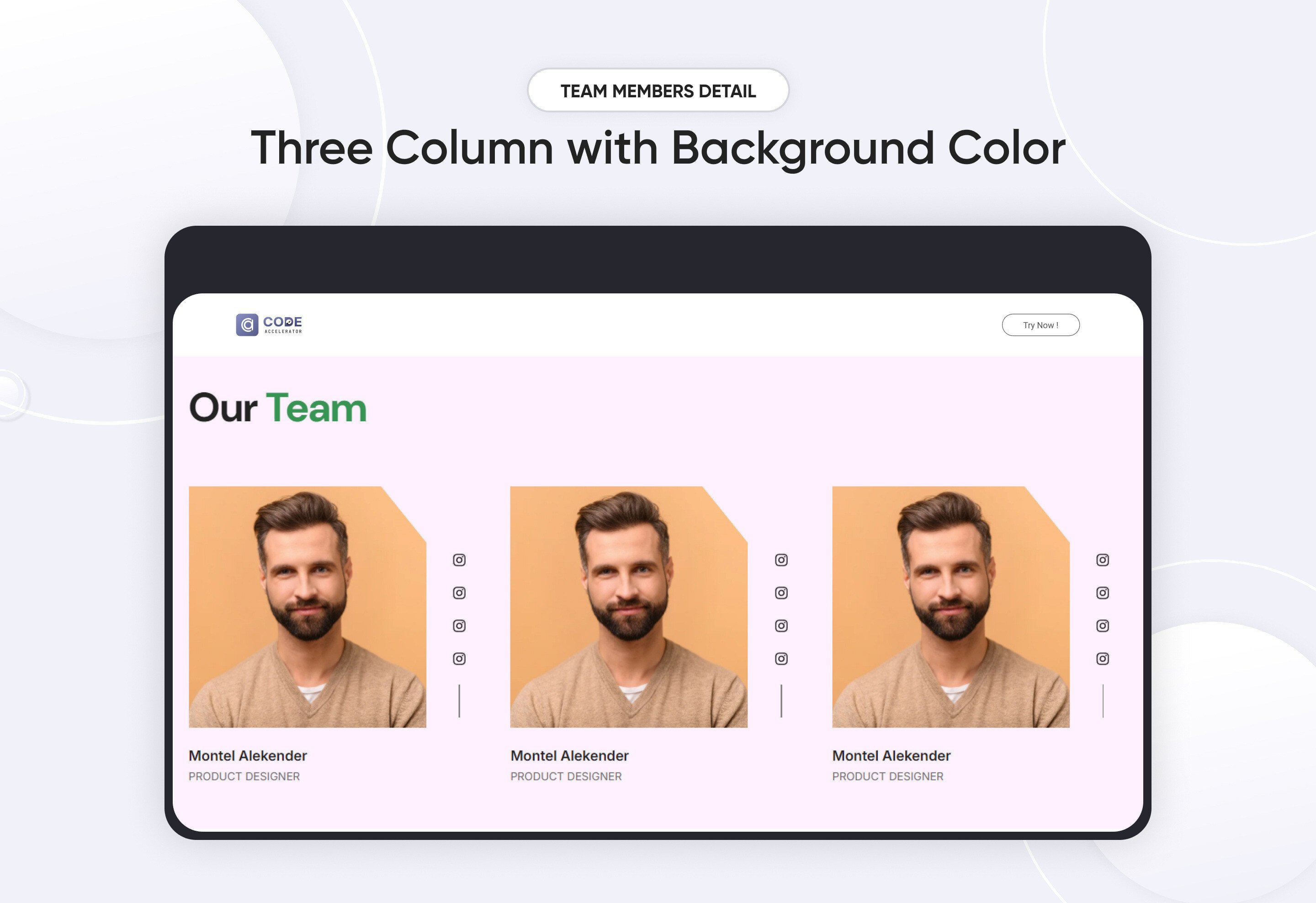
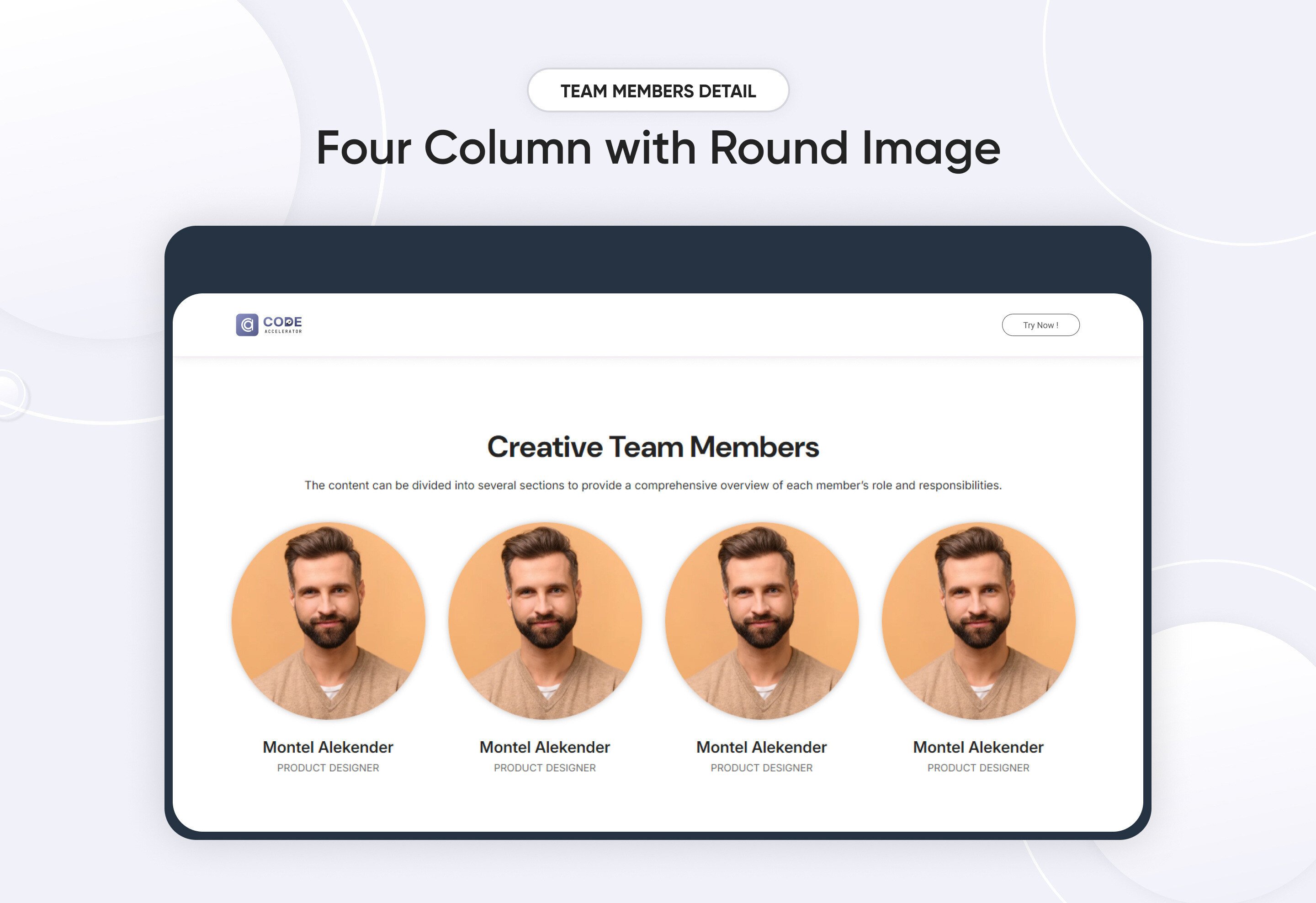
A team member module is a crucial part of any team management or HR system. It focuses on managing individual team members, their profiles, roles, performance, and interactions within the team. This module serves as a centralized hub for storing and accessing detailed information about each team member, supporting their engagement and growth within the organization.
Key Features :
-
Profile Management: Store detailed profiles for each team member.
-
Role & Responsibility Management: Assign specific roles and responsibilities to each team member, with the ability to update as roles evolve.
-
Flexibility & Scalability: Easily manage growing teams, changing roles.
Discover More in the Knowledge Base
Explore detailed documentation, setup instructions, feature explanations, and best practices to help you get the most out of this module quickly and efficiently.
 $29
$29
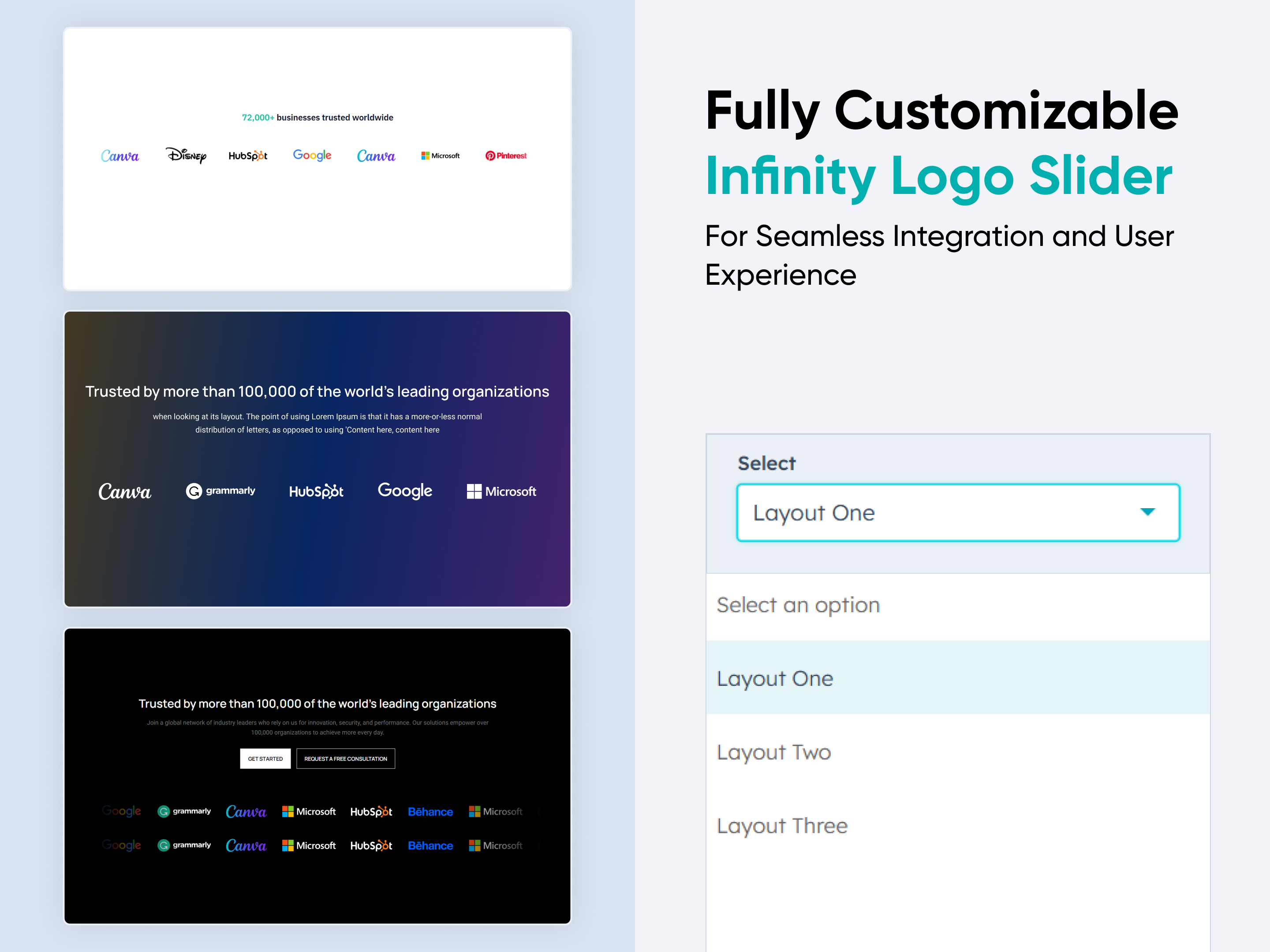
Infinity Logos Slider
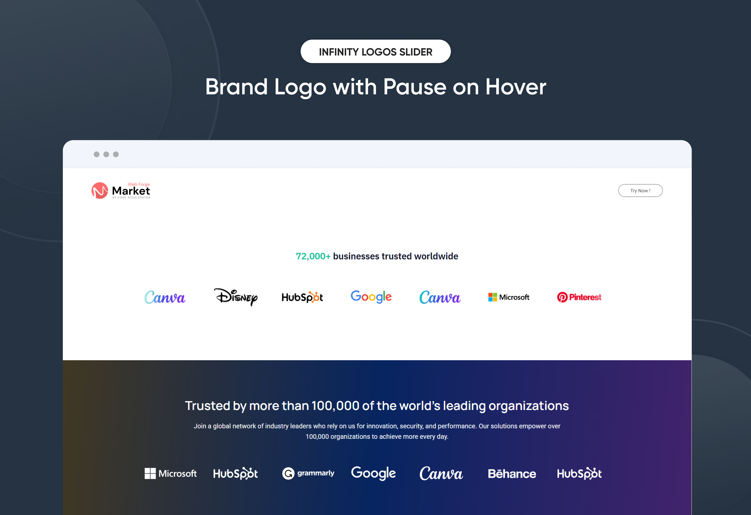
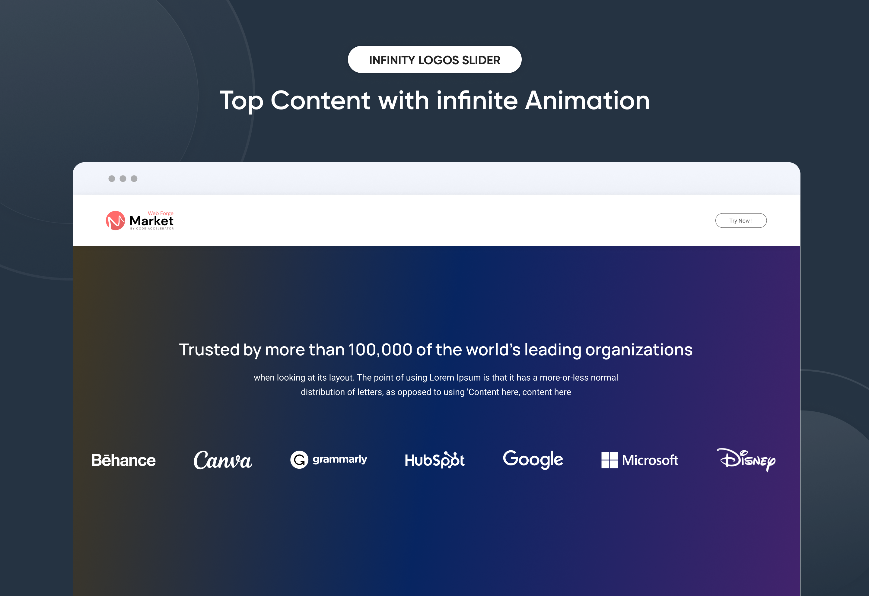
The Infinity Logos Slider is a smooth, continuously scrolling carousel crafted to showcase brand logos, client partnerships, or sponsor affiliations in a clean and engaging format. With its infinite loop animation and dual-direction sliding rows, this responsive module adds dynamic visual movement to your page. Perfect for building trust and brand authority, the slider elegantly highlights your collaborations, making your website look polished and professional.
Key Features Infinity Logos Slider Module :
✅ Endless Looping Animation: Logos slide infinitely without interruption, creating a seamless and professional visual flow.
✅ Dual-Direction Rows: Supports multiple rows with independent directions—top row left-to-right, bottom row right-to-left—for dynamic motion.
✅ Pause on Hover: Slider automatically pauses when hovered, allowing users to view logos without distraction.
✅ Fully Responsive: Works seamlessly on all devices (desktop, tablet, mobile).
✅ Infinity Auto-Scrolling: Smooth auto-slide.
✅ Fully Customizable Design: Easily adjust spacing, background color, and padding directly within the module settings.
✅ Lightweight & Fast: Optimized for speed and performance.
Discover More in the Knowledge Base
Explore detailed documentation, setup instructions, feature explanations, and best practices to help you get the most out of this module quickly and efficiently.
 $29
$29
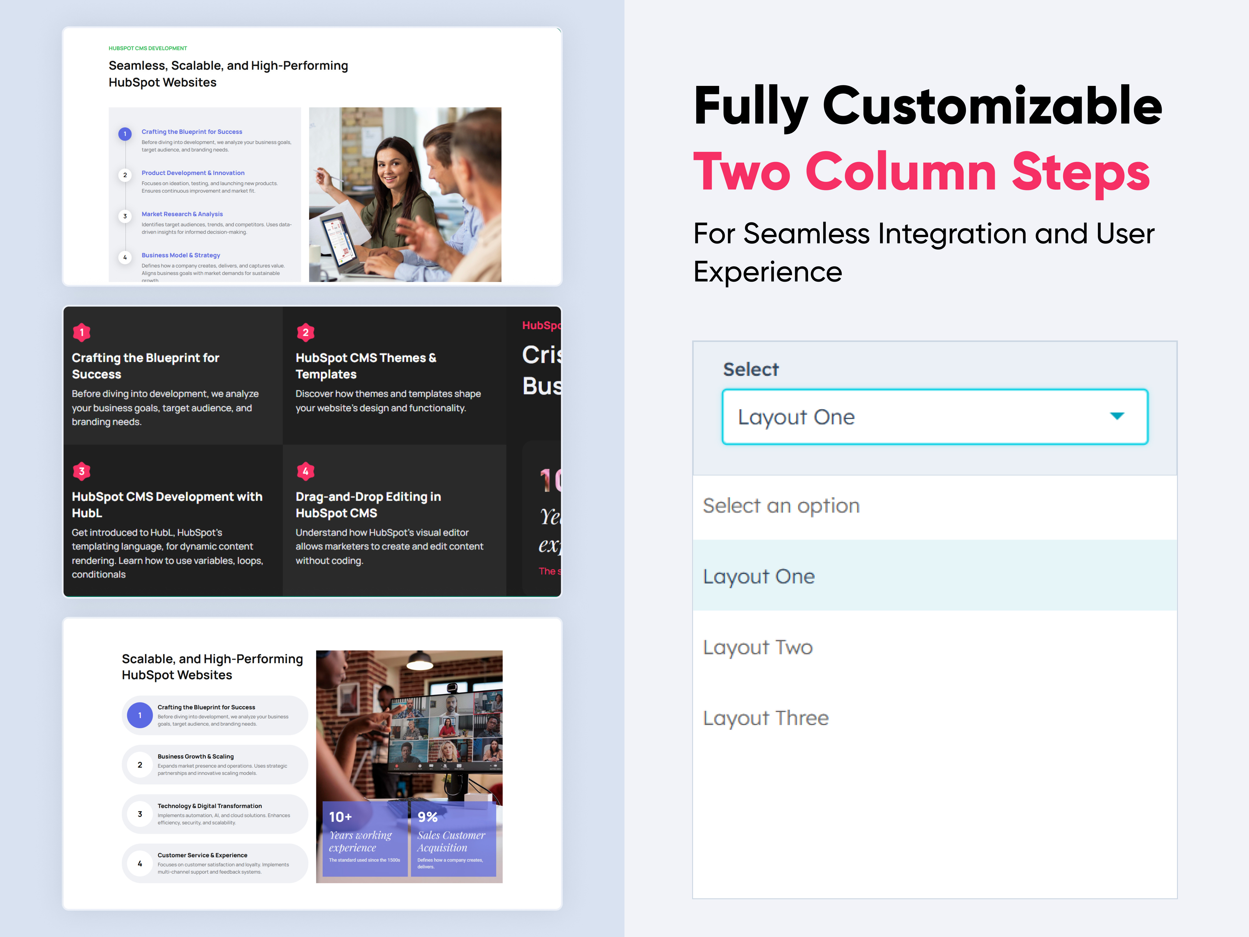
Two Column Steps
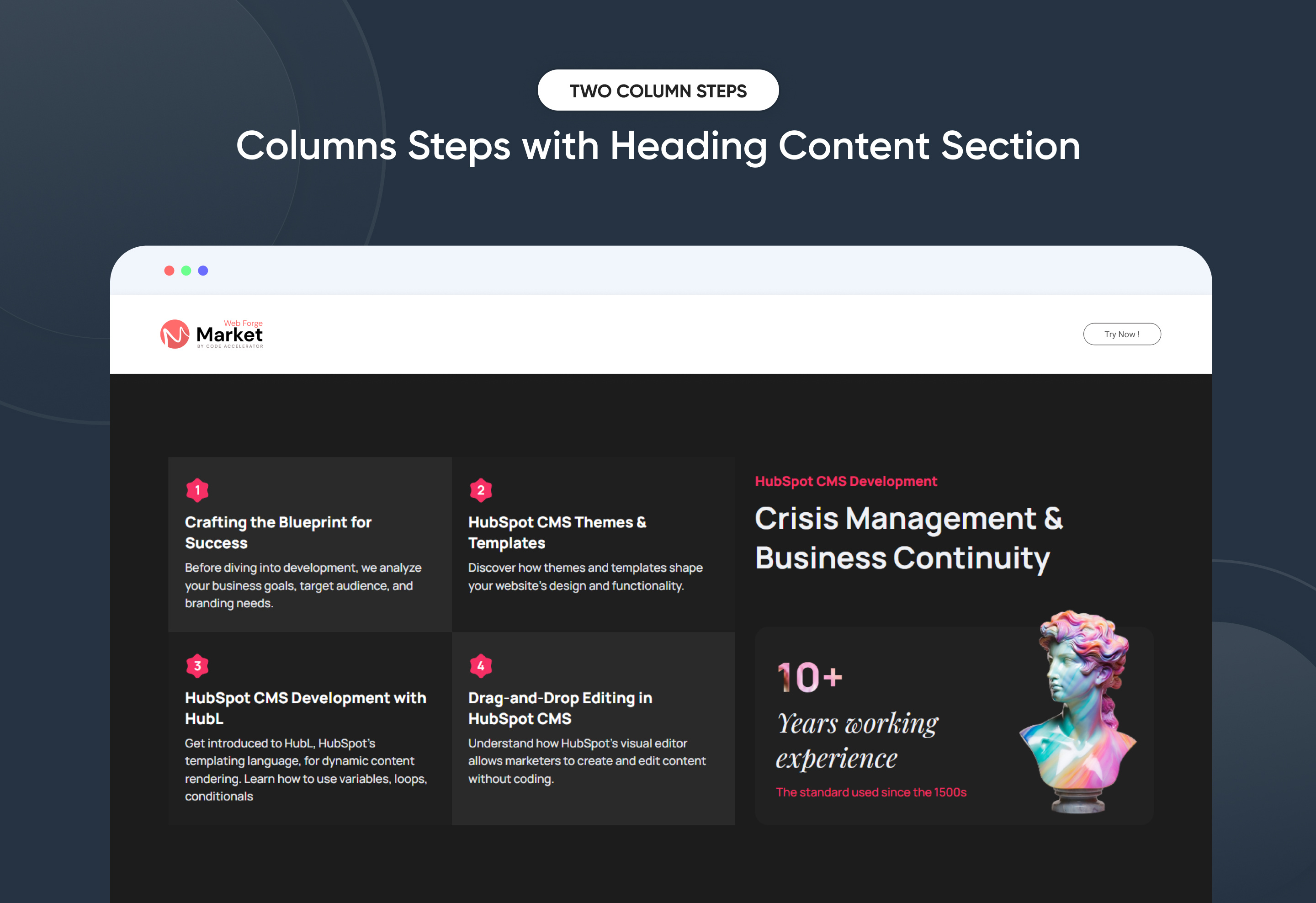
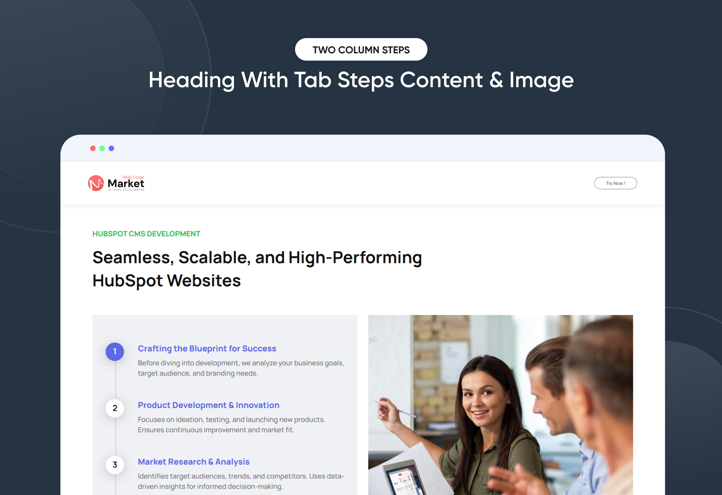
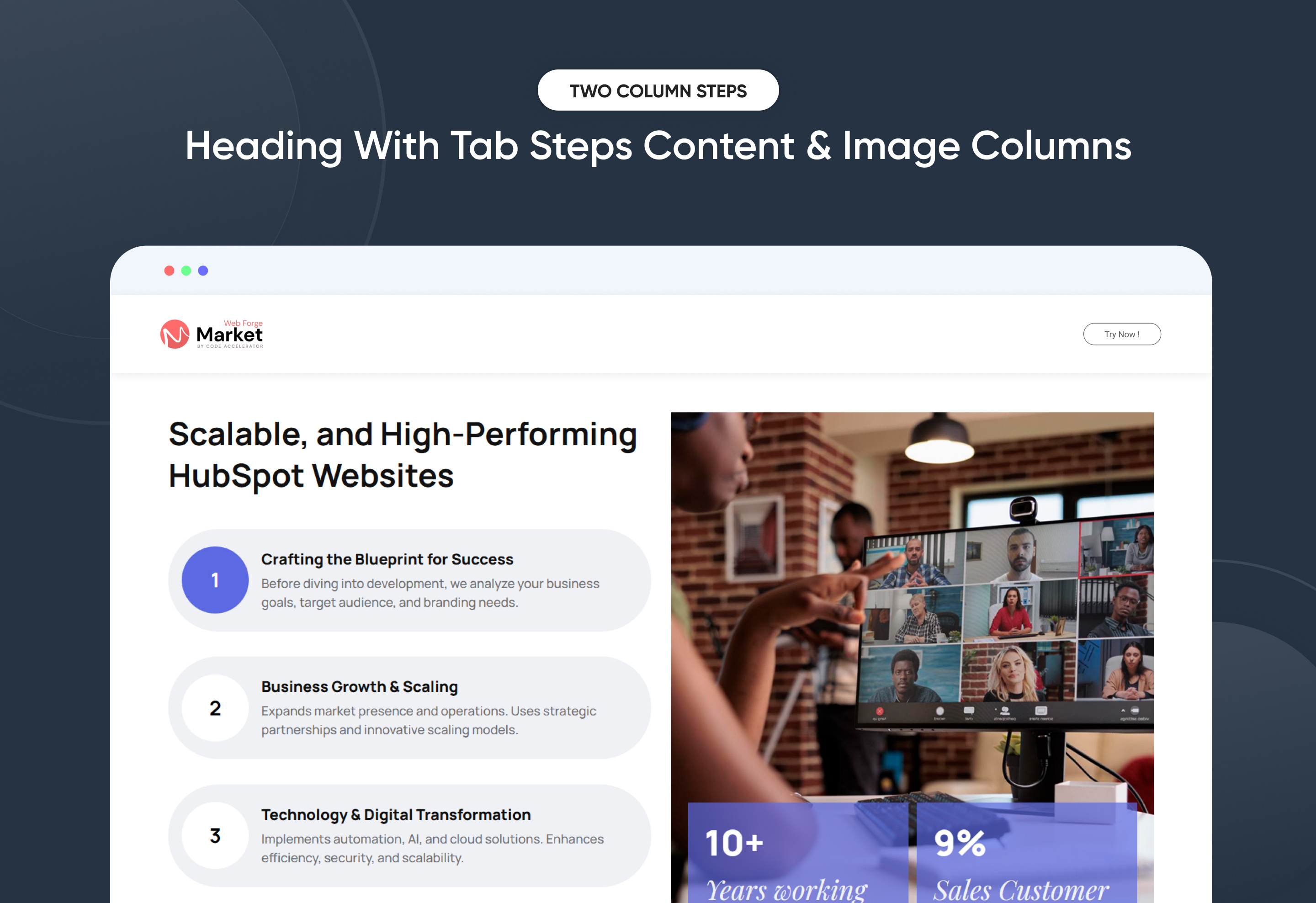
The Two Column Steps Module is designed to present step-by-step information in an organized, user-friendly format. This module is useful for tutorials, onboarding processes, instructional guides, or any content that requires sequential navigation.
Key Features of a Two Column Steps Module :
1️⃣ Step Numbering
-
Each step is distinctly numbered to ensure clarity and easy tracking.
-
The numbering helps users follow the process in a structured way.
2️⃣ Two-Column Layout
-
The left column typically contains the step number and title.
-
The right column provides images with more details.
-
This layout enhances readability and maintains a clean, structured design.
3️⃣ Step with Tab Functionality
-
Each step can include a tab-based navigation system.
-
Tabs can be used to segment additional information without overwhelming the user.
4️⃣ Responsive & Adaptive Design
-
Adjusts seamlessly for different screen sizes, ensuring a smooth experience on desktop and mobile.
-
On smaller screens, the two-column layout may stack vertically for better readability.
5️⃣ Customizable Design
-
Colors, fonts, and step layouts can be customized to match branding and UI design preferences.
-
Step no. or visuals can be added next to steps for improved understanding.
Discover More in the Knowledge Base
Explore detailed documentation, setup instructions, feature explanations, and best practices to help you get the most out of this module quickly and efficiently.
 $29
$29
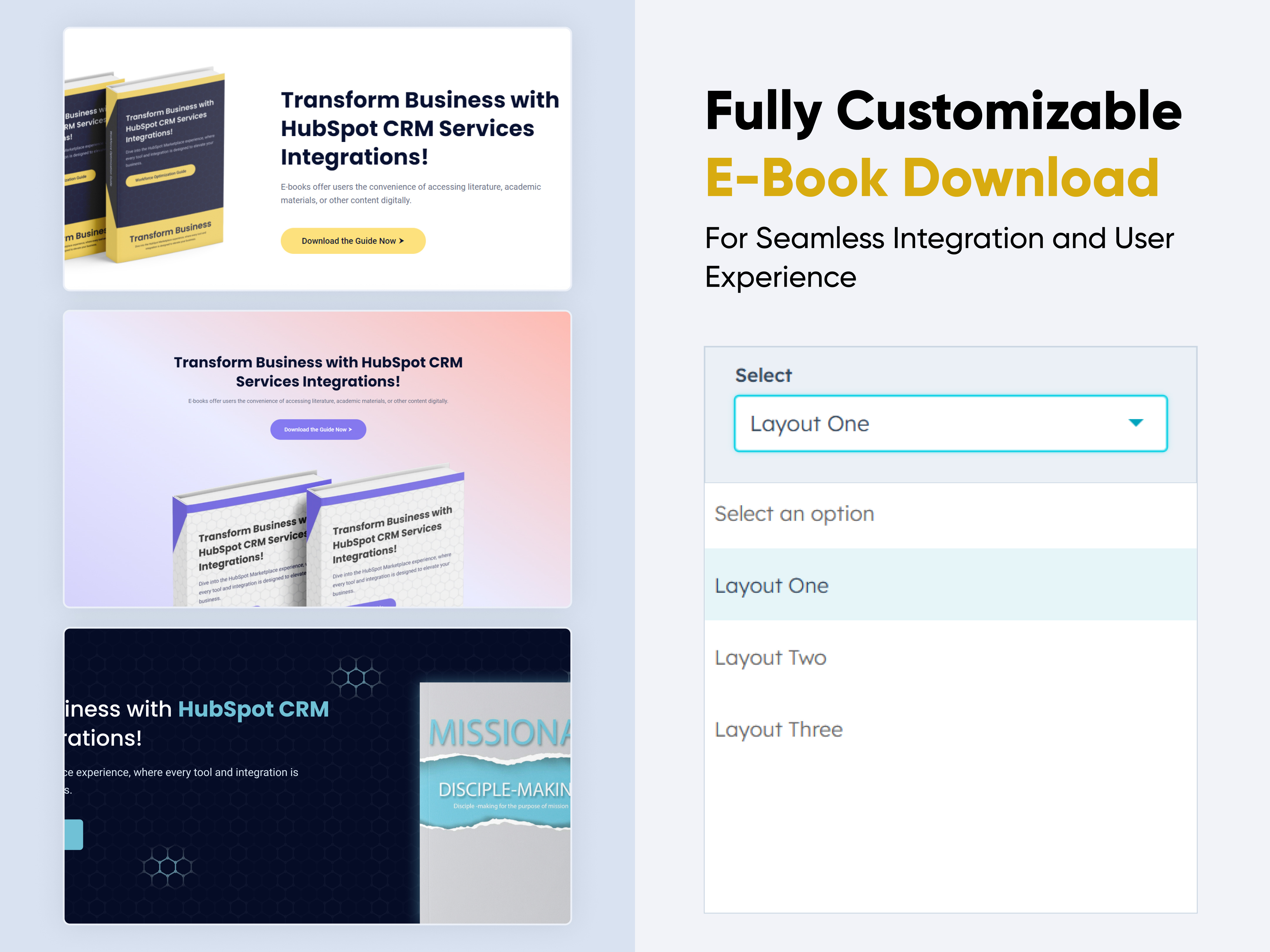
E-Book Download
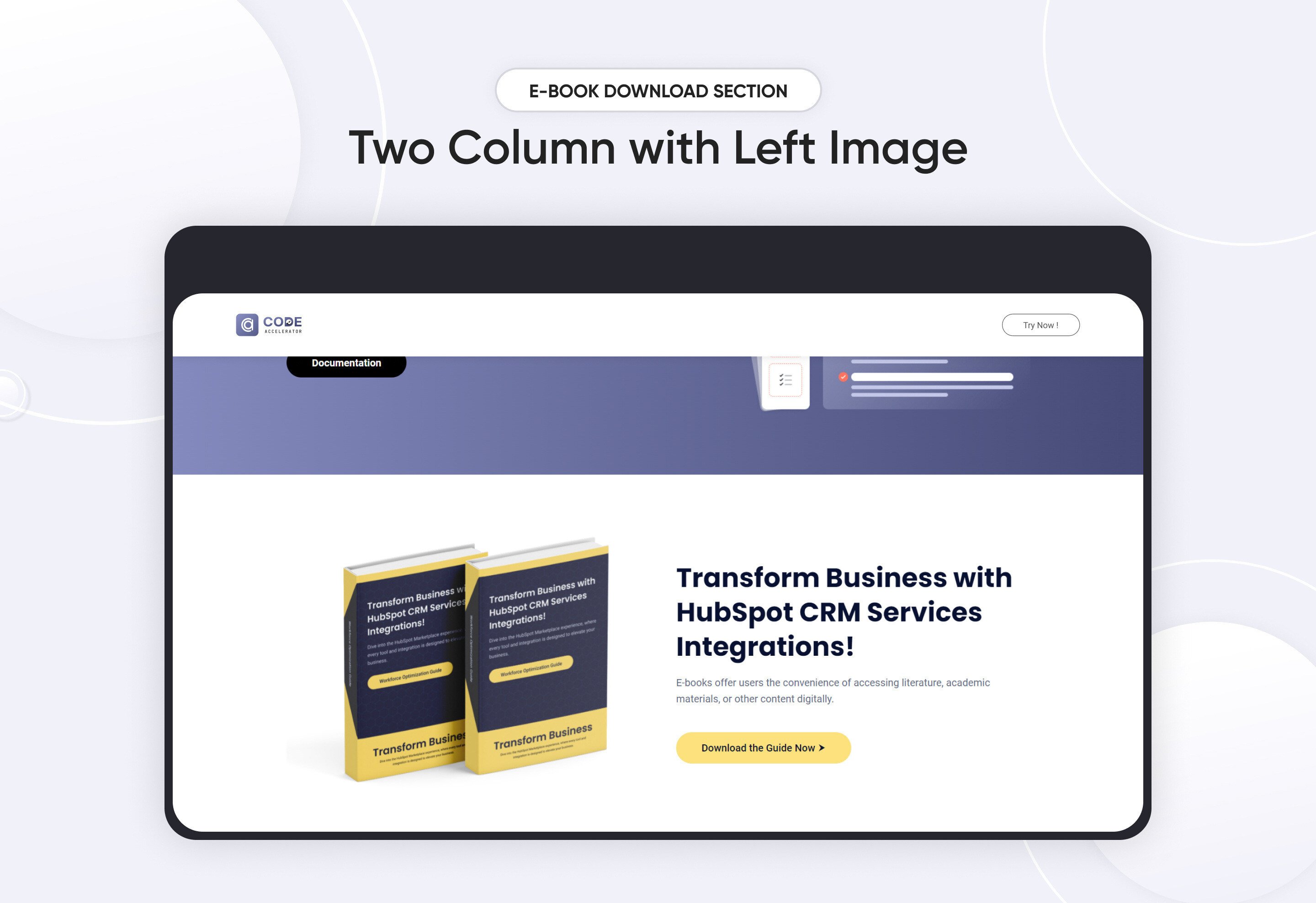
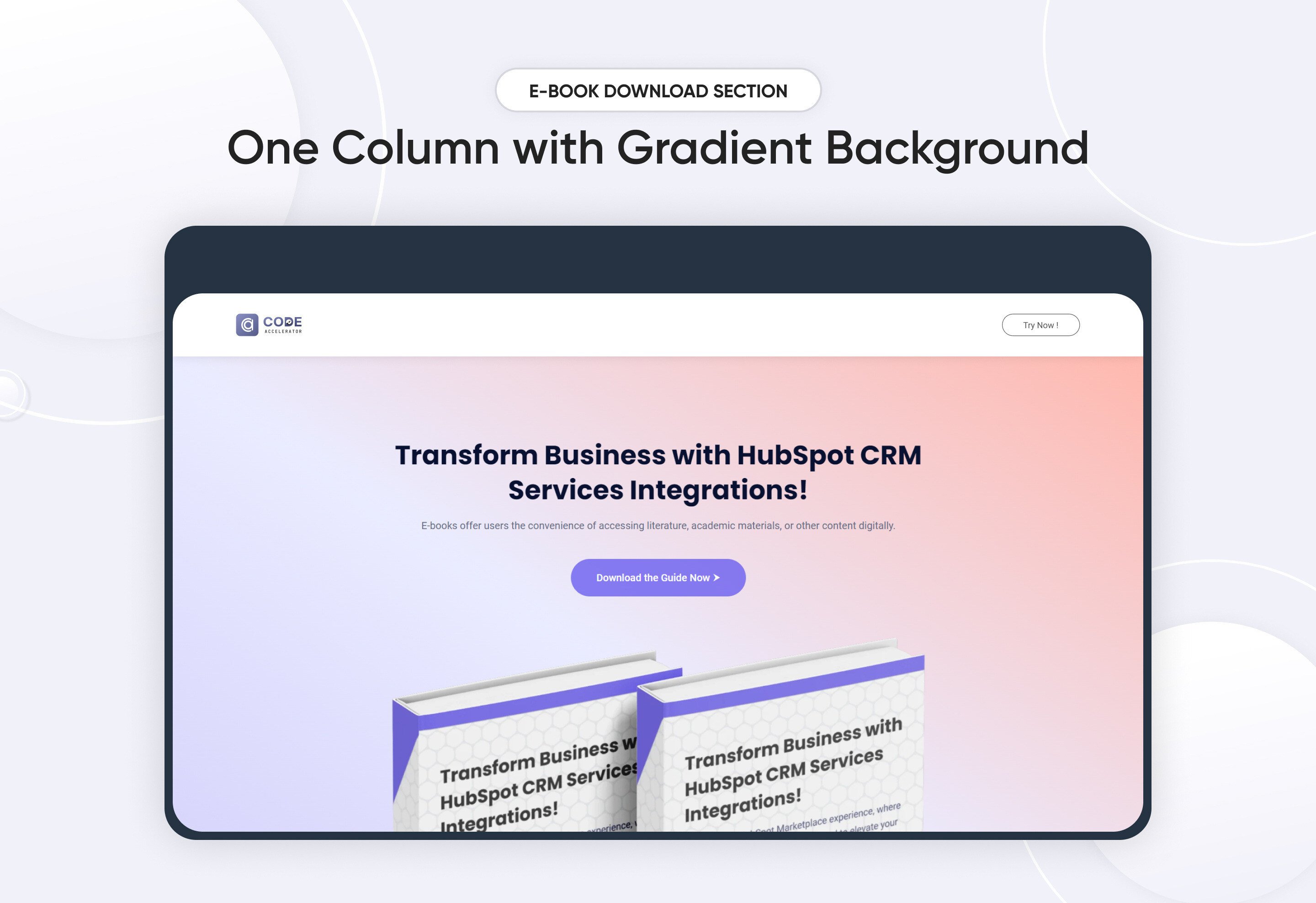
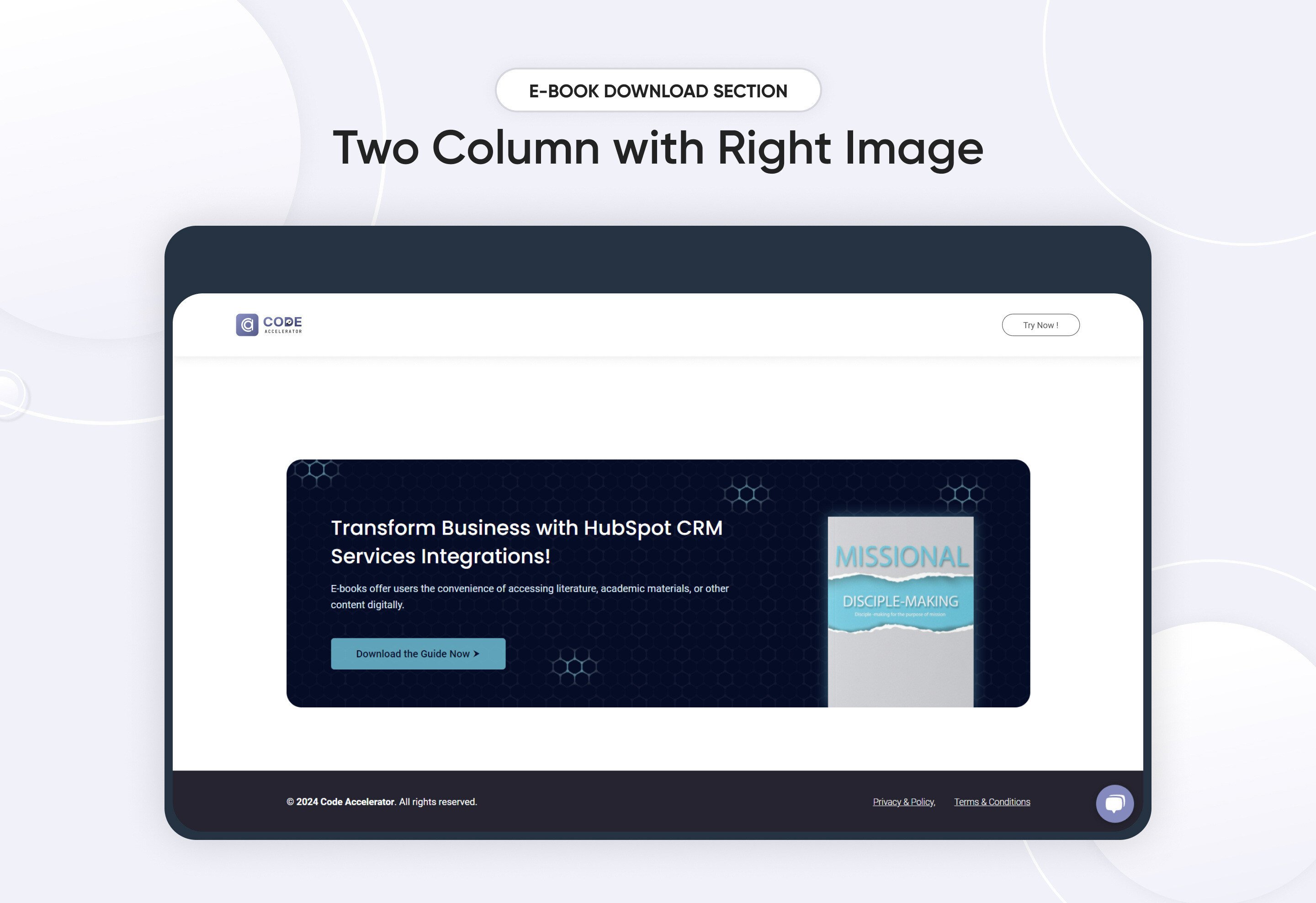
The Ebook Module is a powerful tool designed to streamline the creation and distribution of digital publications. Here’s a comprehensive overview of its key features and benefits:
Key Features of the E-Book Download Module :
-
User-Friendly Interface:
-
Intuitive Design: Easily navigate through the module with a clean and straightforward layout.
-
Drag-and-Drop Functionality: Simplify the process of adding images, text.
-
-
Fully Responsive:
-
Mobile Optimization: Automatically adjusts content for optimal viewing on all devices, including desktops, tablets, and smartphones.
-
No Coding Required: Enjoy a seamless experience without the need for additional coding or styling adjustments.
-
-
Customization Options:
-
Styling Controls: Modify colors, typography, margins, paddings, box shadows, and borders directly from the styles tab to match your branding.
-
Template Variety: Choose from a selection of pre-designed templates or create your own unique layout.
-
-
Hyperlinks and Navigation:
Easily add links and bookmarks for a smooth reading experience.
Discover More in the Knowledge Base
Explore detailed documentation, setup instructions, feature explanations, and best practices to help you get the most out of this module quickly and efficiently.
 $39
$39
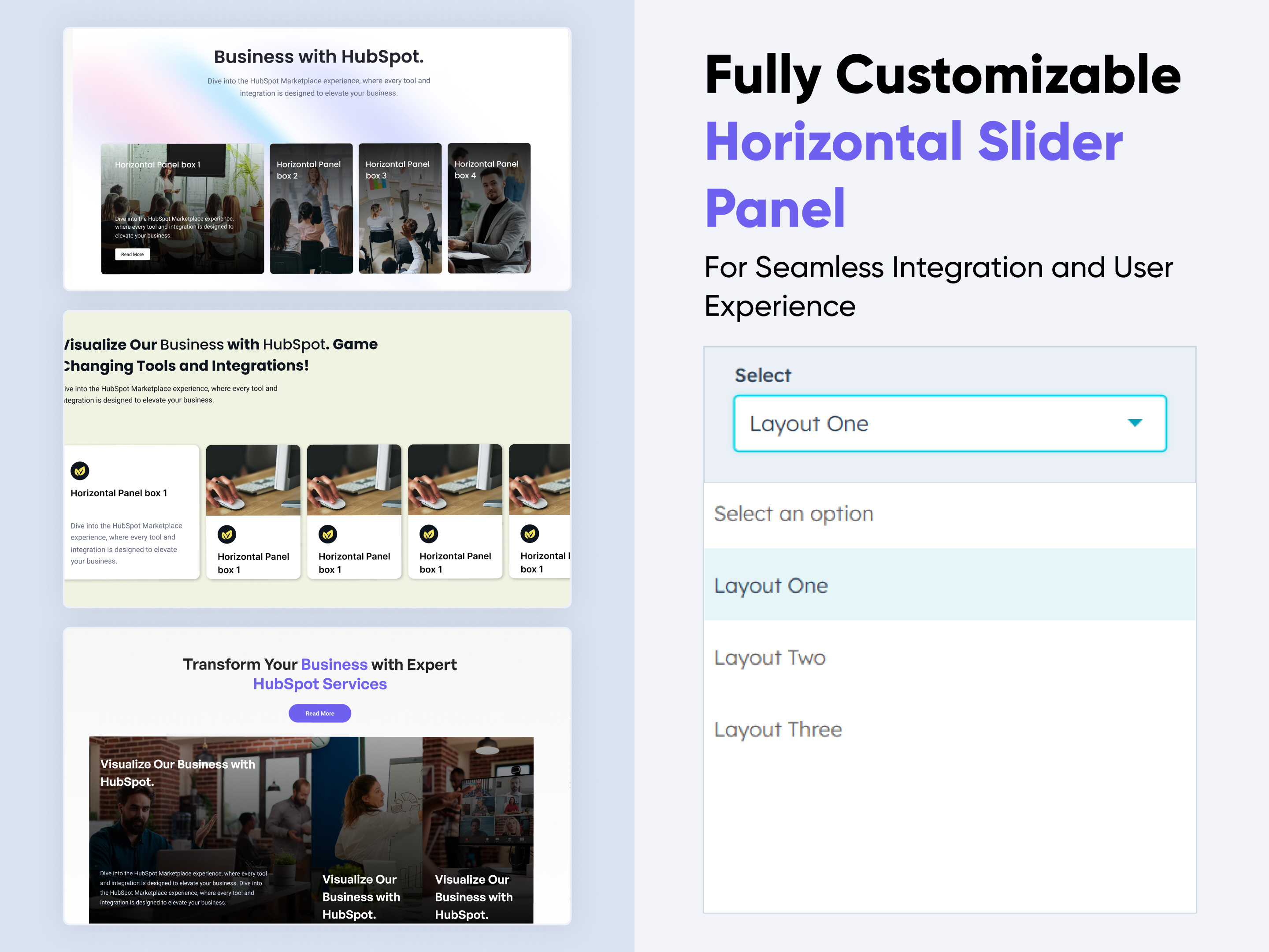
Horizontal Slides Panel
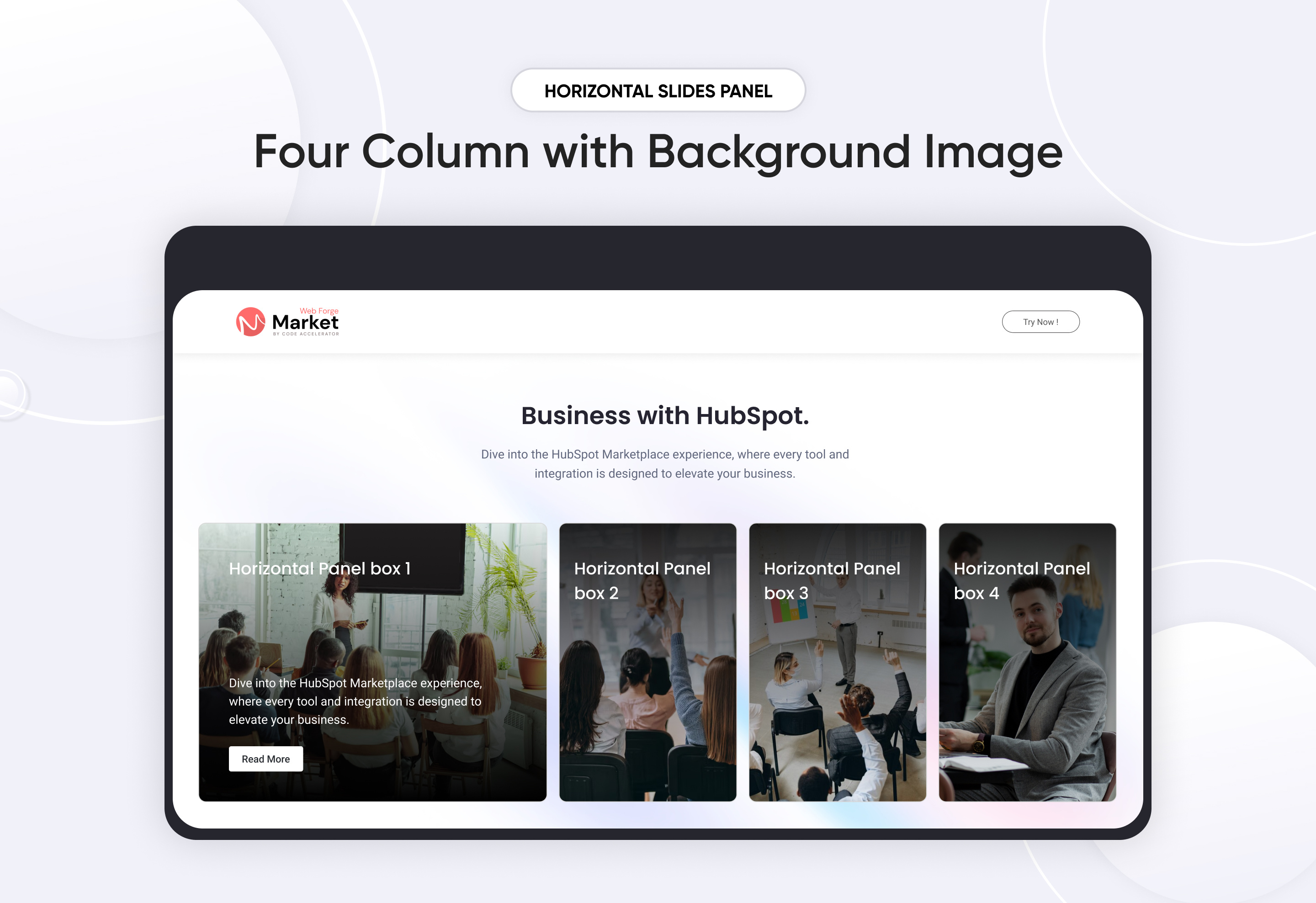
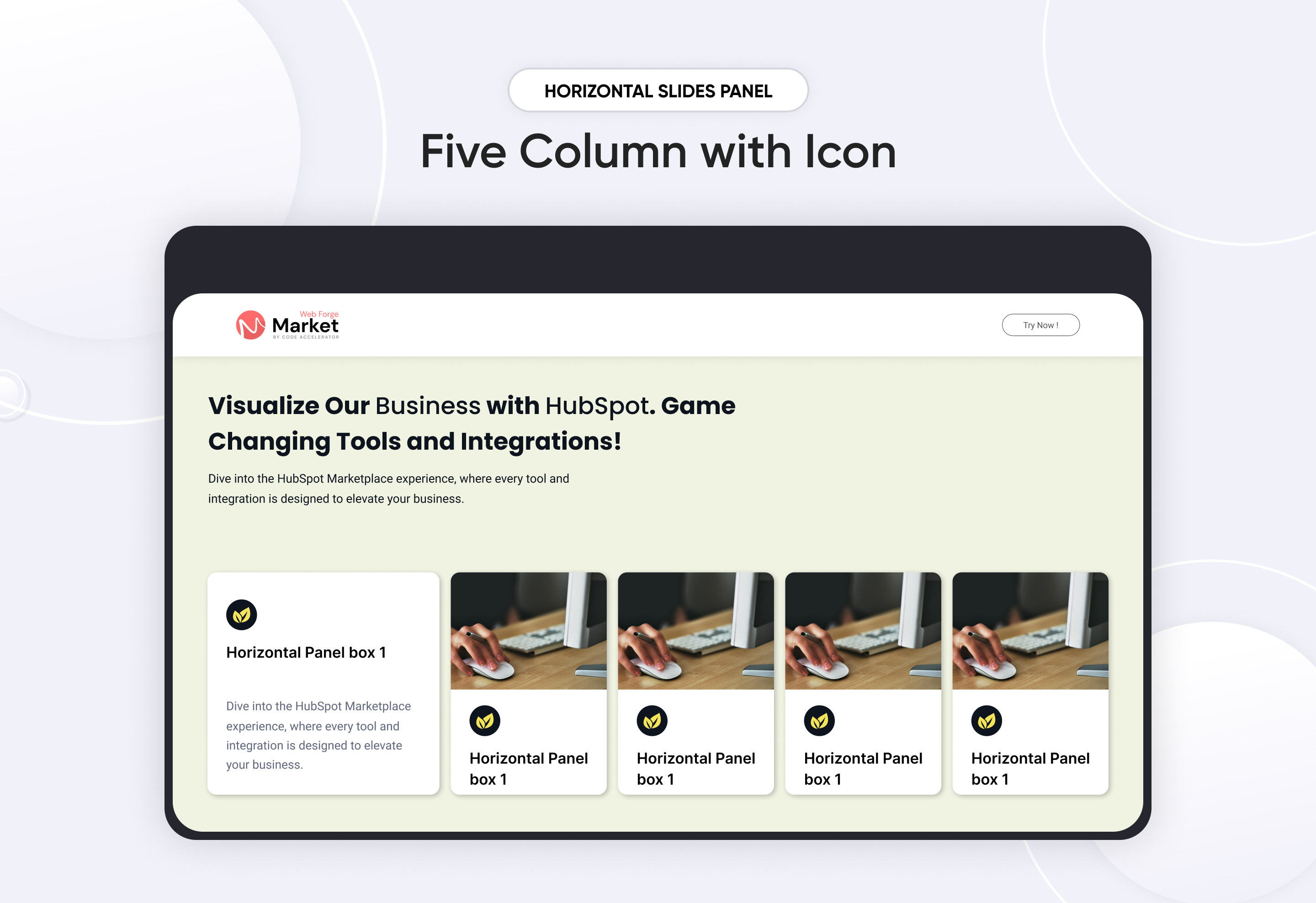
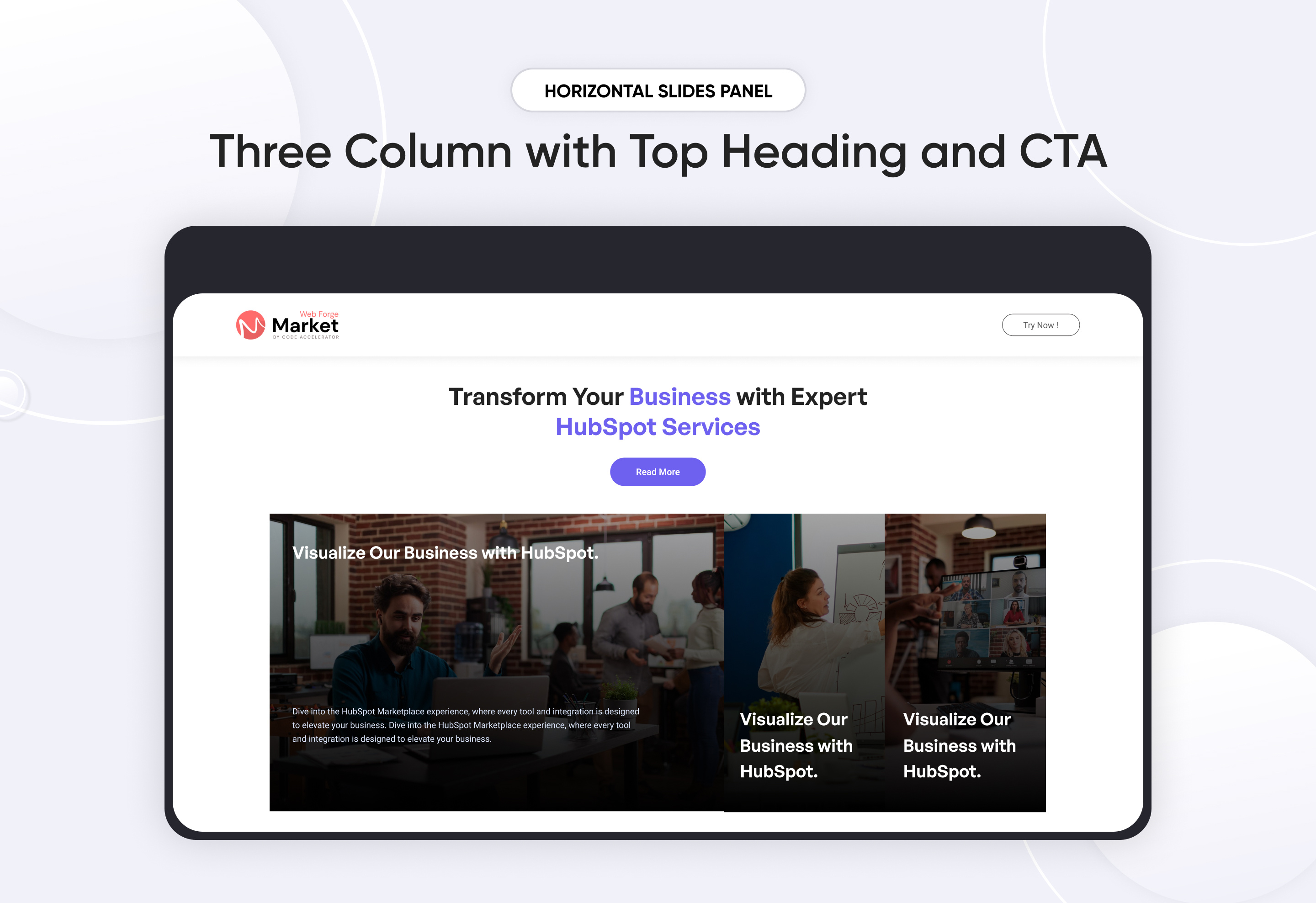
A Horizontal Slides Panel is a UI component that enables smooth left-to-right sliding of content, commonly used for displaying images, cards, or information in a structured and interactive way.
Key Features of a Horizontal Slides Panel Module :
✅ Smooth Horizontal Scrolling
✅ Click Sliding
✅ Multiple Layouts
✅ Responsive & Adaptive Design – Adjusts based on screen size and touch gestures.
✅ Text & Images – Supports various content types within slides.
Discover More in the Knowledge Base
Explore detailed documentation, setup instructions, feature explanations, and best practices to help you get the most out of this module quickly and efficiently.
 $19
$19
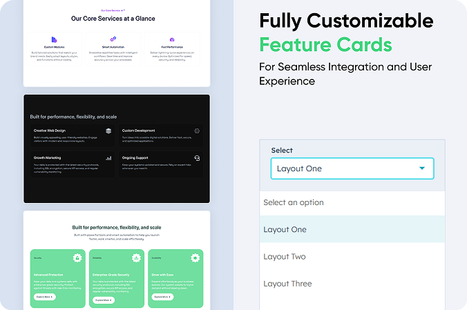
Feature Cards
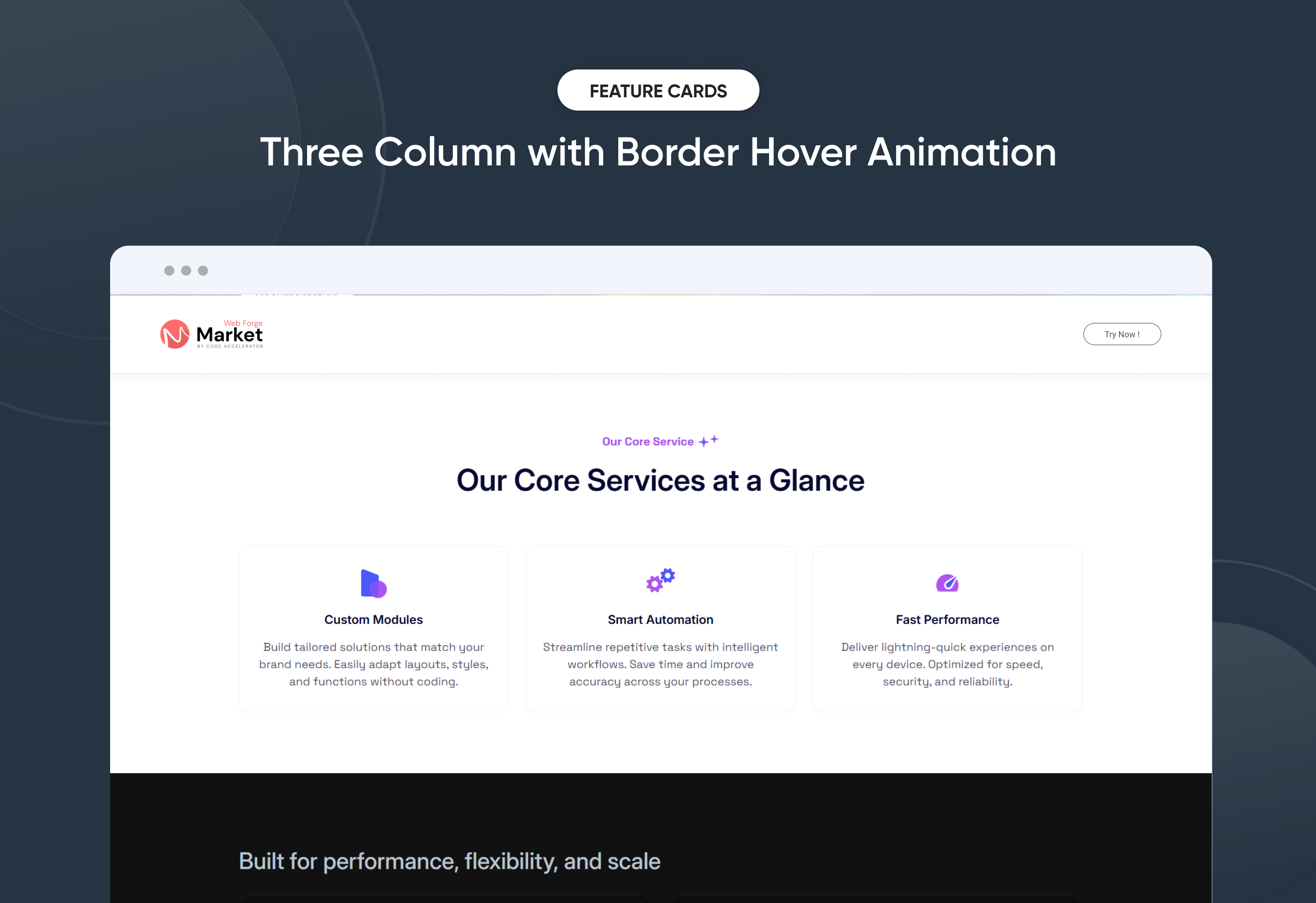
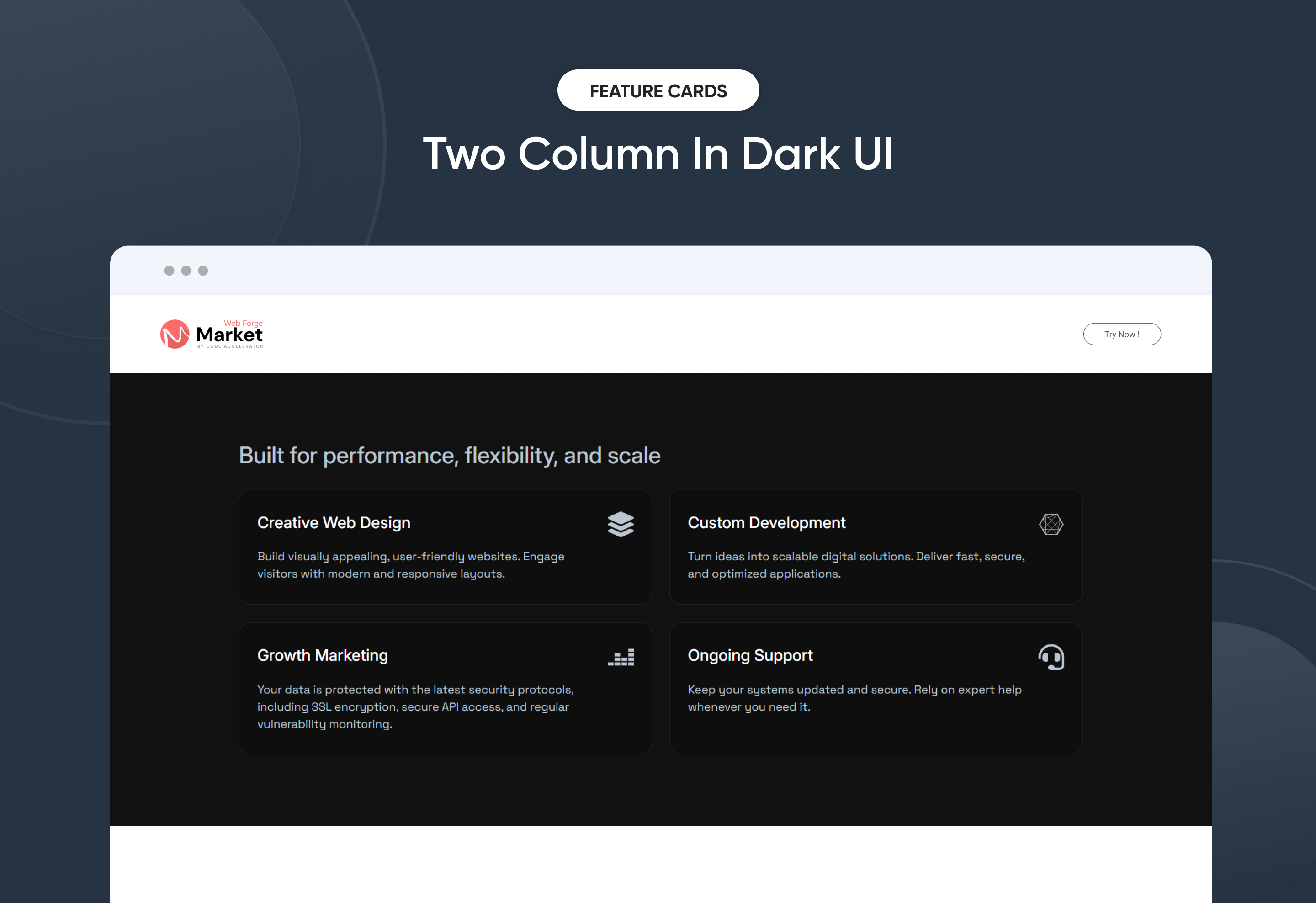
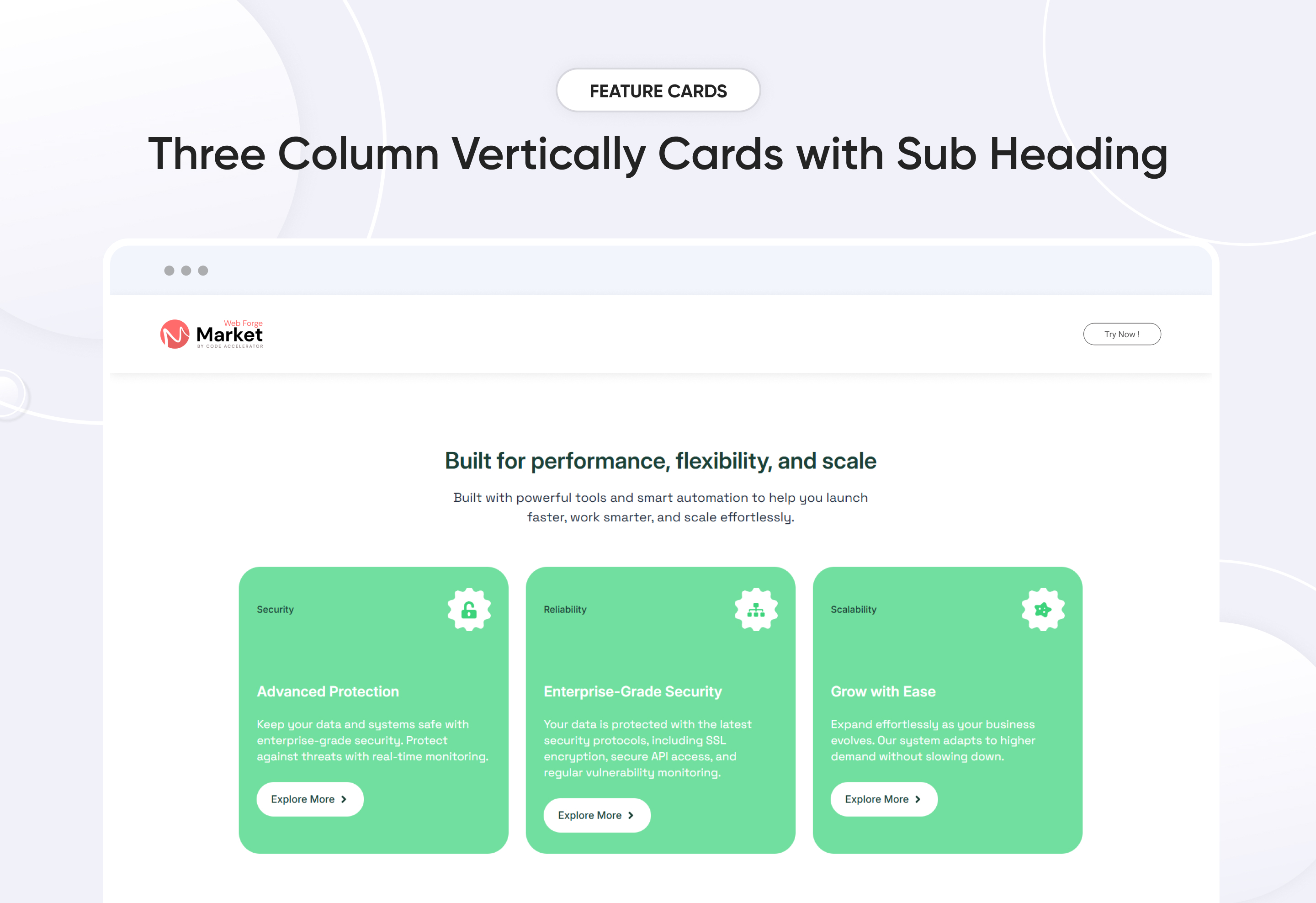
Quickly create a personalized ‘Feature Cards’ section to showcase your product or service highlights with impact. This flexible module lets you customize layouts, colors, and styles to align with your brand. No coding required—just easy, intuitive controls. Ideal for presenting features in a clear, engaging, and professional way on any HubSpot page.
Key Features of a Feature Cards Module :
✅ 3 Unique Layout Options – Choose from three beautifully crafted slider layouts to match any design style.
✅ Fully Mobile Responsive – Seamlessly adapts to all screen sizes for the best viewing experience.
✅ Modern & Clean Design – Sleek, contemporary styling fits perfectly into any modern website.
✅ Easy to Edit – Quickly customize content, styles, and settings without hassle.
✅ Hover & Animation Effects – Engage users with smooth hover states, transitions, and subtle animations.
✅ Optimized for Performance – Lightweight and fast for smooth transitions and loading.
✅ Call to Action (CTA) – A friendly nudge like “Contact me” or “Book a Consultation” with a button.
Discover More in the Knowledge Base
Explore detailed documentation, setup instructions, feature explanations, and best practices to help you get the most out of this module quickly and efficiently.
.png) $29
$29
Motion Cards
.png)
.png)
.png)
Motion Cards is a dynamic module designed to showcase your content with smooth entrance animations and hover effects. Easily highlight services, features, or team members using stylish, responsive cards. Customize layout, icons, text, and animations for an engaging visual experience.
Key Features of a Motion Cards Module :
✅ Interactive Hover Effects – Enhance user engagement with smooth and dynamic hover animations.
✅ Customizable Layouts – Choose and adjust card layouts to suit your content and design needs.
✅ Responsive Design – Looks great and functions perfectly across all screen sizes.
✅ Content Customization – Easily edit titles, descriptions, icons, and images as per your needs.
✅ Styling Options – Personalize colors, fonts, spacing, and card shapes with ease.
✅ Call-to-Action (CTA) Integration – Add CTAs to drive user interaction and conversions.
✅ Performance Optimization – Lightweight design ensures fast loading and smooth performance.
✅ Motion Animation – Apply entrance and hover-based animations for a modern visual impact.
Discover More in the Knowledge Base
Explore detailed documentation, setup instructions, feature explanations, and best practices to help you get the most out of this module quickly and efficiently.
 $29
$29
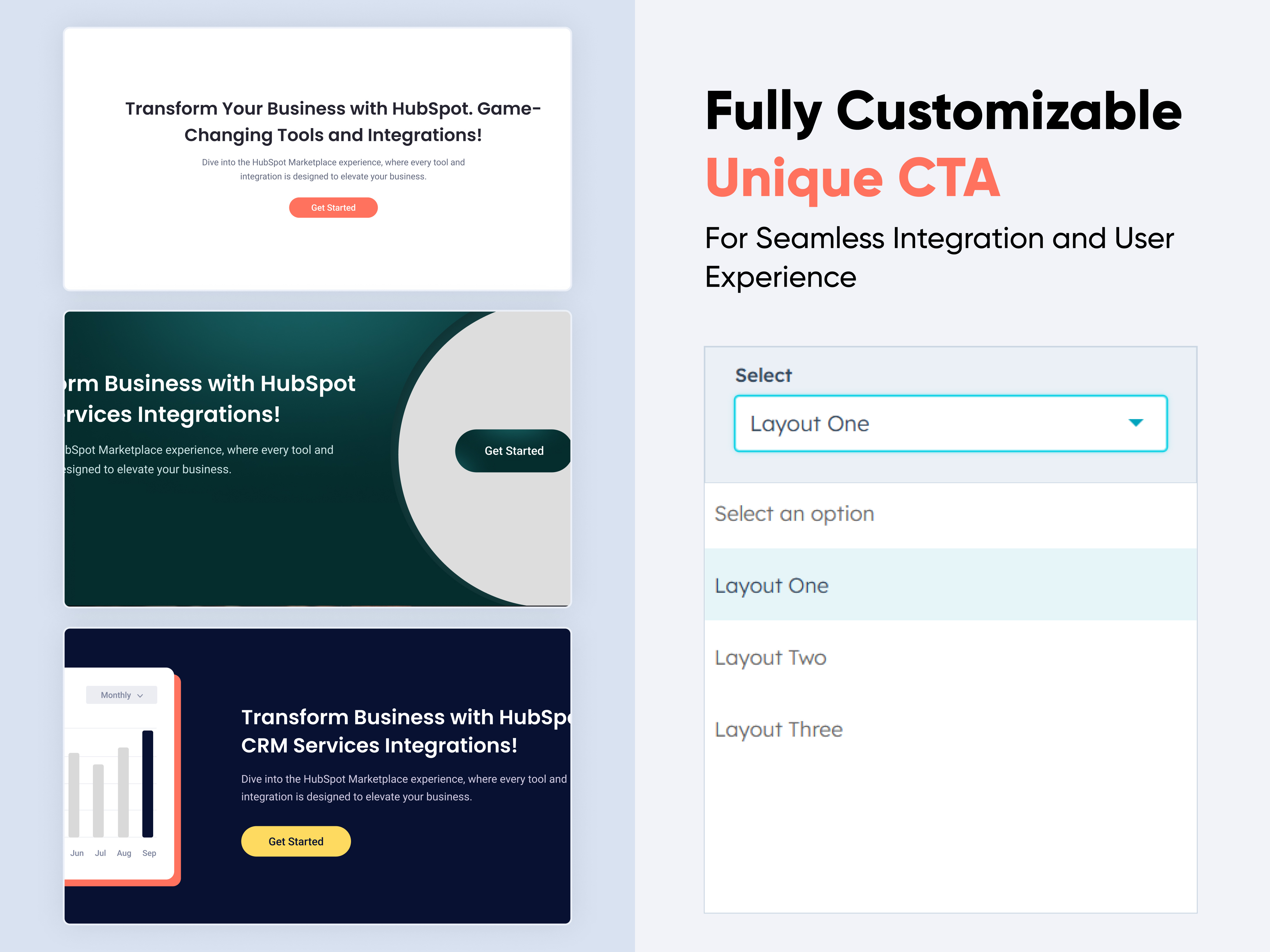
Unique CTA
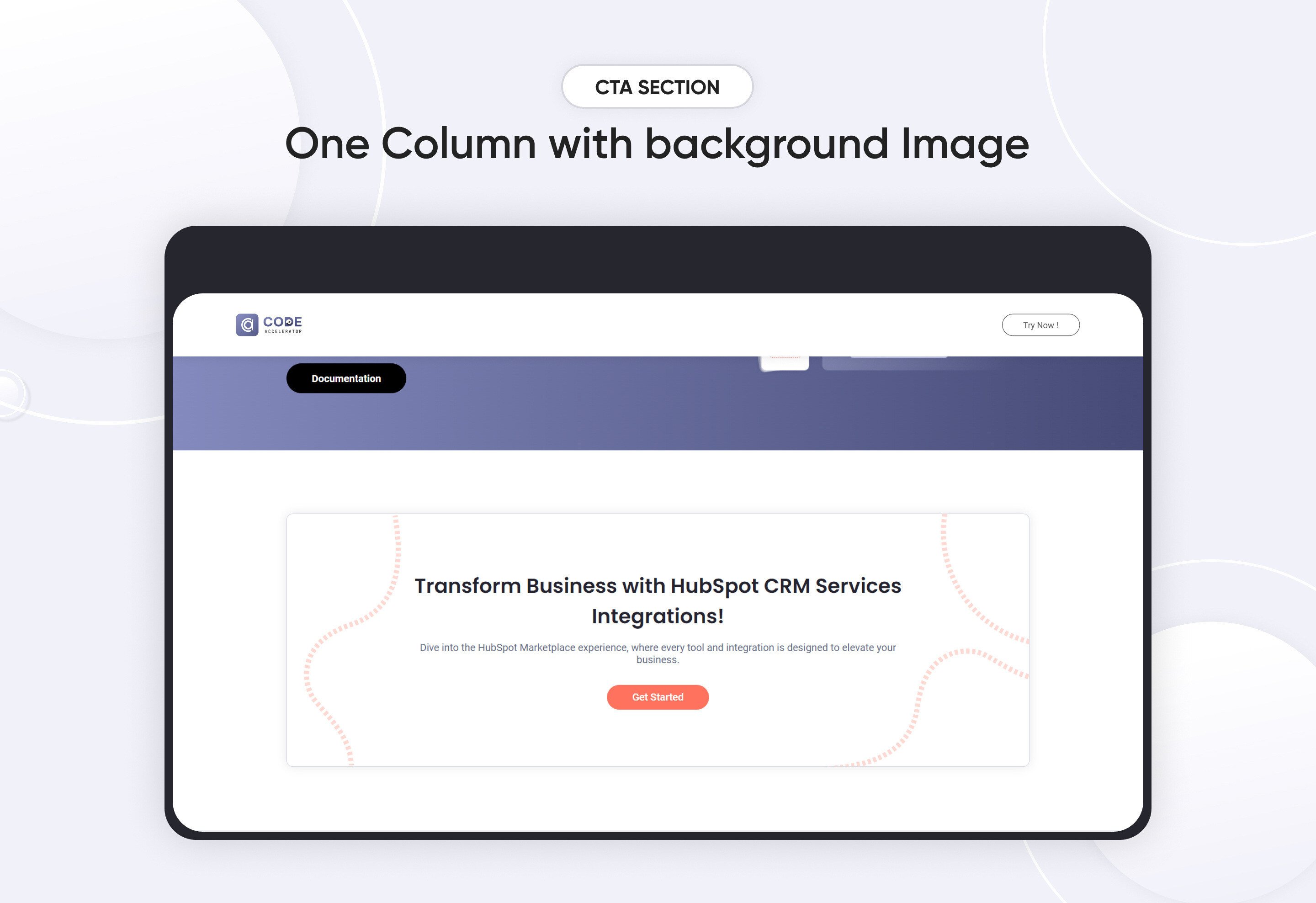
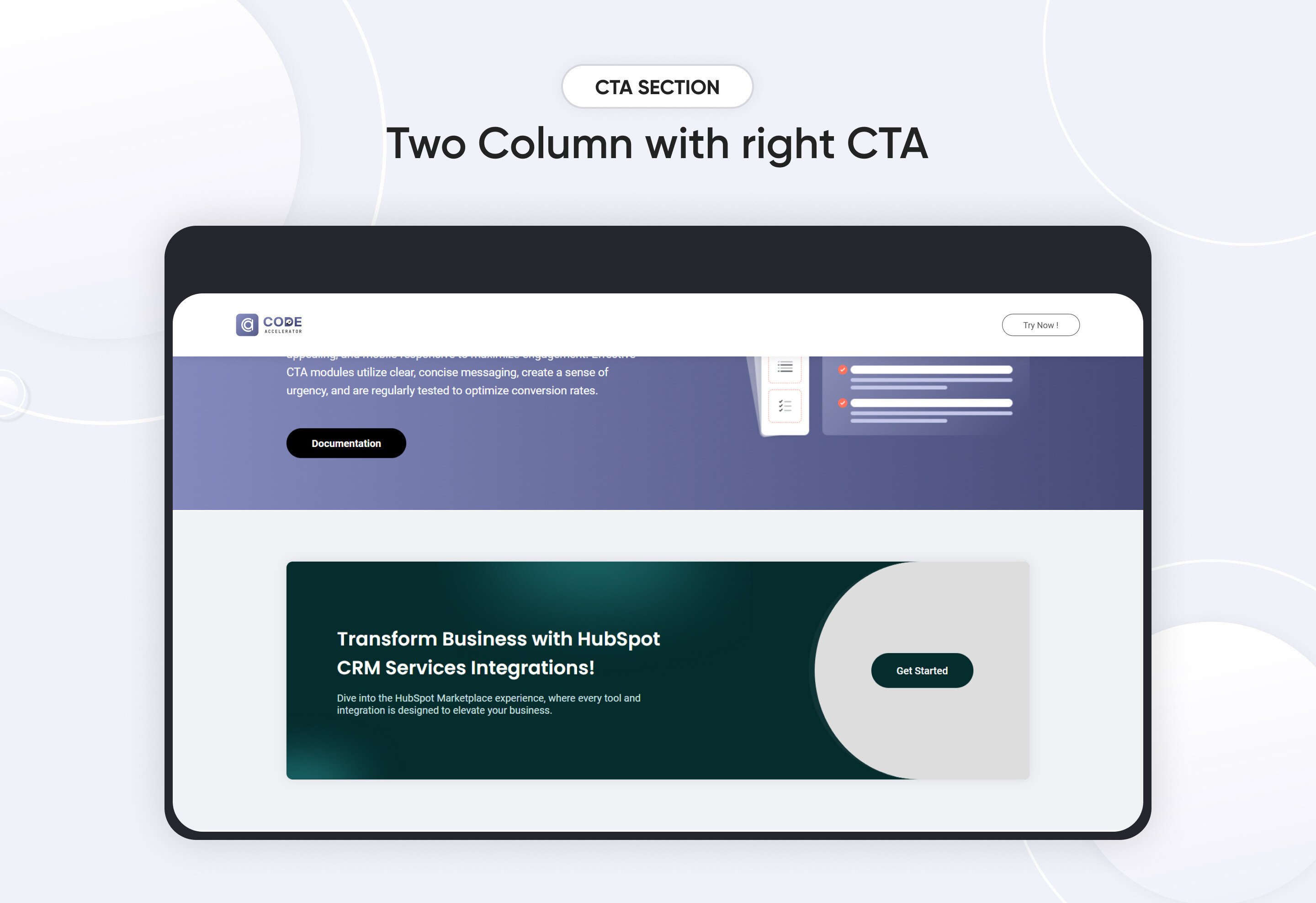
-3.jpeg)
A CTA (Call to Action) Module is a web component designed to encourage users to take a specific action, such as subscribing, downloading, or purchasing. This section typically includes a compelling headline, supporting text, and a prominent button. The design should be clean, visually appealing, and mobile-responsive to maximize engagement. Effective CTA modules utilize clear, concise messaging, create a sense of urgency, and are regularly tested to optimize conversion rates.
Features and Customization Options:
-
Compelling Headline: A strong, attention-grabbing headline that clearly conveys the value or purpose of the action.
-
Action-Oriented Button: A prominent button with clear, persuasive text (e.g., "Sign Up," "Get Started," "Learn More") that encourages immediate user action.
-
Supporting Text: Brief and concise text that explains the benefits or value proposition, providing additional context to support the CTA.
-
Responsive Design: A layout that adapts seamlessly to different screen sizes, ensuring a great user experience on desktops, tablets, and mobile devices.
-
Contrasting Colors: Strategic use of color to make the CTA button stand out and draw the user's eye to the desired action.
-
Minimalistic Design: Clean and clutter-free design to keep the user's focus on the primary action.
-
Clear Value Proposition: Clear messaging that quickly communicates what the user will gain by taking the action.
Discover More in the Knowledge Base
Explore detailed documentation, setup instructions, feature explanations, and best practices to help you get the most out of this module quickly and efficiently.
 $free
$free
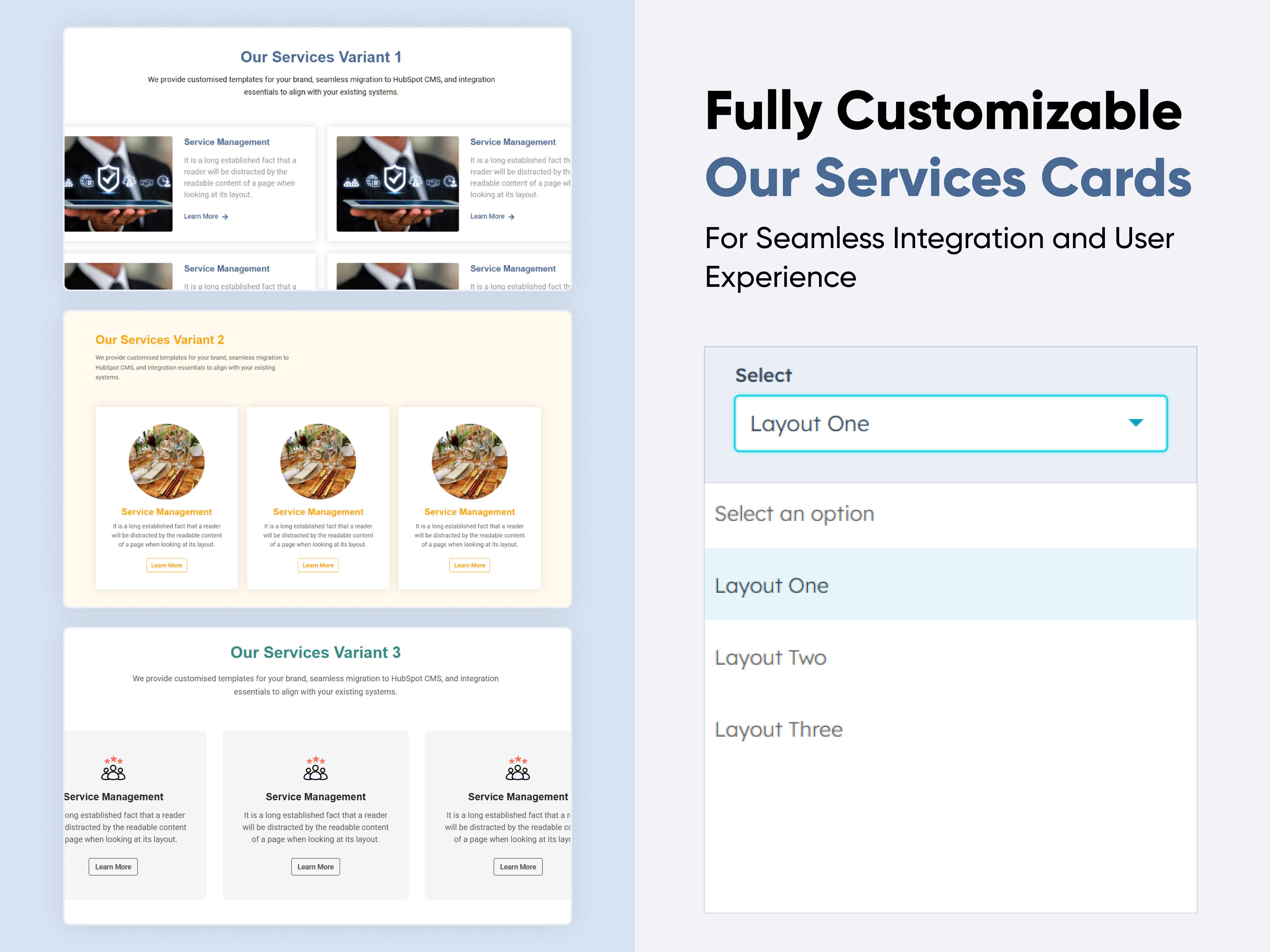
Our Services Cards
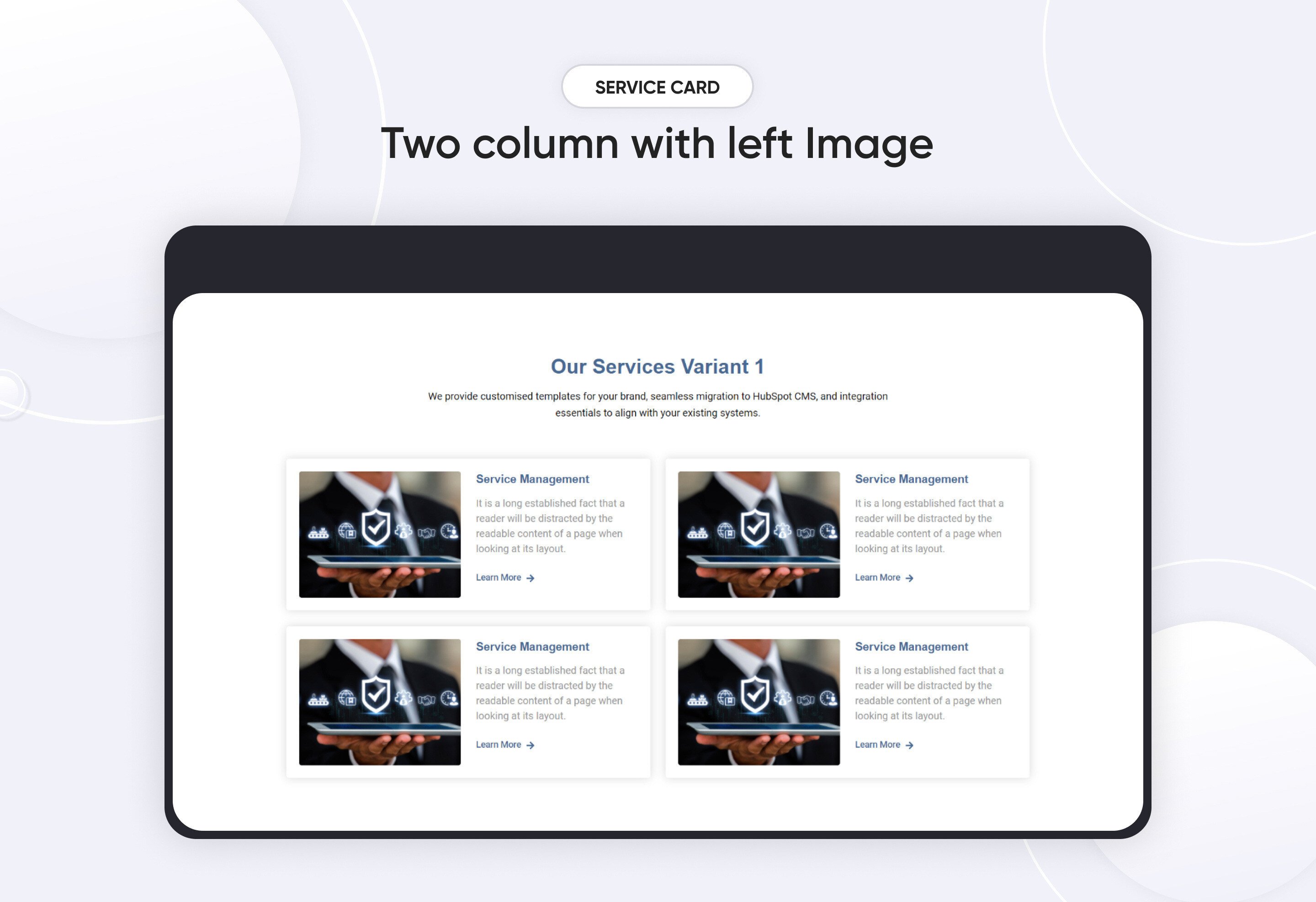
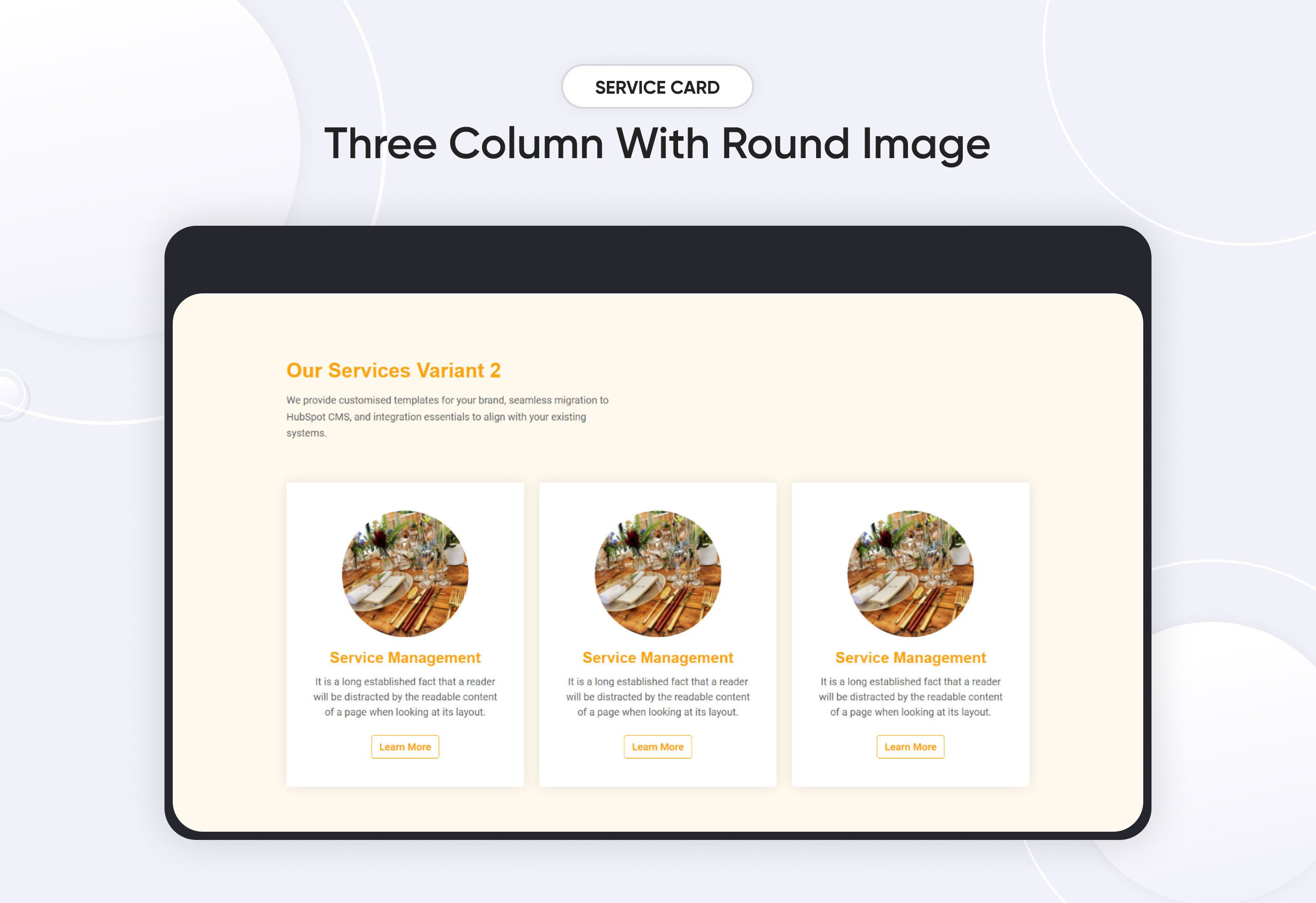
The Services Cards module is a versatile solution designed to showcase your services or offerings in a visually appealing and organized manner. This documentation provides a comprehensive guide to setting up, customizing, and managing the module, covering key features such as layout options, card customization, responsive design settings, and more.
Key Features :
-
Select and arrange card layouts (e.g., one, two, or three columns).
-
Customize card headings, descriptions, and icons.
-
Adjust margin, padding, and background colors for optimal presentation.
-
Ensure a responsive experience across all devices, including mobile, tablets, and desktops.
Discover More in the Knowledge Base
Explore detailed documentation, setup instructions, feature explanations, and best practices to help you get the most out of this module quickly and efficiently.
 $29
$29
Hero Banner Pro
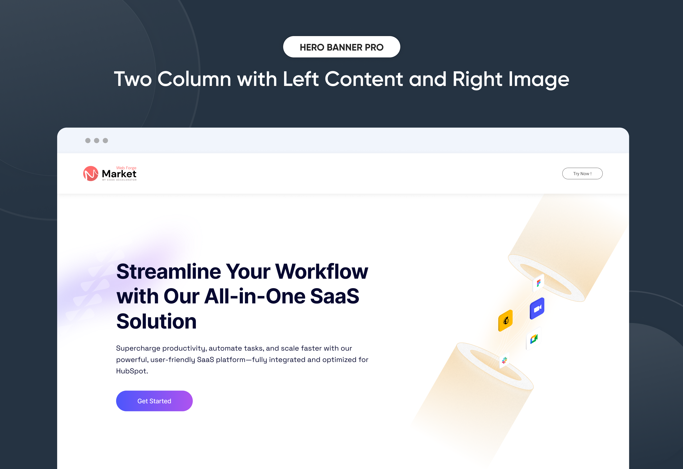
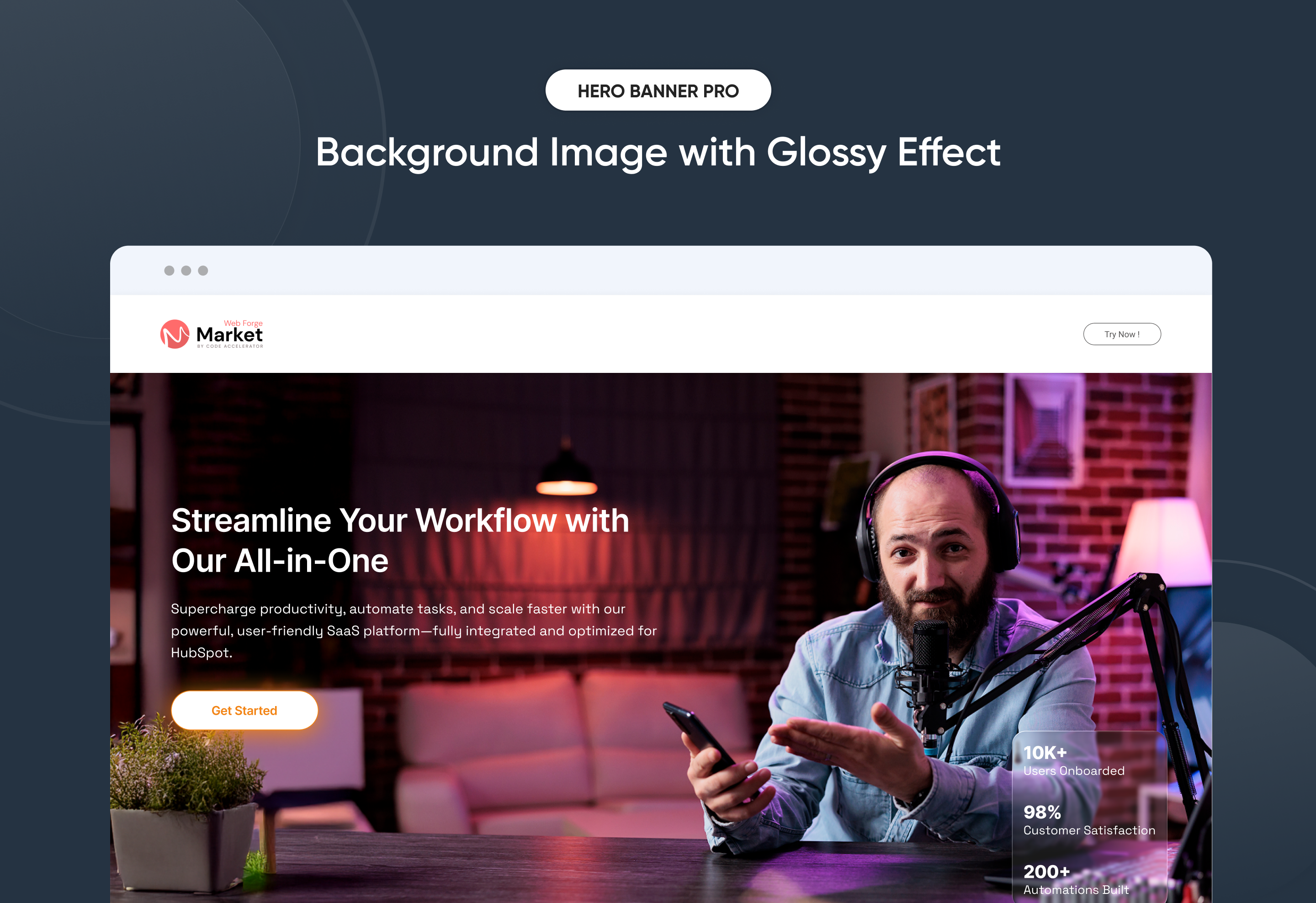
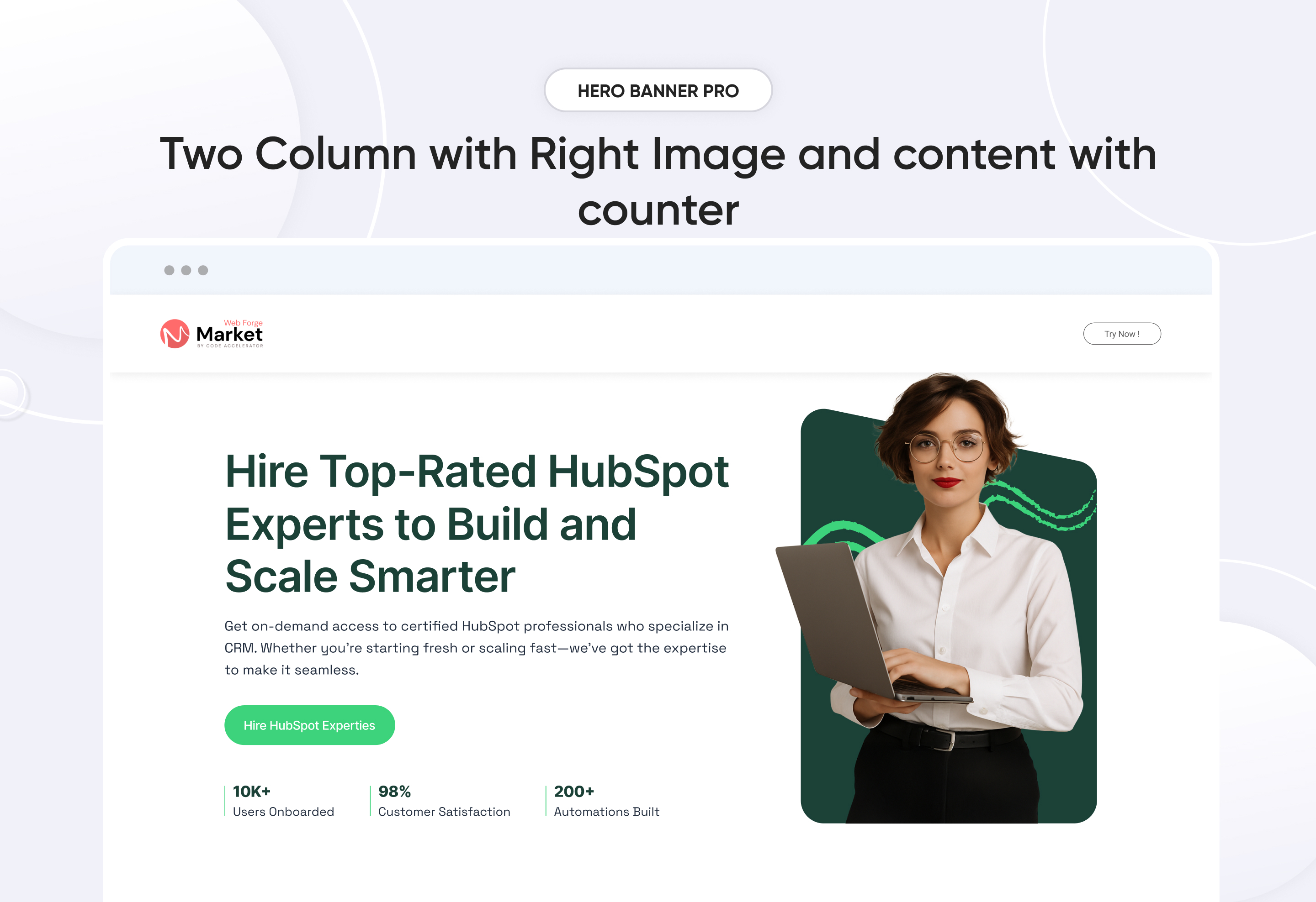
Make a stunning first impression with Hero Banner Pro, a flexible and modern hero section designed for high-converting landing pages and websites. This module lets you highlight your product, service, or brand message with engaging headlines, call-to-actions, visuals, and performance-driven counters.
With 3 ready-to-use layouts (Layout 1, Layout 2, and Layout 3), you can instantly switch designs to match your website’s style — no coding required. Built for responsiveness, customization, and ease of use, Hero Banner Pro ensures your hero section looks great on every device.
Key Features of a Hero Banner ProModule :
- 🎨 Multiple Layout Options – Choose from Layout 1, Layout 2, or Layout 3 with a simple setting.
- ✍️ Customizable Headline & Description– Add engaging titles, and supporting text.
- 🔘 Flexible CTA Button – Add call-to-action buttons with custom styles and links.
- 🔢 Counter/Stats Section – Showcase metrics like users, satisfaction rate, or integrations.
- 📱 Responsive Design – Optimized for desktop, tablet, and mobile.
- 🎨 Background Styles – Gradient, image or solid color options.
- 🔧 Typography & Color Controls – Easily adjust fonts, sizes, and colors.
- ⚡ Lightweight & Fast – Clean code ensures quick load times.
- 🙌 User-Friendly – Built for marketers and businesses with no coding required.
Discover More in the Knowledge Base
Explore detailed documentation, setup instructions, feature explanations, and best practices to help you get the most out of this module quickly and efficiently.
 $29
$29
Latest Insights Blog
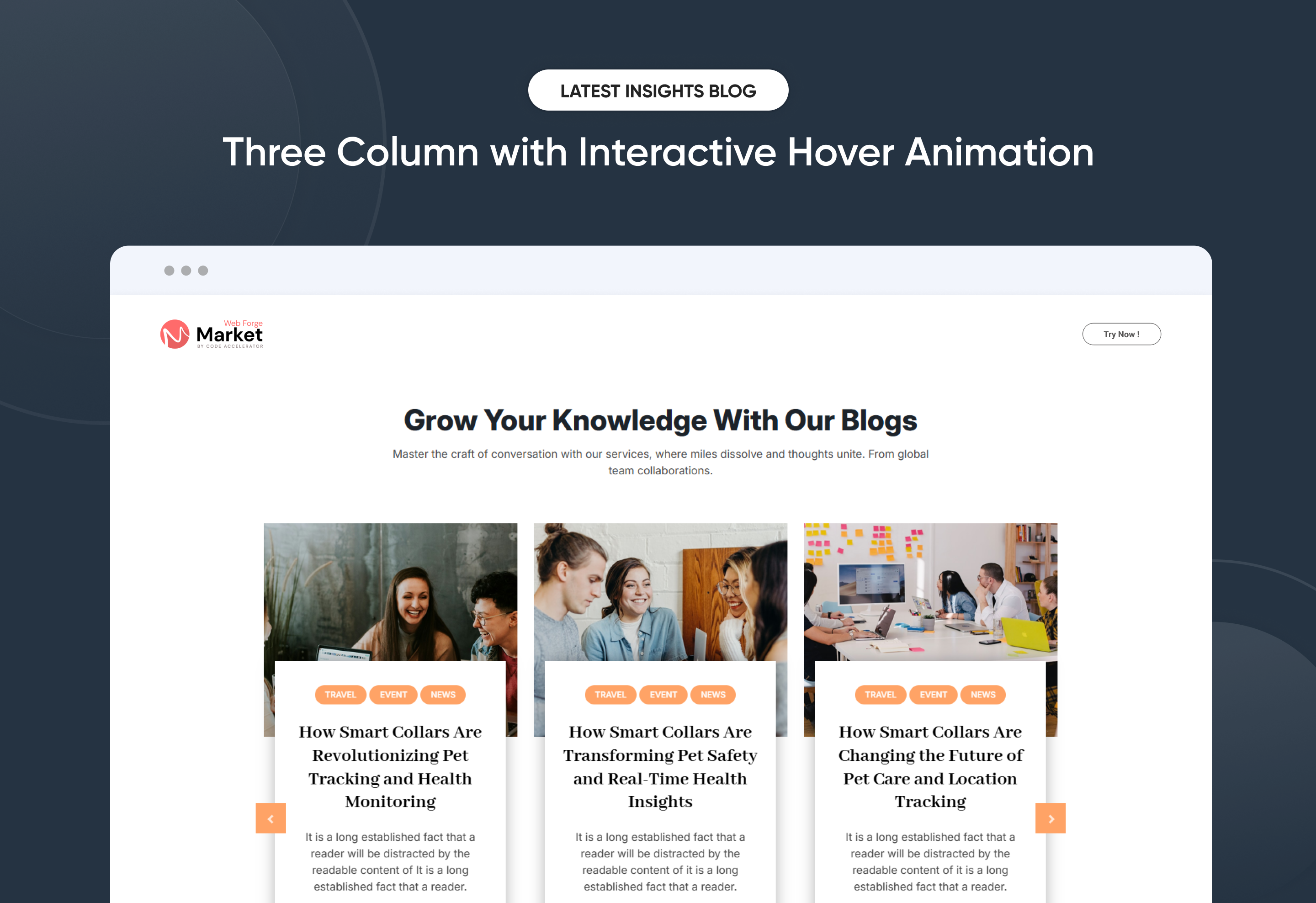
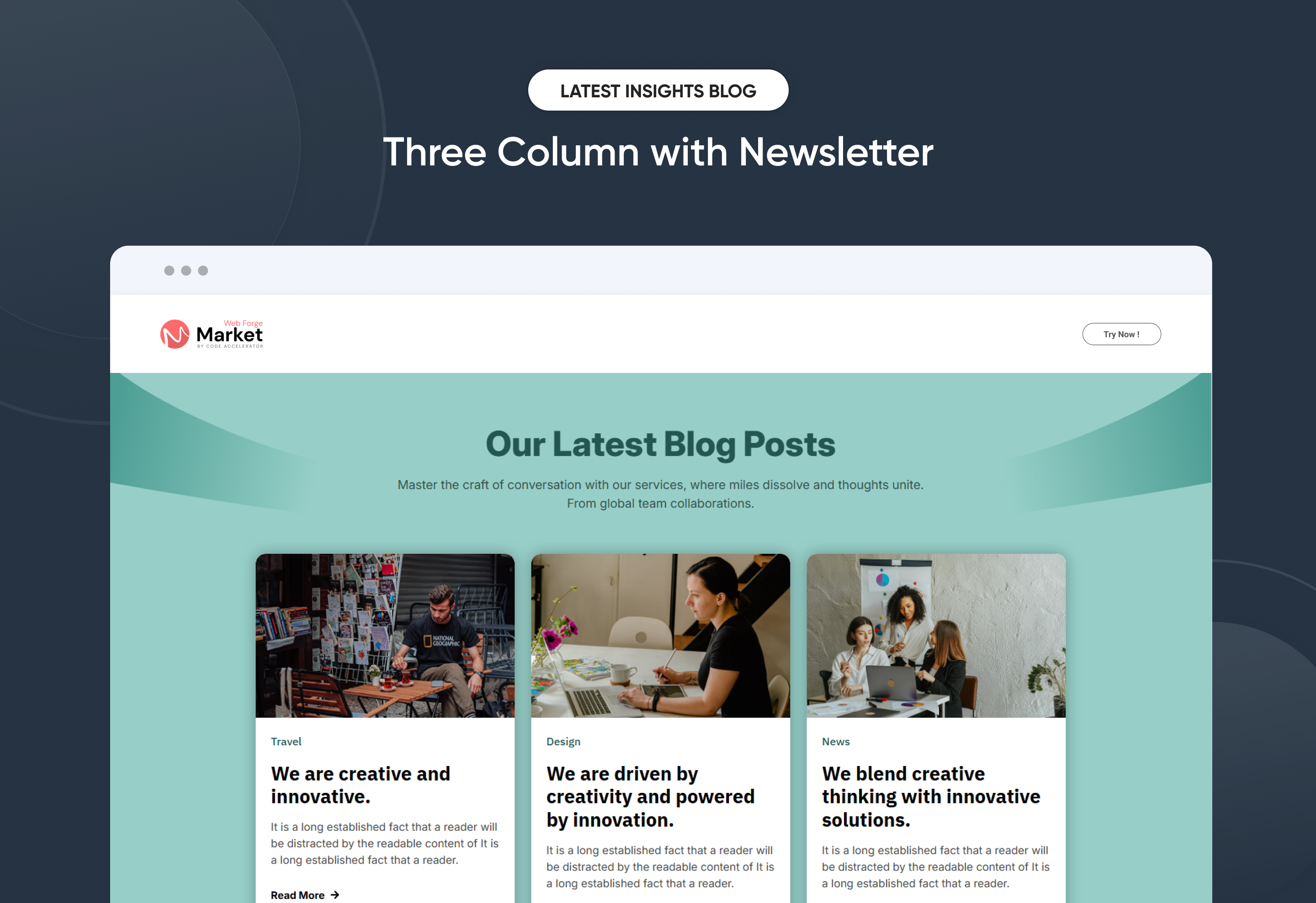
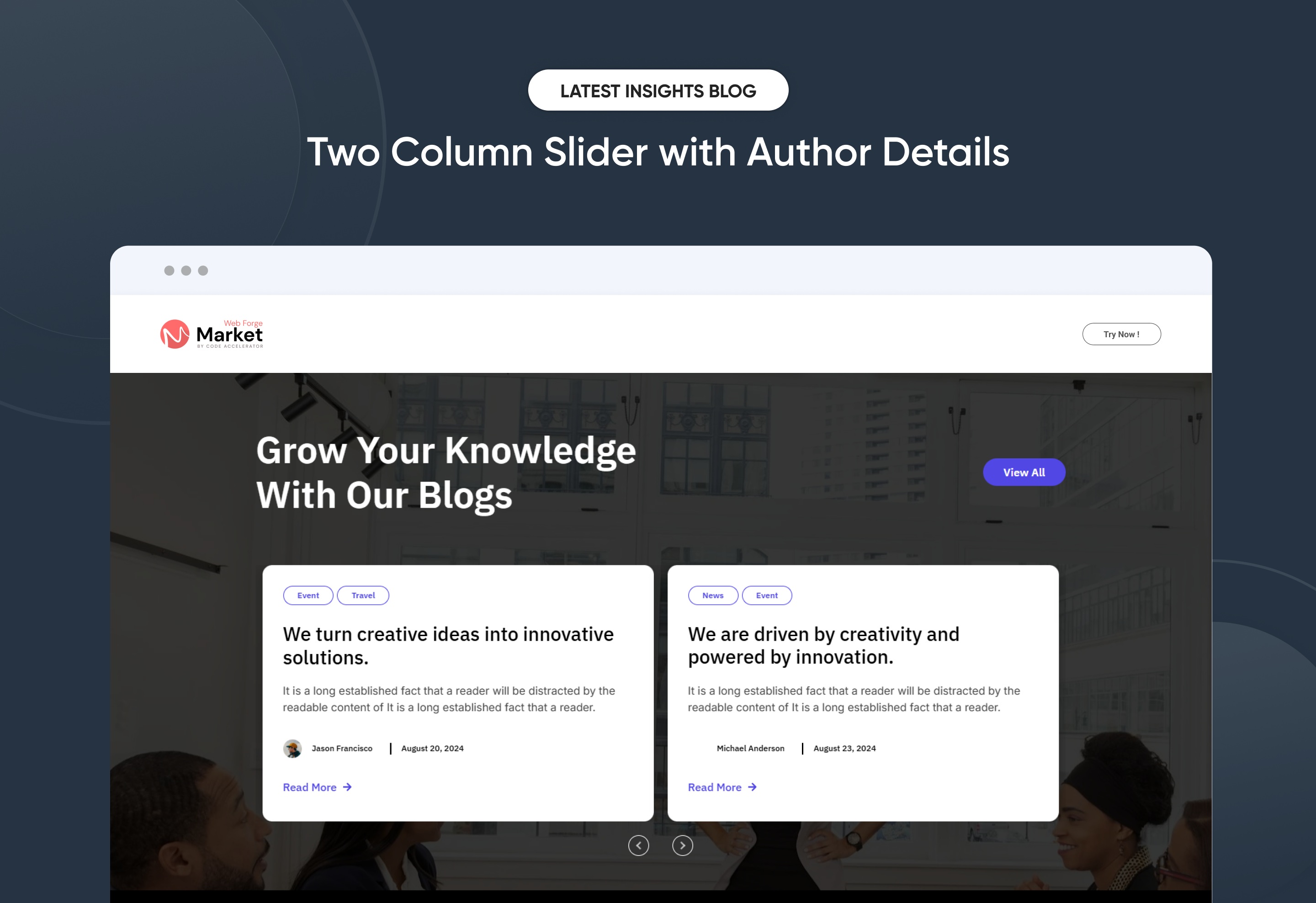
Effortlessly showcase your Latest Insights Blog with a clean, modern layout designed to increase engagement and content visibility. The Latest Insights Blog module automatically displays your most recent articles, giving you full control over layout, spacing, and display settings—no coding required. Easily customize blog titles, featured images, author details, publish dates, and call-to-action elements to align with your brand identity. Perfect for highlighting fresh insights, driving traffic to your blog, and keeping any HubSpot page consistently updated with valuable content.
Key Features of a Latest Insights Blog Module :
✅ Automatic Latest Post Fetching – Dynamically displays the most recent blog posts without manual updates.
✅ Fully Mobile Responsive – Seamlessly adapts to all screen sizes for the best viewing experience.
✅ Modern & Clean Design – Sleek, contemporary styling fits perfectly into any modern website.
✅ Easy to Edit – Quickly customize content, styles, and settings without hassle.
✅ Hover & Animation Effects – Engage users with smooth hover states, transitions, and subtle animations.
✅ Optimized for Performance – Lightweight and fast for smooth transitions and loading.
✅ Call to Action (CTA) – A friendly nudge like “Contact me” or “Book a Consultation” with a button.
Discover More in the Knowledge Base
Explore detailed documentation, setup instructions, feature explanations, and best practices to help you get the most out of this module quickly and efficiently.
 $29
$29
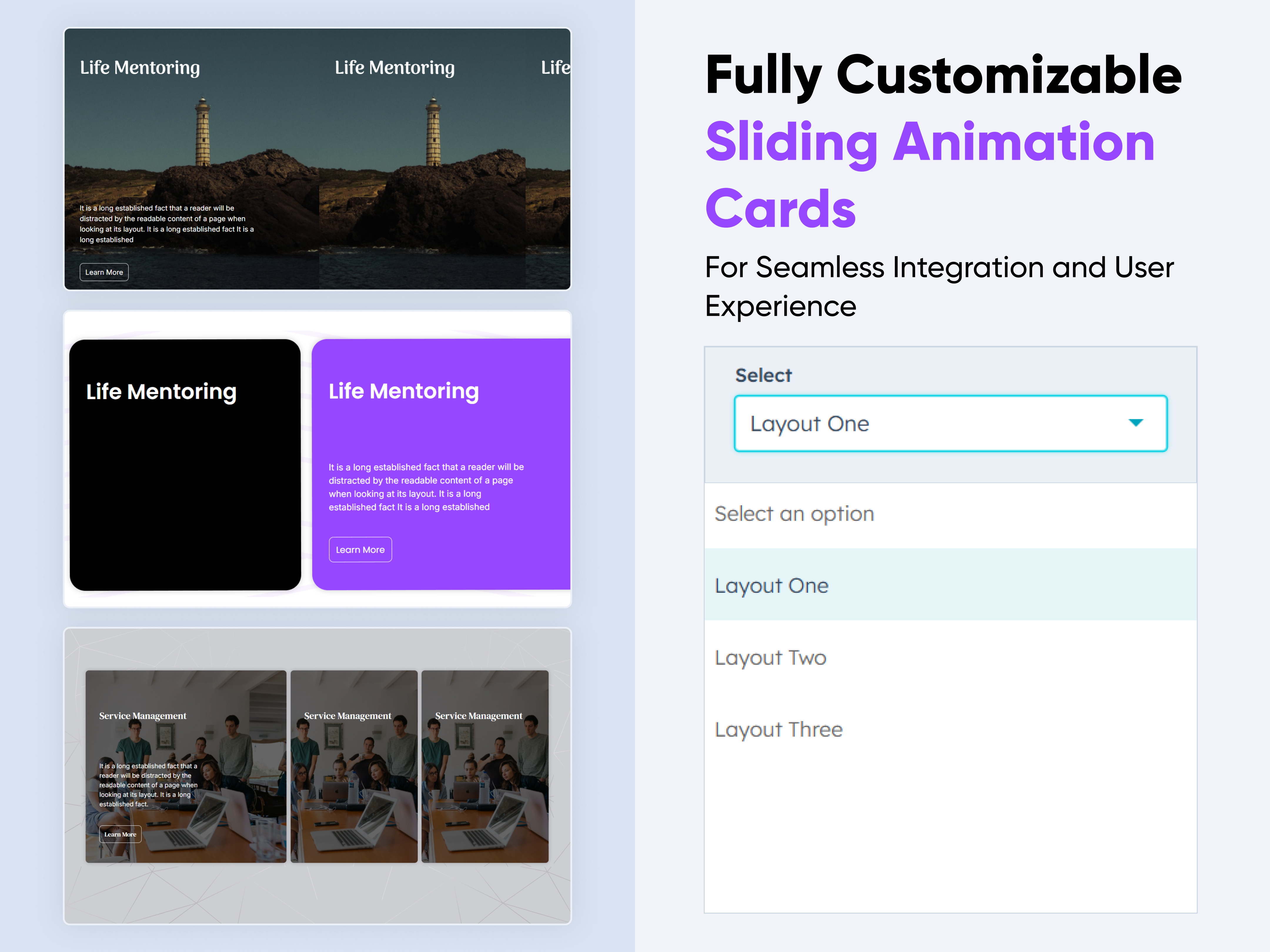
Sliding Animation Cards
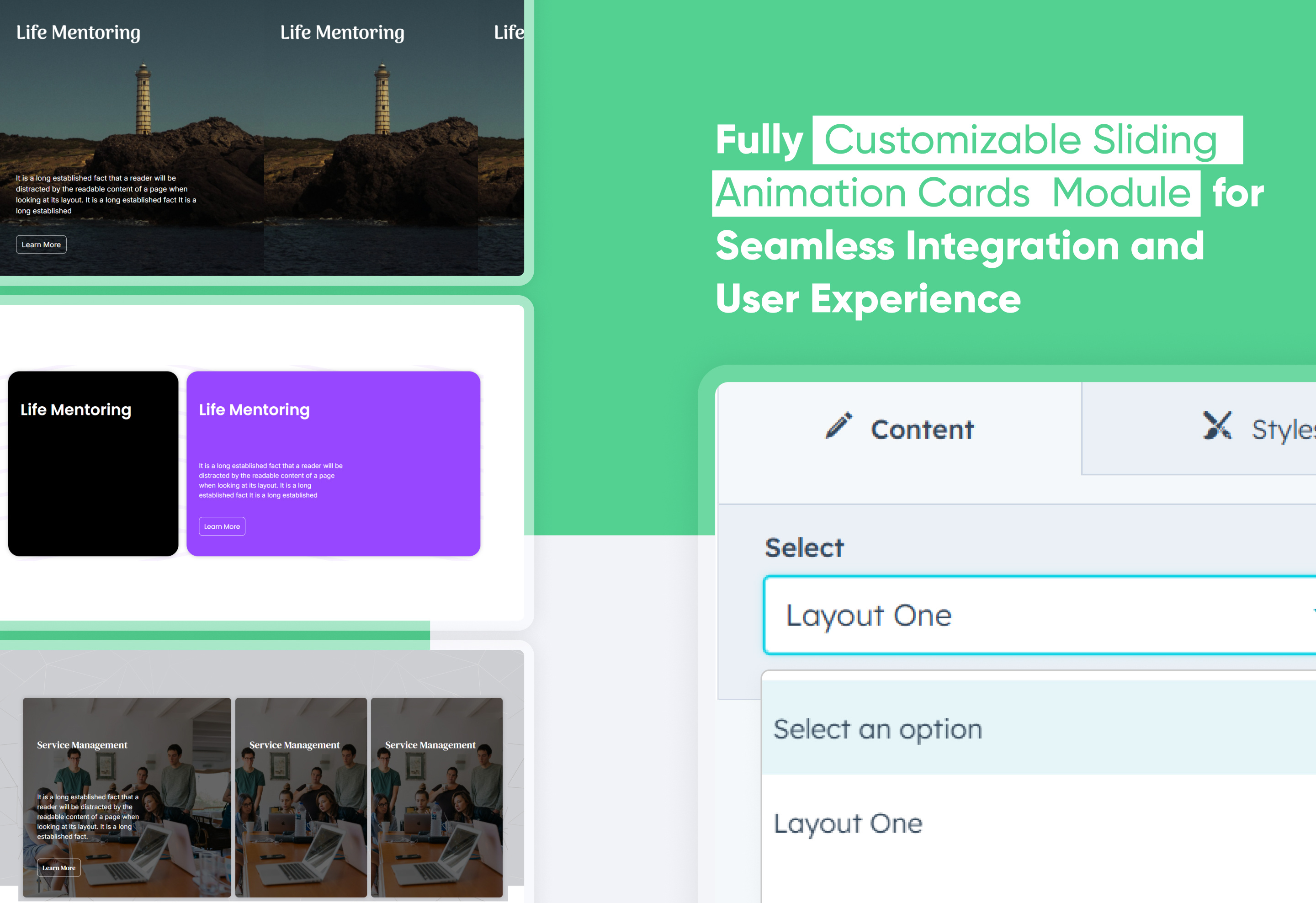
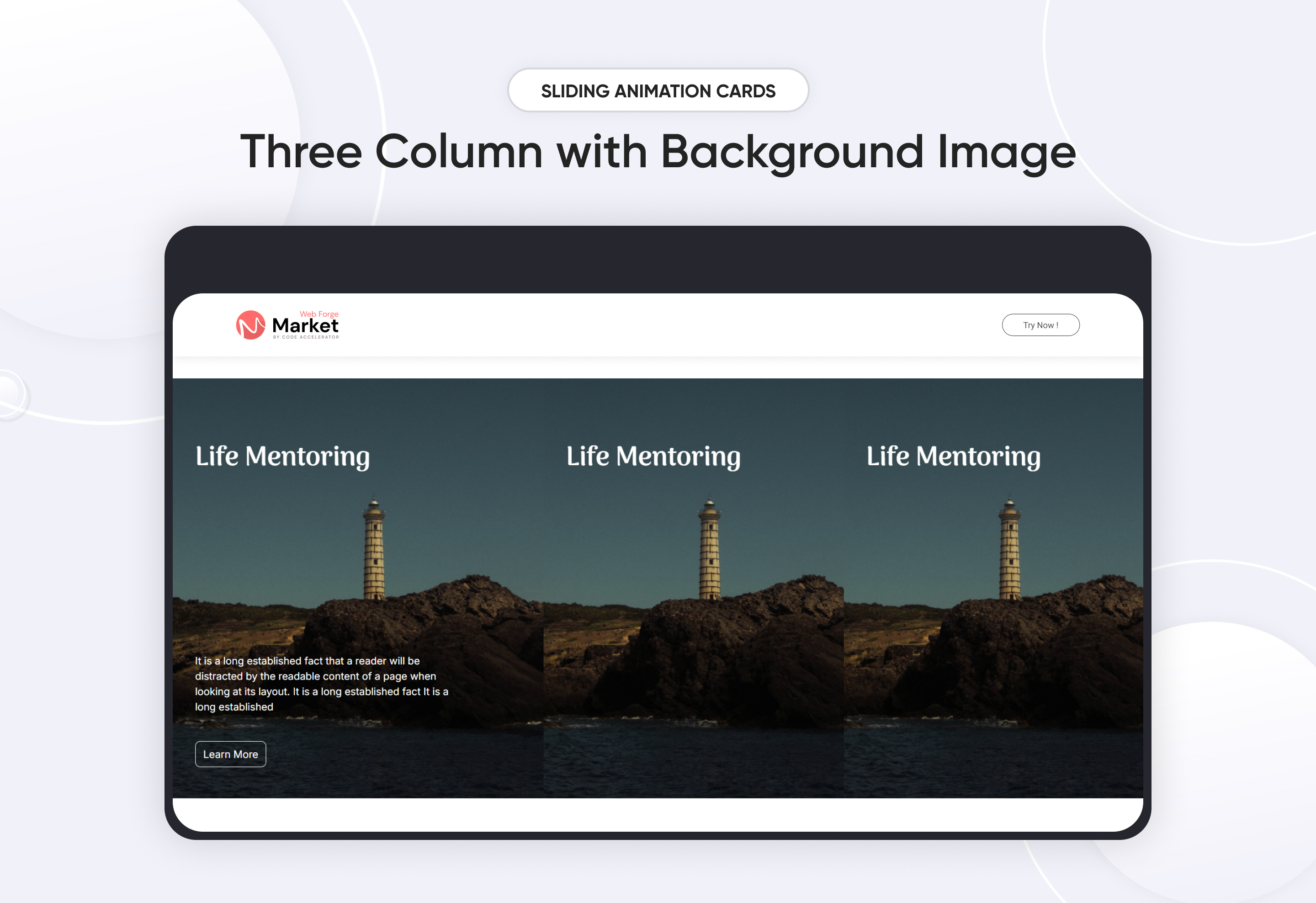
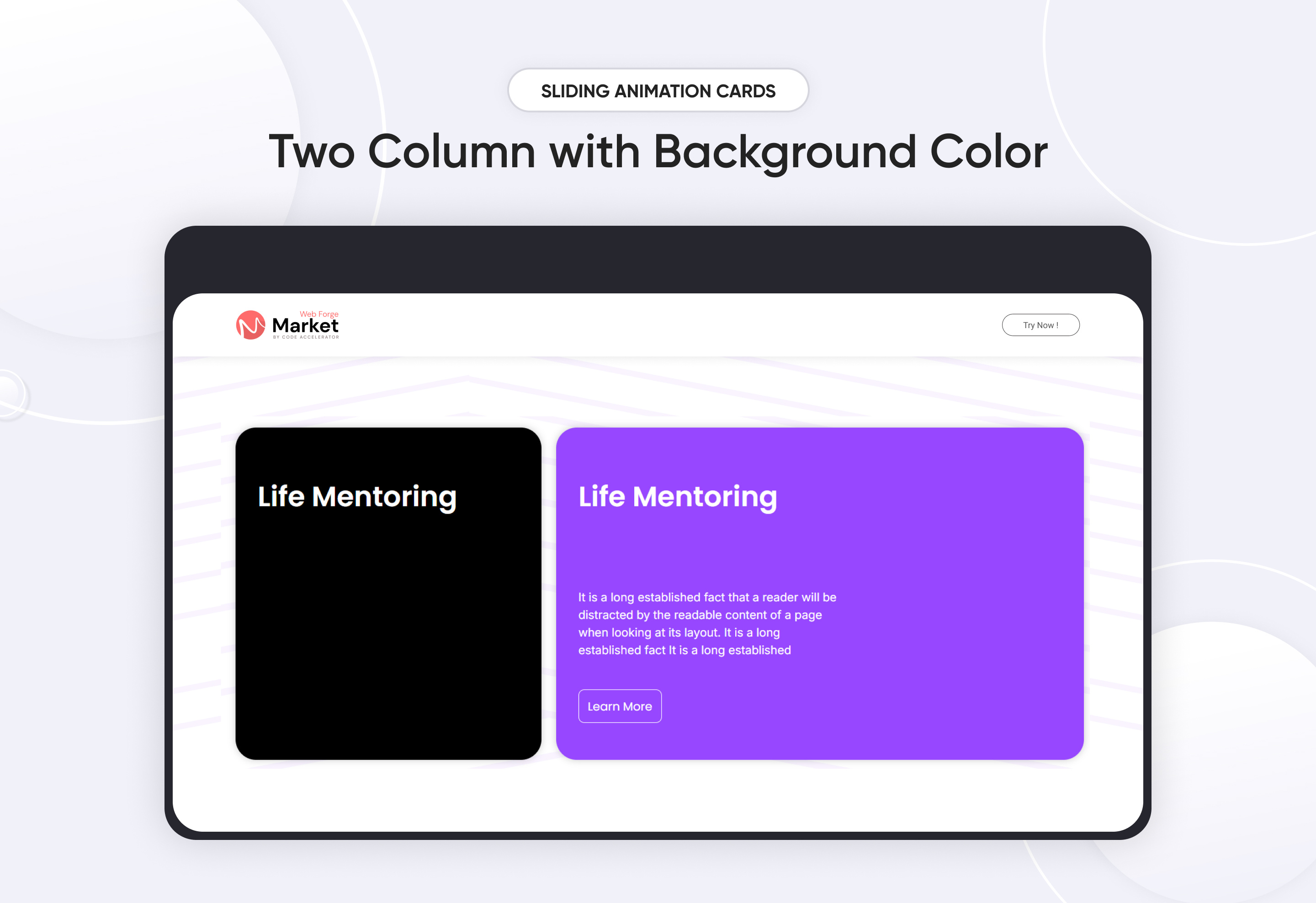
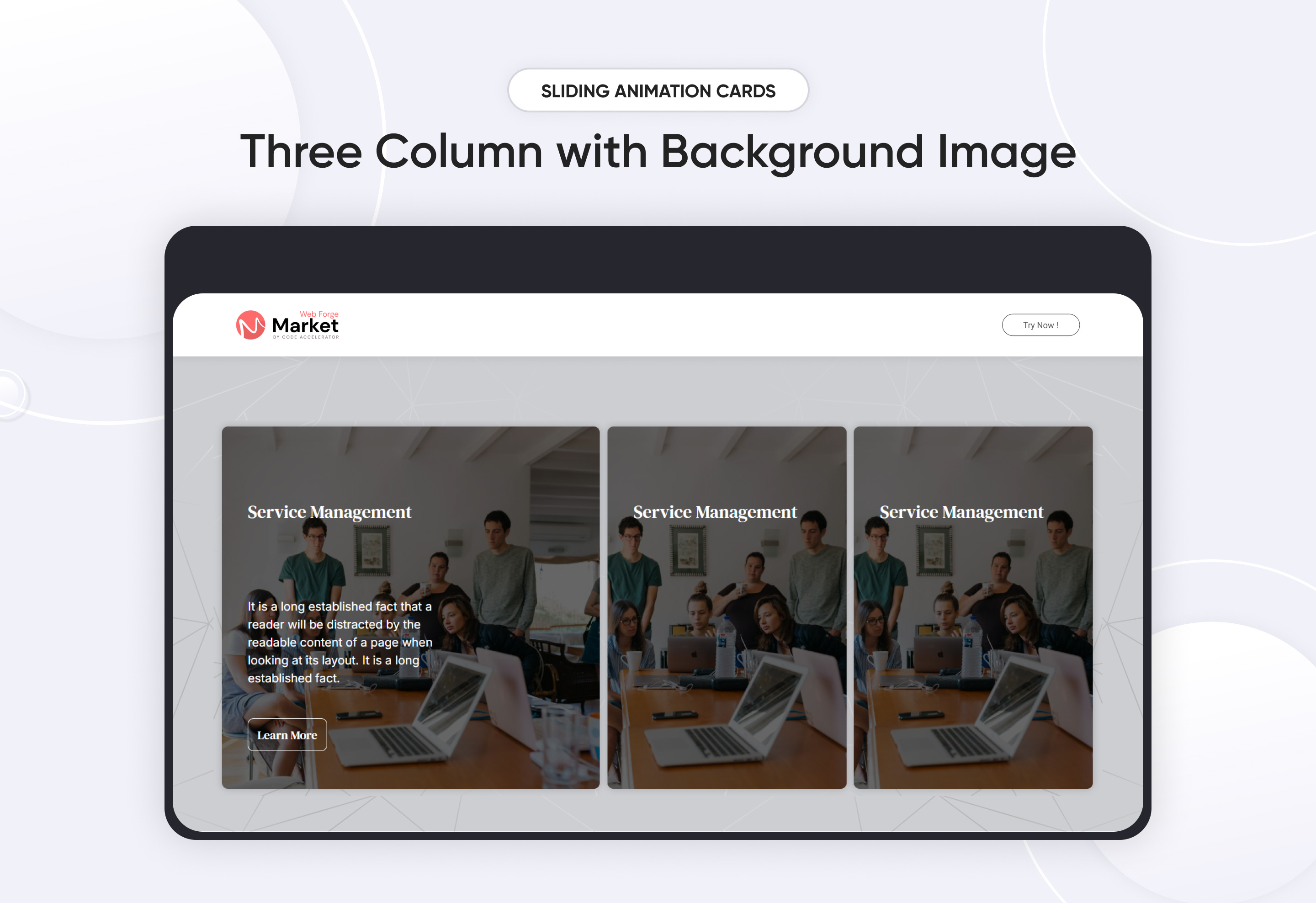
A Sliding Animation Cards module is a UI component that features cards moving in a sliding motion, often used for showcasing content like images, text, or product listings dynamically.
Key Features of a Sliding Animation Cards Module :
-
Smooth Sliding Animation – Cards slide horizontally.
-
Responsive Design – Adjusts based on screen size for mobile and desktop.
-
Hover & Click Effects – Optional animations on interaction.
Use Cases
-
Image Galleries
-
Testimonial Sliders
-
Product Showcases
-
News & Blog Highlights
-
Interactive Dashboards
Discover More in the Knowledge Base
Explore detailed documentation, setup instructions, feature explanations, and best practices to help you get the most out of this module quickly and efficiently.
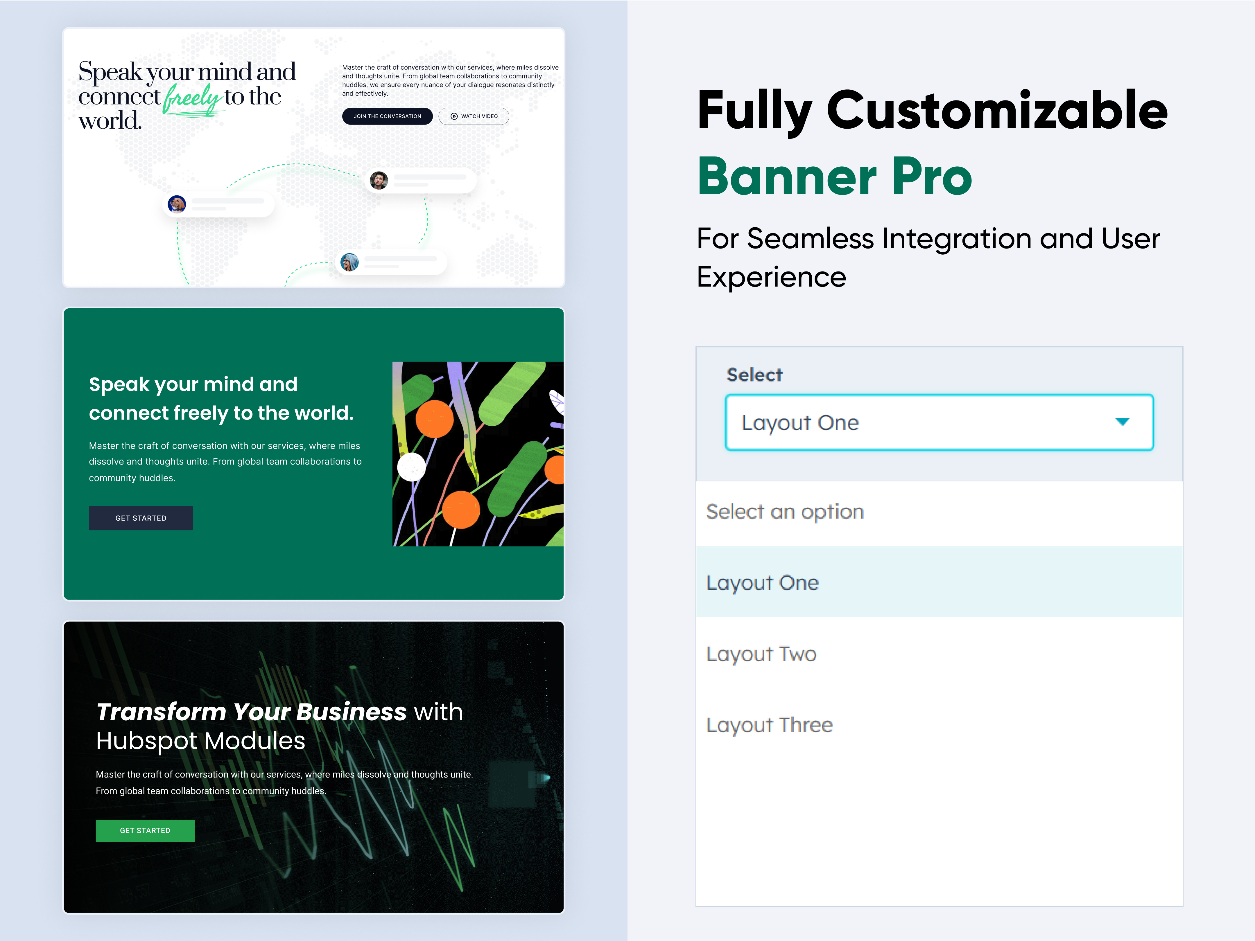 $19
$19
Banner Pro
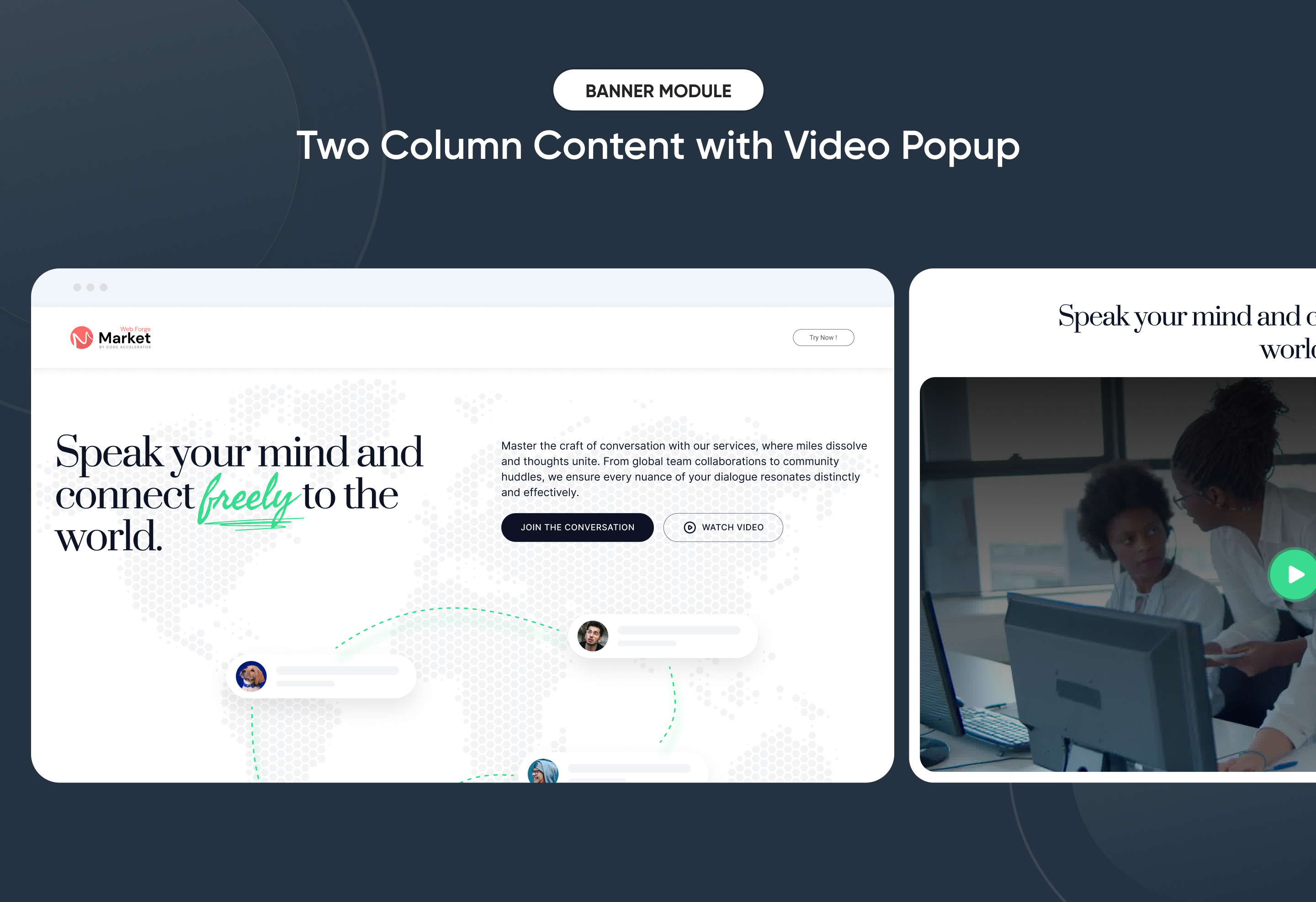
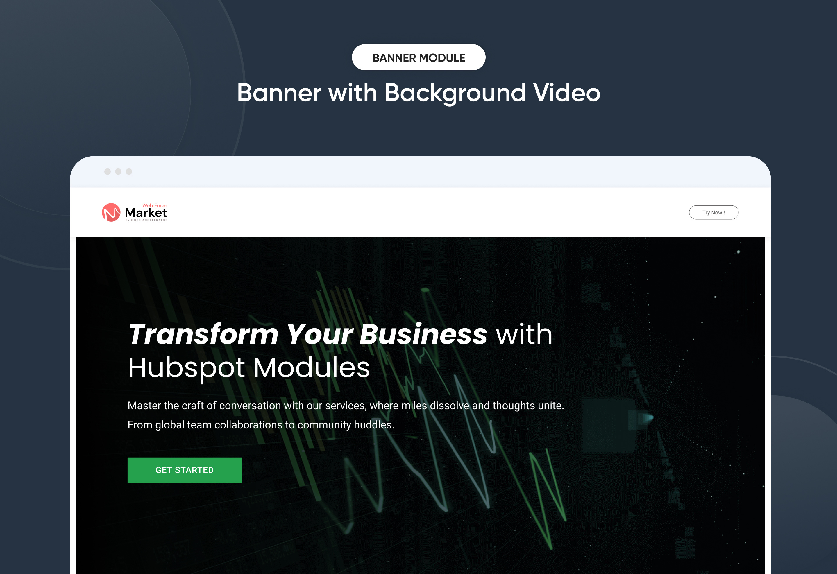
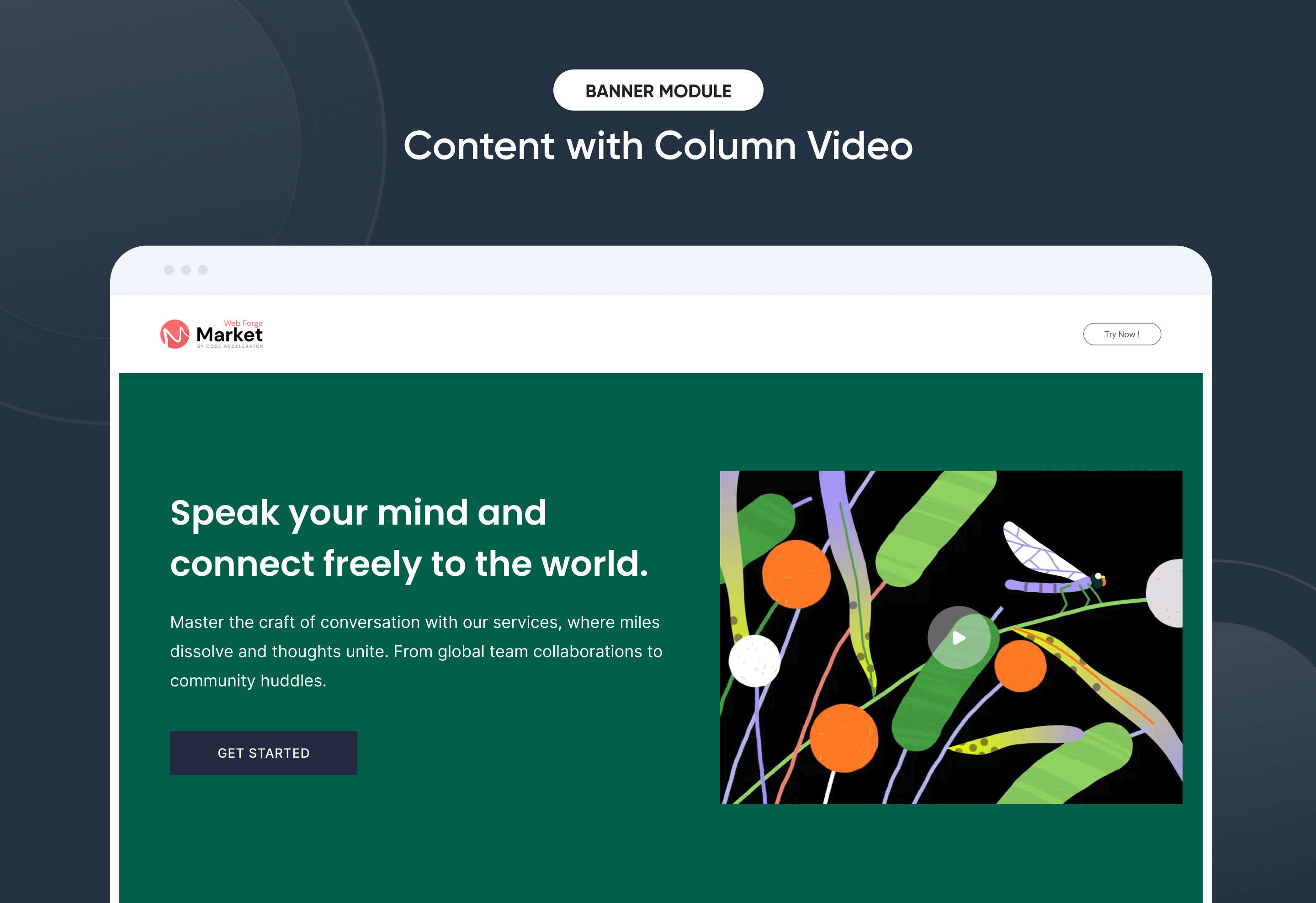
A banner component is a versatile UI element used to highlight key messages, promotions, or branding on a website. It provides a visually appealing way to capture user attention and drive engagement.
Key Features of a Banner Pro Module :
1. Multiple Layouts
-
Offers flexibility with various design structures banners.
-
Can accommodate different content types like text, images, and pop video.
2. CTA Popup with Video
-
A call-to-action button that triggers a video popup.
-
Enhances user engagement by presenting multimedia content without leaving the page.
3. Background Video Banner
-
A dynamic banner featuring an autoplay video as the background.
-
Helps create a more immersive experience, perfect for storytelling or branding.
4. Two-Column Content with Video
- A hybrid layout that pairs descriptive content with an embedded video.
- Useful for product showcases, tutorials, or company introductions.
Discover More in the Knowledge Base
Explore detailed documentation, setup instructions, feature explanations, and best practices to help you get the most out of this module quickly and efficiently.
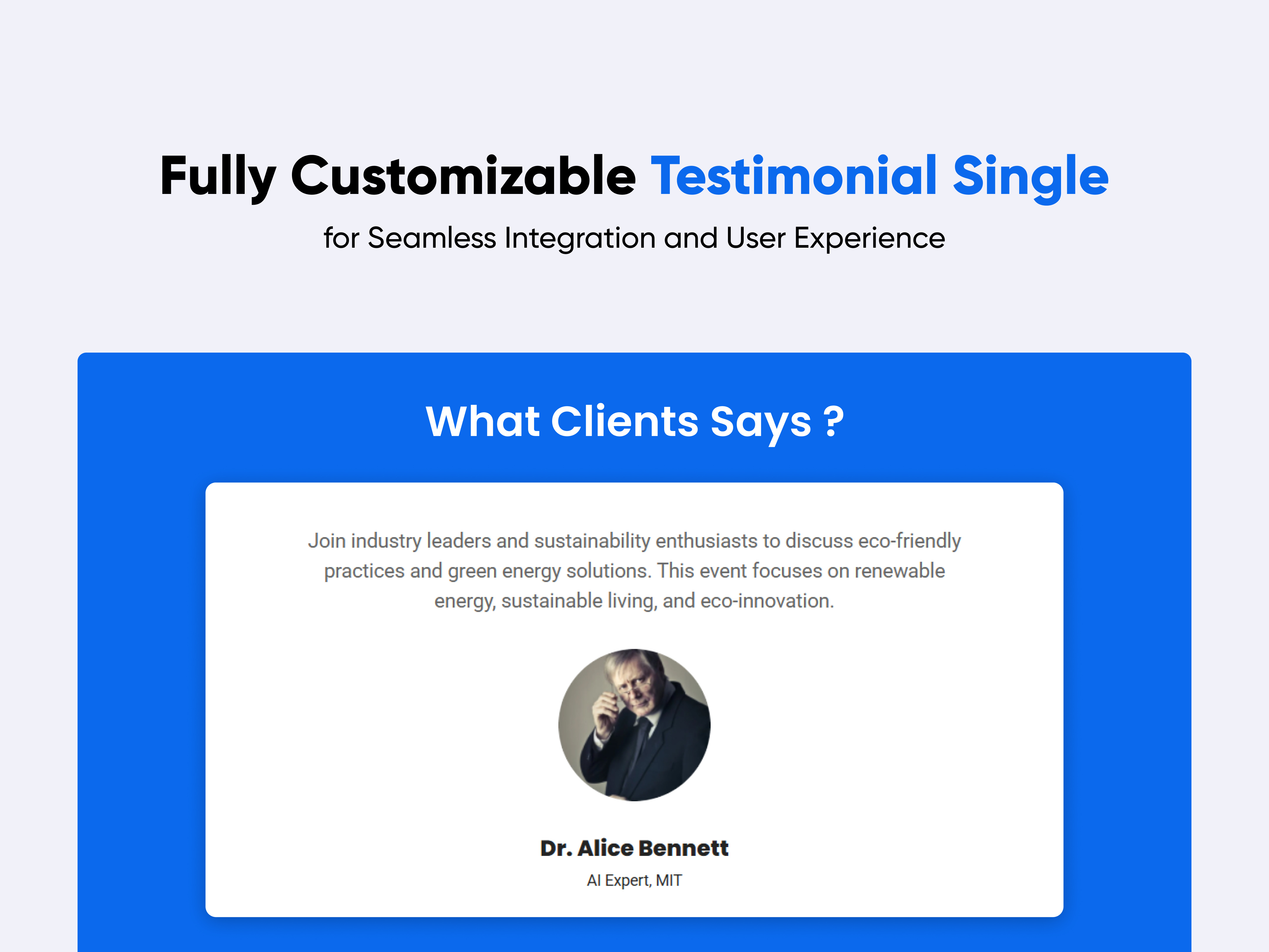 $free
$free
Testimonial Single
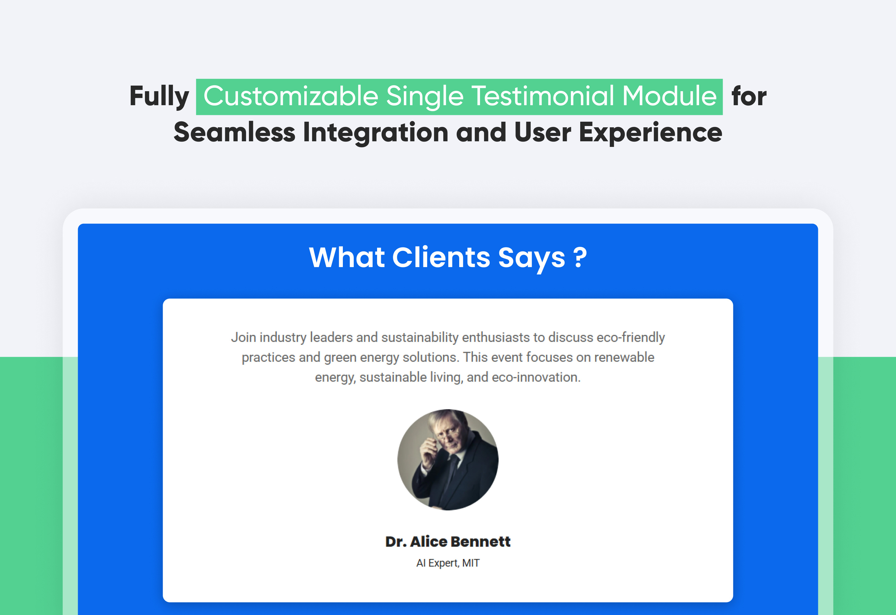
A Testimonial Single Module is a structured component used in websites and applications to display individual user testimonials. It highlights customer feedback in a visually appealing and engaging manner.
Key Components:
-
Customer Name & Role: Displays the name of the person giving the testimonial and their position (if applicable).
-
Profile Image: Option to include a photo or avatar of the customer.
-
Testimonial Text: The actual review or feedback given by the customer.
Features of the Testimonial Single Module:
-
Responsiveness: Fully adaptive to different screen sizes, ensuring a smooth experience on mobile, tablet, and desktop.
-
Image : Ability to include profile image.
-
Typography & Styling: Custom font styles, colors, and alignment options for enhanced design consistency.
Discover More in the Knowledge Base
Explore detailed documentation, setup instructions, feature explanations, and best practices to help you get the most out of this module quickly and efficiently.
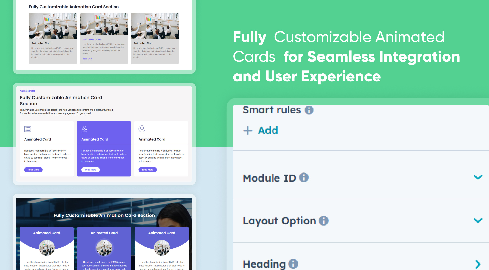 $39
$39
Animated Cards
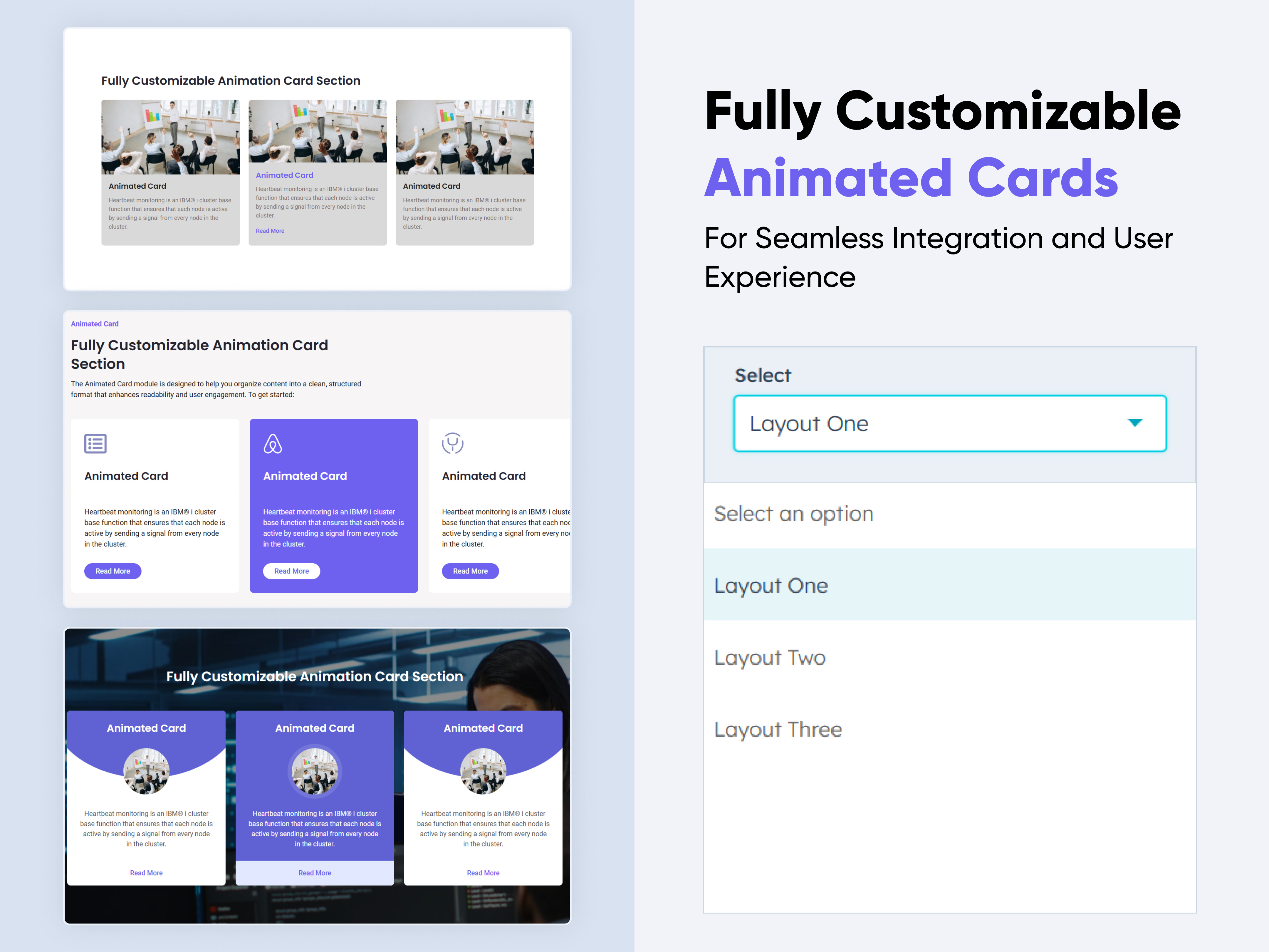
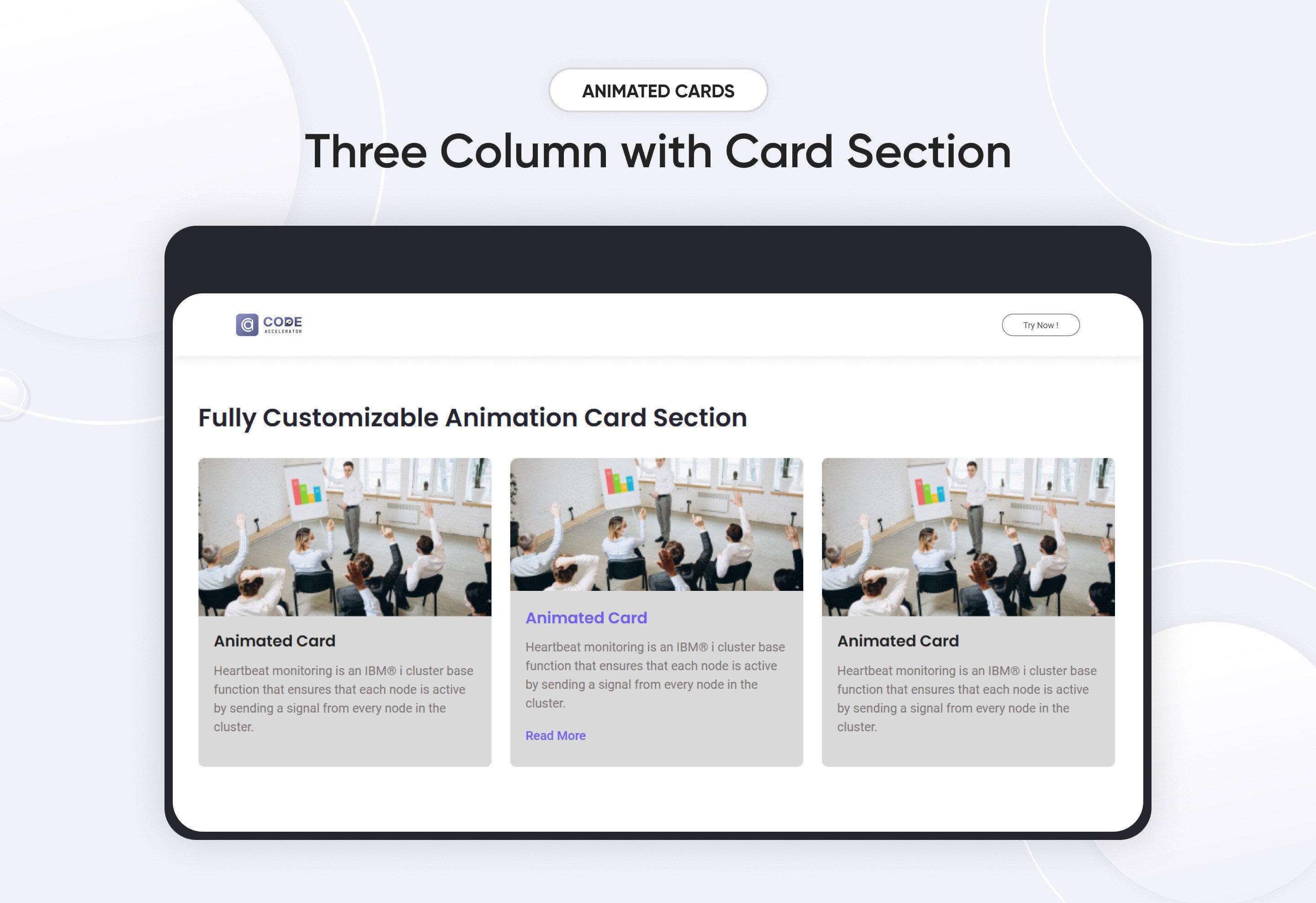
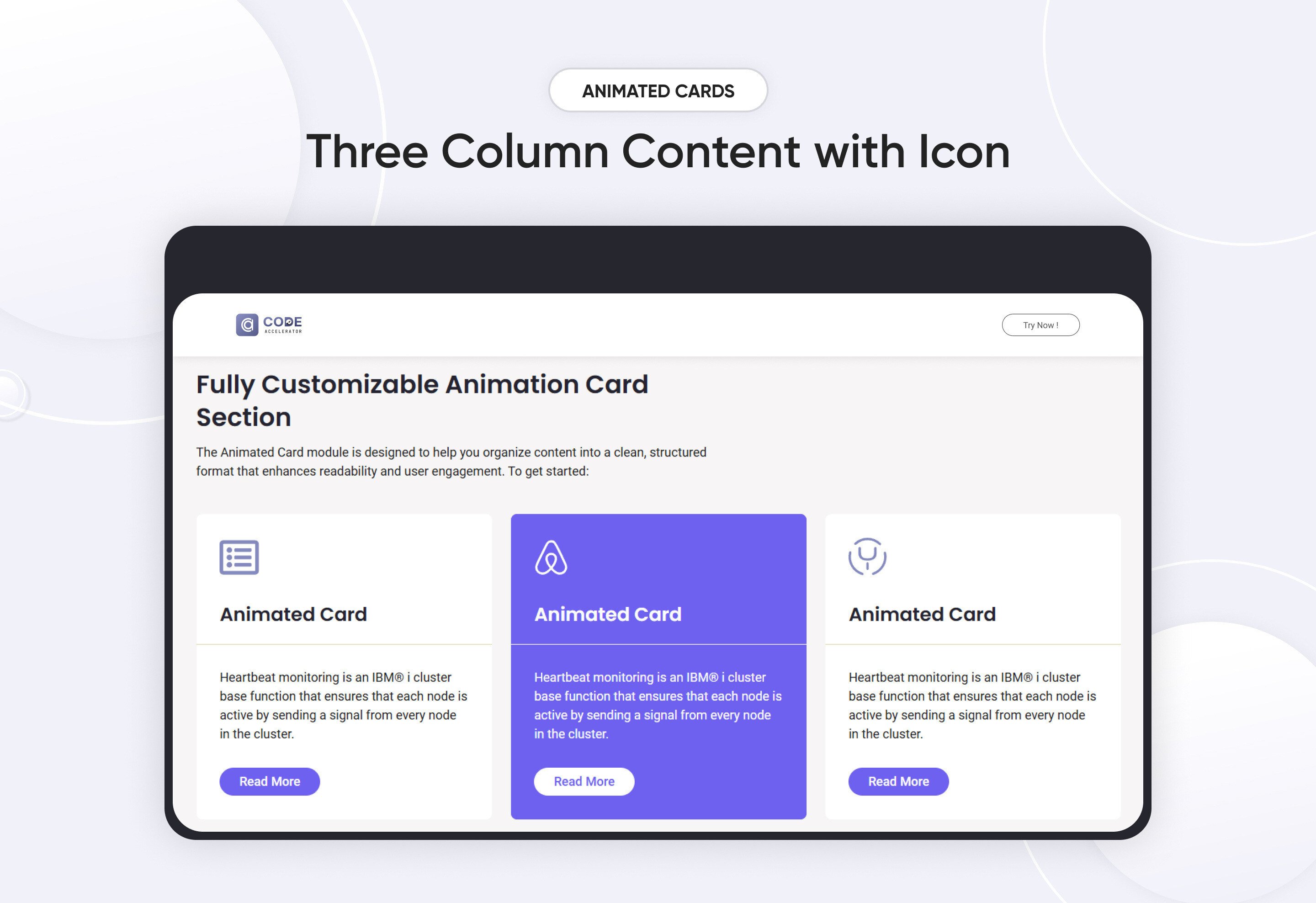
-1.jpeg)
An Animated Cards Module typically refers to an interactive design element used on websites or applications. This module consists of a collection of "cards" (rectangular elements) that showcase information or content and include animations to enhance user engagement.
Key Features Animated Cards Module :
-
Responsive Design: Adjusts seamlessly across devices, from desktops to mobile screens.
-
Hover Effects: Visual feedback when users hover over cards, such as scaling, highlighting, or revealing additional information.
-
Customizable Styles: Fully customizable with CSS variables for themes, fonts, colors, and animations.
-
Performance Optimization: Lightweight animations optimized to ensure smooth interactions without lag.
Discover More in the Knowledge Base
Explore detailed documentation, setup instructions, feature explanations, and best practices to help you get the most out of this module quickly and efficiently.
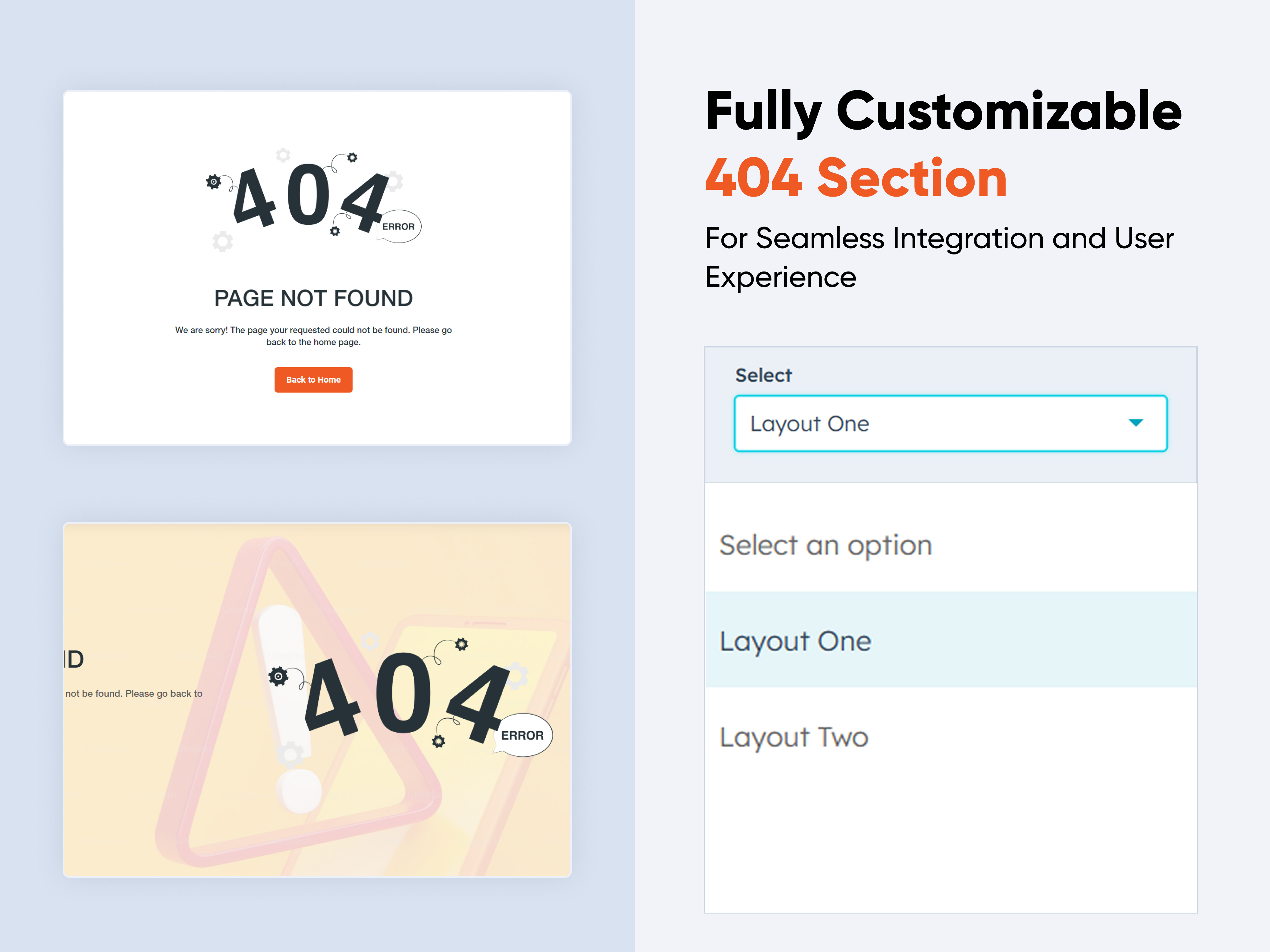 $free
$free
404 Section
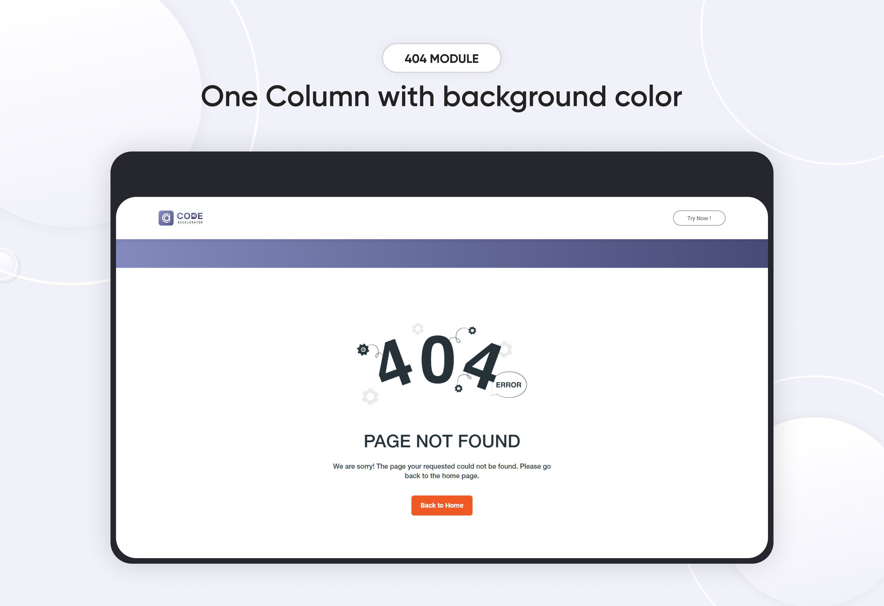
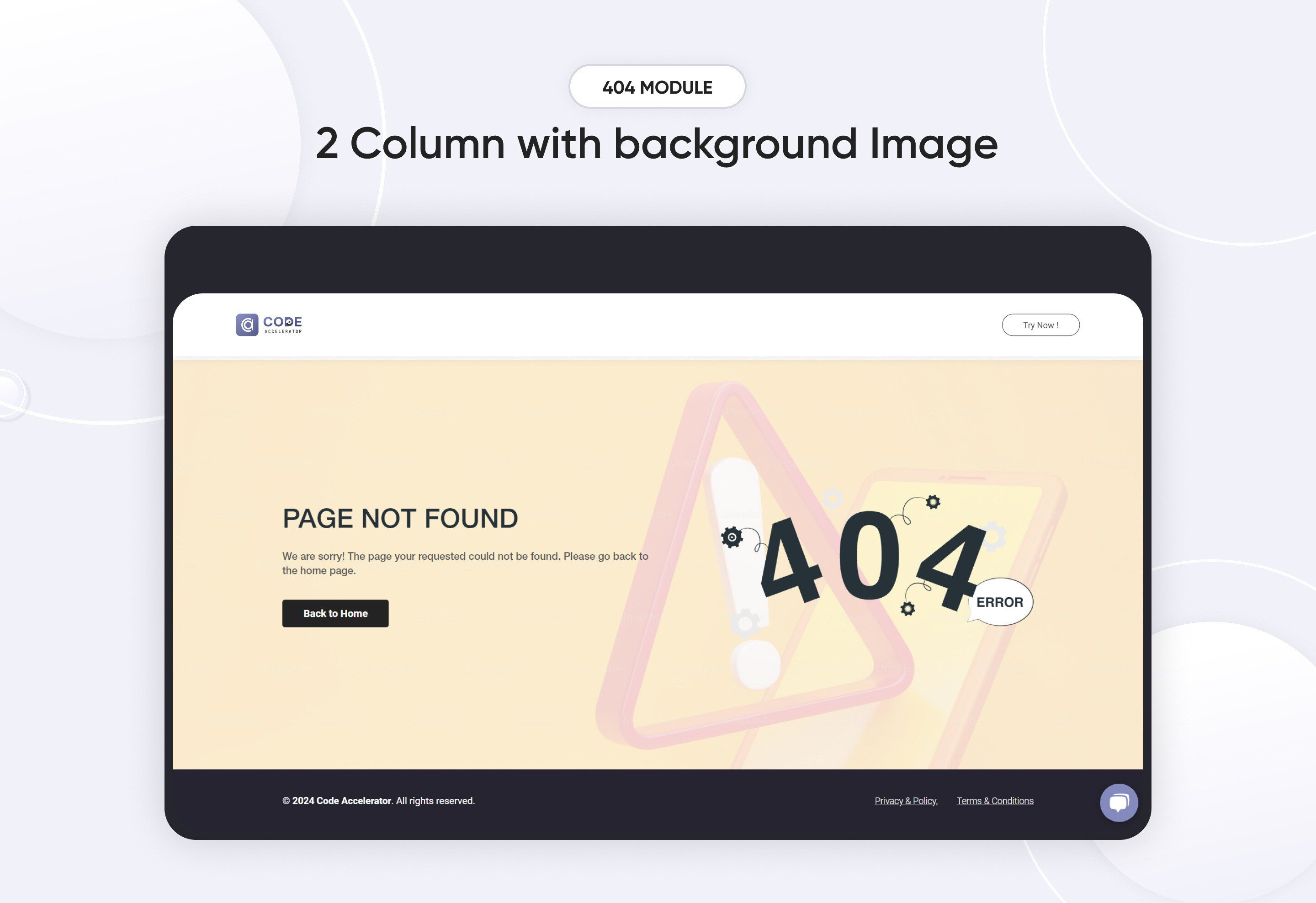
The 404 Module provides a user-friendly and customizable solution for handling "Page Not Found" errors on your website. It helps maintain a positive user experience even when visitors encounter broken links or deleted content.
Key Features :
-
Customizable Error Message:
-
Personalize the error message to fit your brand’s tone, offering a friendly apology or helpful guidance.
-
-
Mobile Optimization
-
Ensure the 404 page is responsive and looks great on all devices, from smartphones to desktops.
-
-
Design and Layout
-
Choose from various design templates, color schemes, and fonts to match your site's style.
-
Discover More in the Knowledge Base
Explore detailed documentation, setup instructions, feature explanations, and best practices to help you get the most out of this module quickly and efficiently.
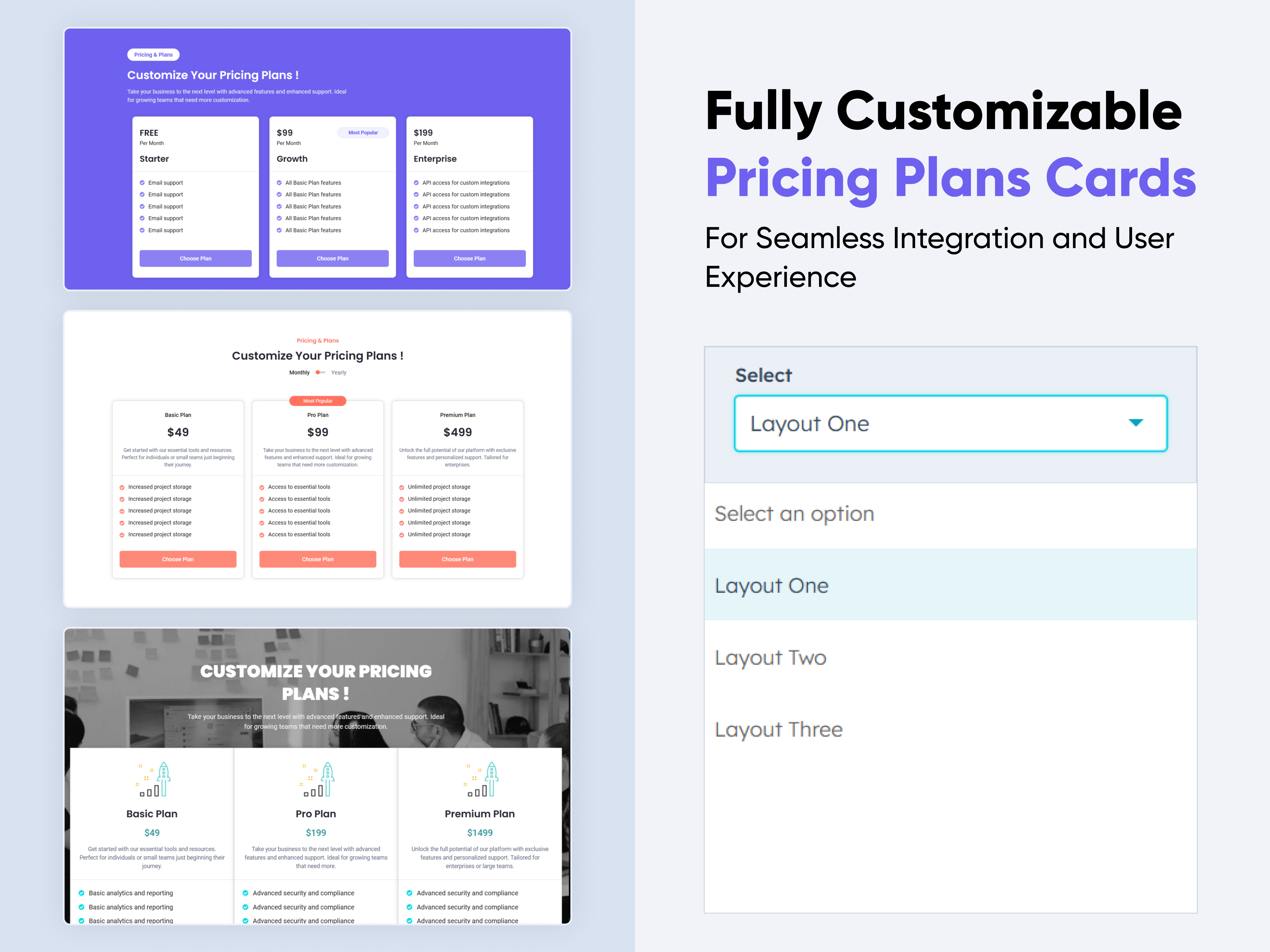 $29
$29
Pricing Plans Card
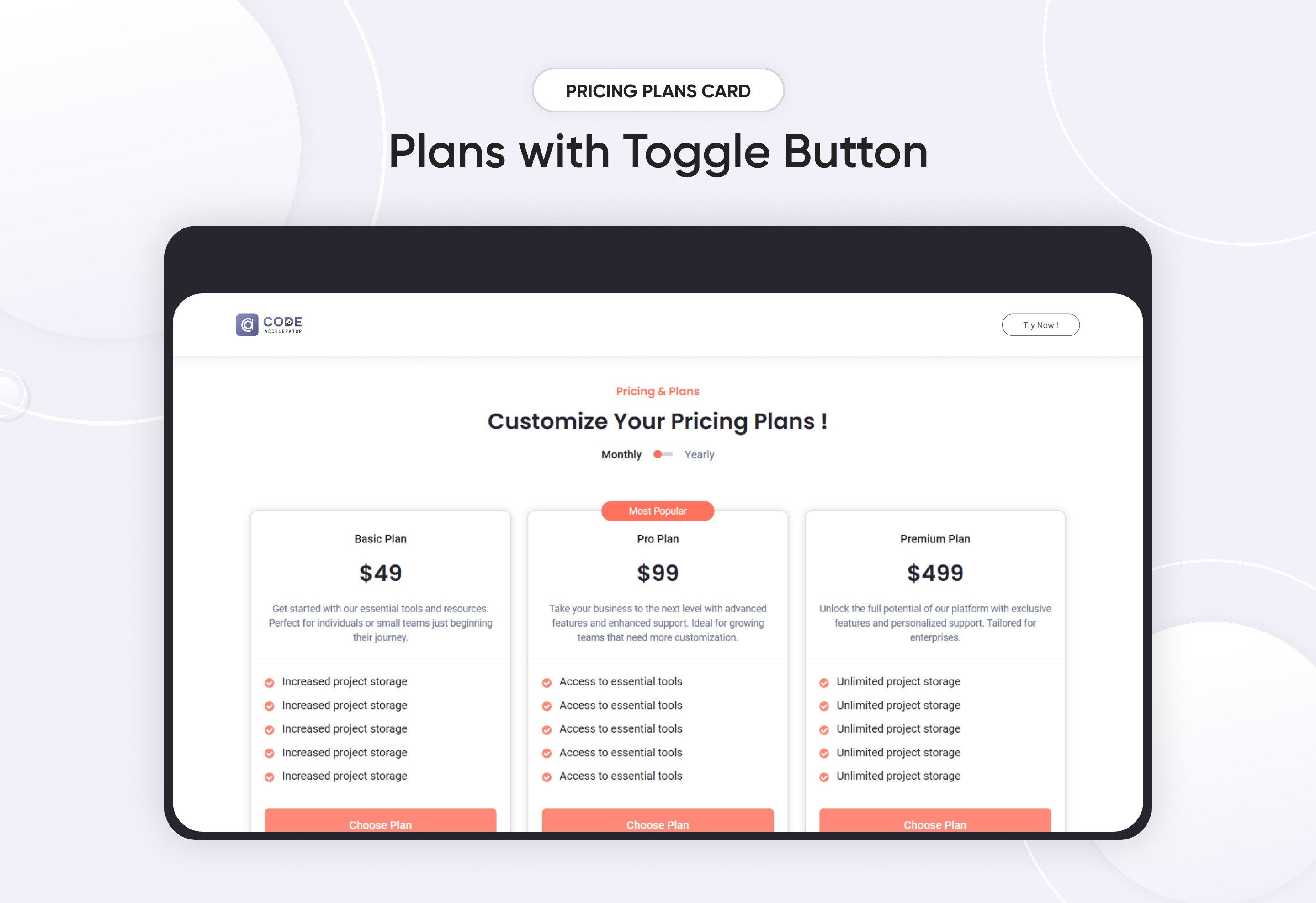
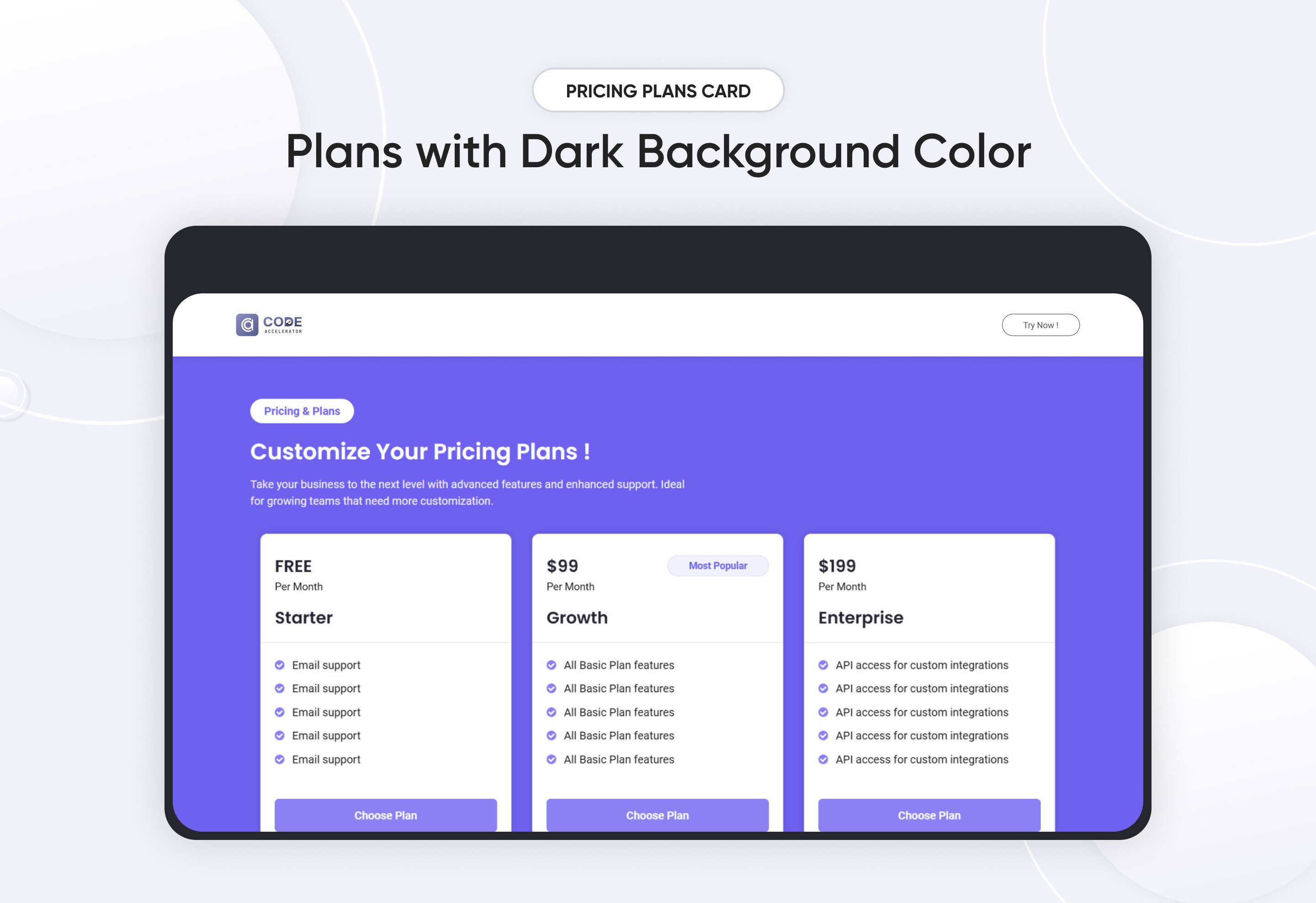
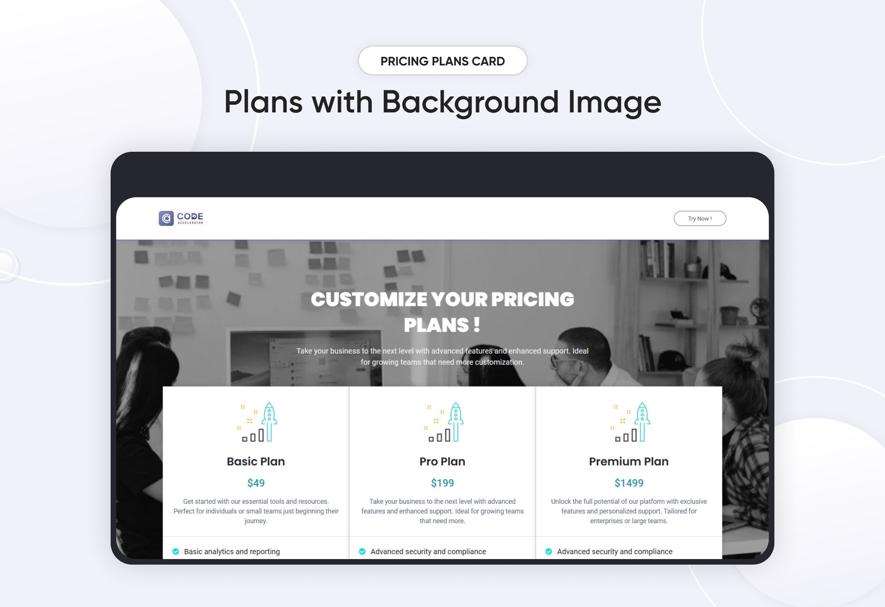
A Pricing Plan module is a crucial part of many websites, particularly for businesses offering subscription services, products with tiered pricing. It typically includes information on the features and costs of different service levels to help customers choose the best option for their needs. Here's an overview of the key elements often included in a Pricing Plan module.
Key Features Pricing Plan Module :
- Responsive Layout: Ensure that the module adjusts for mobile, tablet, and desktop views.
- Plan Names and Levels: Each tier should have a distinct, easy-to-understand name (e.g., Basic, Standard, Premium).
- Clear CTA Text: Each plan should have a dedicated button with actionable text like "Get Started" or "Choose Plan."
- Expandable Details: Use collapsible sections to expand on feature descriptions without cluttering the layout.
Discover More in the Knowledge Base
Explore detailed documentation, setup instructions, feature explanations, and best practices to help you get the most out of this module quickly and efficiently.
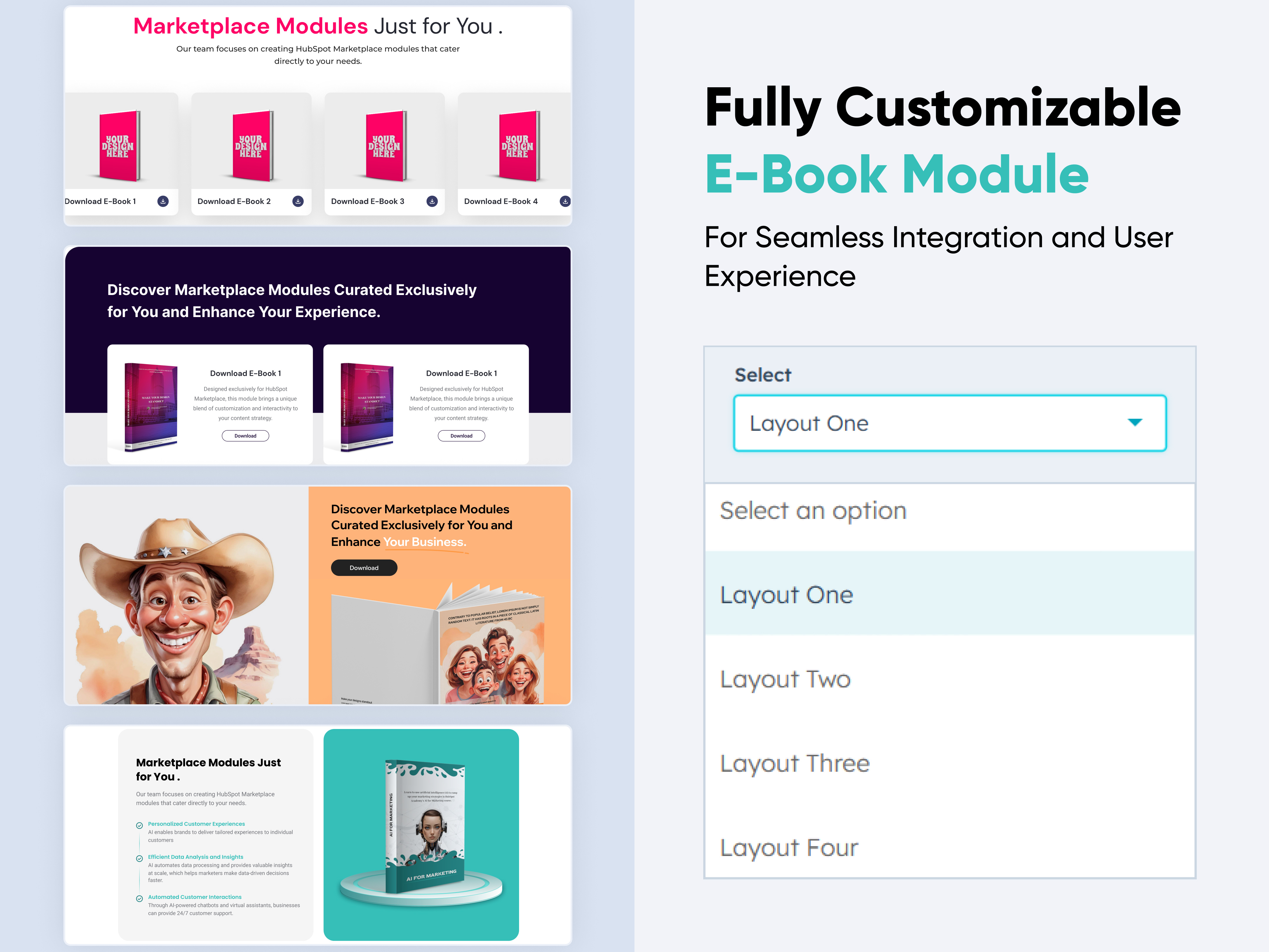 $19
$19
Download eBook Now
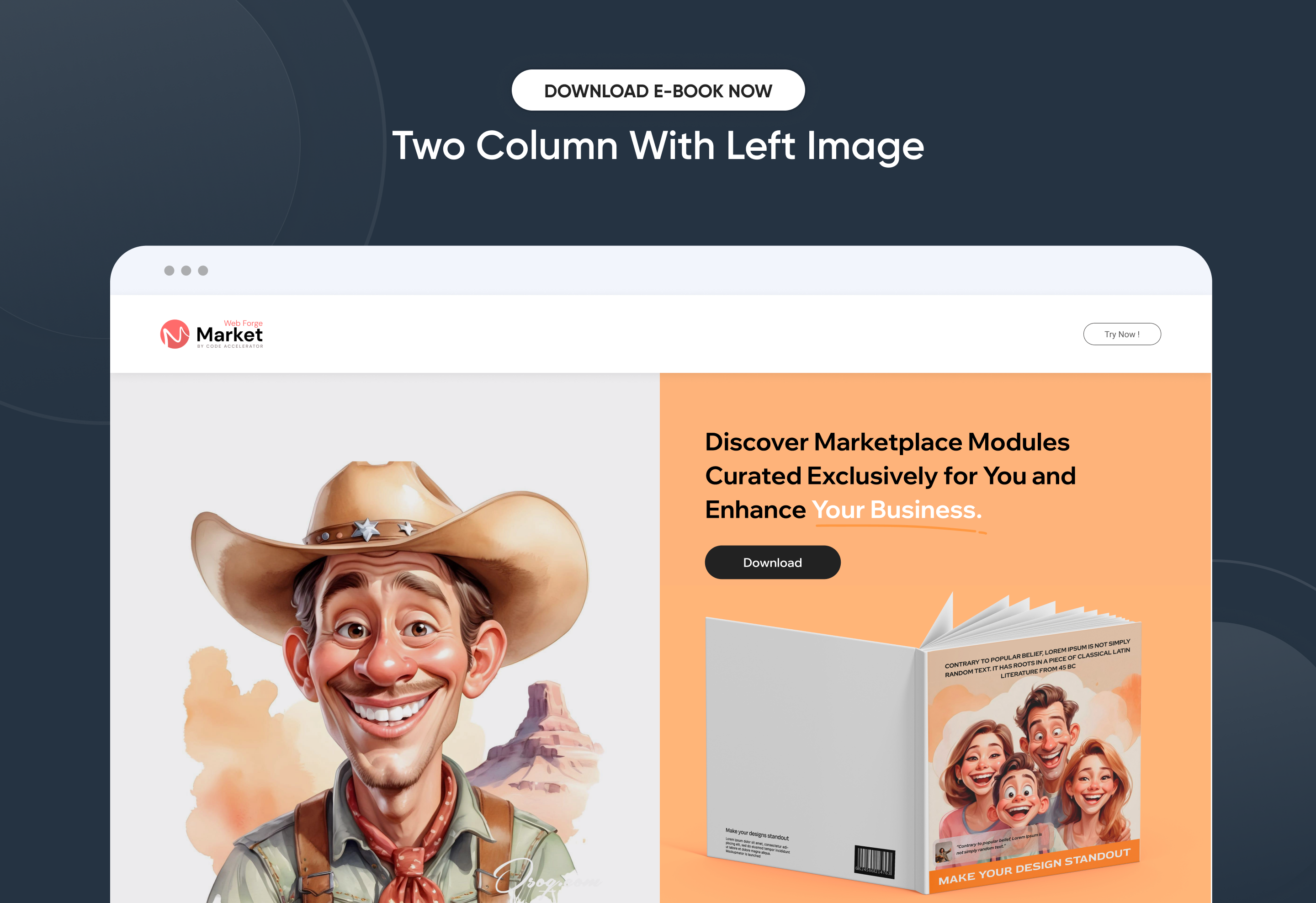
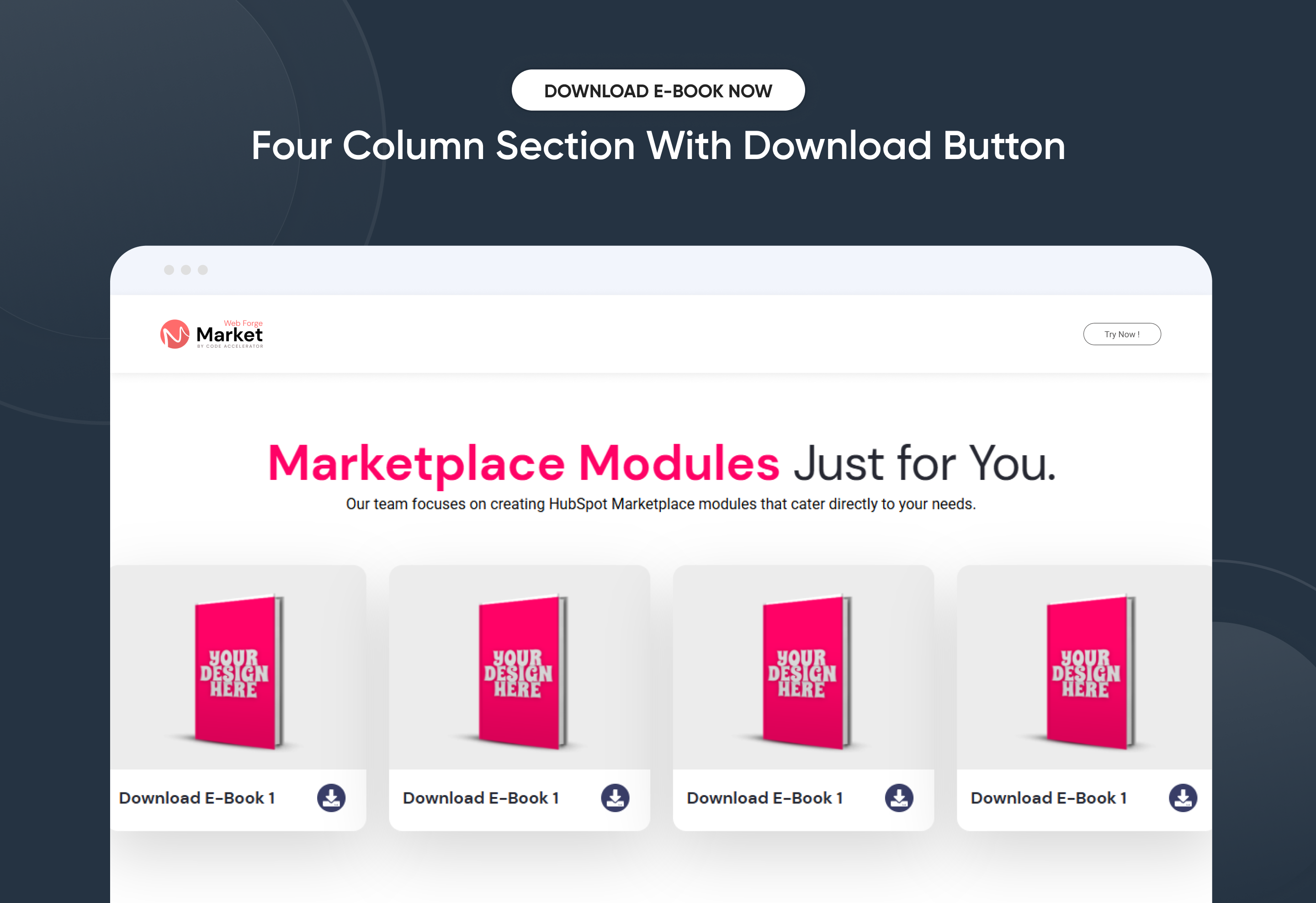
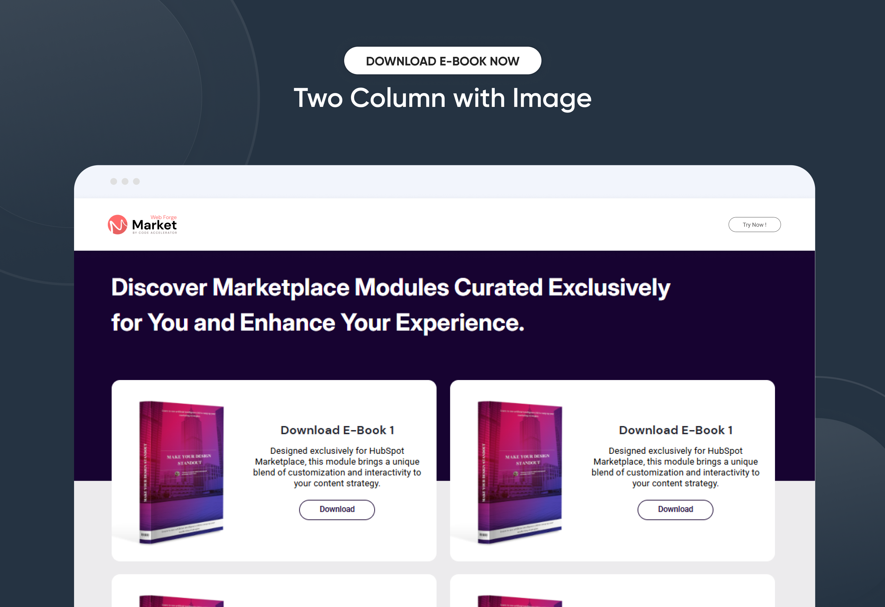
In today’s digital world, giving away free eBooks is a fantastic way to connect with your audience and generate leads! Creating a friendly "Download eBook Now" module makes it super easy for people to access valuable content while helping you capture those important leads.We're excited to help you create your very own custom HubSpot module for downloading eBooks. It’s super simple, and we’ll walk you through each step. Let’s dive in!
⚙️ Key Features at a Glance
✅ 4 layout variations with individual styling controls
✅ Fully responsive design across mobile, tablet, and desktop
✅ Upload your eBook image or icon for visual appeal
✅ Clean code and developer-friendly structure
🧩 4 Ready-to-Use Layouts – Customize Your Way!
Our module offers four fun layout options, each designed to suit different needs, looks, and sections of your page:
1. Two Column
Enjoy a combination of left side content with a CTA and a neat list style.
2. Two Column with Image
Eye-catching left side image paired with engaging right side content that includes a heading and CTA, topped off with a lovely image below.
3. 4 Column Cards
Create a vibrant layout with four cards featuring a stylish design, complete with an eye-catching image on top and a download icon below.
4. Two Column Cards
Two beautifully designed cards with an attractive background! Each card has a left side image and a right side with text and a compelling CTA to grab attention.
Every layout comes with its own style settings, making it super easy for you to personalize:
- Background and text colors
- Padding and spacing
- Button styles
- Typography
- Image alignment and size
No design skills? No worries! Everything is easy to edit right in the HubSpot editor. Have fun customizing!
Discover More in the Knowledge Base
Explore detailed documentation, setup instructions, feature explanations, and best practices to help you get the most out of this module quickly and efficiently.
 $free
$free
CTA Back To Top
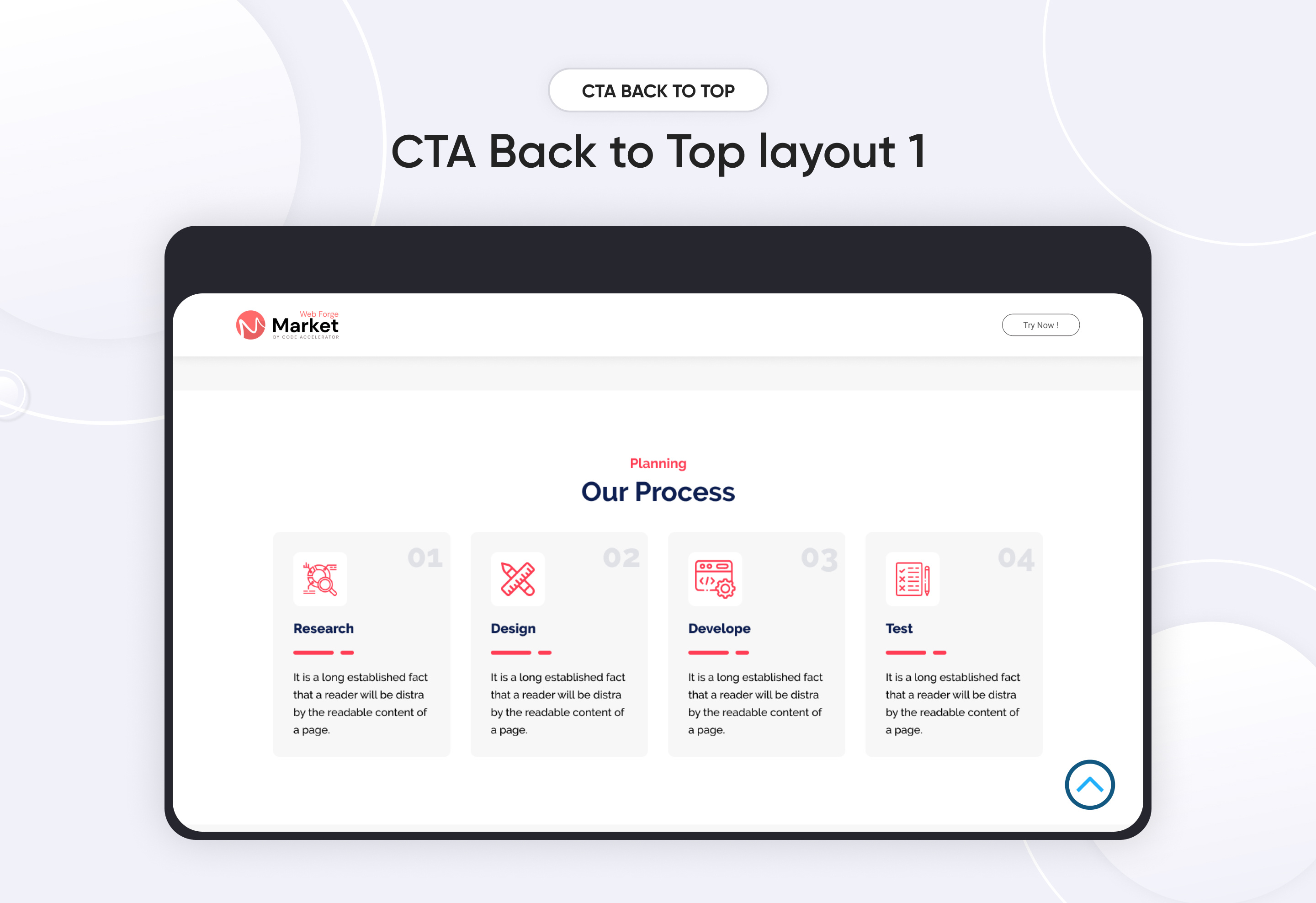
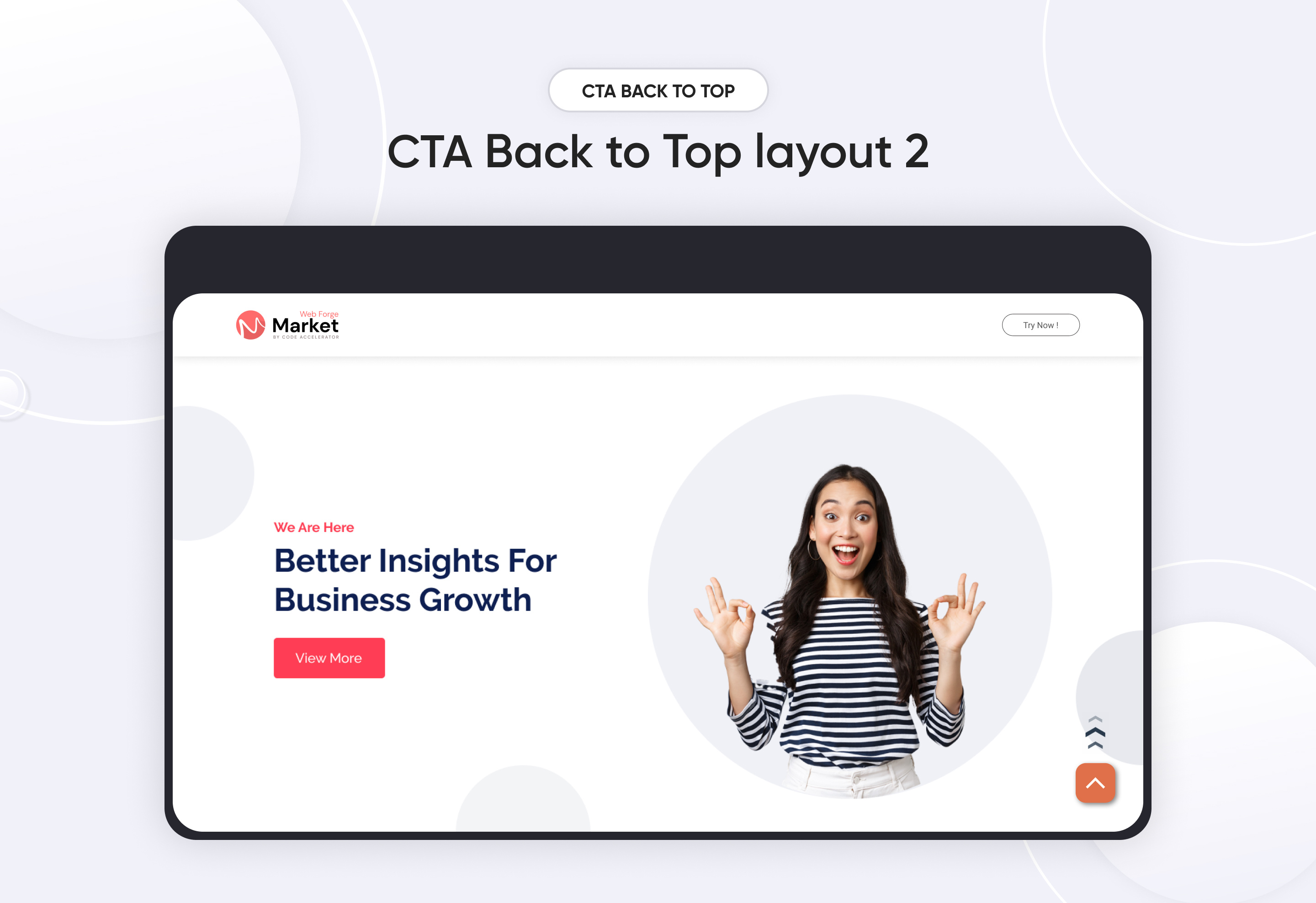
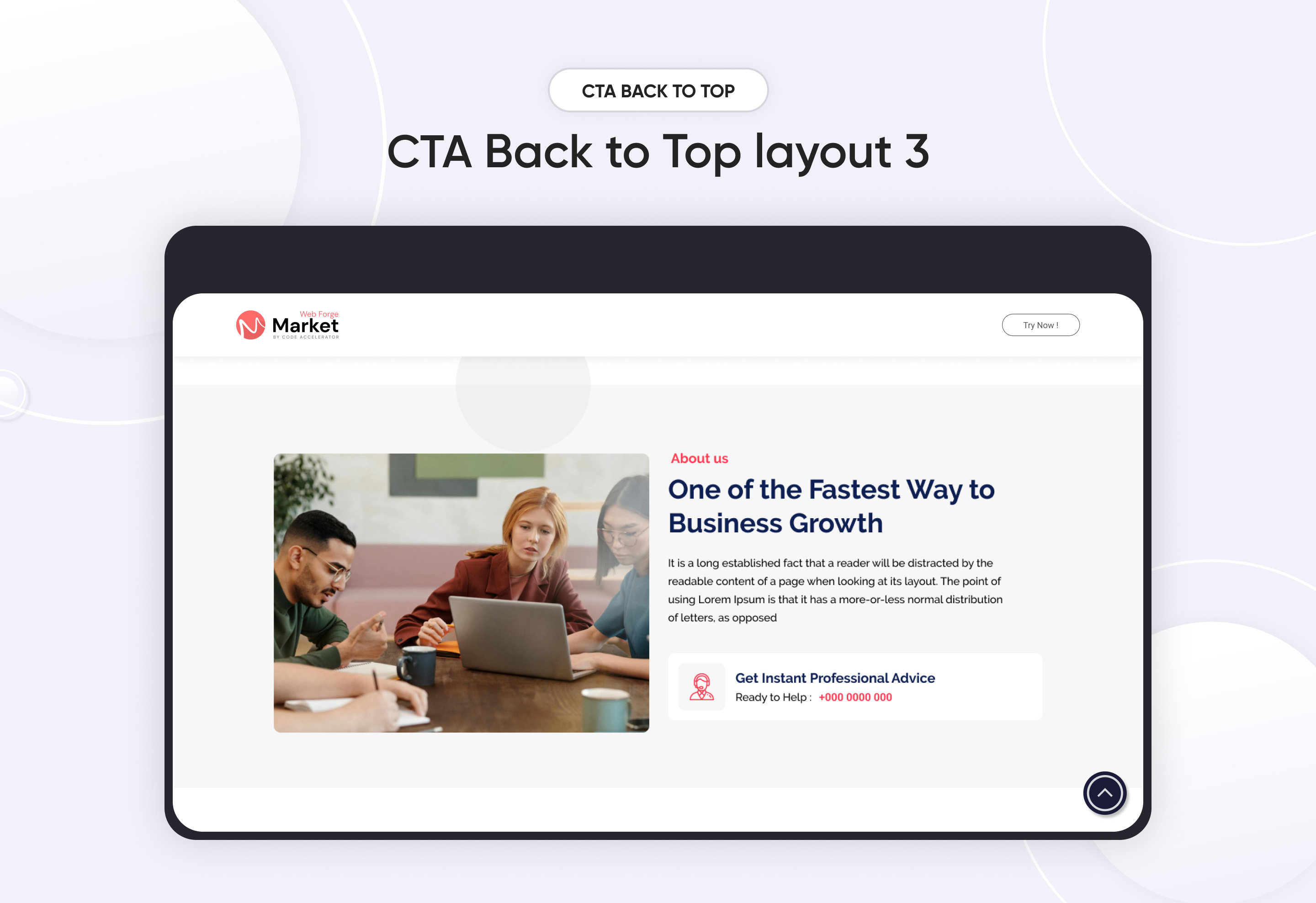
A "Back to Top" button is a user interface element that allows users to quickly return to the top of a webpage without manually scrolling, enhancing navigation efficiency, especially on lengthy pages.
Key Features of a CTA Back To Top Module :
-
Visibility Control: The button typically appears after the user has scrolled a certain distance down the page, ensuring it's available when needed without cluttering the interface.
-
Customizable Positioning: Developers can position the button in various locations on the screen (e.g., bottom-right) to align with the website's design and user experience considerations.
-
Adjustable Appearance: Options to modify the button's size, shape (round, square), color, and iconography allow it to match the site's aesthetic seamlessly.
-
Smooth Scrolling: Implementing smooth scroll animations enhances the user experience by providing a gentle transition back to the top.
-
Device Responsiveness: The button can be configured to appear on specific devices (e.g., only on mobile or desktop).
-
Auto-Hide Functionality: To maintain a clean interface, the button can be set to disappear after a certain period of inactivity or when the user returns to the top of the page.
Discover More in the Knowledge Base
Explore detailed documentation, setup instructions, feature explanations, and best practices to help you get the most out of this module quickly and efficiently.
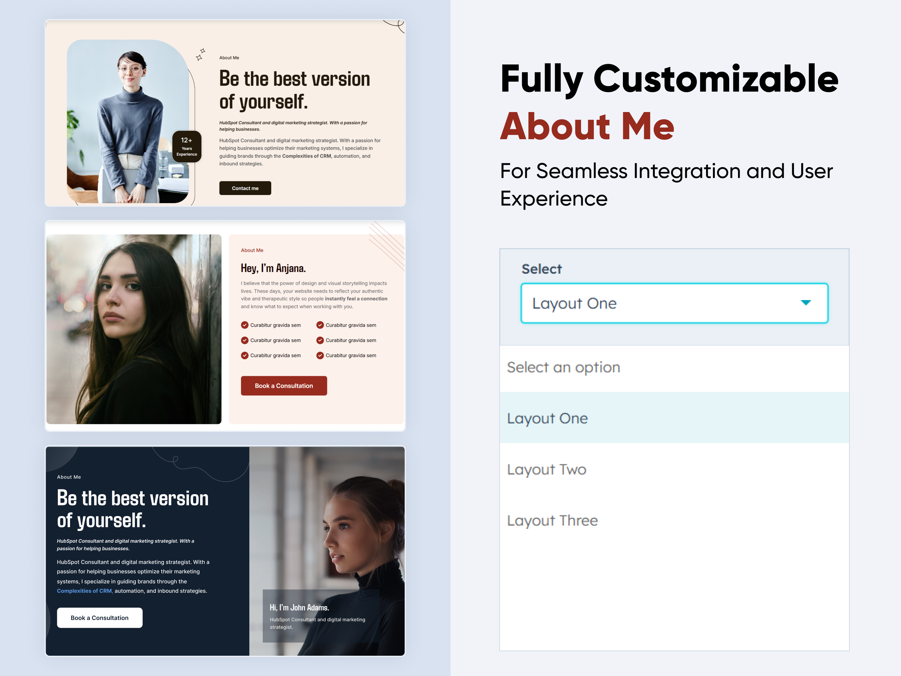 $29
$29
About Me
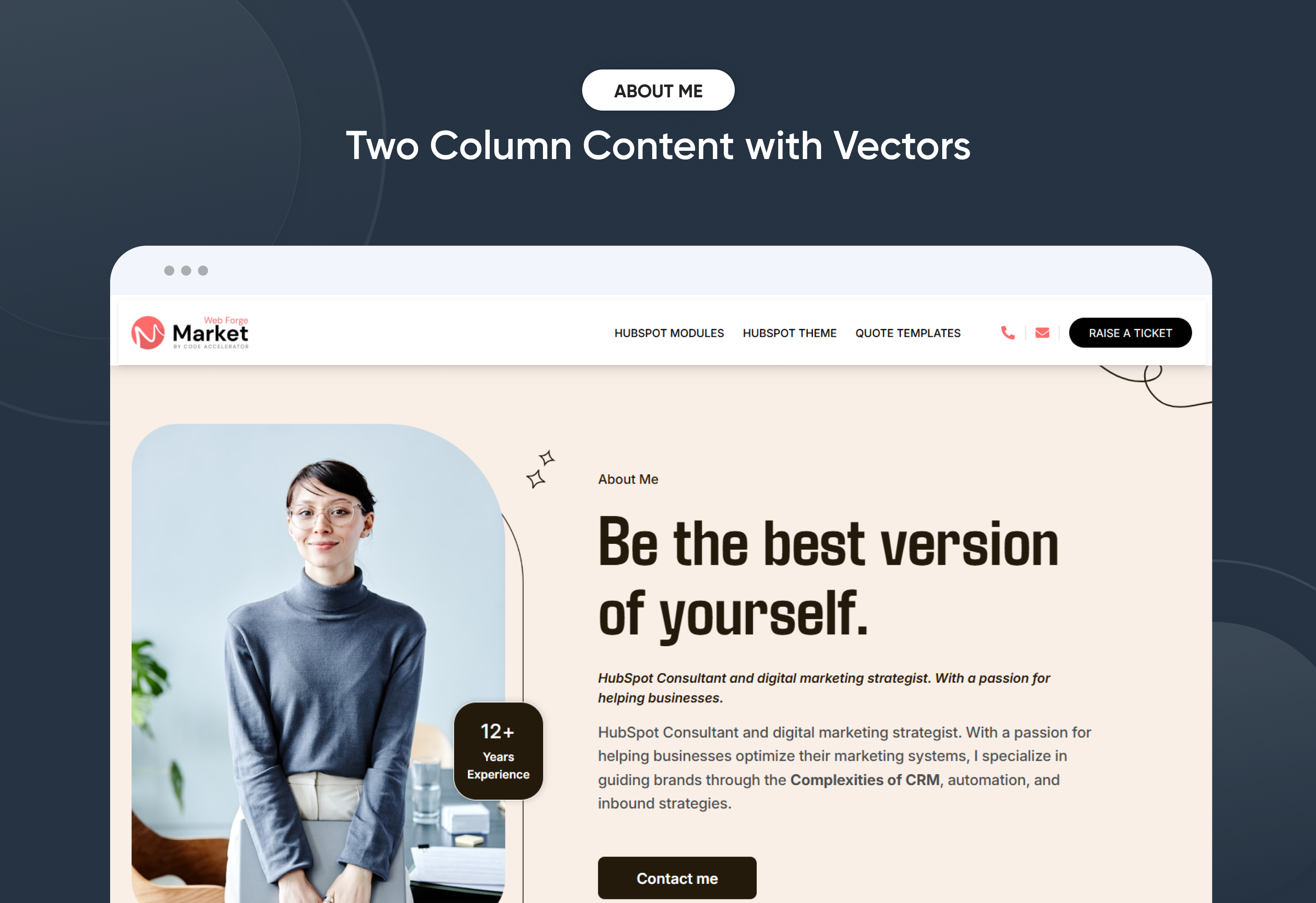
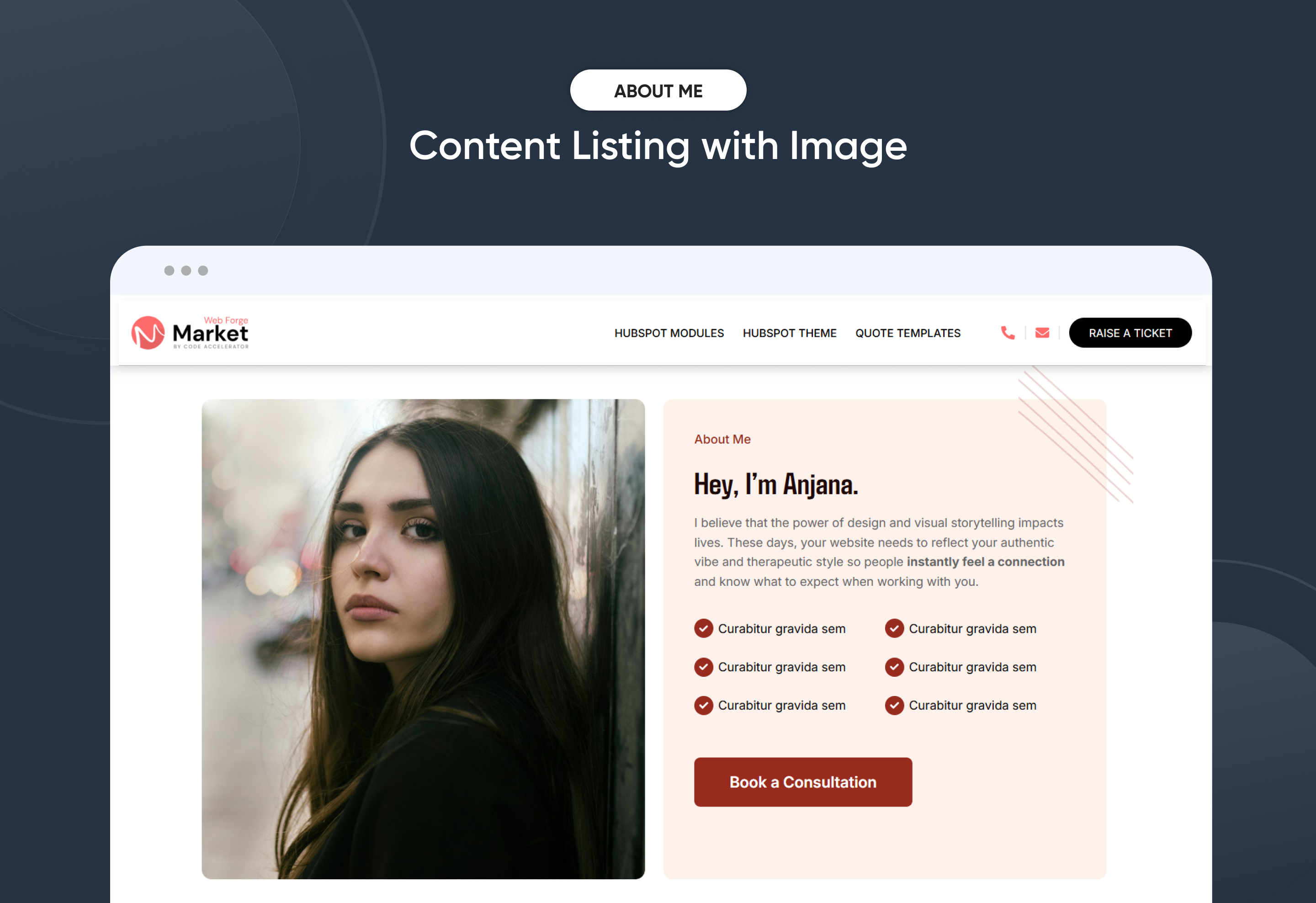
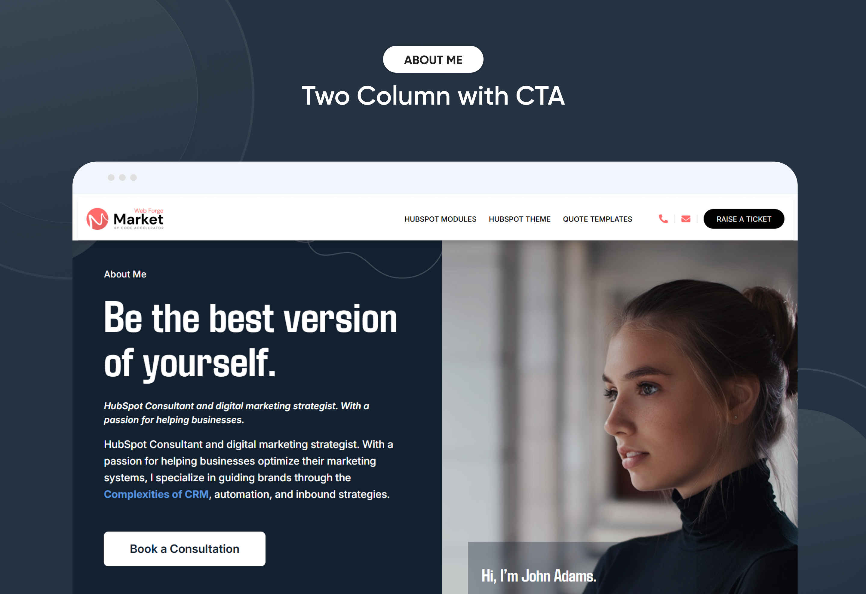
Create a personalized "About Me" section with ease. This flexible module lets you customize styles, layouts, and design elements to match your brand. No coding needed—just simple, intuitive controls. Perfect for adding a professional touch to your site.
Key Features of a About Me Module :
✅ 3 Unique Layout Options – Choose from three beautifully crafted slider layouts to match any design style.
✅ Fully Mobile Responsive – Seamlessly adapts to all screen sizes for the best viewing experience.
✅ Personal Introduction – A brief overview highlighting who you are, your background, and personality.
✅ Professional Summary – A snapshot of your career, skills, and areas of expertise.
✅ Modern & Clean Design – Sleek, contemporary styling fits perfectly into any modern website.
✅ Easy to Edit – Quickly customize content, styles, and settings without hassle.
✅ Easy to Integrate – Simple setup and integration into any page or theme.
✅ Optimized for Performance – Lightweight and fast for smooth transitions and loading.
✅ Call to Action (CTA) – A friendly nudge like “Contact me” or “Book a Consultation” with a button.
Discover More in the Knowledge Base
Explore detailed documentation, setup instructions, feature explanations, and best practices to help you get the most out of this module quickly and efficiently.
$39
Pricing Plans Premium
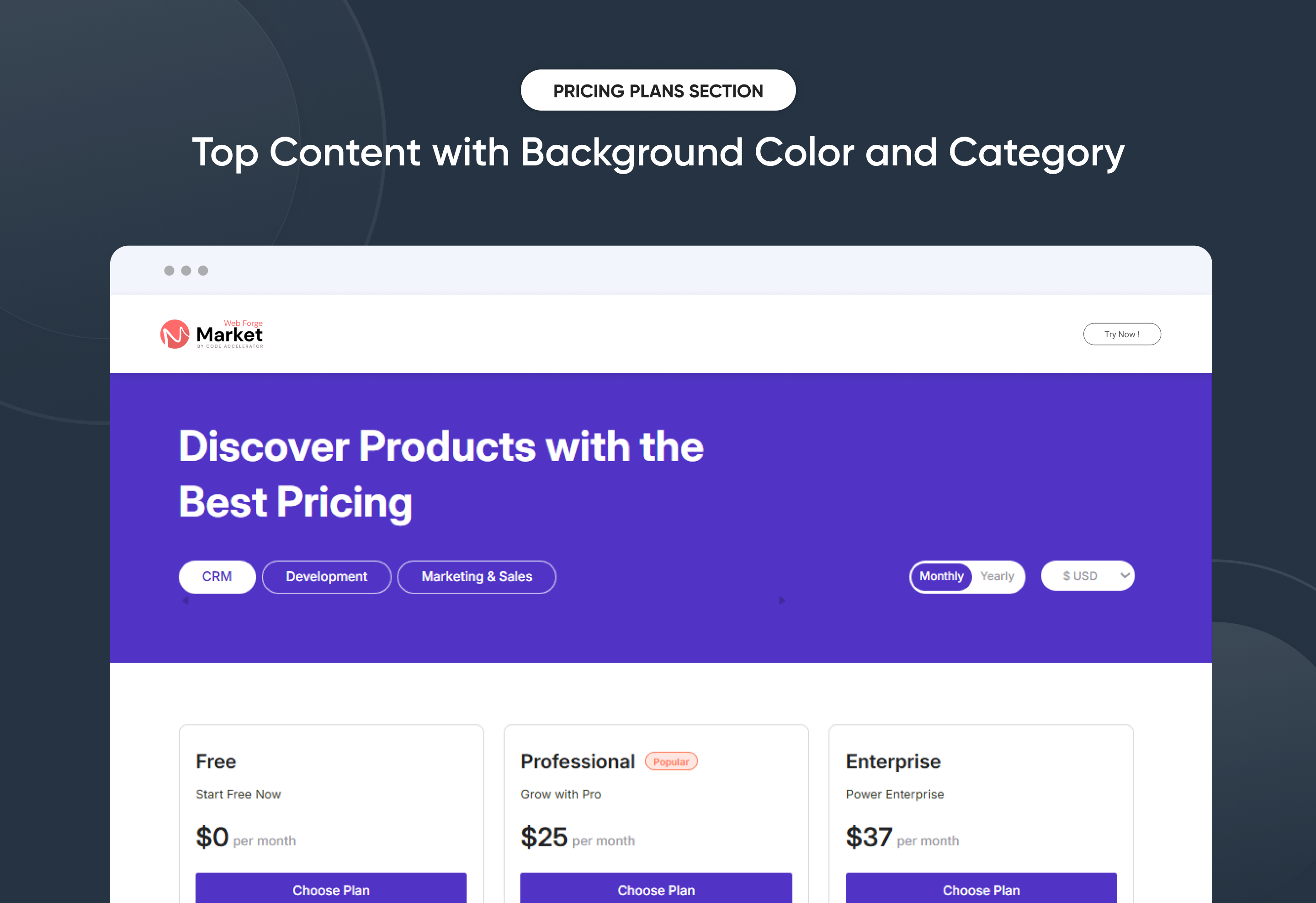
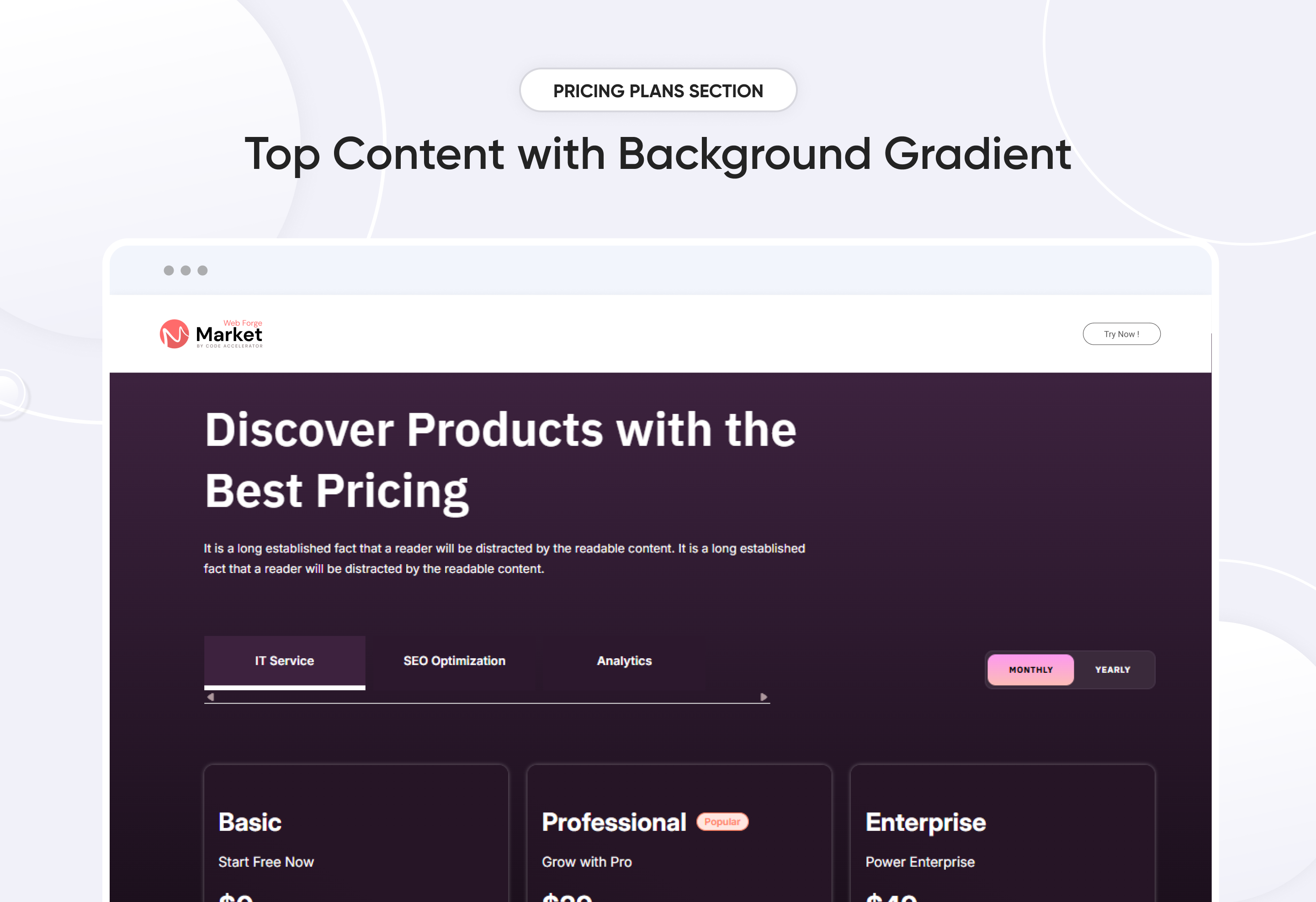
Turn your pricing section into a high-converting sales tool—without writing a single line of code.
Pricing Plans Premium lets you showcase, customize, and update your plans in minutes. Flexible layouts, currency toggles, and category-based pricing make it easy for customers to find the perfect fit. Drag-and-drop controls, interactive animations, and instant updates create a smooth buying experience that scales with your business growth.
Key Features :
✅ Monthly & Yearly Toggle – Seamless switch between billing cycles.
✅ 3 Flexible Layouts – List, or accordion views adapt to any design style.
✅ Modern & Clean Design – Sleek, contemporary styling fits perfectly into any modern website.
✅ Easy to Edit – Quickly customize content, styles, and settings without hassle.
✅ Easy to Integrate – Simple setup and integration into any page or theme.
✅ Optimized for Performance – Lightweight and fast for smooth transitions and loading.
✅ Category-Based Pricing – Organize plans by service category.
Discover More in the Knowledge Base
Explore detailed documentation, setup instructions, feature explanations, and best practices to help you get the most out of this module quickly and efficiently.
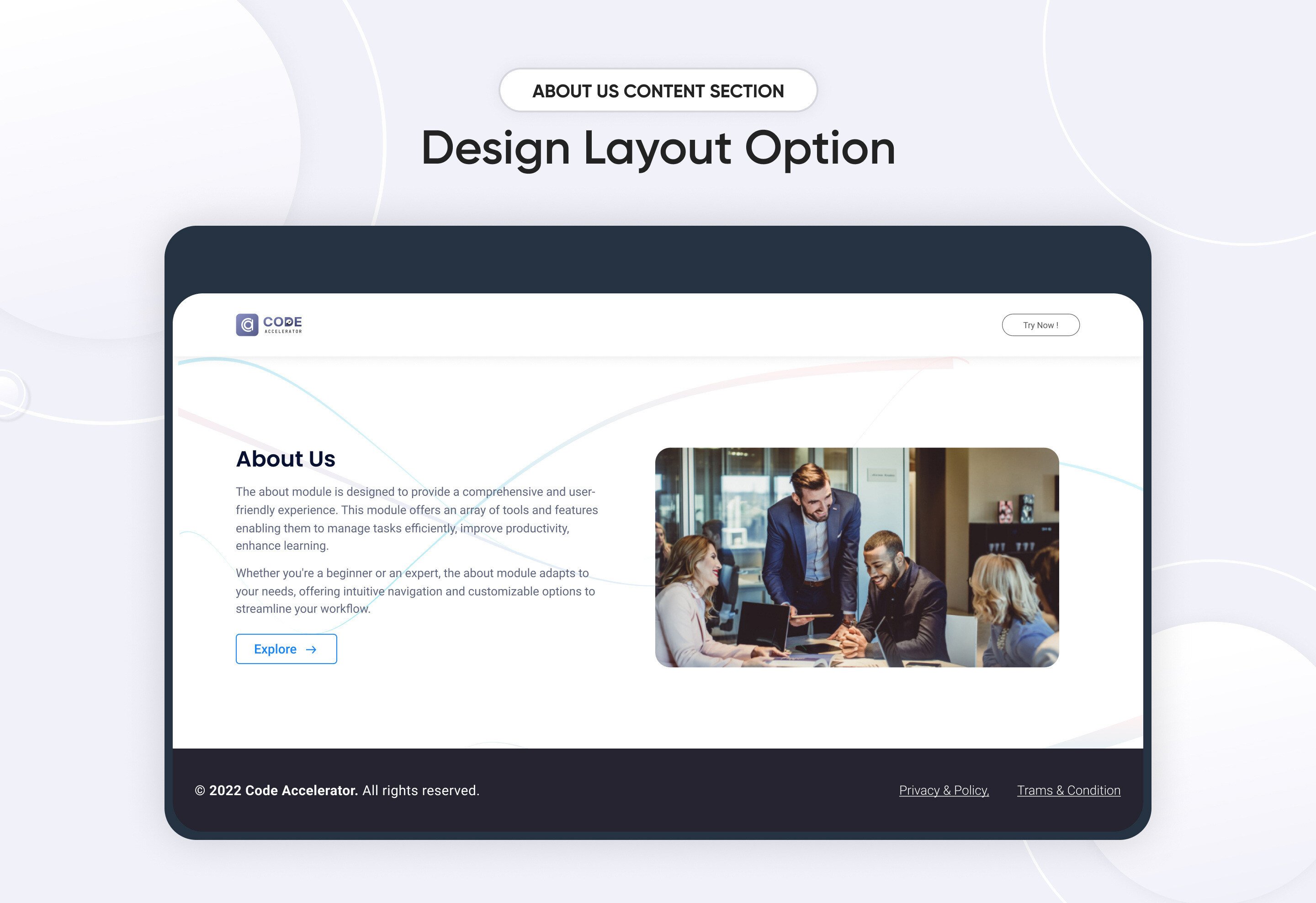 $free
$free
About Us Content
The About Us module is a dedicated section that introduces your company or organization to visitors. It highlights your mission, values, and the story behind your brand, helping to create a connection with your audience.
Key Features of the About Us Content Module:
-
Company Overview
Provides a clear and concise introduction to your business, including its mission, vision, and core values.
-
Call to Action
Encourages visitors to take the next step, whether it's contacting you, learning more, or exploring your products/services.
-
Core Values
Emphasizes the principles and values that guide your company’s work and decision-making process.
Discover More in the Knowledge Base
Explore detailed documentation, setup instructions, feature explanations, and best practices to help you get the most out of this module quickly and efficiently.
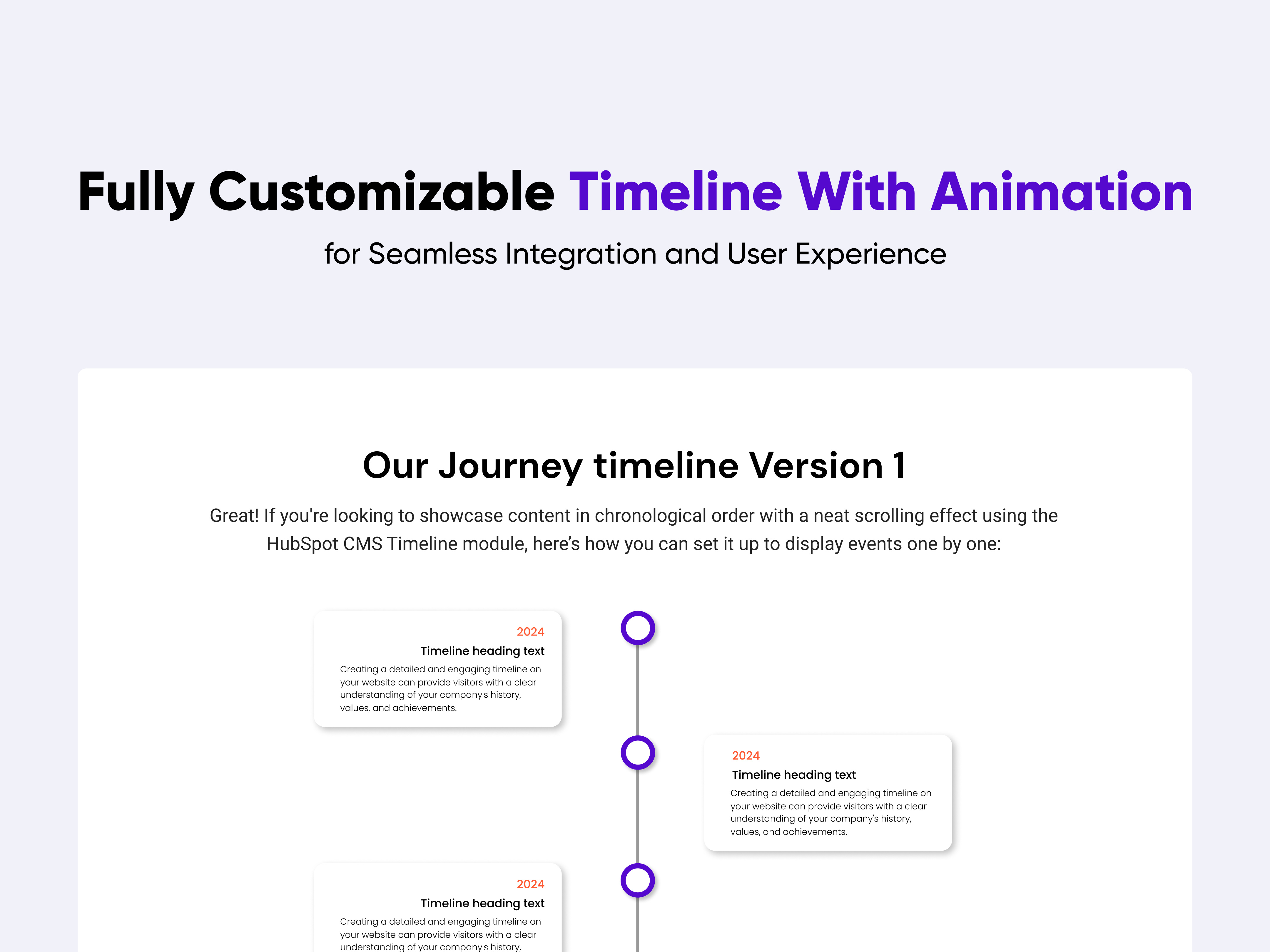 $29
$29
Timeline with Animation
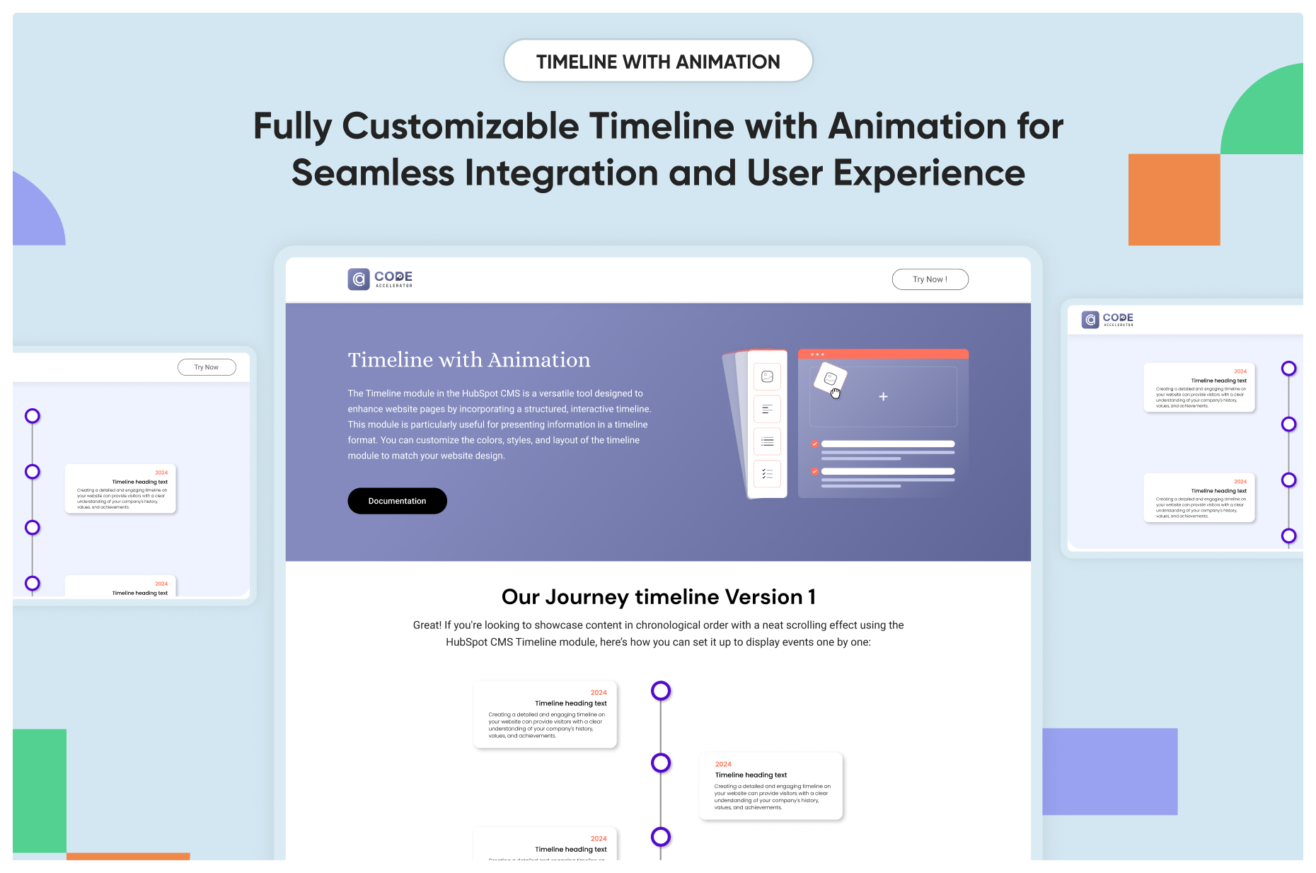
A "timeline module" in the context of software or web development typically refers to a component or feature that allows users to create, manage, and display chronological events in an interactive and visually appealing manner. Here's a knowledge base covering various aspects of a timeline module:
Key Features :
-
Event Management: Users can add, edit, and delete events along a chronological timeline. Each event typically includes details such as a title, description, date, and optionally.
-
Responsive Design: The timeline module should be responsive, meaning it adapts smoothly to different screen sizes and devices. This ensures a consistent user experience across desktops, tablets, and mobile devices.
-
Customizable Styling: Users can customize the appearance of the timeline to match their branding or design preferences. This includes options for colors, fonts, sizes, and overall layout.
-
Smooth Animations: Implement smooth animations to enhance the user experience during drag-and-drop actions.
Discover More in the Knowledge Base
Explore detailed documentation, setup instructions, feature explanations, and best practices to help you get the most out of this module quickly and efficiently.
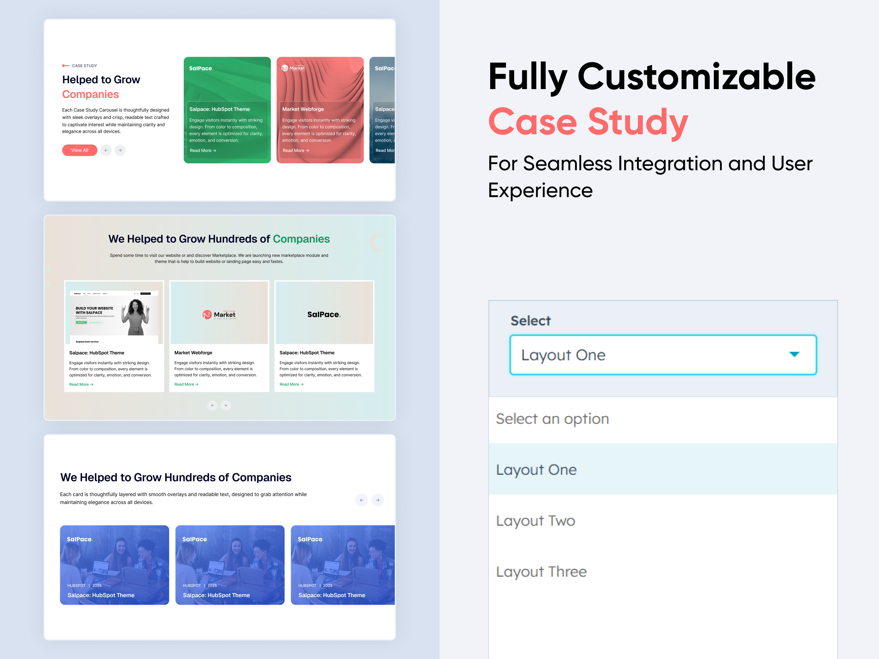 $19
$19
Case Study
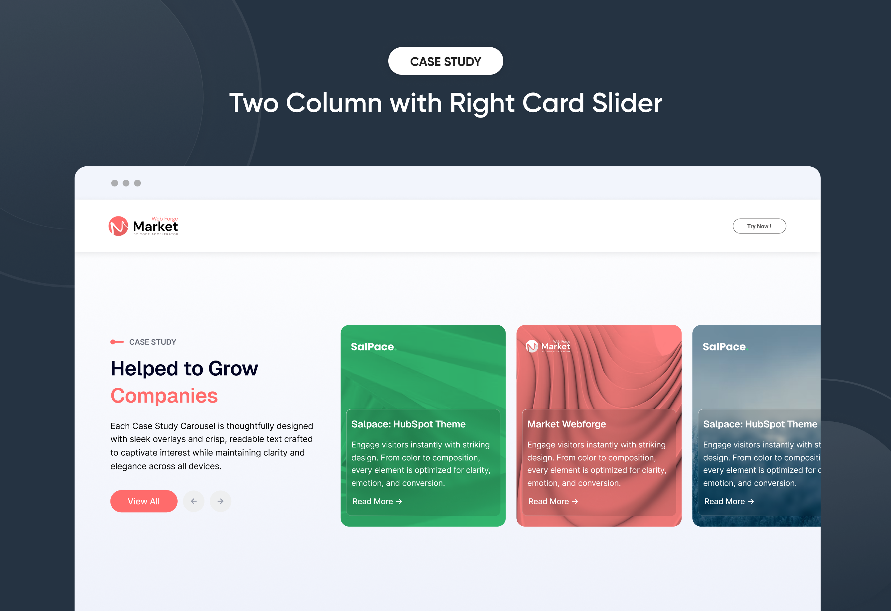
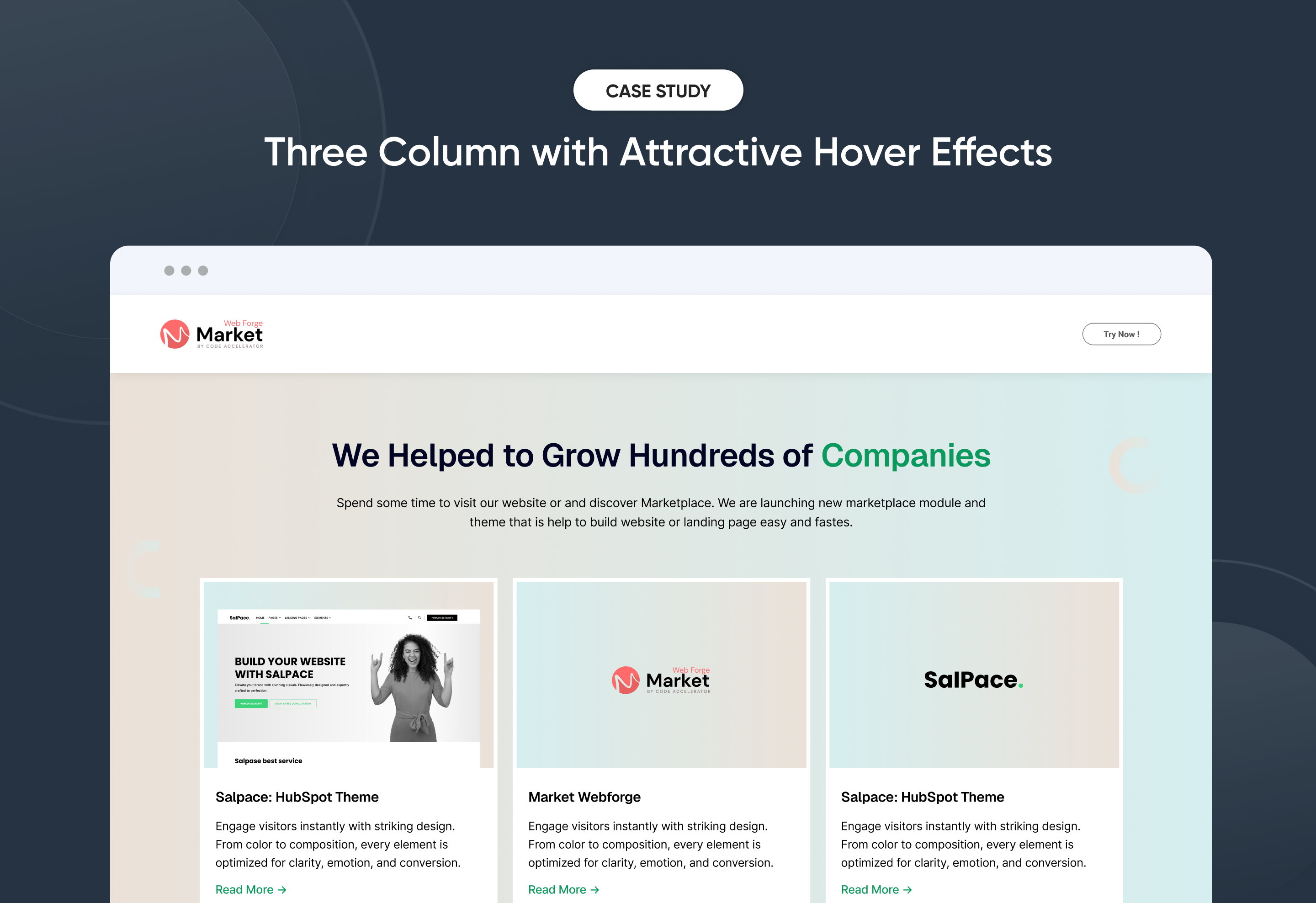
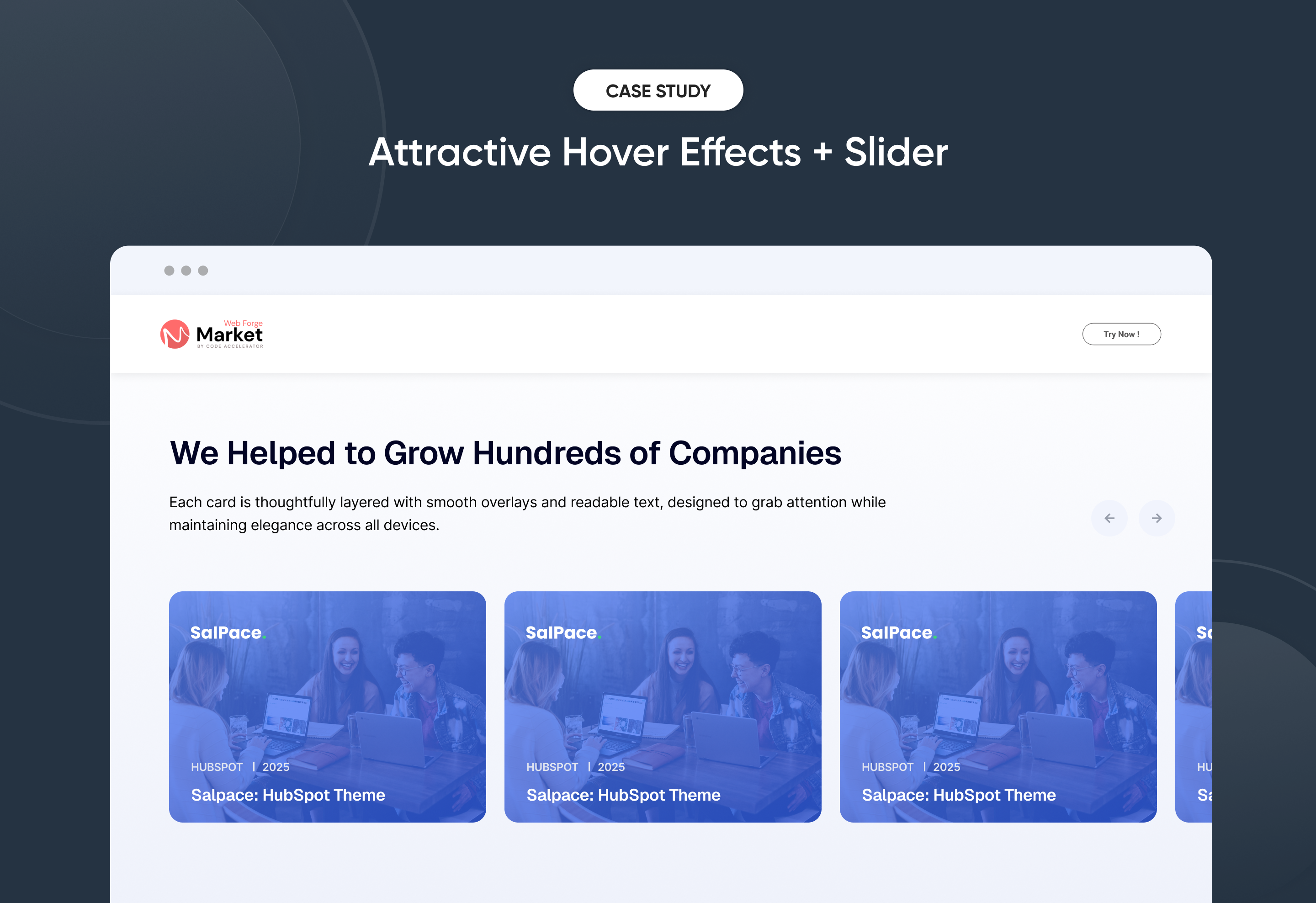
Quickly create a compelling ‘Case Study’ section to showcase client success stories and real results with impact. This flexible module lets you customize layouts, images, and content to match your brand style. No coding required—just simple, intuitive controls. Perfect for presenting case studies in a clear, engaging, and professional way on any HubSpot page.
Key Features of a Case Study Module :
✅ Smooth Slider Functionality – Built-in carousel with autoplay, navigation arrows, and swipe support for a modern browsing experience.
✅ Fully Mobile Responsive – Seamlessly adapts to all screen sizes for the best viewing experience.
✅ Modern & Clean Design – Sleek, contemporary styling fits perfectly into any modern website.
✅ Easy to Edit – Quickly customize content, styles, and settings without hassle.
✅ Hover & Animation Effects – Engage users with smooth hover states, transitions, and subtle animations.
✅ Optimized for Performance – Lightweight and fast for smooth transitions and loading.
✅ Call to Action (CTA) – A friendly nudge like “Contact me” or “Book a Consultation” with a button.
Discover More in the Knowledge Base
Explore detailed documentation, setup instructions, feature explanations, and best practices to help you get the most out of this module quickly and efficiently.
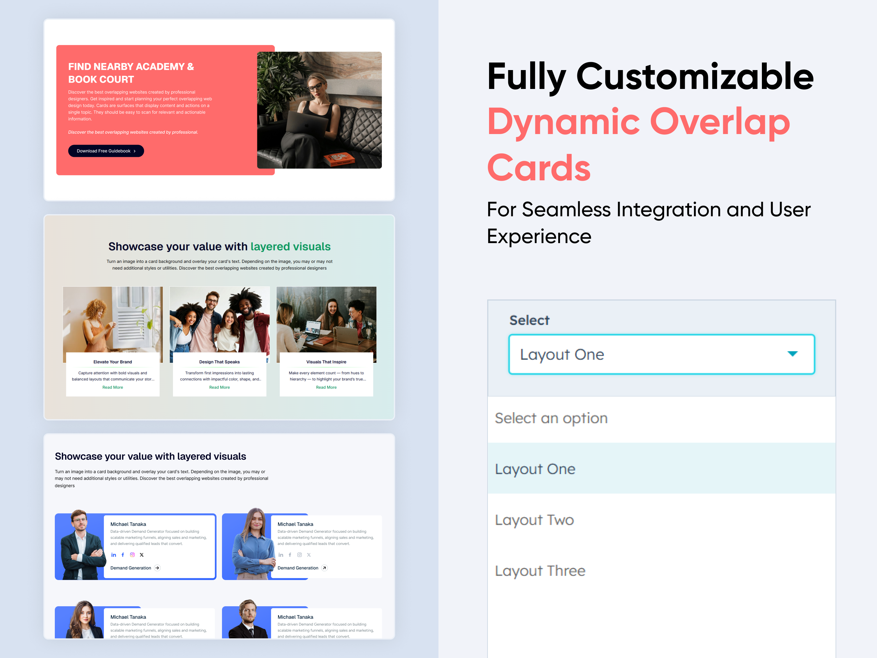 $19
$19
Dynamic Overlap Cards
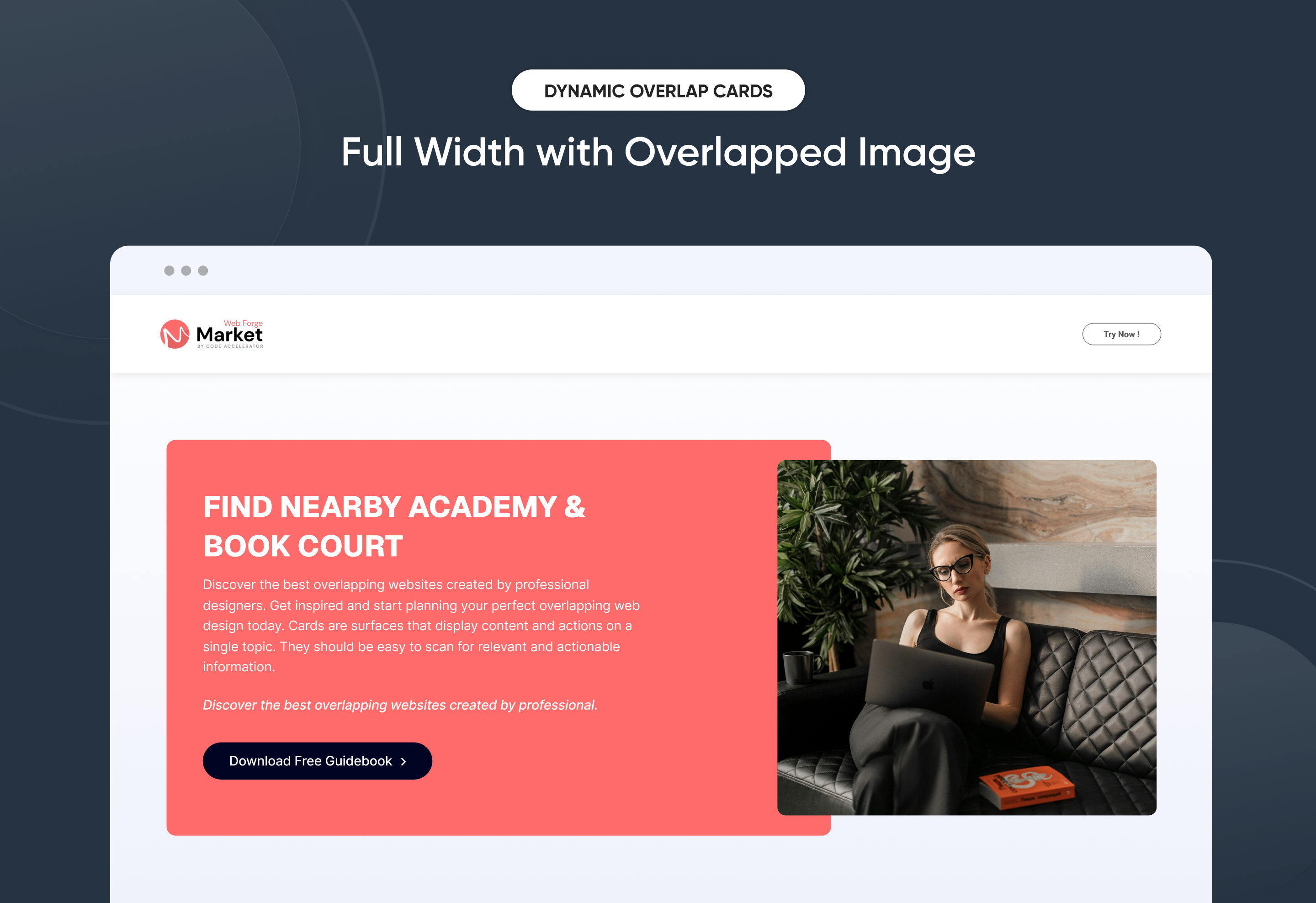
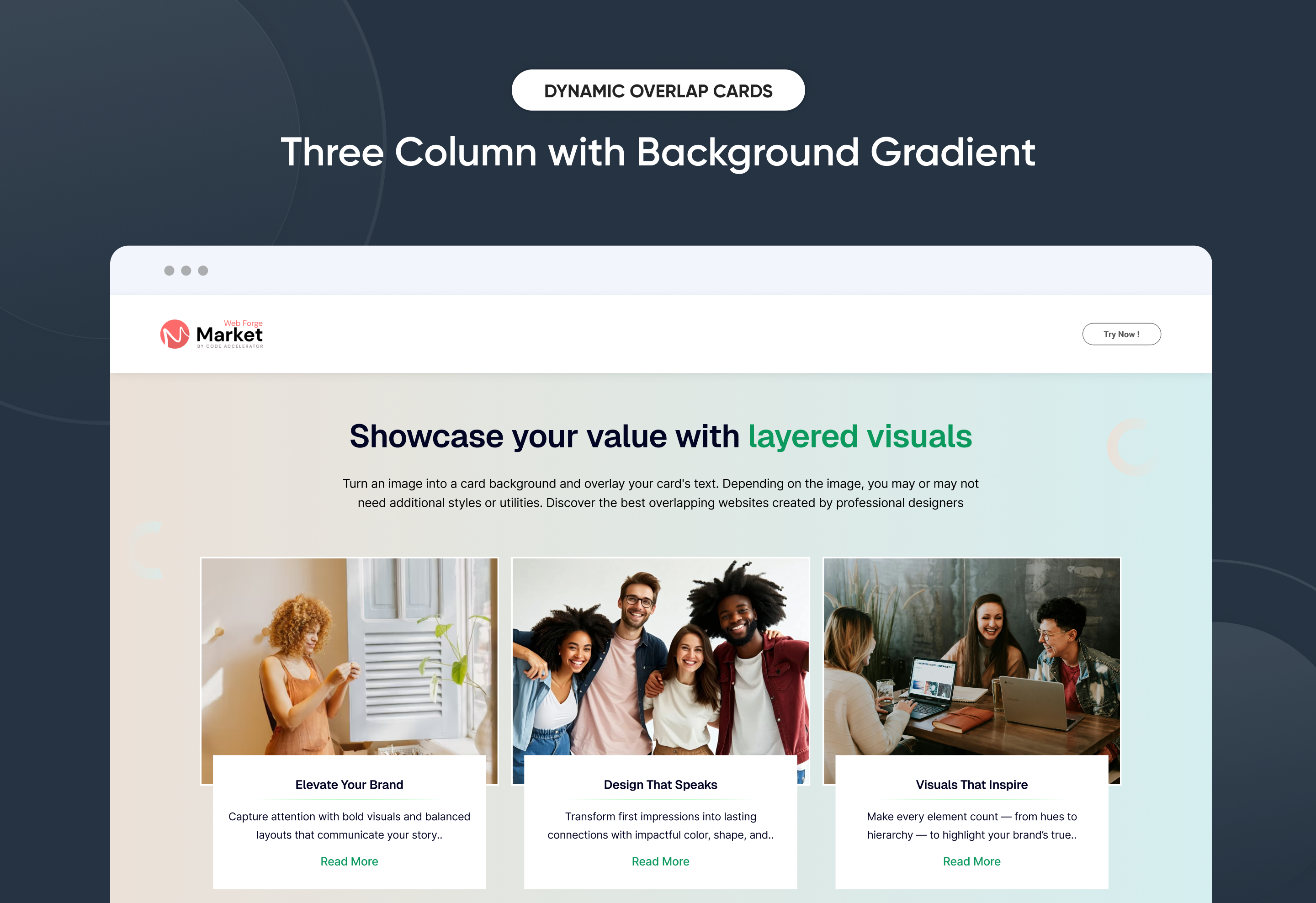
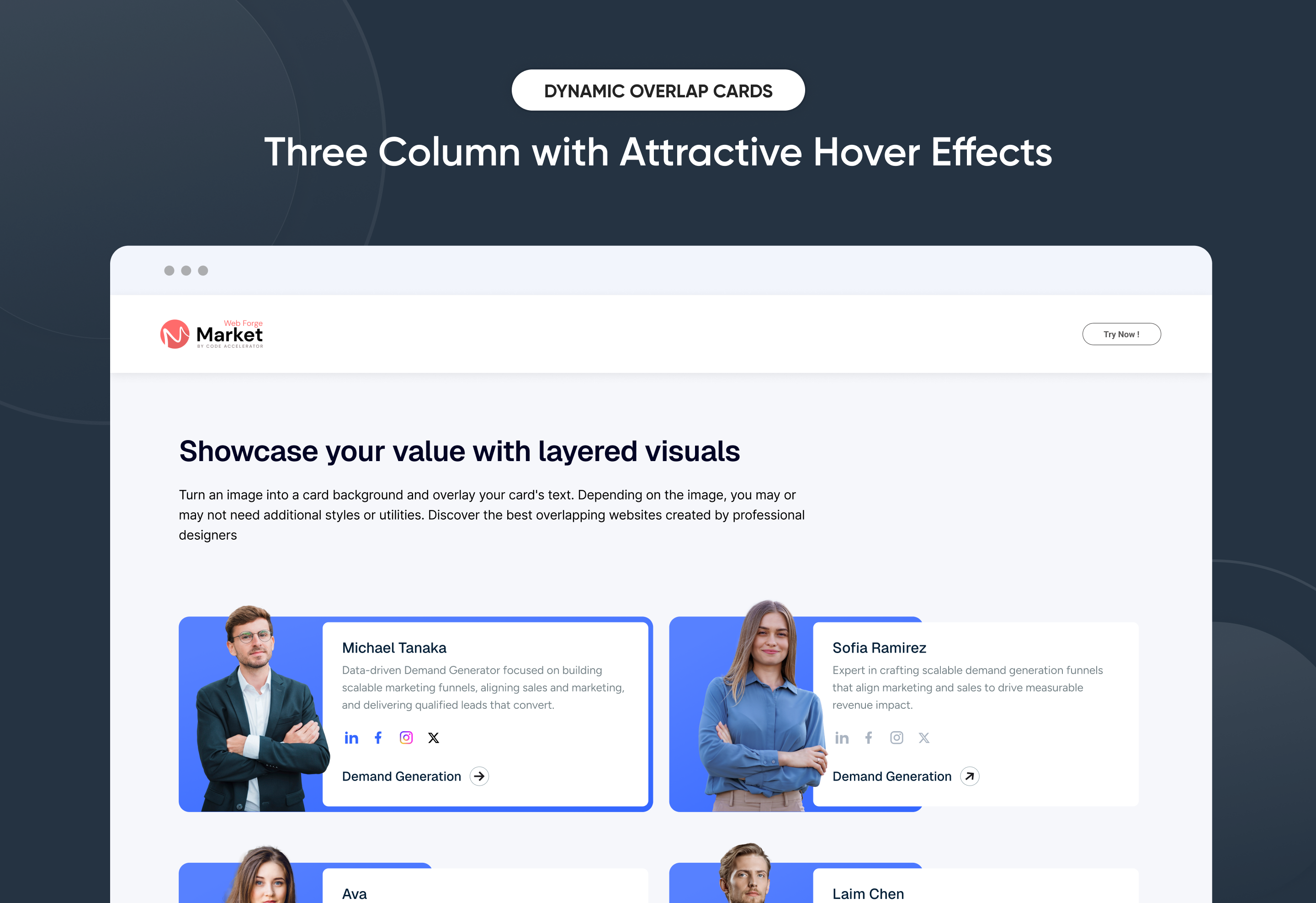
Effortlessly build eye-catching overlap-style content sections to highlight services, features, or team members with visual depth. The Dynamic Overlap Cards module offers full control over layout, spacing, and animations—no coding needed. Customize text, images, and hover effects to perfectly match your brand. Ideal for creating modern, interactive showcases on any HubSpot page.
Key Features of a Dynamic Overlap Cards Module :
✅ Modern Overlap Card Design – Create visually stunning layouts with layered card effects that instantly grab attention.
✅ Fully Mobile Responsive – Seamlessly adapts to all screen sizes for the best viewing experience.
✅ Modern & Clean Design – Sleek, contemporary styling fits perfectly into any modern website.
✅ Easy to Edit – Quickly customize content, styles, and settings without hassle.
✅ Hover & Animation Effects – Engage users with smooth hover states, transitions, and subtle animations.
✅ Optimized for Performance – Lightweight and fast for smooth transitions and loading.
✅ Call to Action (CTA) – A friendly nudge like “Contact me” or “Book a Consultation” with a button.
Discover More in the Knowledge Base
Explore detailed documentation, setup instructions, feature explanations, and best practices to help you get the most out of this module quickly and efficiently.
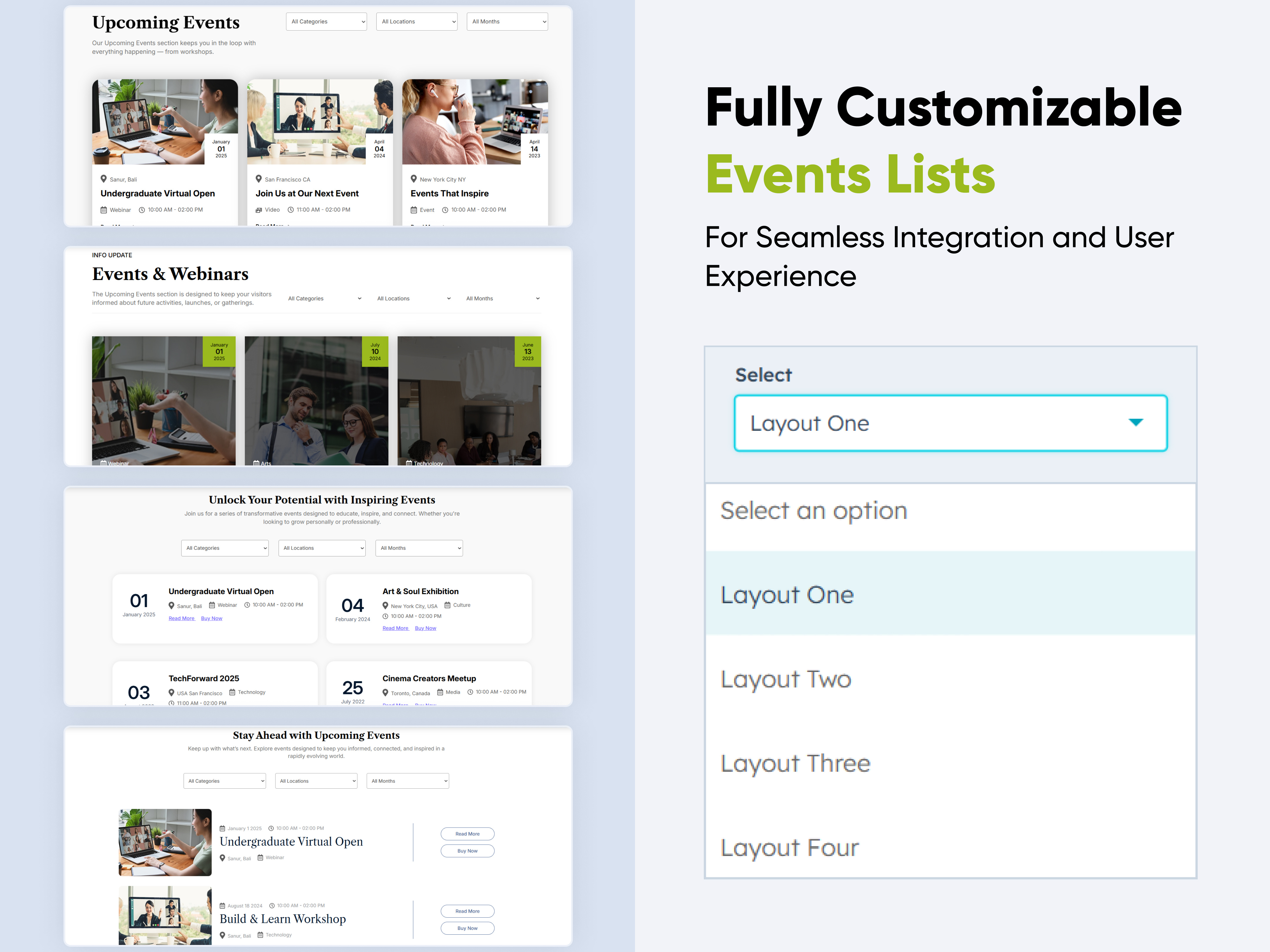 $39
$39
Events List Premium
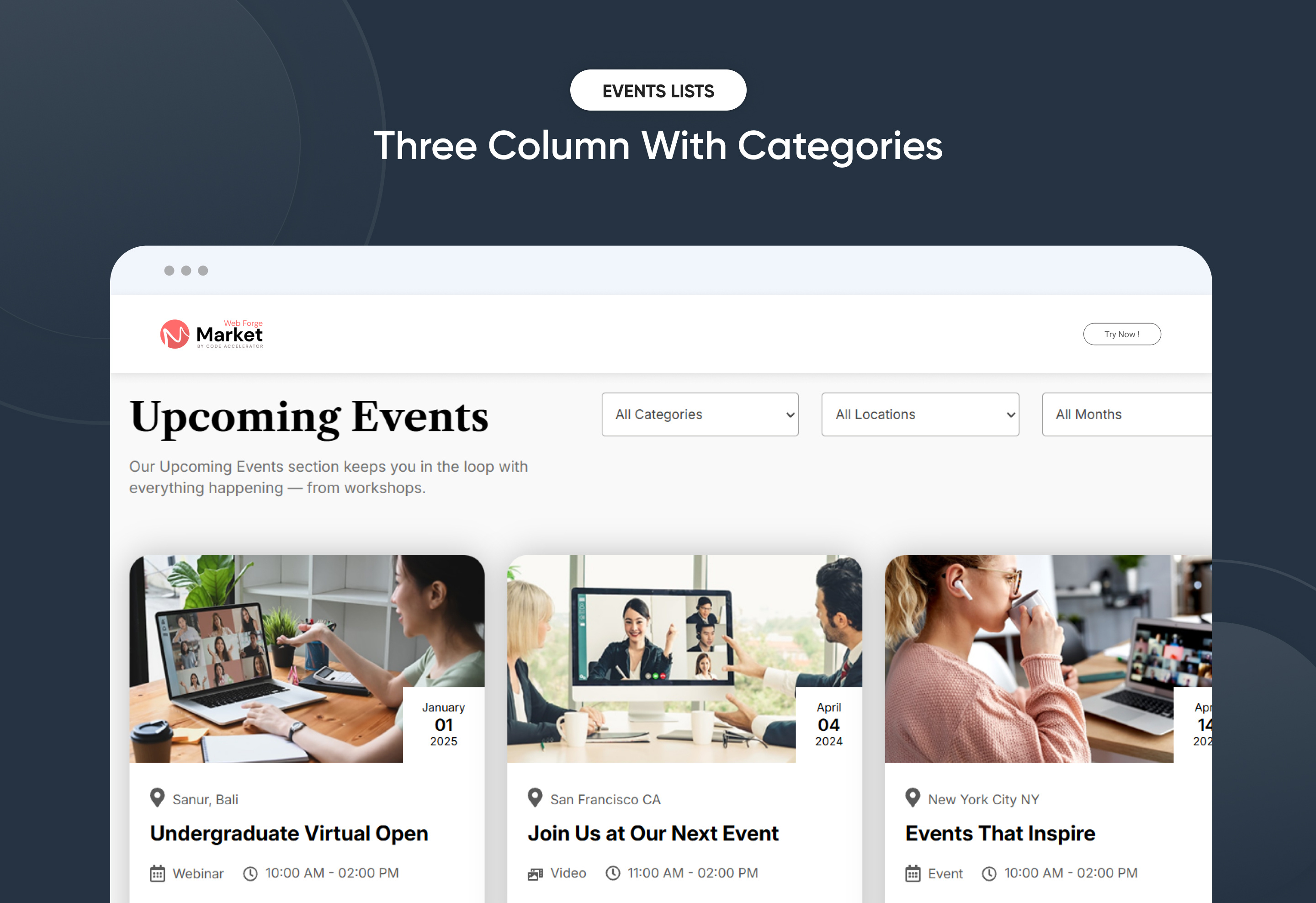
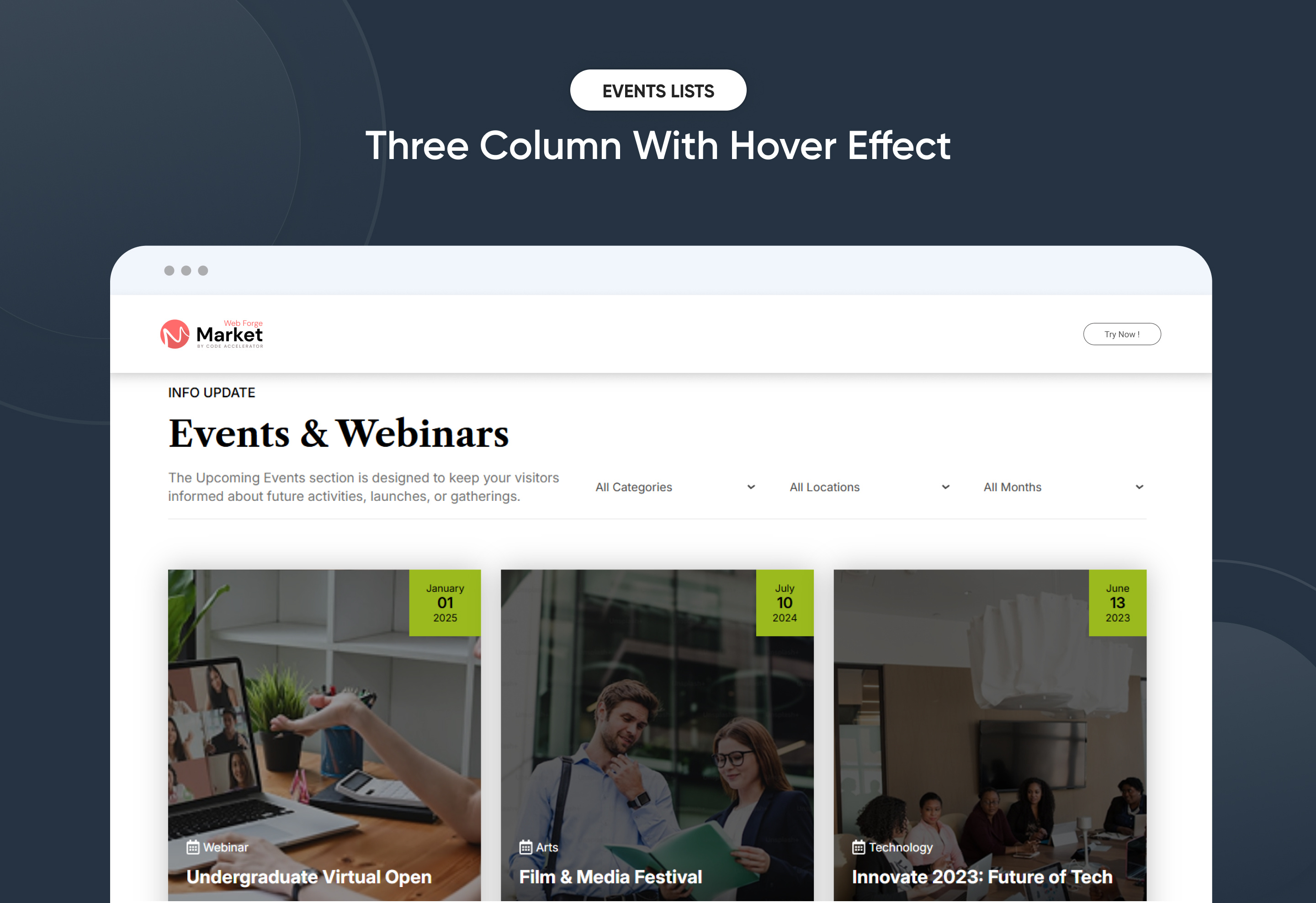
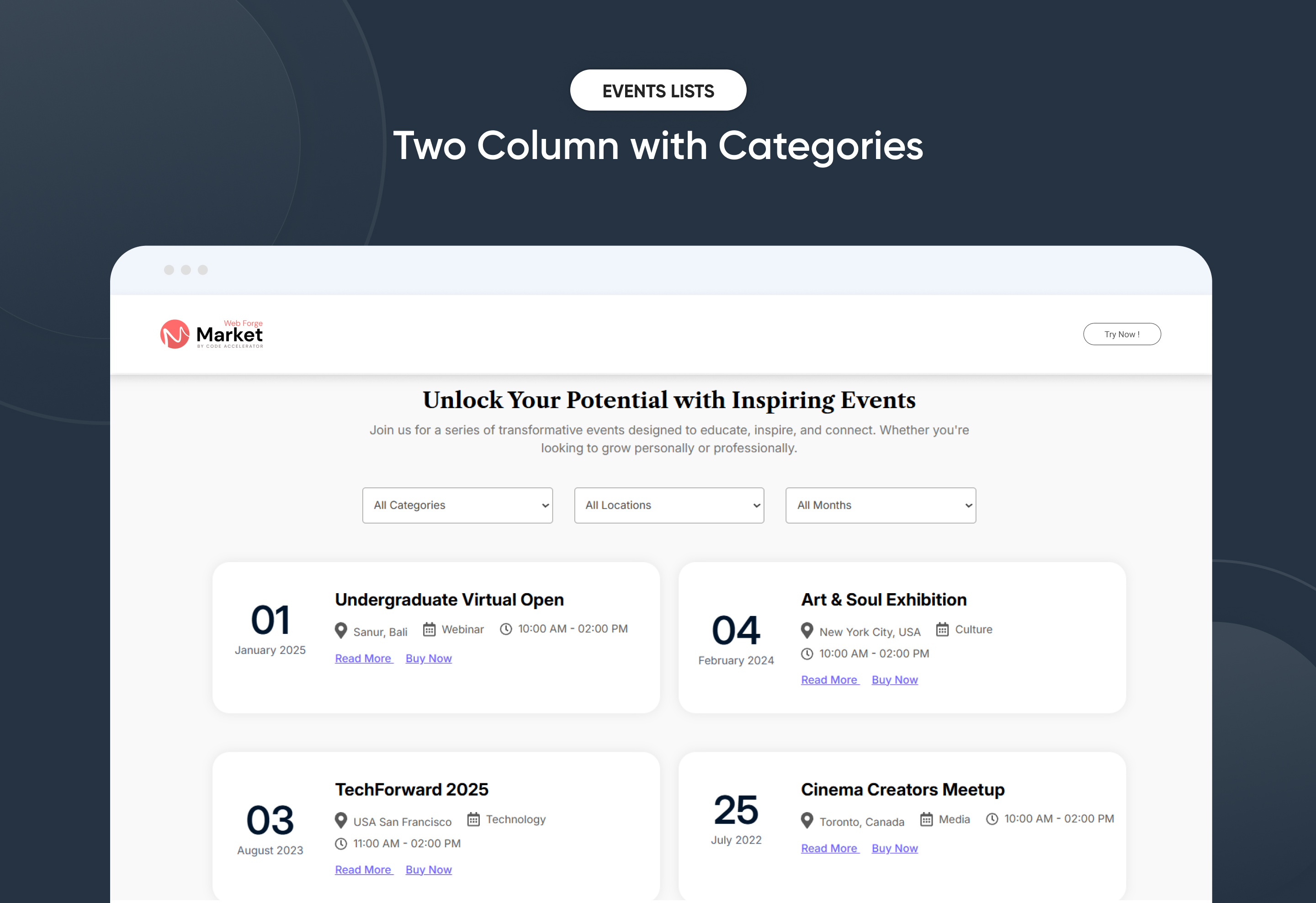
A feature-rich, responsive event listing system designed to give users a seamless way to explore upcoming happenings. Perfect for organizations, communities, and brands that run multiple events across locations and timeframes.
Key Features of a Events List Premium Module :
🧩4 Layout Options
-
Choose from four professionally designed layouts.
-
Tailored for different use cases — from compact card views to full-detail layouts.
🎯 Advanced Filtering
Each layout includes built-in filters for:
-
Location – Narrow events by city, region, or venue.
-
Month – View events based on upcoming or specific months.
-
Category – Filter by event types (e.g., Webinar, Workshop, Conference).
-
Tab Option – Choose tabbed filtering for clean, fast navigation between categories.
📱 Fully Responsive
-
Mobile-first design adapts beautifully across devices.
-
Ensures touch-friendly interaction and smooth filtering on smaller screens.
Discover More in the Knowledge Base
Explore detailed documentation, setup instructions, feature explanations, and best practices to help you get the most out of this module quickly and efficiently.
-1.png) $49
$49
Step Process Or Services
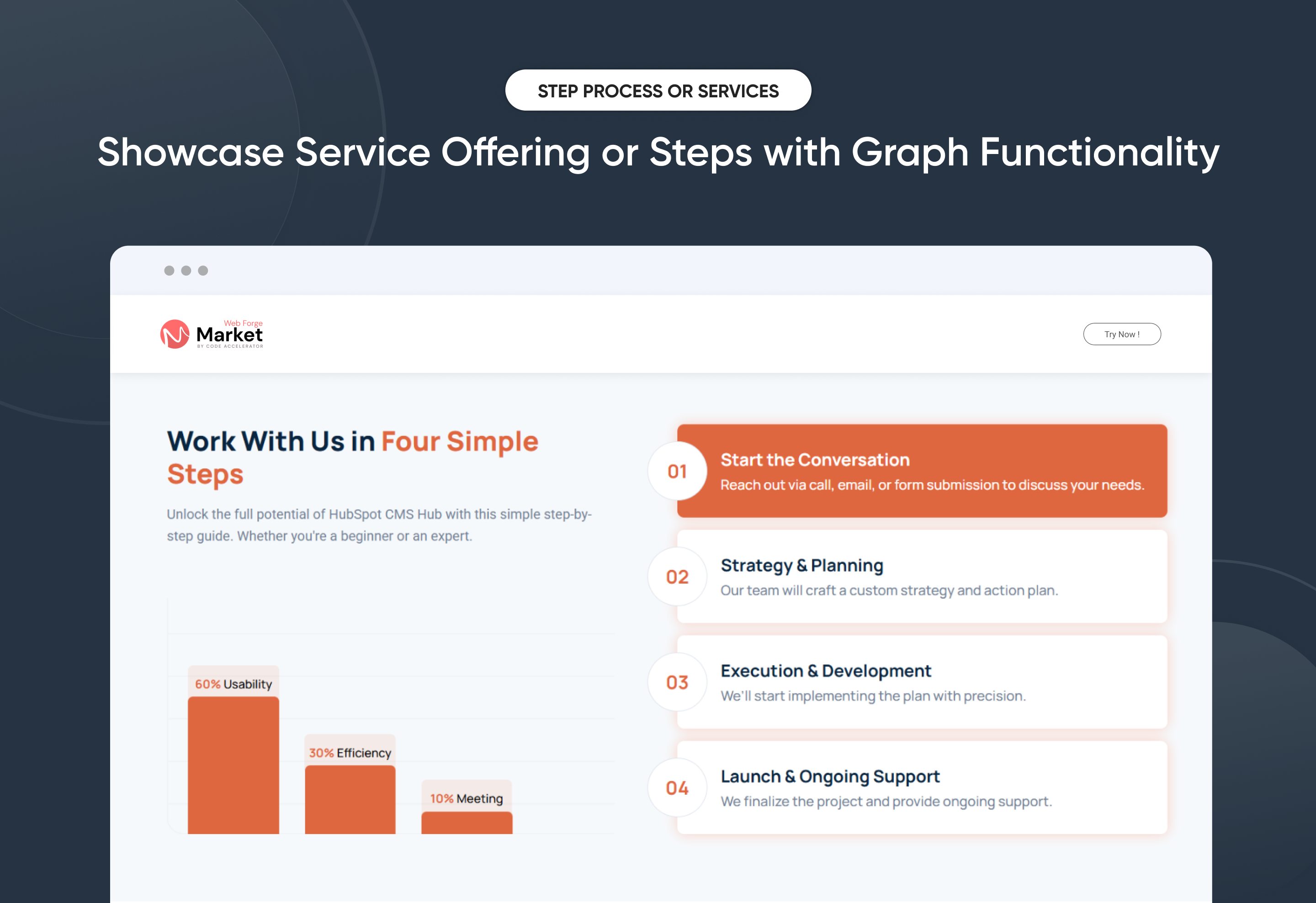
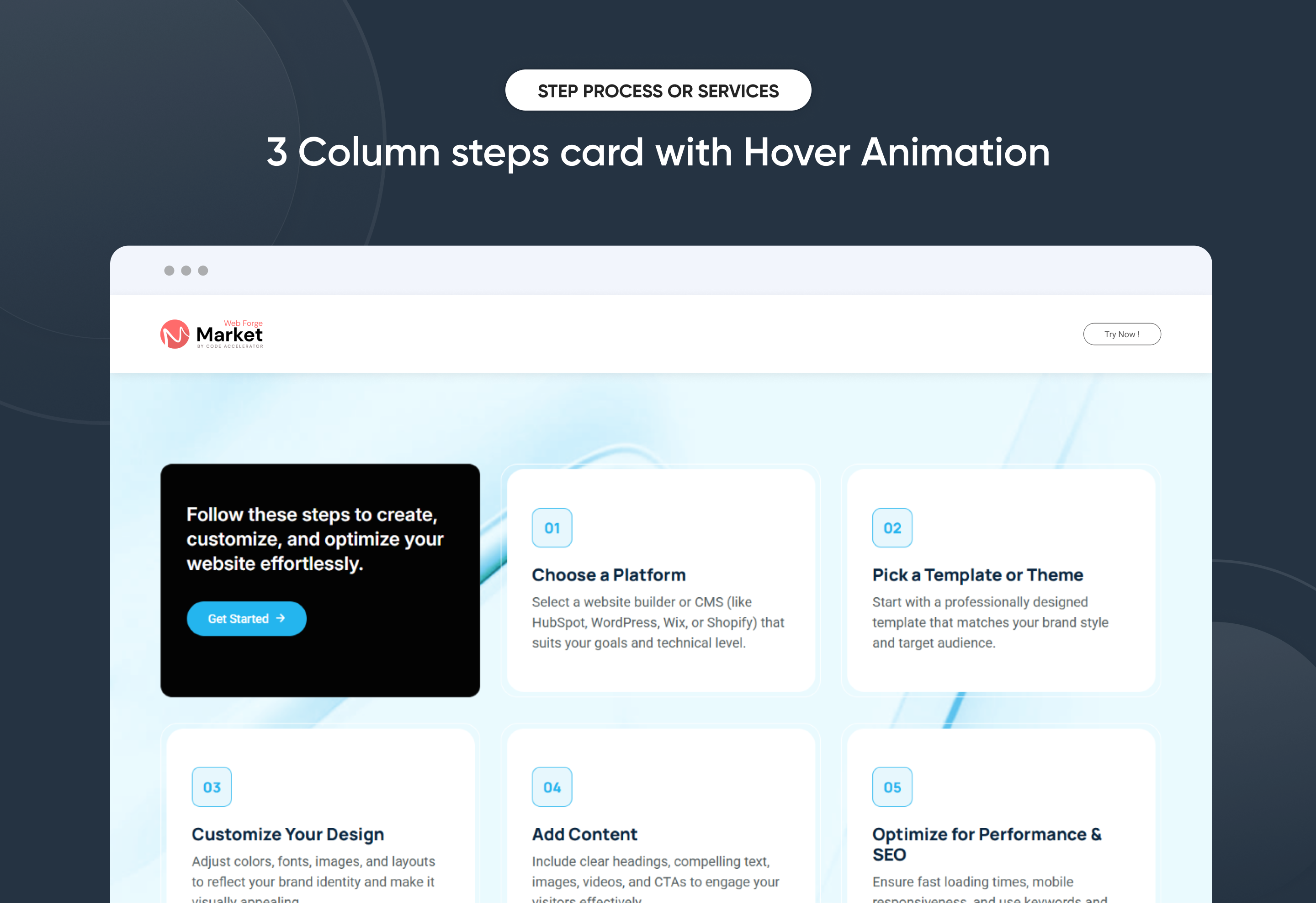
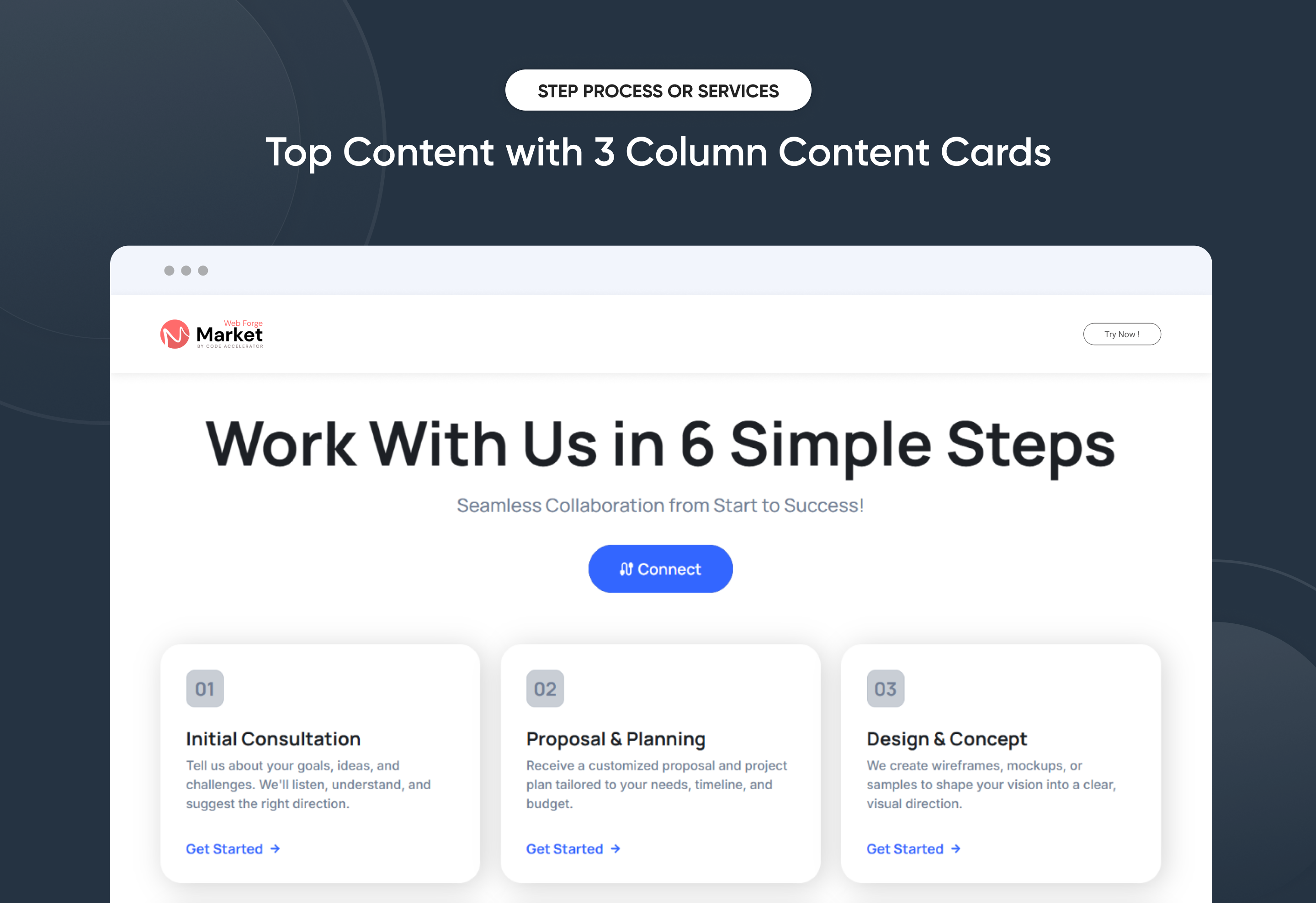
The Step Process Or Services is designed to present step-by-step information in an organized, user-friendly format. This module is useful for tutorials, onboarding processes, instructional guides, or any content that requires sequential navigation.
Key Features of a Step Process Or Services :
✅ Graph Functionality
- Visually represent progress or performance with built-in graph elements for added clarity and impact.
✅ Step Numbering
-
Each step is distinctly numbered to ensure clarity and easy tracking.
-
The numbering helps users follow the process in a structured way.
✅ Two-Column Layout
-
The left column typically contains the step number and title.
-
The right column provides images with more details.
-
This layout enhances readability and maintains a clean, structured design.
✅ Step with Tab Functionality
-
Each step can include a tab-based navigation system.
-
Tabs can be used to segment additional information without overwhelming the user.
✅ Responsive & Adaptive Design
-
Adjusts seamlessly for different screen sizes, ensuring a smooth experience on desktop and mobile.
-
On smaller screens, the two-column layout may stack vertically for better readability.
✅ Customizable Design
-
Colors, fonts, and step layouts can be customized to match branding and UI design preferences.
-
Step no. or visuals can be added next to steps for improved understanding.
Discover More in the Knowledge Base
Explore detailed documentation, setup instructions, feature explanations, and best practices to help you get the most out of this module quickly and efficiently.
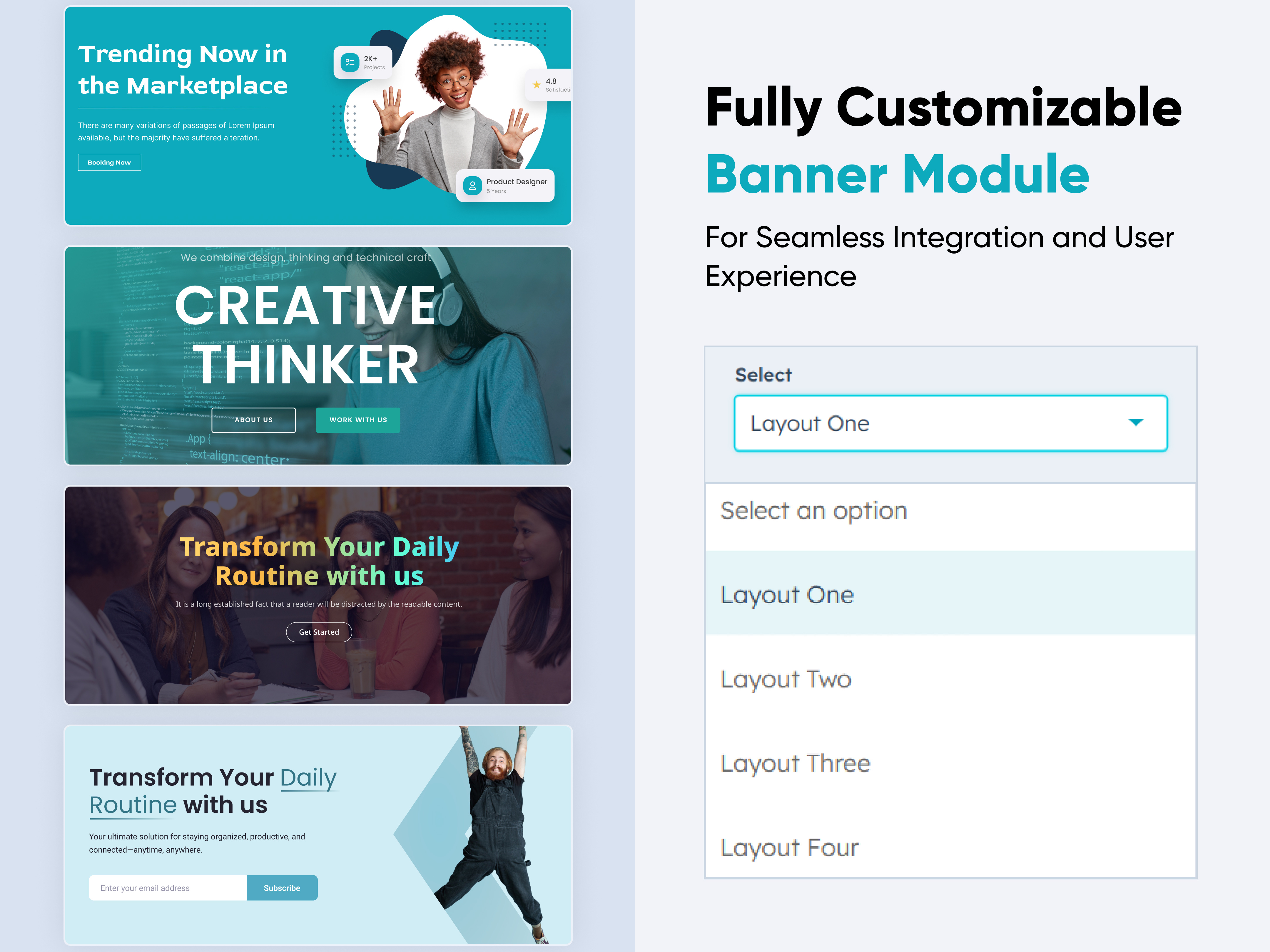 $29
$29
Banner
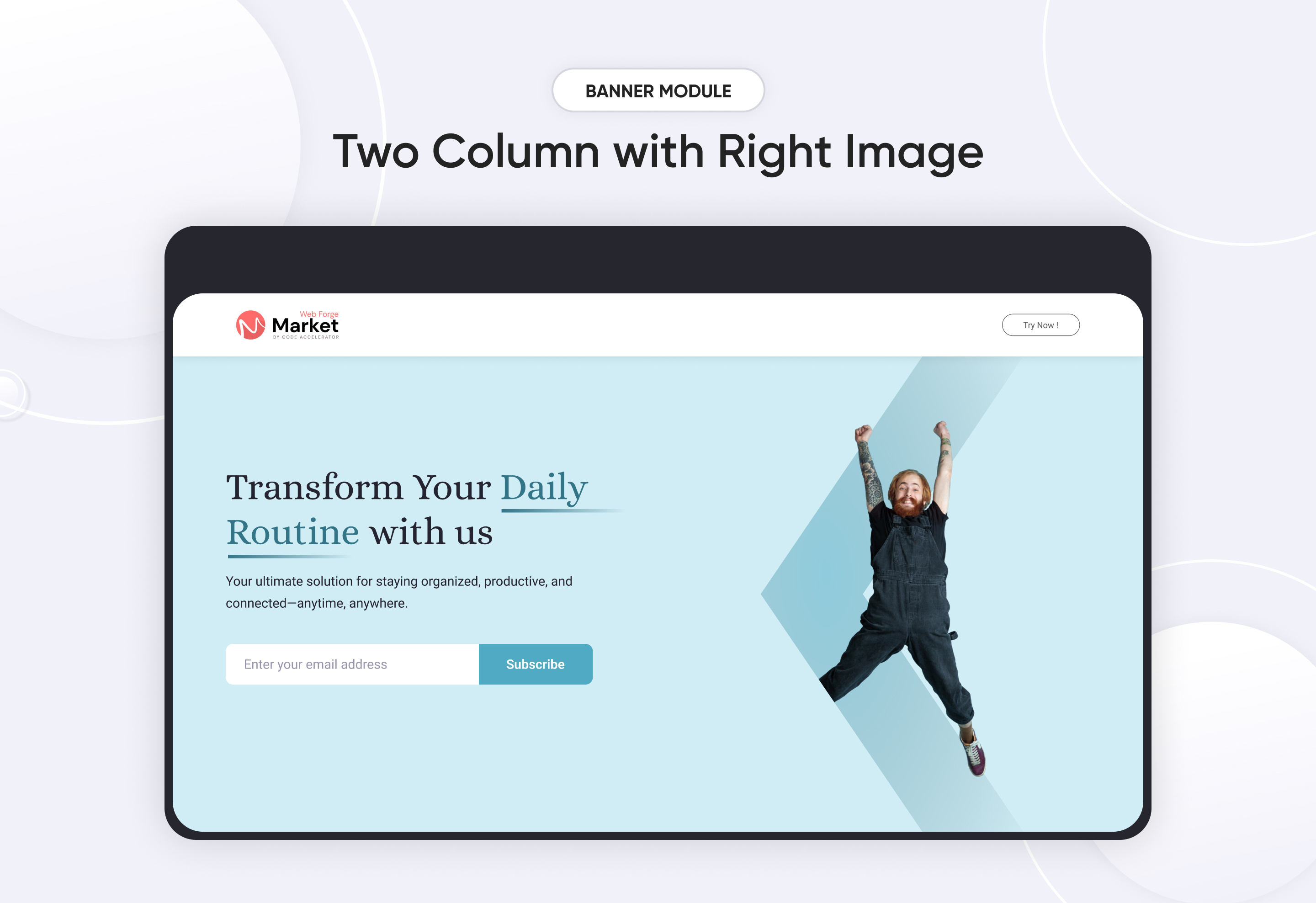
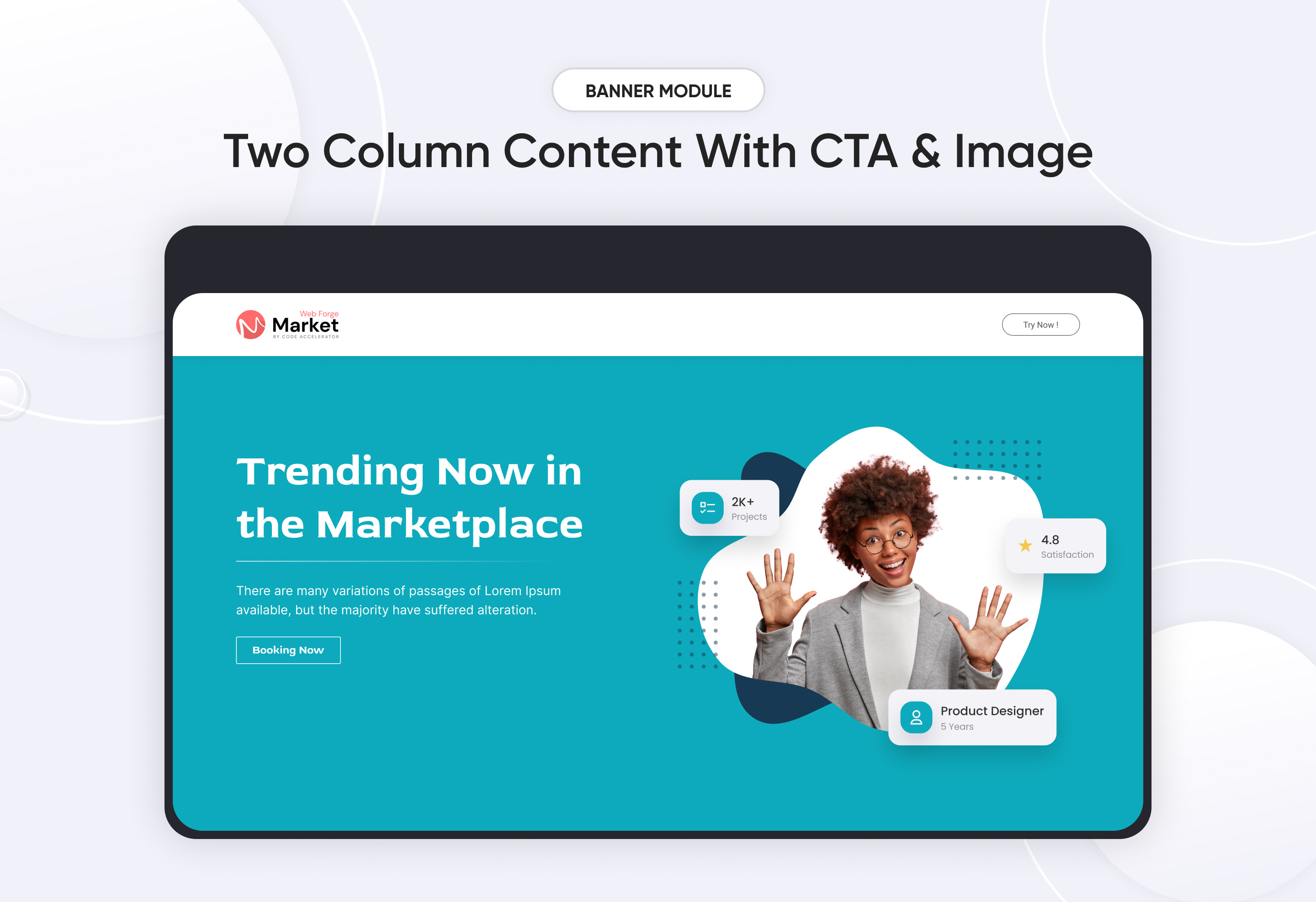
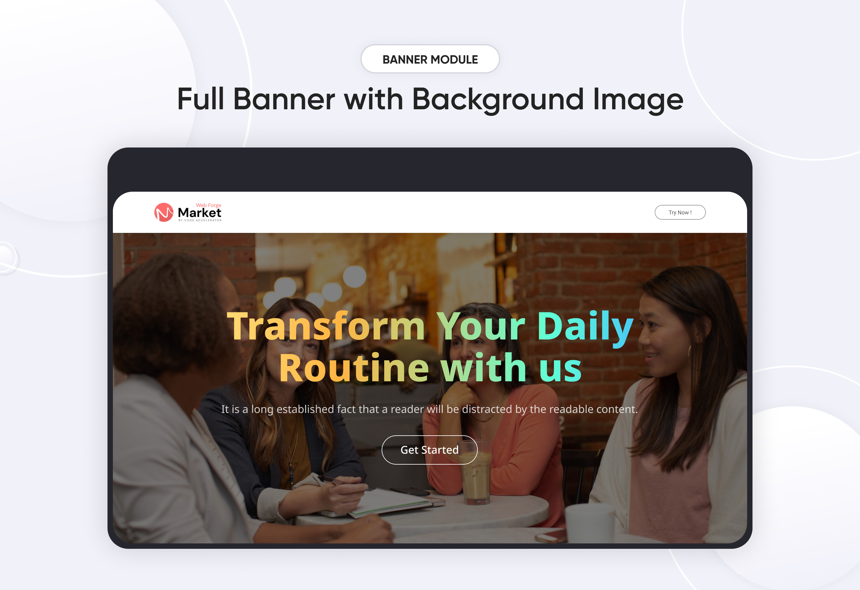
A Banner Module is a UI component used to display important messages, promotions, announcements, or visual content in a structured and engaging way. It can be static or dynamic, with interactive elements such as animations, buttons.
Key Features of a Banner Module :
-
Text Support – Can include image, text, and CTA.
-
Call-to-Action (CTA) Integration – Includes buttons for user interaction.
-
Responsive & Adaptive Design – Adjusts to different screen sizes.
-
Customizable Module– Supports different styles, colors, and layouts.
Use Cases:
🎯 Marketing & Promotions – Highlight sales, offers, and discounts.
📰 Announcements – Display alerts, news updates, and notifications.
📢 Hero Sections – Large banners for landing pages.
💻 Dashboard Notices – Important user notifications.
🎨 Brand Awareness – Showcasing company messages or taglines.
Discover More in the Knowledge Base
Explore detailed documentation, setup instructions, feature explanations, and best practices to help you get the most out of this module quickly and efficiently.
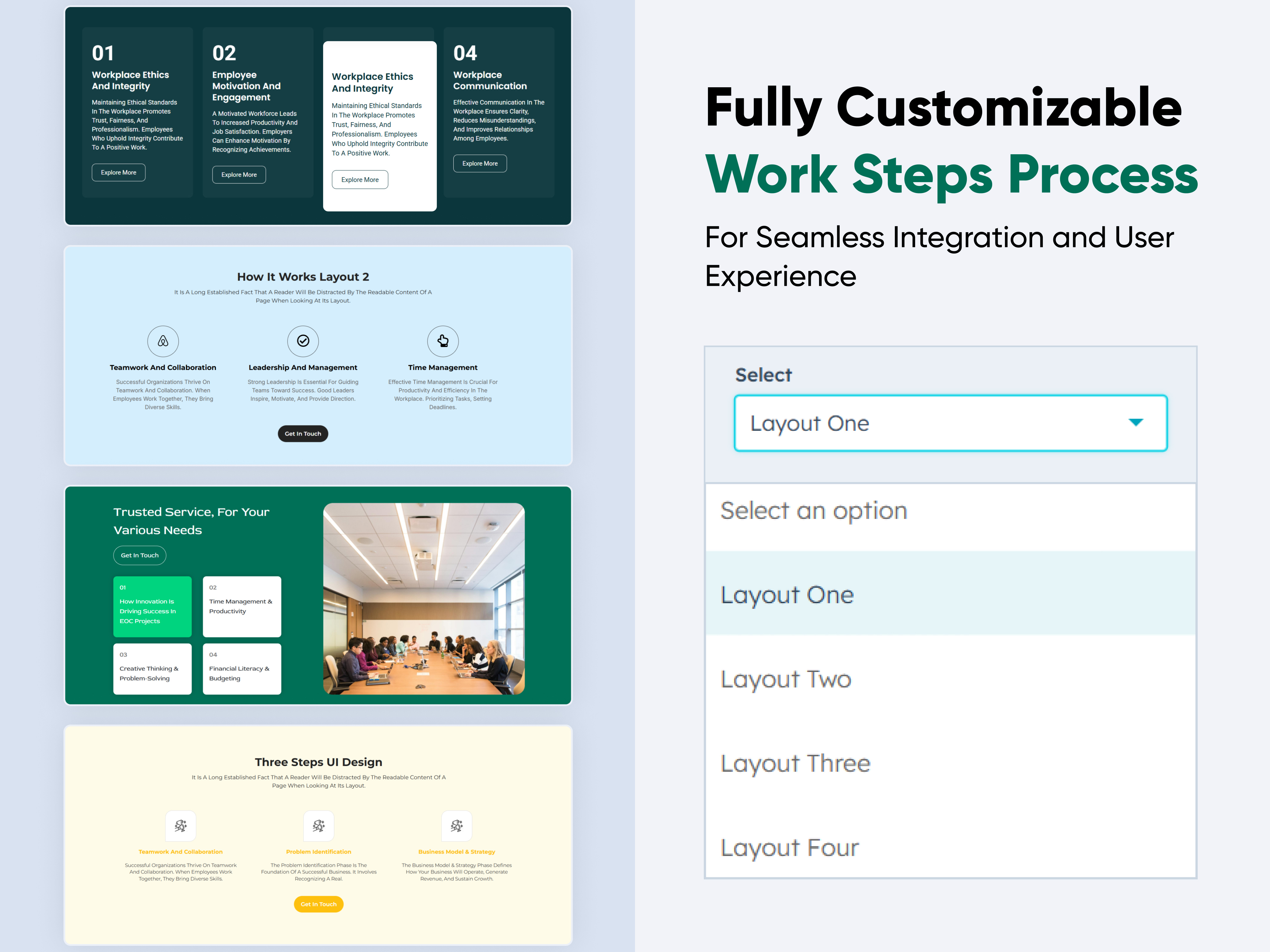 $39
$39
Work Steps Process
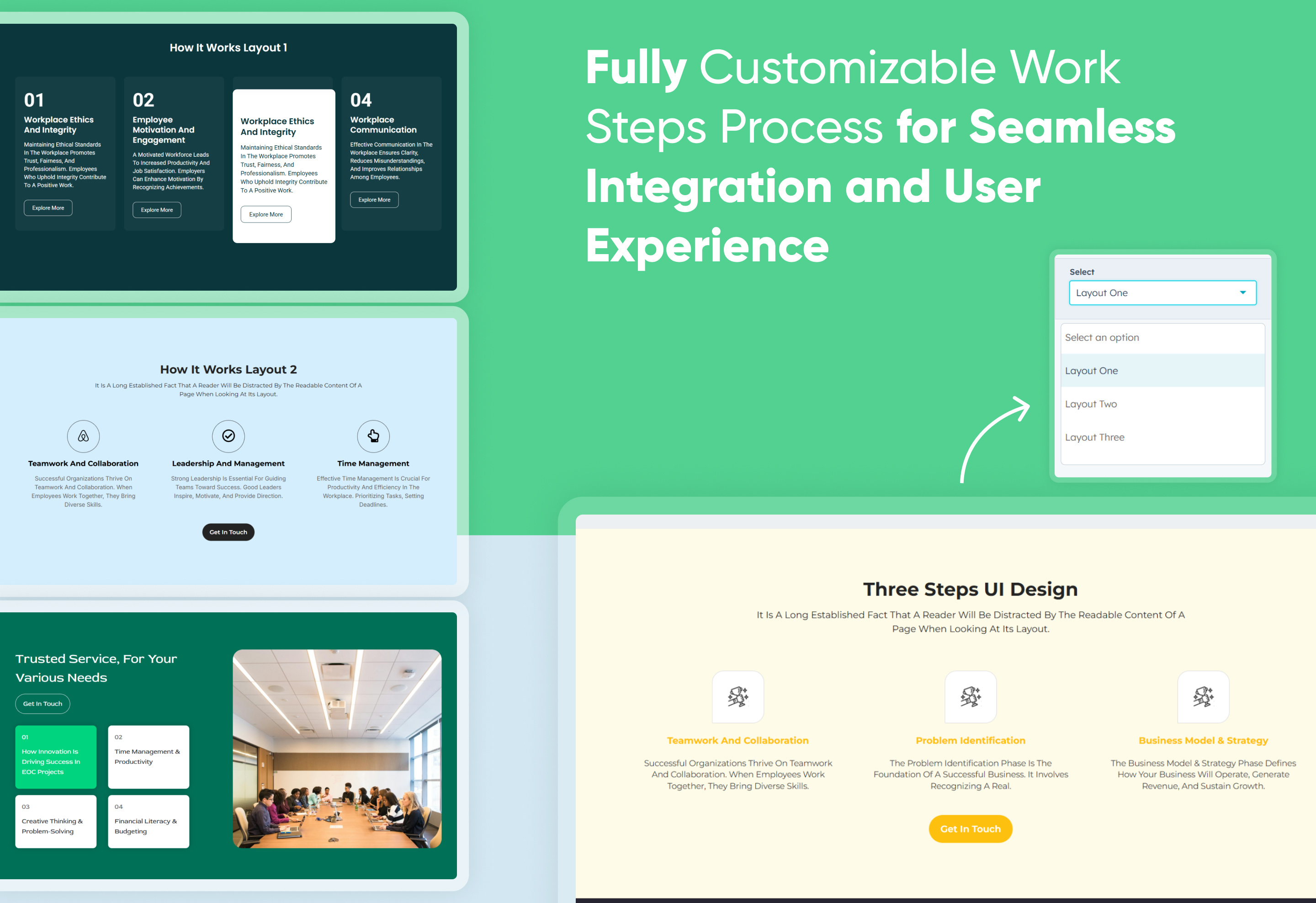
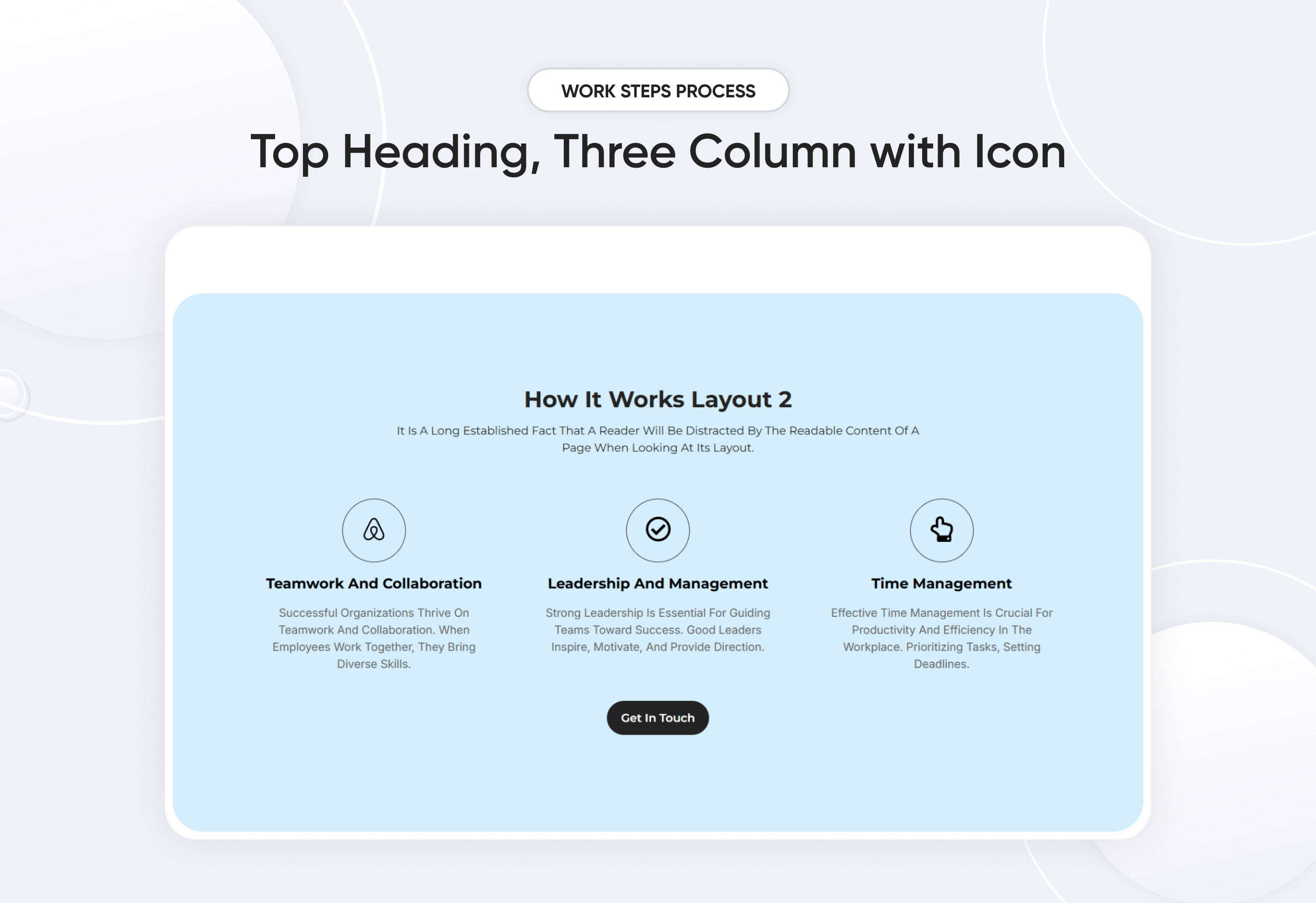
.jpg)
The Steps Process Module is a system or software component designed to manage and track multi-step workflows, guiding users through sequential actions in a structured and organized manner. It is commonly used in project management, onboarding, e-commerce checkouts, form submissions, and automation processes.
Key Features Work Steps Process Module :
- Works seamlessly on desktops, tablets, and mobile devices.
- Provides a consistent user experience across platforms.
- Customizable step names, descriptions, and icons
- Customizable Appearance Change colors, sizes, shapes, and positioning to match your brand.
- Lightweight & Fast-Loading Minimal impact on page speed.
Discover More in the Knowledge Base
Explore detailed documentation, setup instructions, feature explanations, and best practices to help you get the most out of this module quickly and efficiently.
 $29
$29
Multistyle Hero Banner
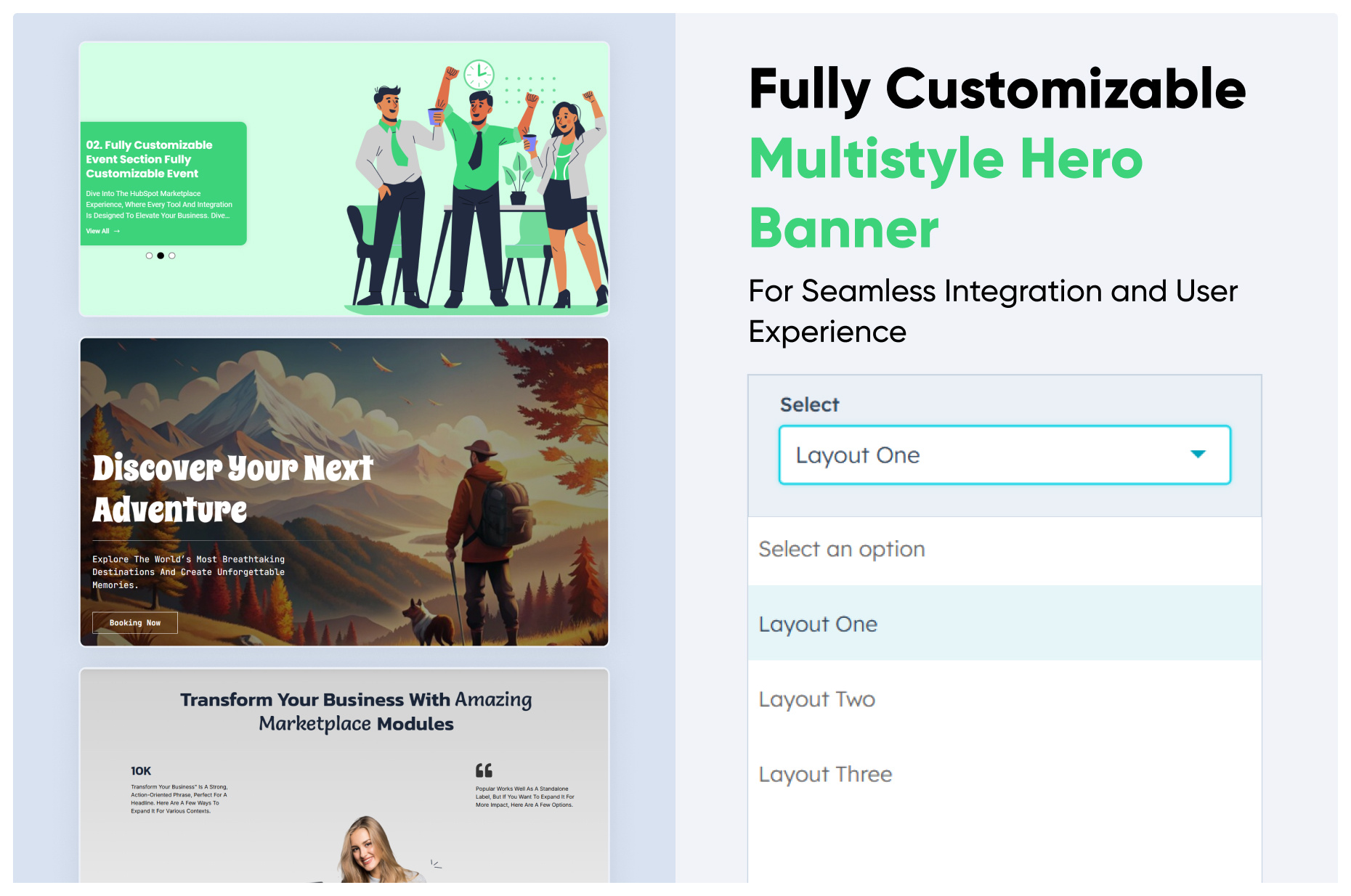
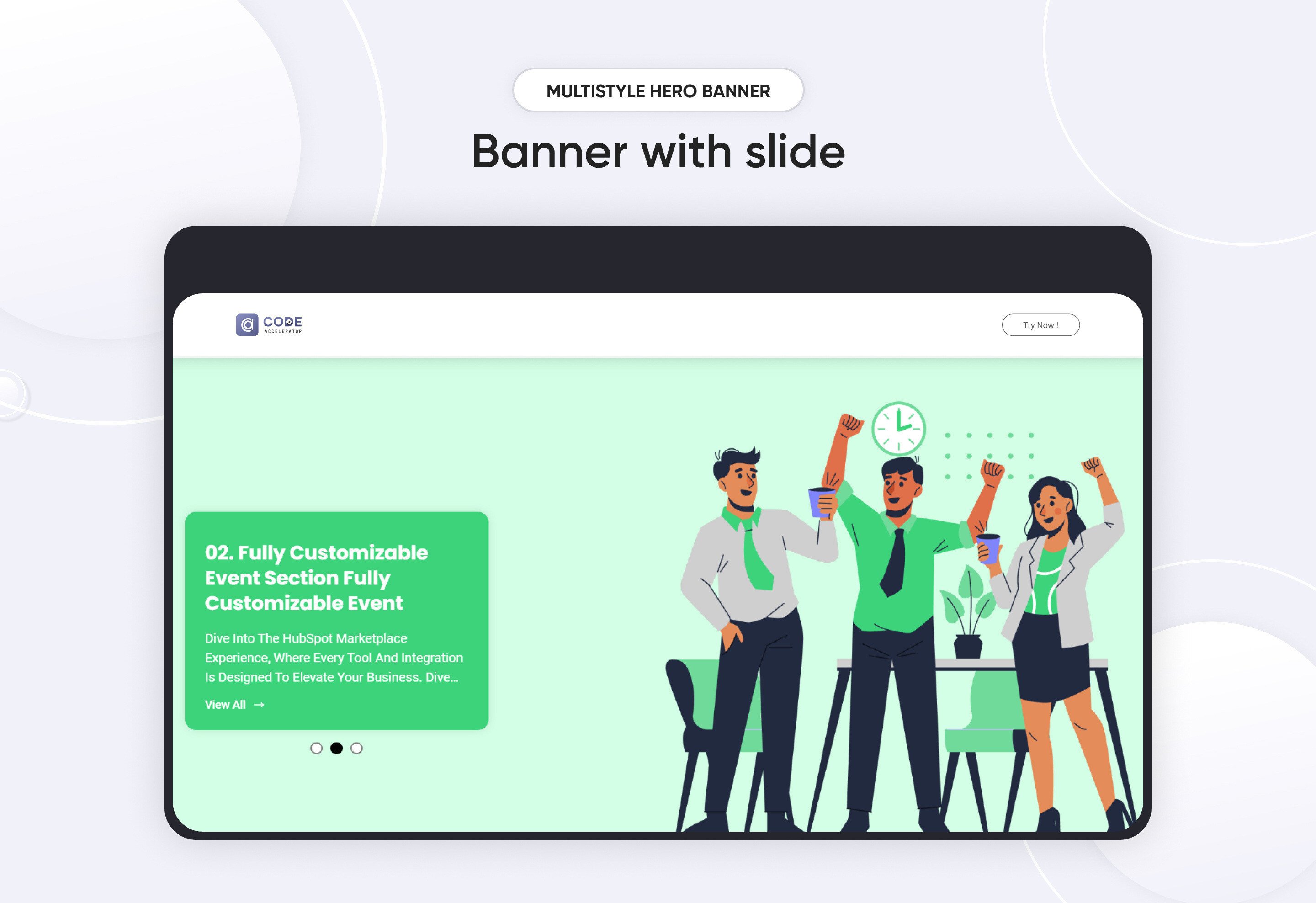
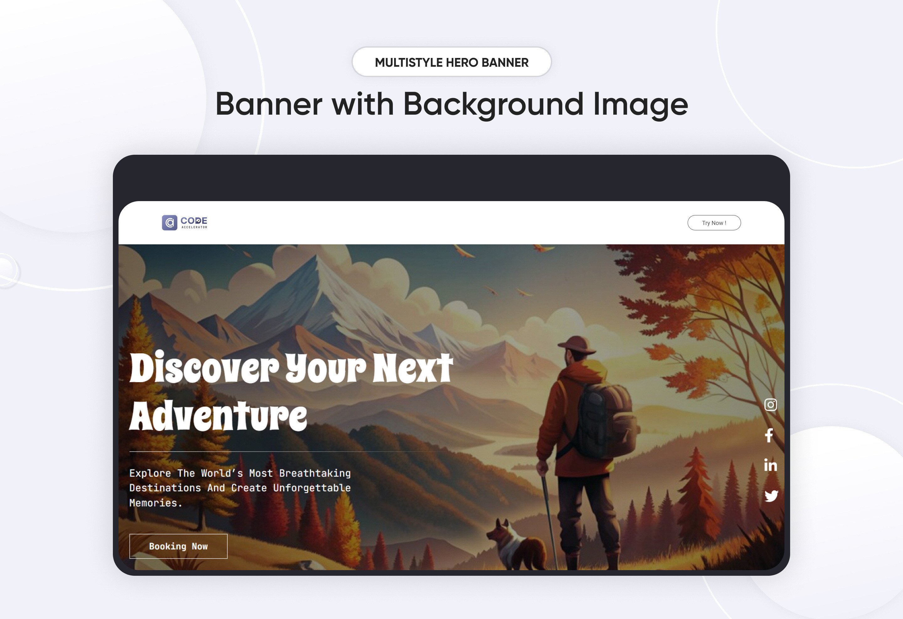
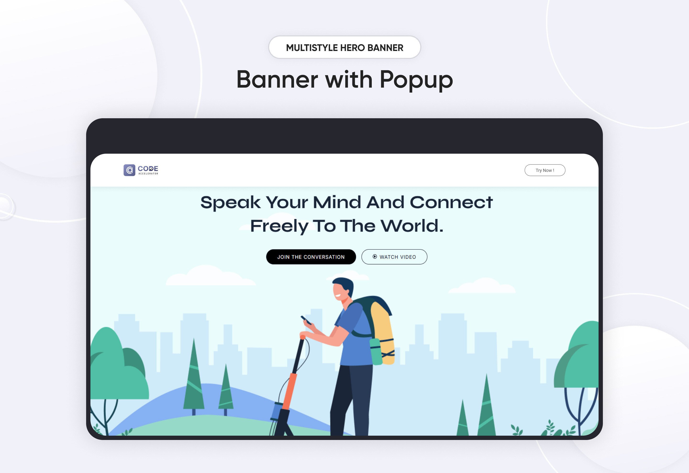
A Multistyle Hero Banner is a web design technique that combines various visual and stylistic elements to create a visually striking and functional focal point on a webpage. These banners are typically located at the top of a webpage and are designed to grab attention, communicate key messages, and set the tone for the website's branding. The "multistyle" approach adds variety and interest by integrating multiple design styles, such as imagery, typography, animations, and interactive elements.
Key Features Multistyle Hero Banner Module :
Imagery:
-
Background Images: Can feature high-quality photographs, illustrations, or abstract art.
-
Video Backgrounds: Provide a dynamic feel, especially for modern or tech-oriented sites.
Typography:
-
Headline Text: Bold, large, and impactful, often using contrasting fonts.
-
Subheadings: Smaller text providing additional context.
Responsive Design:
- Ensures the banner is visually appealing and functional on all screen sizes.
- Dynamic resizing of images, typography, and interactive elements.
Endlessly Customizable
It works like magic with just a few clicks! Customize everything you want—colors, fonts, paragraphs, headings, images, and videos effortlessly.
Layouts and Styles
The Hero module gives you the flexibility to choose from a range of layouts and styles tailored to your needs. Whether it’s a slider hero banner, a video banner design, or a minimalist look, this module provides the tools to craft the perfect visual impact.
Easily change module content.
You can easily customize the content in this module.
Effortlessly Customize Module Styles
You can easily adjust styles in this module, customizing spacing, text color, button color, background color, and more to suit your preferences.
Discover More in the Knowledge Base
Explore detailed documentation, setup instructions, feature explanations, and best practices to help you get the most out of this module quickly and efficiently.
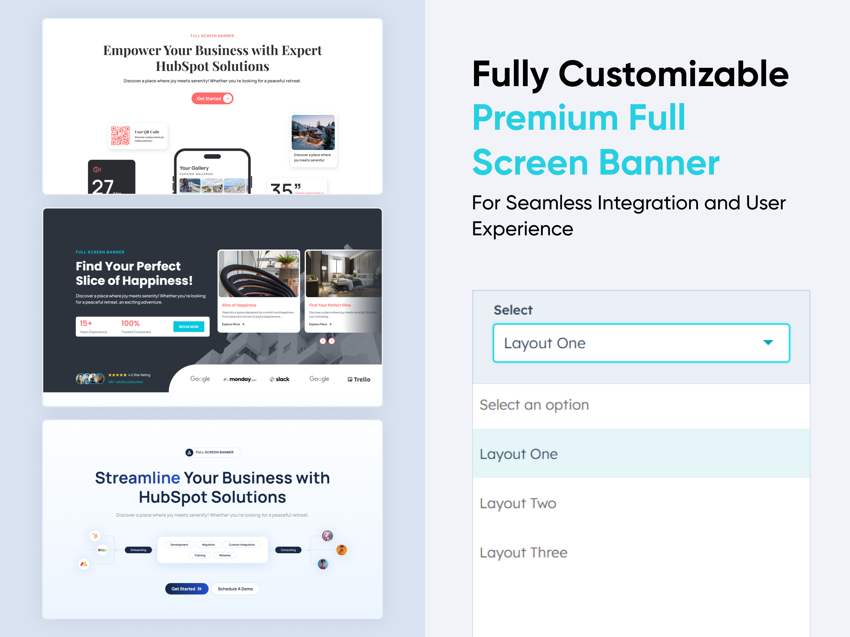 $29
$29
Premium Full Screen Banner
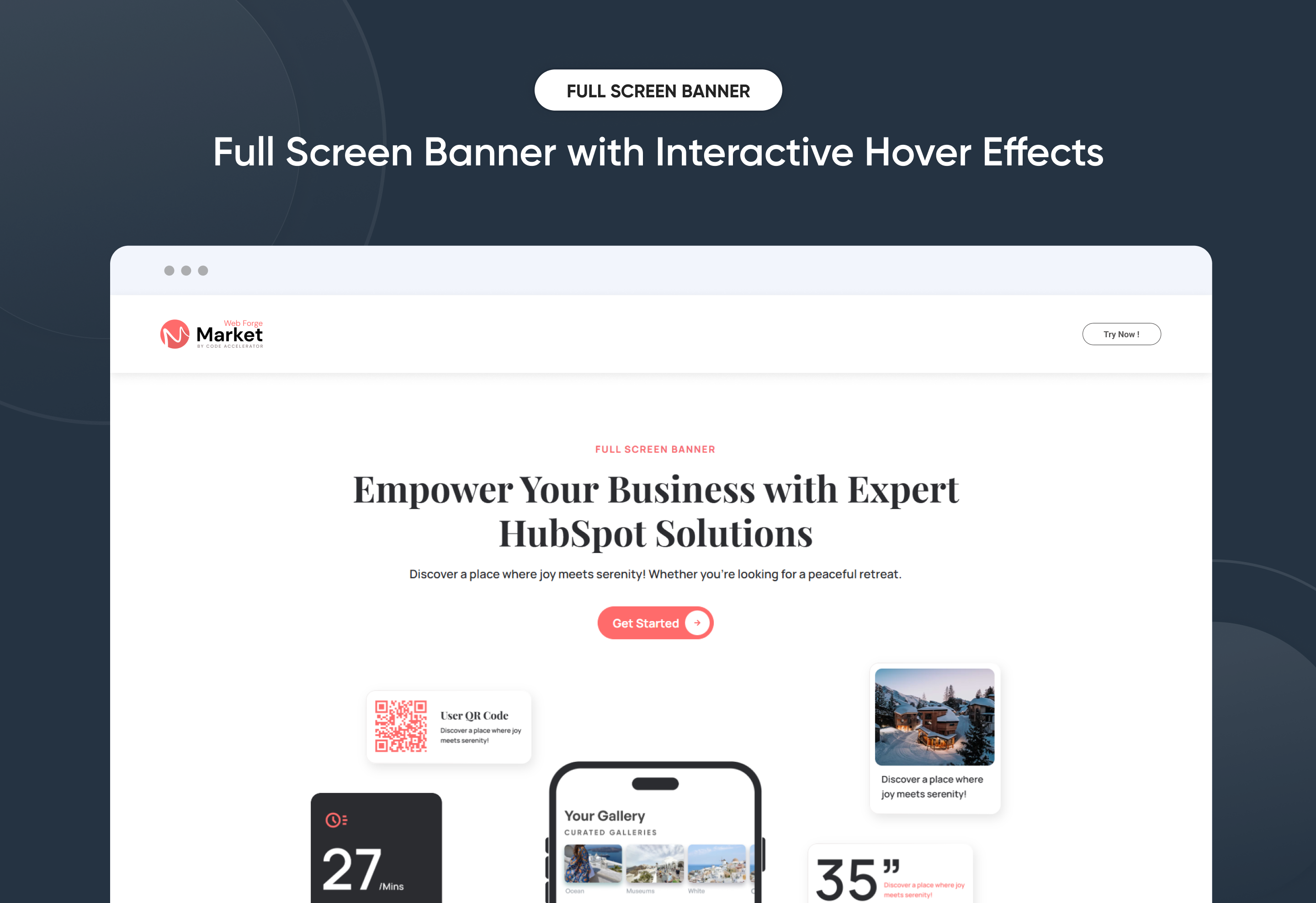
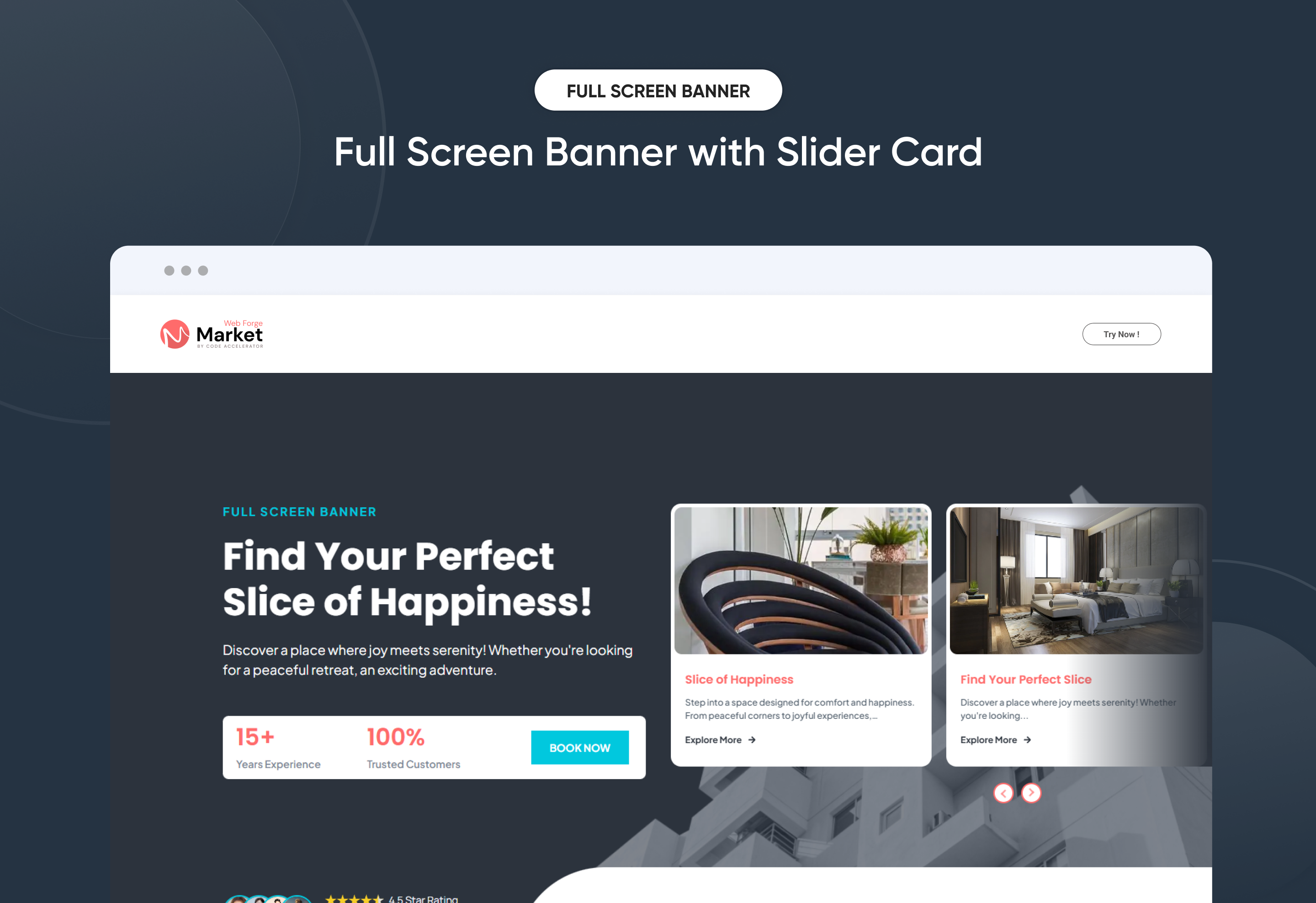
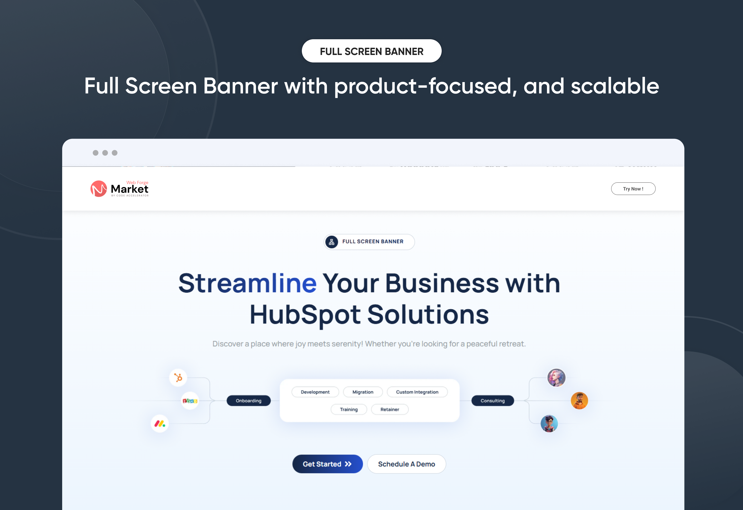
The Premium Full Screen Banner Module helps you create bold, immersive hero sections that instantly capture attention and elevate your brand experience. Designed for visual impact, it features full-screen layouts, smooth slider transitions, and engaging hover effects—giving you complete control over how your key messages are presented.
Easily manage banner headlines, supporting content, background media, and CTA buttons directly within HubSpot—no coding required. With mobile-first responsiveness, flexible content positioning, adjustable spacing, and advanced style controls, this module ensures your full-screen banners look stunning and perform flawlessly across all devices.
Whether you’re launching a campaign, highlighting a core service, or creating a powerful first impression, the Premium Full Screen Banner delivers a polished, high-impact experience that boosts engagement and drives meaningful user action.
Key Features of a Premium Full Screen Banner Module :
-
Multiple Layouts – Choose from 3 distinct hero banner styles.
-
Responsive Design – Optimized for all screen sizes, ensuring a flawless experience on desktop, tablet, and mobile.
-
Flexible Content Options – Easily update headings, descriptions, and CTAs directly within HubSpot.
-
Customizable Visuals – Add images, graphics, or mockups to match your brand identity and campaign goals.
-
Engaging Call-to-Actions – Drive conversions with customizable CTA buttons tailored to your business objectives.
-
Design Flexibility – Adjust spacing, alignment, and background colors for a unique, on-brand look.
-
User-Friendly Editing – No coding required—built for marketers to launch modern hero sections quickly.
-
Optimized Performance – Lightweight and SEO-friendly to ensure speed and visibility.
-
Versatile Use Cases – Perfect for homepages, landing pages, service showcases, or campaign launches.
Discover More in the Knowledge Base
Explore detailed documentation, setup instructions, feature explanations, and best practices to help you get the most out of this module quickly and efficiently.
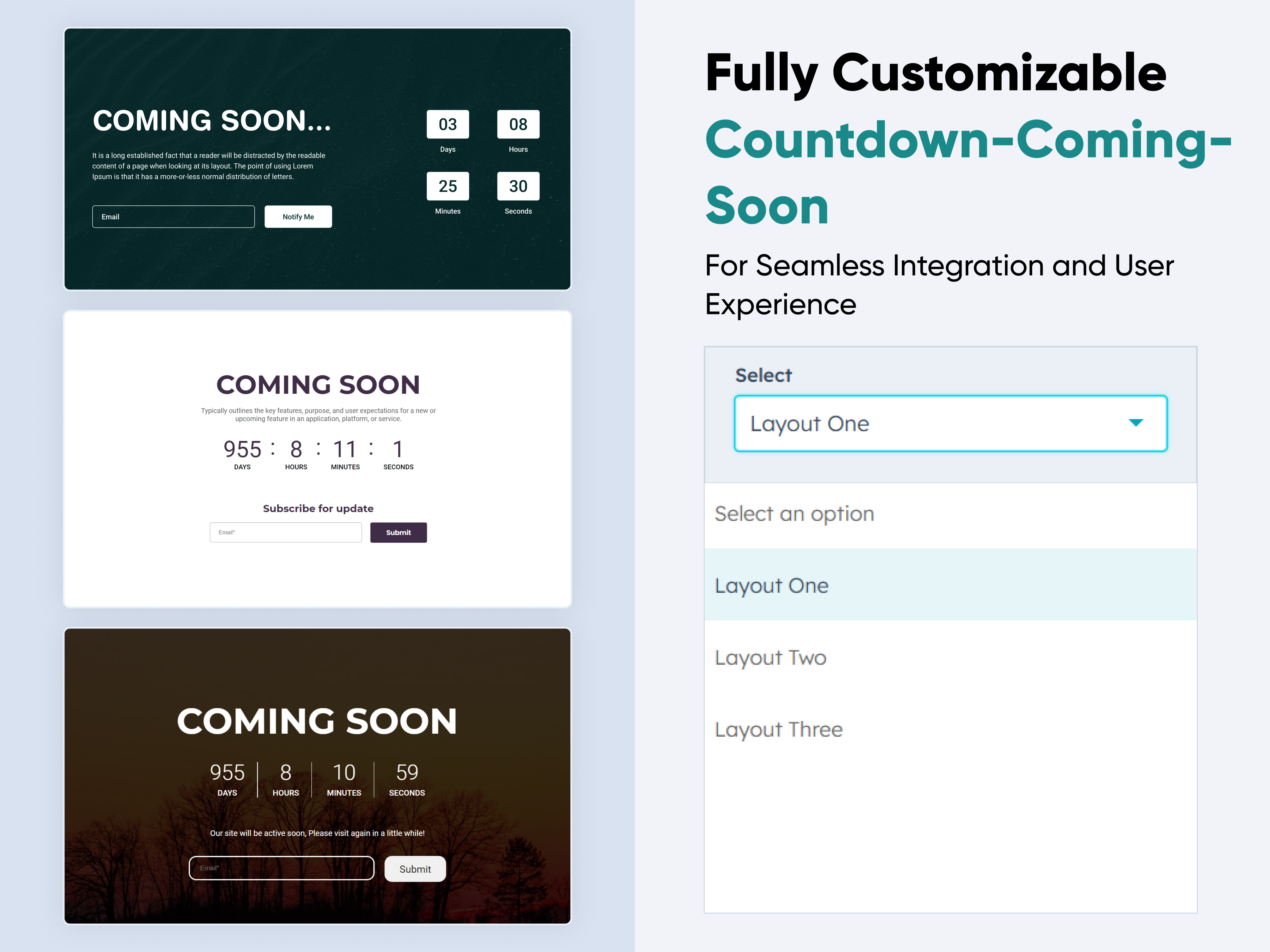 $29
$29
Countdown Coming soon
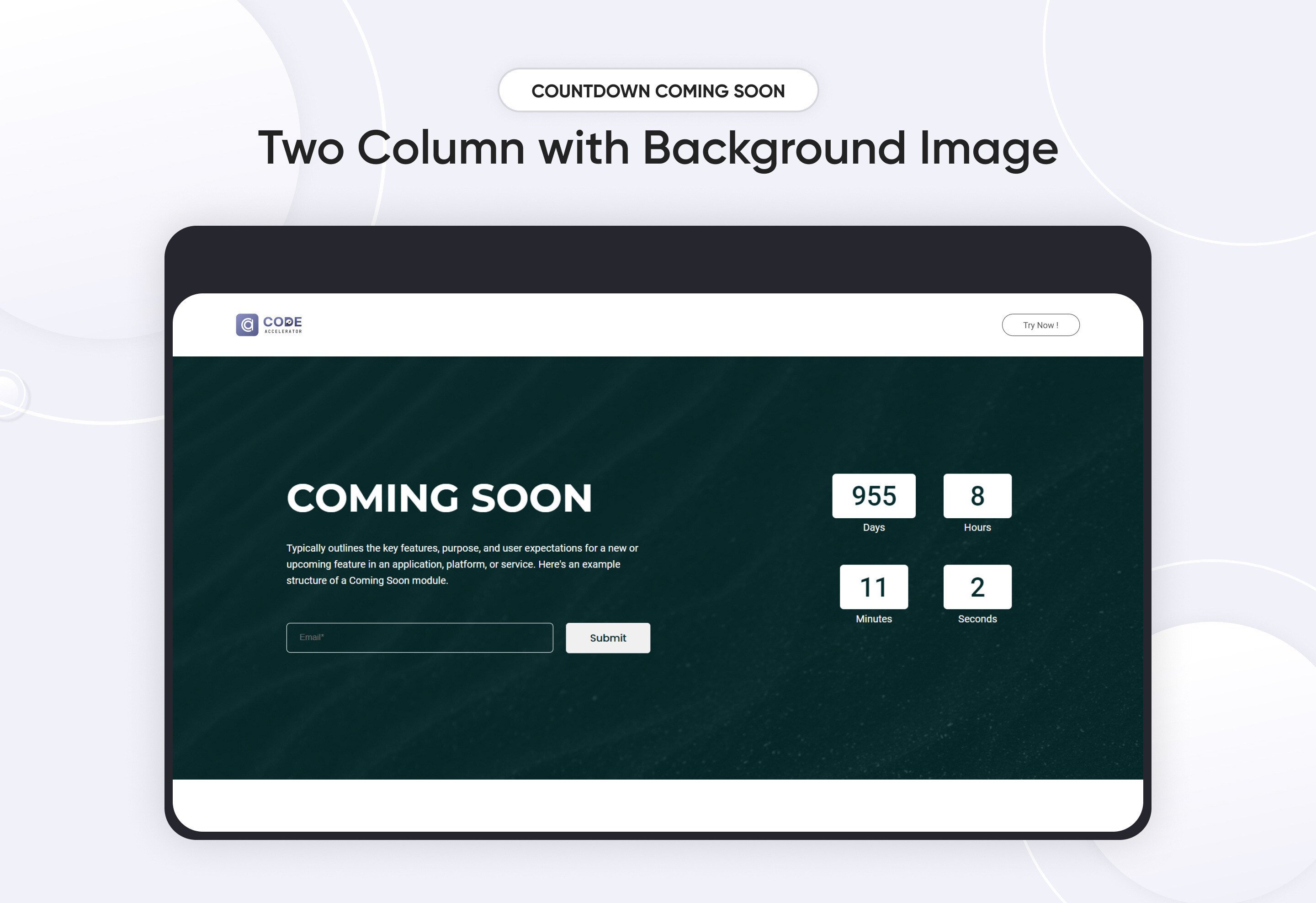
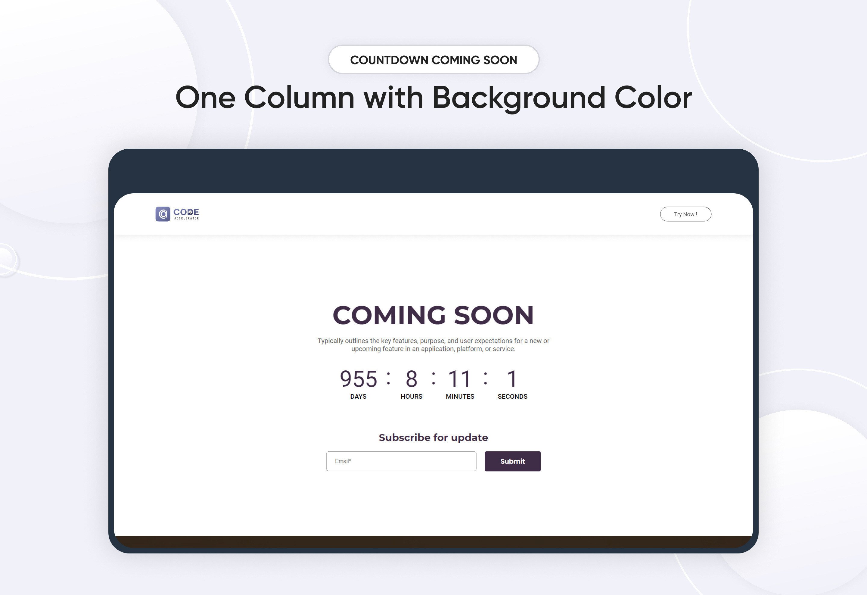
-4.jpeg)
The "Coming Soon" module introduces an exciting new feature designed to enhance user experience by providing early insights into upcoming functionalities. This module will offer a sneak peek into the future updates, allowing users to stay informed and prepared for the latest advancements
Key Features of the Countdown Coming soon Module :
- Customizable Countdown Timer
Set a countdown timer with the ability to choose the end date and time, ensuring users know exactly when your content or product will launch. - Adaptable Time Settings
Easily adjust the countdown by changing the days, hours to fit your launch schedule. - Fully Responsive Design
The module automatically adapts to all devices, providing a seamless experience on desktops, tablets, and smartphones. - Three Design Variants
Choose from three professionally designed styles to match your brand and aesthetic preferences. - Background Customization
Set a custom background image, color to create a visually appealing waiting page. - SEO-Friendly
Optimize the coming soon page with SEO settings to ensure your site maintains visibility even before it launches.
Discover More in the Knowledge Base
Explore detailed documentation, setup instructions, feature explanations, and best practices to help you get the most out of this module quickly and efficiently.