HubSpot Theme
HubSpot Modules
- About Me
- Infinity Testimonial Slider
- Events List Premium
- Download eBook Now
- Two Column
- Banner Pro
- Two Column Steps
- Image Gallery With Animation
- Parallax
- What We Offer
- Horizontal Slides Panel
- Banner
- Sliding Animation Cards
- CTA Back To Top
- Location With Map
- Testimonial Single
- Work Steps Process
- Sticky Social Icon
- Brand Logo Slider
- Animated Cards
- Multistyle Hero Banner
- Pricing Plans Card
- Hover Box Animation
- About Us Content
- Upcoming Events
- Unique CTA
- Team Members Detail
- E-Book Download
- Countdown Coming soon
- Our Services Cards Documentation Page
- 404 Section
- Main Hero Banner
- Client Logos Section
- Counter Cards Documentation Page
- Timeline Module Documentation Page
- Knowlegebase: Hubspot FAQ Module
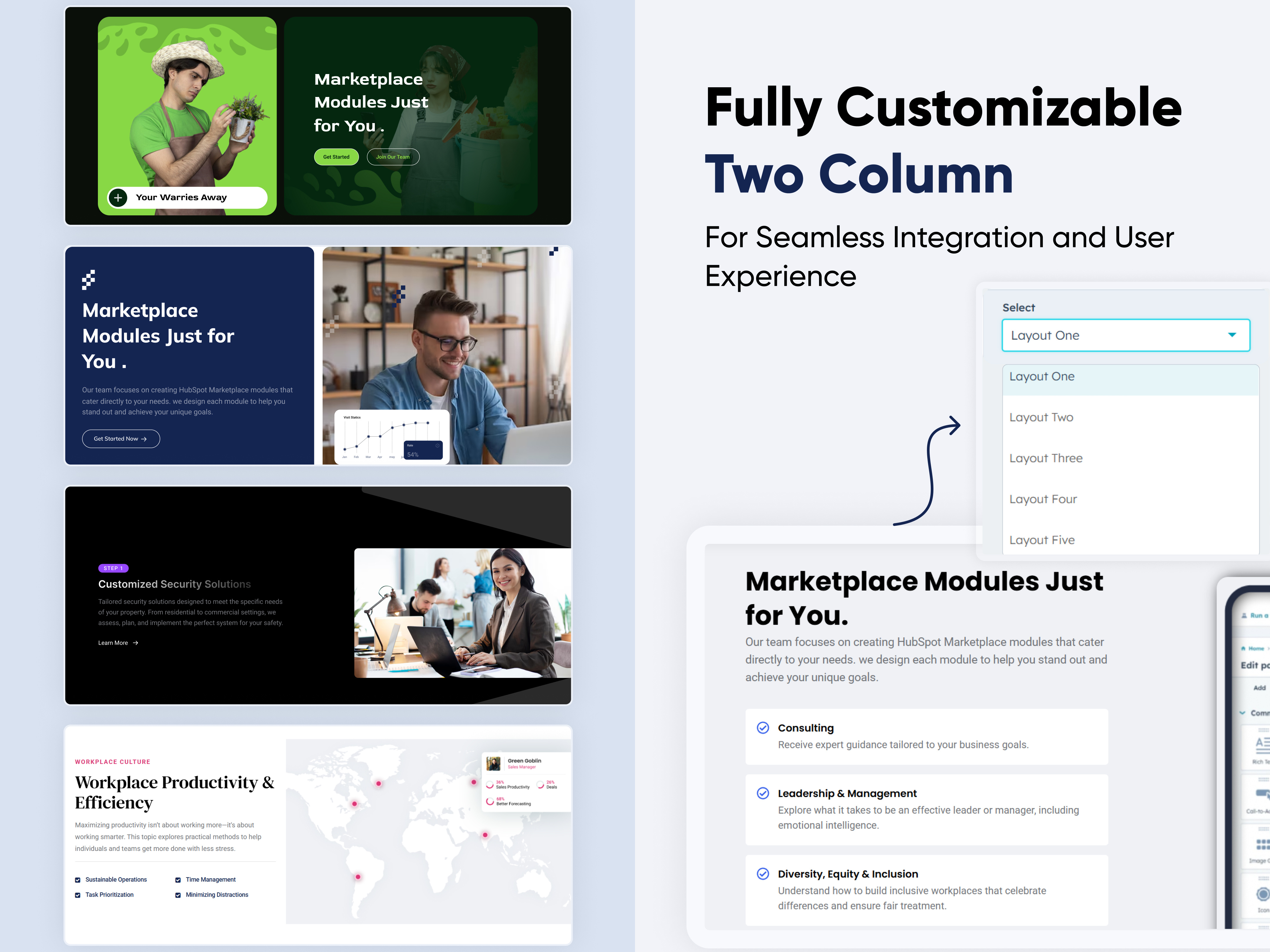
A Two-Column is a flexible and visually balanced structure where content is split into two vertical sections — typically for combining text, images, and interactive elements. It enhances clarity, storytelling, and user engagement.
Key Features of a Two Column Module :
🧩 Multiple Layouts
-
Various column orientations: text left/image right, image left/text right, centered content, staggered steps, etc.
-
Adaptable for landing pages, product intros, service descriptions, and more.
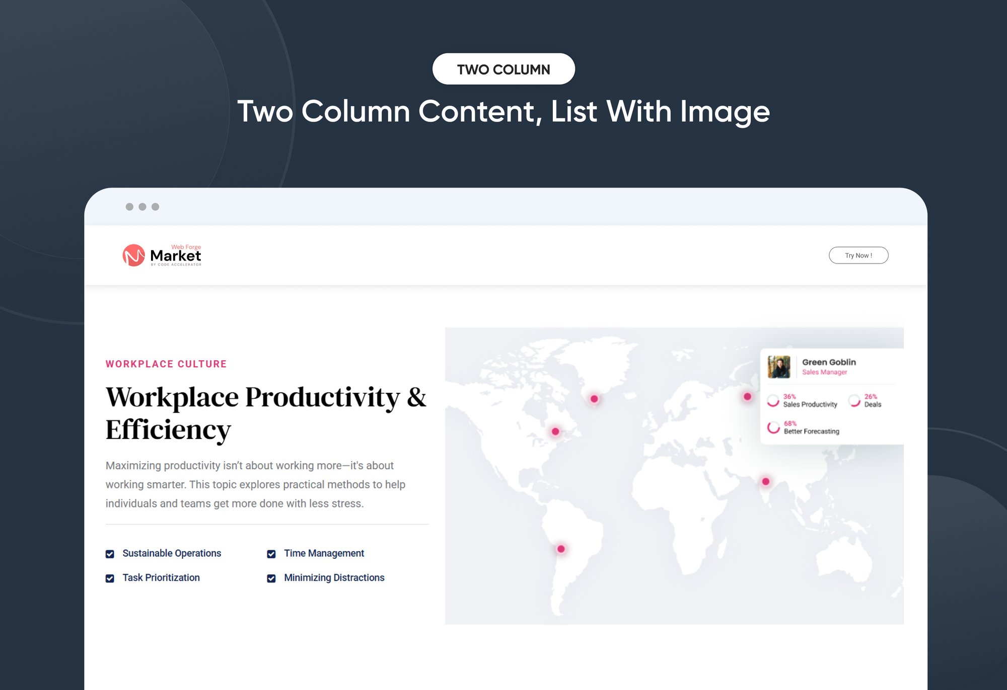
📄 Content with List + Right Column Image
-
Left column: bullet points, icons, or descriptive content.
-
Right column: static or animated image (e.g., feature breakdown, benefits list).
🔢 Background Content with Number Value + Right Image
-
Content appears over a background color or image.
-
Includes numerical highlights (e.g., stats, KPIs) and supporting visuals in the right column.
🖼️ Content on Background Image with Multiple CTAs + Left Side Image
-
Left column: product or hero image.
-
Right column: background image, layered content, and multiple buttons for different user actions (e.g., "Learn More", "Get Started").
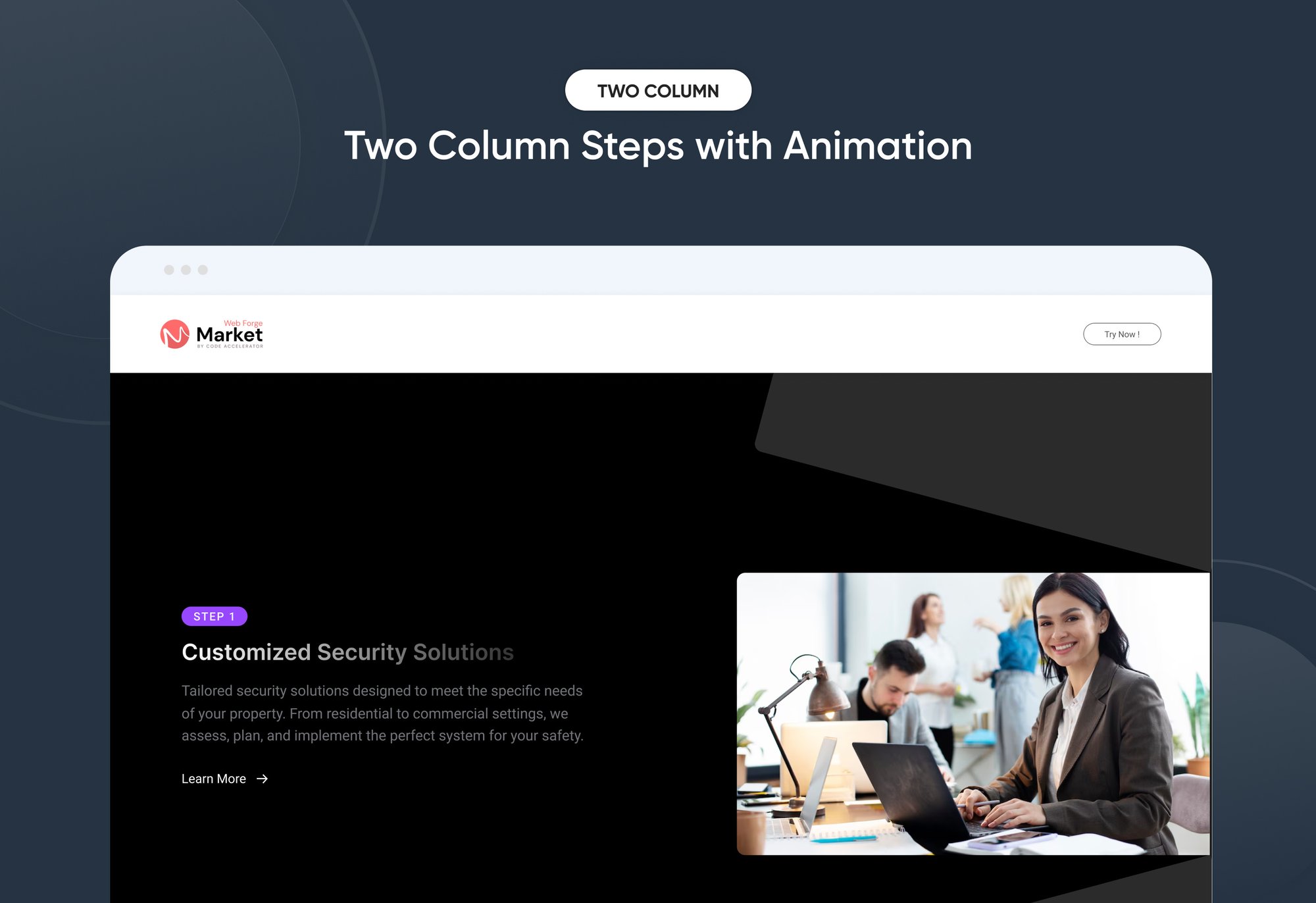
🔁 Repeating Content with Step-by-Step + Animated Images
-
A vertically stacked, two-column layout with steps (1-2-3...) and accompanying animated images or icons.
-
Great for onboarding flows, process explanations, or feature walkthroughs.
How to Set Up the Two Column Module in HubSpot :
In the main dashboard, go to the ‘Content’ tab and select either ‘Website’ or ‘Landing Pages,’ depending on where you want to add the section. This lets you choose the right location for managing or updating your content.
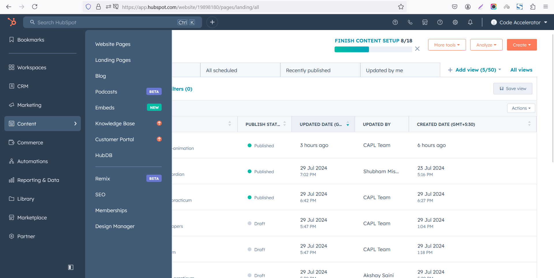 Select the page where you want to apply the module.
.png)
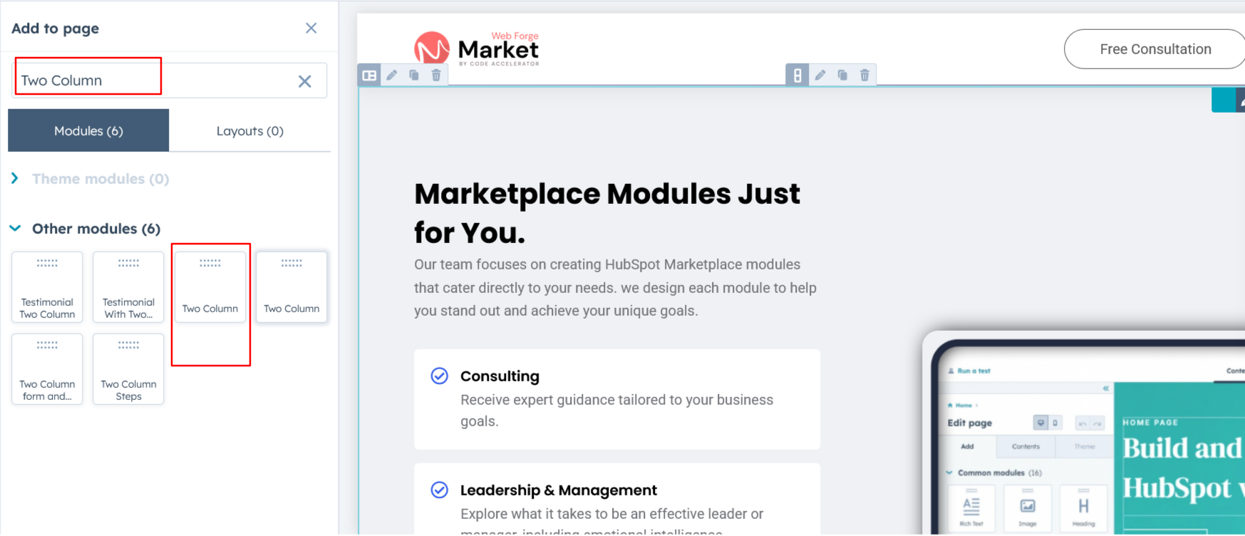
Search for "Two Column" and drag and drop the module into the desired location on your page.
Module Defaults Options:
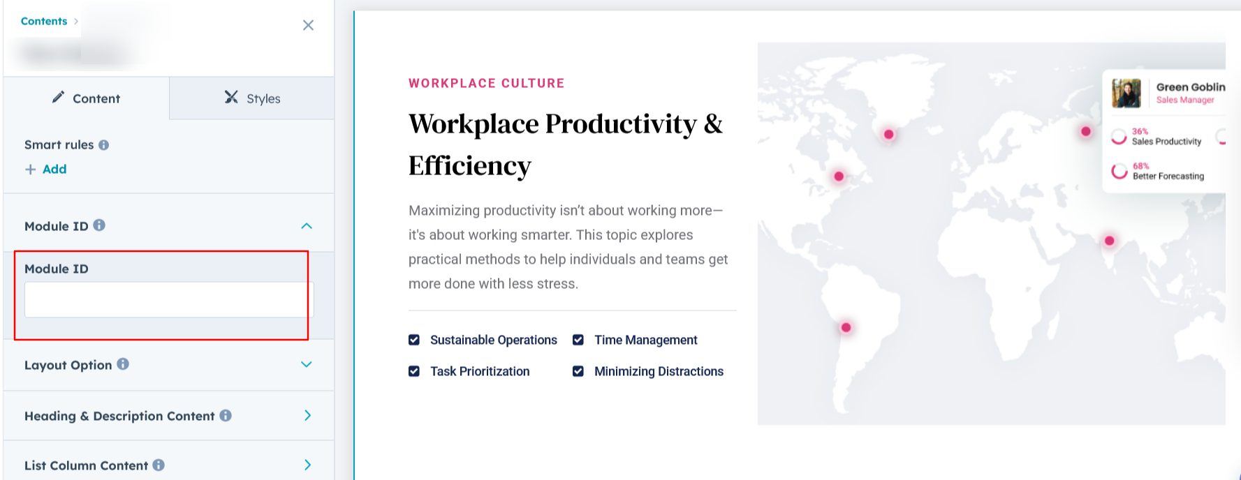
Layout ID :
Easily enhance navigation by adding an ID to the target section and using the same ID in an anchor link. This enables a smooth scrolling effect when users click a Call-to-Action (CTA) button, improving the overall user experience.
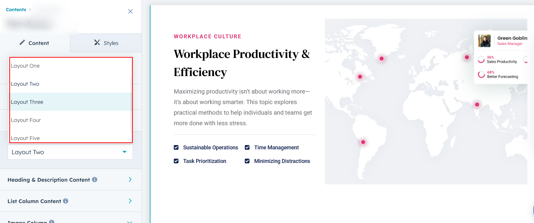
Layout Options :
For the Banner Pro, select your preferred layout (e.g., Layout 1, Layout 2, Layout 3, Layout 4 or Layout 5). Easily rearrange event cards within the chosen layout to achieve the perfect content flow and visual arrangement, ensuring a seamless and engaging user experience.
Options :
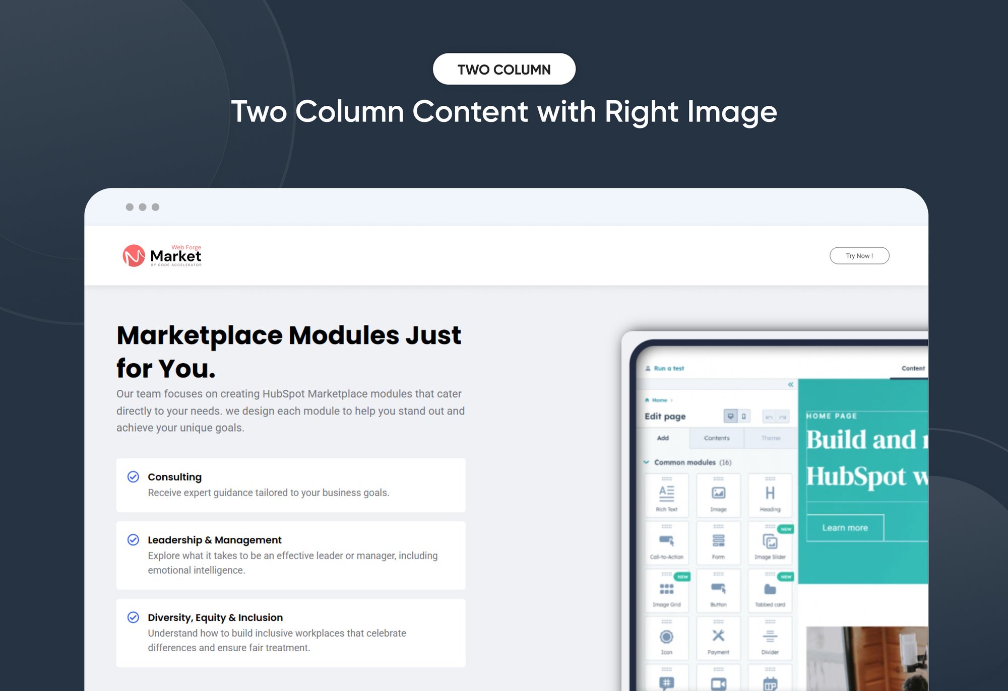
- Layout 1 : The layout features a heading and description with repeatable list content, along with an image displayed on the right side for a balanced and engaging design.
- Layout 2 : The layout features a heading and description with repeatable list content with icon, along with an image displayed on the right side for a balanced and engaging design.
- Layout 3 : The layout features a heading, description, and multiple CTAs, with the option to include an image in the left column for added visual impact.
- Layout 4 : The layout features a heading, description, and CTA, with a two-column option. You can add a number value with a description on the left, and an image on the right for a visually appealing layout.
- Layout 5 : The layout features a step number, heading, description, and CTA, accompanied by an image on the right. Content can be repeated multiple times with smooth animations for an engaging user experience.
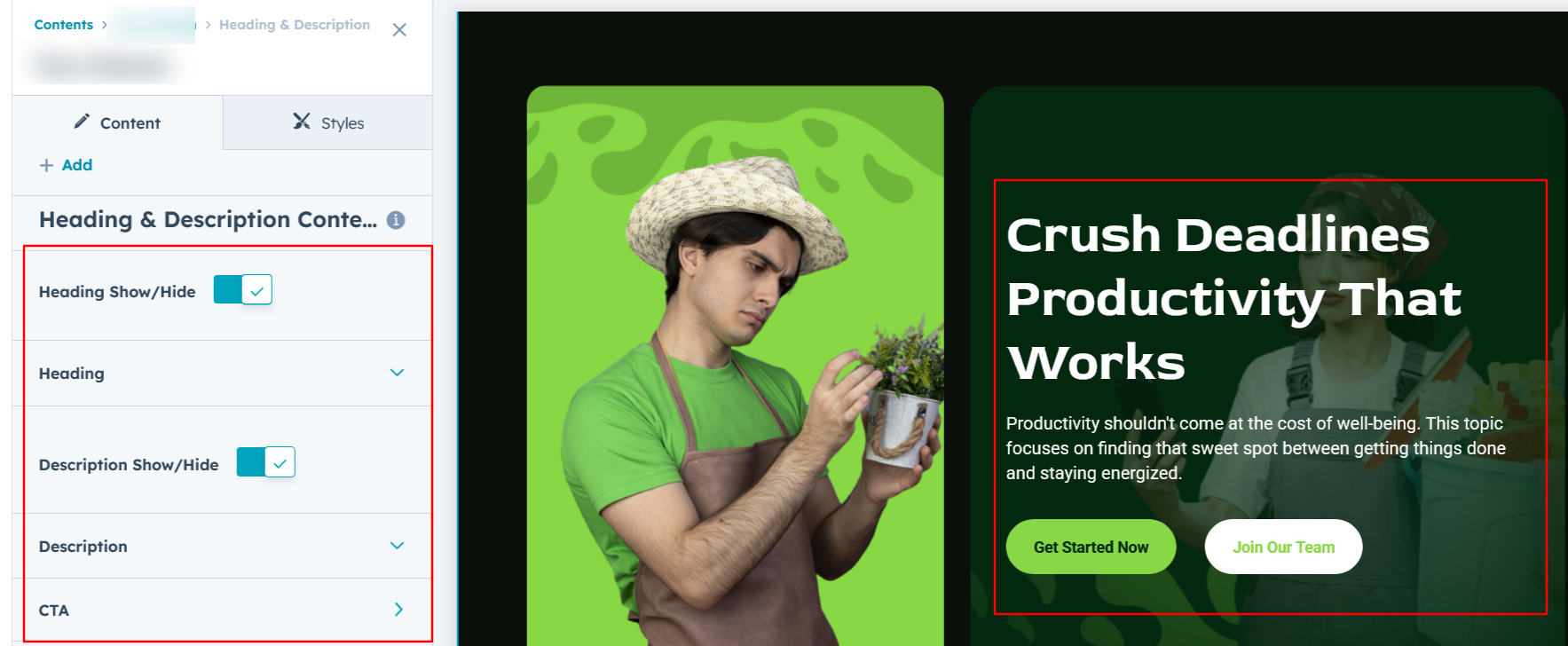
Heading/Description & CTA Content :
You can modify the heading, description, and CTA with the flexibility to show or hide each element as needed.
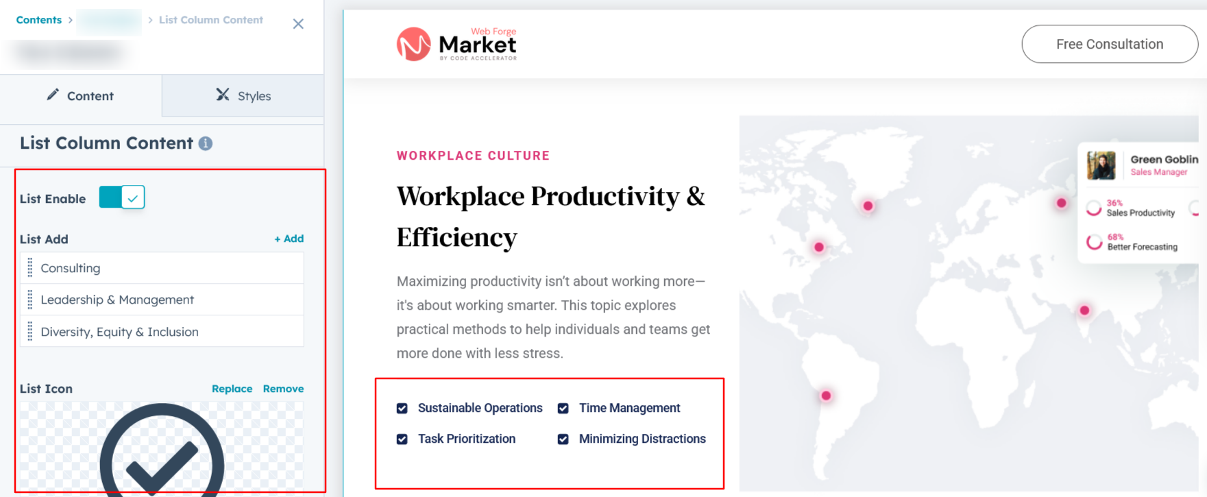
List Column Content :
You can add multiple list items with descriptions and icons, and choose to show or hide them based on your specific requirements. It's Available in layout 1 and 2.
Counter Column Content :
In Layout 4, you can add a counter value and content in the left column, with the flexibility to show or hide them as needed.
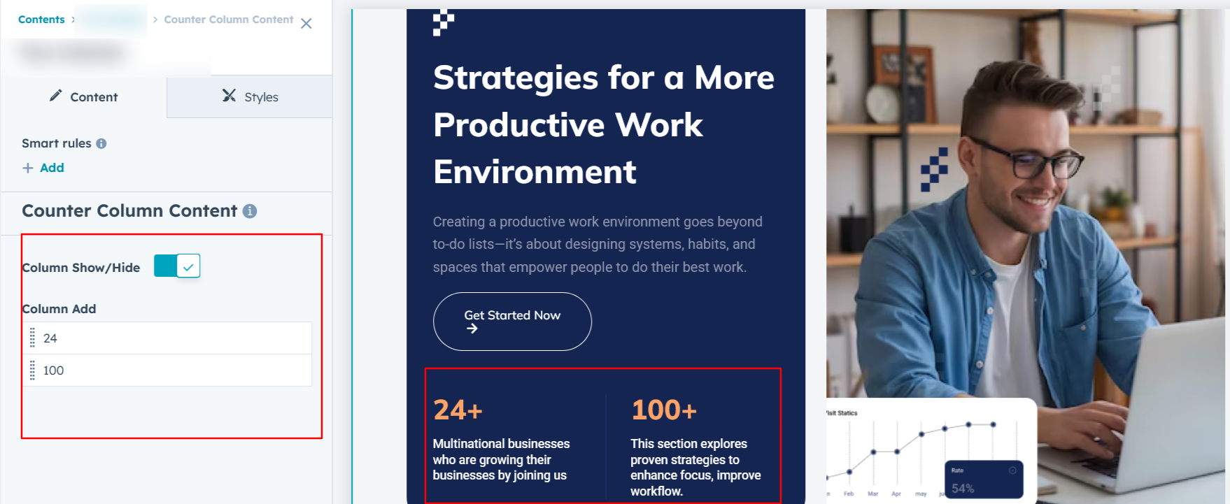
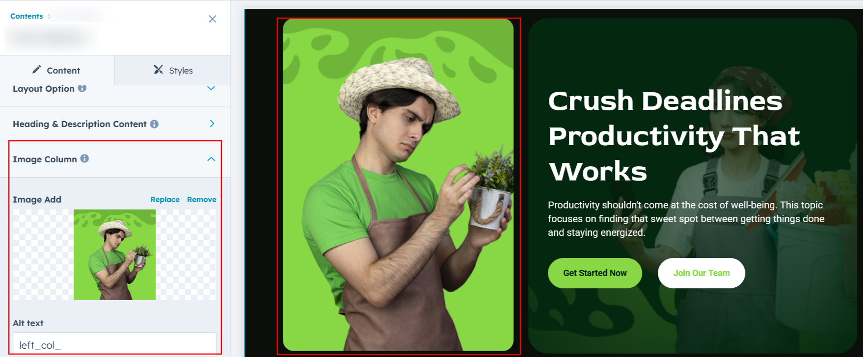
Image Column :
You can select and customize the column image according to your preferences, ensuring it aligns perfectly with your design.
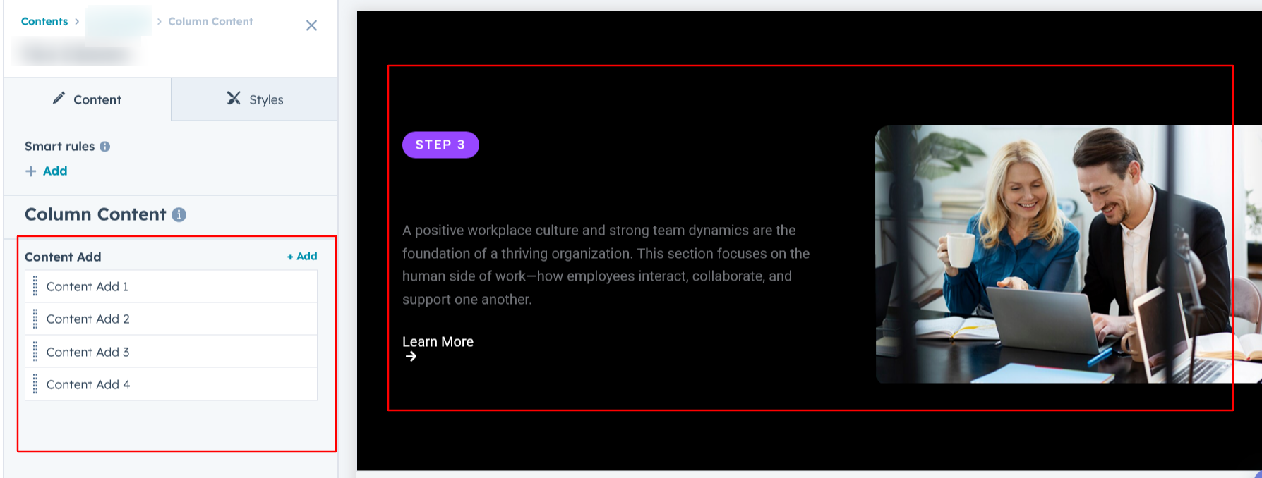
Column Content :
In Layout 5, you can add column content with multiple repeatable items, offering greater flexibility and dynamic layout options to suit your content needs.
Module Style Options:
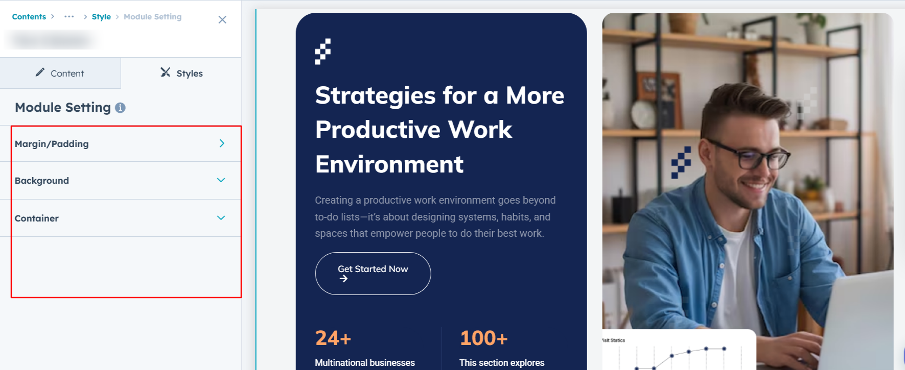
Module Setting :
Adjust the margins, padding, background colors, and container width to achieve your desired look and feel for the module. This flexibility lets you fine-tune the layout and aesthetics, ensuring your design is both visually appealing and user-friendly.
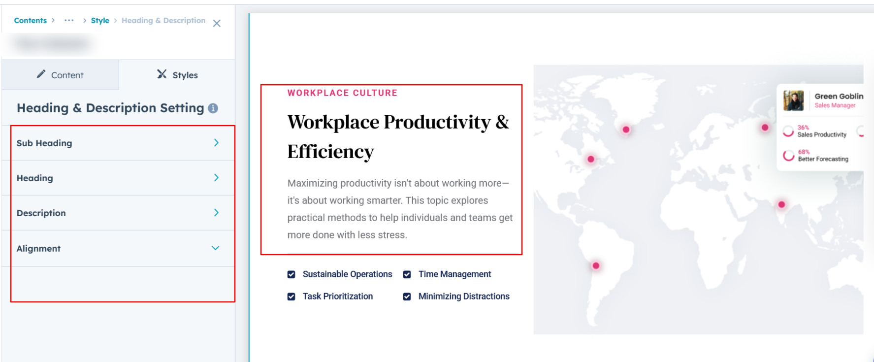
Heading/Description & CTA Setting :
Users can customize spacing and adjust typography for the heading, description, and CTA. This includes modifying color, font size, weight, and line height for both mobile and desktop views—ensuring a personalized, visually cohesive design across all devices.
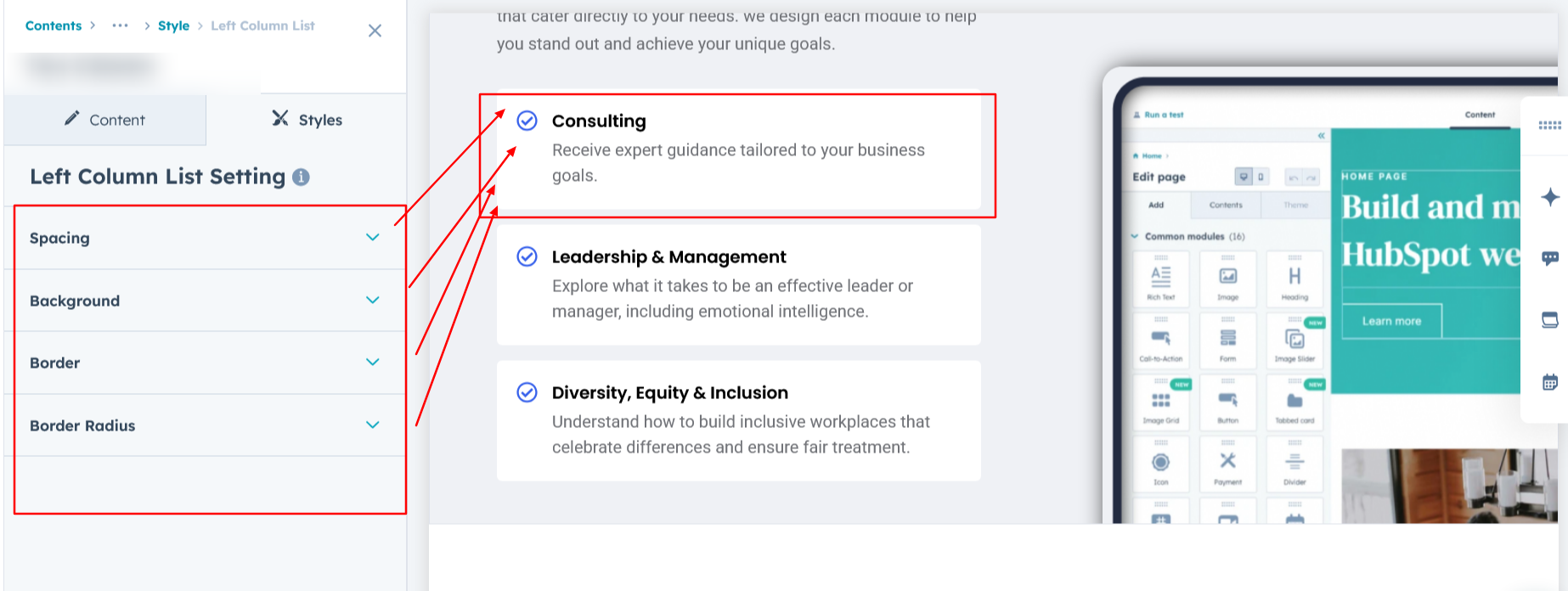
Left Column List Setting :
In Layouts 1, you can customize the left column list by setting the background color, border radius, border, and spacing, allowing it to align seamlessly with your design preferences.
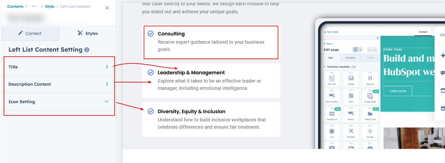
Left List Content Setting :
In Layouts 1 and 2, you can customize the list title and description by adjusting typography, color, line height, spacing, and text transform to perfectly suit your design needs
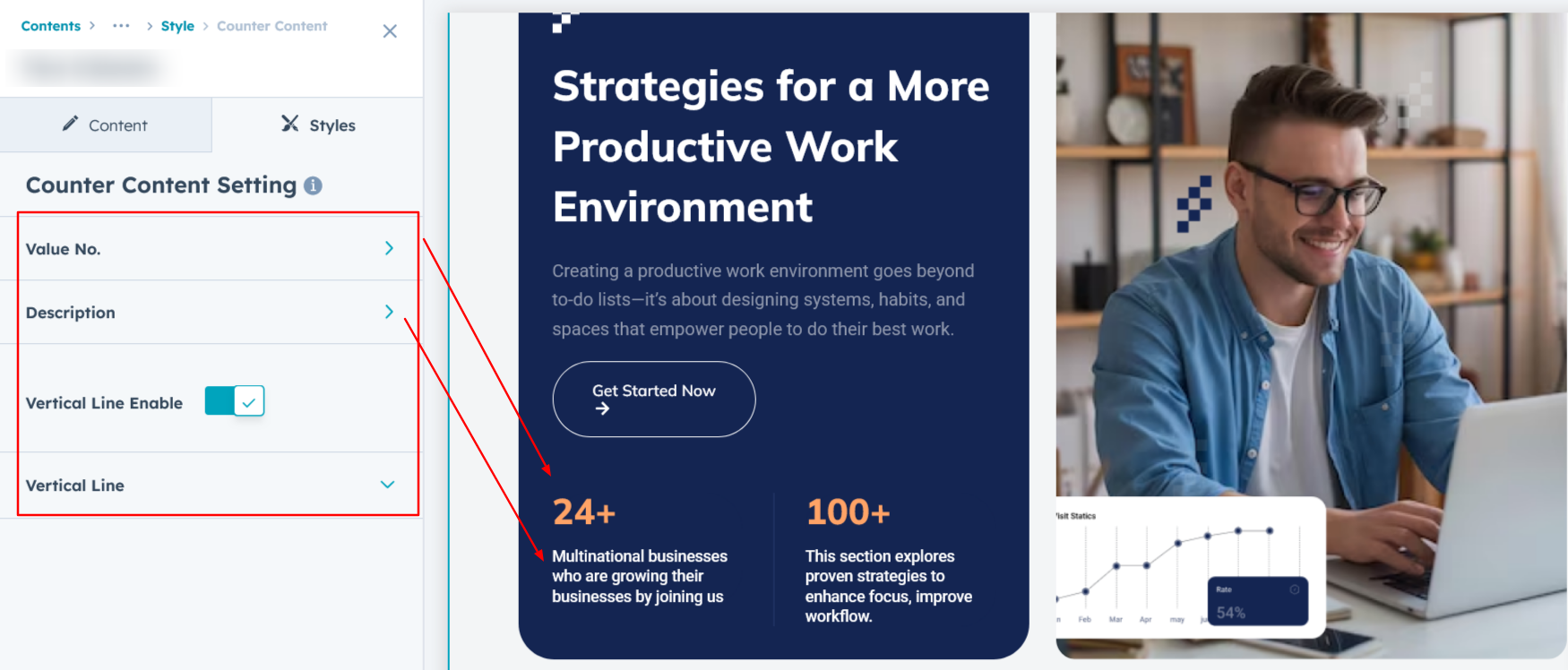
Counter Content Setting :
In Layout 4, you can customize the typography of the left column's bottom content, including the value number and text. Adjust font size, line height, spacing, text transform, and apply a vertical border style to align with your design preferences.
Left Column Setting :
In Layout 4, you can set the background color, spacing, border, and border radius in the left column to match your desired styling and layout preferences.
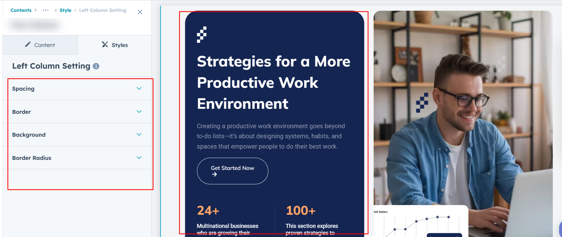
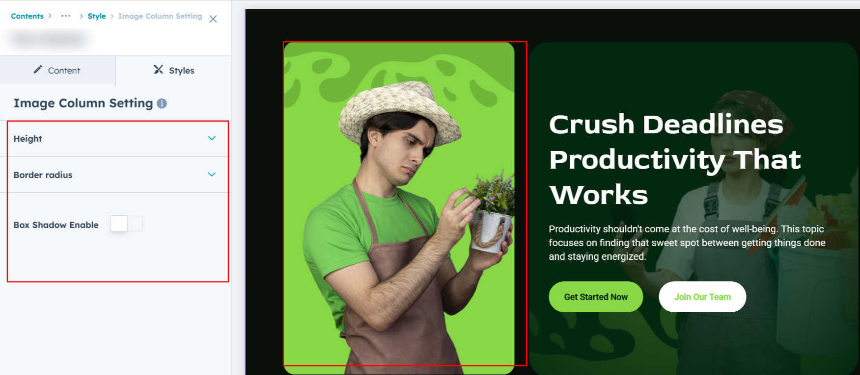
Image Column Setting :
Easily customize the image height for desktop and mobile view, and rounded corners to achieve the perfect look for your design. It's available in layout 1, 2, 3 and 4.
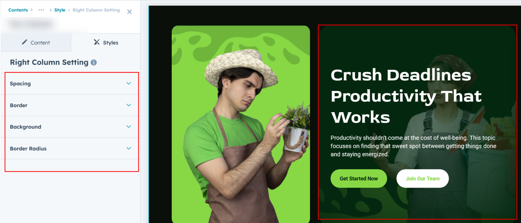
Right Column Setting :
You can customize the right column by adjusting spacing, border radius, and border settings. Additionally, choose a background option—either an image or a solid color—to match your design preferences. It's available in layout 3.
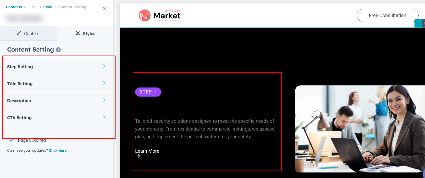
Content Setting :
In Layout 5, you can customize the left column content typography for both desktop and mobile, including options for color, font size, spacing, text transform, and alignment to ensure a consistent and responsive design.
We hope you enjoy using our two column module to create a seamless experience for both your users and your marketing team. At Code Accelerator, we're committed to ensuring your HubSpot experience is exceptional. If you need a custom HubSpot module or require a tailored HubSpot CMS or CRM setup, please don’t hesitate to Contact Us.
Need Help? We’ve Got You Covered!
Our expert support team is here to guide you. Whether it’s troubleshooting, setup, or customization, we’ll help you get the most out of your modules with ease.