HubSpot Theme
HubSpot Modules
- Startup Growth Metrics
- Smart FAQ Accordion
- Premium Full Screen Banner
- Latest Insights Blog
- Two Column Testimonial
- Dynamic CTA Banner
- Latest Blog Highlights
- Dynamic Overlap Cards
- Case Study
- Modern Video Showcase
- Content Grid Pro
- Modern Hero Banner
- Feature Cards
- Use Case Tabs
- Feature Accordion Pro
- Info Cards
- Hero Banner Pro
- Pricing Plans Premium
- Job Search and Category Premium
- Infinity Logos Slider
- Stats Number Counter
- Step Process Or Services
- Motion Cards
- FAQ Premium
- Tab with Content
- Service Animation Cards
- About Me
- Infinity Testimonial Slider
- Events List Premium
- Download eBook Now
- Tabbed Info Display
- Banner Pro
- Two Column Steps
- Image Gallery With Animation
- Parallax
- What We Offer
- Horizontal Slides Panel
- Banner
- Sliding Animation Cards
- CTA Back To Top
- Location With Map
- Testimonial Single
- Work Steps Process
- Sticky Social Icon
- Brand Logo Slider
- Animated Cards
- Multistyle Hero Banner
- Pricing Plans Card
- Hover Box Animation
- About Us Content
- Upcoming Events
- Unique CTA
- Team Members Detail
- E-Book Download
- Countdown Coming soon
- Our Services Cards Documentation Page
- 404 Section
- Main Hero Banner
- Client Logos Section
- Counter Cards Documentation Page
- Timeline Module Documentation Page
- Knowlegebase: Hubspot FAQ Module
-3.jpeg?width=2000&name=03%20thumbnail(1)-3.jpeg)
A CTA (Call to Action) Module is a web component designed to encourage users to take a specific action, such as subscribing, downloading, or purchasing. This section typically includes a compelling headline, supporting text, and a prominent button. The design should be clean, visually appealing, and mobile-responsive to maximize engagement. Effective CTA modules utilize clear, concise messaging, create a sense of urgency, and are regularly tested to optimize conversion rates.
Features and Customization Options:
-
Compelling Headline: A strong, attention-grabbing headline that clearly conveys the value or purpose of the action.
-
Action-Oriented Button: A prominent button with clear, persuasive text (e.g., "Sign Up," "Get Started," "Learn More") that encourages immediate user action.
-
Supporting Text: Brief and concise text that explains the benefits or value proposition, providing additional context to support the CTA.
-
Responsive Design: A layout that adapts seamlessly to different screen sizes, ensuring a great user experience on desktops, tablets, and mobile devices.
-
Contrasting Colors: Strategic use of color to make the CTA button stand out and draw the user's eye to the desired action.
-
Minimalistic Design: Clean and clutter-free design to keep the user's focus on the primary action.
-
Clear Value Proposition: Clear messaging that quickly communicates what the user will gain by taking the action.
How to Set Up the Unique CTA Module in HubSpot :
-
In the main dashboard, navigate to the Content tab and select either Website Pages or Landing Pages, depending on where you want to add the service section.

-
Choose the page where you want to apply the module.
.png?width=2850&height=1440&name=Screenshot%20(20).png)
-
Search for "Unique CTA" and drag and drop the module into the desired location on your page.

Module Defaults Options:
Layout Options :
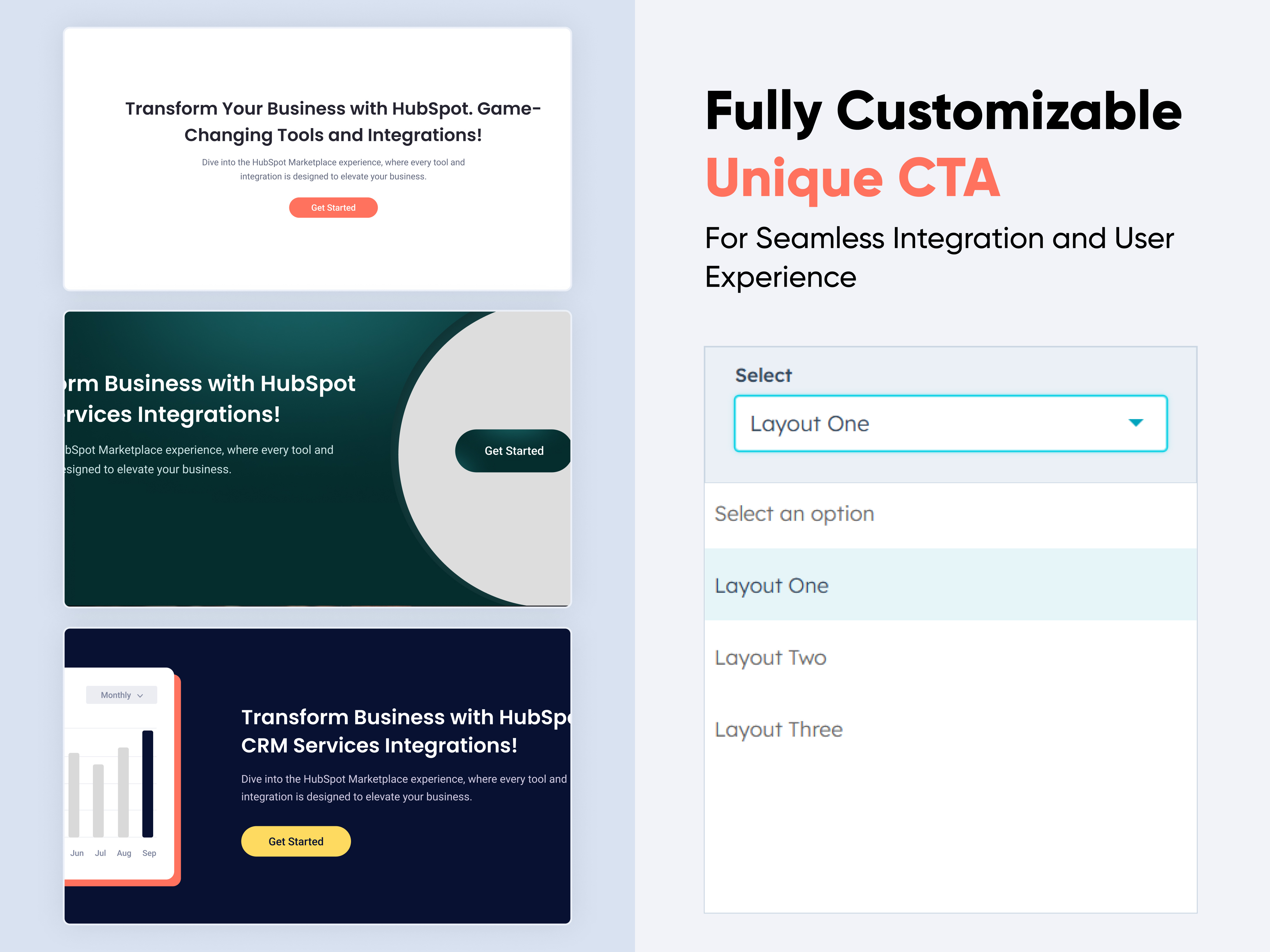
For the CTA module section, select your preferred layout (e.g., Layout 1, Layout 2 & Layout 3) and easily rearrange it to achieve the ideal content flow.
Options:
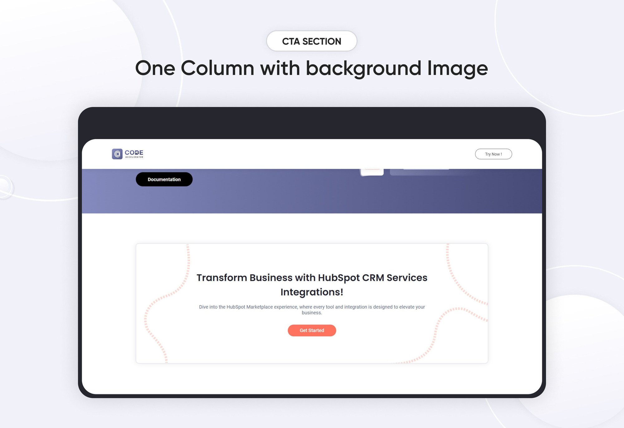
- Layout 1: For Layout 1 of a CTA (Call to Action) module, where the heading, description, and CTA button are all center-aligned.
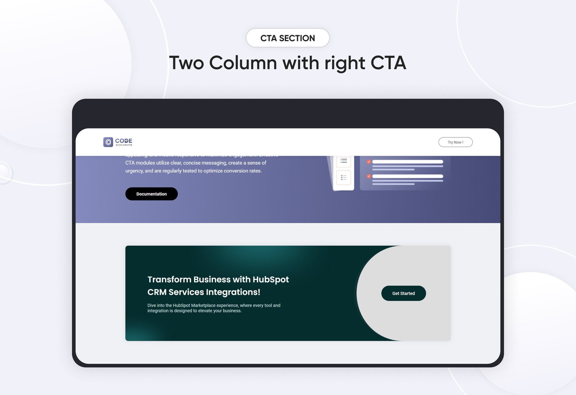
- Layout 2: For Layout 2 of a CTA (Call to Action) module, where the content is organized in a two-column format with the heading and description on the left and the CTA on the right.
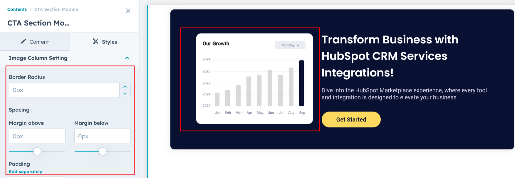
- Layout 3: For Layout 3 of a CTA (Call to Action) module, where the design is organized in a two-column format with an image on the left and the heading, description, and CTA on the right

Heading & Description :
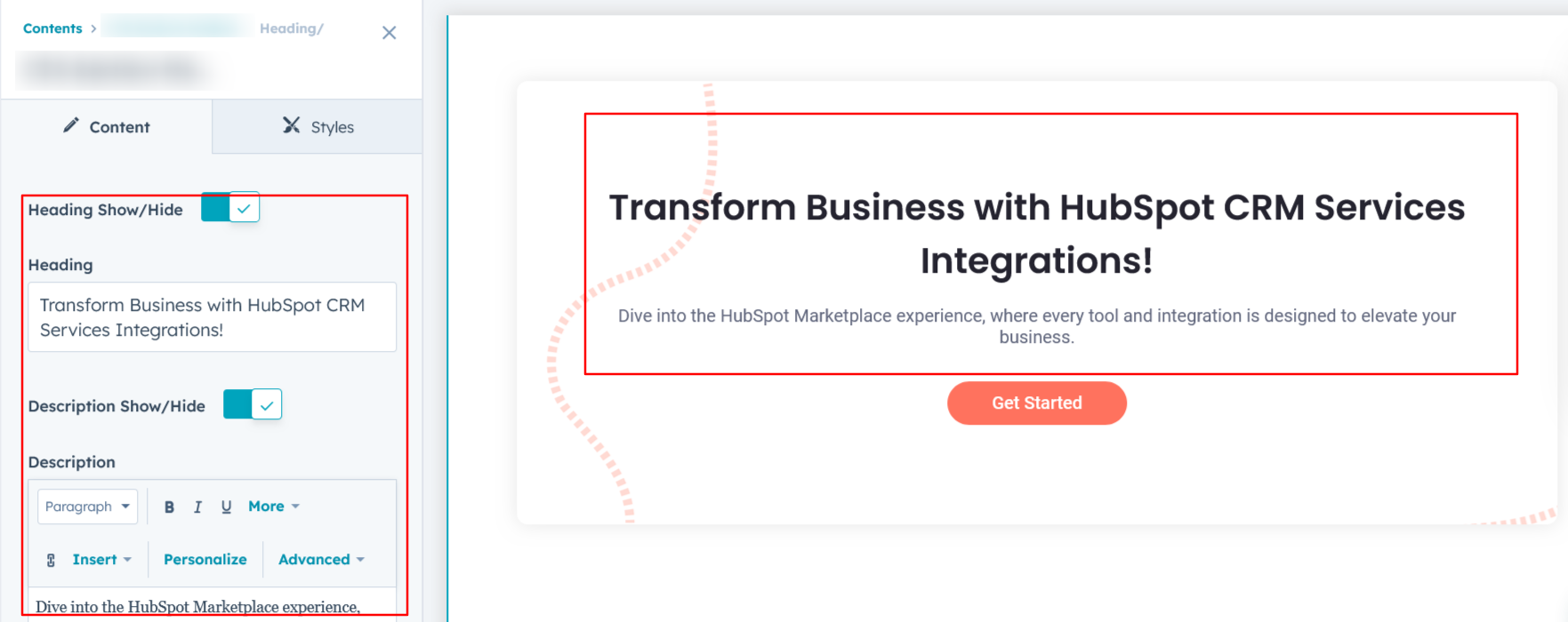
You can easily customize the content in your CTA module's heading sections to suit your needs. Adjust the 'Heading' and 'Description' to align with your specific messaging, or choose to hide these sections entirely if desired.
Options:
- Toggle Visibility: Easily show or hide the heading and description sections based on your requirements, allowing for a cleaner and more focused design.
CTA Show/Hide :
You can customize the CTA link and CTA text according to your preferences, providing flexibility to tailor the call to action to your specific needs. Additionally, there is an option to show or hide the CTA entirely, giving you full control over its visibility.

Image Column :
For Layout 3, the left side of the CTA module features an image option that visually complements the content on the right. You have the flexibility to show or hide the image column based on your design needs, ensuring the layout remains adaptable and clean.

Module Style Options:
Module Setting :
You have full control over customizing the module's design to achieve your ideal layout. Adjust the margin and padding settings, choose a background option—whether it's a solid color, image, or gradient—and set the container width to perfectly align with your overall design goals.

CTA Section Setting :
You can customize the CTA section by adjusting the background color, spacing, border, border radius, and box shadow to create a distinctive and visually appealing design.

Heading & Description Setting :
Users can customize the maximum width, bottom spacing, and content alignment of the CTA module. Typography settings, including font size, weight, and line height for headings and descriptions, can be adjusted for both mobile and desktop views. Additionally, spacing adjustments are available for both mobile and desktop layouts, allowing for a tailored and responsive design.

CTA Setting :
You can customize the CTA section for both desktop and mobile views by adjusting typography settings, background color, hover color, border, border radius, and spacing. Additionally, you can fine-tune the alignment for a cohesive and responsive design across different devices.
 Image Column Setting :
For Layout 3, you can customize the image settings by adjusting the border radius, spacing. This allows for a tailored look that complements the overall design of your CTA module.
We hope you will love working with our CTA module and creating a seamless experience for both your users and marketers on your team. Here at Code Accelerator, we strive to ensure that your experience with HubSpot is a great one! If you need a custom HubSpot module or require a customized HubSpot CMS or CRM setup, Please Contact Us.
Need Help? We’ve Got You Covered!
Our expert support team is here to guide you. Whether it’s troubleshooting, setup, or customization, we’ll help you get the most out of your modules with ease.

