HubSpot Theme
HubSpot Modules
- Startup Growth Metrics
- Smart FAQ Accordion
- Premium Full Screen Banner
- Latest Insights Blog
- Two Column Testimonial
- Dynamic CTA Banner
- Latest Blog Highlights
- Dynamic Overlap Cards
- Case Study
- Modern Video Showcase
- Content Grid Pro
- Modern Hero Banner
- Feature Cards
- Use Case Tabs
- Feature Accordion Pro
- Info Cards
- Hero Banner Pro
- Pricing Plans Premium
- Job Search and Category Premium
- Infinity Logos Slider
- Stats Number Counter
- Step Process Or Services
- Motion Cards
- FAQ Premium
- Tab with Content
- Service Animation Cards
- About Me
- Infinity Testimonial Slider
- Events List Premium
- Download eBook Now
- Tabbed Info Display
- Banner Pro
- Two Column Steps
- Image Gallery With Animation
- Parallax
- What We Offer
- Horizontal Slides Panel
- Banner
- Sliding Animation Cards
- CTA Back To Top
- Location With Map
- Testimonial Single
- Work Steps Process
- Sticky Social Icon
- Brand Logo Slider
- Animated Cards
- Multistyle Hero Banner
- Pricing Plans Card
- Hover Box Animation
- About Us Content
- Upcoming Events
- Unique CTA
- Team Members Detail
- E-Book Download
- Countdown Coming soon
- Our Services Cards Documentation Page
- 404 Section
- Main Hero Banner
- Client Logos Section
- Counter Cards Documentation Page
- Timeline Module Documentation Page
- Knowlegebase: Hubspot FAQ Module
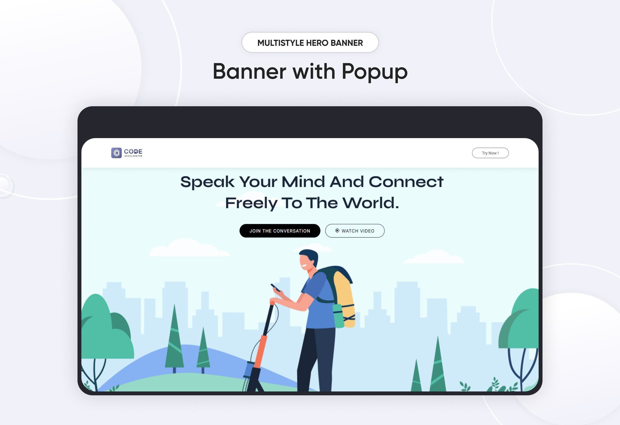
Multistyle Hero Banner
Provider:
Code Accelerator Pvt. Ltd.
thecodeaccelerator.comA Multistyle Hero Banner is a web design technique that combines various visual and stylistic elements to create a visually striking and functional focal point on a webpage. These banners are typically located at the top of a webpage and are designed to grab attention, communicate key messages, and set the tone for the website's branding. The "multistyle" approach adds variety and interest by integrating multiple design styles, such as imagery, typography, animations, and interactive elements.
Key Features Multistyle Hero Banner Module :
Imagery:
-
Background Images: Can feature high-quality photographs, illustrations, or abstract art.
-
Video Backgrounds: Provide a dynamic feel, especially for modern or tech-oriented sites.
Typography:
-
Headline Text: Bold, large, and impactful, often using contrasting fonts.
-
Subheadings: Smaller text providing additional context.
Responsive Design:
- Ensures the banner is visually appealing and functional on all screen sizes.
- Dynamic resizing of images, typography, and interactive elements.
Endlessly Customizable
It works like magic with just a few clicks! Customize everything you want—colors, fonts, paragraphs, headings, images, and videos effortlessly.
Layouts and Styles
The Hero module gives you the flexibility to choose from a range of layouts and styles tailored to your needs. Whether it’s a slider hero banner, a video banner design, or a minimalist look, this module provides the tools to craft the perfect visual impact.
Easily change module content.
You can easily customize the content in this module.
Effortlessly Customize Module Styles
You can easily adjust styles in this module, customizing spacing, text color, button color, background color, and more to suit your preferences.
How to Set Up the Multistyle Hero Banner Module in HubSpot :
In the main dashboard, navigate to the ‘Content’ tab and select either ‘Website’ or ‘Landing Pages’, depending on where you want to add the section. This allows you to choose the appropriate location for managing or updating your content.
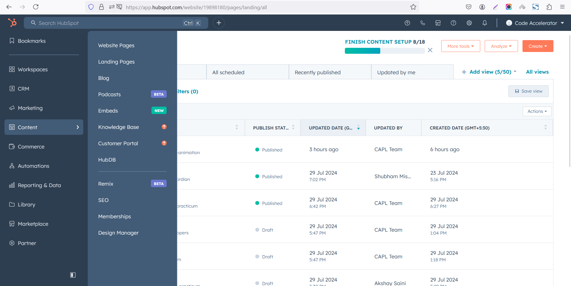
Select the page where you want to apply the module.
.png?width=2850&height=1440&name=Screenshot%20(20).png)
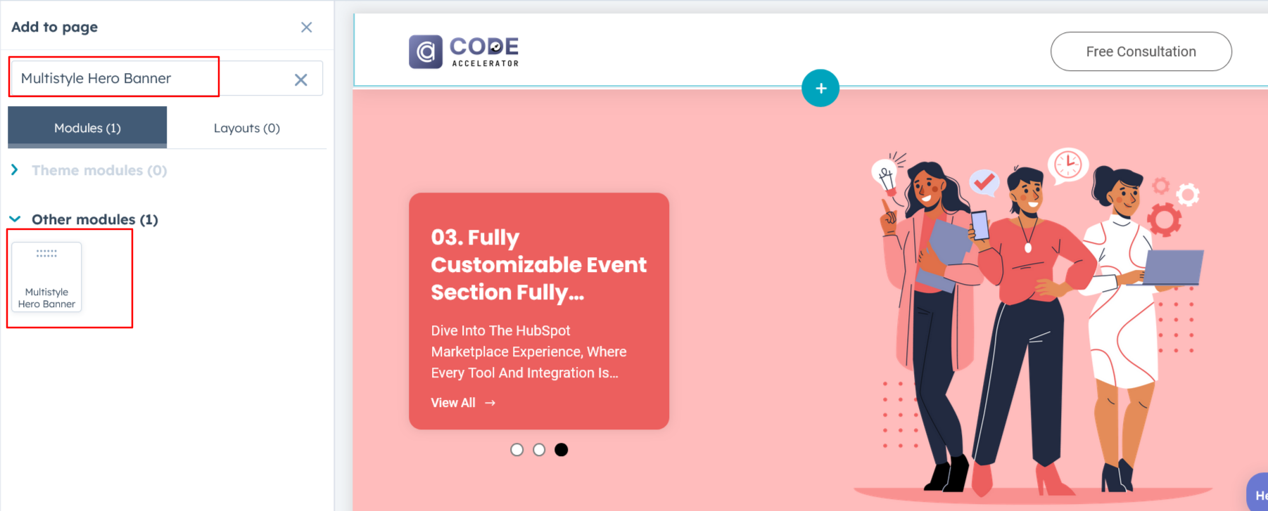
Search for "Multistyle Hero Banner" and drag and drop the module into the desired location on your page.
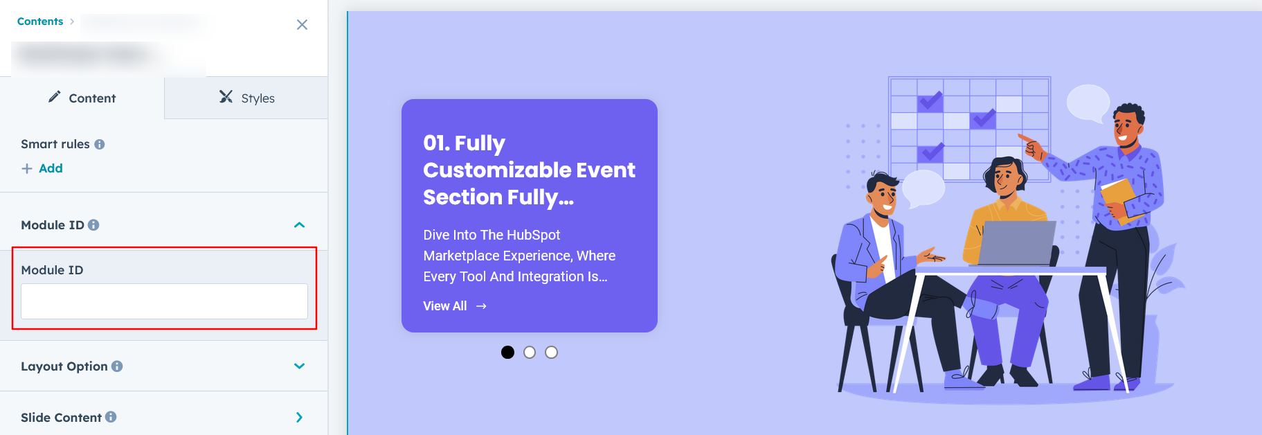
Module Defaults Options:
Layout ID :
To enable a smooth scrolling effect for a Call to Action (CTA), start by assigning an ID to the target element. Then, use that ID in the href attribute of the anchor link for the CTA. When users click the CTA, the page will smoothly scroll to the designated section.
Layout Options :
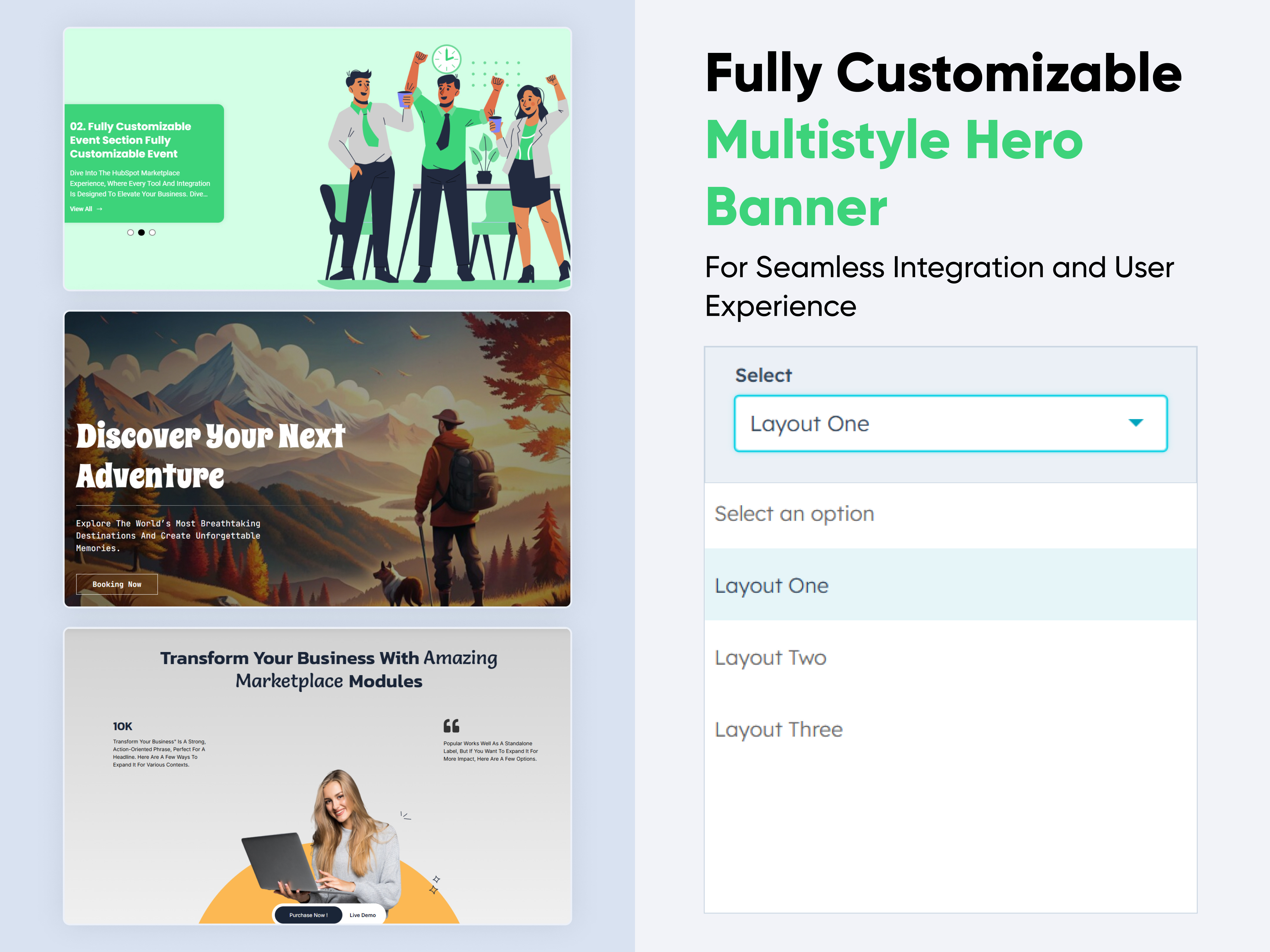
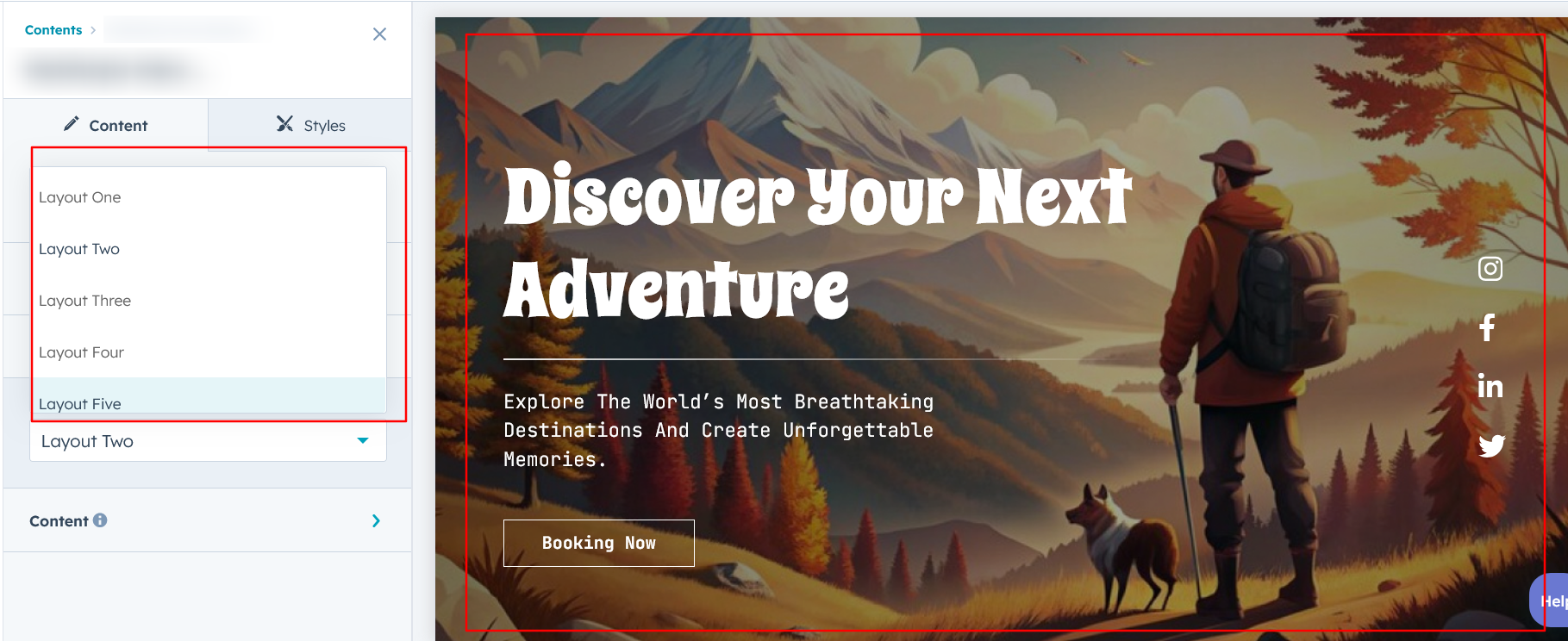
For Multistyle Hero Banner, select your preferred layout (e.g., Layout 1, Layout 2, or Layout 3, Layout 4, Layout 5, Layout 6). You can easily rearrange the cards within the chosen layout to create the ideal content flow and visual arrangement.
Options :
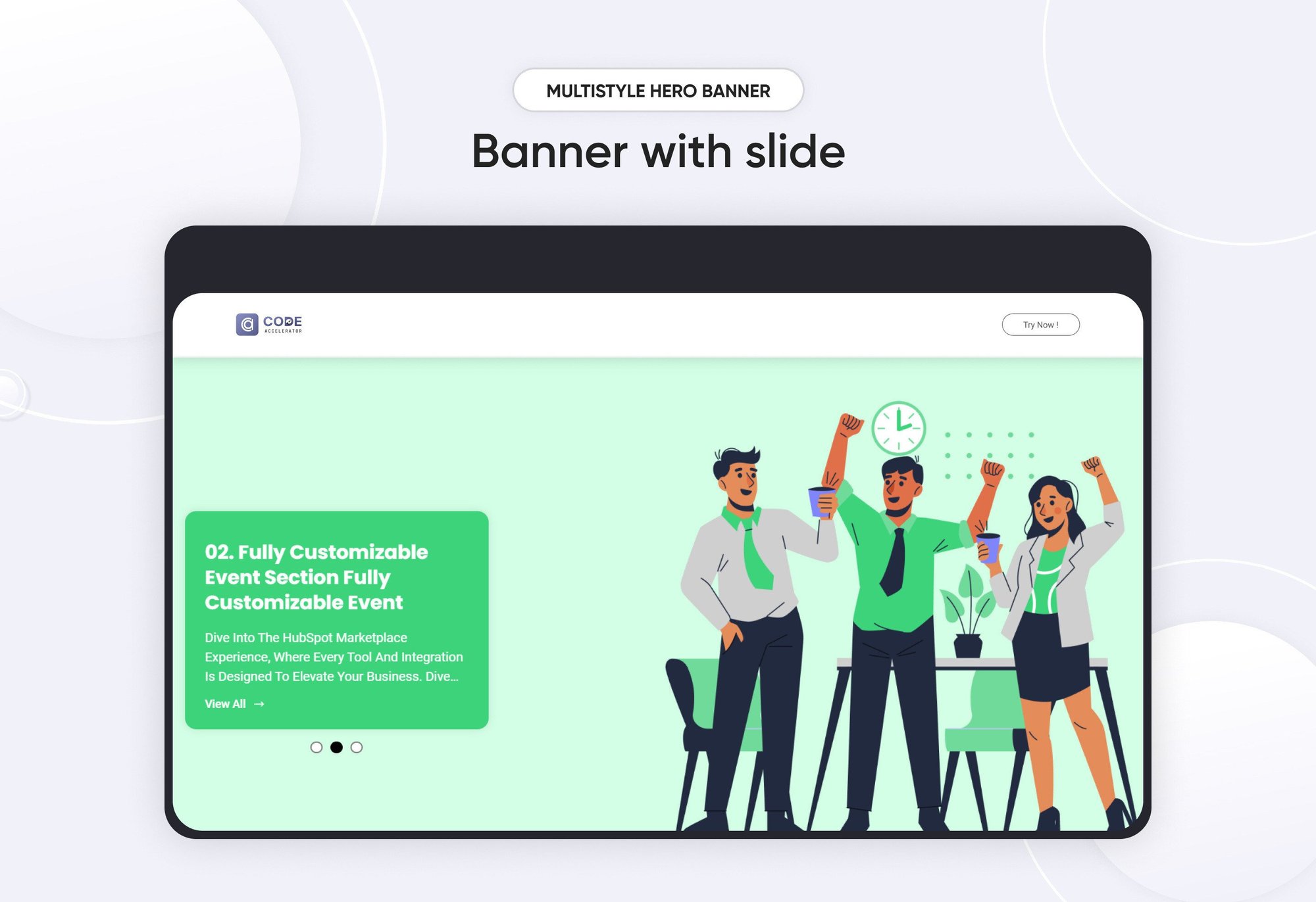
- Layout 1 : This layout allows you to add multiple slides, each with customizable content and a column for images.
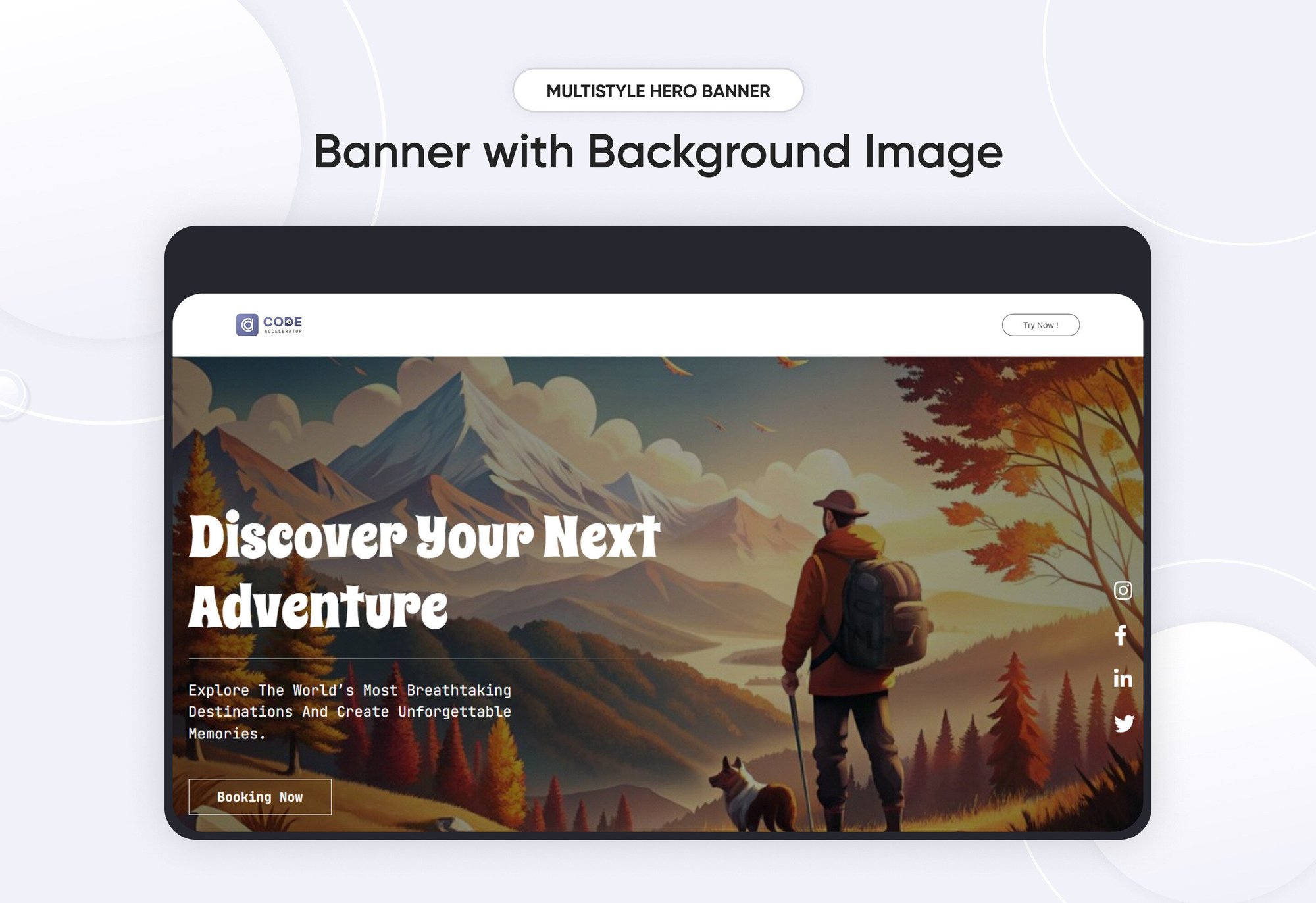
- Layout 2 : This layout features a background image, customizable content, and social icons with link options for seamless integration.
- Layout 3 : This layout showcases centrally aligned content with a modern design. It also includes multiple CTA options, CTA with the ability to trigger popups for enhanced interactivity.
- Layout 4 : This layout features a centrally aligned title with a two-column content design. It also includes multiple CTA options, CTA capable of triggering popups for added interactivity.
- Layout 5 : This layout features an animated heading, accompanied by a two-column design that includes both content and an image for a dynamic and engaging presentation.
- Layout 6 : This layout features a background video with overlaying content, creating an immersive and dynamic visual experience.
Slide Content :
For Layout 1, feel free to customize each slide by adding content and duplicating slides as needed to meet your requirements.

Content :
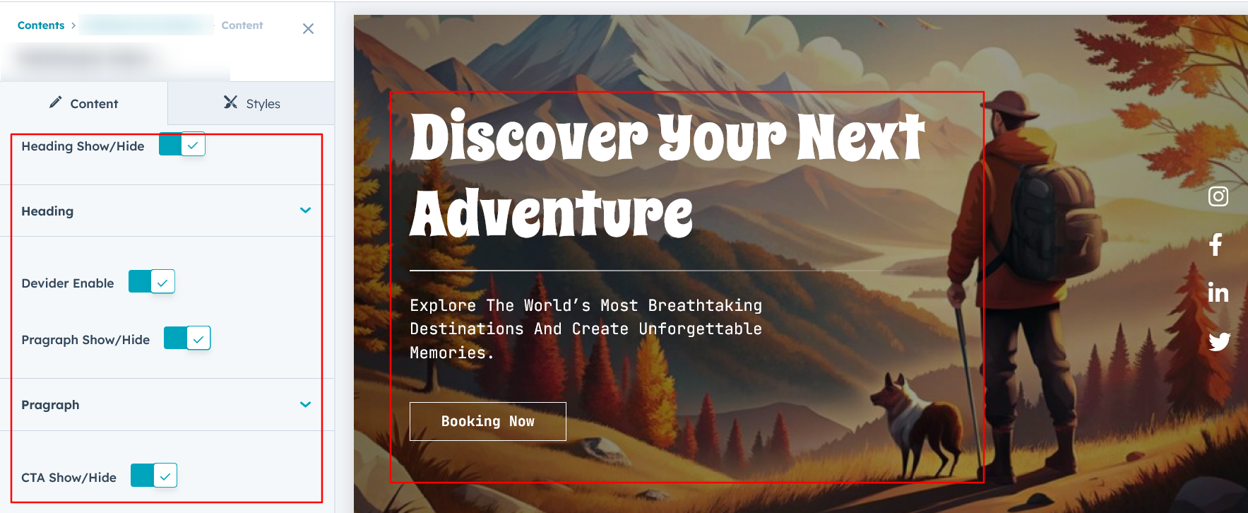
In Layouts 2, 3, 5, and 6, you can customize the content title, description, and CTA text with links. Additionally, in Layout 4, you can modify the column content to suit your needs. Layout 2 also includes options to add and customize social icons with links.
Module Style Options:
Module Setting :
Adjust the margins, padding, background colors, and container width to achieve your desired look and feel for the module. In Layout 1, you can assign a different background to each slide for added variety. This flexibility allows you to fine-tune the layout and aesthetics, ensuring your design is visually appealing, functional, and user-friendly.

Column Setting :
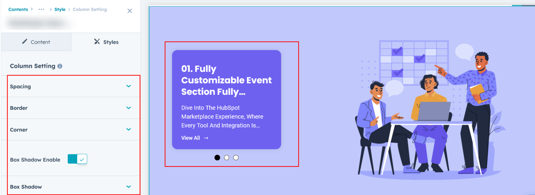
For Layout 1, users can customize the spacing of the left slide column, as well as adjust the border, border radius, and box shadow to achieve their desired design style.
Column Content Setting :
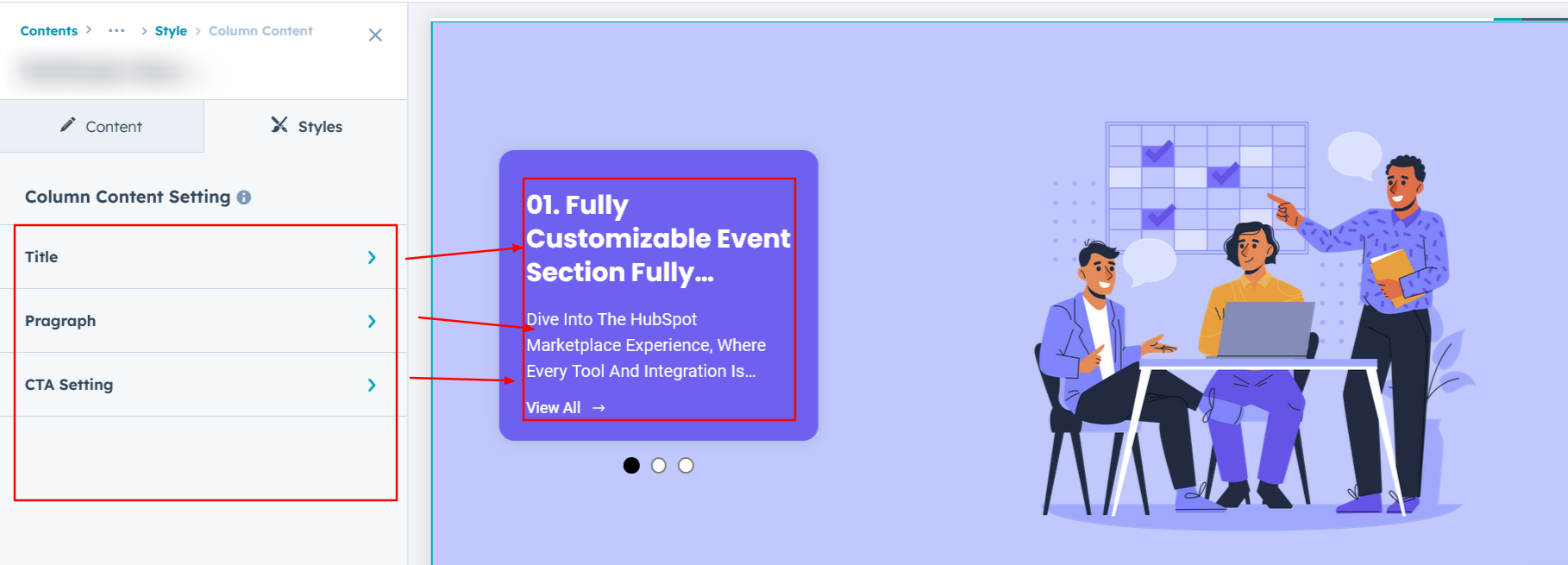
In Layout 1, users can customize the title, description, and CTA typography, including font size, line height, and spacing for both mobile and desktop views. Additionally, text transform and alignment options are available. For the CTA, users can configure the border, border radius, background color, and apply hover effects for enhanced interactivity.
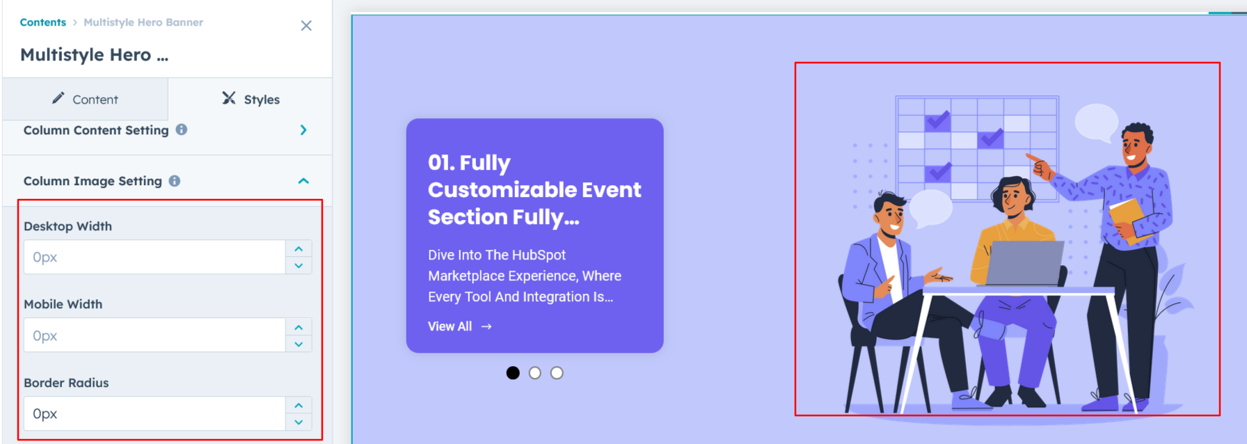
Column Image Setting :
In Layouts 1 and 5, users can customize the column image width for both desktop and mobile views, as well as add a border radius for a polished and tailored design.
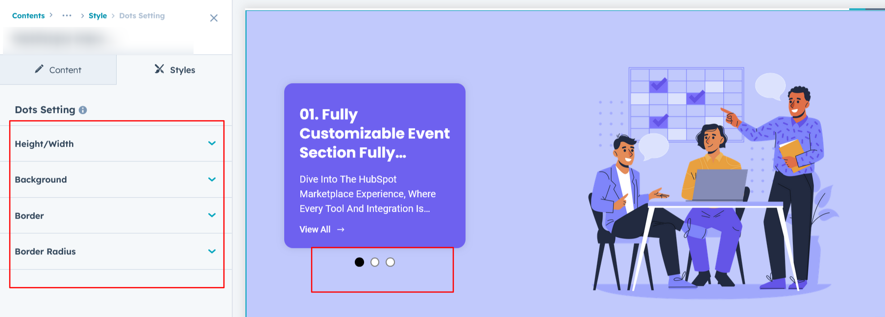
Dots Setting :
In Layout 1, users can customize the dots' height and width, background colors, border, border radius, and also set a unique background color for the active dot.
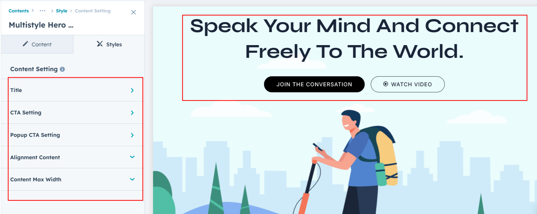
Content Setting :
In Layouts 2, 3, 4, 5, and 6, users can customize the heading, description, and call-to-action with options for font size, line height, color, spacing, alignment, and text transformation. Additionally, users can set background colors, hover backgrounds, borders, and text colors to enhance the design and interactivity.
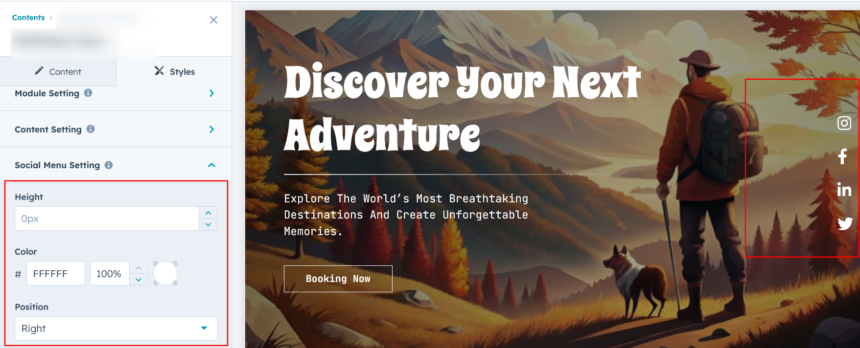
Social Menu Setting :
In Layout 2, users can customize the social icons' height, color, and position them on the left or right side as desired.
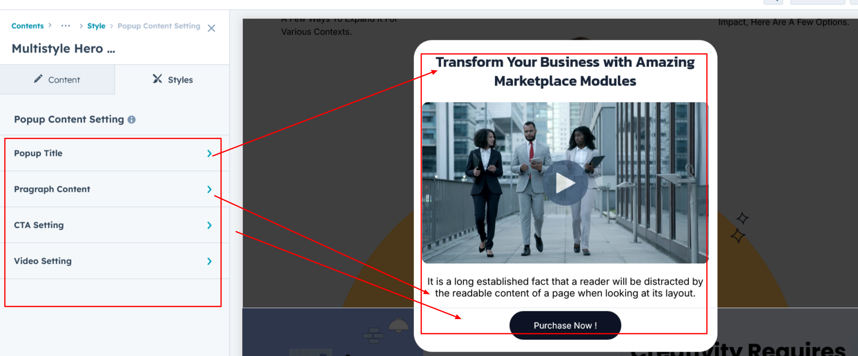
Popup Content Setting :
In Layouts 3 and 4, users can customize the popup title, description, and CTA typography, including font size, color, spacing, text transformations, and alignment. Additionally, users can adjust the video spacing and corner styling for a tailored appearance.
Popup Section Setting :
In Layouts 3 and 4, the popup section allows users to add a background, adjust spacing, and customize the border, border radius, and width for a personalized design.

We hope you enjoy using multistyle hero banner module to create a seamless experience for both your users and your marketing team. At Code Accelerator, we're committed to ensuring your HubSpot experience is exceptional. If you need a custom HubSpot module or require a tailored HubSpot CMS or CRM setup, please don’t hesitate to Contact Us.
Need Help? We’ve Got You Covered!
Our expert support team is here to guide you. Whether it’s troubleshooting, setup, or customization, we’ll help you get the most out of your modules with ease.
