HubSpot Theme
HubSpot Modules
- Startup Growth Metrics
- Smart FAQ Accordion
- Premium Full Screen Banner
- Latest Insights Blog
- Two Column Testimonial
- Dynamic CTA Banner
- Latest Blog Highlights
- Dynamic Overlap Cards
- Case Study
- Modern Video Showcase
- Content Grid Pro
- Modern Hero Banner
- Feature Cards
- Use Case Tabs
- Feature Accordion Pro
- Info Cards
- Hero Banner Pro
- Pricing Plans Premium
- Job Search and Category Premium
- Infinity Logos Slider
- Stats Number Counter
- Step Process Or Services
- Motion Cards
- FAQ Premium
- Tab with Content
- Service Animation Cards
- About Me
- Infinity Testimonial Slider
- Events List Premium
- Download eBook Now
- Tabbed Info Display
- Banner Pro
- Two Column Steps
- Image Gallery With Animation
- Parallax
- What We Offer
- Horizontal Slides Panel
- Banner
- Sliding Animation Cards
- CTA Back To Top
- Location With Map
- Testimonial Single
- Work Steps Process
- Sticky Social Icon
- Brand Logo Slider
- Animated Cards
- Multistyle Hero Banner
- Pricing Plans Card
- Hover Box Animation
- About Us Content
- Upcoming Events
- Unique CTA
- Team Members Detail
- E-Book Download
- Countdown Coming soon
- Our Services Cards Documentation Page
- 404 Section
- Main Hero Banner
- Client Logos Section
- Counter Cards Documentation Page
- Timeline Module Documentation Page
- Knowlegebase: Hubspot FAQ Module


-2.webp?width=2000&name=03%20thumbnail(1)-2.webp)
A "Main Hero Banner" module in HubSpot is a prominent section, usually placed at the top of a webpage, that serves as the first visual element visitors see when they land on your site. It is designed to grab attention and convey your primary message or call-to-action. Here's what typically goes into the content of a Hero Banner module.
Key Features :
-
Headline (Main Text)
- Prominent and Impactful: The headline is usually the largest text element in the module, designed to quickly communicate the core message or value proposition.
- Customizable Fonts and Sizes: You can adjust the font style, size, and color to align with your brand’s identity.
- Subheadline (Supporting Text)
- Additional Context: Provides further explanation or supporting details for the main headline.
- Flexible Placement: Can be placed above or below the headline, depending on the design.
- Call-to-Action (CTA)
- Action-Oriented Buttons: Typically includes one or more buttons prompting visitors to take a specific action, such as "Sign Up," "Learn More," or "Contact Us."
- Customizable Design: Button styles, colors, and text can be tailored to stand out within the hero module.
- Background Image or Overlay
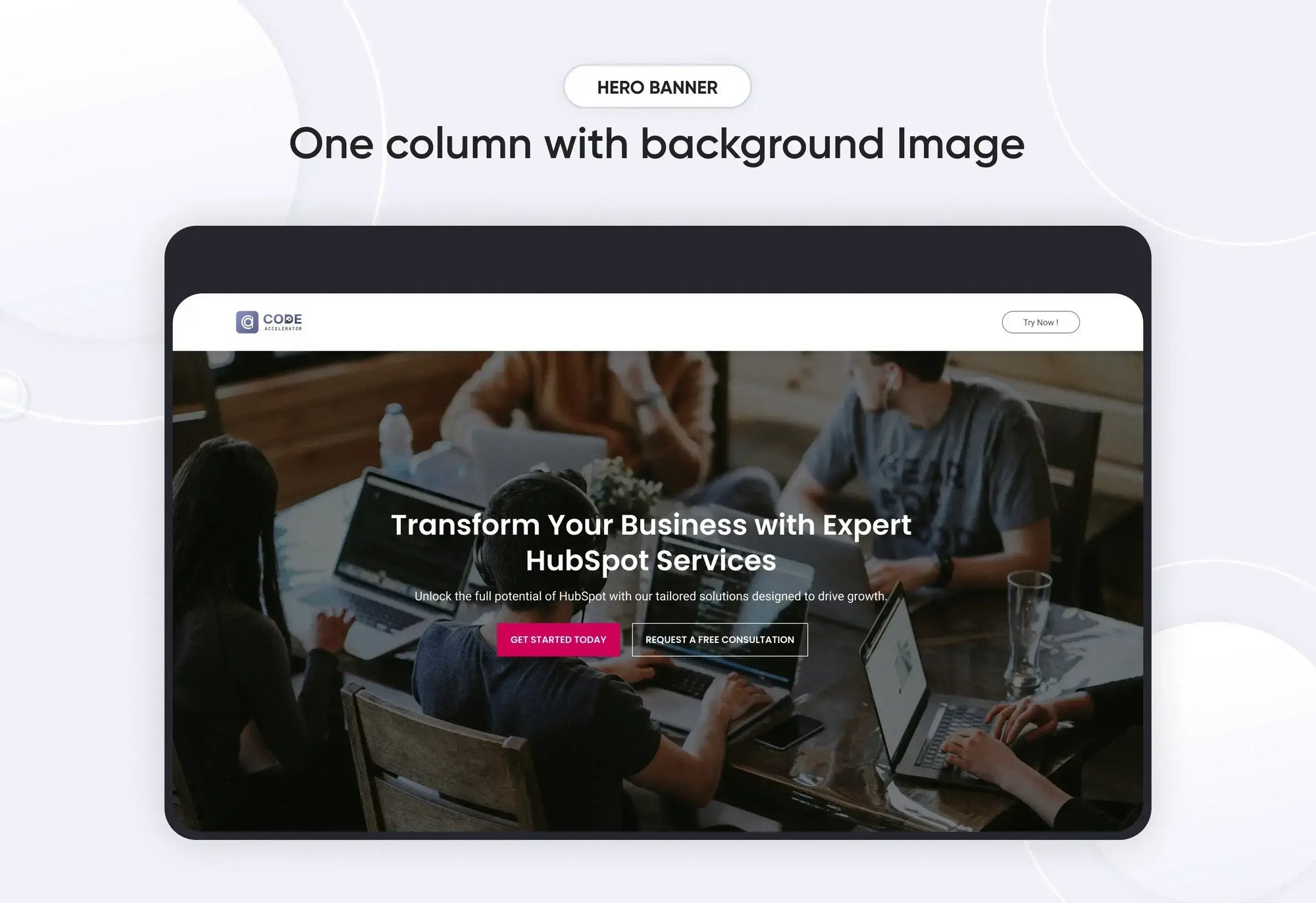
- Visual Appeal: The hero module often features a full-width background image that complements the text and overall design.
- Overlay Options: A color or gradient overlay can be applied to enhance text readability over the background image or video.
- Responsive Design
- Mobile Optimization: The hero module is designed to be fully responsive, ensuring that all elements (text, CTA, images, etc.) look great and function well on any device, including desktops, tablets, and smartphones.
- Customizable Layout
- Flexible Content Arrangement: The module allows for various layouts, such as centered text, left-aligned text, or split-screen designs where text and images/videos are side by side.
- Padding and Margin Control: You can adjust the spacing around elements to ensure the content is well-balanced and visually appealing.
- SEO-Friendly
- Alt Text and Metadata: You can add alt text to images and metadata to the hero module content, helping improve SEO and accessibility.
- Theme and Brand Integration
- Consistent Styling: The hero module can be designed to seamlessly integrate with your site’s overall theme and branding, ensuring a cohesive visual experience.
Setting Up the Main Hero Banner Module :
-
In the main dashboard, navigate to the Content tab and select either Website Pages or Landing Pages, depending on where you want to add the service section.

-
Choose the page where you want to apply the module.
.png?width=2850&height=1440&name=Screenshot%20(20).png)
-
Search for "Main Hero Banner" and drag and drop the module into the desired location on your page.

Module Defaults Options:
Heading & Description :
You can easily tailor the content in your hero banner heading sections to meet your specific needs. Customize the "Heading" and "Description" to perfectly align with your messaging, and if desired, you have the option to hide the section entirely.
Options :
- Toggle Visibility: Easily show or hide the heading and description sections as needed.
- Custom Heading Styles: Choose from heading styles (h1 to h6) to control the prominence and appearance of your headings.

Layout Options :
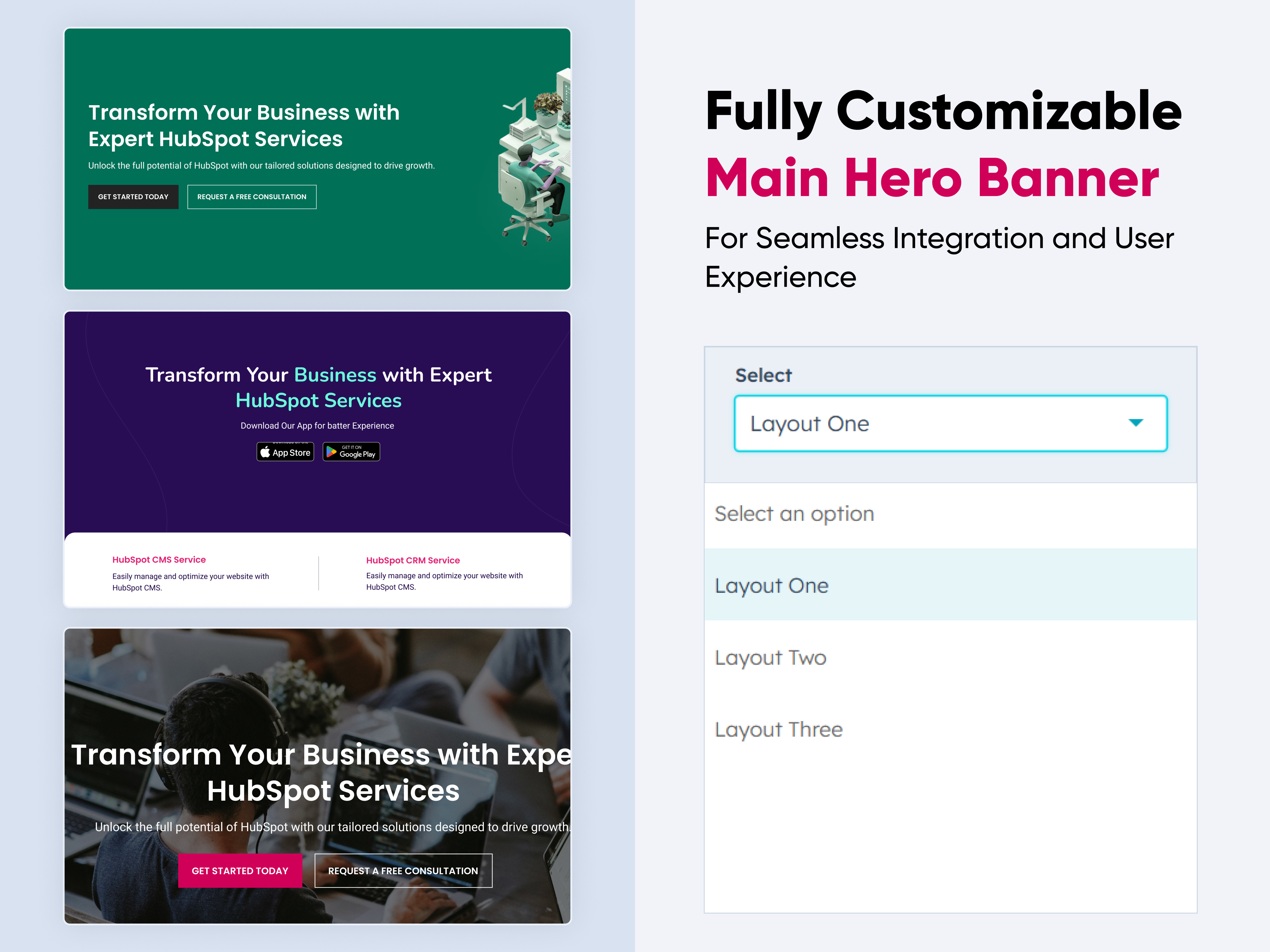
For hero banner sections, choose your preferred layout (e.g., Layout 1, Layout 2, or Layout 3). Easily rearrange the cards within your selected layout to achieve the perfect content flow.
Options :
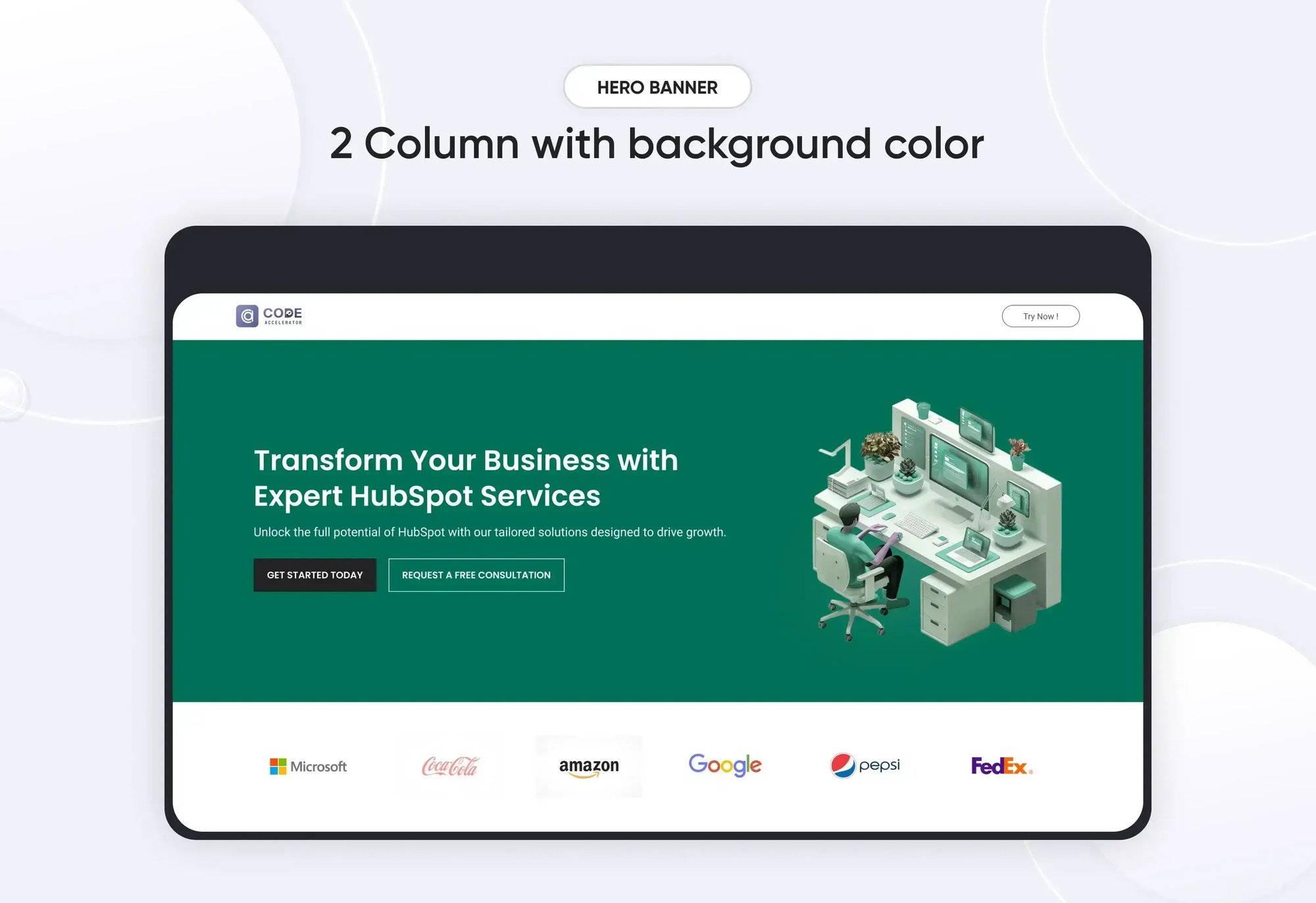
- Layout 1: A hero banner with two columns featuring a heading, description, and CTA on the left, and an image on the right.
- Layout 2: A hero banner with a centrally aligned heading, description, and CTA for a balanced and focused presentation.
- Layout 3: A hero banner with a centrally aligned heading, description, and CTA, plus an additional content section at the bottom for extended messaging.

CTA Options :
You can easily customize the hero banner's CTA with options for both text and link customization. The CTA is available for Layout 1 and Layout 2, allowing you to tailor the call-to-action to fit your needs perfectly.

Module Style Options:
Module Setting :
Fine-tune margins, padding, background colors, and container width to create your ideal design and layout.

Heading & Description Setting :
Users can customize the maximum width, bottom spacing, and content alignment. Additionally, typography settings—such as font size, weight, and line height for headings and descriptions—can be adjusted for both mobile and desktop views. Spacing adjustments are also available for mobile and desktop layouts.

CTA Setting :
Position the CTA within your content (e.g., left, center, or right alignment). Adjust spacing around the CTA to ensure it’s visually appealing and effectively positioned within your layout. Control the size of the CTA button or text link to ensure it stands out appropriately.

Image Column Setting :
You can set image height for desktop and mobile also and set the border radius in image. image column only available in layout 1.

Bottom Section Setting :
In the bottom section of Layout 3, you can customize the background color, border radius, and spacing for both desktop and mobile views. Additionally, you can adjust the color and width of the center border.

Bottom Section Content Setting :
In the bottom content section, you can customize the title and content by adjusting the size, weight, line height, and spacing for both desktop and mobile views.

We hope you find our hero banner module valuable in enhancing both user experience and marketing effectiveness. At Code Accelerator, we're dedicated to making your HubSpot experience outstanding. For custom HubSpot modules or personalized HubSpot CMS and CRM setups, please feel free to reach out to Contact Us.
Need Help? We’ve Got You Covered!
Our expert support team is here to guide you. Whether it’s troubleshooting, setup, or customization, we’ll help you get the most out of your modules with ease.

