HubSpot Theme
HubSpot Modules
- Startup Growth Metrics
- Smart FAQ Accordion
- Premium Full Screen Banner
- Latest Insights Blog
- Two Column Testimonial
- Dynamic CTA Banner
- Latest Blog Highlights
- Dynamic Overlap Cards
- Case Study
- Modern Video Showcase
- Content Grid Pro
- Modern Hero Banner
- Feature Cards
- Use Case Tabs
- Feature Accordion Pro
- Info Cards
- Hero Banner Pro
- Pricing Plans Premium
- Job Search and Category Premium
- Infinity Logos Slider
- Stats Number Counter
- Step Process Or Services
- Motion Cards
- FAQ Premium
- Tab with Content
- Service Animation Cards
- About Me
- Infinity Testimonial Slider
- Events List Premium
- Download eBook Now
- Tabbed Info Display
- Banner Pro
- Two Column Steps
- Image Gallery With Animation
- Parallax
- What We Offer
- Horizontal Slides Panel
- Banner
- Sliding Animation Cards
- CTA Back To Top
- Location With Map
- Testimonial Single
- Work Steps Process
- Sticky Social Icon
- Brand Logo Slider
- Animated Cards
- Multistyle Hero Banner
- Pricing Plans Card
- Hover Box Animation
- About Us Content
- Upcoming Events
- Unique CTA
- Team Members Detail
- E-Book Download
- Countdown Coming soon
- Our Services Cards Documentation Page
- 404 Section
- Main Hero Banner
- Client Logos Section
- Counter Cards Documentation Page
- Timeline Module Documentation Page
- Knowlegebase: Hubspot FAQ Module
A Pricing Plan module is a crucial part of many websites, particularly for businesses offering subscription services, products with tiered pricing. It typically includes information on the features and costs of different service levels to help customers choose the best option for their needs. Here's an overview of the key elements often included in a Pricing Plan module.
Key Features Pricing Plan Module :
- Responsive Layout: Ensure that the module adjusts for mobile, tablet, and desktop views.
- Plan Names and Levels: Each tier should have a distinct, easy-to-understand name (e.g., Basic, Standard, Premium).
- Clear CTA Text: Each plan should have a dedicated button with actionable text like "Get Started" or "Choose Plan."
- Expandable Details: Use collapsible sections to expand on feature descriptions without cluttering the layout.
How to Set Up the Pricing Plans Card Module in HubSpot :
In the main dashboard, navigate to the ‘Content’ tab and select either ‘Website’ or ‘Landing Pages’, depending on where you want to add the section. This allows you to choose the appropriate location for managing or updating your content.

Select the page where you want to apply the module.
.png?width=2850&height=1440&name=Screenshot%20(20).png)
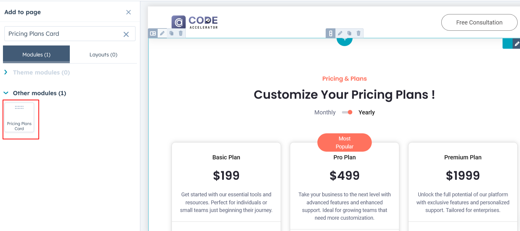
Search for "Pricing Plans Card" and drag and drop the module into the desired location on your page.
Module Defaults Options:
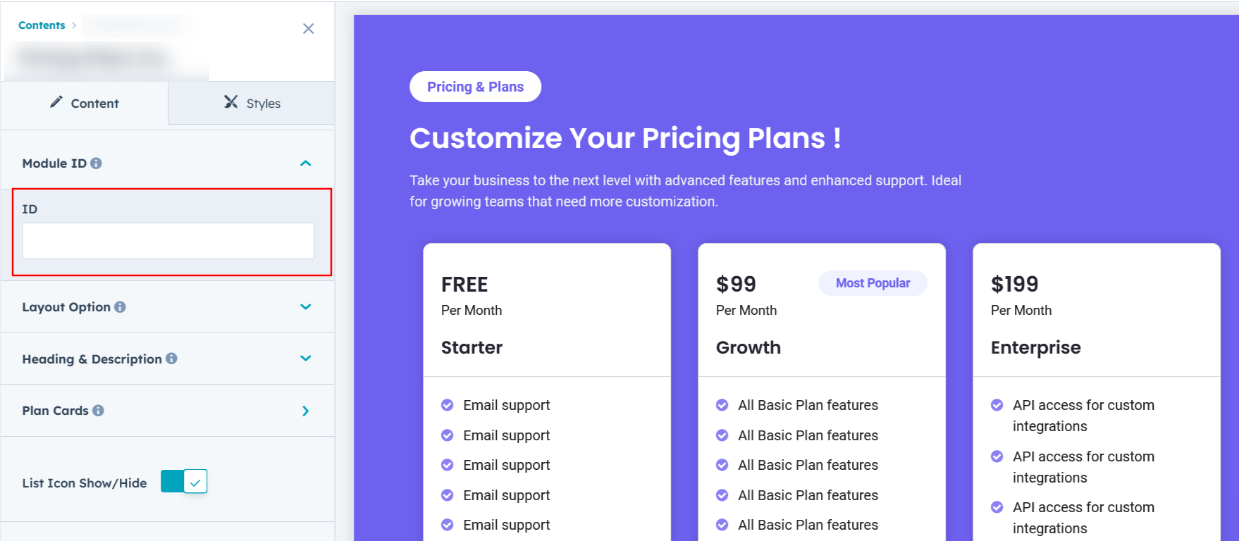
Layout ID :
To enable a smooth scroll effect for a CTA (Call to Action), assign an ID to the target element. Then, use the same ID in an anchor link. When a user clicks the CTA, the page will smoothly scroll to the specified section.
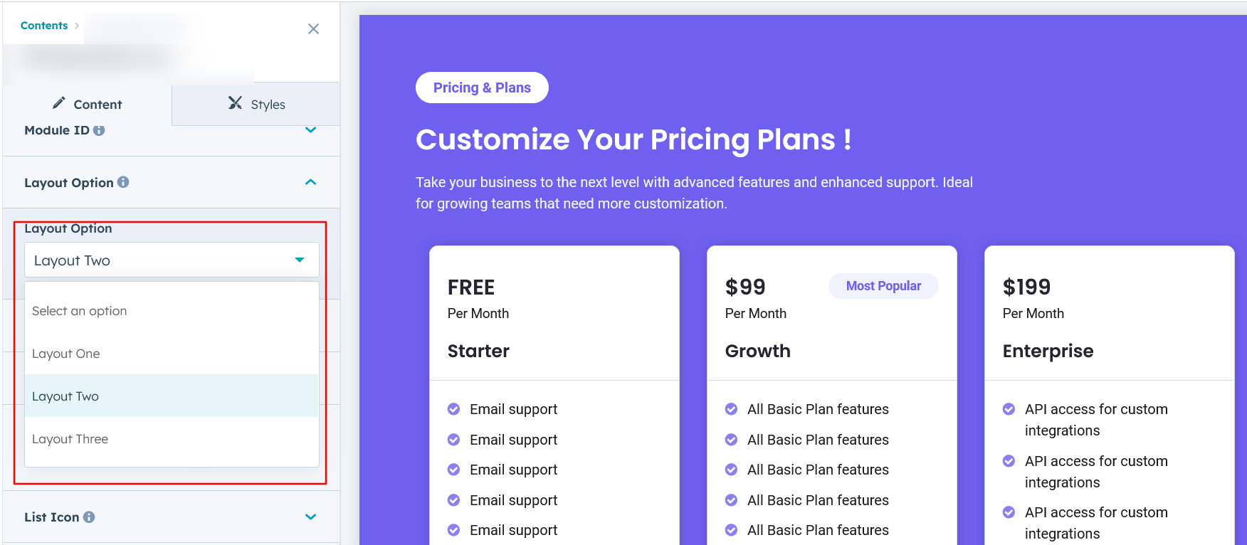
Layout Options :
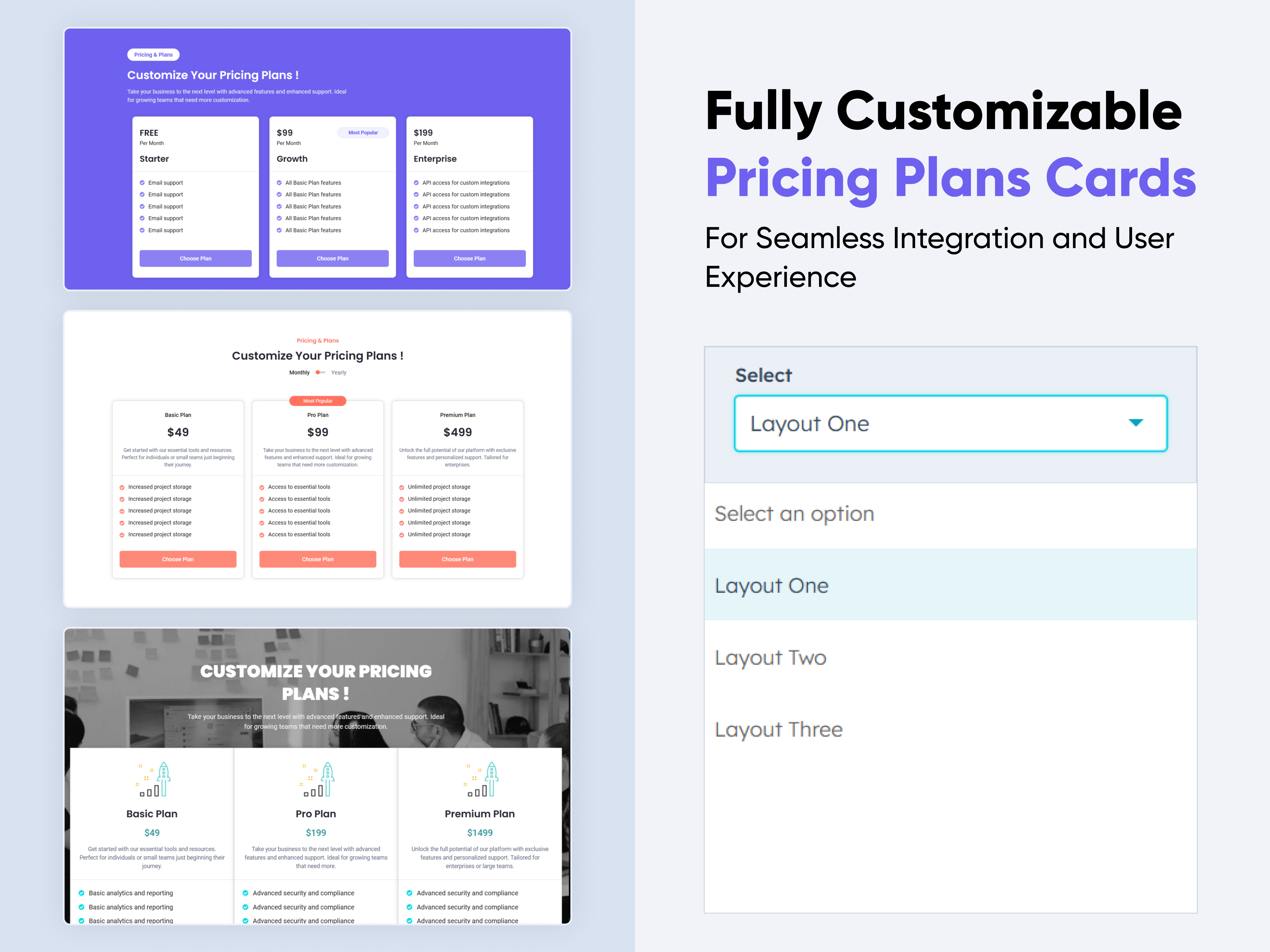
For Pricing Plans, select your preferred layout (e.g., Layout 1, Layout 2, or Layout 3). You can easily rearrange the event cards within the chosen layout to create the ideal content flow and visual arrangement.
Options :
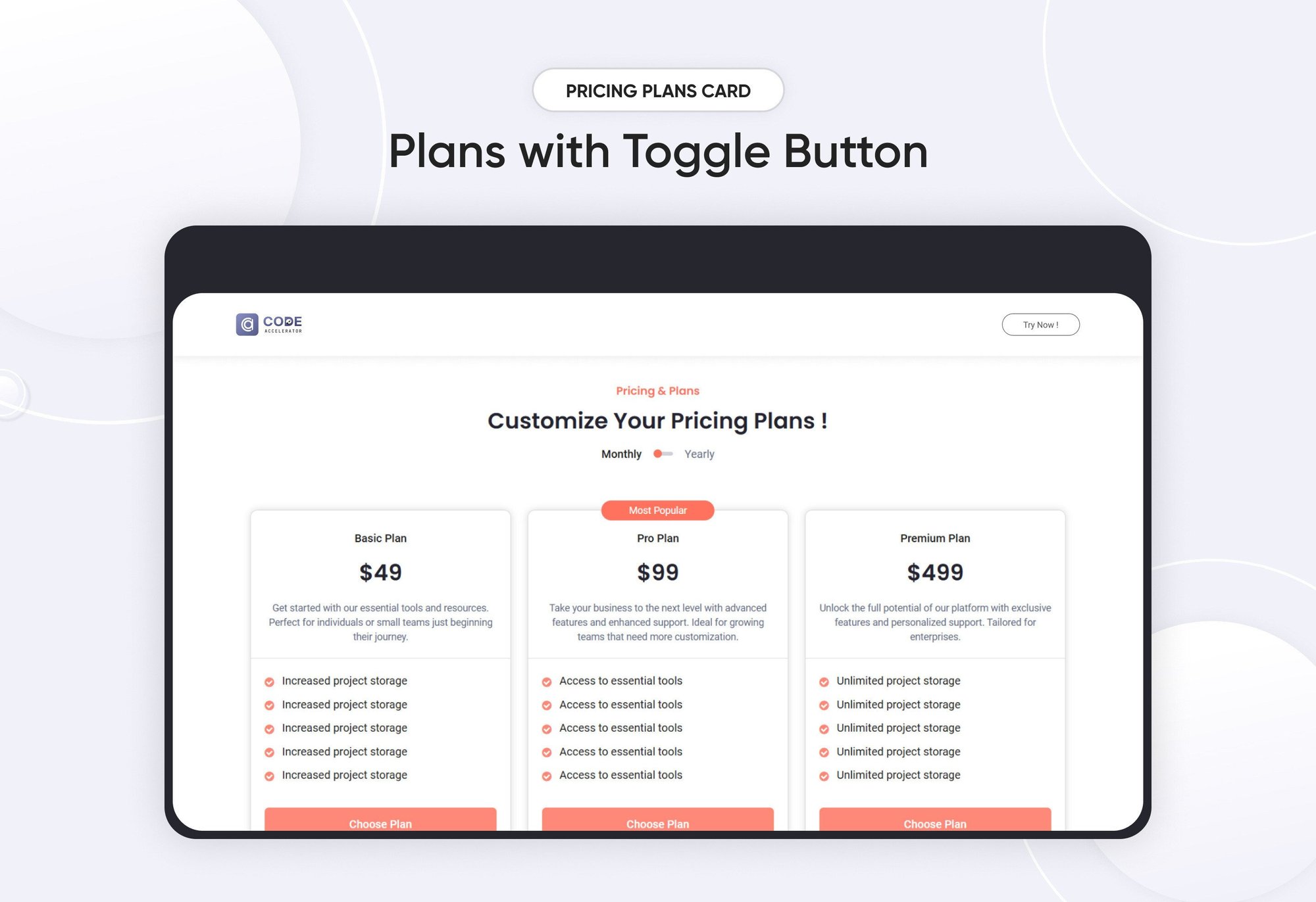
- Layout 1 : This layout displays pricing options with a toggle between monthly and yearly plans, allowing users to easily compare features and choose the best option.
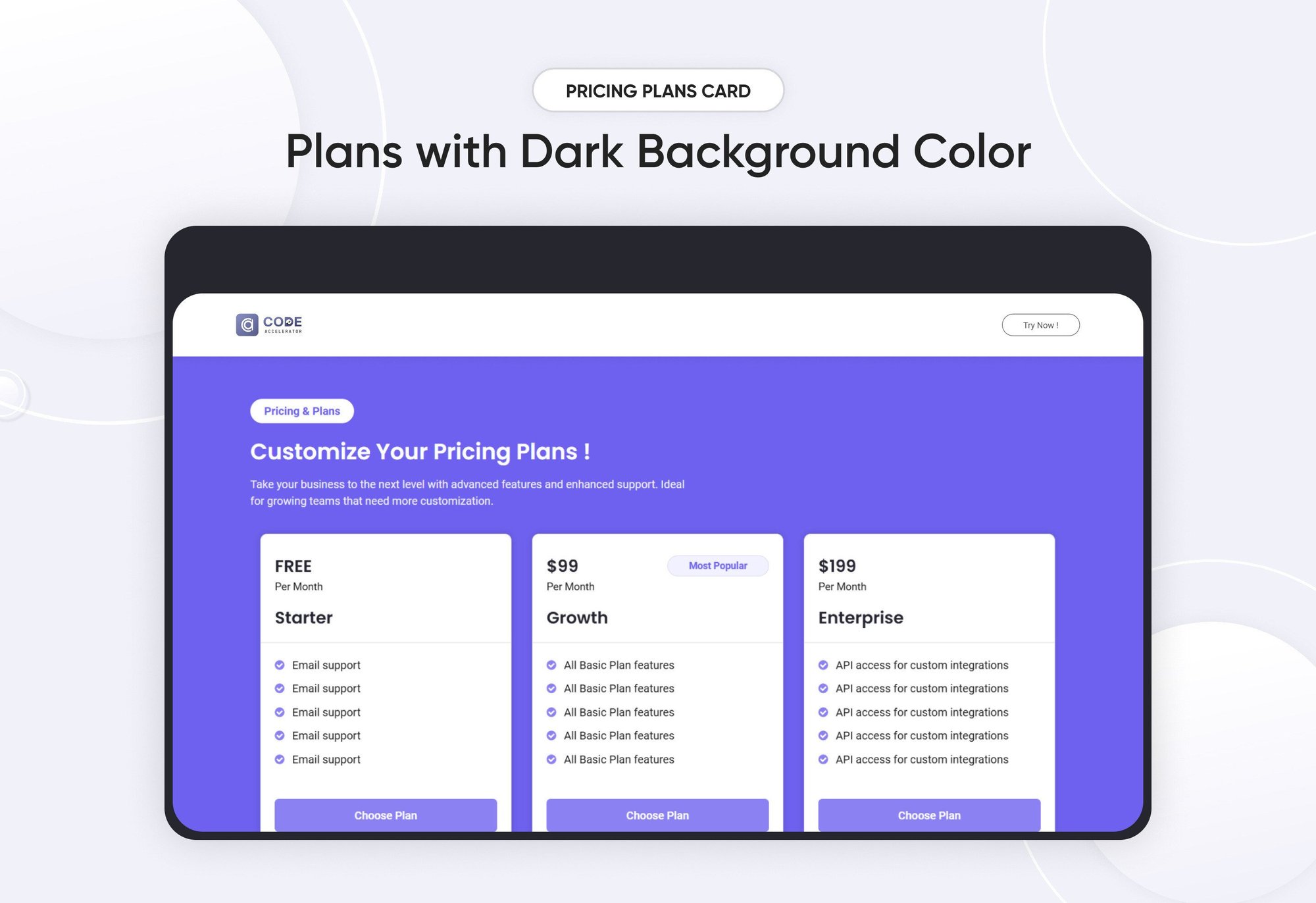
- Layout 2 : This layout showcases features alongside a single pricing option, with an optional dark background for enhanced visual appeal.
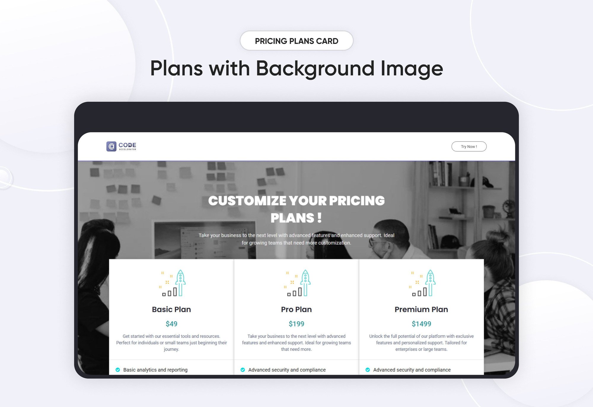
- Layout 3: This layout features a modern design with a background image, creating a visually engaging and contemporary look.
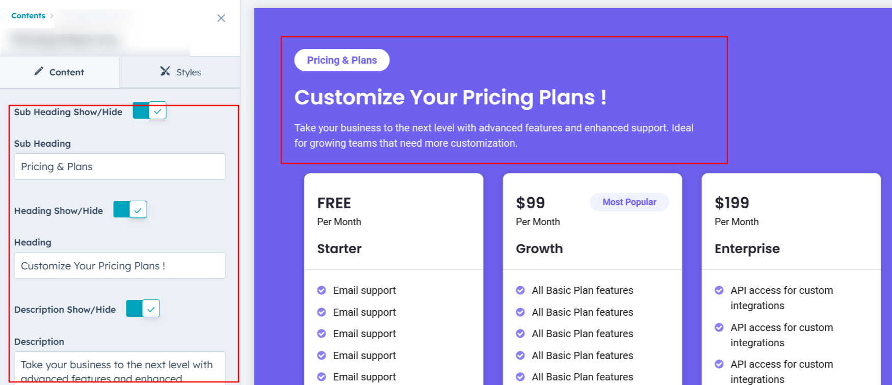
Heading, Description & Sub Heading :
Easily customize the content in your module by modifying the Heading, Description & Sub Heading to suit your needs. You can also choose to hide the section if desired, giving you complete control over the presentation and functionality of your content.
Options :
- Heading Show/Hide Toggle
- Description Show/Hide Toggle
- Sub Heading Show/Hide Toggle
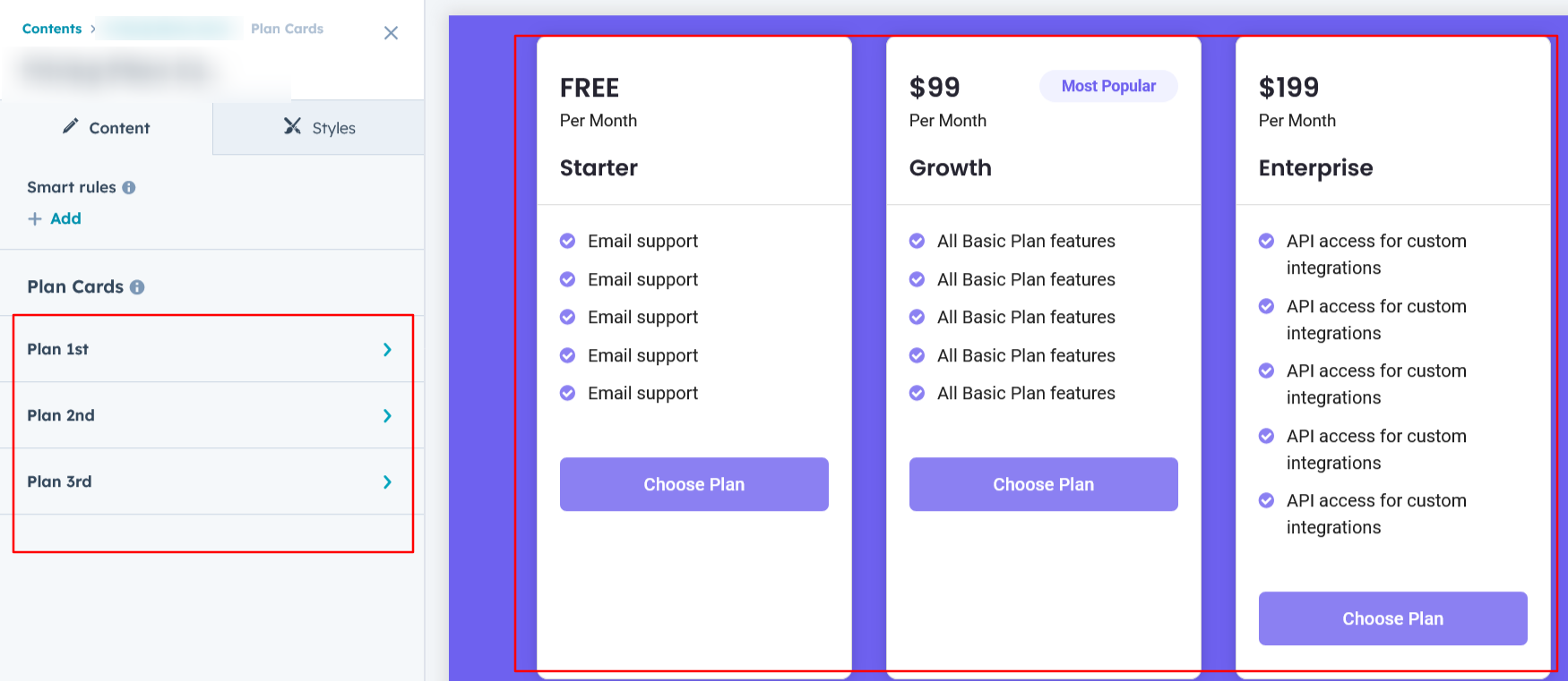
Plan Cards Column :
You can customize the plan's price, name, description, and features. Additionally, highlight Plan 2 with a 'Most Popular' tag and include a show/hide option for the CTA button to enhance user interaction.
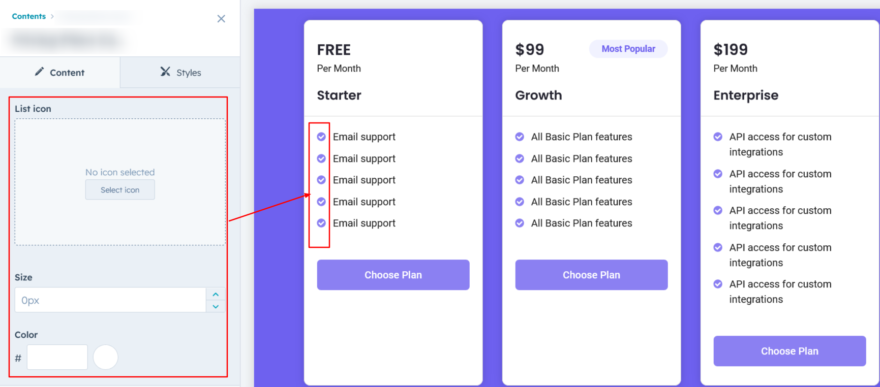
List Icon :
You can easily add or remove icons from the features list, as well as customize their size and color to match your design preferences.
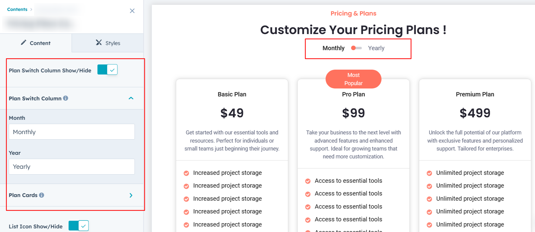
Plan Switch Column :
You can toggle between monthly and yearly plan prices in this layout, which is exclusively available in Layout One.
Module Style Options:
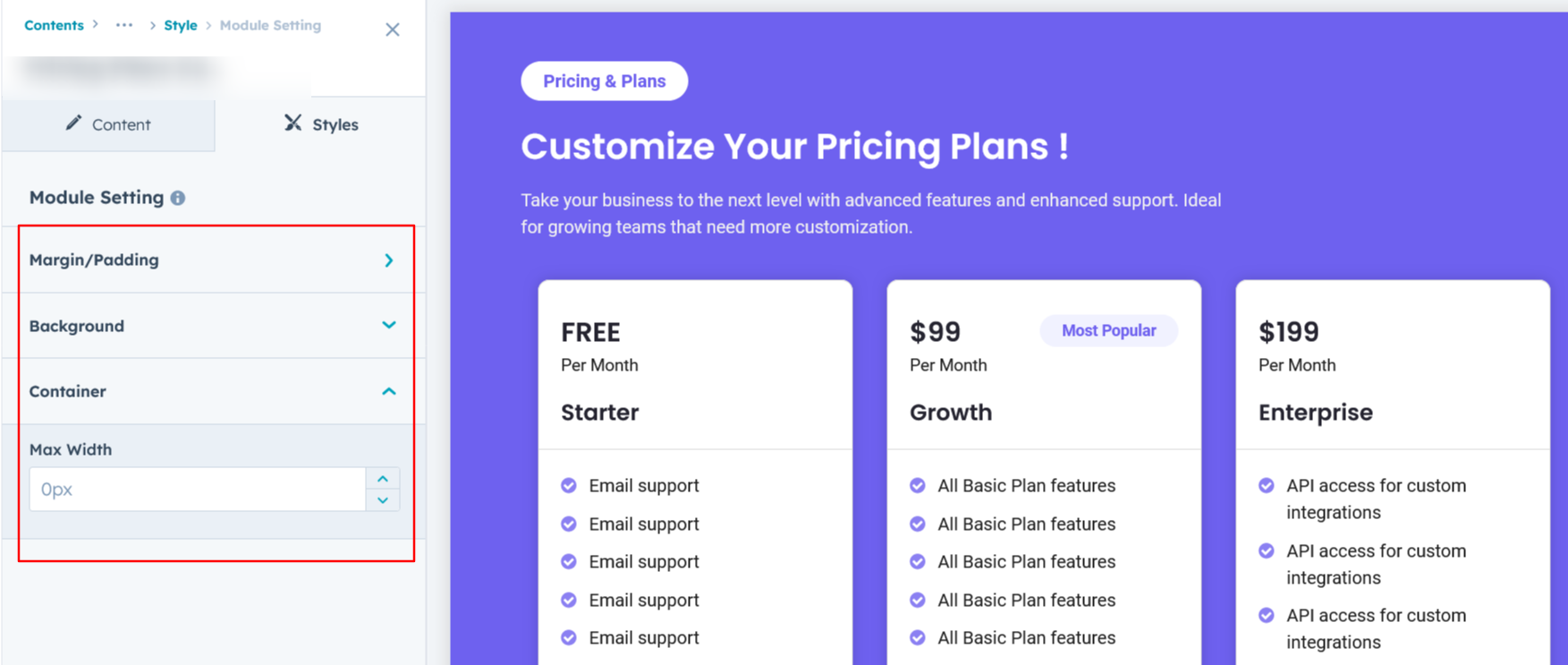
Module Setting :
Adjust the margins, padding, background colors, and container width to achieve your desired look and feel for the module. This flexibility allows you to fine-tune the layout and aesthetics, ensuring that your design is not only visually appealing but also functional and user-friendly.
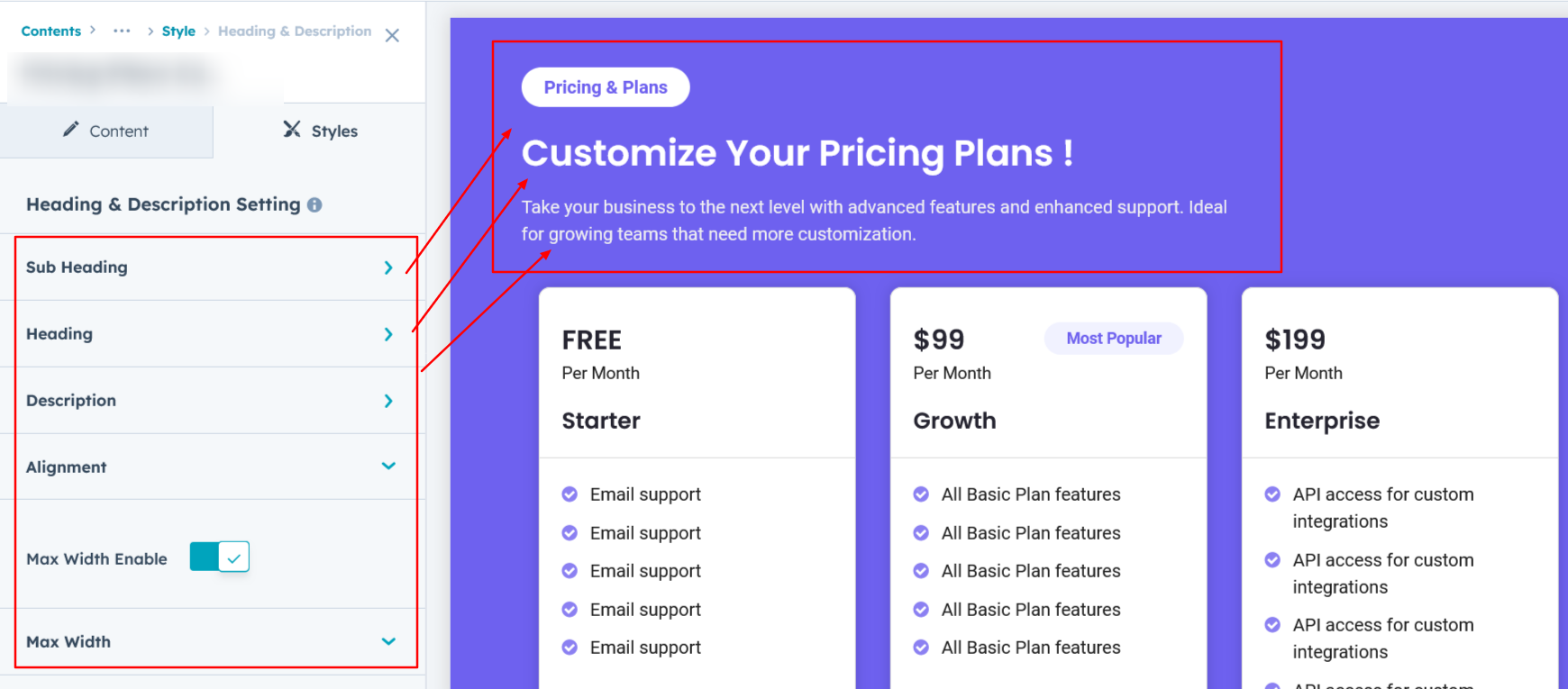
Heading, Description & Sub Heading Setting :
Users can customize the spacing of the module, as well as adjust the typography for the heading and description & sub heading. This includes modifying the color, font size, weight, and line height for both mobile and desktop views, allowing for a personalized and visually cohesive design across all devices.
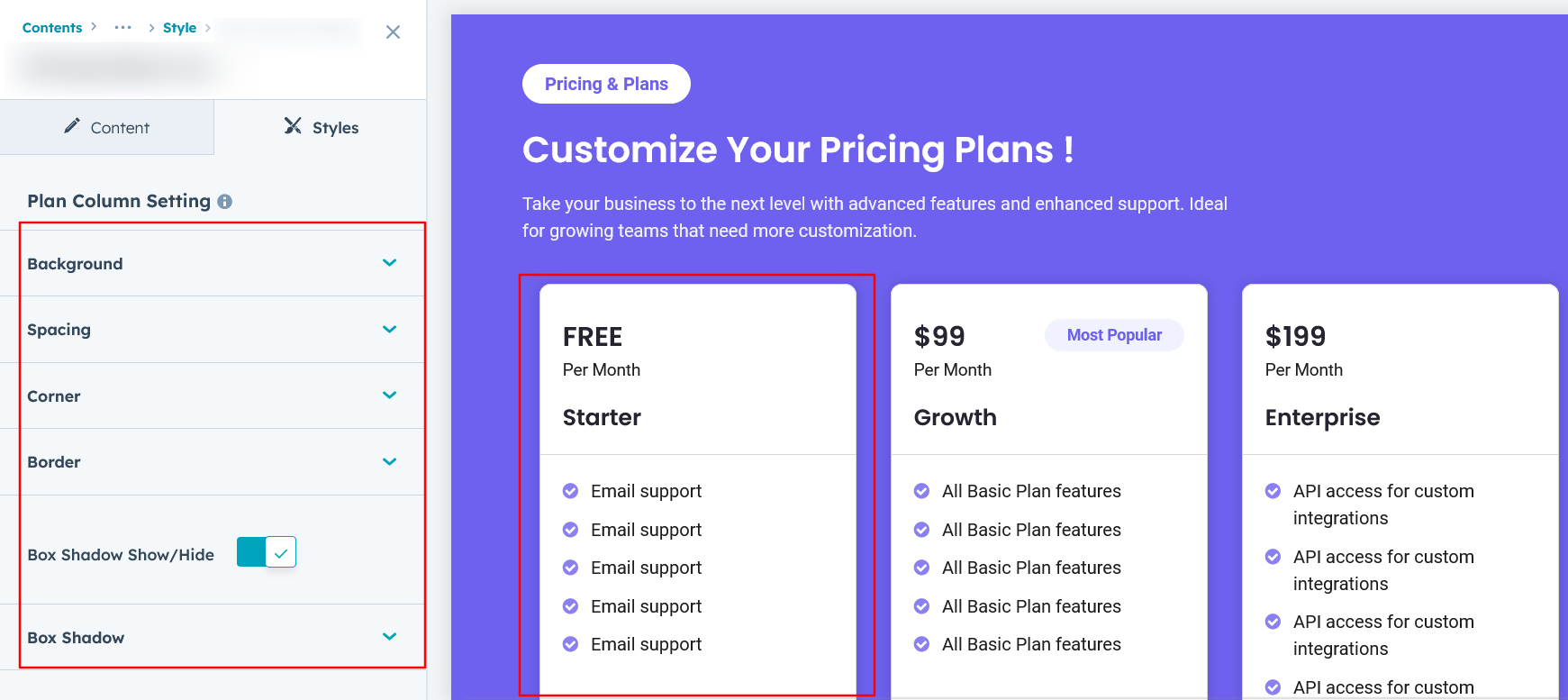
Plan Column Setting :
Users have the flexibility to customize the plan column spacing for both desktop and mobile views. Additionally, you can modify the background color, set borders and border radii, and apply box shadows to enhance depth and visual appeal.
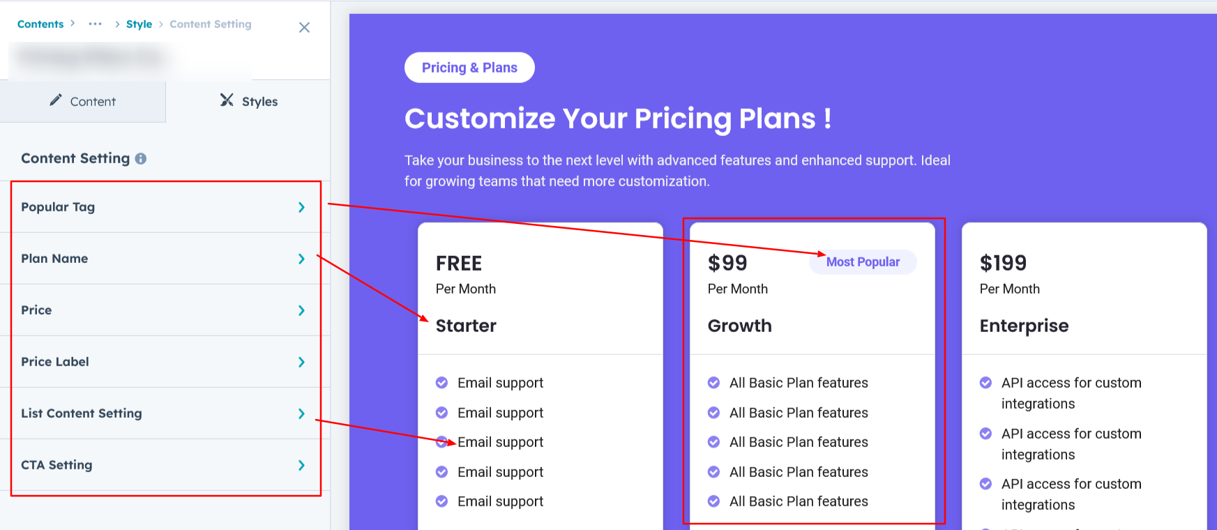
Content Setting :
Users can customize the typography of the plan column, adjusting spacing, line height, font size, and color for both desktop and mobile views. This feature provides complete control over the visual style, ensuring consistency across all devices.
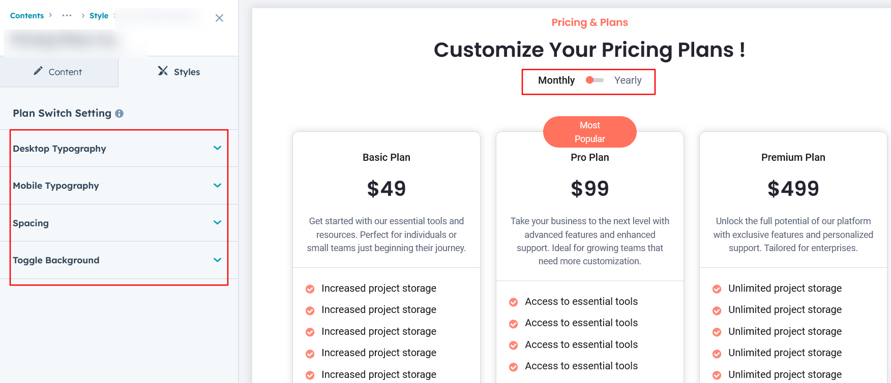
Plan Switch Setting :
Users can customize the typography of the plan switch toggle in Layout One, allowing adjustments to spacing, line height, font size, and color for both desktop and mobile views.
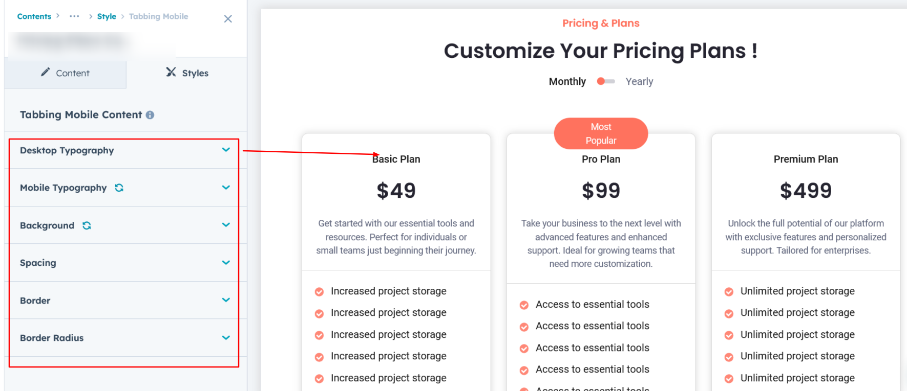
Tabbing Mobile Content :
In this setup, you can customize the mobile view tabbing style exclusively for Layout 1 and Layout 3.
We hope you enjoy using our pricing module to create a seamless experience for both your users and your marketing team. At Code Accelerator, we're committed to ensuring your HubSpot experience is exceptional. If you need a custom HubSpot module or require a tailored HubSpot CMS or CRM setup, please don’t hesitate to Contact Us.
Need Help? We’ve Got You Covered!
Our expert support team is here to guide you. Whether it’s troubleshooting, setup, or customization, we’ll help you get the most out of your modules with ease.

