HubSpot Theme
HubSpot Modules
- Startup Growth Metrics
- Smart FAQ Accordion
- Premium Full Screen Banner
- Latest Insights Blog
- Two Column Testimonial
- Dynamic CTA Banner
- Latest Blog Highlights
- Dynamic Overlap Cards
- Case Study
- Modern Video Showcase
- Content Grid Pro
- Modern Hero Banner
- Feature Cards
- Use Case Tabs
- Feature Accordion Pro
- Info Cards
- Hero Banner Pro
- Pricing Plans Premium
- Job Search and Category Premium
- Infinity Logos Slider
- Stats Number Counter
- Step Process Or Services
- Motion Cards
- FAQ Premium
- Tab with Content
- Service Animation Cards
- About Me
- Infinity Testimonial Slider
- Events List Premium
- Download eBook Now
- Tabbed Info Display
- Banner Pro
- Two Column Steps
- Image Gallery With Animation
- Parallax
- What We Offer
- Horizontal Slides Panel
- Banner
- Sliding Animation Cards
- CTA Back To Top
- Location With Map
- Testimonial Single
- Work Steps Process
- Sticky Social Icon
- Brand Logo Slider
- Animated Cards
- Multistyle Hero Banner
- Pricing Plans Card
- Hover Box Animation
- About Us Content
- Upcoming Events
- Unique CTA
- Team Members Detail
- E-Book Download
- Countdown Coming soon
- Our Services Cards Documentation Page
- 404 Section
- Main Hero Banner
- Client Logos Section
- Counter Cards Documentation Page
- Timeline Module Documentation Page
- Knowlegebase: Hubspot FAQ Module
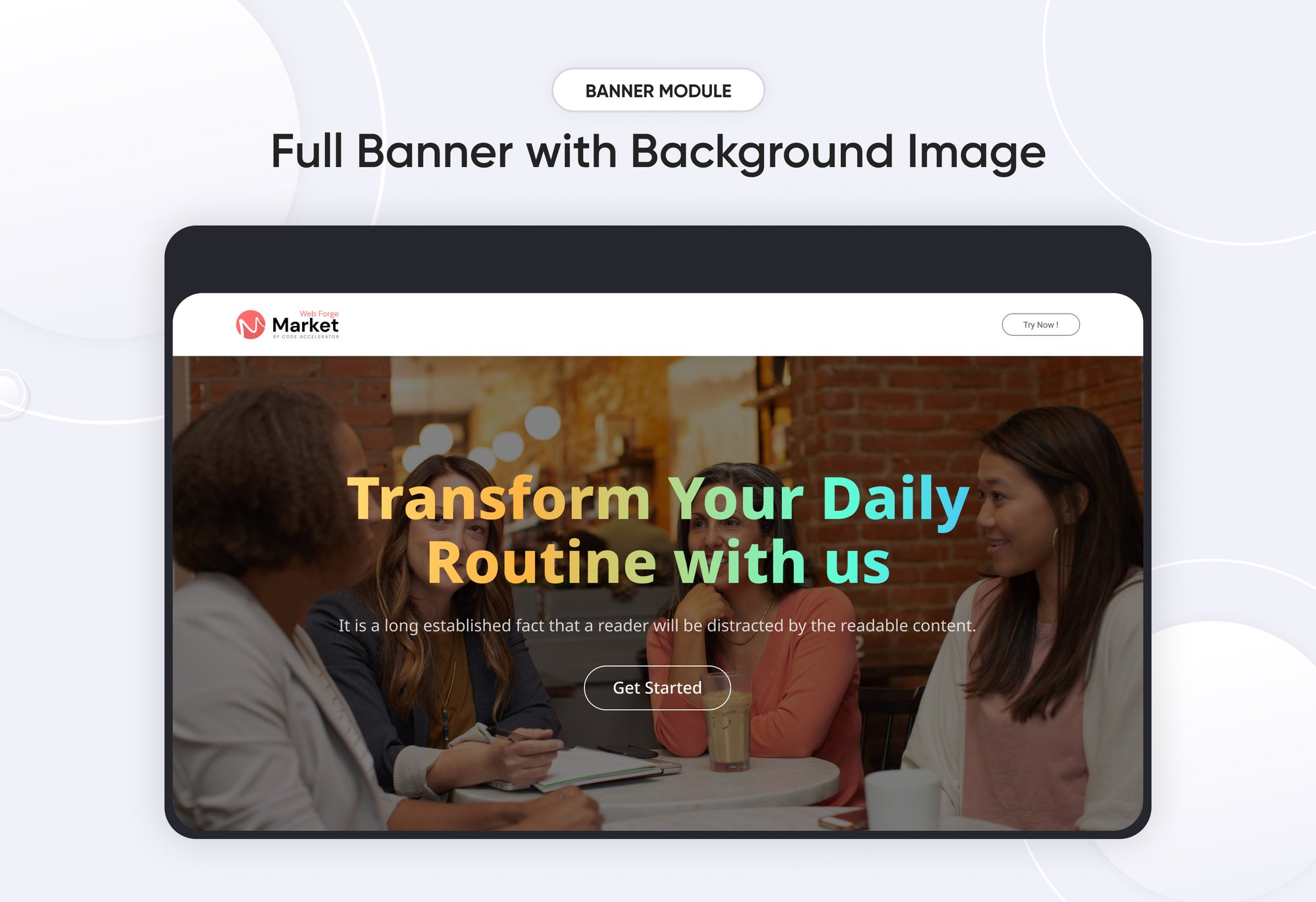
A Banner Module is a UI component used to display important messages, promotions, announcements, or visual content in a structured and engaging way. It can be static or dynamic, with interactive elements such as animations, buttons.
Key Features of a Banner Module :
-
Text Support – Can include image, text, and CTA.
-
Call-to-Action (CTA) Integration – Includes buttons for user interaction.
-
Responsive & Adaptive Design – Adjusts to different screen sizes.
-
Customizable Module– Supports different styles, colors, and layouts.
Use Cases:
🎯 Marketing & Promotions – Highlight sales, offers, and discounts.
📰 Announcements – Display alerts, news updates, and notifications.
📢 Hero Sections – Large banners for landing pages.
💻 Dashboard Notices – Important user notifications.
🎨 Brand Awareness – Showcasing company messages or taglines.
How to Set Up the Banner Module in HubSpot :
In the main dashboard, go to the ‘Content’ tab and select either ‘Website’ or ‘Landing Pages,’ depending on where you want to add the section. This lets you choose the right location for managing or updating your content.
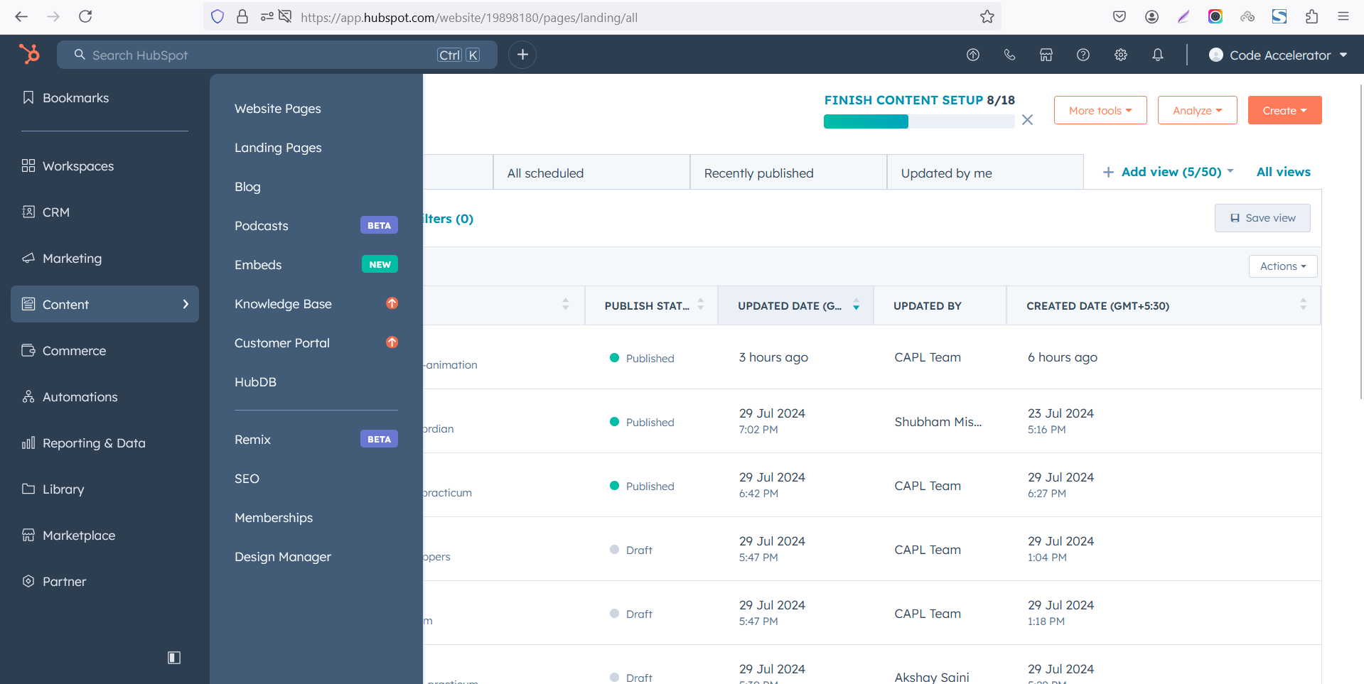 Select the page where you want to apply the module.
.png)
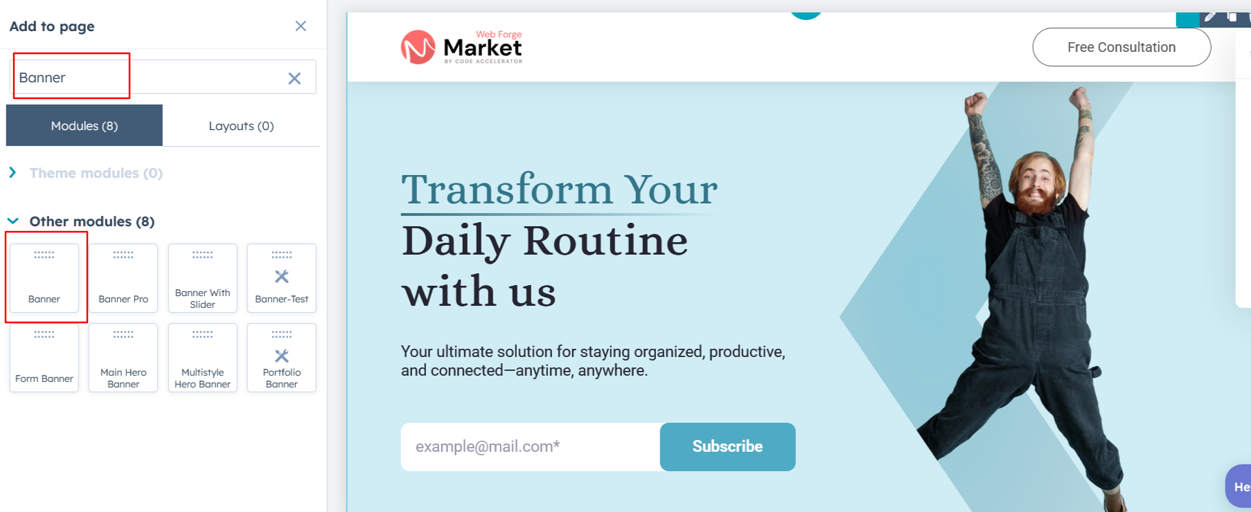
Search for "Banner" and drag and drop the module into the desired location on your page.
Module Defaults Options:
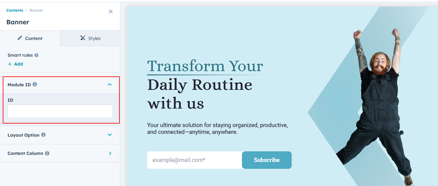
Layout ID :
You can add an ID to the target section and use the same ID in an anchor link to enable a smooth scrolling effect when a user clicks on a Call-to-Action (CTA) button, enhancing navigation and user experience.
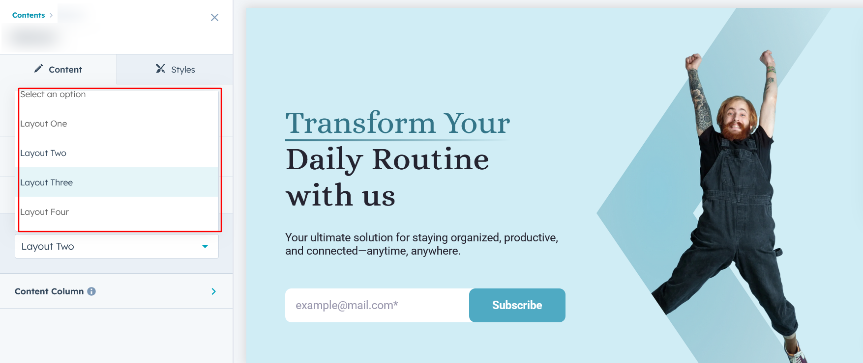
Layout Options :
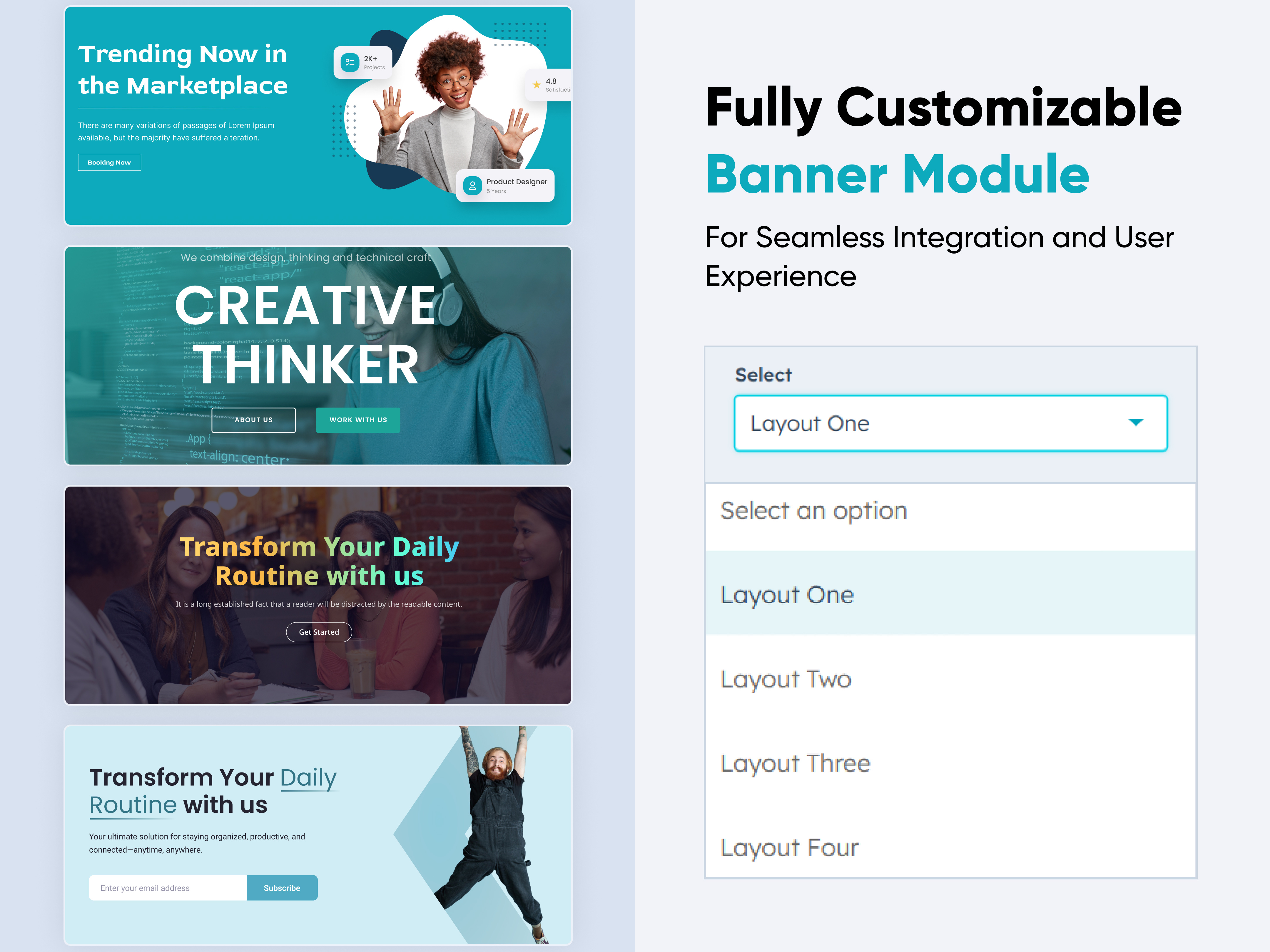
For Banner, select your preferred layout (e.g., Layout 1, Layout 2 or Layout 3). You can easily rearrange the event cards within the chosen layout to create the ideal content flow and visual arrangement.
Options :
- Layout 1 : The layout features a heading and description with multiple Call-to-Action (CTA) options, allowing for flexible engagement and user interaction.
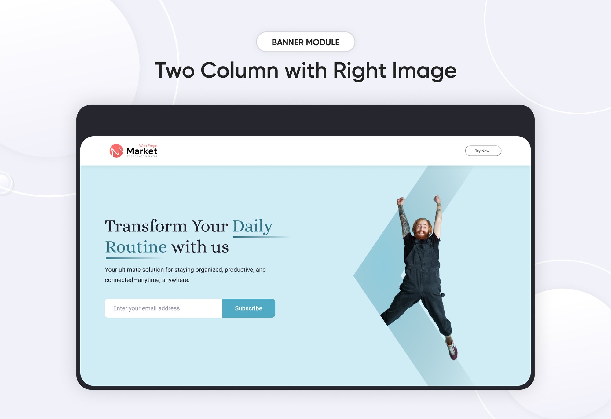
- Layout 2 : The layout features two columns: one containing a heading, description, and a subscribe form, and the other displaying an image, creating a balanced and engaging design.
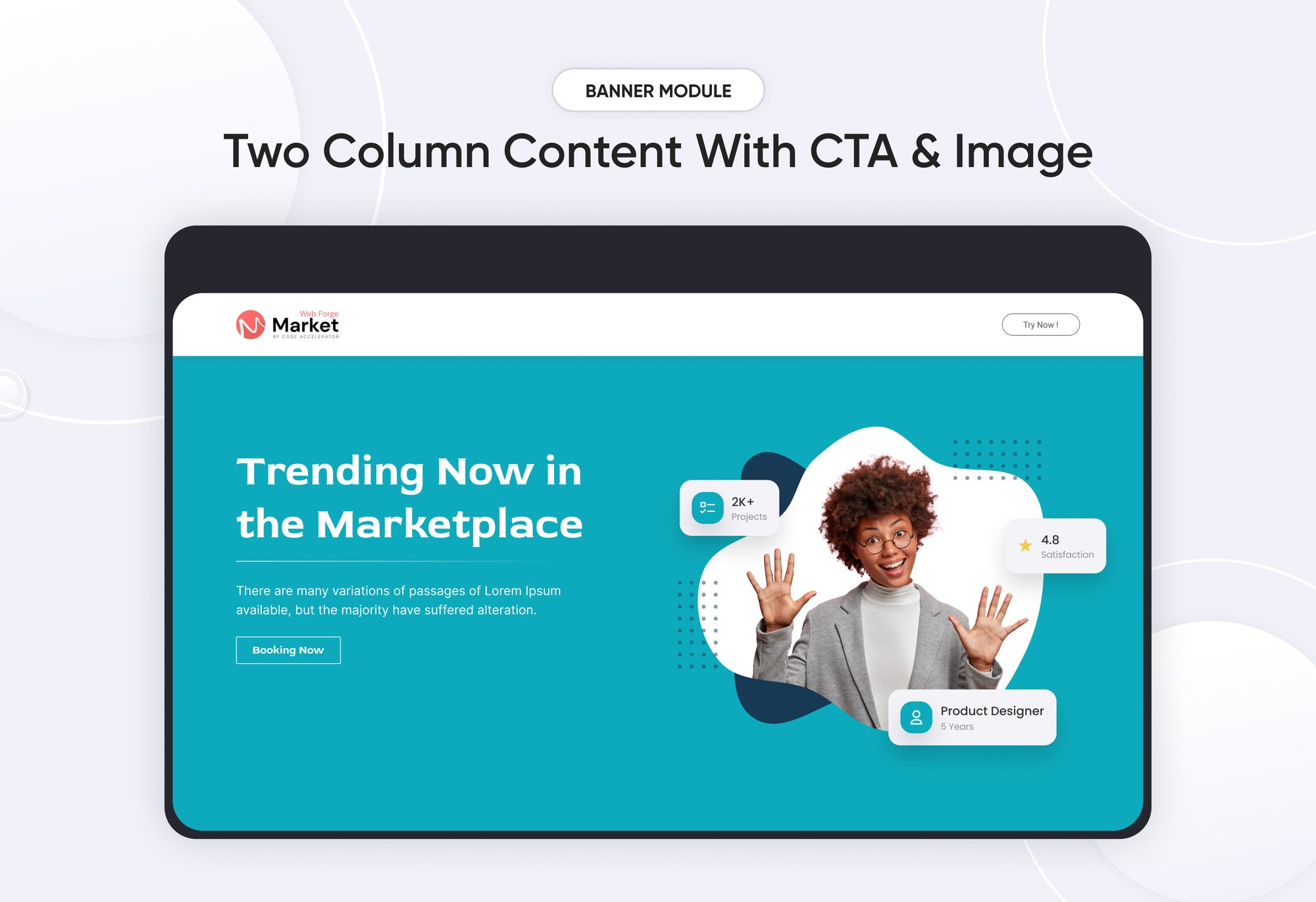
- Layout 3 : The layout features two columns: one with a heading, description, and Call-to-Action (CTA), and the other showcasing an image, ensuring a visually balanced and engaging design.
- Layout 4 : The layout features a centrally aligned heading, description, and Call-to-Action (CTA), creating a clean and visually appealing design.
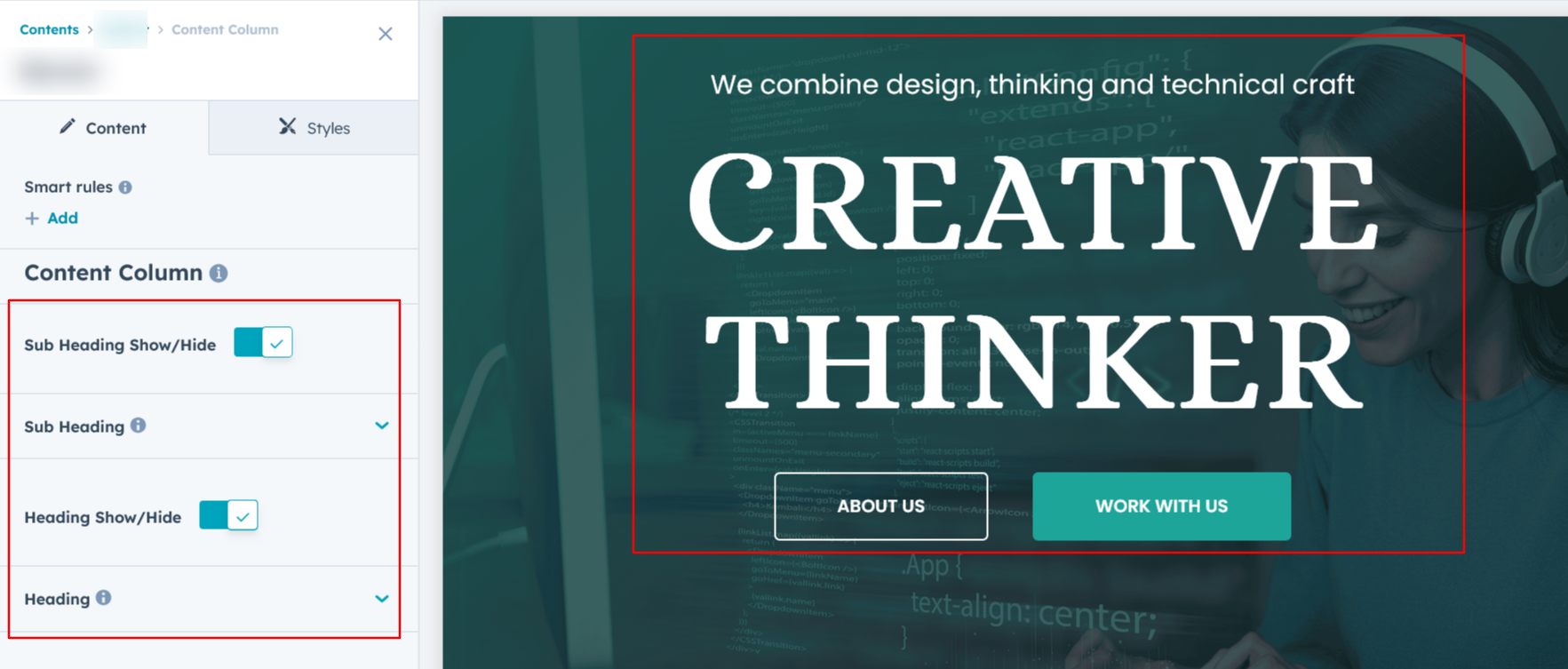
Content Column :
You can customize all column content according to your preferences, allowing you to adjust heading, description, CTA & images, and styles to match your design and branding needs.
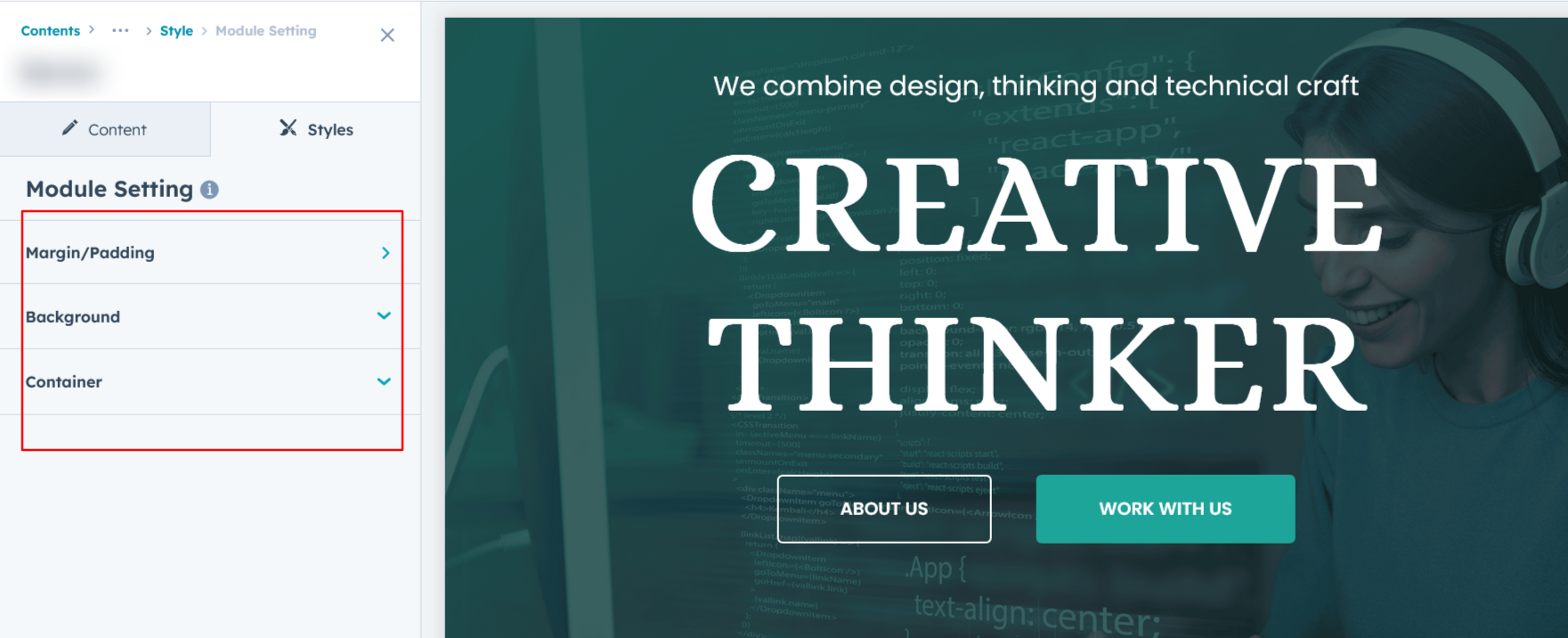
Module Style Options:
Module Setting :
Adjust the margins, padding, background colors, and container width to achieve your desired look and feel for the module. This flexibility lets you fine-tune the layout and aesthetics, ensuring your design is both visually appealing and user-friendly.
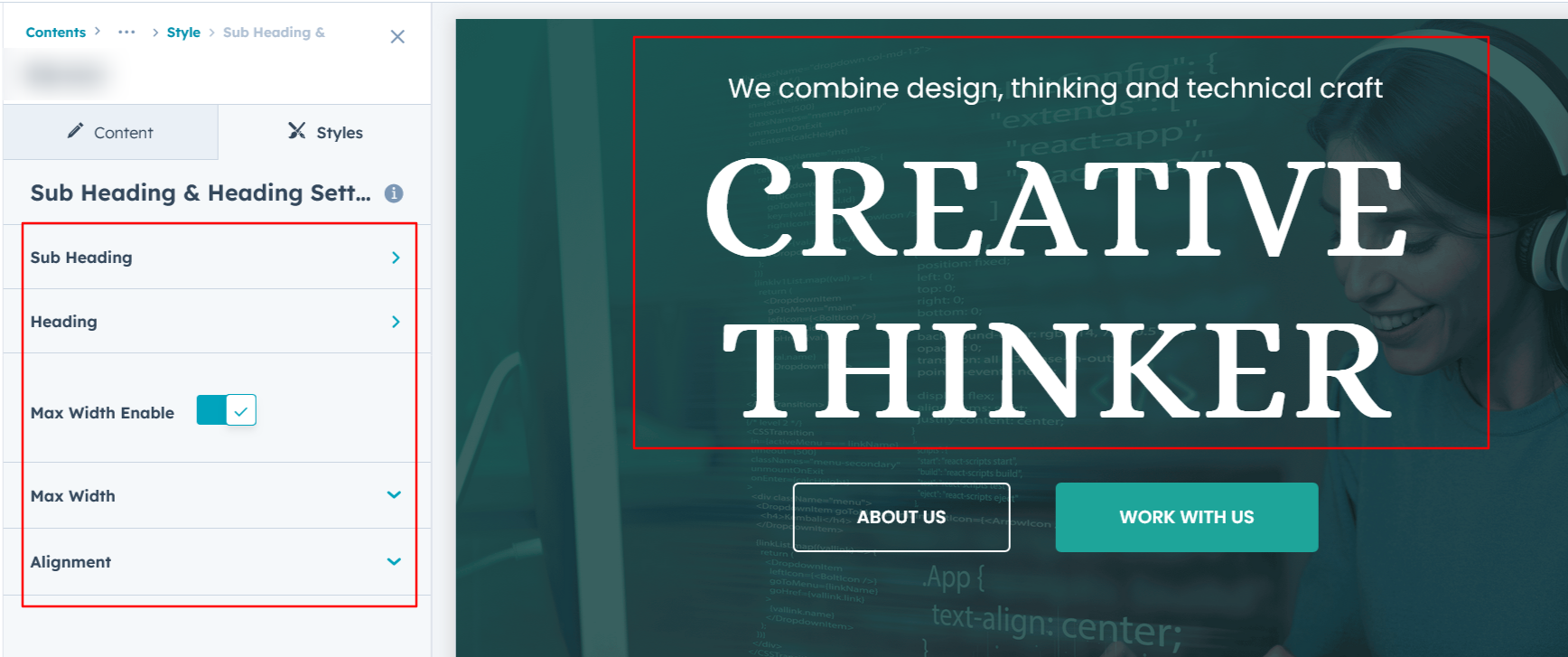
Heading & Sub Heading Setting :
Users can customize the spacing of the module, as well as adjust the typography for the heading and sub heading. This includes modifying the color, font size, weight, and line height for both mobile and desktop views, allowing for a personalized and visually cohesive design across all devices.
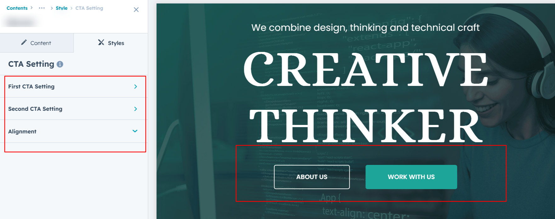
CTA Setting :
You can customize the Call-to-Action (CTA) by adjusting the typography, font size, weight, color, background color, border, corner radius, and spacing, ensuring it aligns perfectly with your design and branding.
Form Setting :
In Layout Two, you can customize the Input and Call-to-Action (CTA) by adjusting the typography, font size, weight, color, background color, line height, border, and corner radius, ensuring a visually appealing and user-friendly design.
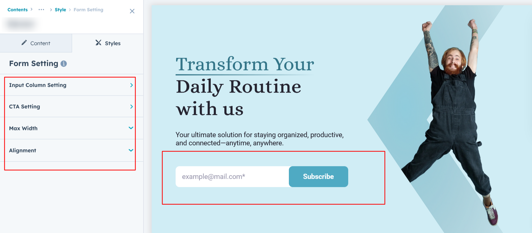
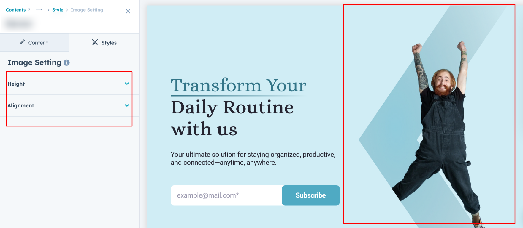
Image Setting :
In Layout Two and Layout Three, you can customize the image by adjusting its height and alignment, ensuring it integrates seamlessly with your design and enhances visual appeal.
We hope you enjoy using our banner module to create a seamless experience for both your users and your marketing team. At Code Accelerator, we're committed to ensuring your HubSpot experience is exceptional. If you need a custom HubSpot module or require a tailored HubSpot CMS or CRM setup, please don’t hesitate to Contact Us.
Need Help? We’ve Got You Covered!
Our expert support team is here to guide you. Whether it’s troubleshooting, setup, or customization, we’ll help you get the most out of your modules with ease.
