HubSpot Theme
HubSpot Modules
- Startup Growth Metrics
- Smart FAQ Accordion
- Premium Full Screen Banner
- Latest Insights Blog
- Two Column Testimonial
- Dynamic CTA Banner
- Latest Blog Highlights
- Dynamic Overlap Cards
- Case Study
- Modern Video Showcase
- Content Grid Pro
- Modern Hero Banner
- Feature Cards
- Use Case Tabs
- Feature Accordion Pro
- Info Cards
- Hero Banner Pro
- Pricing Plans Premium
- Job Search and Category Premium
- Infinity Logos Slider
- Stats Number Counter
- Step Process Or Services
- Motion Cards
- FAQ Premium
- Tab with Content
- Service Animation Cards
- About Me
- Infinity Testimonial Slider
- Events List Premium
- Download eBook Now
- Tabbed Info Display
- Banner Pro
- Two Column Steps
- Image Gallery With Animation
- Parallax
- What We Offer
- Horizontal Slides Panel
- Banner
- Sliding Animation Cards
- CTA Back To Top
- Location With Map
- Testimonial Single
- Work Steps Process
- Sticky Social Icon
- Brand Logo Slider
- Animated Cards
- Multistyle Hero Banner
- Pricing Plans Card
- Hover Box Animation
- About Us Content
- Upcoming Events
- Unique CTA
- Team Members Detail
- E-Book Download
- Countdown Coming soon
- Our Services Cards Documentation Page
- 404 Section
- Main Hero Banner
- Client Logos Section
- Counter Cards Documentation Page
- Timeline Module Documentation Page
- Knowlegebase: Hubspot FAQ Module


Team Members Detail
Provider:
Code Accelerator Pvt. Ltd.
thecodeaccelerator.comA team member module is a crucial part of any team management or HR system. It focuses on managing individual team members, their profiles, roles, performance, and interactions within the team. This module serves as a centralized hub for storing and accessing detailed information about each team member, supporting their engagement and growth within the organization.
Key Features :
-
Profile Management: Store detailed profiles for each team member.
-
Role & Responsibility Management: Assign specific roles and responsibilities to each team member, with the ability to update as roles evolve.
-
Flexibility & Scalability: Easily manage growing teams, changing roles.
How to Set Up the Team Members Module in HubSpot :
-
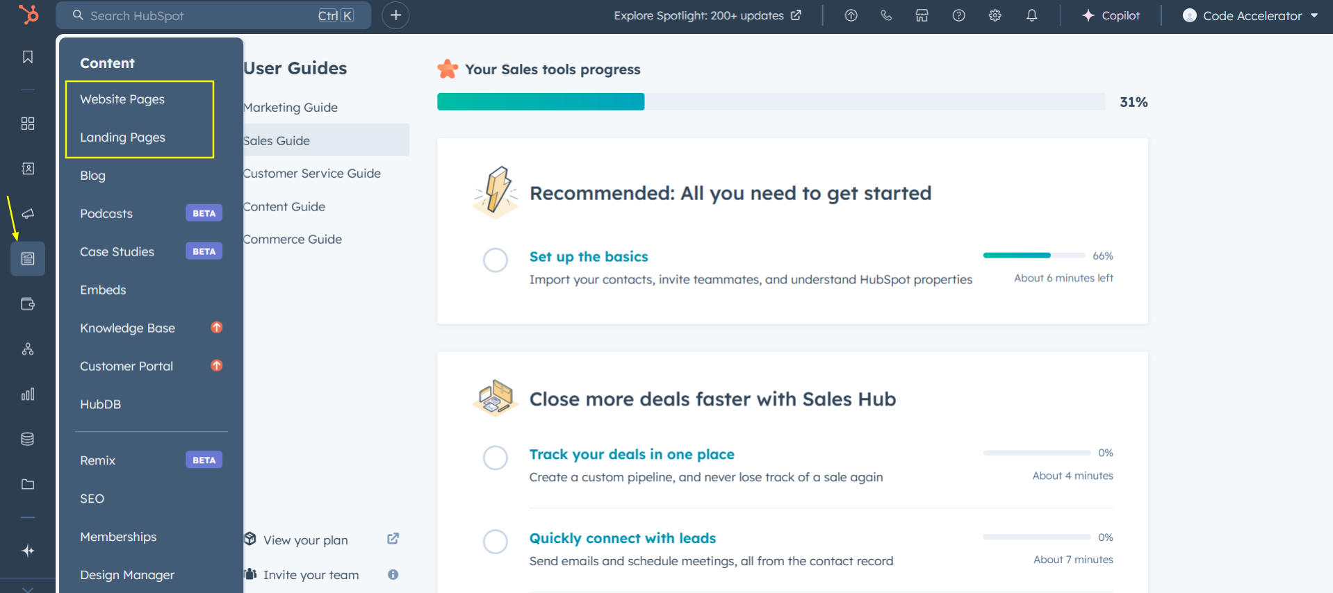
In the main dashboard, navigate to the ‘Content’ tab and choose either ‘Website’ or ‘Landing Pages’ depending on where you want to add the service section.
-
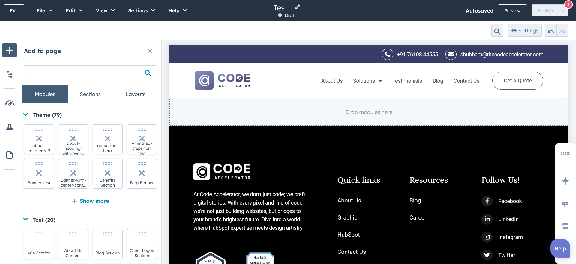
Select the page where you want to apply the module.
-
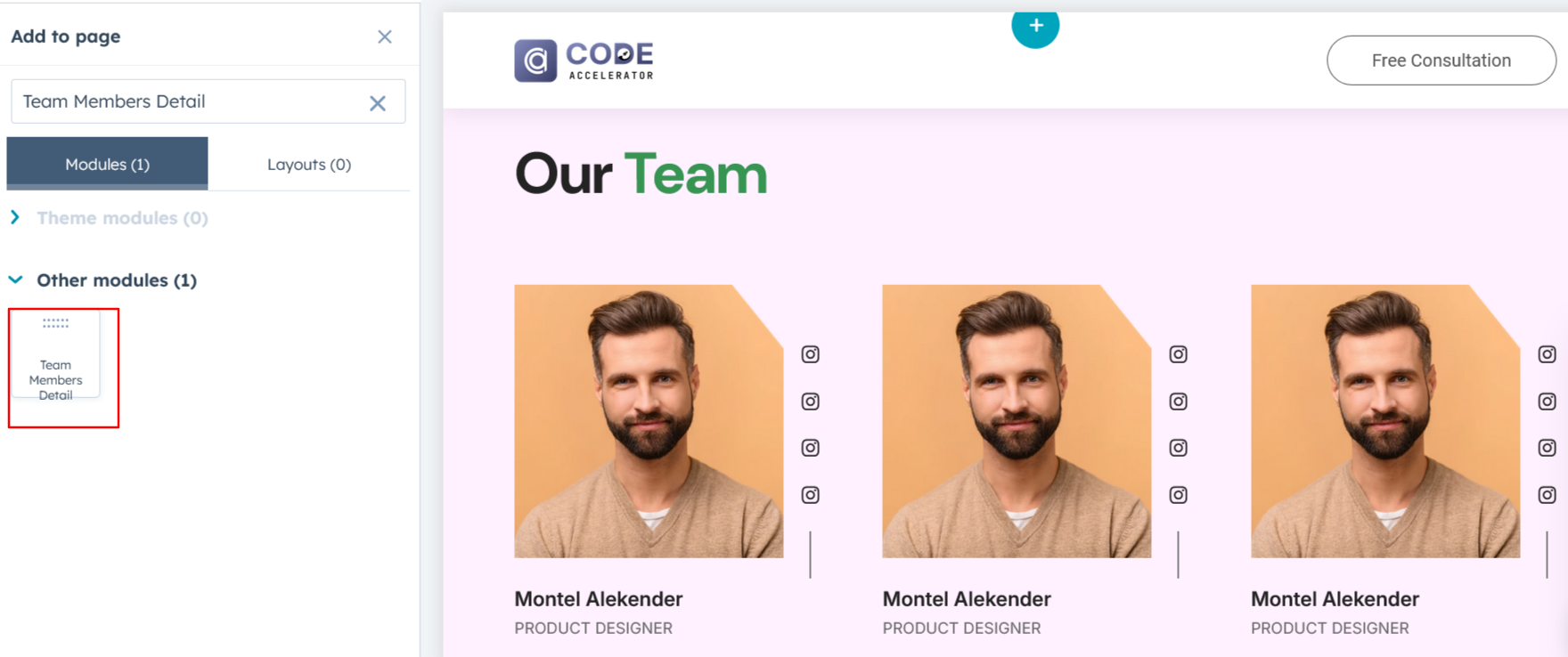
Search for "Team Members Detail" and drag and drop the module into the desired location on your page.
Module Defaults Options:
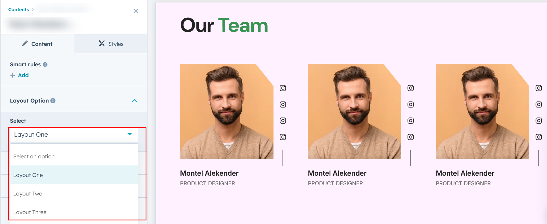
Layout Options :
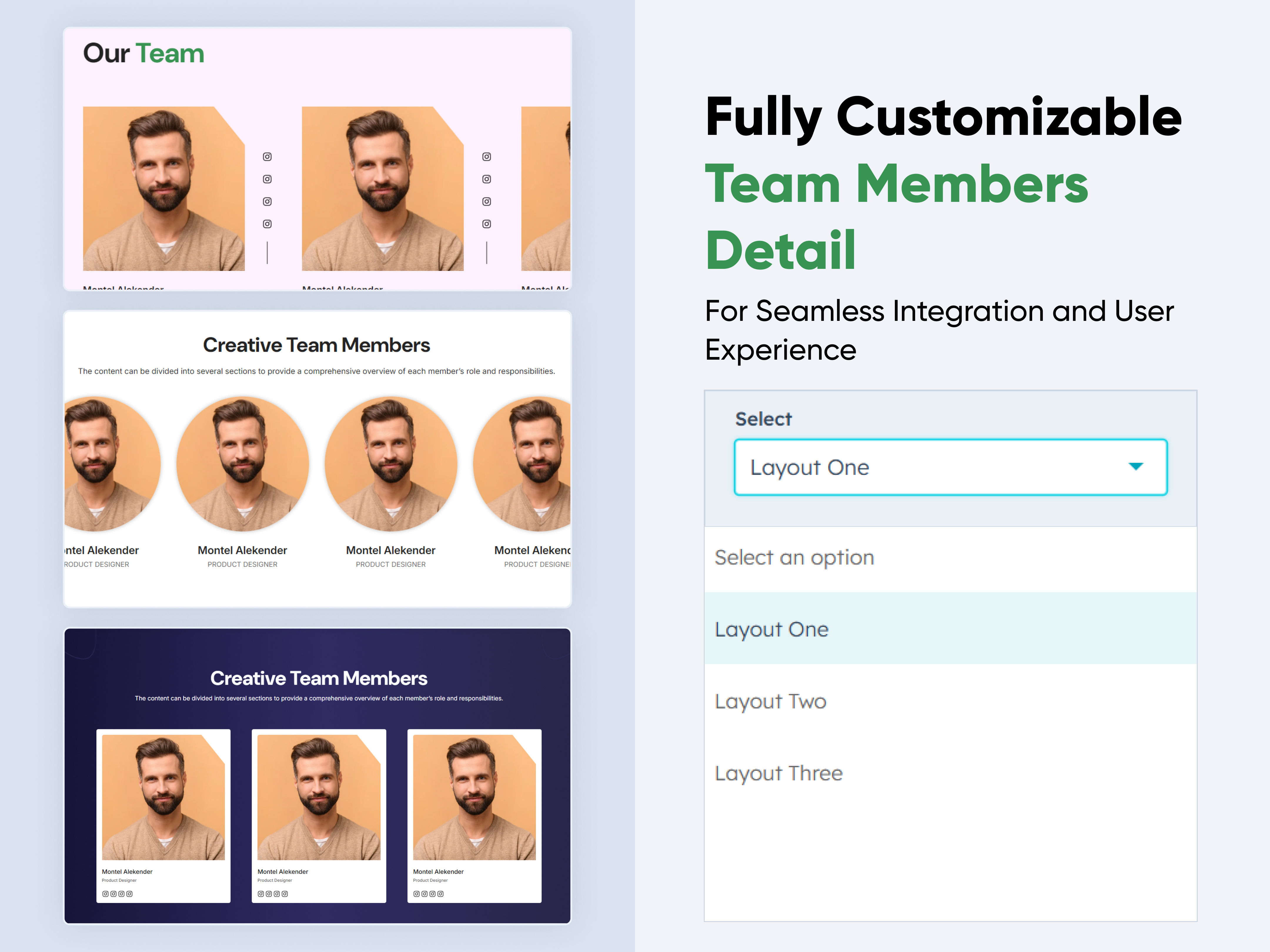
For team members, choose your preferred layout (e.g., Layout 1, Layout 2, or Layout 3). You can easily rearrange the cards within the chosen layout to achieve the perfect content flow.
Options :
- Layout 1: A three-column layout with names and designations at the bottom and a social menu overlaying the image to the right
- Layout 2: A four-column layout with a round image, where social icons appear only on hover,
- Layout 3: A three-column layout with a background color, an image at the top, and all details (name, designation, and social icons) displayed at the bottom.
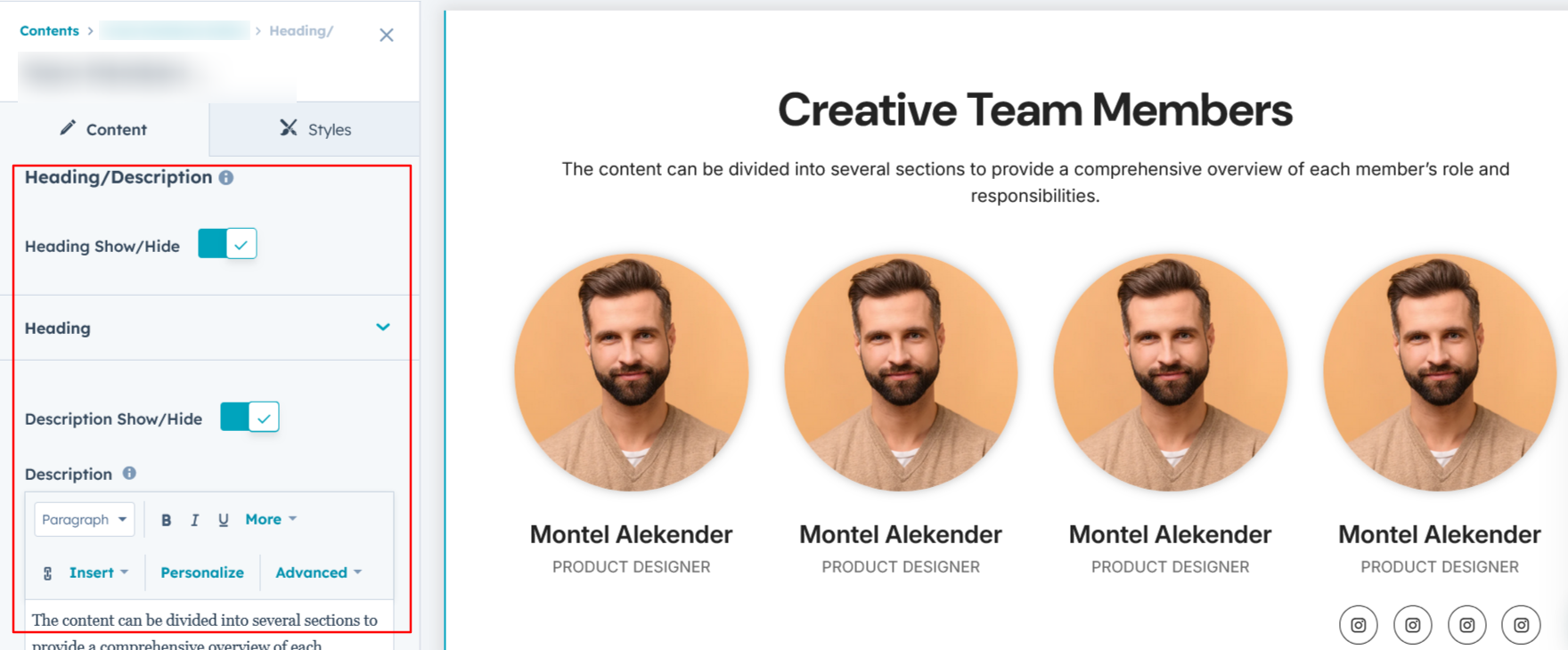
Heading & Description:
Easily customize the content in your contact us heading sections. Modify the "Heading," "Description," to fit your needs, and choose to hide the section if desired.
Options :
- Heading & Description Hide/Show Toggle
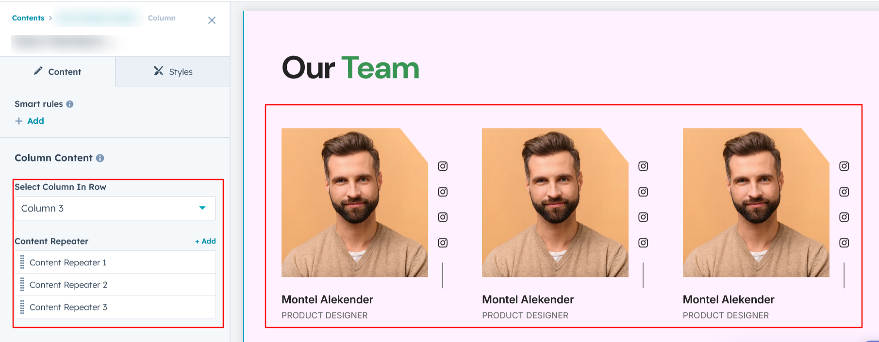
Column Content :
You can easily customize the content in team member columns by editing the member names and designations.
Options :
- Column options in single row
- Repeat the column items
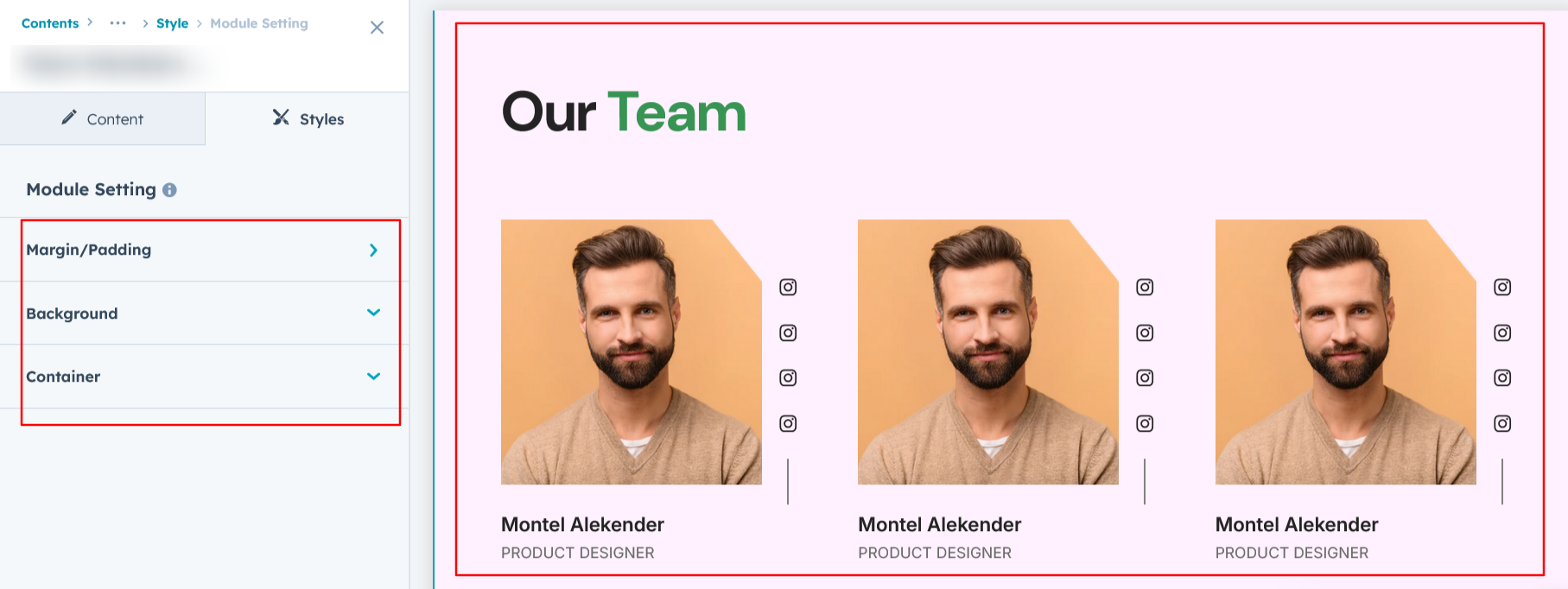
Module Style Options:
Module Setting :
Adjust margins, padding, background colors, and container width to achieve the desired look and feel.
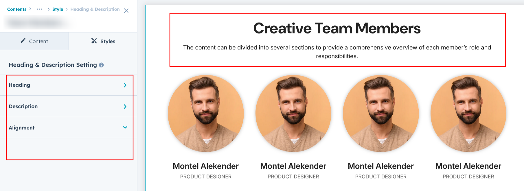
Heading & Description Setting :
Users can customize the bottom spacing, and content alignment. Additionally, users can adjust the typography for the heading, description, including font size, weight, and line height for both mobile and desktop views.
Column Section Setting :
Users can customize the column section by adjusting the background color, border, corners, and adding box shadows. They can also fine-tune spacing for both desktop and mobile views, ensuring optimal appearance across devices

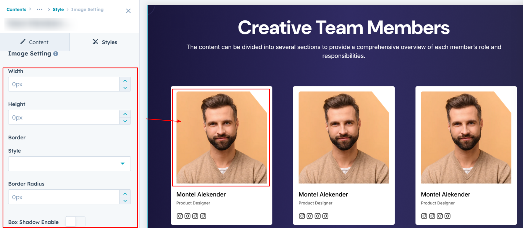
Image Setting :
Users can customize the image height and width, as well as add borders, rounded corners, and box shadows for a polished look.
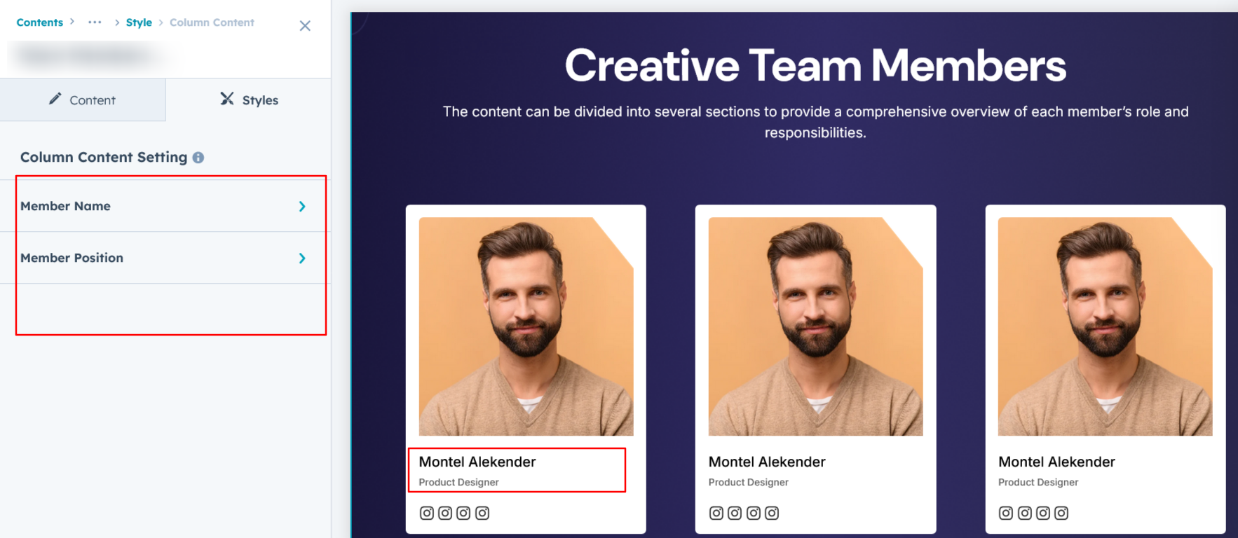
Column Content Setting :
Users can customize the member name and position typography separately for desktop and mobile views, including font size, style, and weight. Additionally, they can adjust the bottom spacing to ensure proper alignment and visual balance across different devices.
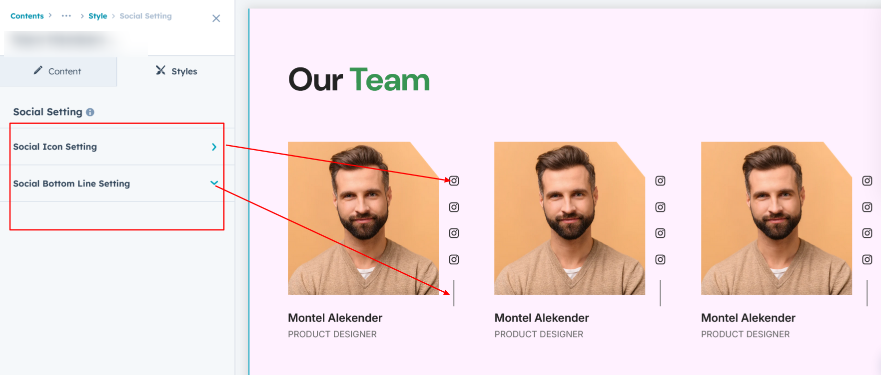
Social Setting :
Users can customize the icon’s color, background, height, and width, and can add borders with rounded corners. They can also apply hover effects such as background color, border color, and icon color changes. Additionally, spacing adjustments can be made for both desktop and mobile views, ensuring that icons look consistent and visually appealing across all devices. Users can also change the social icon divider’s color, height, and width, with these customization specifically applying to layout 1.
We hope you enjoy using our team members module to create a seamless experience for both your users and your marketing team. At Code Accelerator, we're committed to ensuring your HubSpot experience is exceptional. If you need a custom HubSpot module or require a tailored HubSpot CMS or CRM setup, please don’t hesitate to Contact Us.
Need Help? We’ve Got You Covered!
Our expert support team is here to guide you. Whether it’s troubleshooting, setup, or customization, we’ll help you get the most out of your modules with ease.
