HubSpot Theme
HubSpot Modules
- Startup Growth Metrics
- Smart FAQ Accordion
- Premium Full Screen Banner
- Latest Insights Blog
- Two Column Testimonial
- Dynamic CTA Banner
- Latest Blog Highlights
- Dynamic Overlap Cards
- Case Study
- Modern Video Showcase
- Content Grid Pro
- Modern Hero Banner
- Feature Cards
- Use Case Tabs
- Feature Accordion Pro
- Info Cards
- Hero Banner Pro
- Pricing Plans Premium
- Job Search and Category Premium
- Infinity Logos Slider
- Stats Number Counter
- Step Process Or Services
- Motion Cards
- FAQ Premium
- Tab with Content
- Service Animation Cards
- About Me
- Infinity Testimonial Slider
- Events List Premium
- Download eBook Now
- Tabbed Info Display
- Banner Pro
- Two Column Steps
- Image Gallery With Animation
- Parallax
- What We Offer
- Horizontal Slides Panel
- Banner
- Sliding Animation Cards
- CTA Back To Top
- Location With Map
- Testimonial Single
- Work Steps Process
- Sticky Social Icon
- Brand Logo Slider
- Animated Cards
- Multistyle Hero Banner
- Pricing Plans Card
- Hover Box Animation
- About Us Content
- Upcoming Events
- Unique CTA
- Team Members Detail
- E-Book Download
- Countdown Coming soon
- Our Services Cards Documentation Page
- 404 Section
- Main Hero Banner
- Client Logos Section
- Counter Cards Documentation Page
- Timeline Module Documentation Page
- Knowlegebase: Hubspot FAQ Module

Provider:
Code Accelerator Pvt. Ltd.
thecodeaccelerator.comOrganize your website content with the "Tab with Content" module for HubSpot. Easily add customizable tabs, rich text, and responsive layouts. Choose from horizontal or vertical alignment and style them to match your brand—no coding needed. Perfect for clean, user-friendly content display.
Key Features of a Tab with Content Module :
✅ Custom Tab Titles – Easily add and label multiple tabs.
✅ Rich Text Content Area – Each tab supports a rich text editor.
✅ Horizontal & Vertical Tab Layouts – Choose between horizontal or vertical tab orientation.
✅ Fully Responsive Design – Optimized for all devices (desktop, tablet, mobile).
✅ Extensive Style Customization – Tab background (solid or gradient), Border styles, Padding/margins, Active/inactive states
✅ Easy to Use with Drag & Drop – Built for HubSpot’s drag-and-drop page editor. No coding required to configure or style tabs
✅ Reusable and Scalable – Add multiple tab sections to a page or reuse across templates.
How to Set Up the Tab with Content in HubSpot :
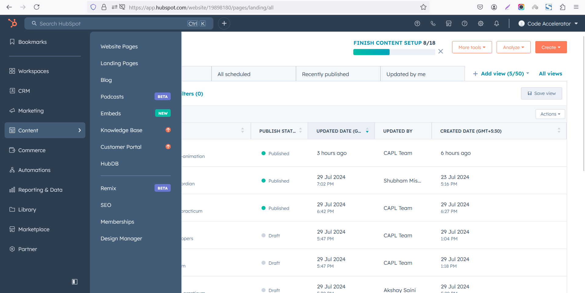
In the main dashboard, go to the ‘Content’ tab and select either ‘Website’ or ‘Landing Pages,’ depending on where you want to add the section. This lets you choose the right location for managing or updating your content.
 Select the page where you want to apply the module.
.png)
Search for "Tabbing with Content" and drag and drop the module into the desired location on your page.

Module Defaults Options:
Layout ID :
Easily enhance navigation by adding an ID to the target section and using the same ID in an anchor link. This enables a smooth scrolling effect when users click a Call-to-Action (CTA) button, improving the overall user experience.

Layout Options :
Easily organize your content with the "Tab with Content" module — ideal for showcasing services, FAQs, or product details. This user-friendly layout allows visitors to switch between tabs without page reloads, improving engagement and readability. Clean design ensures information is structured and accessible. Perfect for enhancing UX on any HubSpot landing or website page.
Options :
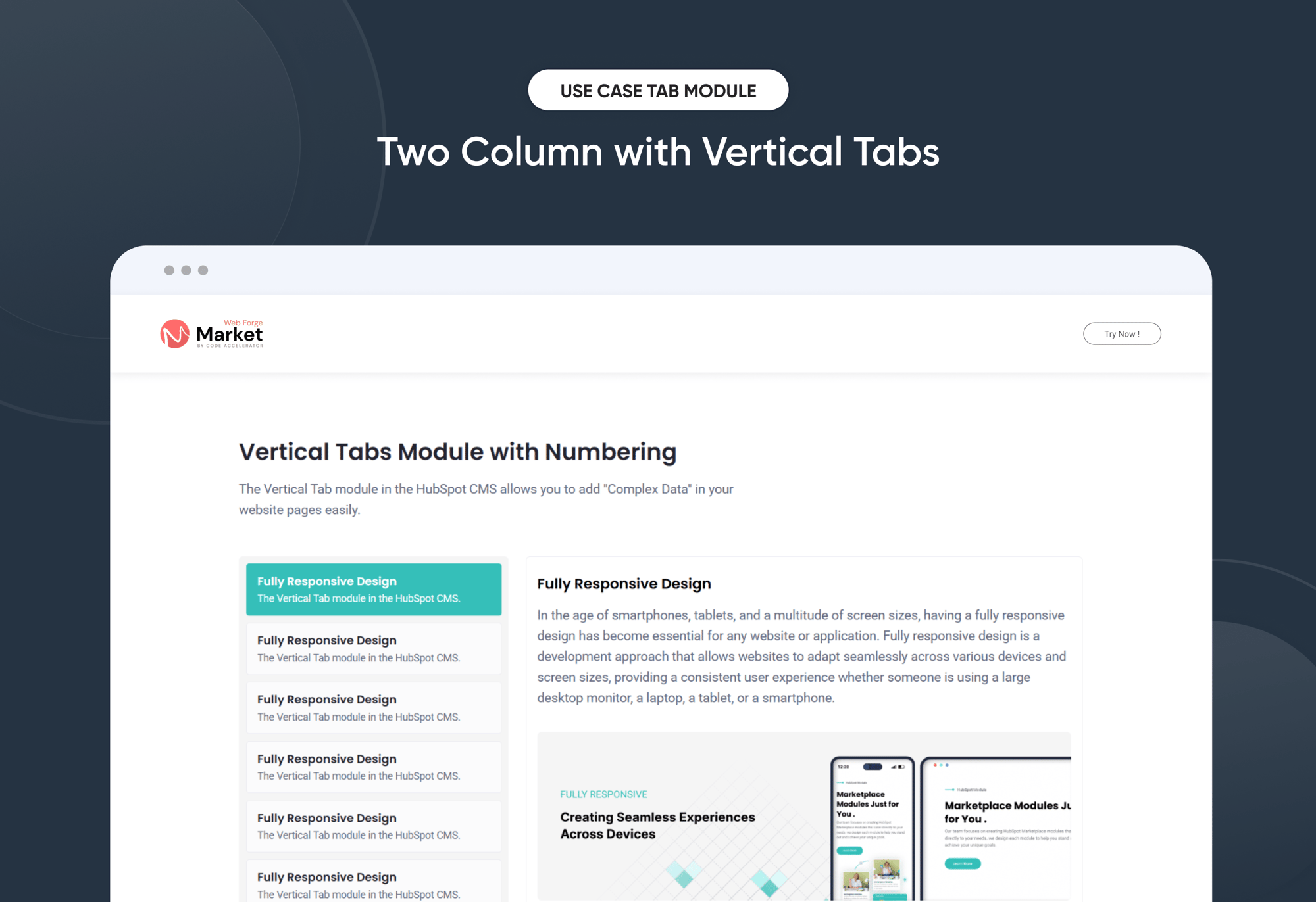
- Layout 1 : Vertical Tabs - Tabs appear in a vertical list on the left, with content on the right. Great for longer tab titles or detailed information. Provides a sidebar-like navigation that's perfect for documentation or comparison pages.
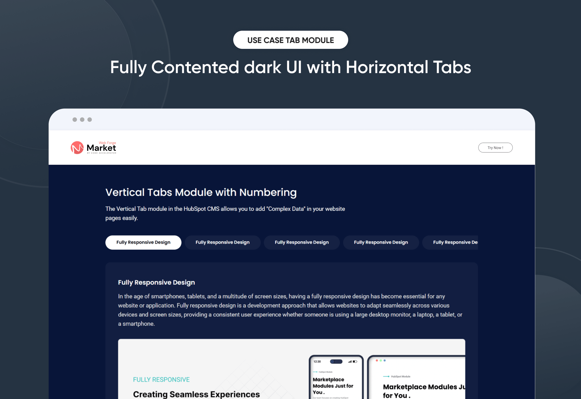
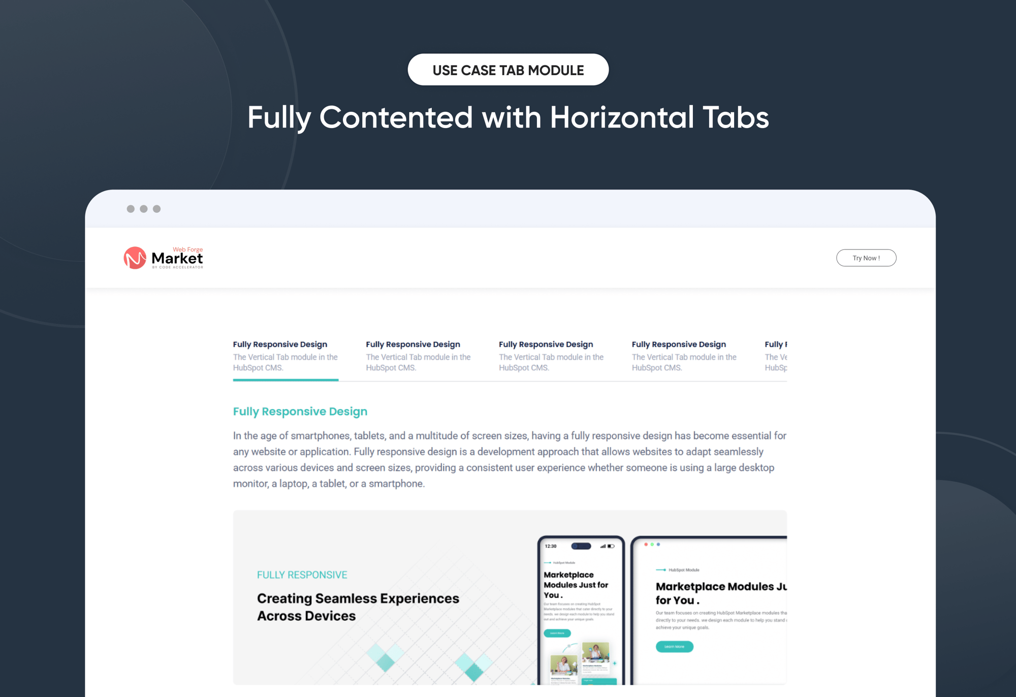
- Layout 2 & 3 : Horizontal Tabs - Tabs are displayed side-by-side at the top, making it easy for users to switch between sections. Ideal for showcasing features, services, or content categories in a clean, linear format. Works best on wider screens.

- Layout 1 and Layout 2 are ideal for building a clean and organized knowledge base. Both layouts allow you to customize headings and descriptions for each tab, helping you clearly label articles, topics, or help sections.
- You can also enable a show/hide feature, giving users the option to expand or collapse content as needed—keeping the interface neat and user-friendly. Whether you prefer the structured sidebar of Layout 1 or the horizontal flow of Layout 2, these layouts provide a flexible way to manage and present helpful content.

All Tabbing & Content Customizable :
Create an organized, interactive experience with customizable tabs that allow users to add and manage rich content with ease. Each tab includes:
- Tab Title - Short and clear titles help users navigate between sections. Perfect for labeling topics, categories, or content areas.
- Rich Content Area (inside each tab) -
Headings - Use headings H1 to H6
Descriptions - Provide detailed explanations or instructions for users.
Bullet or Numbered Lists - Perfect for steps, tips, or grouped information.
Images - Add product screenshots, infographics, or visual instructions to enhance clarity.


Module Style Options:
Module Setting :
Adjust the margin, padding, container width and background colors to achieve your desired look and feel for the module. This flexibility lets you fine-tune the layout and aesthetics, ensuring your design is both visually appealing and user-friendly.

Tabbing & Content Column Setting :
You have full control over customizing the tabbing & content box to align with your design preferences. Adjust the background, spacing, border, corners and to create the perfect look for your layout. Tailor these elements to ensure your content stands out and blends seamlessly with the rest of your design.
- Background Customization
Choose a solid color for your column box. - Spacing Control
Adjust the padding and margin to create the ideal distance between elements and prevent overcrowding. - Border Style
Choose from various styles like solid, dashed, or dotted. - Corner Radius
Round the corners to create smooth, modern edges for a softer design.


Tabbing & Content Setting :
Take full control over your column content by customizing the typography, spacing, and alignment to match your brand's design style. You can adjust text transform options, Whether you’re updating typography, or configuring borders every detail can be tailored for a cohesive and visually appealing look.
- Typography Customization
Adjust font size, style, and color for headings, descriptions, tabbing, listing content and other text elements to create a consistent visual identity. - Spacing & Alignment
Control padding, margin, and text alignment to ensure optimal content positioning and balance. - Text Transform
Modify text case and style (uppercase, lowercase, capitalize) for better readability and emphasis. - Tabbing
Customize the Tabbing background, corner, border, active effect, hover and typography. - Image
Customize the image size and corner to match your brand’s color palette and enhance the overall design. - List Content
Customize the list content color, text color, spacing, list style and typography.


We hope you enjoy using our tab with content module to create a seamless experience for both your users and your marketing team. At Code Accelerator, we're committed to ensuring your HubSpot experience is exceptional. If you need a custom HubSpot module or require a tailored HubSpot CMS or CRM setup, please don’t hesitate to Contact Us.
Need Help? We’ve Got You Covered!
Our expert support team is here to guide you. Whether it’s troubleshooting, setup, or customization, we’ll help you get the most out of your modules with ease.